Old Vs New
Mass Wastage
Plastic and single-use medical supplies have become part of our daily lives but they have severe consequences on our environment. Most plastics and medical supplies are single-use which is increasing plastic pollution, especially after the pandemic due to the number of medical supplies that were disposed of every day. Plastic is ‘becoming part of the Earth’s fossil records and a marker of the Anthropocene’.
Single-use plastic has been integrated into our day to day life, most of which comes from packaging, that eventually ends up in landfills or unregulated waste. Food wrappers, plastic bottles, plastic bottle caps, plastic grocery bags, plastic straws, and stirrers are key items that are infesting the environment, with cigarette butts being the most common, as their filters contain plastic fibres.
Since the Covid-19 pandemic started in 2020 the use of face masks and other protective medical supplies has skyrocketed, but using these single-use protection has had huge environmental costs. It has been estimated that the pandemic causes 7,200 tons of medical waste every day, even with it slowing down last year. Most of the waste is disposable masks, as health care workers in most places are still required to wear them.
The environmental toll of disposable masks | MIT News | Massachusetts Institute of Technology
Visual Feature | Beat Plastic Pollution (unep.org)
1 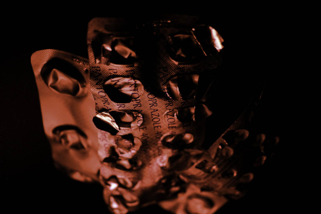
2 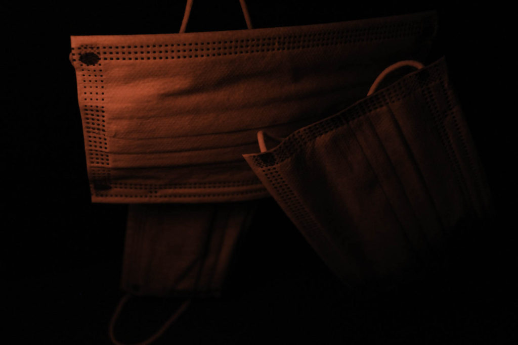
3
These three photographs were inspired by Troy Paiva and his use of neon lighting in his photo book ‘Night Vision; The Art of Urban Exploration’.
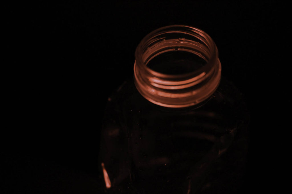
For my first image, I photographed a plastic water bottle while it was set up against a black background in a dark room which gives the photograph an ominous atmosphere, which is enhanced by the red lighting that is highlighted around the bottle top. I like how the most illuminated feature of the bottle is the top and as you get further down the colour doesn’t show as much but there are still pops of it when the edge of the bottle catches the light. I enjoyed using the black background as it was able to single out the bottle and put it to the forefront of the image making it the centre of attention. Lastly, I think the position and angle of the bottle create a more captivating finale image, I made sure that the bottle wasn’t centred and that it wasn’t photographed as a whole as I wanted a more unique photo.
For my second photograph, I used four different empty medicine packages which I hung up on clear string so that they look as if they are floating. I decided to use this type of packaging because I liked how there were different textures and features to each item, for example, the crinkled parts of the plastic when the tablets have been removed which produce shadow’s against the red light illumination the packaging. Also, the thin metal covering that has been opened shines when they reflect the light. I angled the camera downwards when taking the photo so that the top of the medicine was in focus and clear and the bottom of the photograph was blurred. This effect gives the image more depth and I like the contrast it makes between the focused and unfocused parts of the final piece.
For my third photo, I used three disposable masks that were hung up at different angles to make the image more interesting so that they crossed over each other as if they have just been dumped or thrown away. I chose to use the red lighting as it gives the photograph an eerie feeling and some people suggest that red can be used as a symbol of danger, which correlates to the danger that our environments in if plastic pollution increases and mass wastage isn’t lessened or stopped. I decided to include disposable masks in my photoshoot because of the increase of medical waste that has come from the coronavirus pandemic, with the majority of it being from single-use masks. In the image I like how the red light is intense on the left side of the photo and slowly fades into the darkness of the background as you get further to the right, I did this by angling the lighting nearer to the top of the mask placing the camera more to the left looking down of the right side.
4 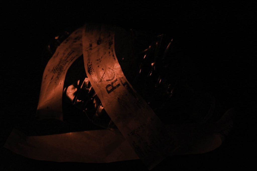
5
These two photographs were also inspired by Troy Paiva as well as Naomi White and her collection on plastic bags and how they are affecting the world.
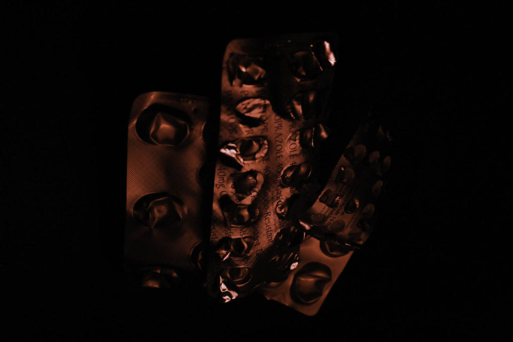
My fourth photo is very similar to my second final image and they are of the same packaging but this has a more intense and rich red instead of the faded red the second photo has. My fourth image is also taken at a different angle which shows off more of the medicine packaging. I like how the metal film creates different shadows due to the different dips and folds that it has, it gives the image more shape and meaning which helps to draw people in and understand the photograph. By having the objects centred it gives the impression that they are floating in an abyss of darkness, which is heightened by how the medicine is only illuminated in the middle and is darker around the edges making it seem like it’s fading in and out of the light.
For my fifth photograph, I had created a set-up of a water bottle and the plastic packaging which I wrapped around and layer across the crinkled bottle. I used faded plastic so that it looks more used and worn down as I wanted to give the effect that they have been thrown away or washed through the sea that destroyed the writing. I placed the light to the left of the camera so that it wasn’t shining on the whole setup and I also didn’t put it too close as I wanted only the packaging and middle of the bottle to be lit up which I achieved. I enjoyed this style of lighting with these objects because I was able to position them in particular ways and change the intensity of the colour depending on how I wanted the image to look. In this particular photo, I had folded the bottle so that it looked more damaged and used, I also angled it away from the light source so that the top of the bottle would be in the dark where you couldn’t see it and the only highlighted area would be the middle with the worn-out packaging.
6 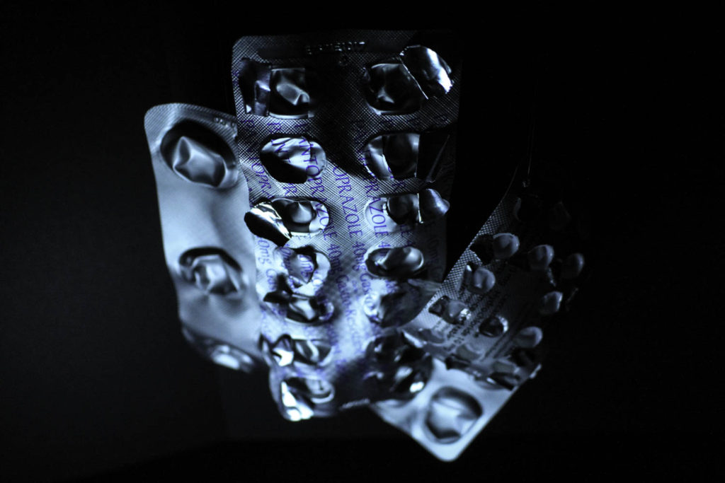
7 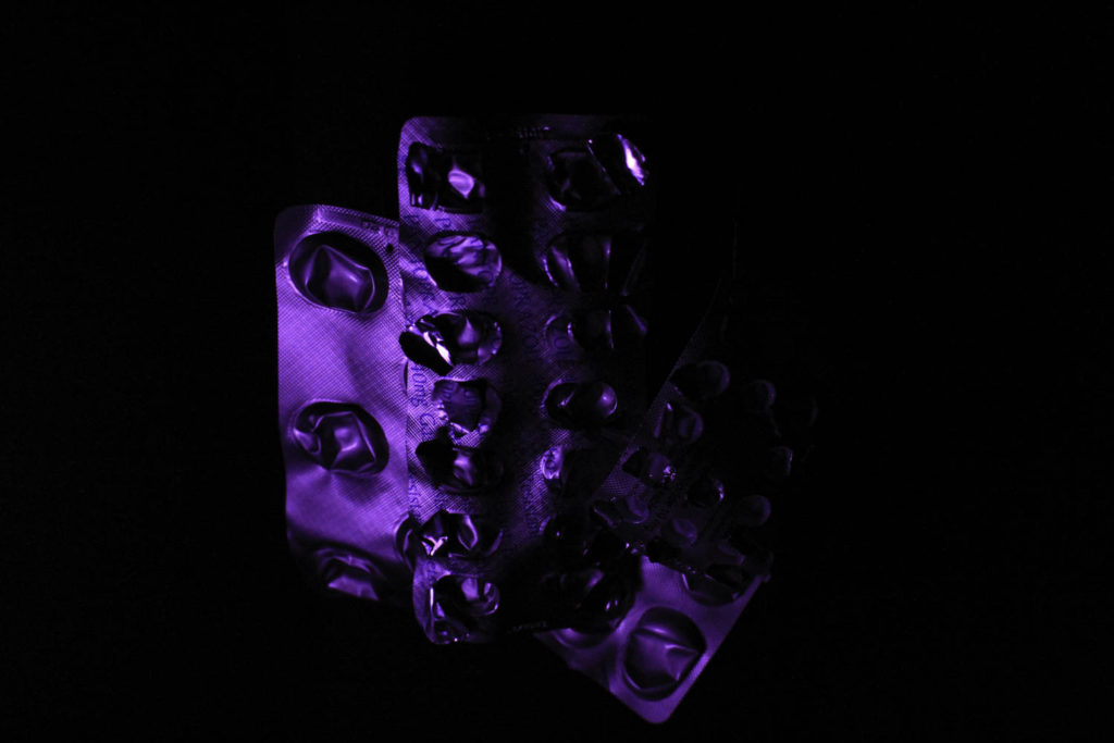
8
As well as the five images above these three were also inspired by troy Paiva and Naomi White for their influence on lighting and plastic in the environment.
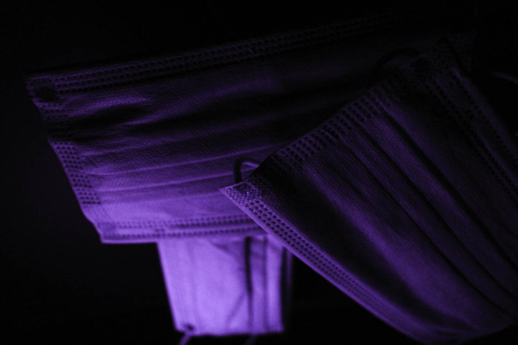
For my sixth image, I have used three disposable masks, like my third final image, but I used purple lighting instead of red. I decided to put the light source quite close to the bottom mask making the lighting more pastel instead of neon and then it slowly fades into a darker, more neon purple and then into the black background. I took the photo from an upwards angle so that the parts of the mask that are closer to the camera are more focused compared to the bottom of the photograph. I like how the masks are folded which helps to make lines of shadows throughout the photo, which adds more texture to the final image. Lastly, I like how close the camera was to the items when the photo was taken which helps the depth in the photograph, which intertwines with the different tones of light. For example, the further down and into the image the lighter and more bright it is and the closer it is to the camera the darker the masks are with deeper shadows.
My seventh photograph is taken at a similar angle as my second photo, from a high up angle, looking down at the objects. Instead of the red, I used blue lighting has a very different atmosphere compared to the red lighting. By using a lighter colour, more of the packaging can be seen as well as the background. I like how the different capsules have been pushed in and create new textures and shapes making the image less flat. I think the colour compliments the silver colour of the metal film and the darker blue writing on the packaging. The shadow set diagonally across the top of the main medicine packaging and travels down onto the smaller packing adds a new element to the photograph which makes it more alluring.
For my eighth photo, I have again used the medicine packaging but with a darker purple that has been made more vibrant by the metallic colour from the packaging. Because the purple is so dark some parts of the packaging blend in with the background which I like because I think it looks like the objects are being pushed through the darkness and are finally coming to light. This could relate to the meaning behind this project which is that over the last few decades the plastic pollution issue is finally coming to light and people are trying to fight against it. Another feature of the image that I enjoy is the different tones of purple that flow throughout the picture, starting from a neon purple which blends into a rich shade of purple and finally into the black of the background. Furthermore, I decided to make the items look like they were floating in the middle of the image, I got the idea for this from Steven Gallagher.
9 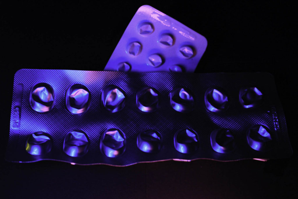
10
These two photos were heavily influenced by Troy Paiva and his photo book ‘Night Vision; The Art of Urban Exploration’.
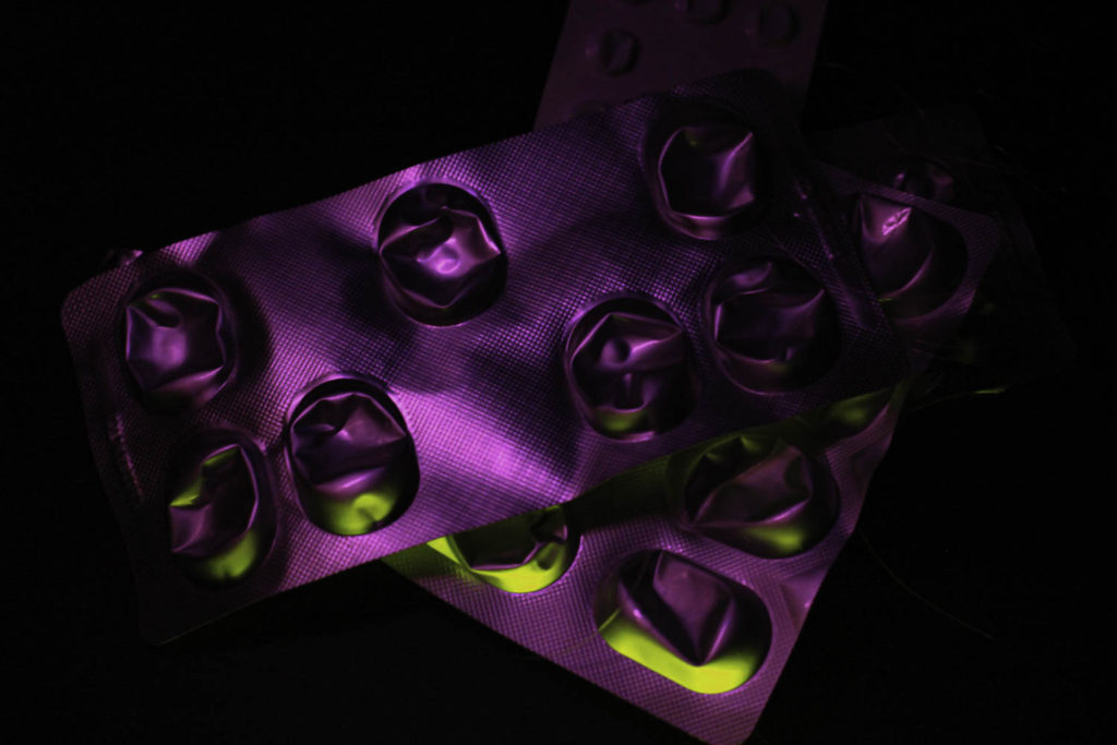
For my ninth photograph, I used two coloured glow sticks to create the pick and yellow combination on the medicine packages. I really enjoyed using the glow sticks as a light source as I was able to mix different colours together and they only illuminated the objects and not the background making them easier to edit. I decided to use pink as the main colour for my image and yellow to highlight the underneath parts of the medicine capsules. With this photo, I didn’t hang the objects up, but I laid them on the black card so that I could keep my dark background and I think the darker background compliments the neon colours and help make them more vibrant. The different textures of the plastic packaging create interesting shadows and new tones of pink and yellow.
Finally, for my tenth image, I also used two coloured glow sticks, pink and blue, which I think compliment each other nicely, they also are able to add another colour as they have mixed together, which has created a neon purple. I placed one of the packet’s upsides down because I wanted the white to contrast with the silver film of the other packet, it also helped to add more colour and shades to the final photograph. I like how the packaging towards the top of the photo is light and as you go down to the bottom it fades into darker colours and blends into the background. As I said before I was inspired by Troy Paiva, and I feel that this is the main image that represents and replicates his work because Paiva used a lot of blues and pinks in his work.

