
Montages
Here I have demonstrated some montage work that I have created from the images above, a combination of monochromatic and colour work. I have also added descriptions and critiques for my work. All of these have been made in Photoshop using a type of cut and paste method to create new photographs from already existing ones.

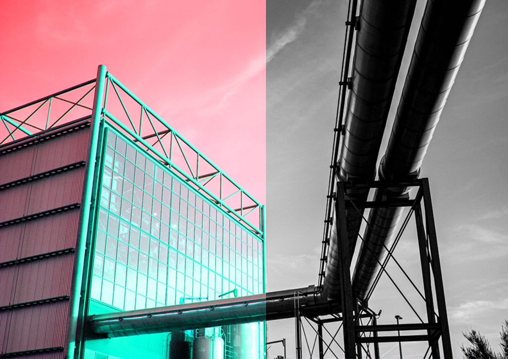
I had the idea to create a more interesting piece by combining two half of an image, edited in different way together to add contrast and attempt to make it more aesthetic. I decided to divide this image in this way as I think the incinerator looks better in colour and the contrast and textures in the metal pipes come through more when they have been edited in a monochromatic way.

Here I have created a montage using two versions of the same images to create a juxtaposition, I used the ‘adjustments’ tool in Photoshop in order to create the pink image in the centre, as this changes the saturation within the image. Additionally, I chose blue and pink as blue is a cool toned colour and pink is a very warm toned colour. I think this image turned out aesthetic as the centre image has hints of green and blue in one section and this helps link the whole piece together, making it more cohesive.


Here I have mostly images from my first photoshoot in order to create these montages, I think that placing the colour images in the centre was a good decision as it creates an aesthetic focal point for the pieces. Furthermore, the photographs in the background of these get a bit lost but I think the overlapped images help combat this issue, deciding what size to make the central images was the most important part.
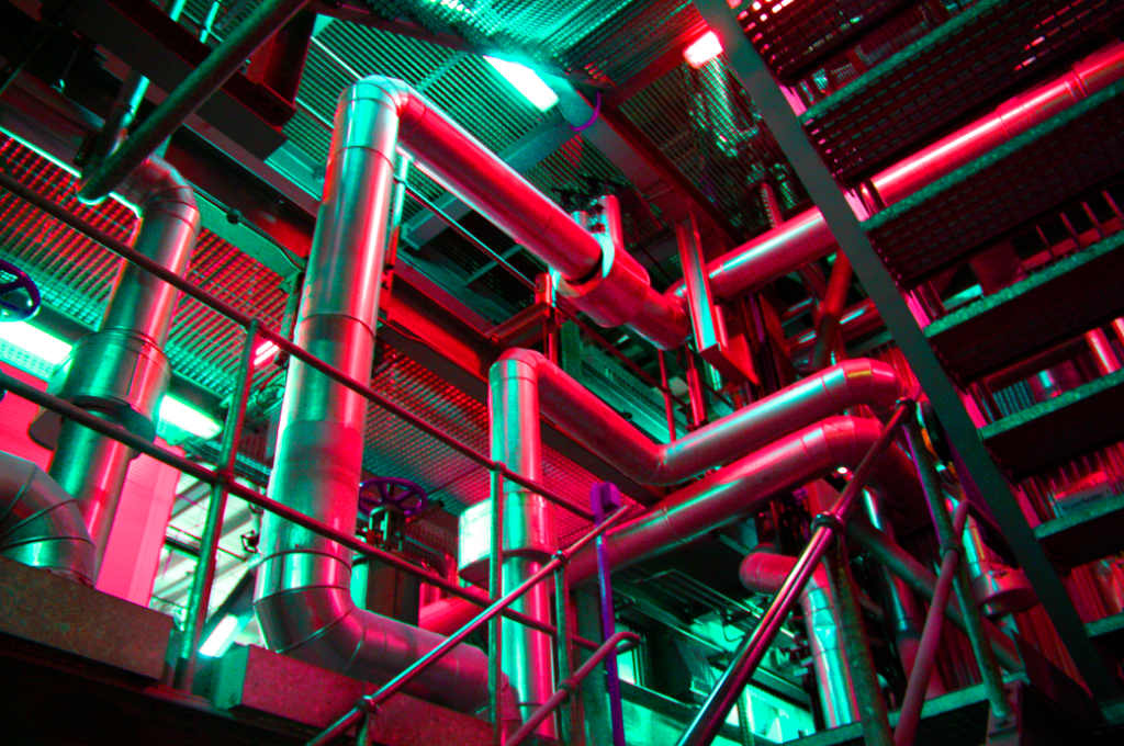
I have reused the first montage above to create this piece, meaning that only half of the image could be edited. The red and turquoise colours contrast well together, however this experiment didn’t turn out as well as expected as there’s not enough contrast or link each half of the photograph. However. I do think the colours bring out structures within the incinerator, such as the metal and glass.

I have created these two montages, they would link well together as the first original image was taken from outside of the incinerator and the second was taken inside at the top floor, where there are massive glass windows, which enabled me to use the best natural light to take the image. I have layered half of the images over the other half. For the first image I changed the contrast but only for the overlapping image, whereas for the second I cropped the left half of the image, placed it over the centre of the right half of the image and then used the ‘adjustments’ setting to make all of the metalwork blue, with contrasts with the warmth of the yellow.
Multi-exposures
Below I have demonstrated some of my multi exposure ideas, using my photographs and photoshop I have overlapping certain parts of the image and then used the adjustment setting and the opacity to merge the image together, sometimes using colour to eventuate the images. The purpose of these multi exposures is to show how much progress humans have made when it comes to industrialising the island.
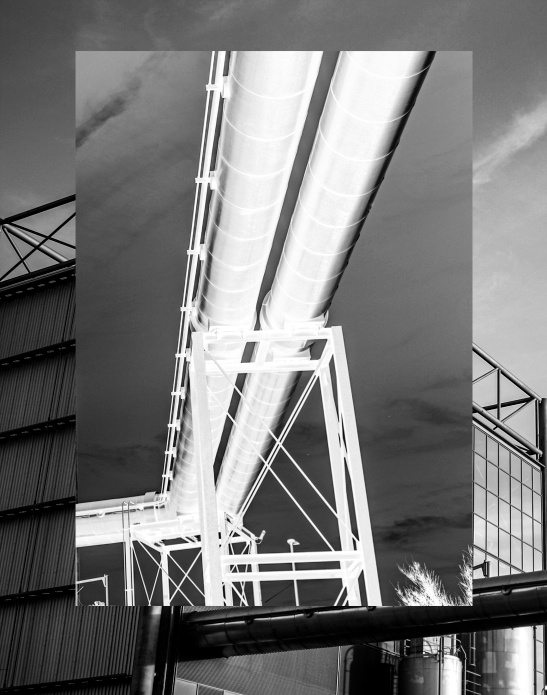
I think that creating a multi exposure using one very busy image with another that only has one focal point always makes for good multi exposures. For example above I have used one image with water tanks and another of the overlooking view of Jersey from the top of Fort Regent. I think despite being monochromatic this image turned out to be eye-catching as there is a lot of depth throughout this multi exposure. The top layer of the image has a lot of simple aspects and this contradicts well with the busy background.
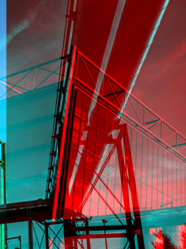
This piece was created combining two halves of the same photograph, I think the red and blue colours compliment each other well. This piece could be hard to view as the structures and all of the lines do get muddy, but this could be seen as an abstract way to create a multiple exposure, as the colour adds more elements to the image, and therefore adds to the depth of the image.


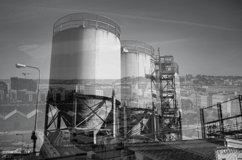
Above I have created a gallery containing an unedited multi exposure and then below the ones edited with colour. I really think the colour helps link to the project of Anthropocene, as the trees and grass often turn out to be contrasting colours, such as the red and blue in the third edit above. This helps us further visualise the difference between manmade and natural structures. I made the multi exposure so that the image of the incinerator was in the background, as I feel like this has been the focus of a lot of my work so far.
Colour Edits
Below I have included some visual examples of my experimenting with the colour settings in Photoshop, sometimes only altering half or one section of the photographs, and other times attempting to illustrate how much of our environment has been shaped by people and how much is natural.
Coloured editing work best with my images which contain metal structures/ objects as the reflective material enhances the colours and makes the pinks and blues lighter. One of the only downfalls of this image is the fact that the original image was not of good quality, the clarity and exposure had to be edited before making this multi exposure, however I still think it turned out successfully as the final piece came out bold and clear. Additionally, the composition of the original photograph made this process easier as there is lots of little details that ended up being nicely edited with the colours.

To create this piece I have selected the area of the photograph which contains the incinerator in Photoshop, using the polygonal lasso tool. After I changed the colours in this part of the image to make them brighter. This has made the image more aesthetic because it looks like a cartoon part of the photo. It could also be viewed that it appears as though this part of the photograph has been hit more by the sun or taken at a different time of day. This created contrast within the image as the altered part looks fake and the rest of the natural surroundings look real.

This piece is very similar to the original photograph, as I haven’t done any other editing such as cropping and overlaying images. To edit this I have only changed the saturation of the image to a pink tone, and through this some green tones have appeared underneath the metal on the left side of the image. In my opinion this piece turned out successfully as I have used it to create a montage as well, the colours really eventuate the textures of the metals and I like how it looks like its surrounded by a glowing light, something unnatural to match with the pipes in the image itself.
Sequencing
Below I have included some ideas for sequencing, if one of these were to be my final piece, I would print them out at size A5 and then create a window frame with a black border, these ideas are just digital layouts of how I would do this. I have showed a range of formats for this grid so that I can show my thought process visually. For now I have just created a gallery to demonstrate the layouts, as I have tried to do so in Photoshop but the quality of the images decreased.
1st Attempt


I have created this layout for my first sequence considering the lighting in each of the images, I think that I have a good contrast between images with lighter and darker exposures. This was in an attempt to make the lighter images stand out and for the silhouette in the darker images to be the focus of them. I think this turned out successful but may be interpreted as random and created without an intention behind it. Furthermore, because the lighting pf the images isn’t the same it means it doesn’t as well to my Bernd and Hilla Becher artist reference.
2nd Attempt


This sequence was created with the intention of grouping images with similar objects/ structures next to each other, creating subsections within the sequence, I think this links well back to original purpose of sequencing (grouping together images of the same objects) and the lighter photographs have been placed in the central row of the arrangement in order to bring attention to this part of the sequence. This piece is probably the weakest out my experimentations as I think that the randomness of my other work is more aesthetic.
3rd Attempt


My third attempt at creating a sequence came out as one of my favourites, despite the randomness of this piece, I think that placing my stronger images in the centre of the arrangement or at the top creates a aesthetic focal point for the sequence. In addition, having images with less exposure around the outside and then lighter in the top centre means that your focus is drawn to all of the piece. Alternatively, some of my images look to dark in this piece and I could be viewed as having too much contrast.