My 3 artists were:
- Craig McDean
- Vilde Rolfsen
- Marco Mori
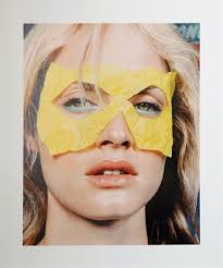
Craig McDean’s work 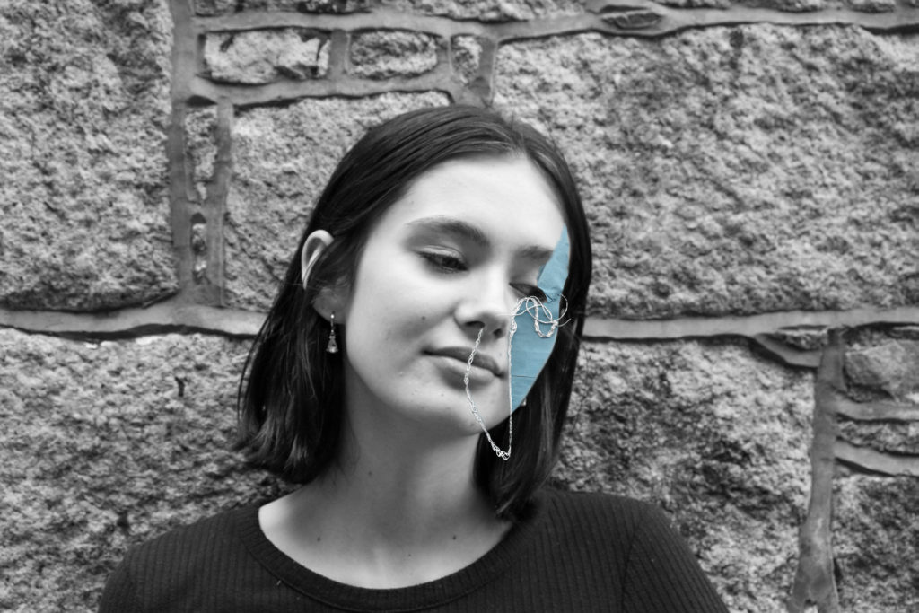
my work
Similarities are that both me and Craig took portraits of a female model with a mask made out of a material that is seen as wasteful or has negative impact on the environment. Differences are that my image has a colour splash feel to it as its in black and white with a blue splash of colour and Craig’s has a full colour image and where I edited in the mask he used a piece of paper as a prop in his shoot.
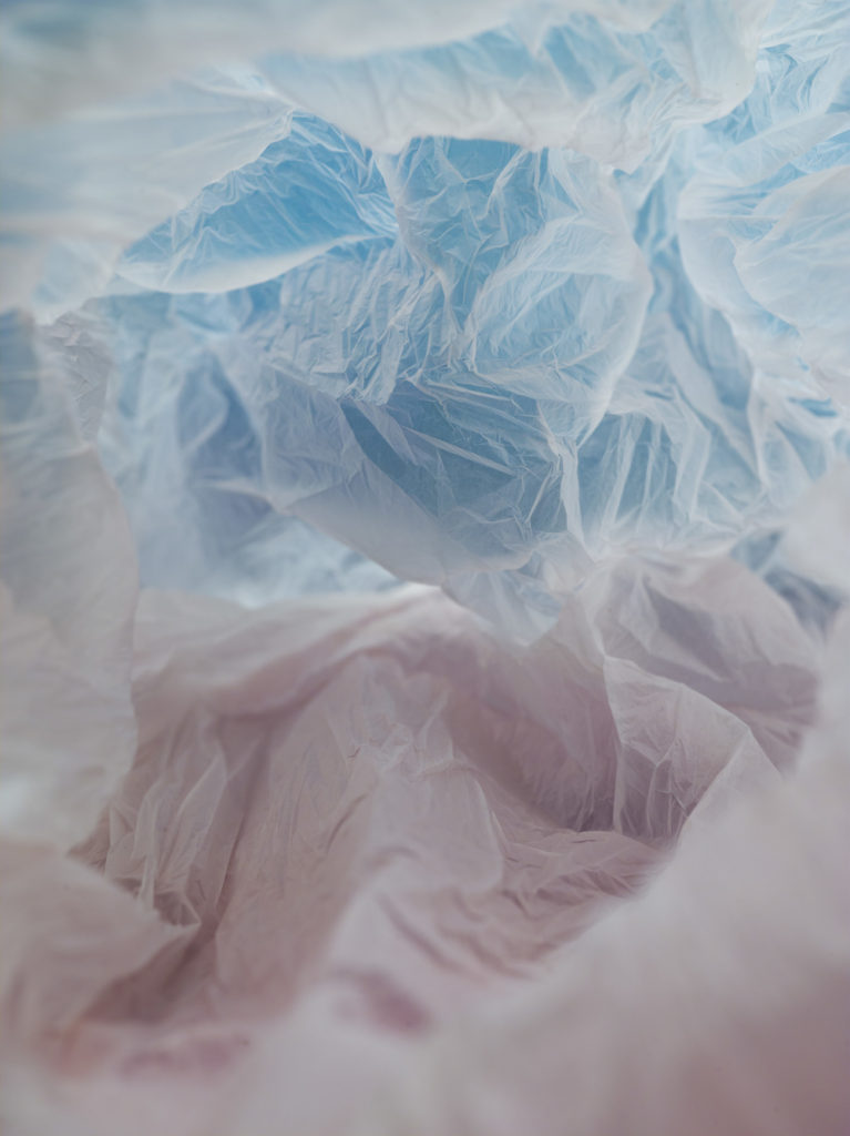
Vield Rolfsen 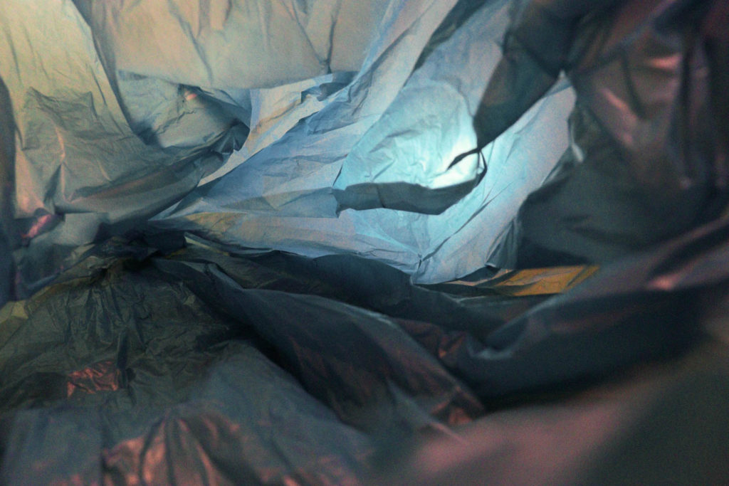
My work
Both mine and Vield’s images have a sense of depth to them both show different tones of blues with contrasting highlights my image is on the darker side but I feel like its still got a similar sense of airiness and light both images have a tunnel like effect in the horizon and are both images of the inside of plastic bags taken with artificial lighting which show how pollution in the ocean is a serious topic.
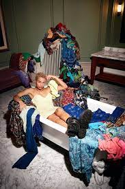
Marco’s work 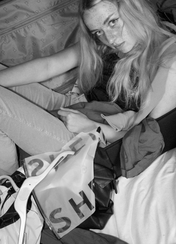
My work
Similarities are that we both photographed a model surrounded by clothing items which are depicted as waste and make the images seem cluttered both our models are making straight eye contact with the camera and both images show a sense of depth and texture. Differences are my image is black and white and shot in a cantered angle to avoid the blanc open space in the background.
