Charlotta María Hauksdóttir’:
charlottas image 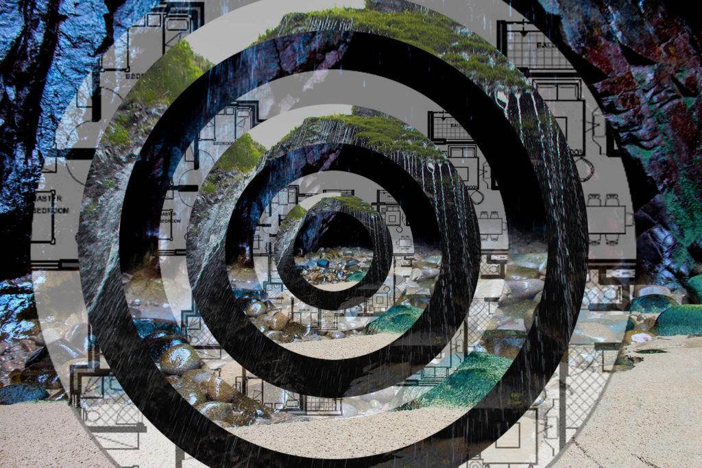
my image
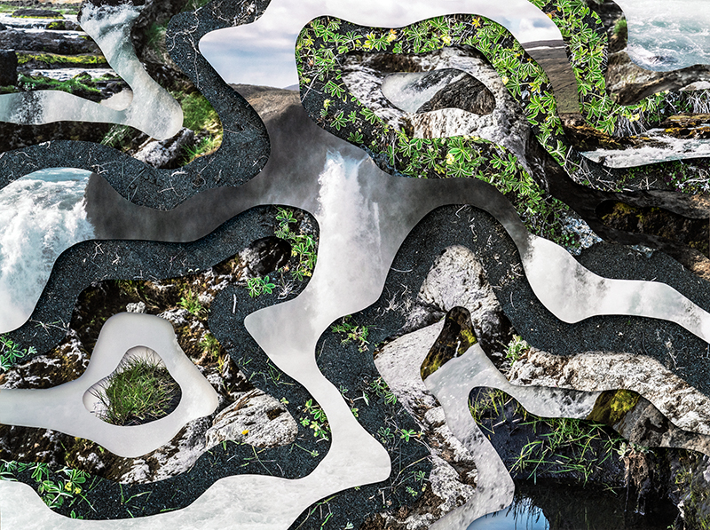
Visually, my image compared to Charlottas looks quite similar. Both images provide an optical illusion effect, In my image i decided to use rings instead of unique cutouts, to provide the image with perfection, just how i viewed the waterfall when I saw it. However, charlotta uses random shapes to show that nothing in nature is ever the same. Both images portray the idea that we are actively destroying the planet, this is literally shown by how in both of the images, the original photos are untouched natural landscapes but myself and charlotta have altered them to portray humans impact on nature. In some of charlottas other work, she uses texts about climate change and global warming , however in my piece i decided to incorporate building plans or a house. i did this to show that this landscape will chang eover the next few needs, due to the fact that jersey has an overpopulation crisis, and the need for housing is more important now than it has ever been. Charlotta took these images also in her home town in iceland , to show that her home is changing drastically due to climate change. The lighting in charlottas images has a warm tone, which is similar to mine, this insinuates the idea that these places are warm and considered home to us, and we want to protect them. In both of our images, the textures vary and stand out a lot, charlotta uses the different sharp textures of rock in comparison to the soft textures of the water, which is very similar to my image.
George Hazarakis
Georges image 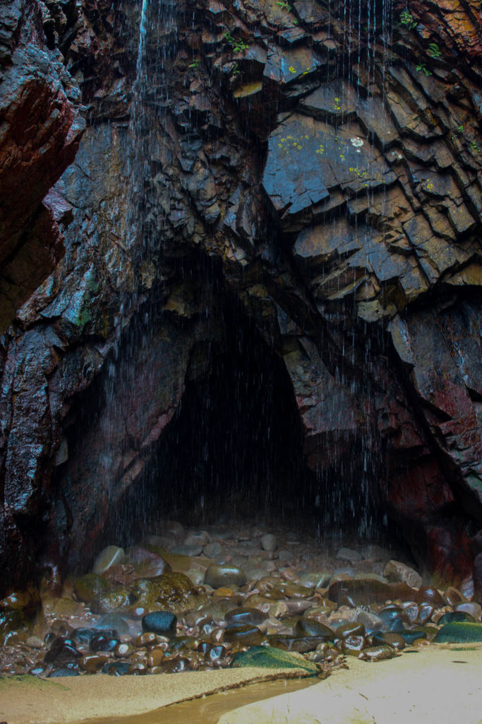
My image
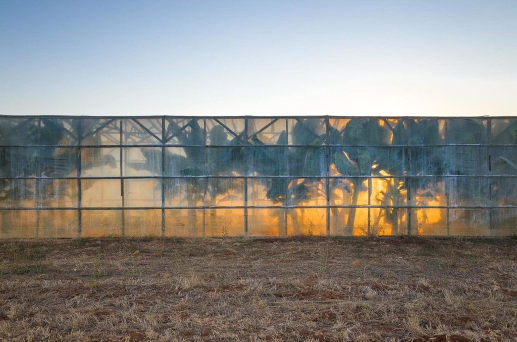
Both images here are Landscape images. there are many differences between these images but the concept behind them is actually particularly similar. both images relate to the idea of Anthropocene by providing the audience with a sense of awe and terror. In these images we have both portrayed the idea of natural beauty. however in my image, the manmade destruction does not yet exist, i wanted to shows what the environment looks like before it is altered. In Georges image he show what happens after man has come in contact with nature and the sad reality behind it. In both images we have saturated the colours to allow them to be seen better then they actually look in real life, this is to highlight how much we should protect nature. A difference between the 2 images is that Georges image uses high exposure and low contrast whereas my image uses high contrast and low exposure so that the colours pop from the rocks, and that the image appears sharper.
andrew moore
andrews image 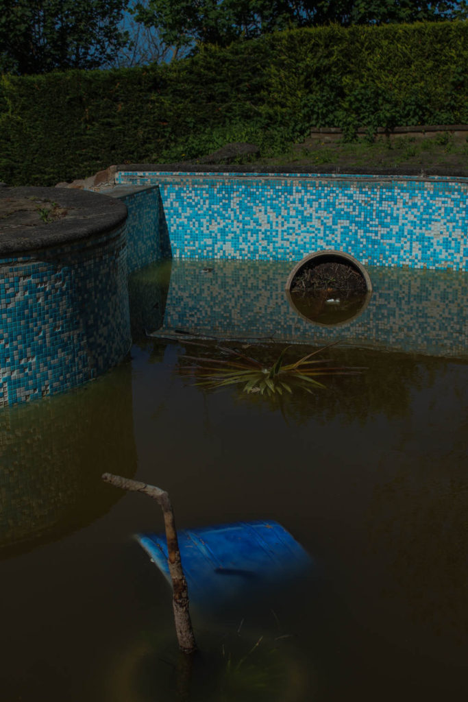
my image
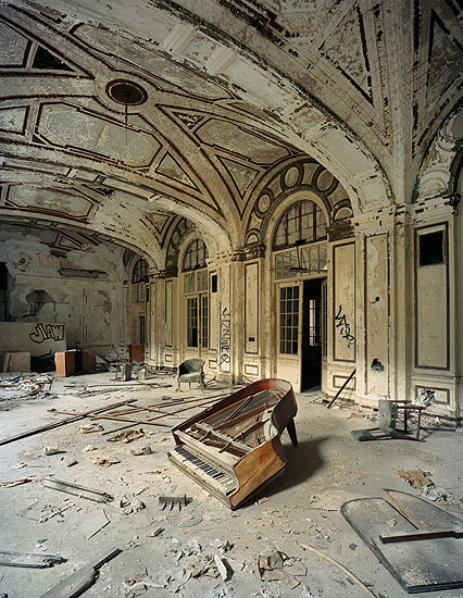
both of these image highlight destruction as the key theme behind the photos. In Andrews image, the key focal point is the piano in the centre, in my image, the key focus is on the objects left in the dirty pool. Both images are warm toned to show that these places were preloved and a safe space in the past. In andrews image, the exposure is quite high to show the natural light coming through the windows, however in my image the exposure is low, making the image look more saturated and almost how a regular swimming pool is viewed through a child’s eyes in a nightmare. i decided to make my image darker to highlight the sad reality of abandoned places, whereas george uses a light image to show that this place was once a place of happiness. Both images show natures effect on manmade objects, in my image on the left, the water in the pool is from rain and is that colour due to dirt and mould growing overtime. You can also see that nature is taking over by growing weeds around the once immaculately maintained patio around the pool. In andrews image, this place has been destroyed by nature, shown by the dulling of colours in the room from the sun, however has also been destroyed by man. This is shown by the broken piano and rubble on the floor. i am very happy with how this image turned out as I wanted to highlight the sadness of an abandoned place, but also anted to make it colourful as if it was seen by a child.
