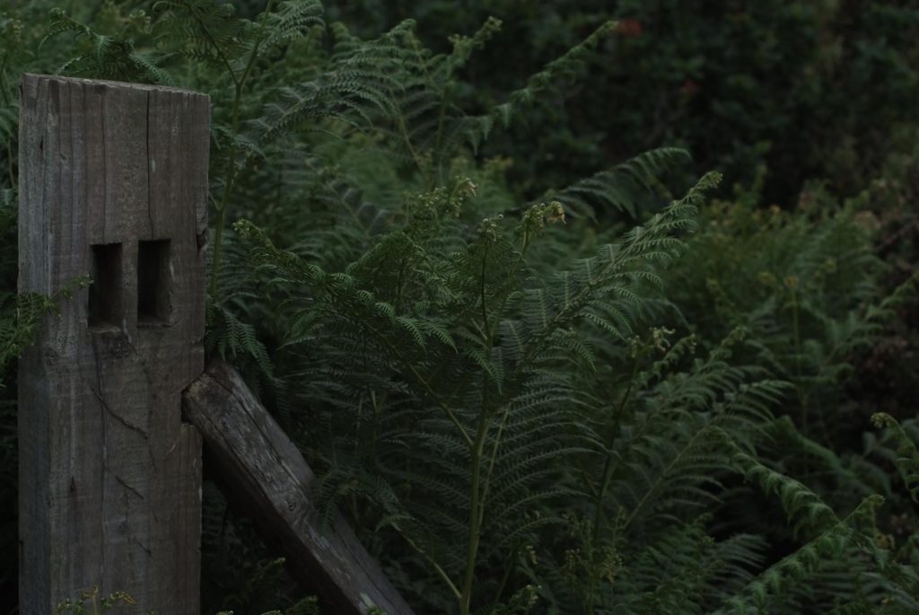
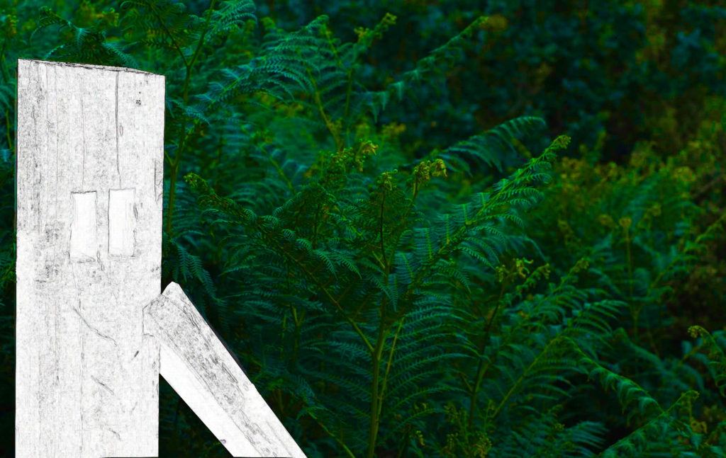
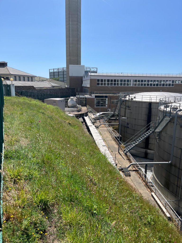
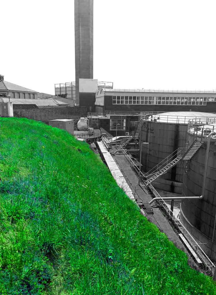
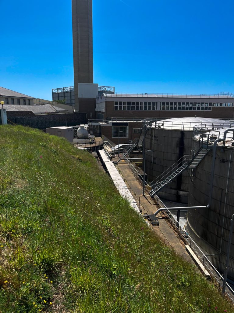
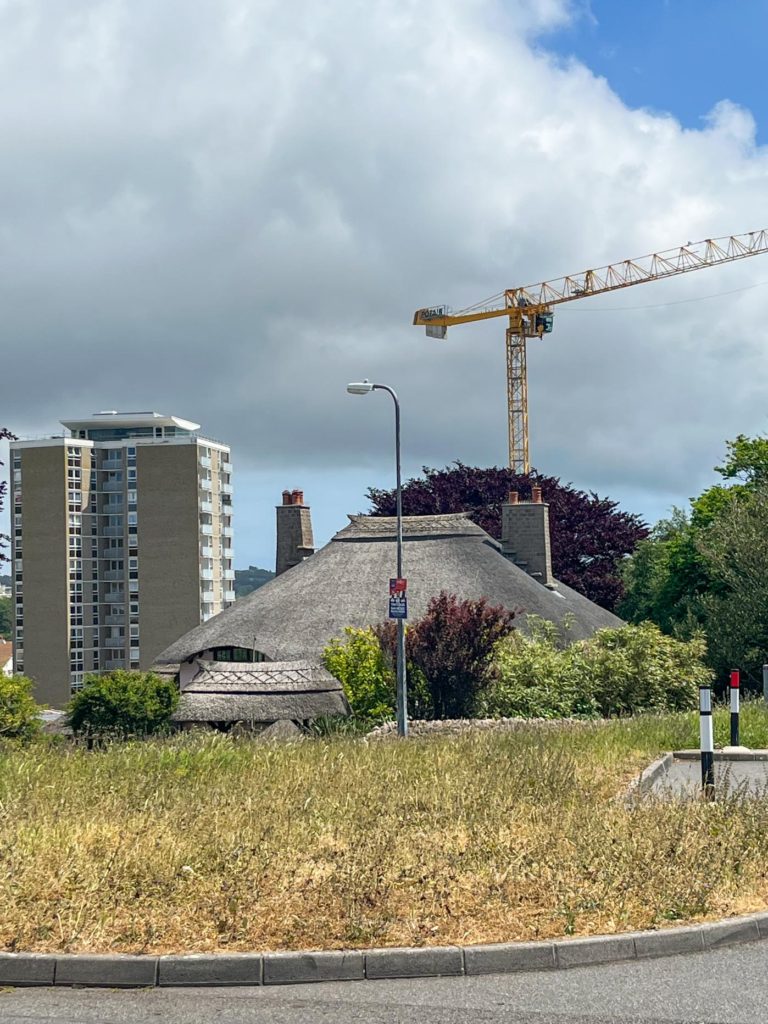
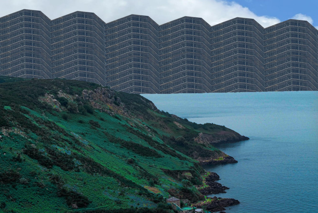
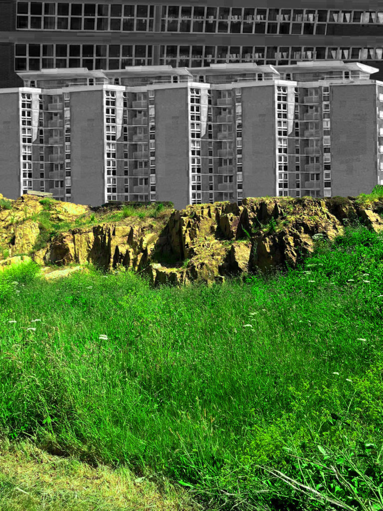
After editing my best photos on Lightroom, I took photos from both shoot 1 and shoot 2 into photoshop to create more interesting and unique edits. These edits included merging different images together to create photomontages, adding a lot of colour to the images to fit the images of Troy Paiva one of the photographers I studied, changing the colours of foliage to fit another one of the photographers I studied, Richard Mosse and creating other unique effects. The images shown are a before and after view of the editing.
Photoshoot Edits
Richard Mosse inspired edits
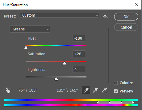
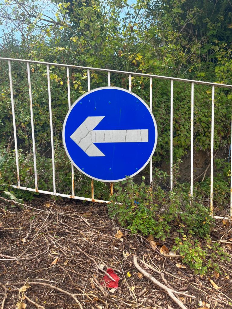
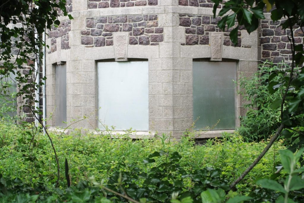
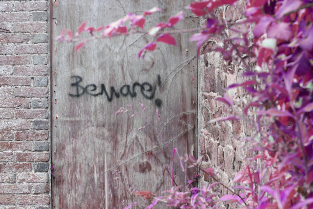
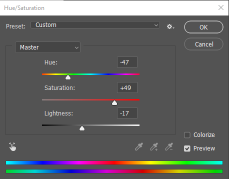
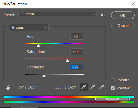
I created the effect of these images on photoshop by changing the Hue/Saturation of the yellows and greens in the image by going to image – adjustments – Hue/Saturation. I believe this image reflects images created by the photographer Richard Mosse and creates a very unique effect. The images on the left are before editing and the images on the right are after editing. Above is the fixtures on the Hue/Saturation setting to create this effect on the images.
Troy Paiva inspired edits
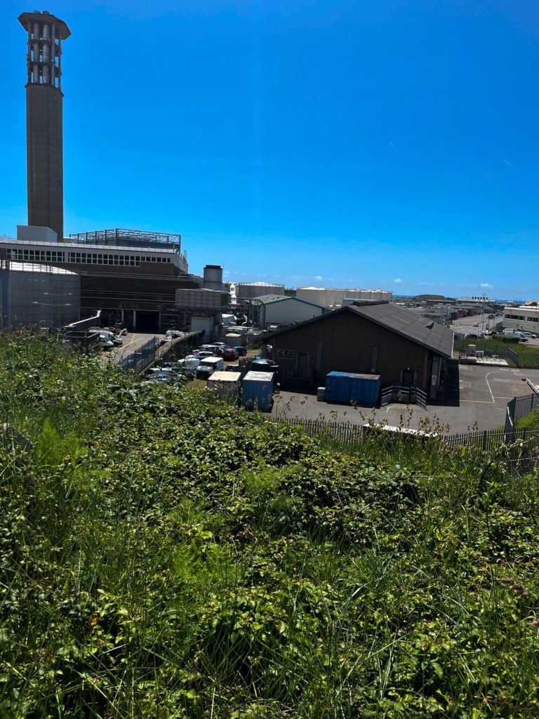
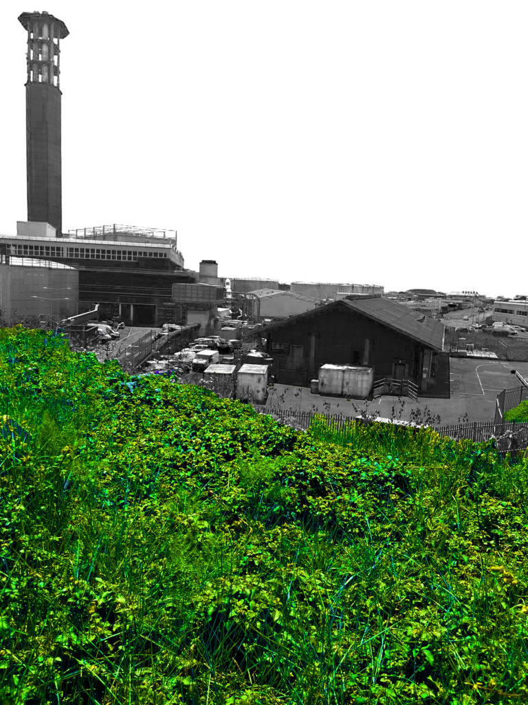
I created these edits by first using the object selection tool to select all of the foliage and grass in the image, I then made everything selected a new layer. I then made the original layer black and white and edited the different colours to create a very bland effect of the human made buildings. I then edited the Hue/Saturation on the new layer to add more life to the natural landscape. Above shows the different setting I used to create these effects, below shows a before and after of the edits.
Other edits
I created these edits using the remainder of my best images I hadn’t used already from both photoshoots as well as using some parts of images I have already used. I focused on creating photomontages by using different parts of multiple images and creating one final edit with all of them using photoshop. I didn’t take much inspiration from other photographers to create these edits although some inspiration was used.
Using these 3 images above I was able to create the edit below. I did this by using the polygonal lasso tool in photoshop to select what parts of the side photos I wanted to paste into the middle image, then I created a second layer of the bottom half of the image so whatever I pasted looked like it was going behind the new layer for a more natural look. I then placed the parts of the side images where I wanted them and made them black and white. I then made the grass more colourful using the Hue/Saturation tool and this was the final product.
Using these 2 images above I created the edit below. I did this by creating a layer over the landscape and sea of the image on the left. Then I took a section of the image on the right using the polygonal lasso tool and pasting lots of that section together to create a skyscraper looking image, I then added that to the back of the image on the right to create lots of buildings on the horizon. Finally I used the Hue/Saturation tool to make the landscape look more colourful and stand out among the rest of the image.
Review of edits
Overall, I am very happy with my final edits. The edits created which are inspired by the artists I studied greatly compare to them in everything from looks, lighting and the colours seen in the images. They also fit into the theme of Anthropocene very well in my opinion. My other edits, where I created photo-montage type images, I am also very happy with. My aim with them was to create unique and cool images which is exactly how I believe they turned out. These edits also fit into the theme of Anthropocene very well also. To improve my artist inspired work, I would have during different times of the day, such as early morning or at night-time. Doing this would have given my a wider range of images to edit. To improve my other edits, I would have taken more photographs of tall buildings, building sites and natural landscapes in order to be able to create more montages with buildings and landscapes like the two above.


