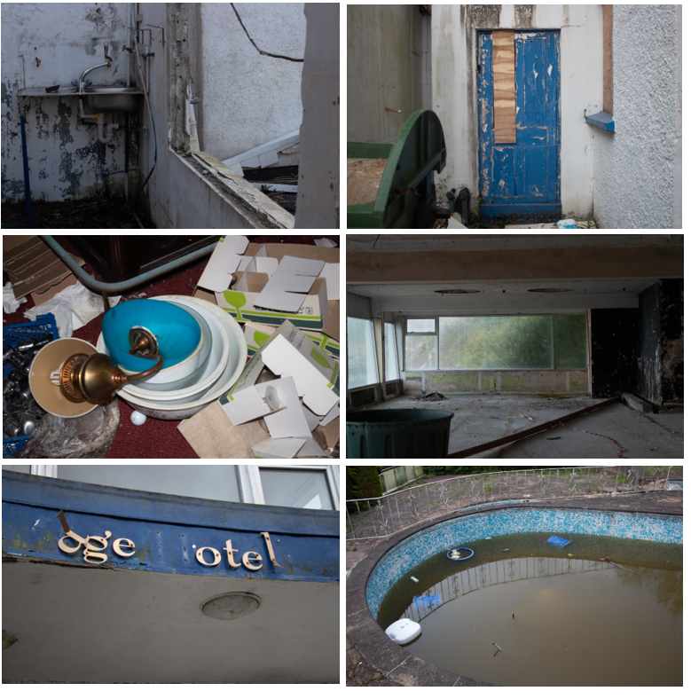
PHOTOSHOOT #1

The photos labeled red are ones that turned out blurry, had bad lighting or poor location. Since the majority of my first photoshoot was taken on my phone, some photos turned out blurry/shaky because of the camera quality.
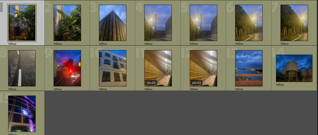
The yellow labeled photos show the ones I liked, but wasn’t sure if they fitted my theme, for example no.13 – the photo is clear and in a good location, but wasn’t relevant to my theme as there was too much sea and not enough material to show that it was representative of industrial buildings.
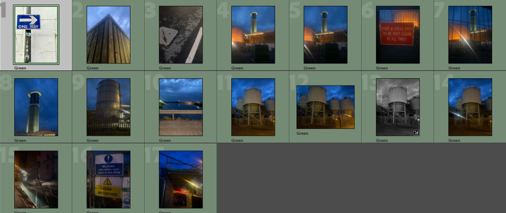
The green photos are the ones I liked the best – although i will not being using all of these in my final photos, after editing i will be able to determine which ones showcase my theme the best. My favourites or no.8 or no.11, as I think they represent my artist reference the best.
GREEN PHOTOS (UNEDITED)
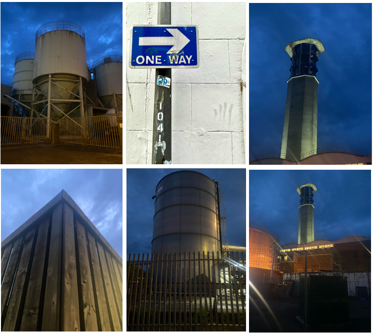
PHOTOSHOOT #2
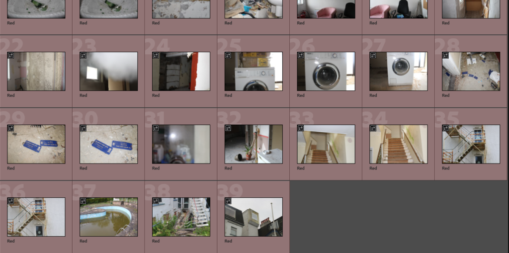
Like photoshoot #1, I chose to label the red photos based off quality location or lighting – parts of this photoshoot included images with people in, which I chose to label red because i want to showcase the hotel as empty to give an eerie atmosphere.
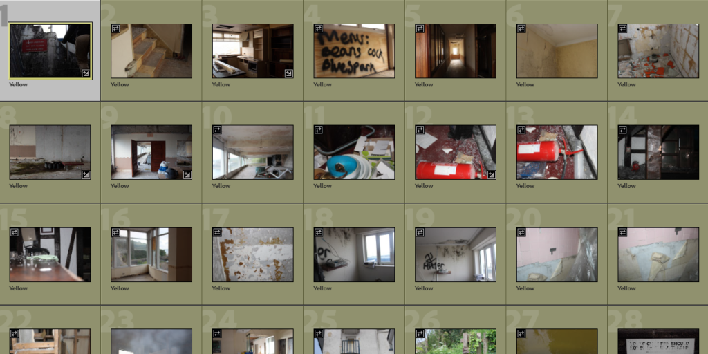
For my yellow labelled, some I really like but they were just a bit blurry or slightly off angle and I wanted the photos, especially in this shoot, to be as near to my chosen aesthetic as possible and I felt these photos weren’t good enough.
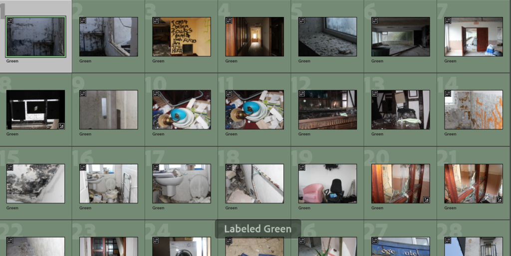
My green labelled photos showcase a number of different rooms, materials and all were taken in places with different lighting, which is why I chose them e.g no.10, which was taken with the flash on in a dark room, compared to no.3, which was taken without flash using natural lighting. Like photoshoot #1, I won’t be using all these but will pick the few that really stand out to me.
GREEN PHOTOS (UNEDITED)
