My Experiments:
Experiment 1:
My attempts:
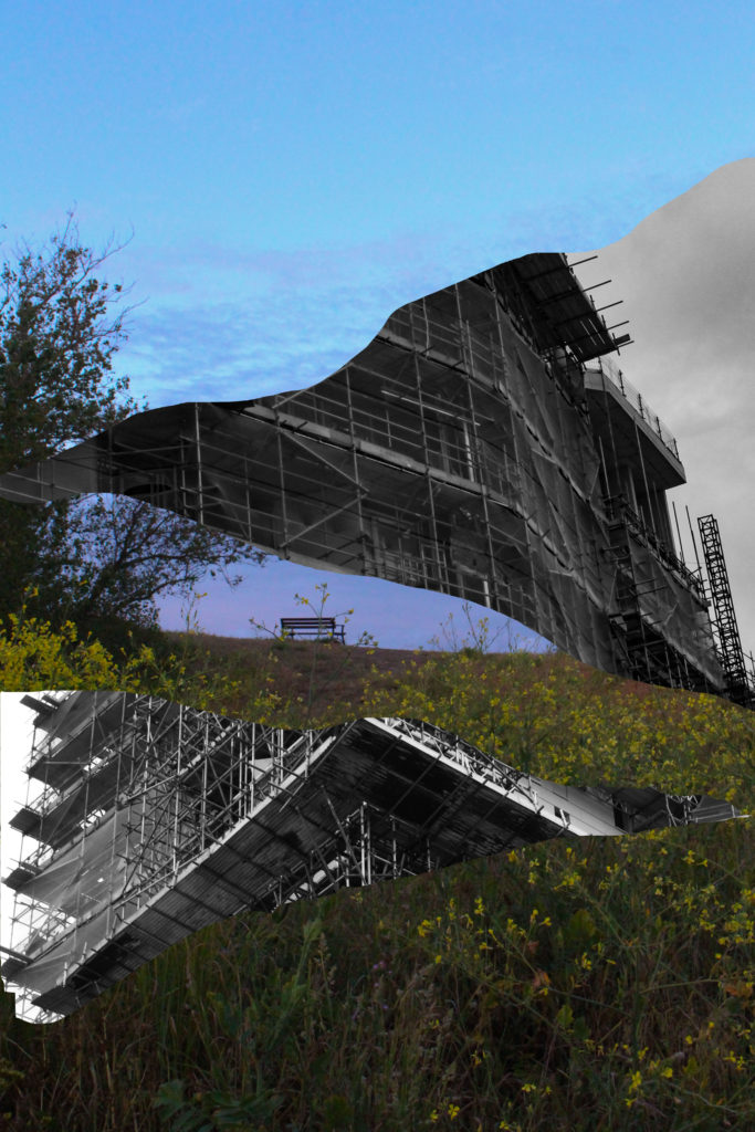
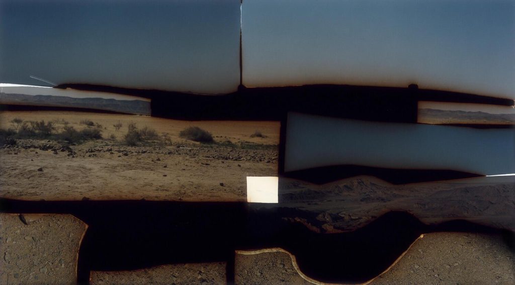
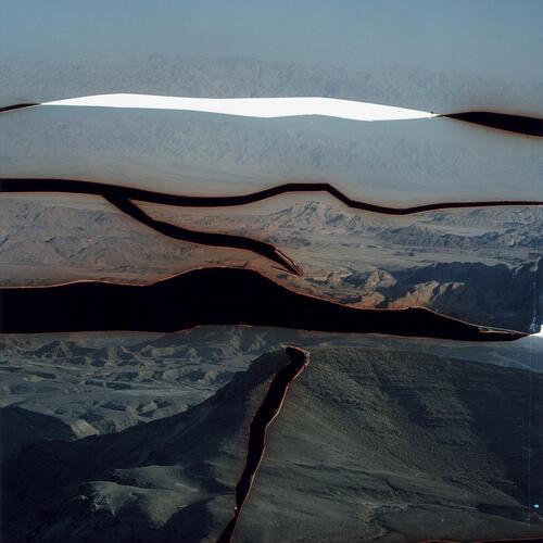
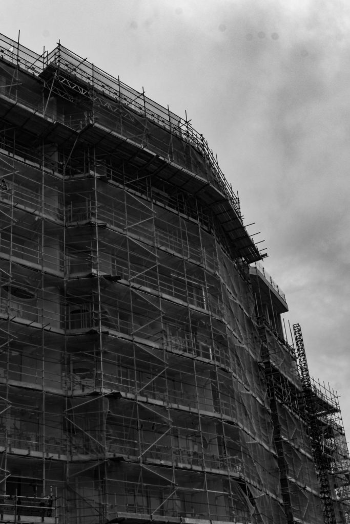
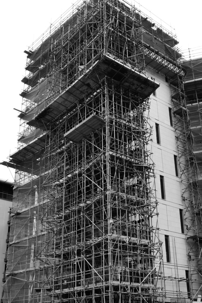
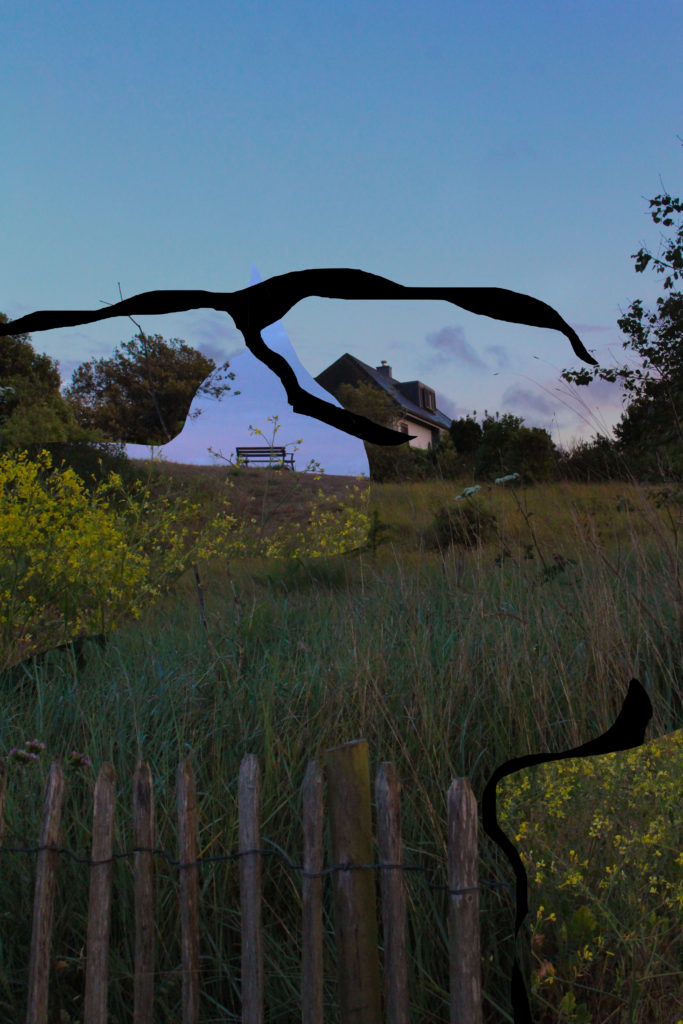
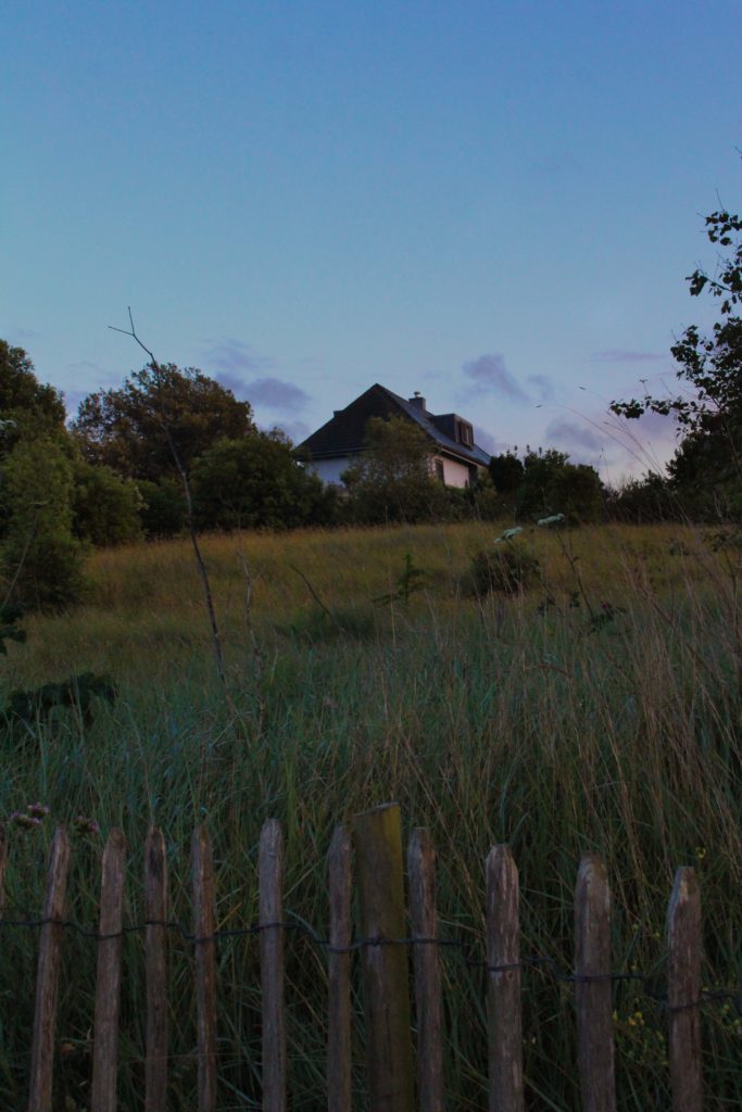
This is the first edit I did because I like the Idea of having a more natural background with industrial bits showing. I used the ‘lasso tool’ on the images of scaffoldings to get those shapes then I just pasted them on to my original image.
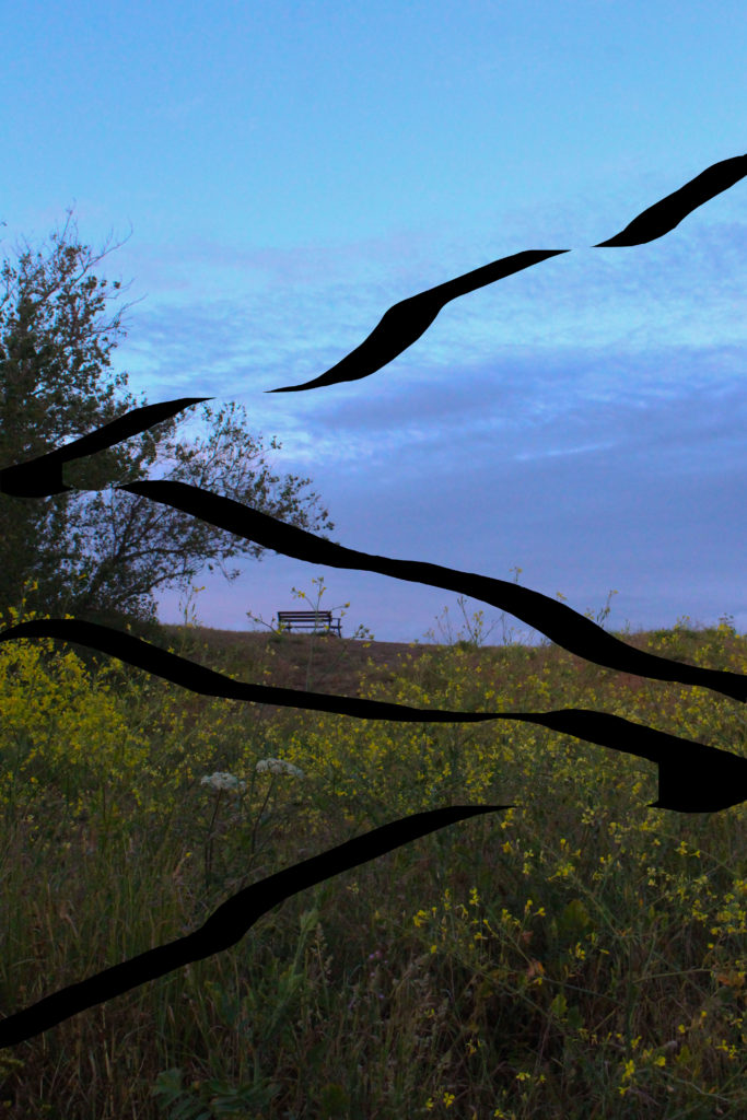
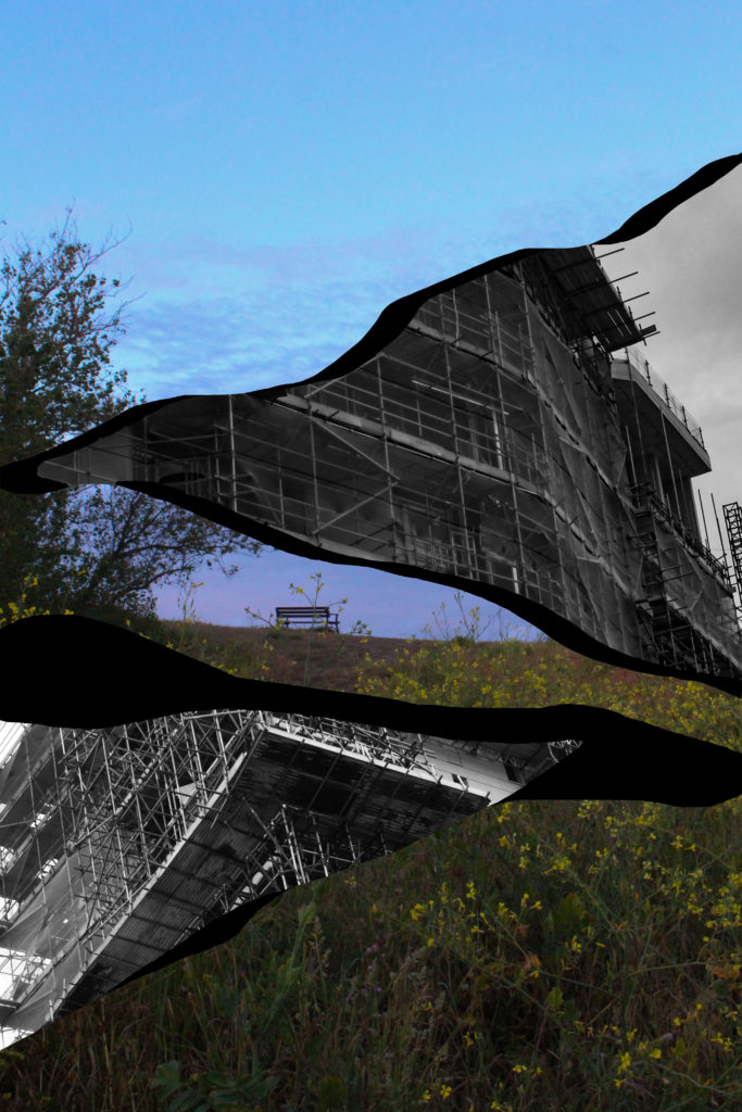
Here I did the same thing as in my 2nd try, but instead of hiding the layers I kept them and hid the scaffoldings because I wanted to see if it looked better without them. I like this one because of the black lines which I think make the image less boring. however, there is not much going on an looks plain so I won’t use it.

This one is very similar to the previous edit because it’s the same idea. However, this one has black space behind the scaffoldings making it look more like Talmor’s work. I got the dark space by using the ‘lasso tool’ on my original layer, right clicking and selecting ‘layer via cut’. Then I hid the new layers and put the scaffolding ones on top.
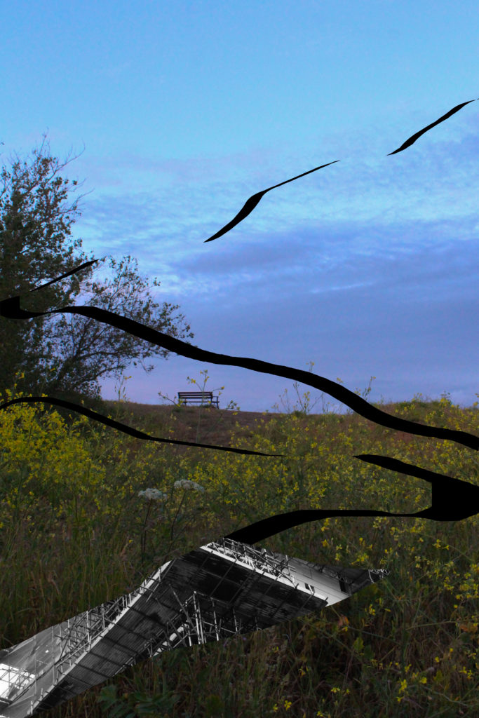
This one’s is the same as the last one. The only difference is that I added a bit of the scaffolding on the left under one of my other layers.
Experiment 2:
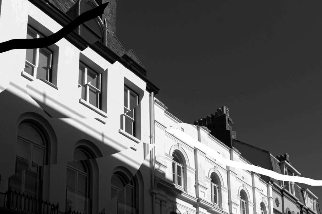
For this edit I used the same technique with the lasso tool and just slightly moved my layers from where the used to be. I like the way it turned out because it looks like a broken mirror which I think is quite interesting.
Experiment 3:
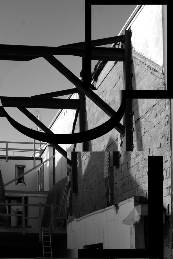
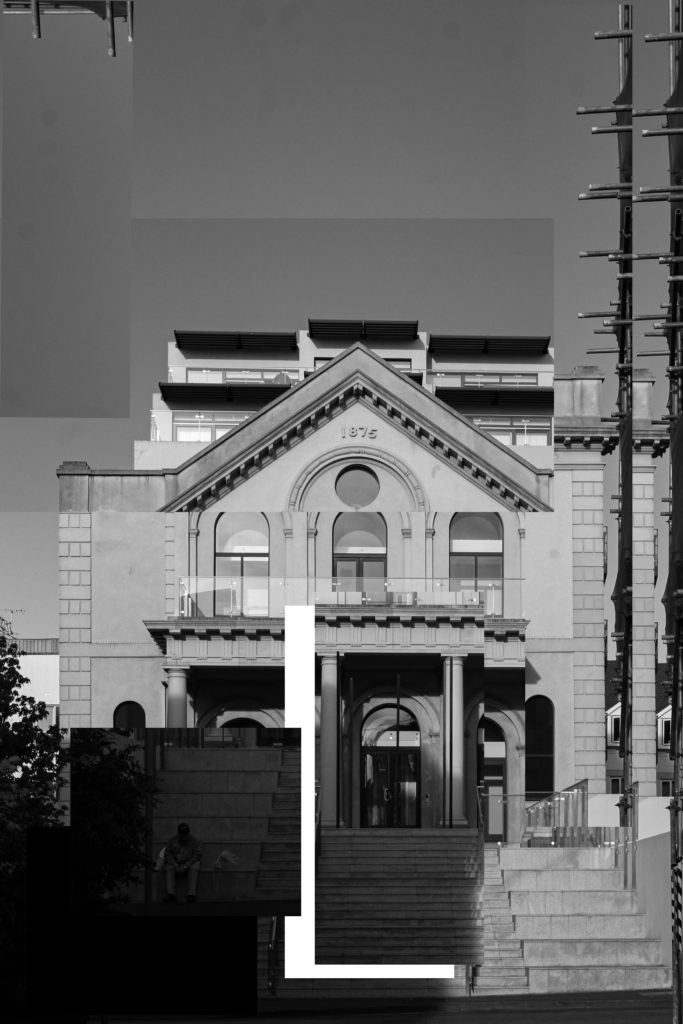
I had the same idea in mind for this edit but instead of using the lasso tool and getting more organic shapes, I used the ‘rectangular marquee tool’ and ‘elliptical marquee tool’ to get the shapes. I like the way it turned out because it looks quite abstract.
More:

