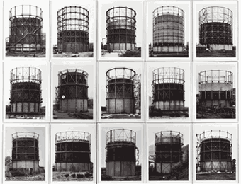
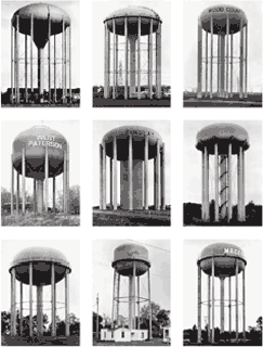
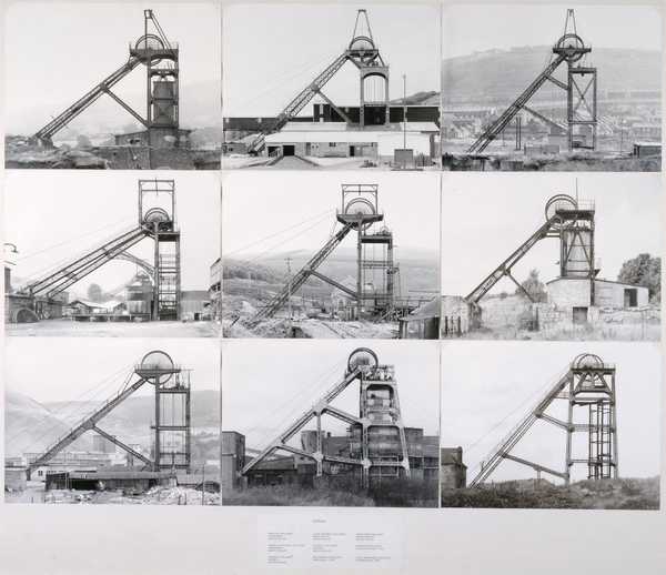
For my first final piece, I have created an image that is very similar to Hilla Bechers work by presenting my images in the same way. I chose to do work inspired by Hilla Becher because I really like the way she lays out her images and presents them on a plain sheet of paper with multiple angles/ different structures because it gives a full response towards the idea of Anthropocene. My image was done slightly different by each photo being taken further away from the main focus (being the water tank).
Process of creating image:
To begin with this image process I started by arranging all my 9 images I need and placed them all in a blank photoshop document and made sure I had the right images so I can complete this piece successfully.
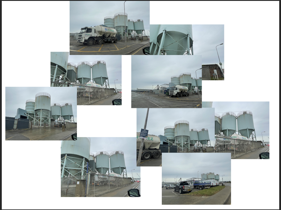
After that, I needed to line the images up in 3×3 square/rectangle and change all the images to black and white to create a nice contrast between the images and background.
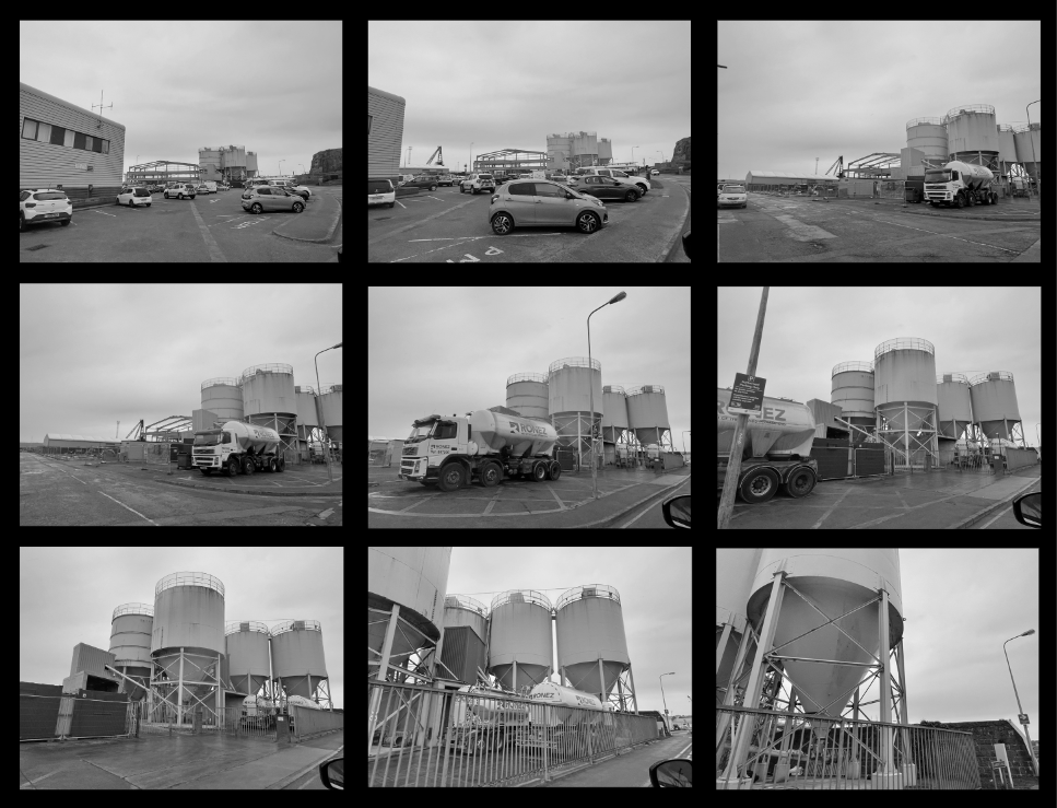
I was going to keep this as a final image but then experimented to see if a borderline around each image looked better. However, Hilla Becher doesn’t use an outline on her images, so I tried to see if it would be more effective. Also, Hilla usually colours her background either grey or white so I thought to be different and try out black and in my opinion it looks better.


Personally, I believe the use of the ‘Strokes’ (outlines) make the image look more quality. This is because of the contrast between the images and the black background give off a great effect.
After finishing this piece I thought to experiment different colour backgrounds to see if it improves the piece. I changed the background to grey and white to see if it would make the images stand out more but I don’t think it looked any better.
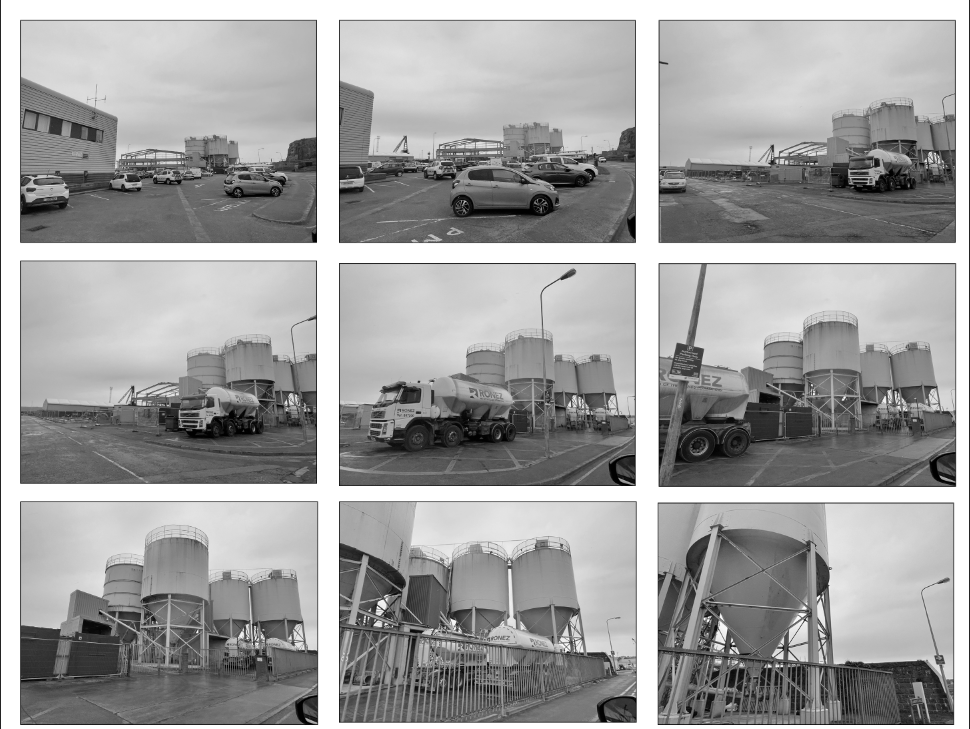
White background 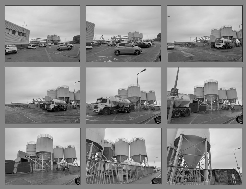
Grey background
Image comparison:
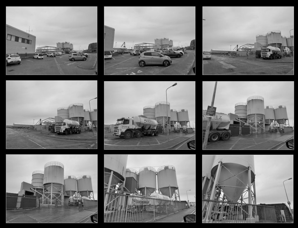
My image 
Hilla Bechers image
As you can see, my images are taken in landscape and have distance between each, however Hilla Bechers images are taken in portrait and are taken of the same structure from different angles. The use of the white background on Hillas image contrasts a nice effect towards the structure. Also, Hillas image has 15 images within it, with mine only having 9 creating a 3×3 rectangle. My main focus in my image are the water tanks, which as you go down the image the closer you get to them. However, Hillas are all taken from the same distance away from the main focus but from different sides and angles.

