My Edits:


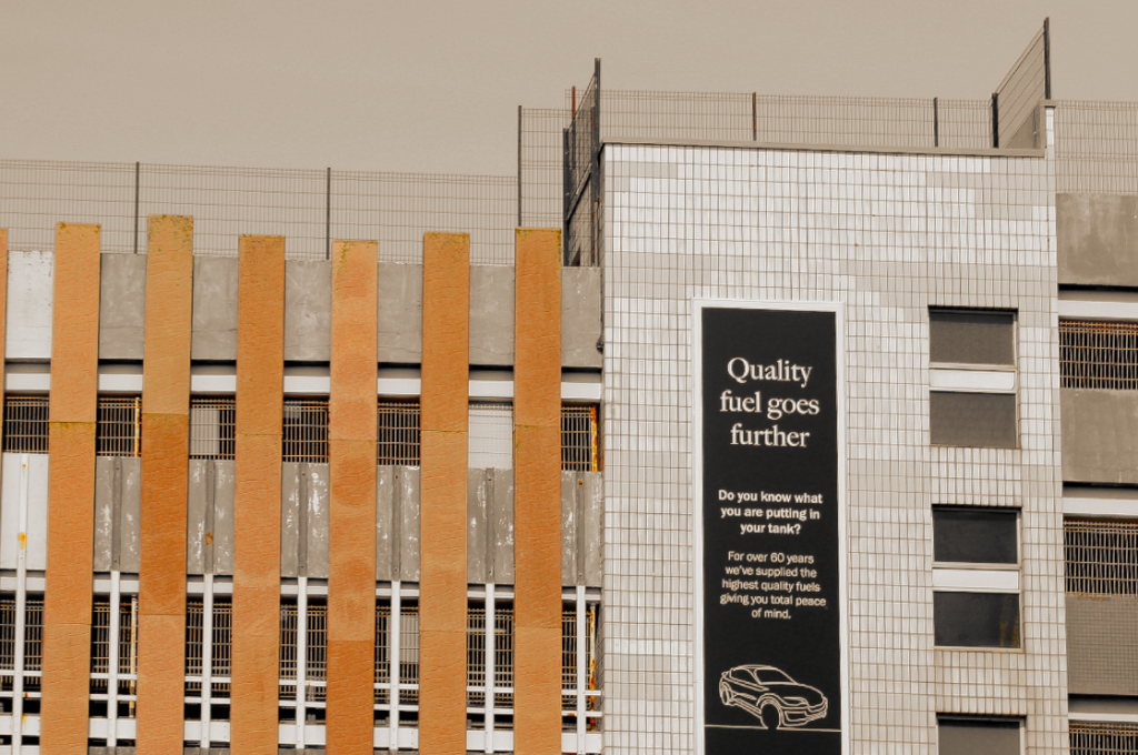
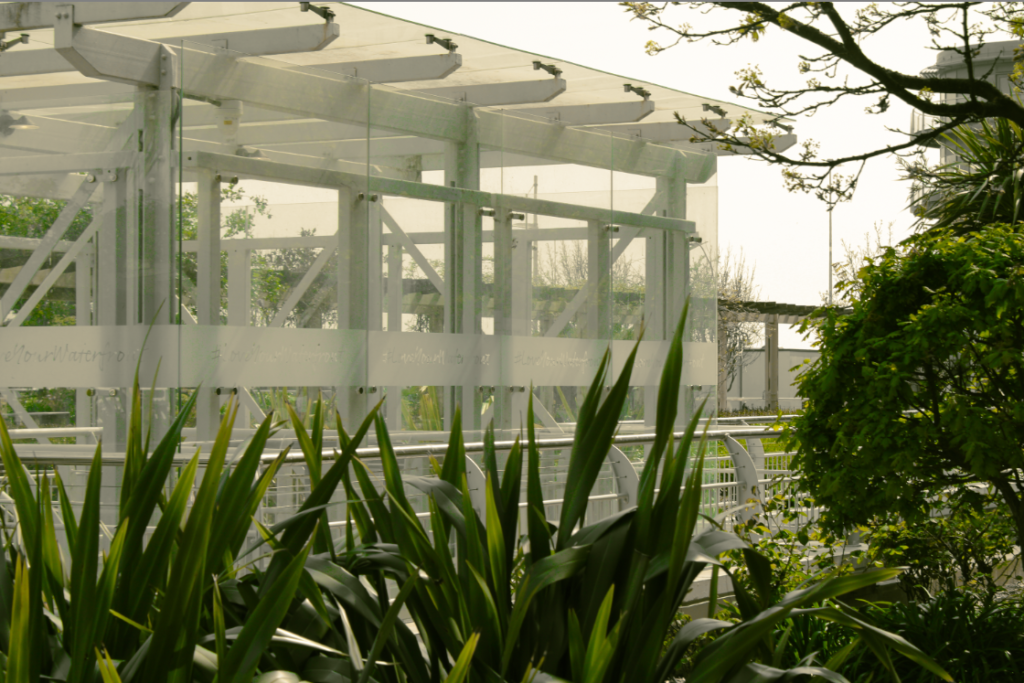
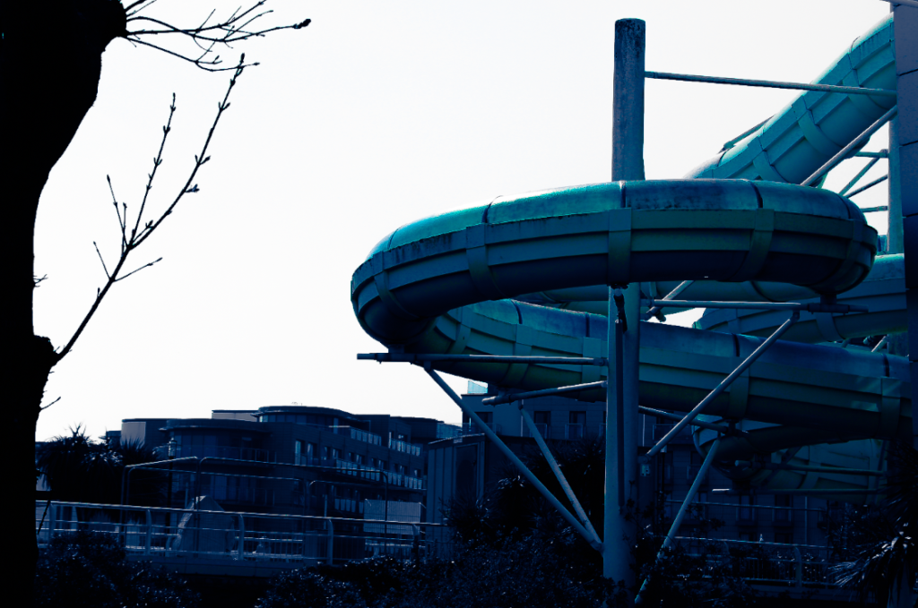
Although these aren’t my final edits, I still want to evaluate what I’ve done up to this point before I change these photos further and end up with a completely different set of images.
Comparing My Work to Felicity Hammond:


Hammond’s work is carefully made in order to portray how fascinated she is by “political contradictions within the urban landscape“. She tends to tint the shadows and highlights in her work, in this photo in particular she tints them blue and a greenish-yellow, which makes her work seem more dramatic, building a post-apocalyptic-esque scene which further emphasising how she feels about the environment. This is similar to what I did to my images as I used different tints in order to emphasize certain aspects of each image. In this image, I tinted the shadows a strong blue to draw more attention towards the ocean and used some green highlights to create an almost dusty visual as I attempted to depict a polluted scene.
Our work also shares some differences such as how Hammond built her photo, giving her full control of everything in her image which is well presented due to her experience as both a photographer and an installation artist. This helps give her photo a unique and rare touch as it looks like a dystopian environment but still includes aspects of urban environments. My image on the other hand, was a photo that I carefully took when outside, unlike Hammond, I didn’t collage my photo or add anything to it in order to create my own world, instead I decided to keep the image the way it was.
