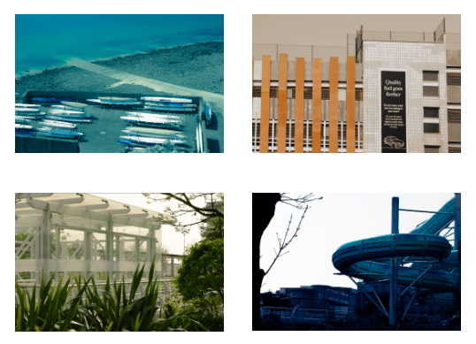
After looking through all my Felicity Hammonds inspired experiments, I chose some images that I wanted to use and further edit as I liked the way they turned out and wanted to group them together. Whilst Editing, I kept referencing Felicity Hammond’s work as I knew I wanted my edits to look similar to hers in terms of the use of colour and in terms of representing the environment.
My Edits:
—-Edit 1:——————————
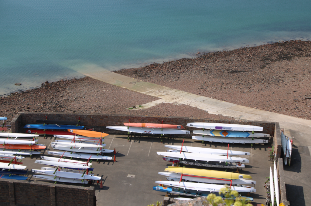
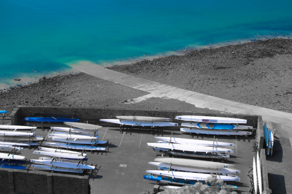
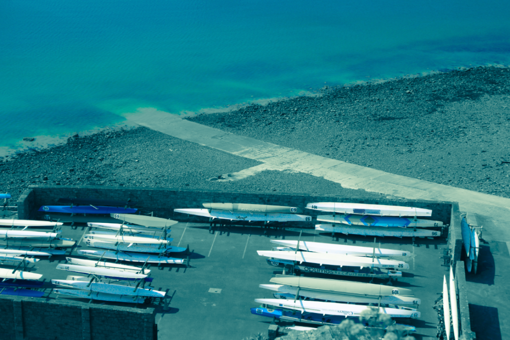
In order to create this edit, I decreased the saturation of everything other than the blue as I wanted the ocean to be the main focus of the image. Then, I decided that I actually wanted to create a more polluted environment which led me to tinting the midtones blue, to emphasize the water aspect of the image, and tint the highlights a pale green which made the path in the image look older and slightly decayed.
—-Edit 2:——————————
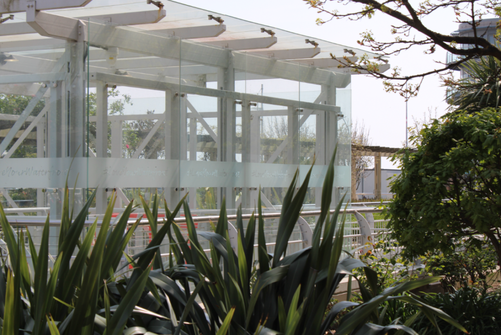
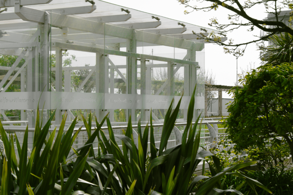
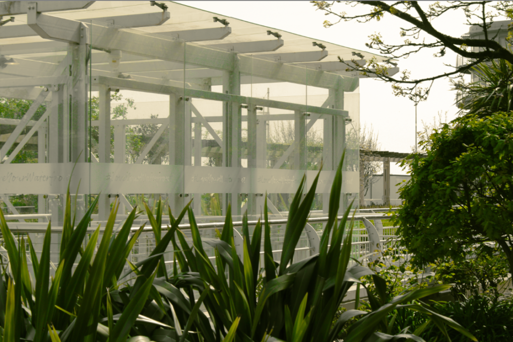
When editing this image, I decided I wanted the foliage in the foreground to stand out which led to me lowering the saturation of every colour in the image other than green and yellow. Next, I decided to try tinting the highlights of the image a pale yellow which gave off the impression that there was a lot of pollution in the air which I decided I liked the look of as it expressed how humanity has taken over rural areas in order to equate for human life.
—-Edit 3:——————————
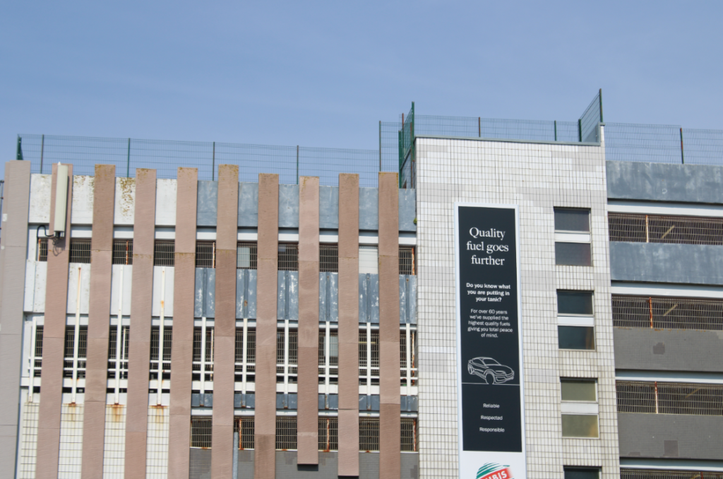
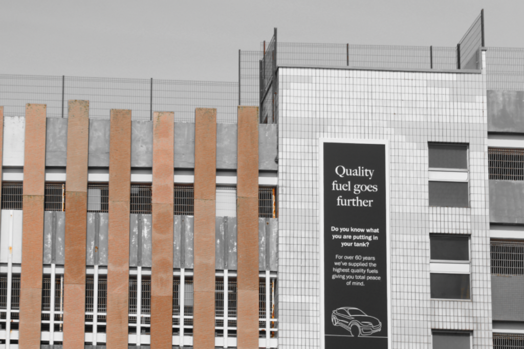
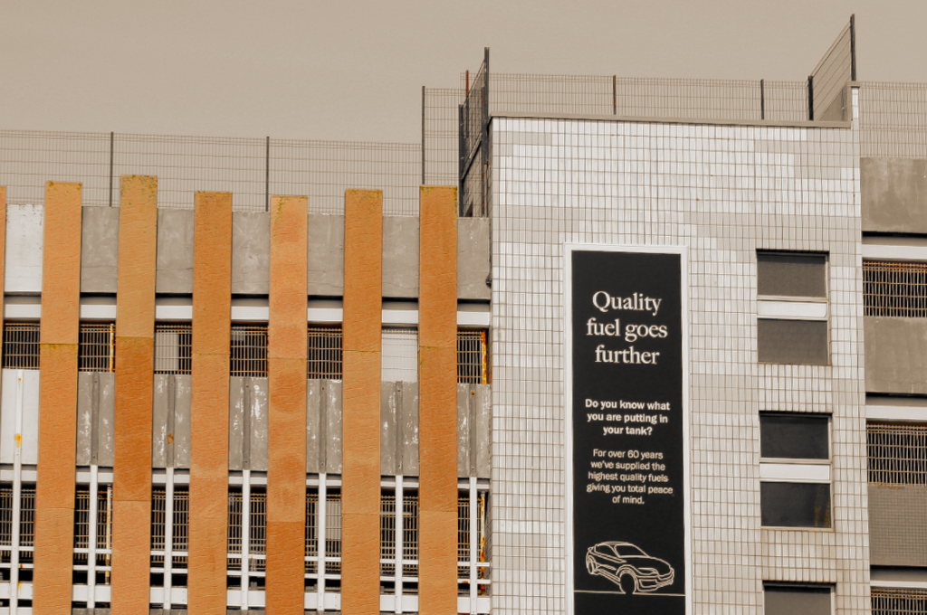
The editing process for this image was similar to the previous edit. I started off by lowering the saturation for every colour except for the orange as I wanted the building to be the main focus of the image. However, for this image, I decided to crop out some parts of the image I deemed unnecessary [i.e.: the blank space in the sky and part of the building on the left]. After that, I tinted the highlights a pale orange, once again making the image seem polluted, and increased the sharpness. This allowed the cracks/scratches in the building to be visible, representing how there are flaws in how humans behave in regards to the environment and how things need to change.
—-Edit 4:——————————
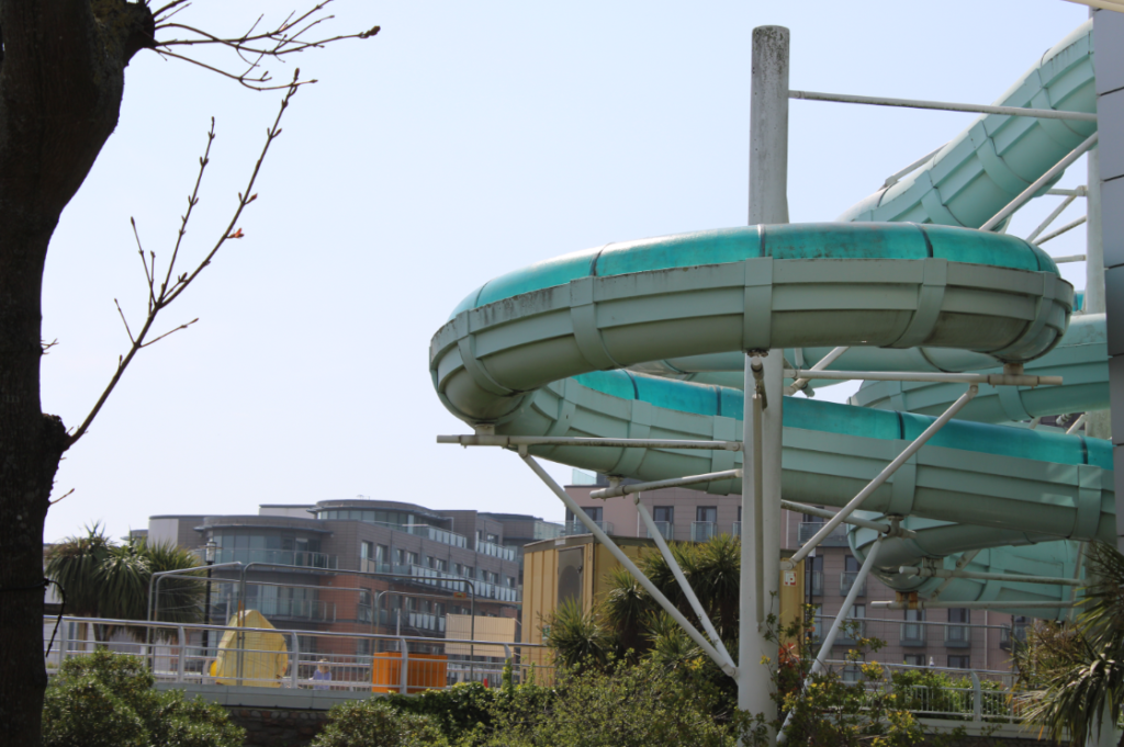
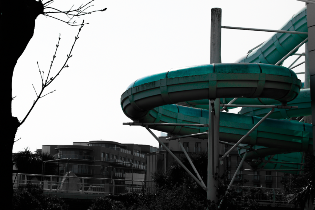
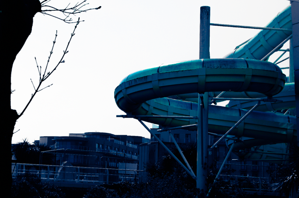
For this edit, I began by lowering the saturation of every colour other than blue, instead increasing the saturation of the blue in order to make the waterslide stand out more and ensuring it’s the main focus of the image. Next, I decided to tint the shadows a deep blue whilst leaving the highlights white, making the image seem more intense compared to the other images as I wanted the blank space to represent the lack of nature due to humanities effect on the planet.
———————-
