Editing photo 3 –
Experiment 1)

For this edit, I began by creating a base to use further, like I have done previously because I think that it helps me to know what I am doing and see how I have edited a picture and what I can do to expand on it further. I started off by bringing the photo into photoshop where I adjusted the contrast and brightness as I wanted to show the fluidity and vibrancy of these 2 coloured plastic bags and how well they work together. I also wanted to try and control the corner where the flashlight was a little too bright in colour so I changed the Vibrancy and colour which brought the brightness of it down but also the picture so to equal this again to bring back the pop of colour in-between I used the hue and saturation tool which allowed me to edit the colours and how bright they were through the saturation for red, hue for blue and lightness overall. To push the colours that extra bit further in showing their colours I adjusted the brightness ands contrast again as well.
I really like how this edit turned out because I like the purple hue which has created a subtle effect in the photo between the mixing of the two plastic bags as it makes them look as if they are one and provides fluidity throughout the photo for this effect. If I were to do this edit again, I think that I would crop the photo slightly so that the corners on either side don’t have huge blocks of colour.
Experiment 2)
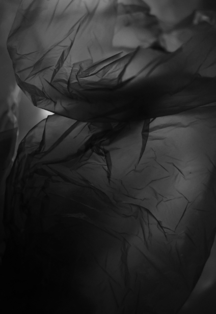
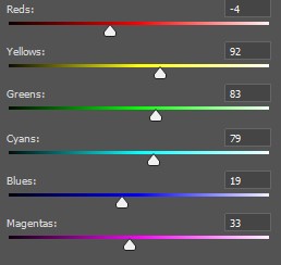
For this edit, I began by turning it into black and white on photoshop as a basis then I used the different colour mixers to be able to balance it out through adjusting them slightly which means that the colours which may still be prominent such as red or blue mainly can be controlled and become darker if I bring the filter down or brighter to create a contrast if I brought them up. After this, I decided that if I cropped the photo I would be able to create a greater focus point for the photo which I wanted to do previously. I decided that the best place to crop would be the middle part because that is where the branch between the two plastic bags is the main part of the photo and I like how the middle is darker than the rest of the photo but also still be able to show the creases pf the plastic bags. If I were to edit this again, I would add a little more highlight into the photo through the contrast and brightness because I think that this would help the structure of the plastic bags be clearer to see and to give them more depth.
Editing photo 4 –
Experiment 1)
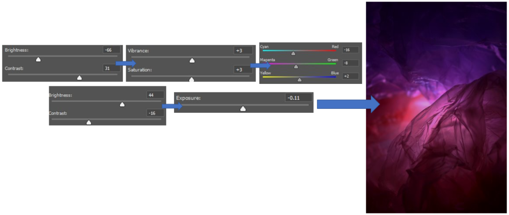
This is how I edited this photo to provide me with a basis for future editing as I really liked how this turned out, even if it is a little darker on the outside, unlike Rolfsen’s work who’s is much lighter, because it creates a highlight in the middle which pulls your attention in instead as the purple and pink tones are eye-catching due to how bright they are.
Experiment 2)
1st 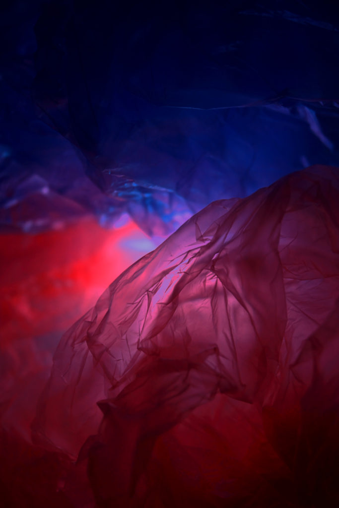
2nd 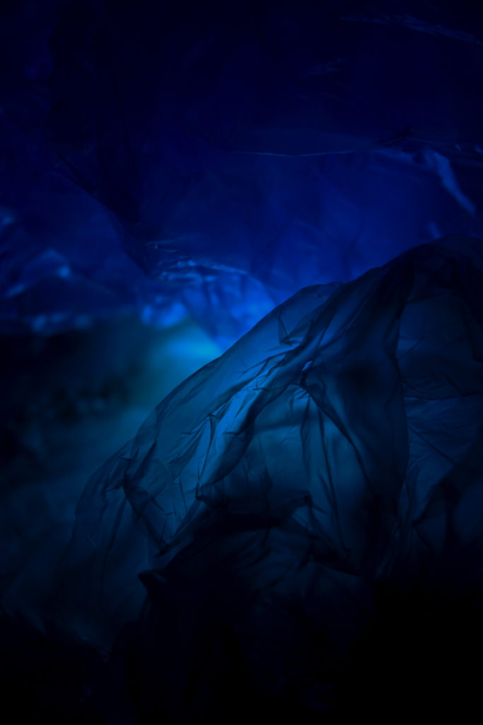
3rd
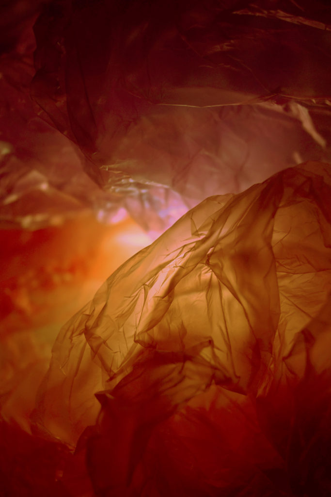
I really liked the way these 3 edits in photoshop have turned out with changing the colour of them because it makes them look different and very unique each time. My most successful edit out of these 3 I think is the 1st one, this is because of the way there are many different tones/shades of orange inside of one photo which helps to add a layer of dimension towards it because it creates a pathway throughout the photo which looks like it is leading towards towards the entrance. I really like this because it can also make it look as if this pathway has caught fire as the orange can resemble flames and as they turn darker the fire is getting more and more intense which can also sow how wildlife is also being impacted with the contribution of fires and how it can destroy natural habitats such as forests. The photo which I think is the least successful out of these is the 2nd because of how the light and exposure has overexposed in the middle while editing and has become too dark on the top/bottom, if I were to fix this I would make sure that the vibrancy of the colours is shown throughout the photo making adjustments where it may be needed to fix and prevent this issue from happening again. I do like how there is a divide in the colours of red and blue which can be used to symbolise the dangers of plastic pollution during the ‘Anthropocene’ similar to Vilde Rolfsen’s work where she uses 2 different colours to captivate and signify this.
Different types of experimentation –
Multi exposure 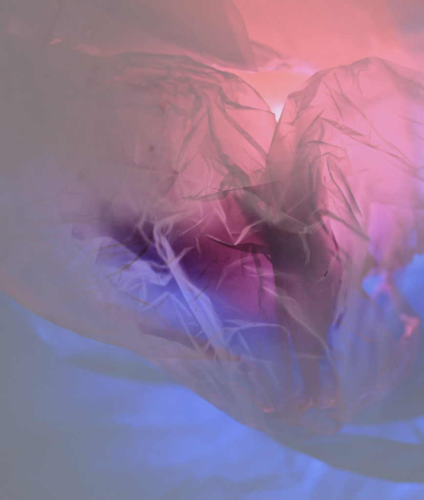
Double exposure 1 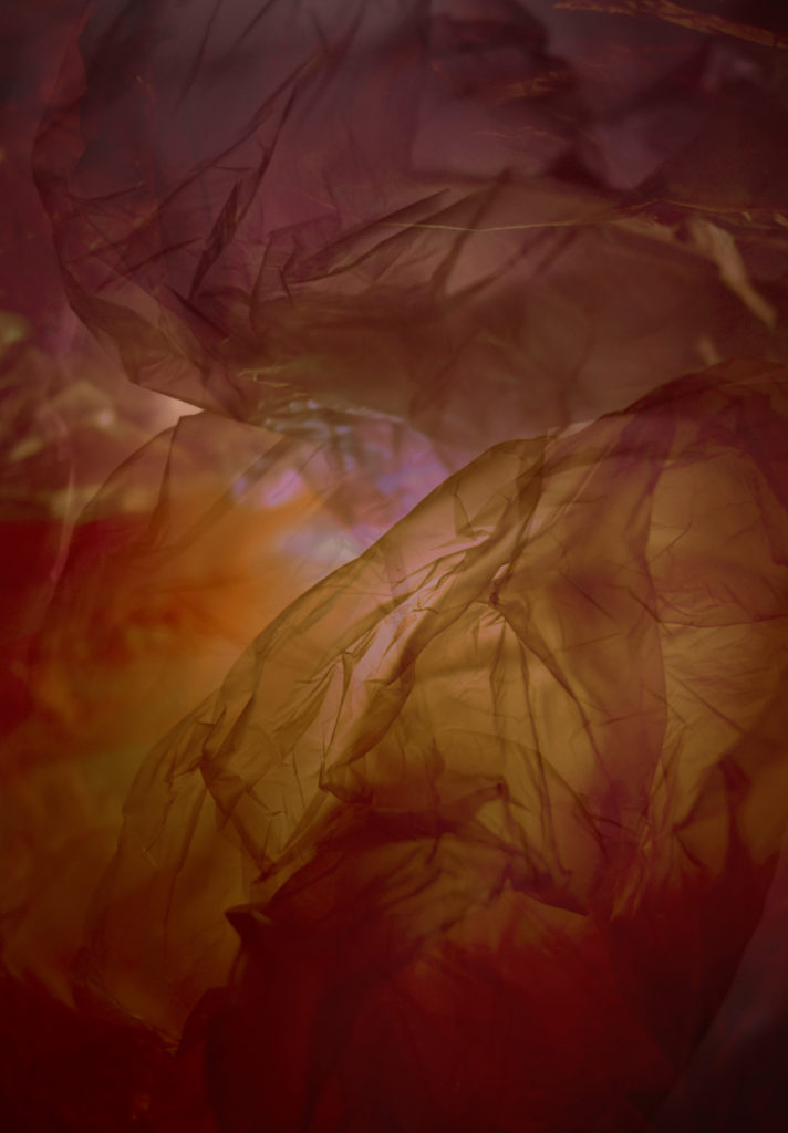
Double exposure 2
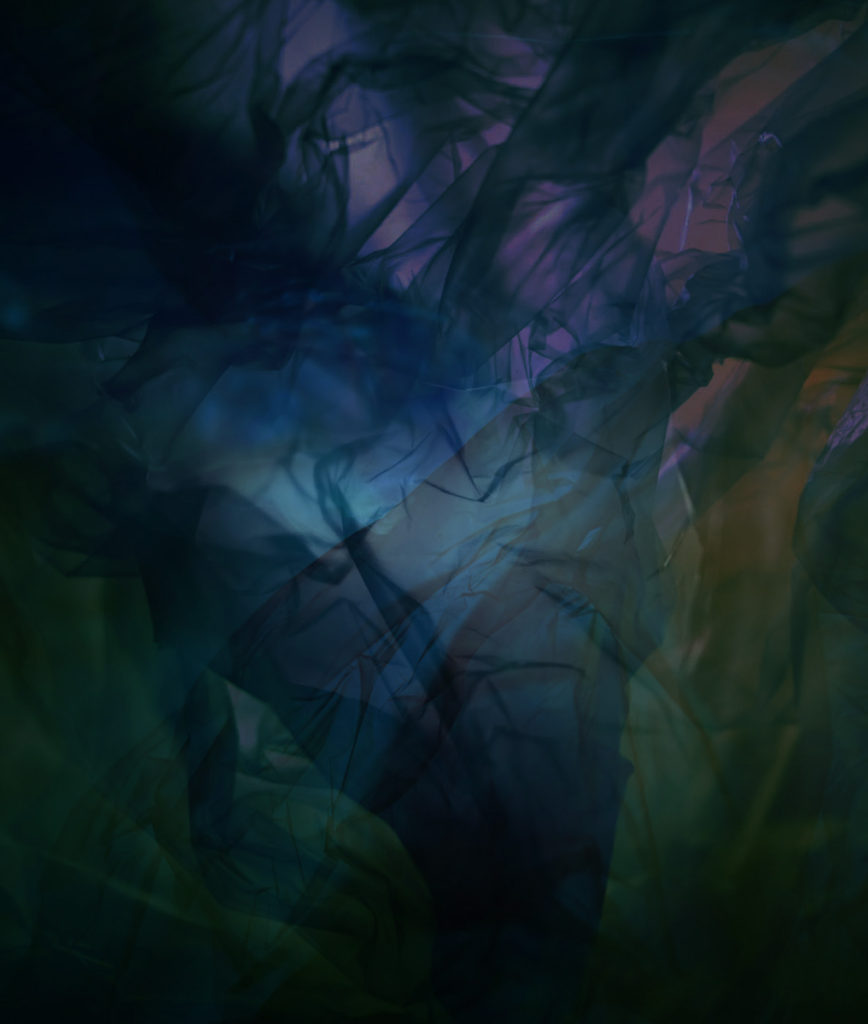
For these edits, I wanted to experiment with all the photos I have edited so far through the use of the multi/double exposure technique. I really enjoyed using this technique as I was able to reflect back on the different photos which I have produced so far and see where there may be strong/weak points in them.
My favourite edit is the double exposure 1 because I like how I have used the bright colours behind the white of a photo because it resembles Vilde Rolfsen’s work where a few may have colours which aren’t as bright due to having either a white plastic bag over the top which can mute the colours slightly or going through photoshop and adding that white filter on top. I also like how the white highlights from the photo on top make the photo create the effect of it looking similar to a rose with the darker part being a stem underneath and the petals falling around it.
My least favourite edit the multi-exposure and this is because I think that it looks quite messy and unorganised because you aren’t able to see all of the different layers which I have introduced in the photo clearly and the some of the colours overlap creating darker parts such as in the top left corner which I don’t like, However, I do like the use of the colours at the bottom which I have used as they have merged together and made a few earthy tones come through such as green and blues, even a slight hint of purple as well. If I were to do this one again, I would make sure to make the opacity of the layers more dominant so that they are able to be seen so that they don’t mix into the plastic and start to get lost and look as if they are apart of the creases.
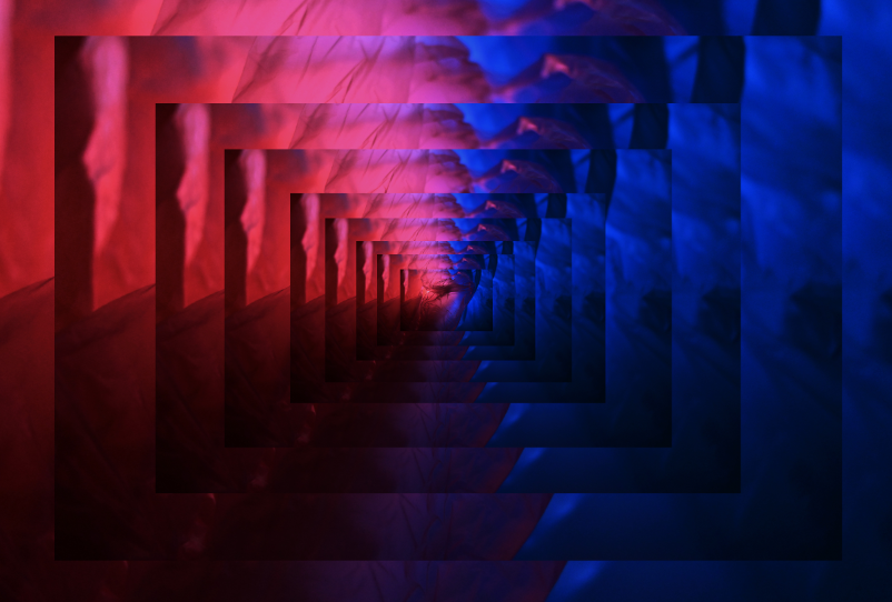
I really liked experimenting with the technique of layering in my work because it creates a 3D effect as if you are looking beneath you where there are different platforms which look as if they are not going to and and I think the darker shadows which contrast well against the bright colours of red, blues, pinks and purples help to create this illusion towards the photograph. If I were to experiment with this technique again I would want to introduce using a mix of 2 photos which work well together because I think that it could make them contrast well against each other (depending on the colours of each photo) which could create a layered effect that shows 2 different ways how the theme of ‘Anthropocene’ is impacting the world through the beauty of plastic bags which is what Vilde Rolfsen does as well.

