About –
Vilde Rolfsen’s photography consists of editing her plastic bag photography to successfully bring the photos to life through the vibrancy and beauty of the plastic bags, which is what I will experiment with in my own work while editing in the style of her. I will attempt to do this in photoshop by cropping the photos, to make the finer details/patterns of the creases more visible which will help to see the colour of the plastic bags which I have chosen to use. To create the beautiful mix of colours which Rolfsen presents in her work as well, I will experiment with the vibrancy, contrast, hue/saturation, channel mixer to transform into a singular colour, etc. Further more, I will also move away from Rolfsen’s style to experiment with changing the colours of the photos into black and white or create a faded look with them through the gradient map, curves etc.
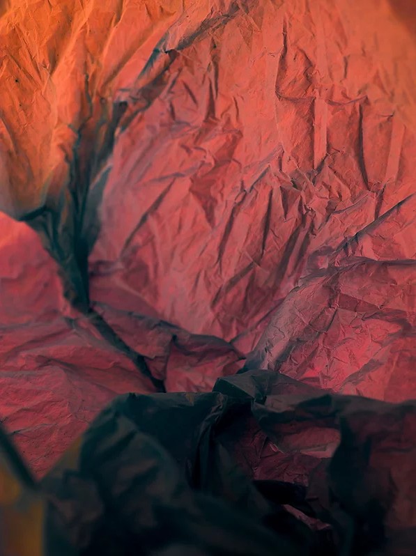
Examples of 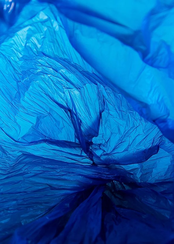
Rolfsen’s work
Editing photo 1 –
Experiment 1)
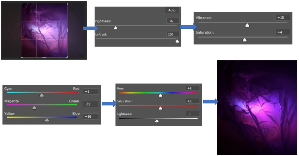
For this edit, I began by editing the photo to get rid of the excess space on the edges of the photo where the plastic bags weren’t quite in focus and had a large surface area, which I didn’t like. After this, I wanted to bring out the vibrancy of the purple plastic bag yet keep parts of it darker, which can be seen in Vilde Rolfsen’s work at the creases and folds. I used the brightness at the start to bring the photo down to a more controlled level of brightness and then brought the contrast all the way up to keep the vibrancy of the purple fluent throughout the photo which can be seen when I was using the vibrancy and saturation which I didn’t need to change as much, due to this. Then to make sure the purple was as bright as it could be, similar to Rolfsen’s work, without overexposing it I used the colour balance to make sure the colours weren’t getting lost in each other due to one colour being too overpowering. This photo is what I used as a basis for editing the photo further on and this is because I really like how it turned out and I think that it would be a good photo to use to experiment in different filters with because there are light and dark points of the photo, similar to Rolfsen’s work.
Experiment 2)
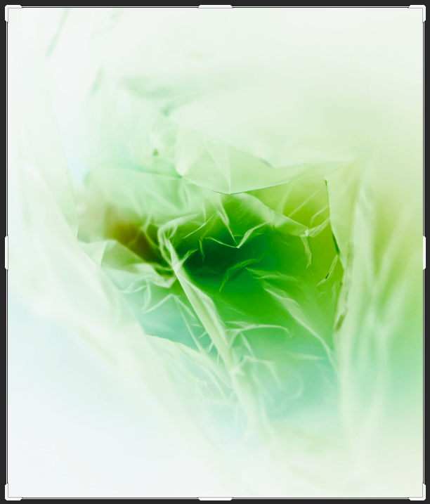
For this edit, I inverted the photo on photoshop and adjusted the density and feather tools a little bit, which created this image which I really like because I think that due to the editing on the basic photograph I had used beforehand made the creases more defined which creates the image of a leaf. I really like how this has been created because similar to a leaf, it shows the intricate little formations which a leaf may have to show its uniqueness. This can also link quite well into the theme of ‘Anthropocene’ as the outdoor environment is another element which is being heavily effected by it and due to the way the lighting is, which makes the surrounding of the photo a bright, plain white makes the leaf appear as if it is fading away more and more, which can show the dangers which are effecting the environment and how if we keep acting as we are, there won’t be much left. I also like how the middle of the leaf appears darker then the rest as it adds a layer of dimension to the photo to make the leaf look realistic as this is where the stem would be on the underneath. If I were to edit this photo again, I would make sure that there is more green involved in the picture which I would edit in the channel mixers and vibrancy/hue because I think that it would add that extra level towards the photo which would make it stand out well, highlighting the fact that it resembles a leaf.
Experiment 3)
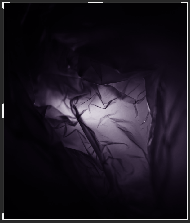
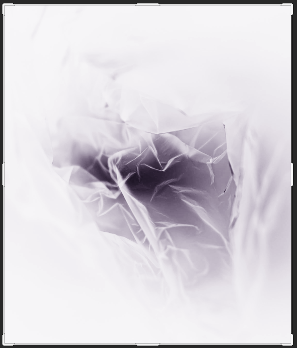
For these edits, I experimented with the black and white filters on photoshop. I used these to transform the photo, highlighting the middle where the flashlight was which makes it become the main area of attraction to someone’s eye and then the black highlights the creases in ways where it makes them defined so that they stand out, creating the effect that you are looking down into a valley or mountainous area.
Then for the second edit, I inverted the black and white photo on photoshop which creates this X-Ray effect which I think is really effective as it creates a miniature landscape inside of itself where the brighter parts can be seen to be higher areas covered in snow whereas the darker bits are where the land falls down, but if I were to edit this further I would have cropped the photo to make the main focus be the small landscape which has been created as I think that the bright, overexposed area from the lighting previously around it makes the focus being taken off of it.
Editing photo 2 –
Experiment 1)
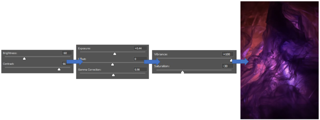
For this edit, I wanted to keep it quite simple to begin with as previously because I think that the base was a good starting point which I really liked and wanted to experiment further with in different ways. I began by bringing the brightness down to try and neutralise the glow of the flashlight a little bit as I thought that it was quite overpowering, but this also made the photos colours become a bit dim so to keep them vibrant I brought up the contrast. Then I used the exposure and gamma correction, a small bit, to help bring out the darker colours but to an extent. I wanted to also extenuate these colours further as I felt that they had gotten a little bit lost while editing, so I brought up the Vibrancy and to keep it stable/equal I brought the saturation down.
Experiment 2)
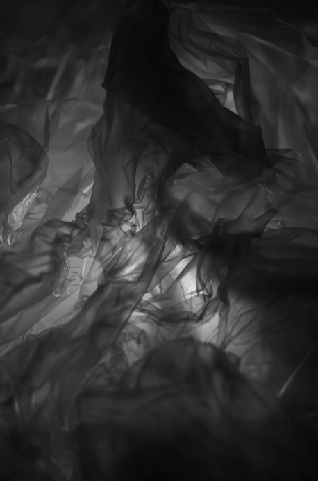
For this, I brought the photo into black and white as I wanted to experiment with dragging the colour put of the photo, as it was a really vibrant photo. I liked the effect that the flashlight brought to the middle of the photo as it adds a gradual change throughout the photo from light to dark which makes the photo appear to be quite sinister in the effect as it creates a tunnelled illusion which makes you wonder what could be down the small gateway which is leading downwards throughout the photo, also adding a 3D element.
Experiment 3)
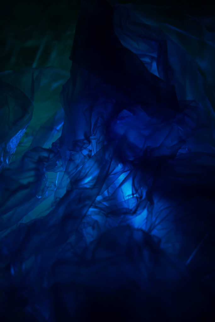
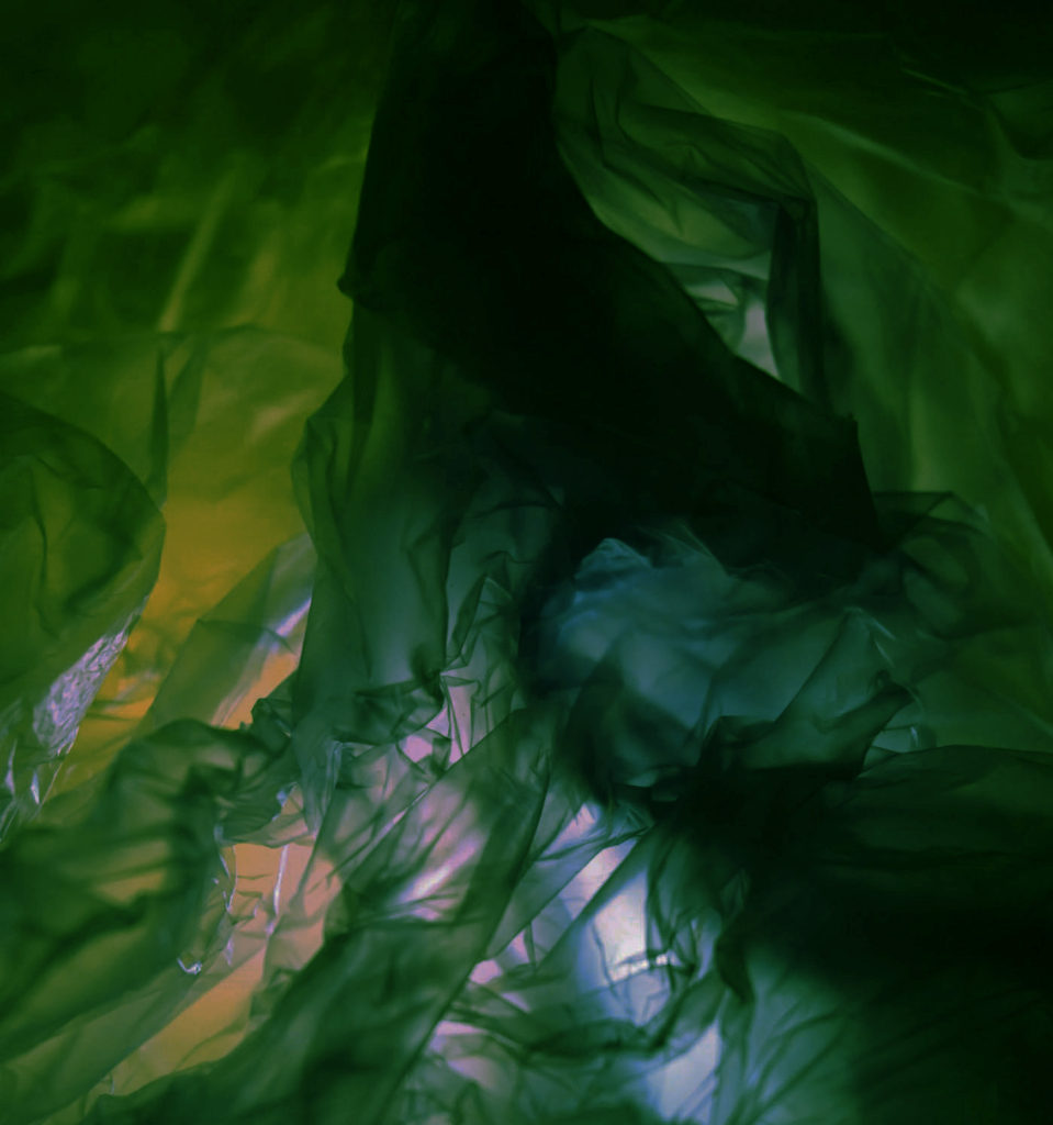
For these edits, I wanted to experiment with changing the colour of the photos completely through the use of the channel mixer in photoshop. I really liked how the blue one came out as it shows a similarity to Rolfsen’s work of a blue plastic bag which I really liked, the blue effect is able to add a sufficient amount of contrast throughout the piece because it is able to level out the light and dark points so that they don’t become too overpowering and bright. If I were to do the photo again, I would crop the photo to get the focus to the middle of the photo where the most creases of the plastic bag are, which I really like, I tried this in the green edit which I think worked quite effectively as it got rid of the excess plastic similar to the first edit of this photo which I did.
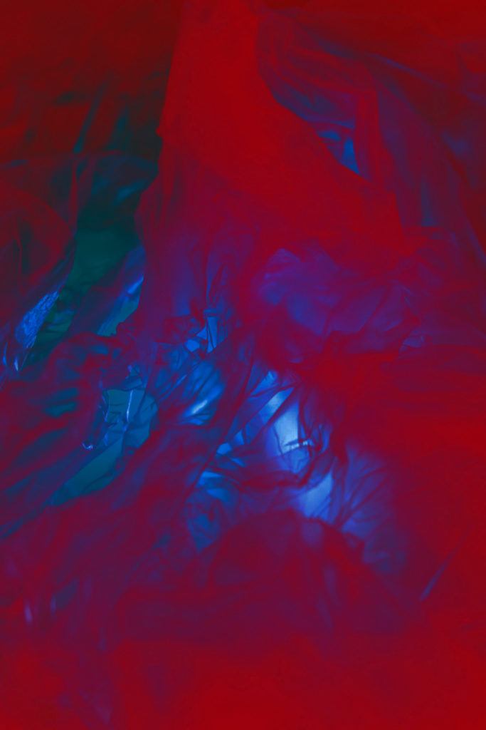
I’m really happy with how these 2 turned out because I liked experimenting with transforming the photo into different colours but the third edit where the photo shares elements of red and blue fading into each other, I wasn’t happy with the way that this had turned out because I think that the red has become too overpowering and doesn’t show the details of the creases which I wanted to have fluid throughout these edits. If I were to do this edit again I would make sure that I change the contrast and saturation to control these levels to make sure that they don’t merge into one.

