Introduction
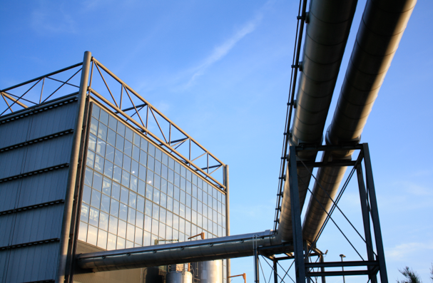
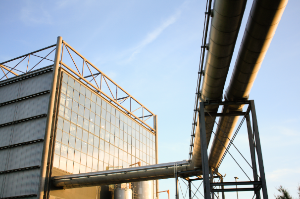
Below I have included some screenshots and descriptions of how I have edited my images in Lightroom Classic, I have also created a ‘before and after’ gallery below for the monochromatic and colour editing. This makes it easier, along with the explanations, to understand the editing process and how it makes the photographs more aesthetic.
Monochromatic Editing
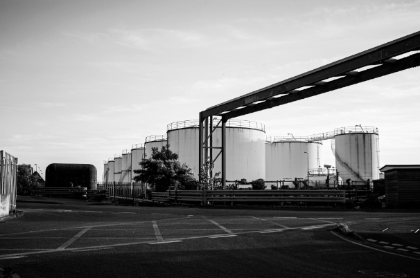
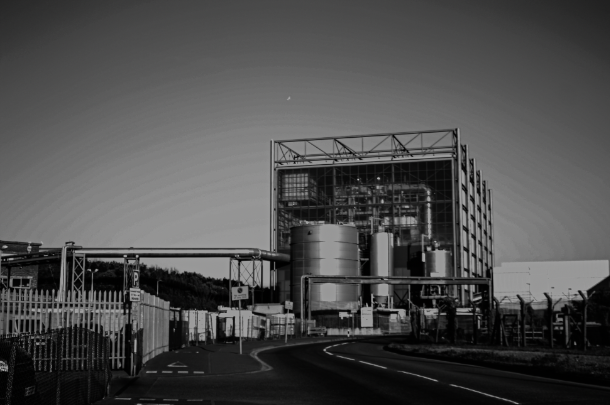
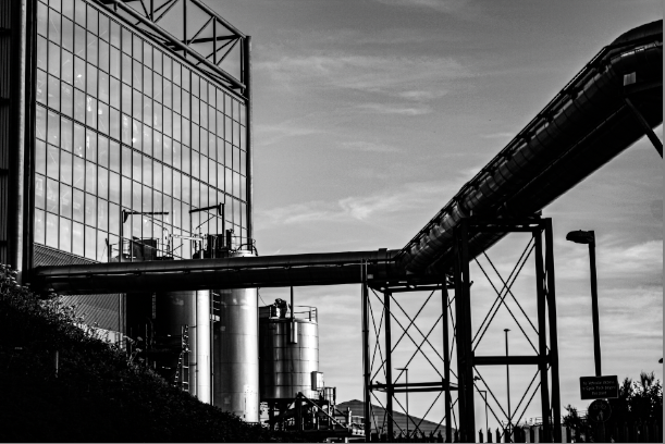
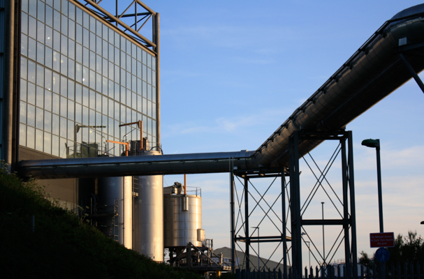
Process: I have edited this range of images below in order to link back to my Frank Gohlke and this helps me link to his industrial work. During the editing process I firstly altered the photographs so that they had no saturation and vibrancy, then to add definition to the images I created increased the texture, clarity and dehaze. The final part of the editing process was to change the exposure and contrast so features such as the clouds in the sky and other lines within the images would be more present.
Intentions: In addition to changing these features, the whites and blacks setting came in very helpful as it meant the engravings in the metals became as more prominent part of the edited images. I didn’t think any of these images needed cropping as I think keeping in some of the surroundings means that the photographs look more like some of my selected artists work, making the next comparing and contrasting part of my project easier.
Colour Editing
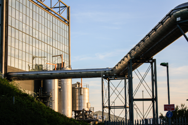
Explanation/ process: Despite a large part of my project being centred around monochromatic work, I have still included some examples of editing in colour. The process of editing these photos included more adjustments such as cropping, realignment and exposure rather than features such as exposure. Some of these images only needed subtle changes, such as a change in saturation, but including evidence they have been edited means they have a higher chance of being used as some of my final images.
Outcomes: Above I have just slightly edited these images to enhance them, some of these images don’t look drastically changed, however I think this is a positive as it means me original work was good. For example, I have only changed the exposure, clarity and saturation for most of these images. For the last two images I only changed the tone of the image so that it might now appear to have been taken earlier on in the evening when the sun was higher in the sky. Alternatively, I’ve found that putting down the exposure on some of these photographs meant that they became too saturated, so to fix this issue I had to make some of the images more dull.
Best Edits
Here are some of my best edited images, this process was made easier as these original images were of a high quality compared to the rest of edits, meaning the angles at which they were taken and the lighting (exposure) didn’t need greatly changed.
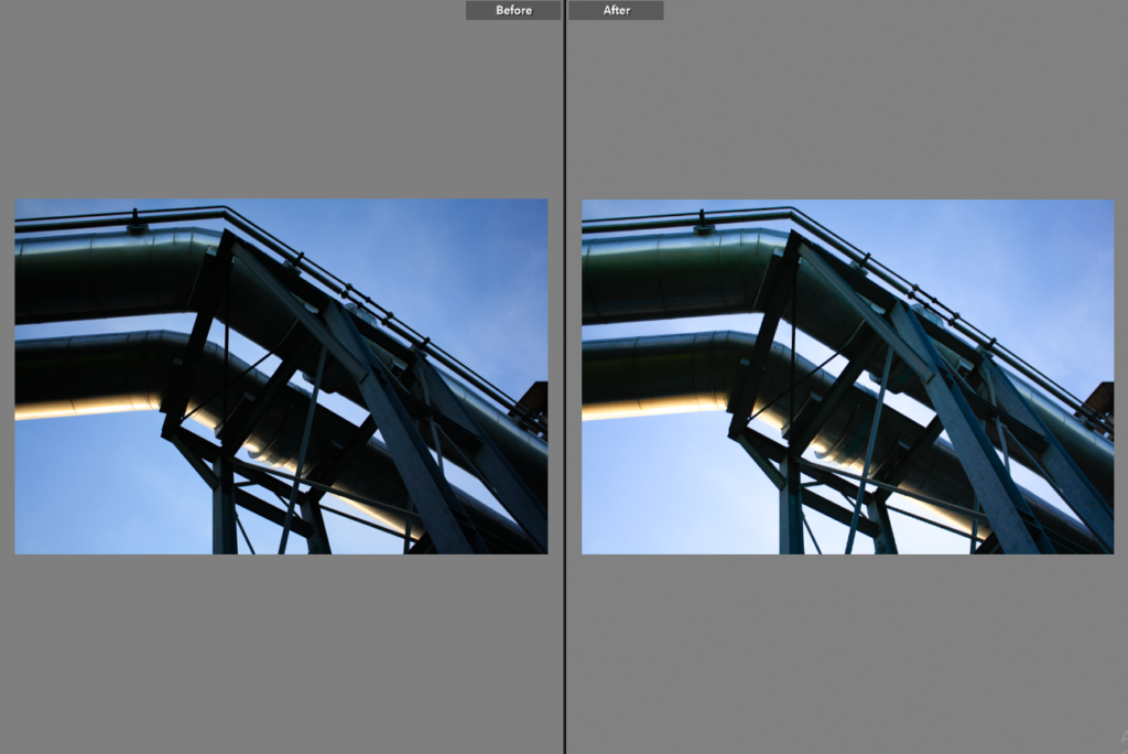
This photograph is one of my strongest throughout both of my photoshoots, it only required little editing with the exposure being increased by a small amount and the saturation being increased as well. I think that this original image is strong because of the composition and lighting so not many adjustments were required. Having the camera on manual meant that I could change the lighting as the sun was setting, considering this was taken as dusk.
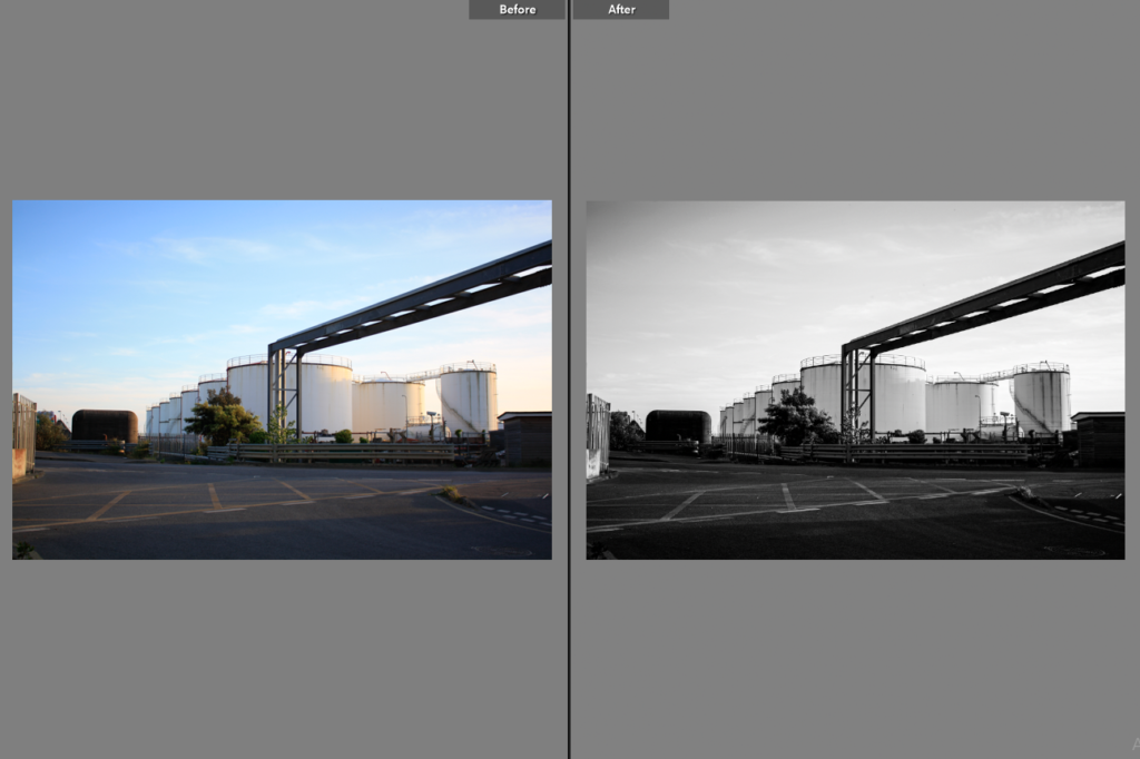
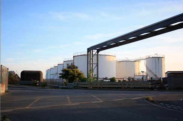
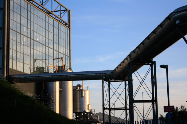
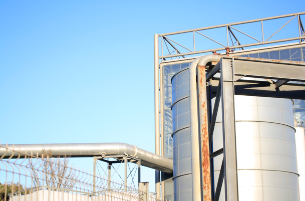
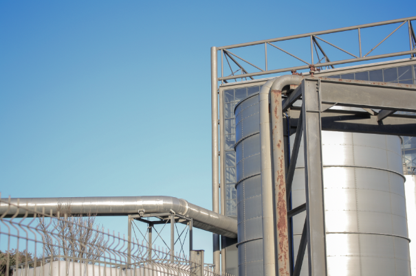
I think this is one of my most successful edits as it very drastic, with the first photograph being full of saturation and the second being full of contrast, both of these images are strong, However, the second links to the work of Frank Gohlke and therefore integrates into my project more, the main changes with this example is the vibrancy, exposure and clarity, as I’ve found the clarity greatly affects monochromatic photos.
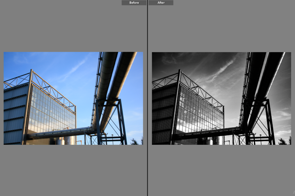
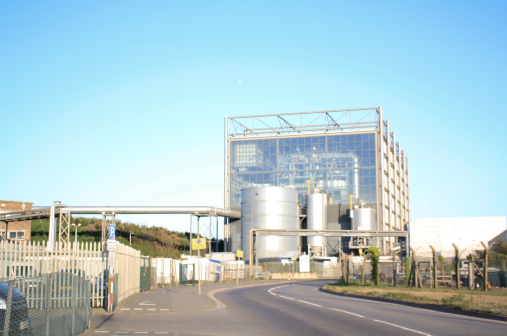
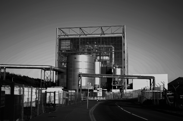
I have chosen to edit this photograph in a monochromatic way as aspects of the image such as the glass of the incinerator have been extenuated and now appear more noticeable. This is important as it makes the image more aesthetic and less dull, altering the contrast makes the image more dramatic and links to the topic of romanticism and Ansel Adams.
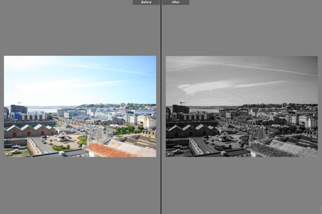
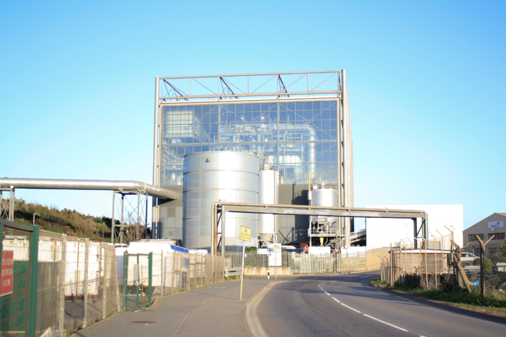
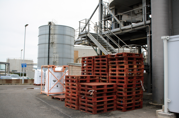
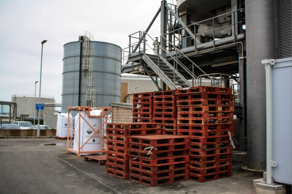
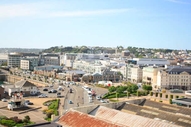
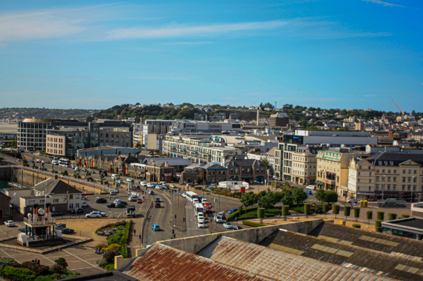
This image is one filled with buildings and structures which are part of Jersey’s reclaimed land. Making this photograph monochromatic meant that the structures have more contrast between them, as the exposure and shadows settings helped to distinguish between each building, I have tried to create as much contrast within the sky so that this part of the image isn’t lost, as its important when juxtaposing natural and manmade features of the image.
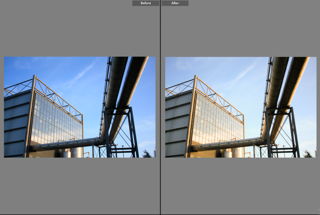
This photograph wasn’t noticeably edited as I thought just changing the image from more of a blue tone to more of a yellow gave the image more vibrancy and a better and different kind of saturation. Furthermore, I altered the exposure by decreasing it so that the focal point of the photograph, the incinerator, would be more recognised.

