Photoshoot 1
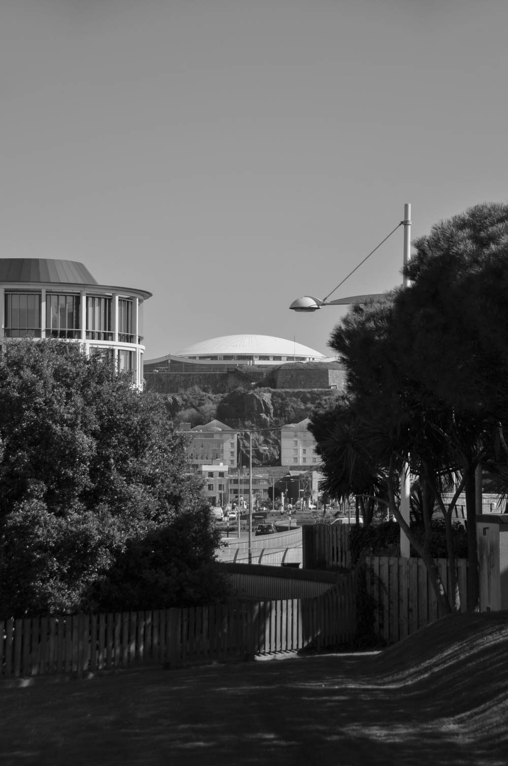
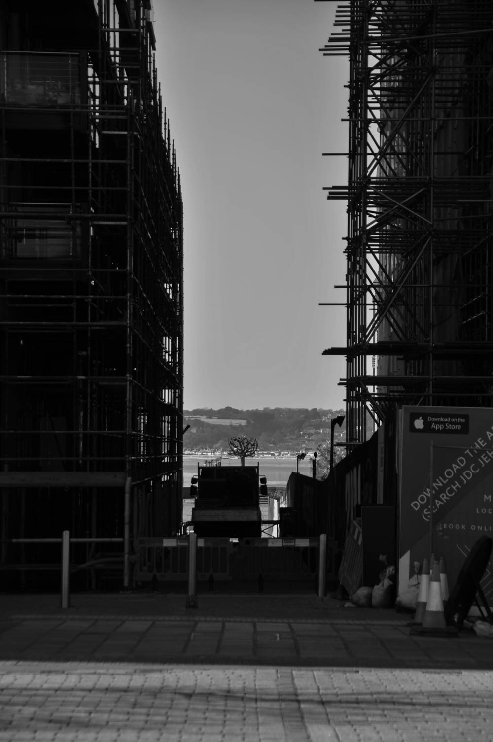
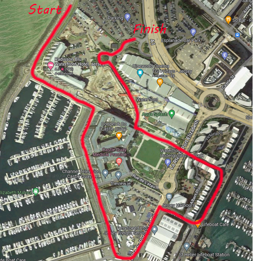
This photoshoot will be conducted on a day after school. I am planning to walk around the Waterfront area, including The Raddison and Castle Quay. I have chosen this area as I believe it will produce good images due to the scenery and numerous monuments and statues in the area. There is also a large construction site in the centre, however this area is fenced away from public access. My main focus for this photoshoot is to capture buildings and large objects in a similar style to my artist reference, Gabriele Basilico. I think that this will be a suitable area to photograph as it will show what effects humans have had, which aren’t always bad. Hopefully I will be able to portray what the human race has created at a cost of the planet’s natural resources.
Route Plan
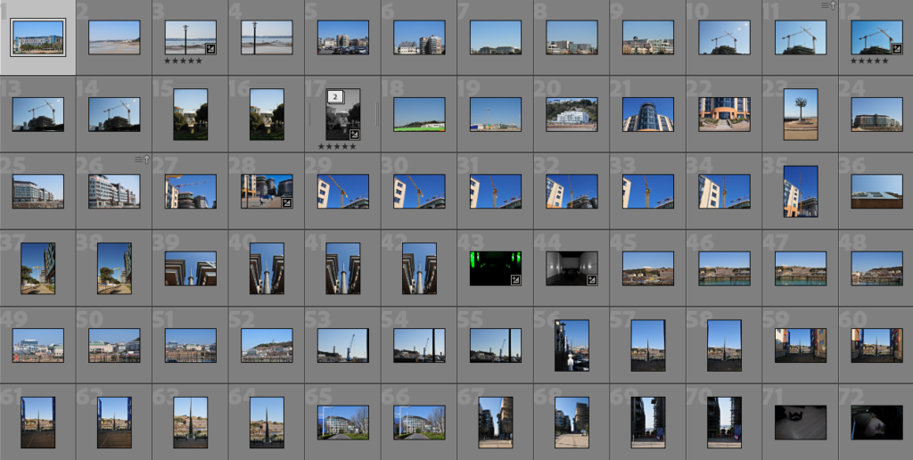
Contact Sheet and Selections
Post-Selection Editing Process
Landscape
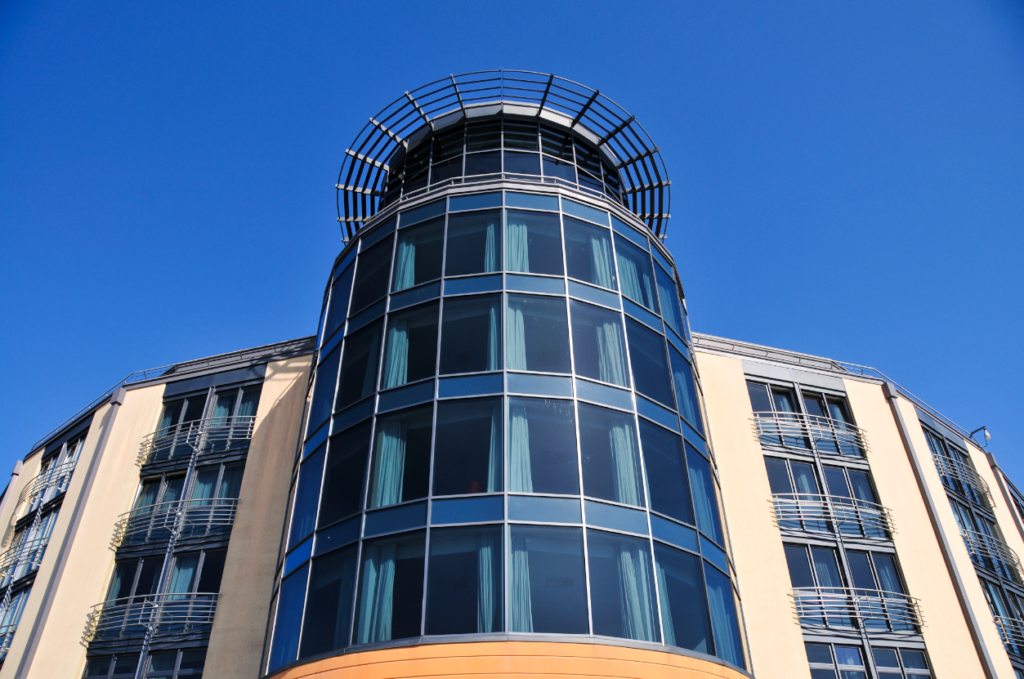
Image 1 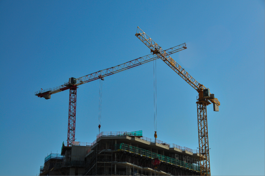
Image 2 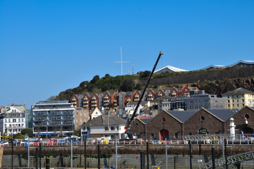
Image 3 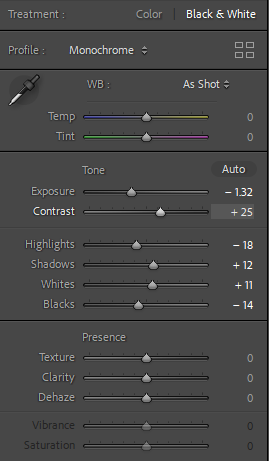
Image 1 Edit Process 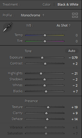
Image 2 Edit Process 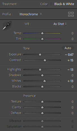
Image 3 Edit Process
Portrait
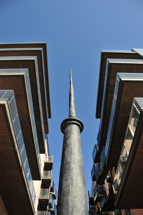
Image 4 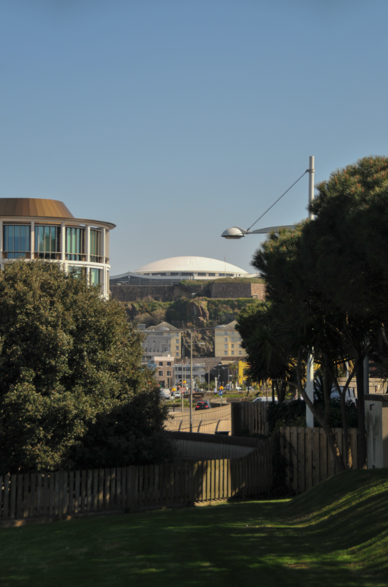
Image 5 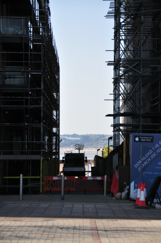
Image 6 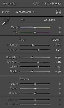
Image 4 Edit Process 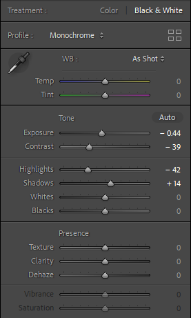
Image 5 Edit Process 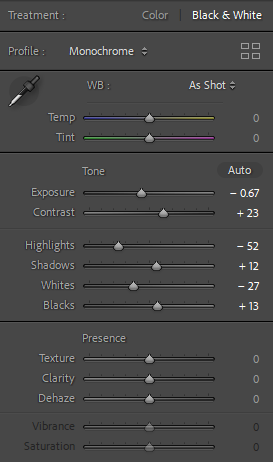
Image 6 Edit Process
Final Images, Post-Enhancement

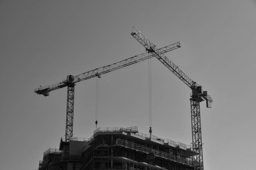
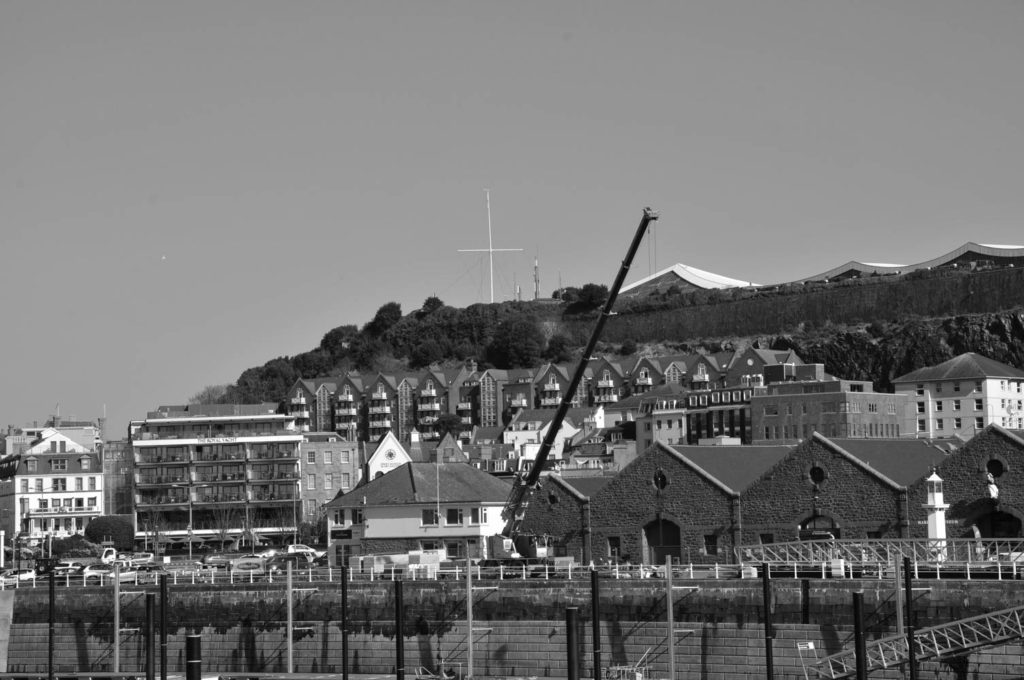
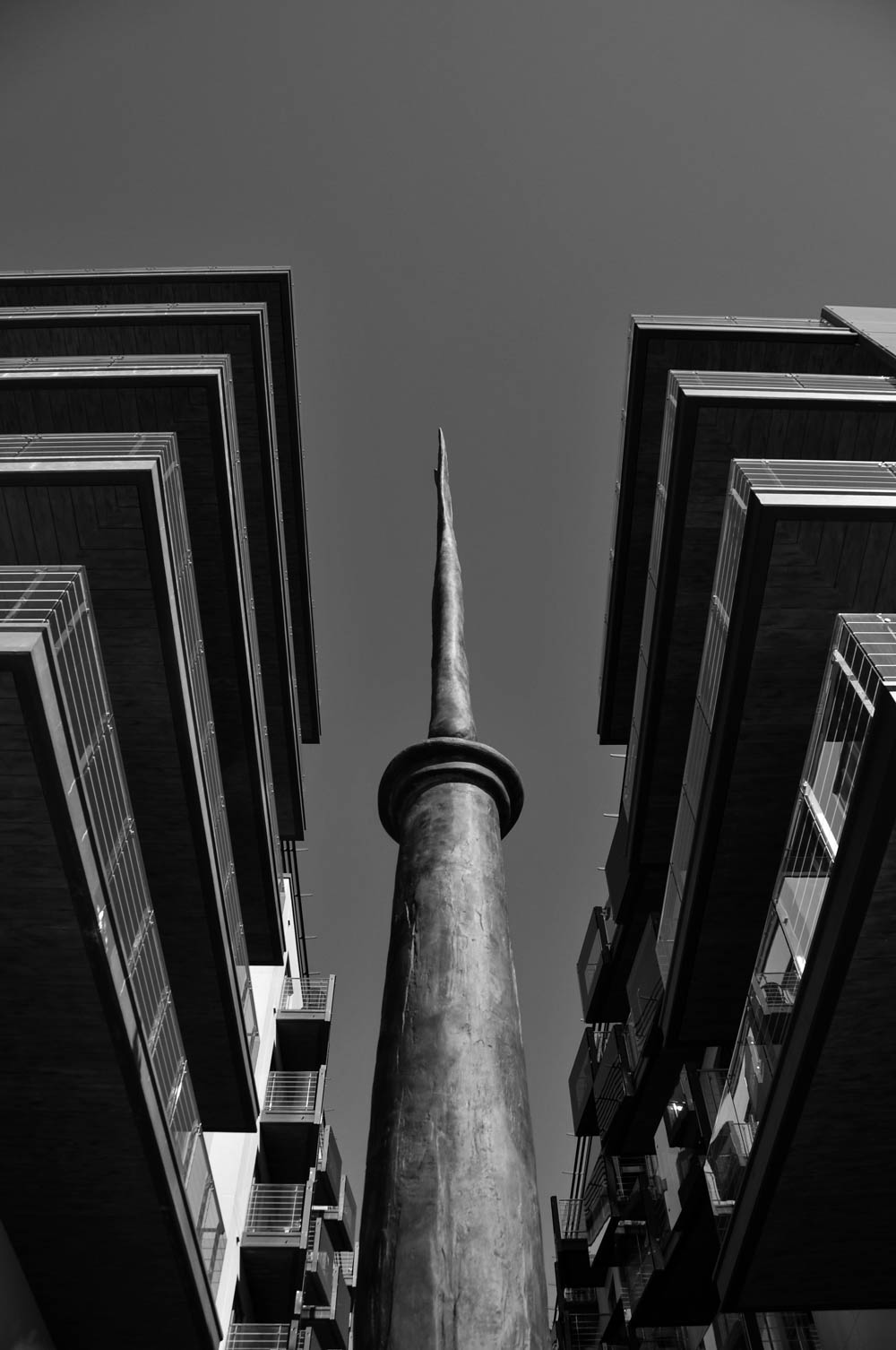
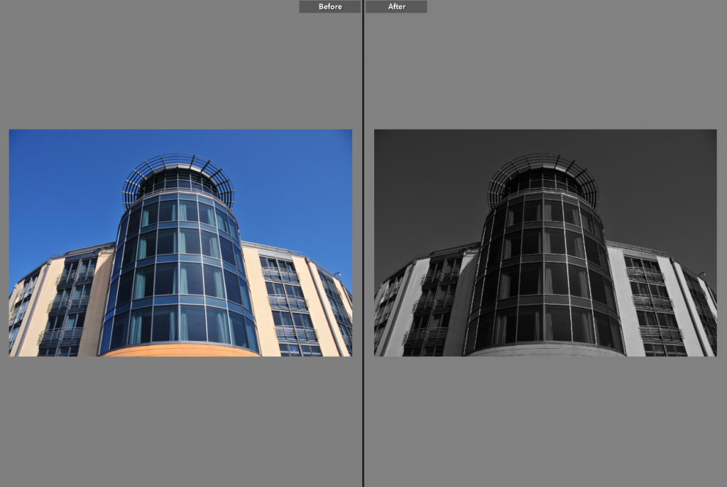
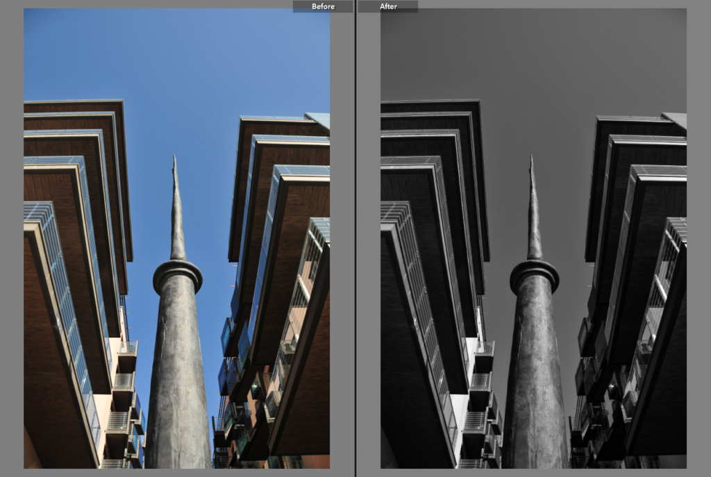
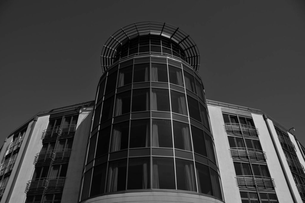
My editing process was conducted as follows; I chose what I thought were my best 6 images from this photoshoot, 3 landscape, 3 portrait. Using Adobe Lightroom Classic software, I gave each image a monochrome filter and decreased the exposure. I also increased the contrast of all images, as well as a few other finishing touches varying from image to image. This was done to make the sky look darker than it actually was in the original. I kept this theme throughout these edits, as well as the finals from the next photoshoot. The best examples of the effect this has from this photoshoot are images 1 and 4. I really like this visual effect as it provides a whole different atmosphere and temperature to the images. A deeper sense of mystery and “the unknown” are also seen here in my opinion.
Comparison Visual Aids
Best Image
From this photoshoot, I have a clear favourite image; Image 1, depicting the harbour-side of the Raddison Hotel from the ground. My reasoning for this is because of how well it demonstrates the effect I was trying to give, explained previously. The symmetry is also almost spot-on, which I really like in general, but particularly for this image. It combines the look of Ansel Adams’ landscapes in Yosemite National Wildlife Park with Gabriele Basilico’s and Frank Gohlke’s depictions of buildings from odd angles. For this reasoning, this is my personal favourite image:
Photoshoot 2
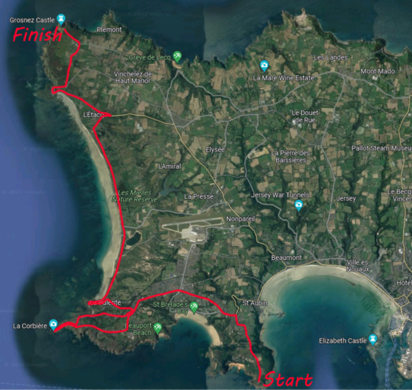
My plan for this photoshoot will be similar to the previous. I am intending to photograph buildings again, however the places I will be visiting are exactly the opposite. I will shift my attention from one side of the Island to the other and photograph the German bunkers and watchtowers along the Island’s Western coastline, as well as a number of other implantations I find en route. I am doing the above as I feel it will provide some interesting and contrasting images to the ones previously taken from Photoshoot 1. This will hopefully show what the buildings we consider new and modern today may look in the not-so-distant future.
Route Plan
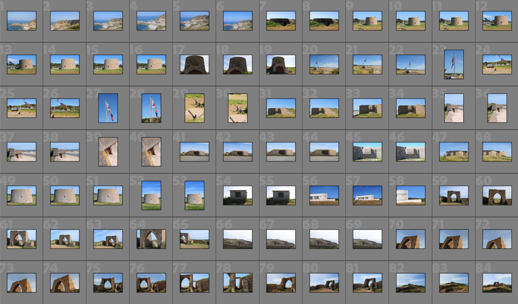
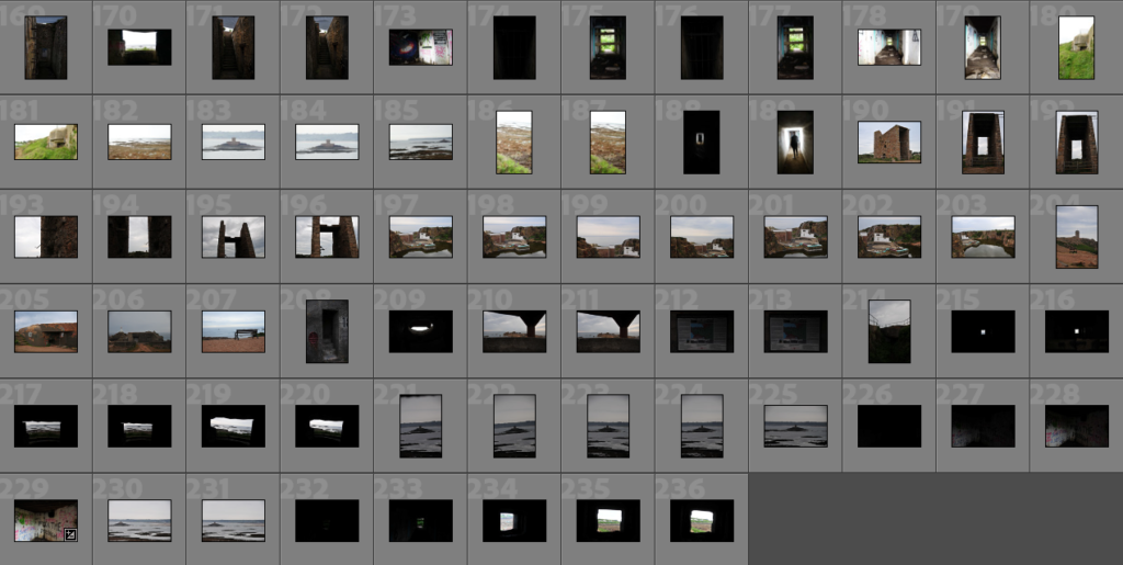
Contact Sheets and Selections
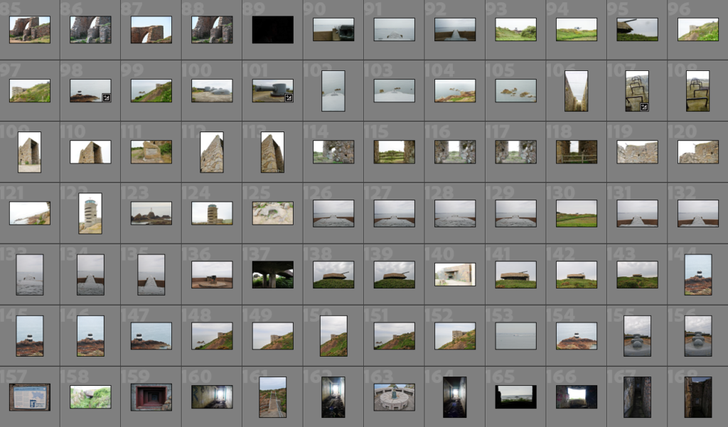
Post-Selection Editing Process
Landscape
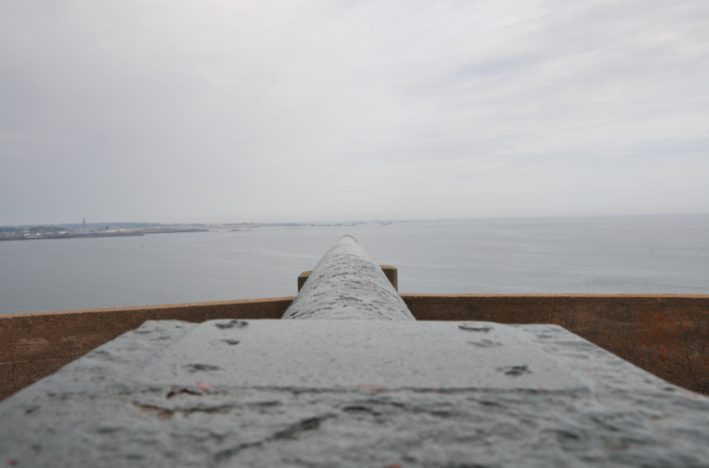
Image 1 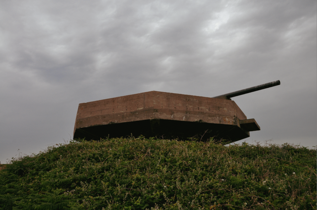
Image 2 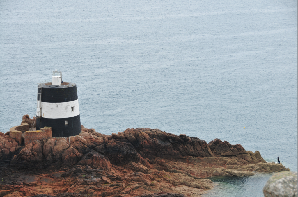
Image 3 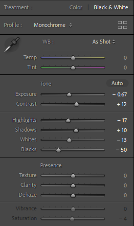
Image 1 Edit Process 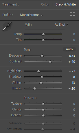
Image 2 Edit Process 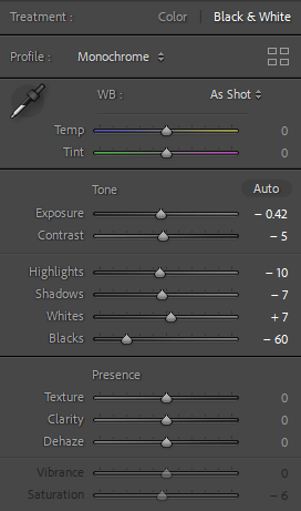
Image 3 Edit Process
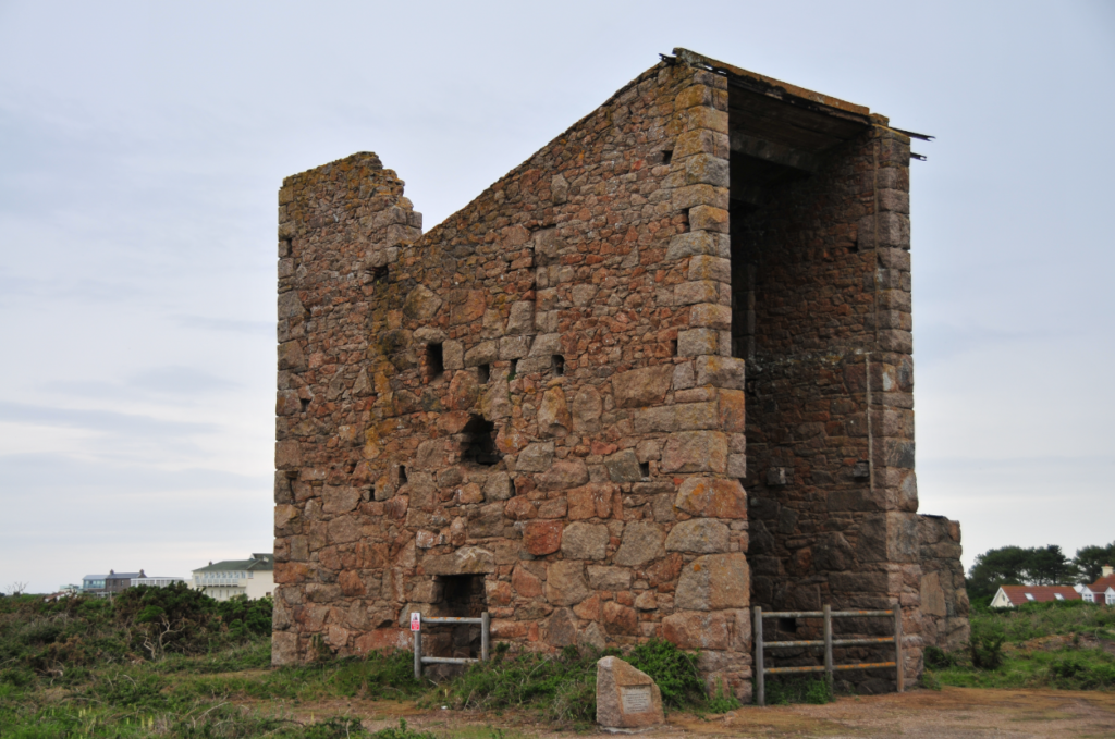
Image 4 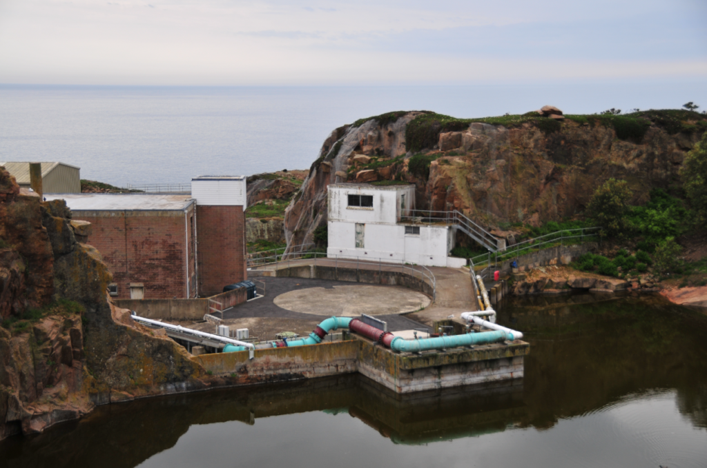
Image 5 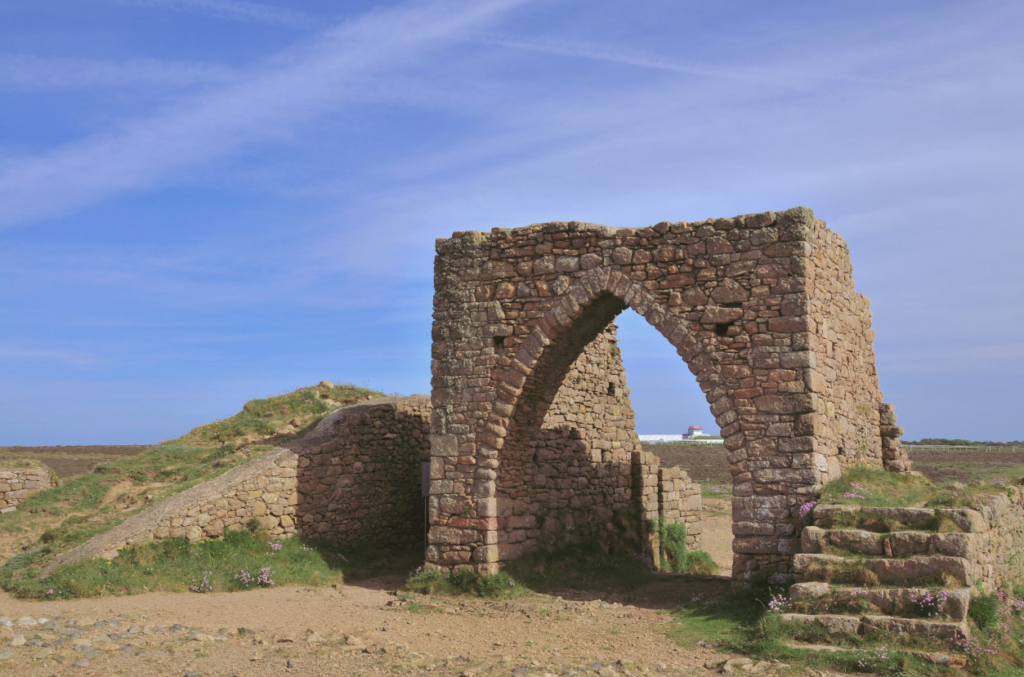
Image 6 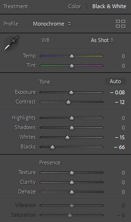
Image 4 Edit Process 
Image 5 Edit Process 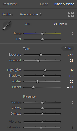
Image 6 Edit Process
Portrait
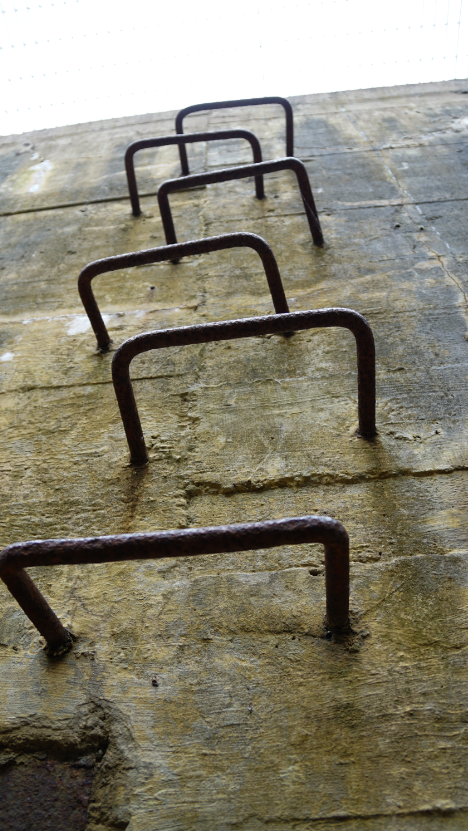
Image 7 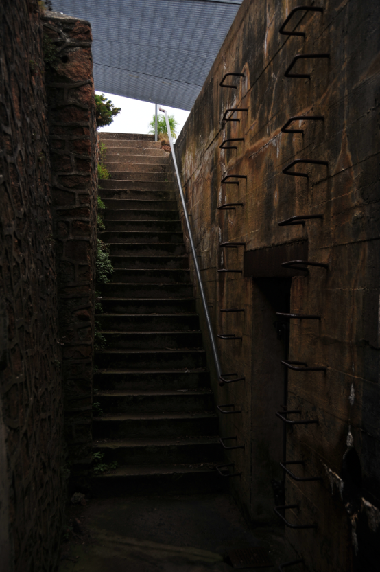
Image 8 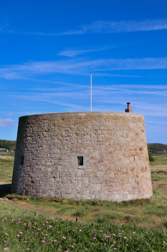
Image 9 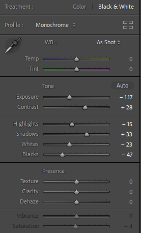
Image 7 Edit Process 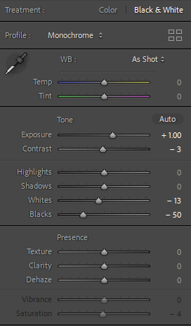
Image 8 Edit Process 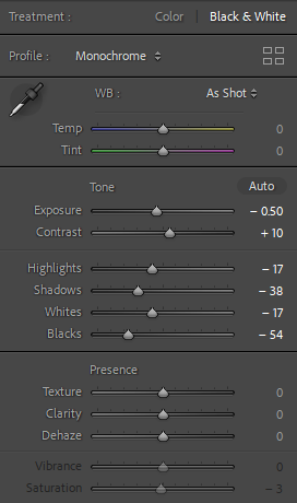
Image 9 Edit Process
Extra Potential Idea
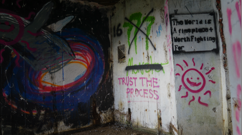
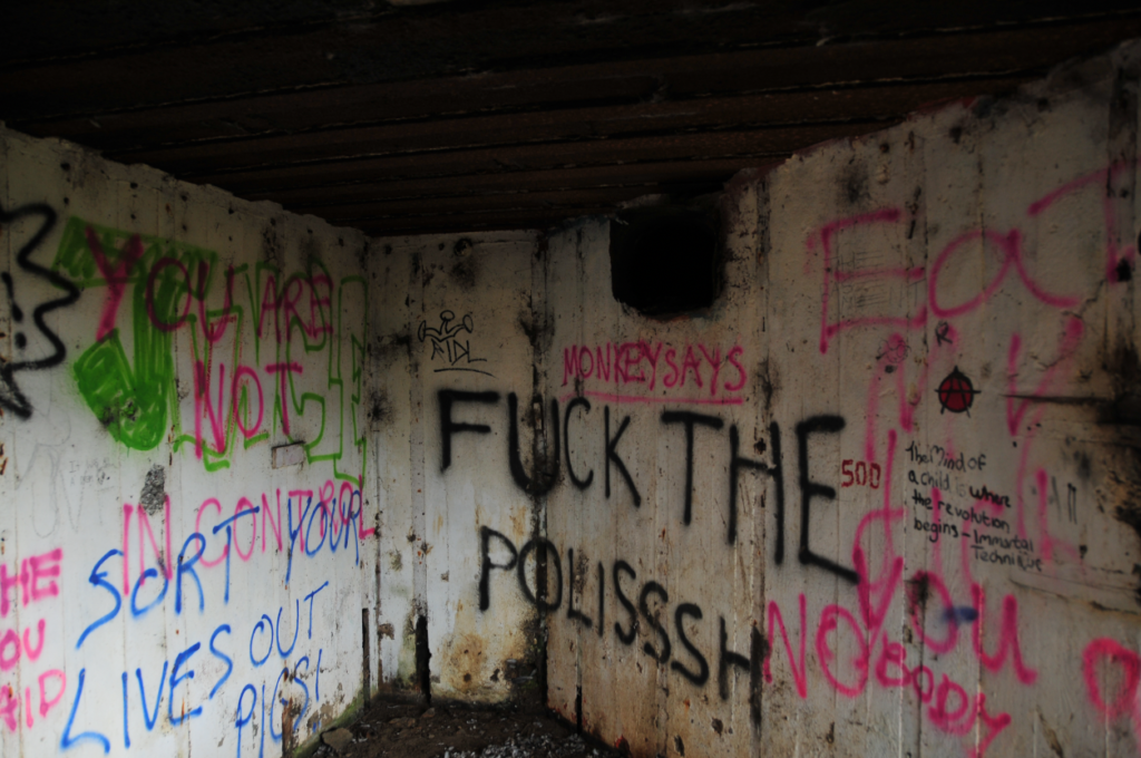
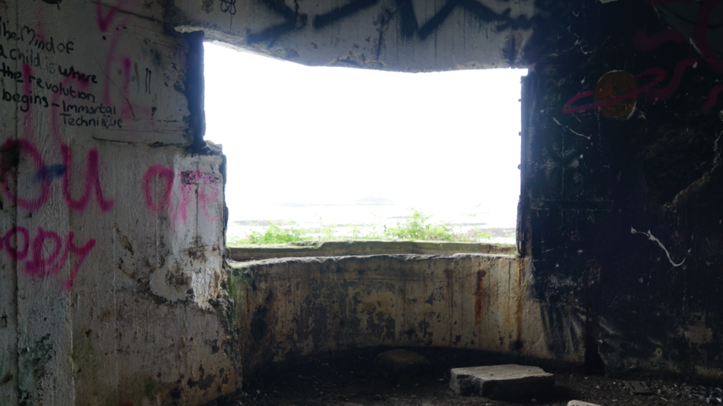
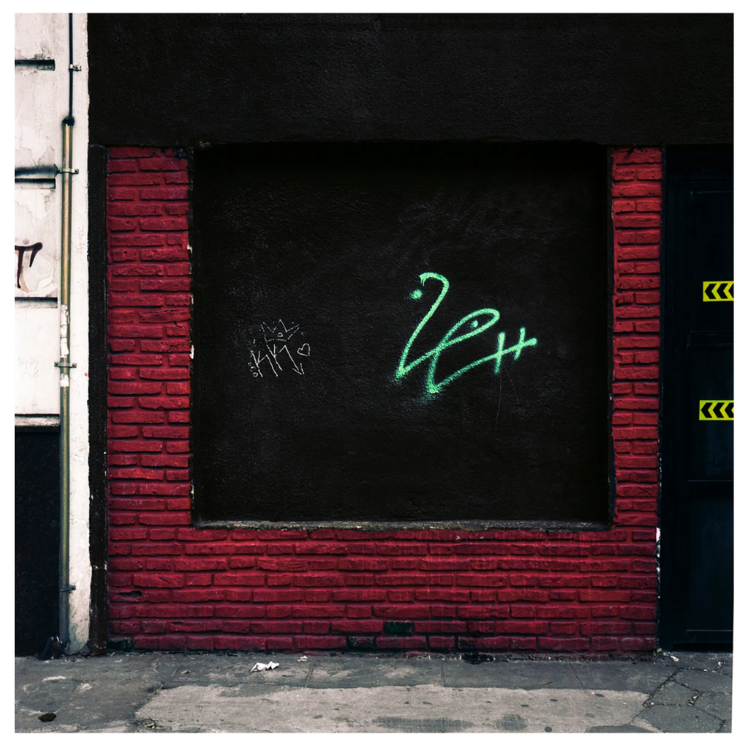
These images capture how these bunkers and structures are treated nowadays. This could show what buildings that are in use today may look like in half a century’s time. I have kept these photos in colour opposed to black and white. This is because of how the colours of the spray paint contrast with the white and brown scheme of the inside of the bunker. This is linkable to Tomás Cambas’ collection of street photography.
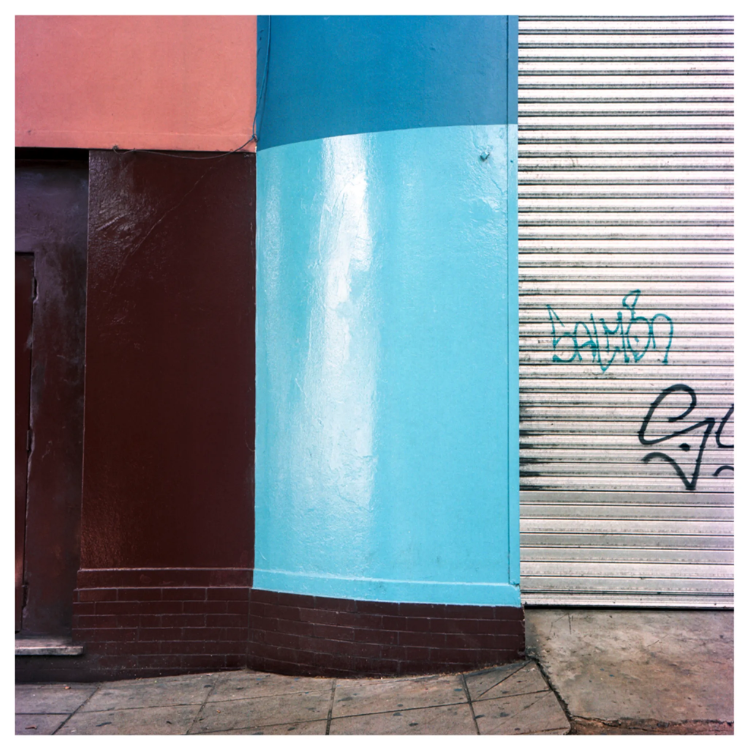
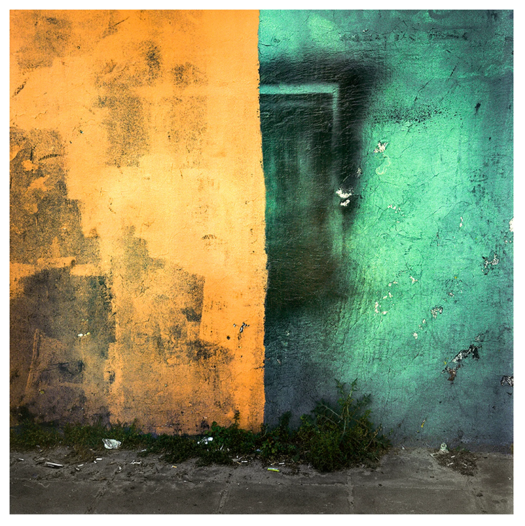
This style of street photography is interesting for a number of reasons. As mentioned previously, there are obvious colour contrasting techniques used throughout, particularly images on the top row. This is effective because of how distinctive they are, similar to what was captured in my photographs. There is also litter visible on the ground in most of the photos, relating to man’s effect on the planet.
Final Images, Post-Enhancement
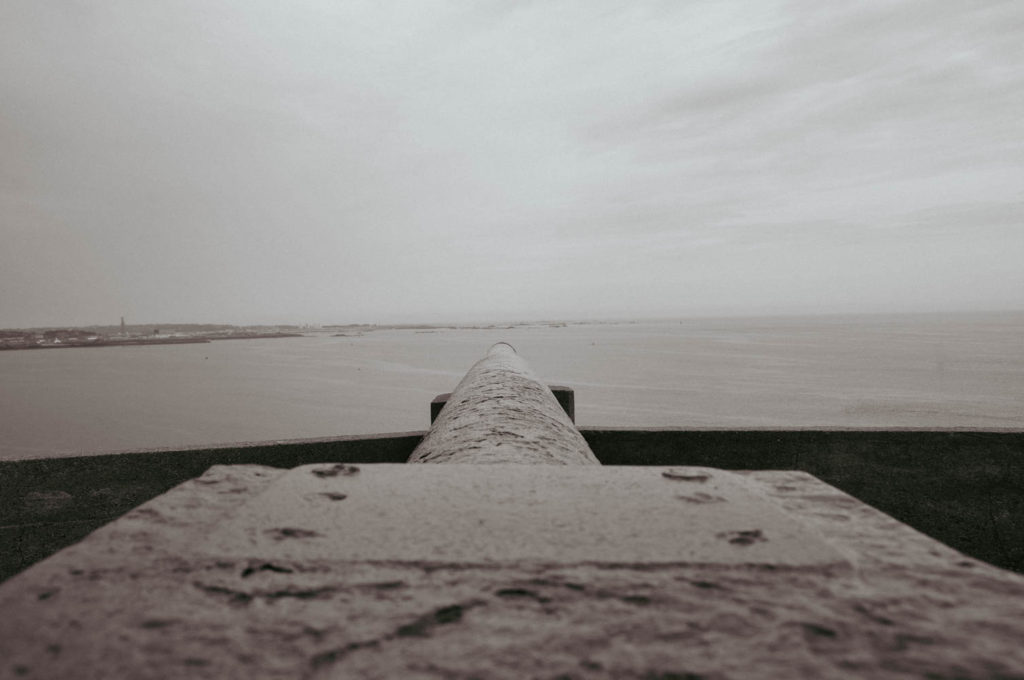

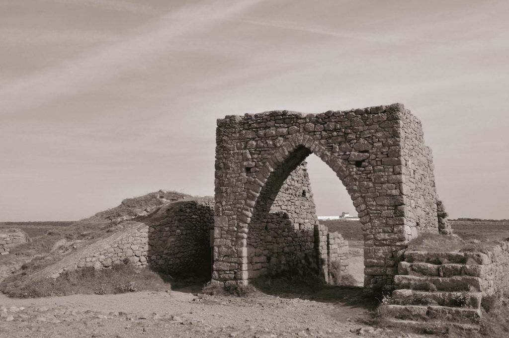
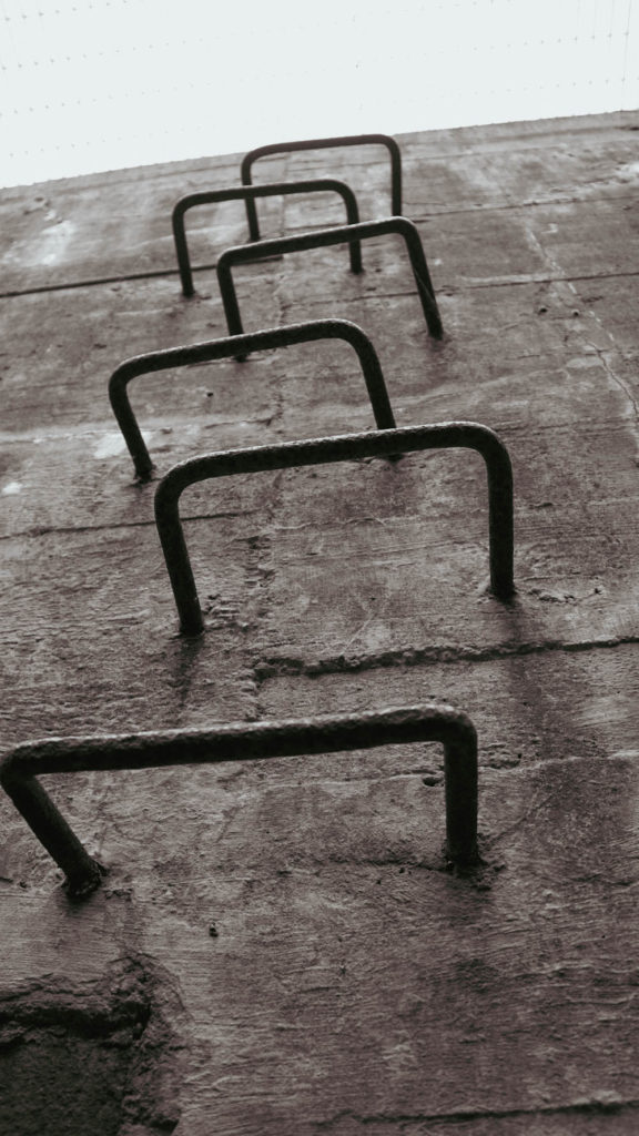
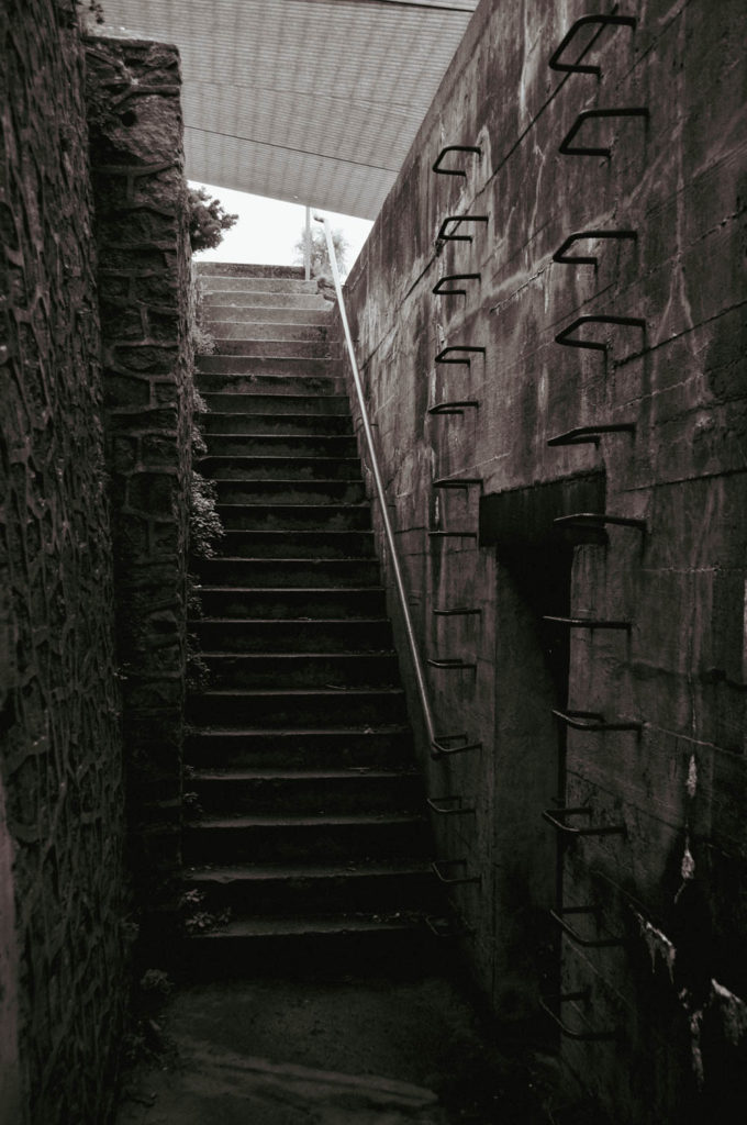
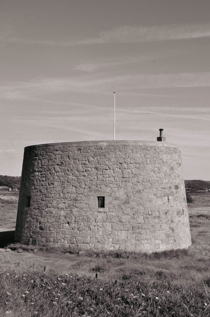
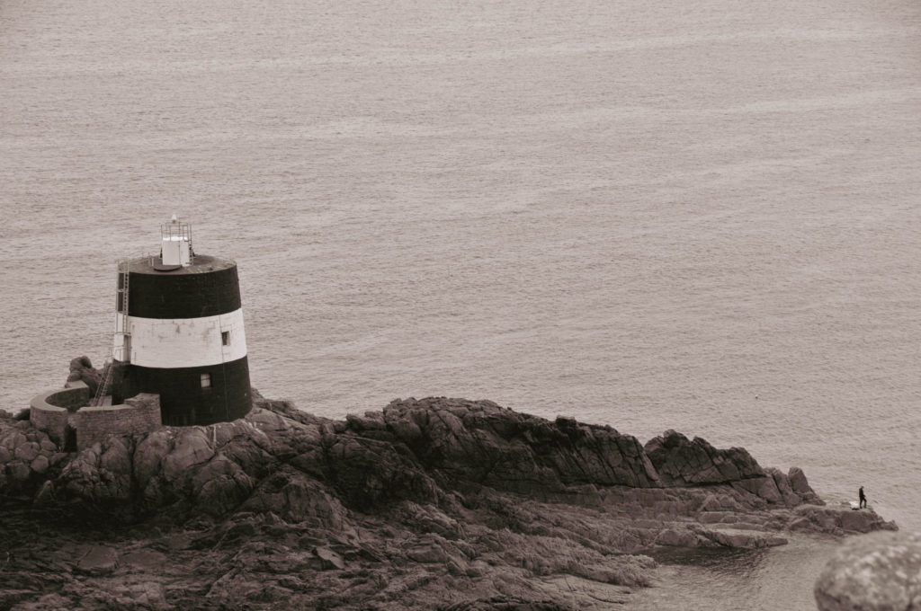
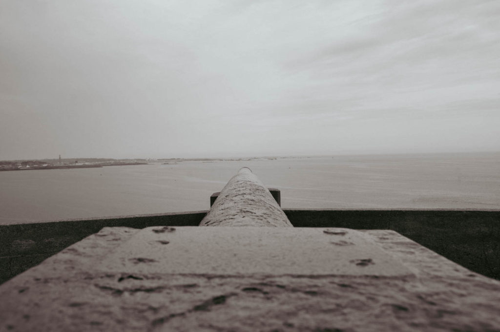
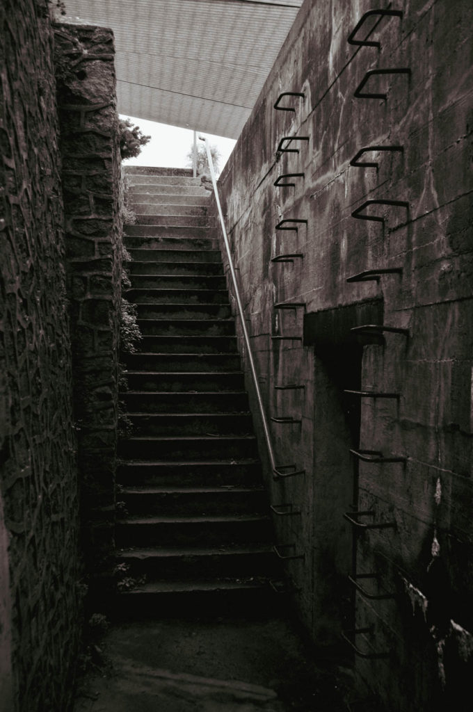
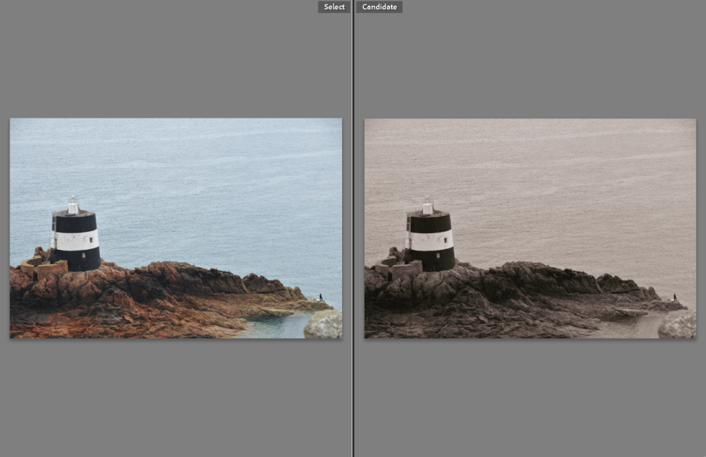
These images were edited in a similar fashion to the previous photoshoot. I began by adding a monochrome filter to make the images black and white. I then used one of the vintage-style profiles that Lightroom Classic provides for the user. This made the photos look like they was taken in the early 20th century almost instantly. As this was the effect I was aiming for, I stuck with it. After this, I did not want to make the images look over-manipulated so only a few minor adjustments varying across the individual photos were necessary. These adjustments included decreasing the highlights, shadows and contrast over a majority of the images as the filter and profile had made the darks too dark and the lights too light. I was very pleased with the results.
Comparison Visual Aid
Best Images
These were the images I thought were the best out of the best. This is because of how much they benefit from the filter and profile layered one over the other. They are also great as they show what photographers could be capturing in 50 years time. My personal favourite is image 3, depicting Tour de Vinde with a man fishing on the rocks nearby, into a perfectly calm low tide. It creates a sense of fear as of how something so small can have such a massive effect on something so huge (human’s effect on the planet). This tower is not big. Situated on a small island, between two relatively small countries, on a huge planet which man has almost depleted of all its resources. A sense and atmosphere of scale is surrounding this image in my opinion.
