Experiment 1:
For this first image experiment I used the software Lightroom to edit and manipulate this original image:
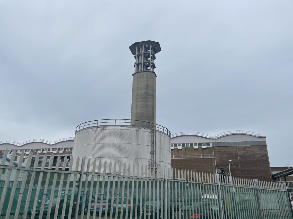
I chose to edit this image because it gives a clear representation of our topic being Anthropocene. Also, I thought that the incinerator and tank below would contrast well due to the different shades of basic colours.
Firstly I decided to change the colour to black and white to bring out more contrast and eliminate the distraction of colour and hope that the final outcome looks good.

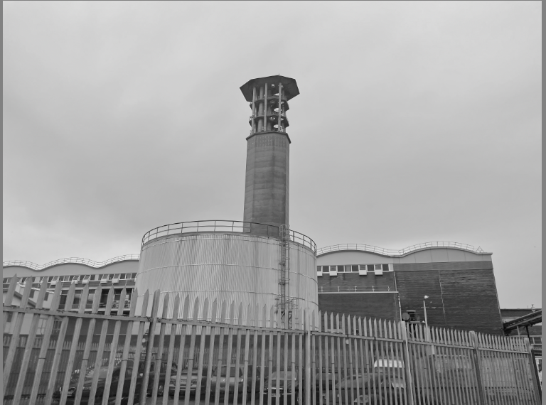
After changing the colour, I was happy with the black and white and decided to start changing the different tools such as contrast, dehaze, and shadows. My idea for this experiment was to try make the image very dark and ghastly. To do this I changed tools such as shadows, blacks and dehaze to create a very gloomy effect.
After changing these the image turned out looking like this:
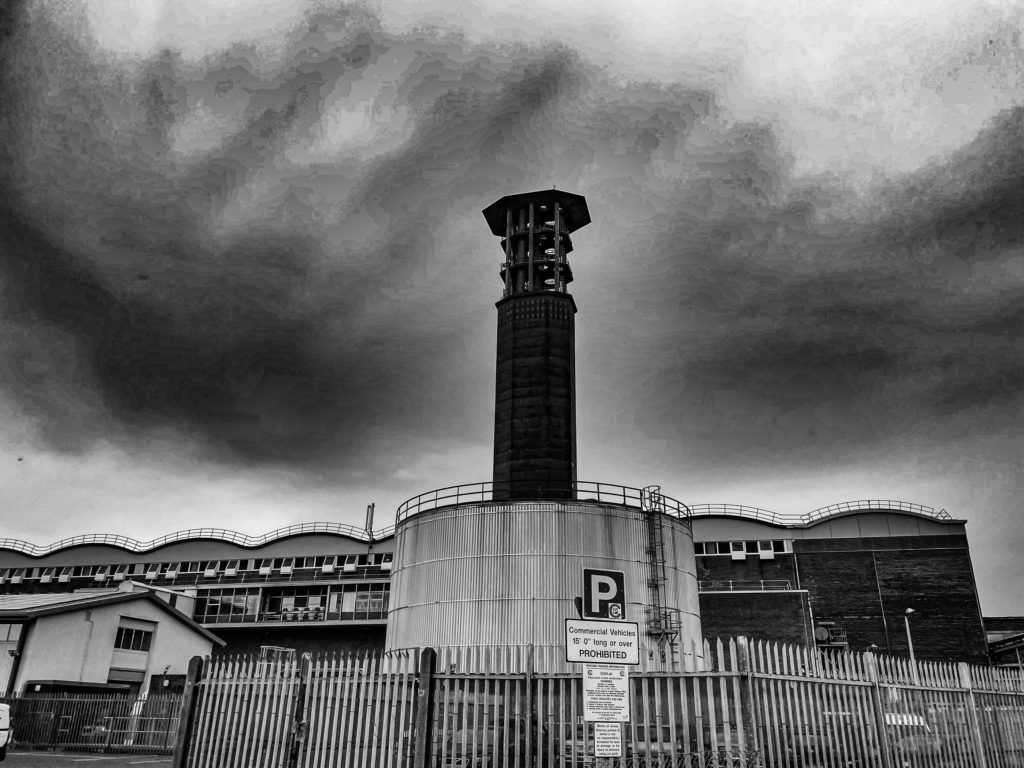
I like the way the darkness of the incinerator contrasts against the lighter colour of the tank positioned below. Also, I really like how the shadowing of the sky contrasts towards the incinerator and buildings at the bottom by having different shades of grey and white.
I decided to experiment cropping the image to try and make the incinerator be more centred and here is how it turned out:
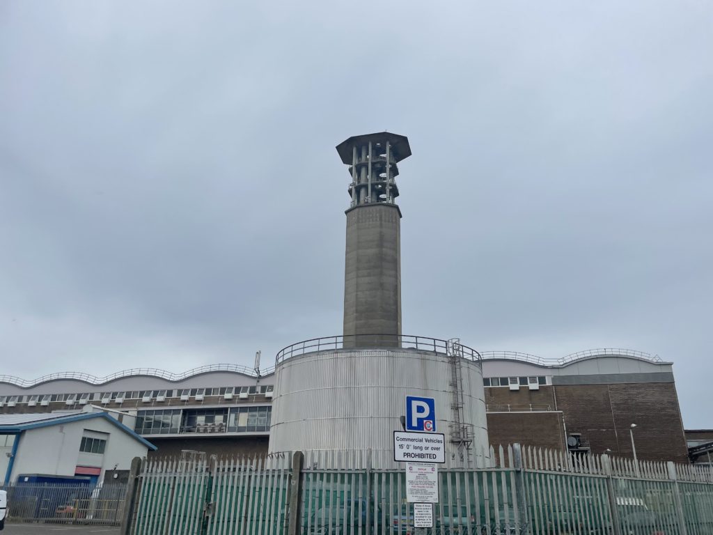
Original image 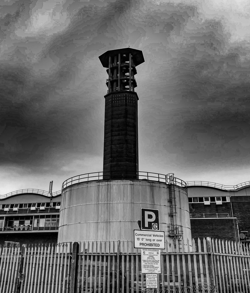
Edited image
Cropping the image makes the viewer focus more on the main attribute being the incinerator which helps link to the topic of Anthropocene because of the pollution these types of buildings cause.
I really like the way this image has turned out because of contrasting throughout the image and the effect it can create towards the viewer being a slight nostalgic feeling, it also focuses viewers on the story of the image instead of the contents in the image.
Experiment 2:
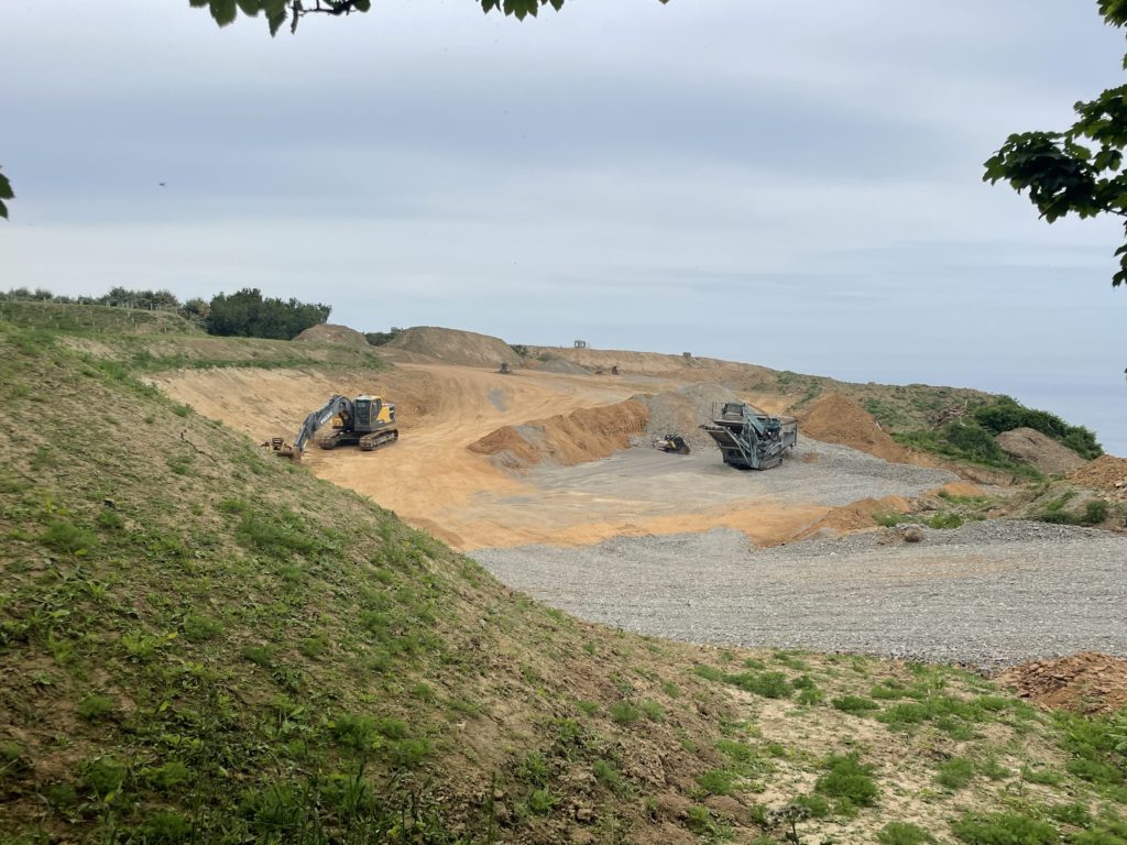
For my second editing experiment I used the software Lightroom and Photoshop to adjust different techniques. I chose to use this image because I am going to try and relate this image to a piece of artist George Mazarakis work.
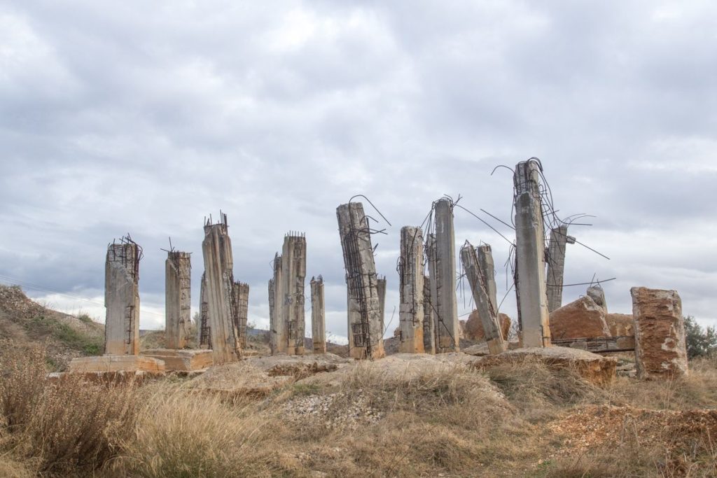
Georges work all have a similar styles by photographing locations with high temperatures and have dry beige like colours throughout his images. I tried to photograph a similar landscape that has dust and sand like colours to try and be as accurate as possible when linking to Georges work.
This is the original image unedited next to an example of Georges work:
As you can see, so far there are some slightly similar aspects such as the colour of the landscape excluding the grass. To begin this accurate representation I am going to take my original image over to photoshop and change the colour of the grass to a similar sort of tone as the sandy areas. I am going to do this buy using the adjustment tool Hue/Saturation and changing the lightness, saturation, and hue.
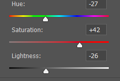
Here is how it turned out so far:

Now I am going to carry this image over to Lightroom and adjust all the basic tools to try and get a clear representation of Georges Mazarakis work.
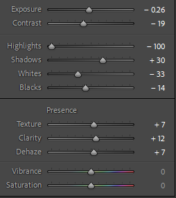
On Lightroom I didn’t change much other than decreasing the highlights to give the image a more darker effect which I think helps represent Georges work.
My image vs George Mazarakis image:
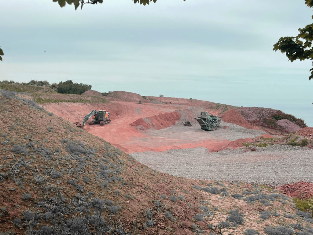
My edited image 
George Mazarakis image
Both images have a similar lighting style by using natural light and natural landscape. Also, they both seem to be taken on days with the same weather conditions which helps the contrasting and lighting of the image. The angle I took my photo from was slightly above the main attractions in the image, however Georges image seems to be taken from an angle that’s lower down to try and capture the whole scenery. Both images seem to have the same temperature and colour cast with the use of the sandy like colours to show the natural landscape. However my image seems to be slightly more colourful which I tried to fix on photoshop but didn’t have any success. The diggers in my image link to the topic of Anthropocene by showing the effect of man made structures towards natural landscapes such as the one shown on my image.
Experiment 3:
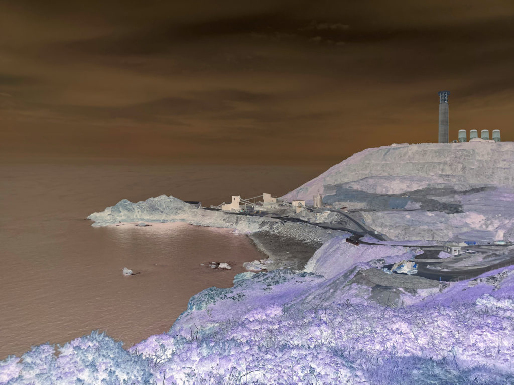
For my third experiment I will be using the software Adobe Photoshop to edit my image. My aim for this experiment is to present a different style of work by inverting my image.
Here is my original image:
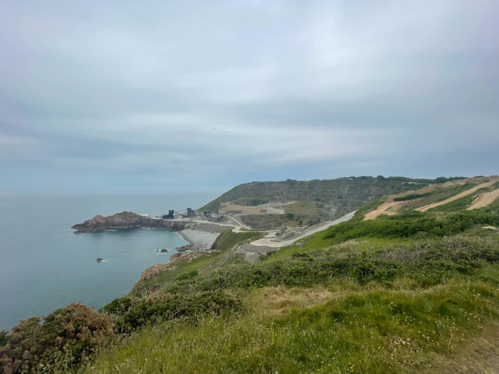
To begin with this edit I firstly started by inverting the image to see how it looks. I did this because I haven’t seen anyone try this style of work yet and wanted to experiment and see if it is effective.
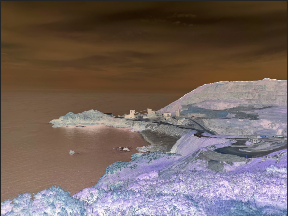
After seeing the result of inverting I started to think of what I could add to the image to try present the idea of Anthropocene throughout the image. I went through all my images from my photoshoots looking for structures that could be introduced into this image. After scrolling through them all I chose 3 images that have objects and structures which I think would fit nicely onto the hills in the back of the image.
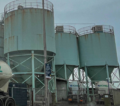
These are the 3 structures I will add to my image:
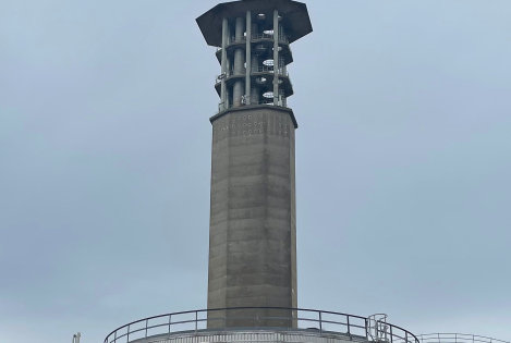
I started the process of adding these structures by firstly adding the incinerator on the hill. This is how it looks:
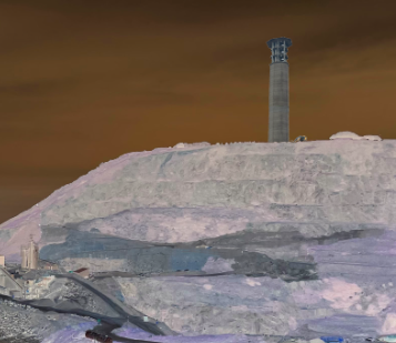
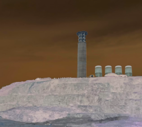
Next. I chose to add the water tanks onto the hill next to the incinerator to try and keep these structures close to each other. Here is how it turned out:
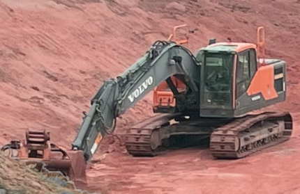
Finally, I added one more feature being a digger positioned on dirt tracks below the hills. Shown here:
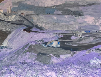
After seeing how this all turned out I was happy with the outcome of the finalised image. I think the use of inverting makes the image more vibrant and eye-appealing which attracts the viewer into the structures around. This is how the final edit turned out:
