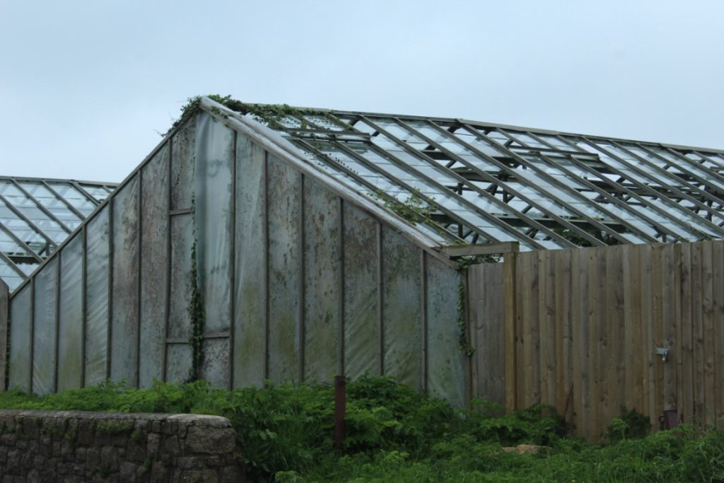
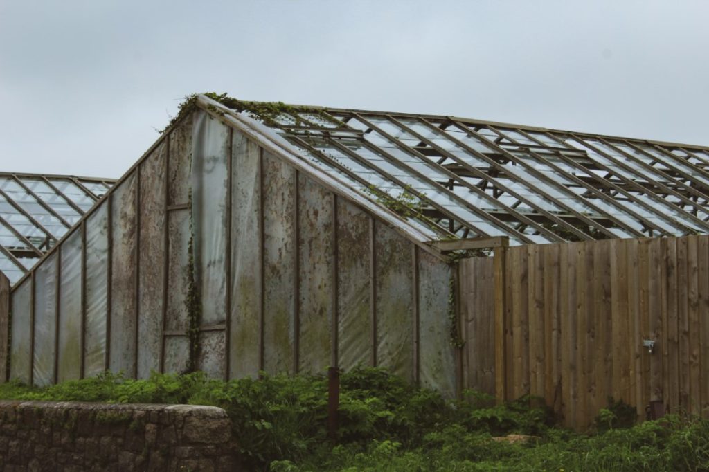
I’ve made very subtle changes to this image, but I wanted to make the colours a bit more vibrant in the photograph. To achieve this, I applied the ‘Vintage instant’ filter in the creative section. I then adjusted a few other aspects such as the exposure, shadows and more, until I was happy enough with how it looked.
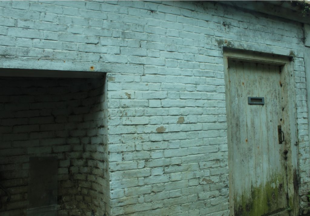
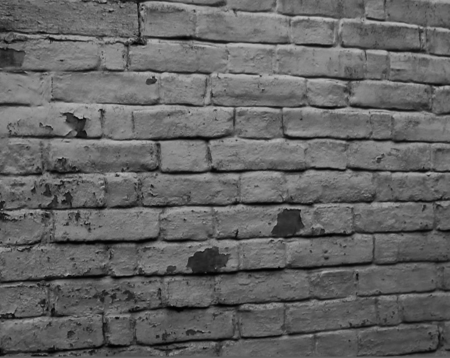
What I have done here is I have cropped the pictures down to a small section of the brick wall so that it can easily display the textures and obvious signs of decay on the building itself. After I cropped it, I added on the ‘High contrast’ black and white filter and adjusted a few other areas such as exposure and shadows.
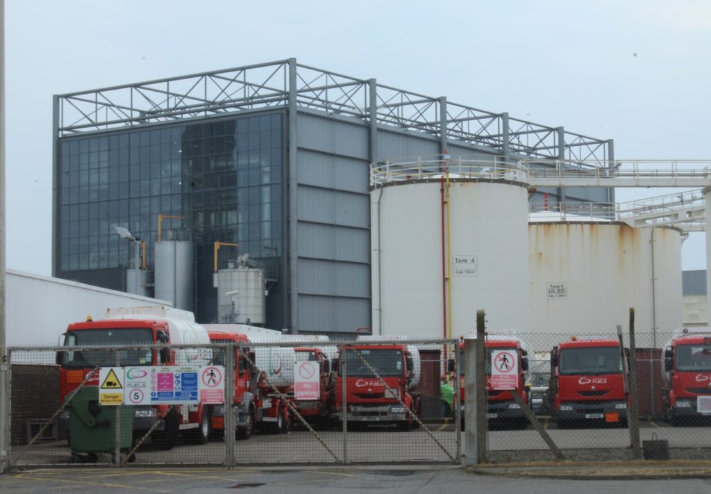
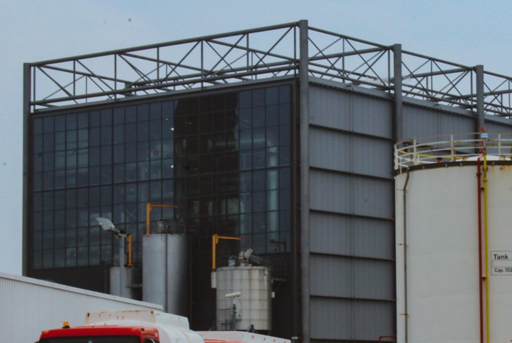
Once again, I have used the ‘Vintage instant’ filter on this image much like the first edit I did. I have also cropped the image down to make it look much cleaner and less cluttered.
