Editing + experimentation

Old Vs New

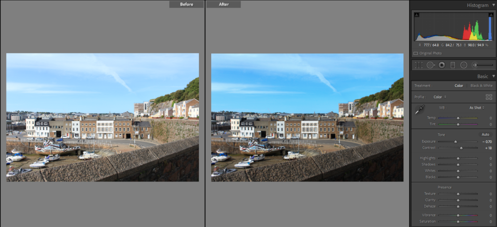
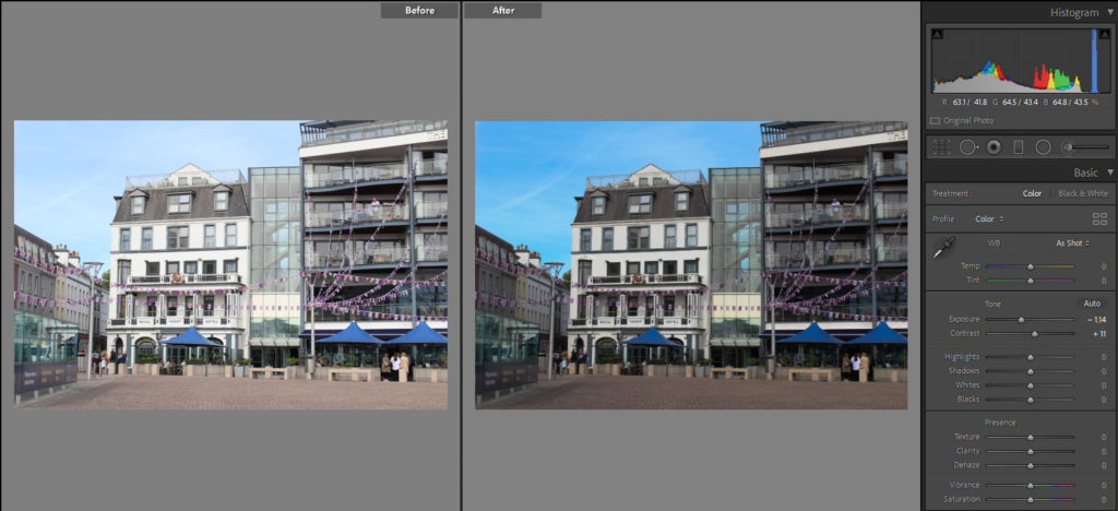
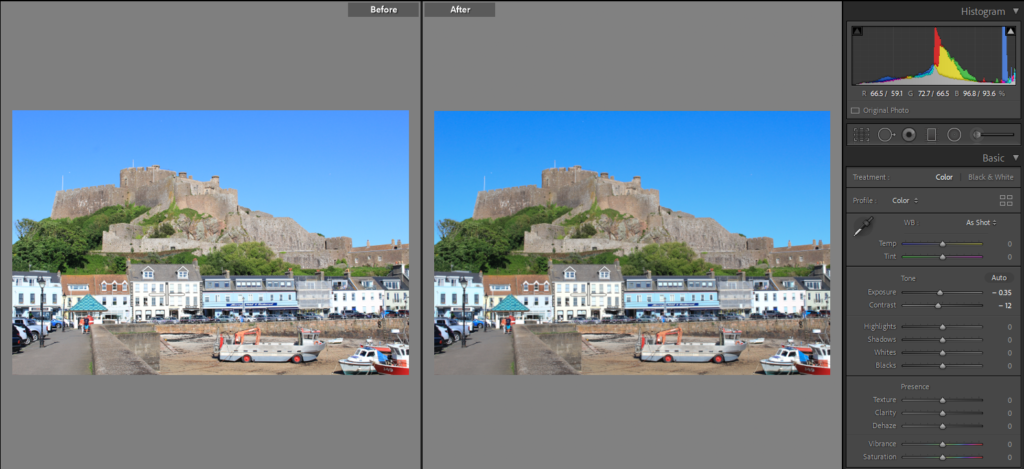
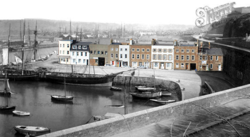
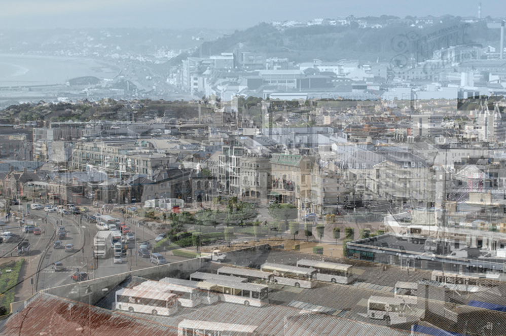
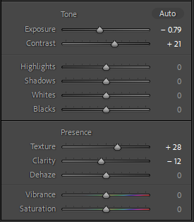
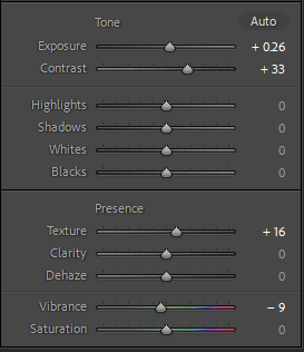
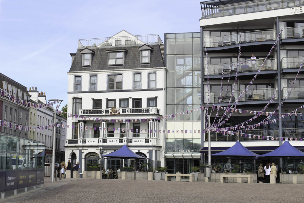
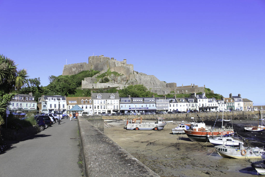
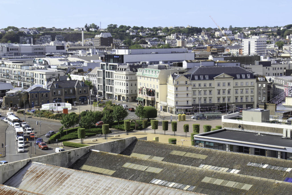
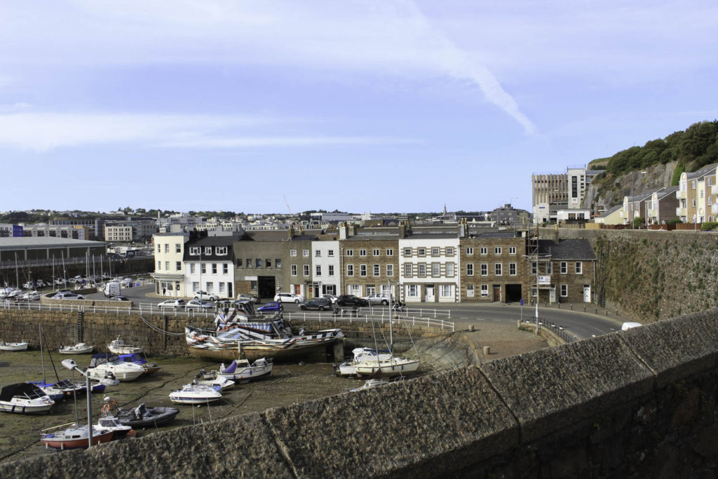
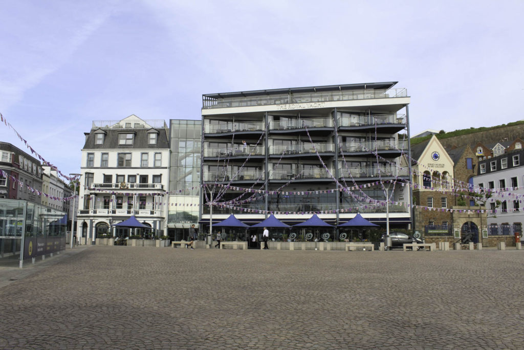
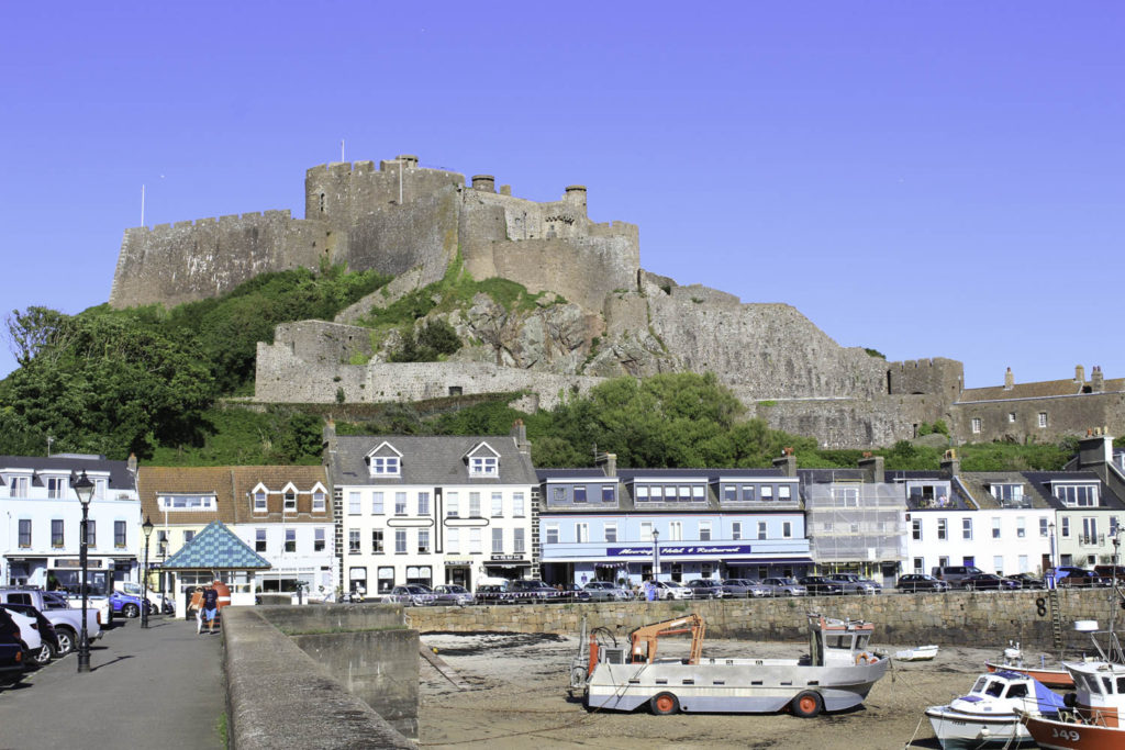
As I didn’t need to change much about these photos, because I need to keep them relatively the same, I have only touched the exposure and contrast. I took the first three photographs on a sunny day, but there were still some clouds as I took the last photo on a sunny day with a clear sky. Because I took them on these days some of them came out overexposed so, I have decreased the exposure and increased the contrast to combat this problem. But in the last photo of Mont Orgueil Castle, I have decreased the contrast because I felt the rocks the castle is made out of were too dark if I edited it the same as the other photos. By doing this the sky is a lot more vibrant and bright which I also didn’t think would fit well with the first three.

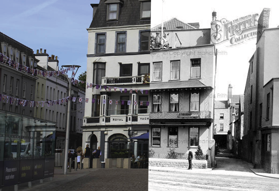
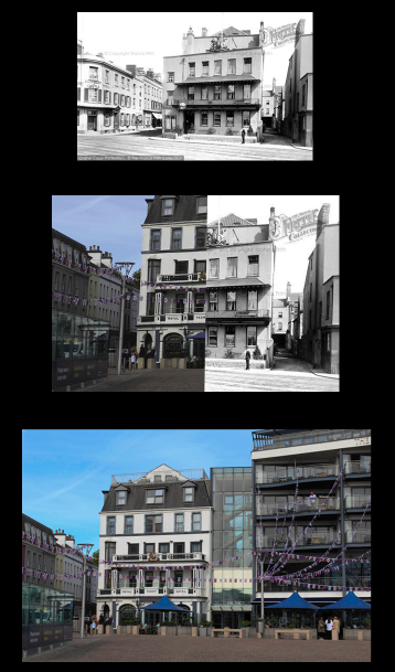
My idea for this photoshoot is to make a sequence out of three images, the first photograph is from the ‘old’ collection, the middle is a combination of both photos and the final photo is from the ‘new’ collection. I would like to do a mixture of four different editing styles for the middle photo so that each sequence/combination of photos is different and has its own style. The four styles I’m planning on using are juxtaposition, overlapping, montage and double exposure, I like these because they will be able to clearly show a transition between old and new.
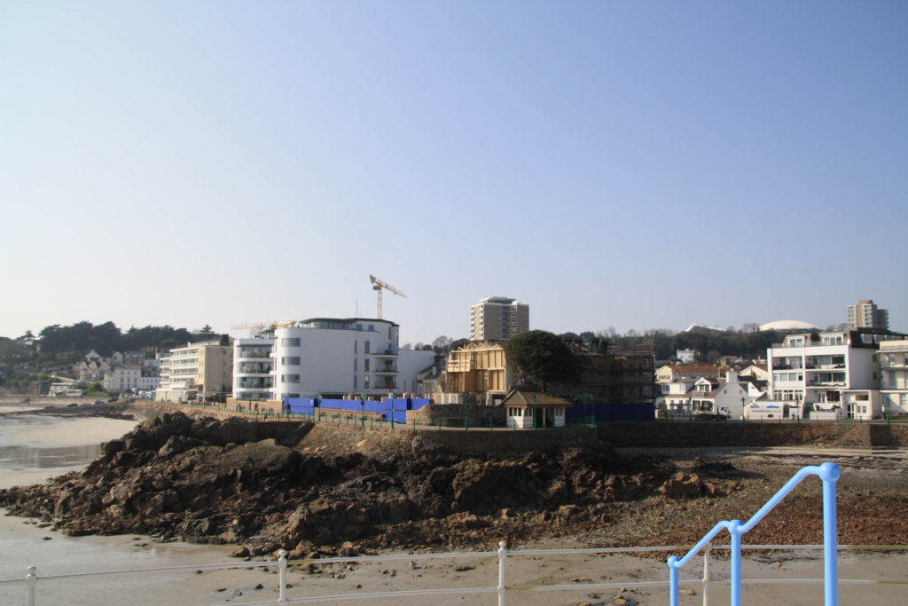
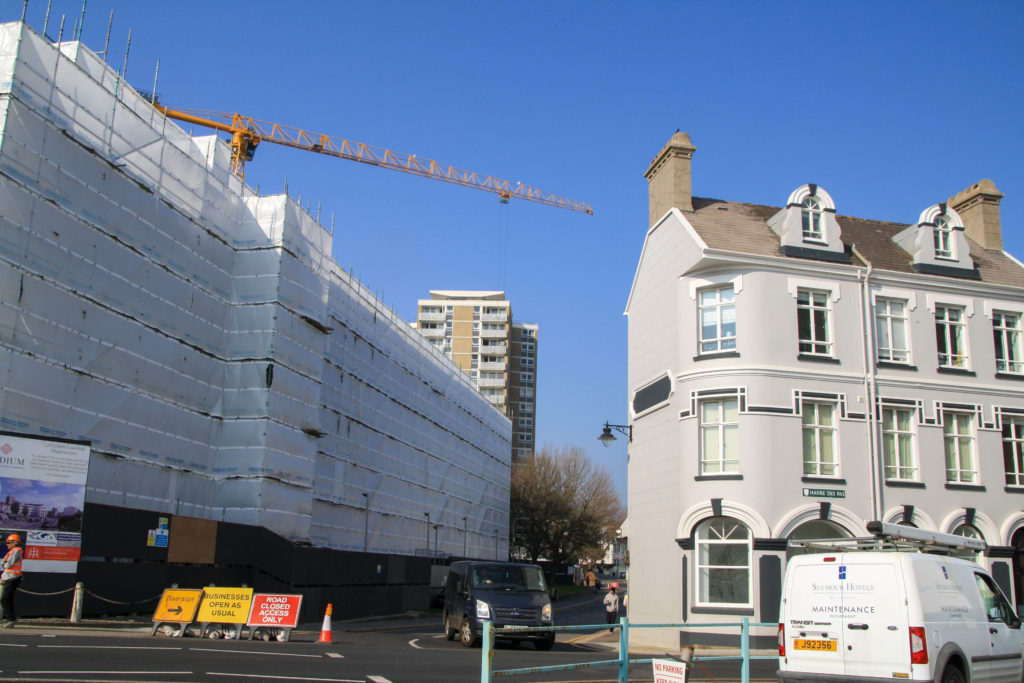
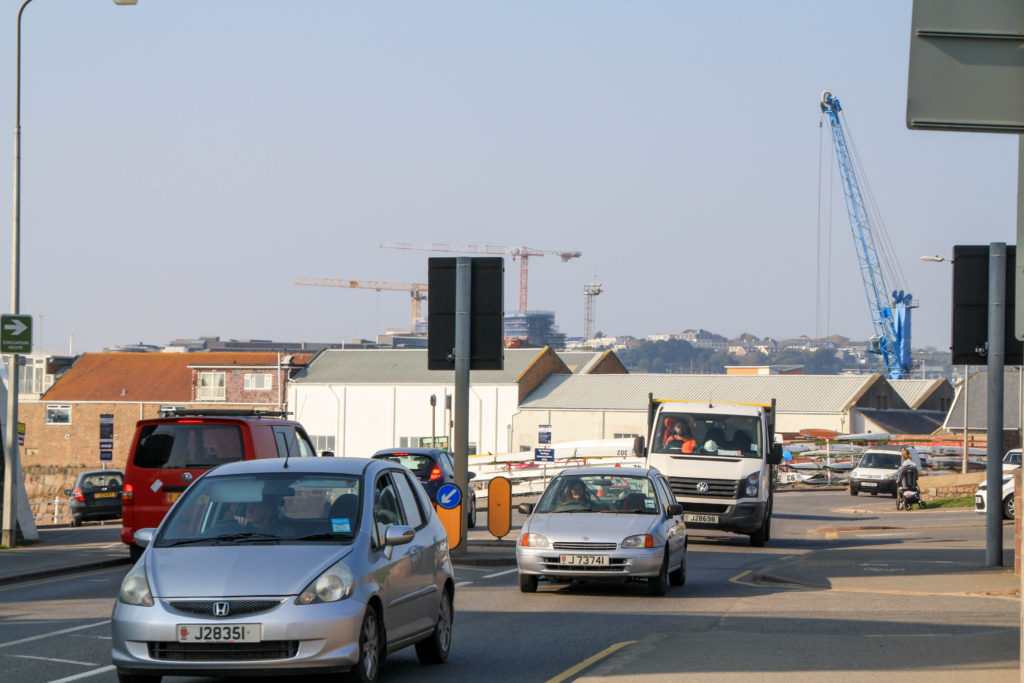
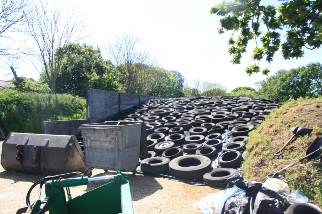
I edited my combinations in photoshop as I was able to use different tools to help me achieve these outcomes, I used tools such as the lasso, cropping and opacity. For the top left photo, I decided to overlap the old and new photos because I liked the way the bright colours from the ‘new’ stood out against the black and white of the ‘old’. I also tried to line up the houses and buildings in each photograph as it looks more put together and the new image doesn’t look out of place against the old. For the top right photo, I wanted to put each of the images side by side because I liked the idea of having one side ‘new’ and one side ‘old’. I tried to match up the photos but there had been an extension upwards, meaning there was a new roof built, which made it harder for me to do. Eventually, I had to crop the new photo but it still resembles my idea and the buildings in each photo line up better. I decided for the bottom left combination that I wanted to do a montage of the two photos, this is where I used the lasso tool, in photoshop I outlined the row of buildings just behind the harbour in the ‘new’ and transferred it to the ‘old’. Again, I tried to line it up so that the photo looks accurate to the old photo underneath. I decided not to move anything else as there were too many other objects in the way for it to look right and like they fit in the photo. Finally, for the bottom right photo, I layered the old and new photographs completely on top of each other, and then I decreased the opacity which allows me to see the photo underneath through the photo on top.

Mass Wastage

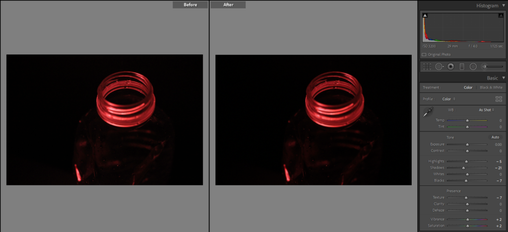
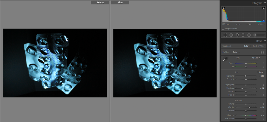
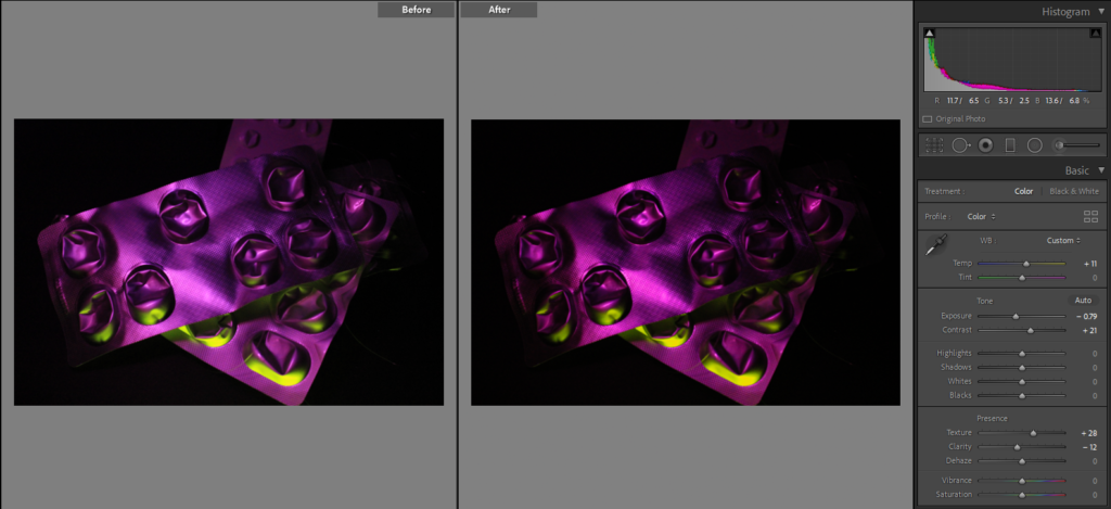
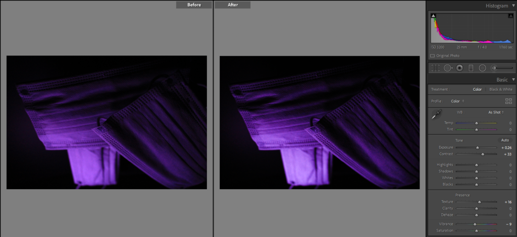
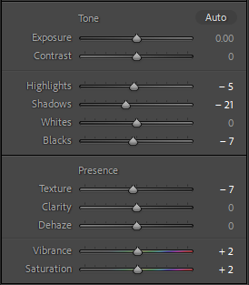
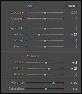
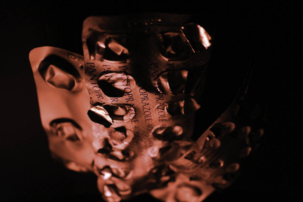
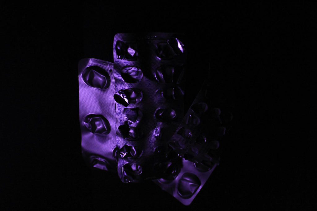
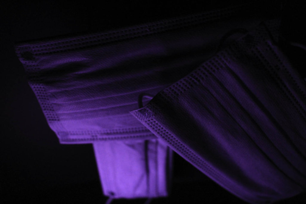
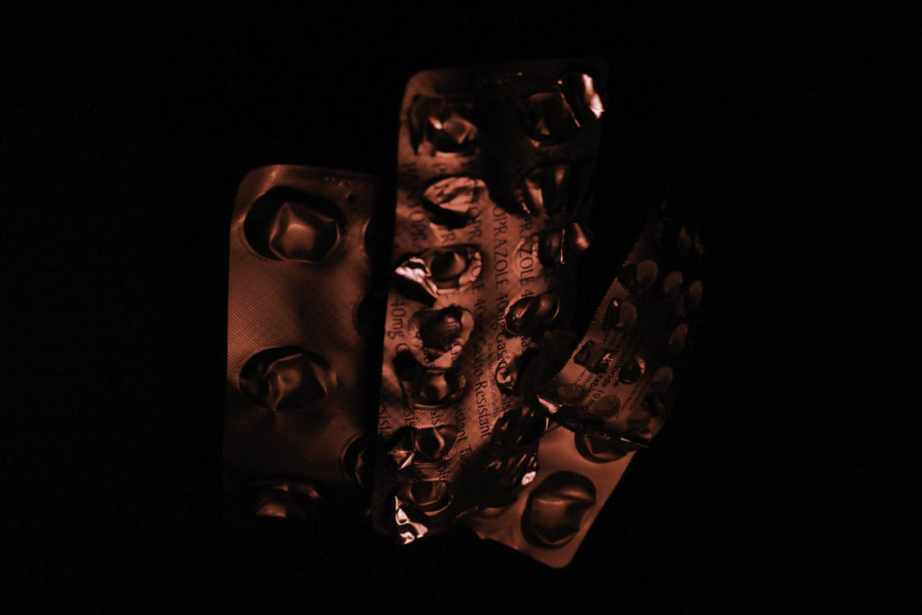
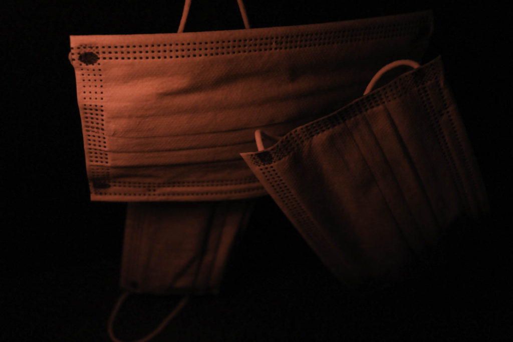
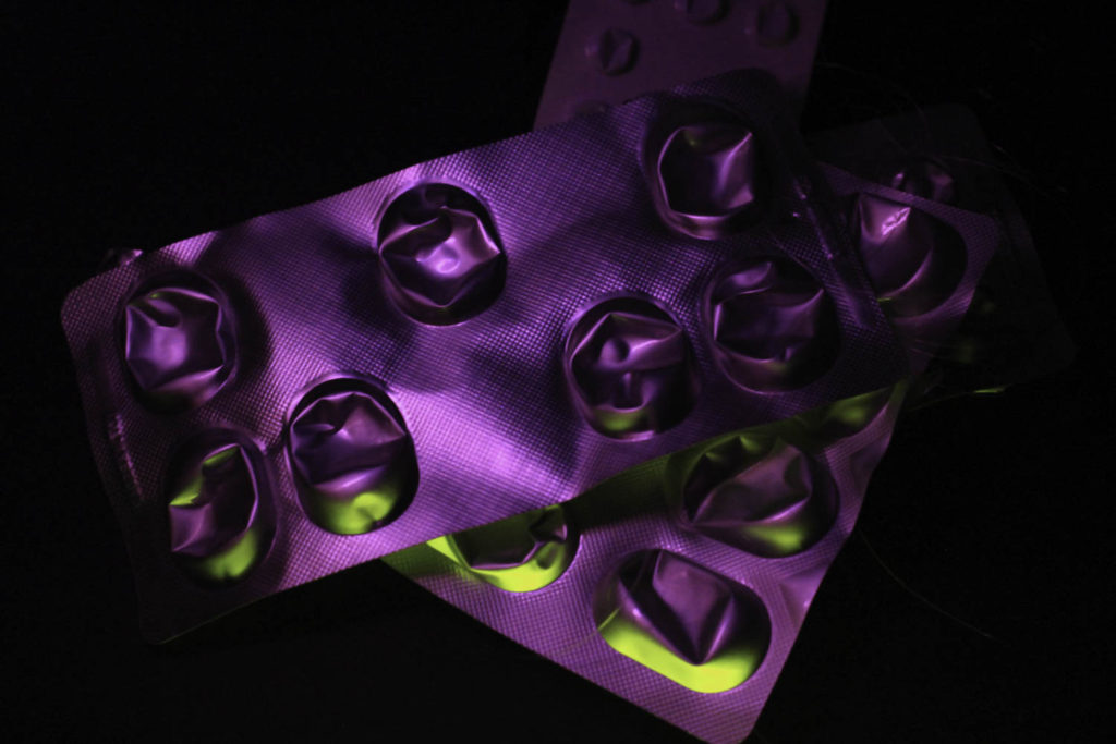
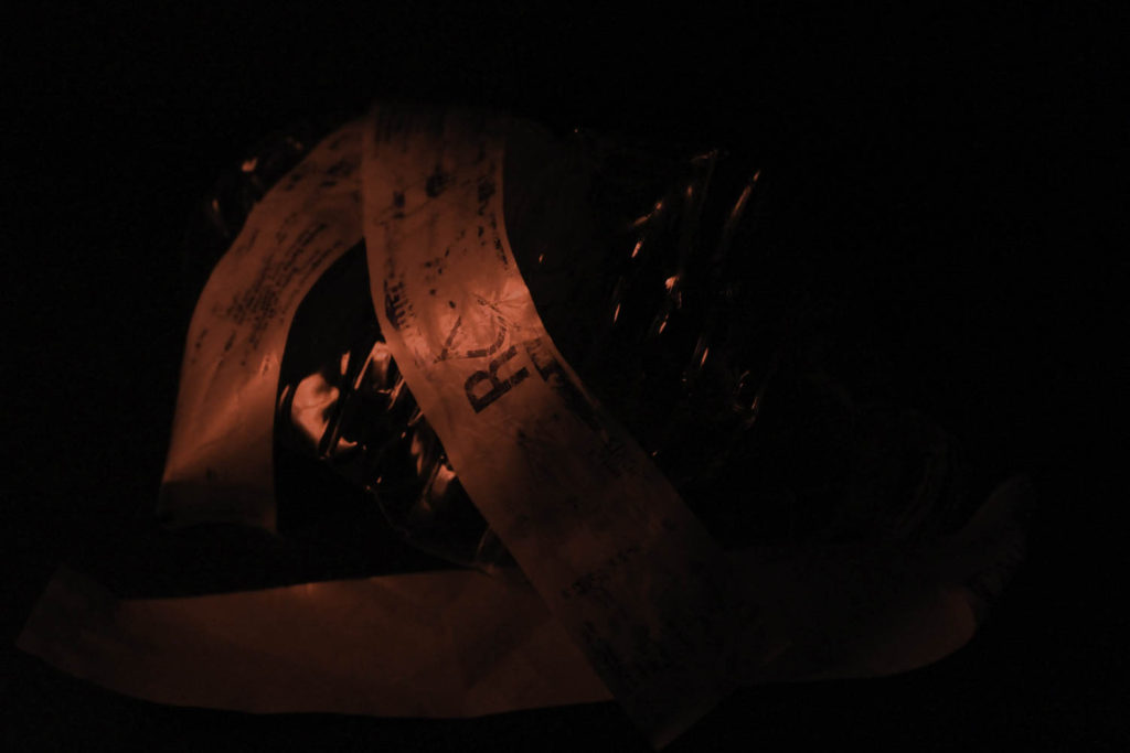
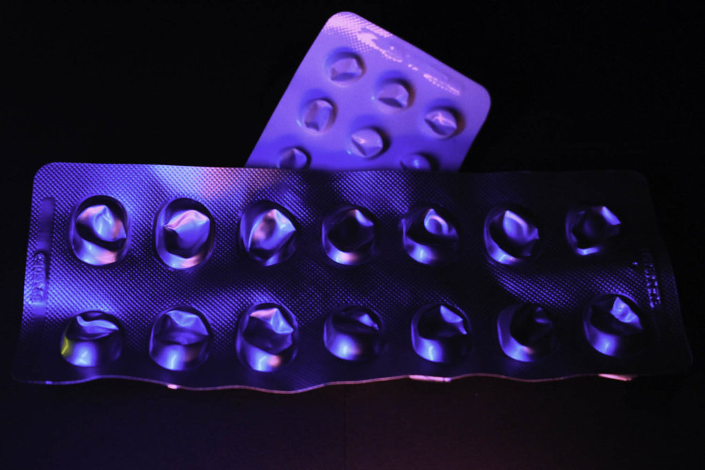
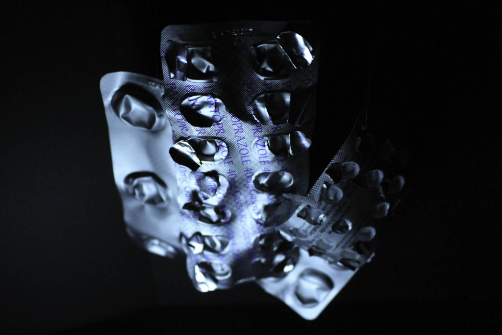
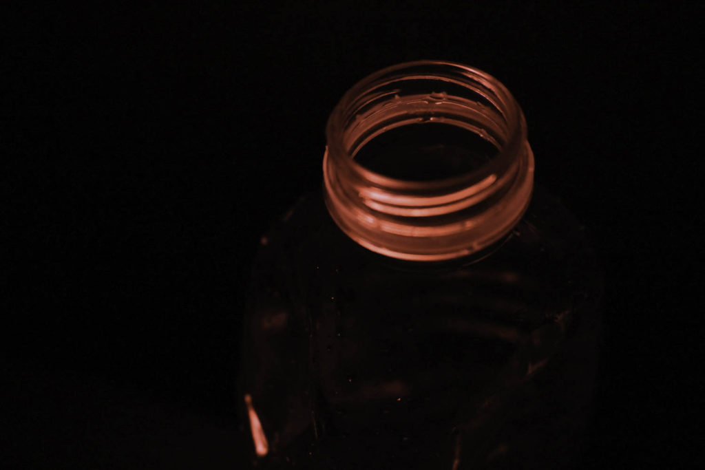
As I originally photographed my different objects with coloured lighting I didn’t have to do much for the editing of each image, I was also already happy with how they turned out. I still altered some of the different tools to either enhance to colour or the texture of each photograph. For example, in the third photo, I increased the texture setting because I used a slow shutter speed while doing my photoshoot for this specific collection, by doing this it resulted in the photographs not having the sharp and precise lines that I wanted. Having increased the texture, I got the bold lines that I imagined the image having. One of the other things that I manipulated in the photographs was the vibrancy and saturation, this helped me achieve the eye-catching colours that I hoped for when doing the photo shoot. Other tools that helped me with this were the exposure, contrast and shadows, by manipulating these I got darker backgrounds making the other colours pop against them. In the last edit, I wanted to get a gradient going from black and fading into purple, I did this by putting the light source closer to the bottom of the masks and in Lightroom increasing the contrast which gives the image a more ominous atmosphere.

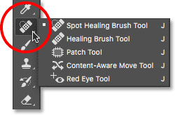
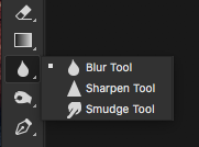
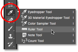
As well as Lightroom, I also used Photoshop to try and improve the imperfections that appeared in the background. I used multiple sheets of card which were propped up against a wall, meaning in some of the photos you can see where they have been layered over each other. To fix this issue I used two different tools in Photoshop, the blur tool and the spot healing tool. Firstly, I would go over the lines with the spot healing tool which would transfer the colour around the area to cover where the sheets connected, I would follow this by using the blur tool, I did this because the colours weren’t blended enough for it not to be noticeable. You can mainly see this issue in the Image of the blue medicine packaging where I tried to give the bottom a more rounded edge as I could not completely blend the cross over together as the shades were different because of where the light source was placed. Furthermore, another tool I used from Photoshop was the eyedropper, this allowed me to copy the colour from one part of the image and transfer it to where I wanted to cover certain parts of the background which were affected or changed by the lighting. I also had to use the eyedropper tool while covering up string around my objects, as I wanted my different items to look like they were floating I hung them from clear string, which still showed in the photograph, with using the eyedropper I was able to cover these up with the same colour as the background.

Sequence Experimentation

For my photographs on the Old Vs New theme, I have chosen to present them in a sequence so that it shows hour the island has changed and adapted to the increase in population and how it has been modernised to cater for new buildings. I have made four different sequences that I believe show my photographs and combinations off in an aesthetic and captivating way.
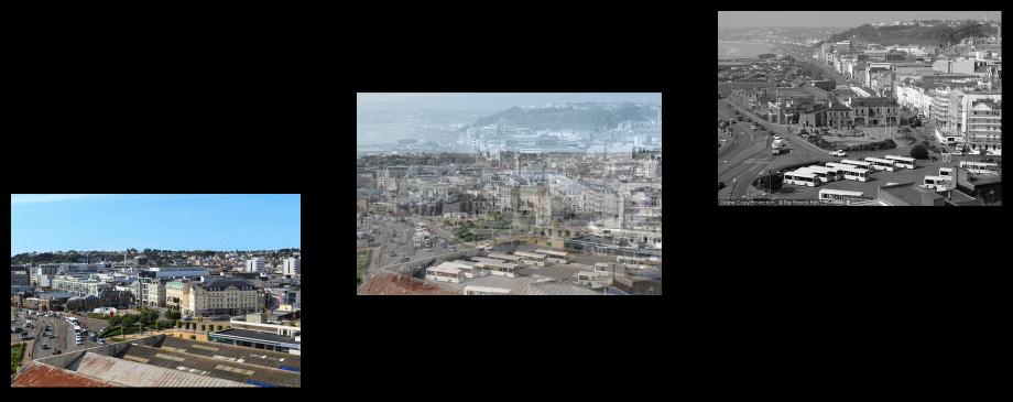
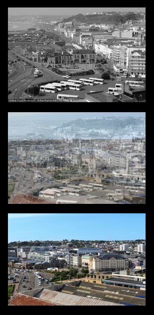
Edit 1: For my first edit I have put my images in a diagonal pattern, starting with the ‘new’ image. In this edit I used double exposure for my combination of the two images, I like how the positions of the photos and the editing of the middle photograph give the impression that the ‘old’ is falling into the ‘new’. For this example of sequence, I feel the best three images to go into the places would be the ‘overlook of St Helier’ which is already displayed above.
Edit 2: For my second edit I have put the images into a vertical pattern with the ‘old’ photo at the top and the ‘new’ photo at the bottom. I like this style of sequence because all images are displayed clearly, it also looks neat and put together meaning it’s enjoyable to look at. For this example of a sequence, I think the best images to go into the places would be ‘the Royal Yacht’ images.
Edit 3: For my third edit I have chosen to put the images horizontally starting with the ‘old’ photo and ending with the ‘new’. I like this pattern because it’s similar to the photographs put vertically, meaning it’s neat and well laid out, but looking at this style of the sequence seems like you reading a story through the pictures. I think the best three images to go into the horizontal sequence would be of Mont Orgueil Castle, as you can see above.
Edit 4: For my final edit I have used the vertical pattern but as the images go down they increase in size, the smallest one being at the top which is the ‘old’ photo and the biggest being the ‘new’ photo. I like this style because I feel it represents how as the island has been modernised it’s got bigger because of the number of people who are now wanting to live in Jersey. For this style, I think the best image to go into the pattern would be ‘The harbour’

anthropocene – presentation of final outcomes

Anthropocene

Urbanisation in Jersey

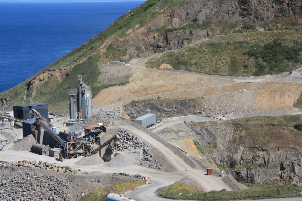
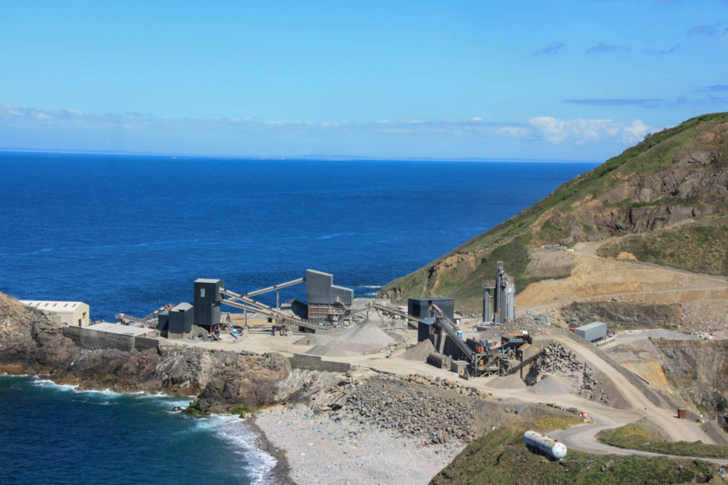
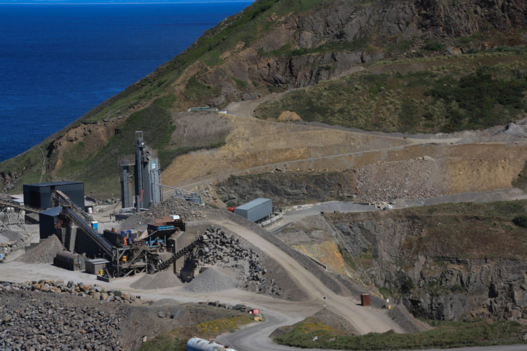
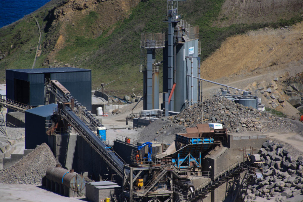
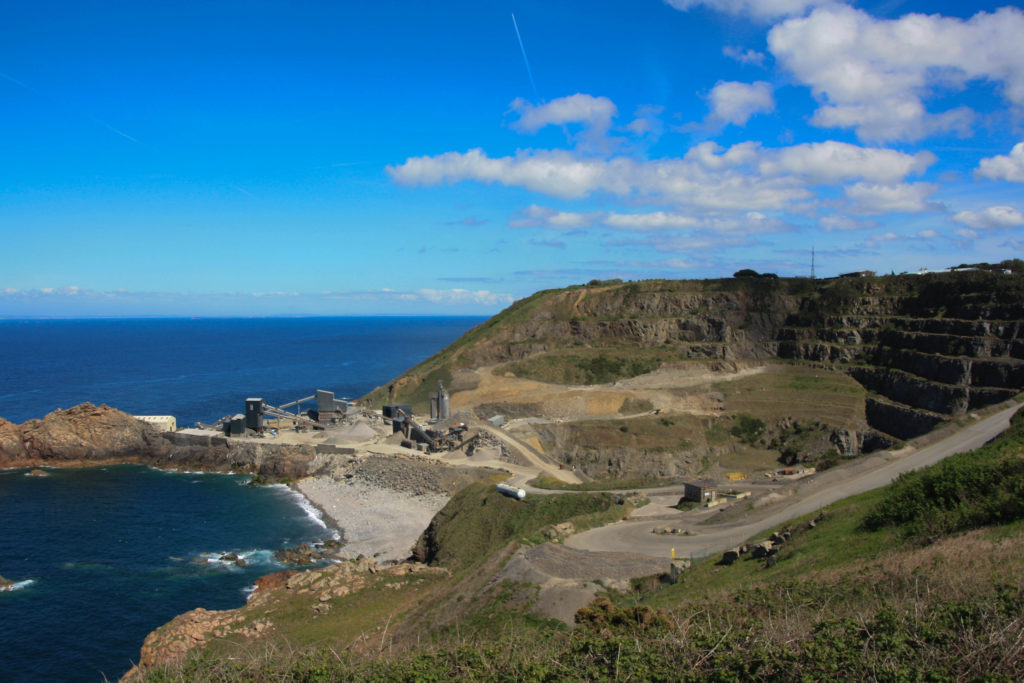
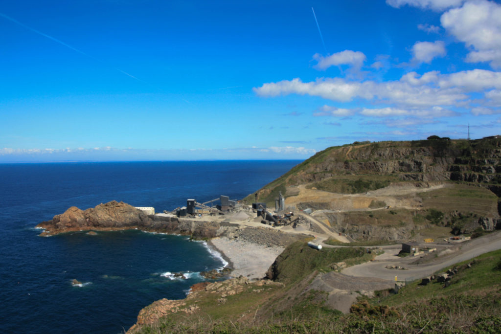
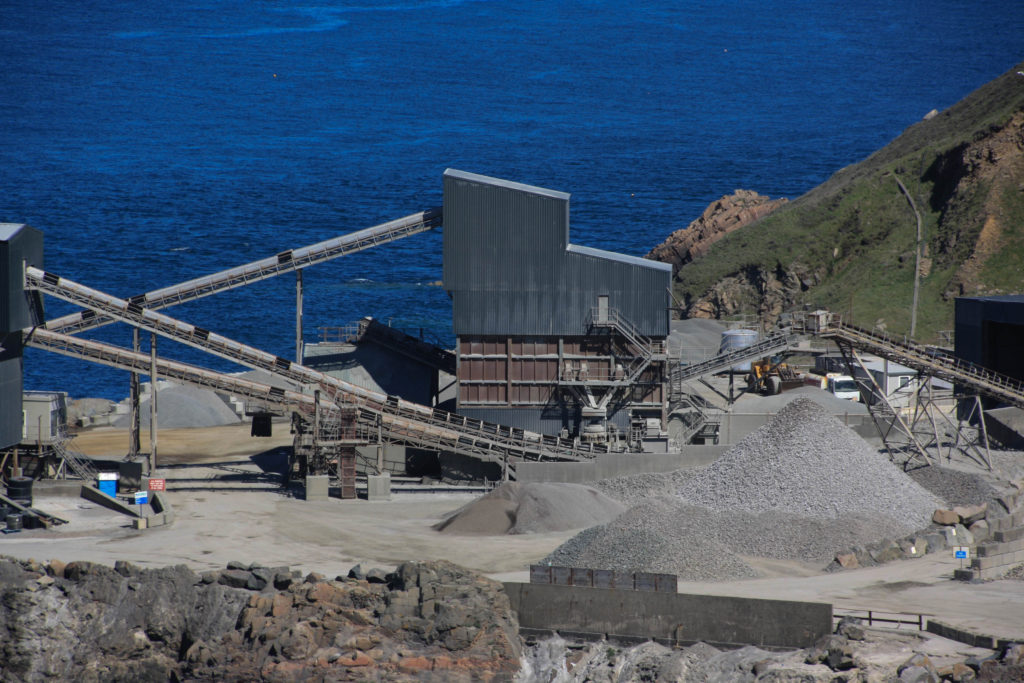
I think these photos represent Anthropocene in Jersey. The building sites and cranes show urbanisation and the quarry shows the impact of man on the Jersey coastline.

The fall of agriculture in Jersey

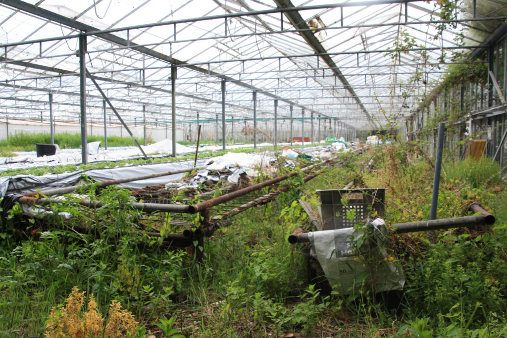
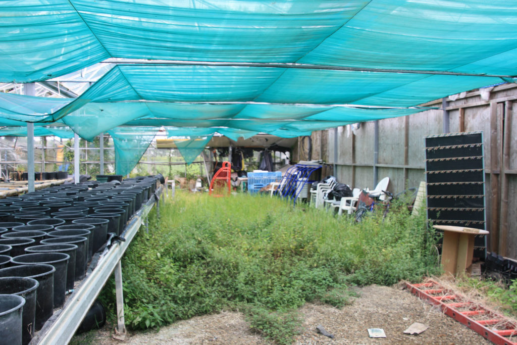
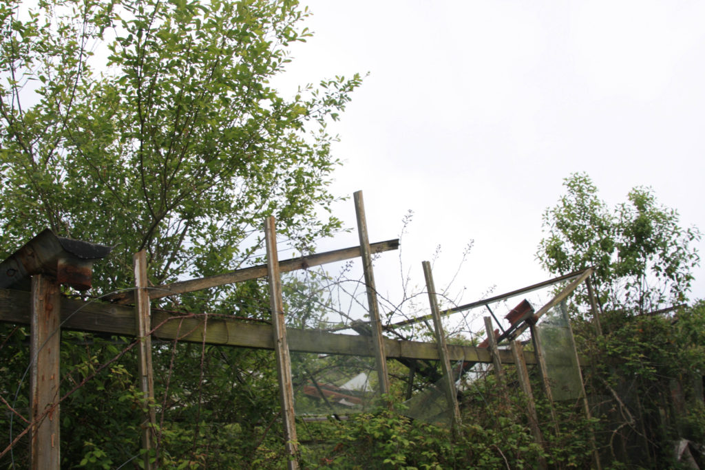
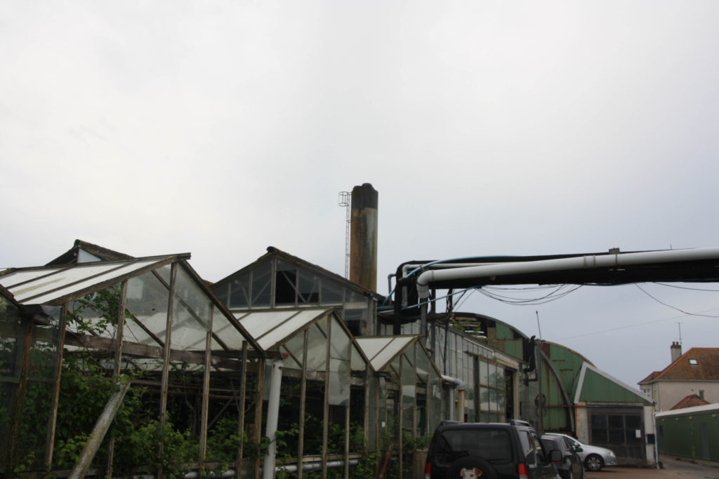
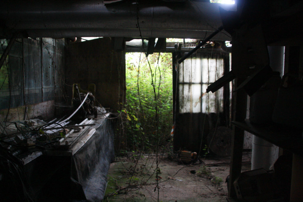
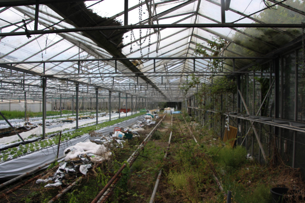
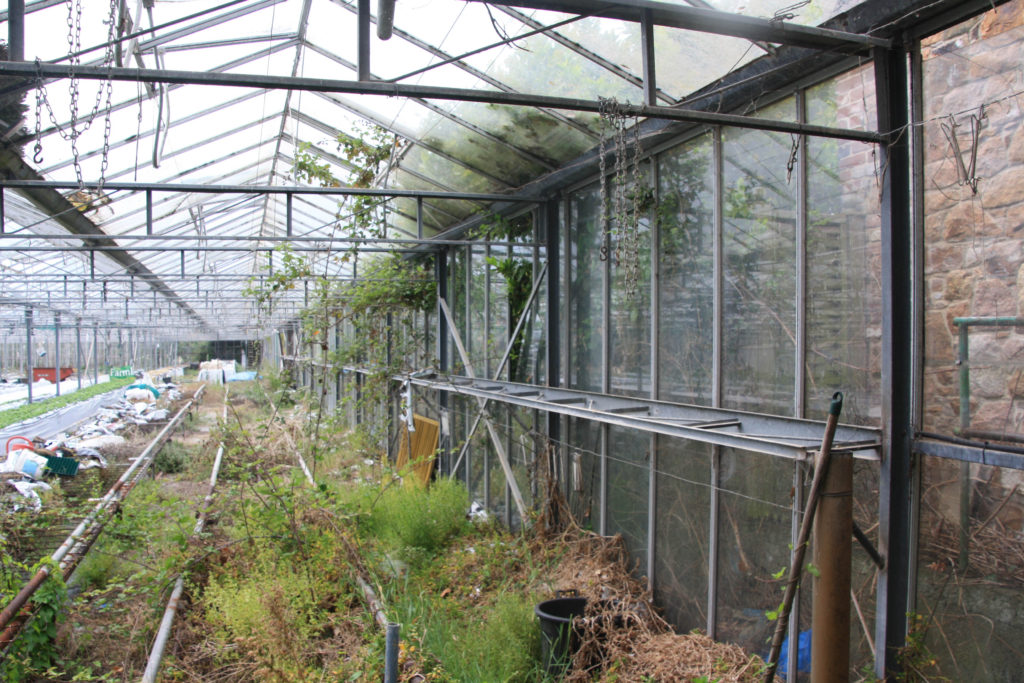
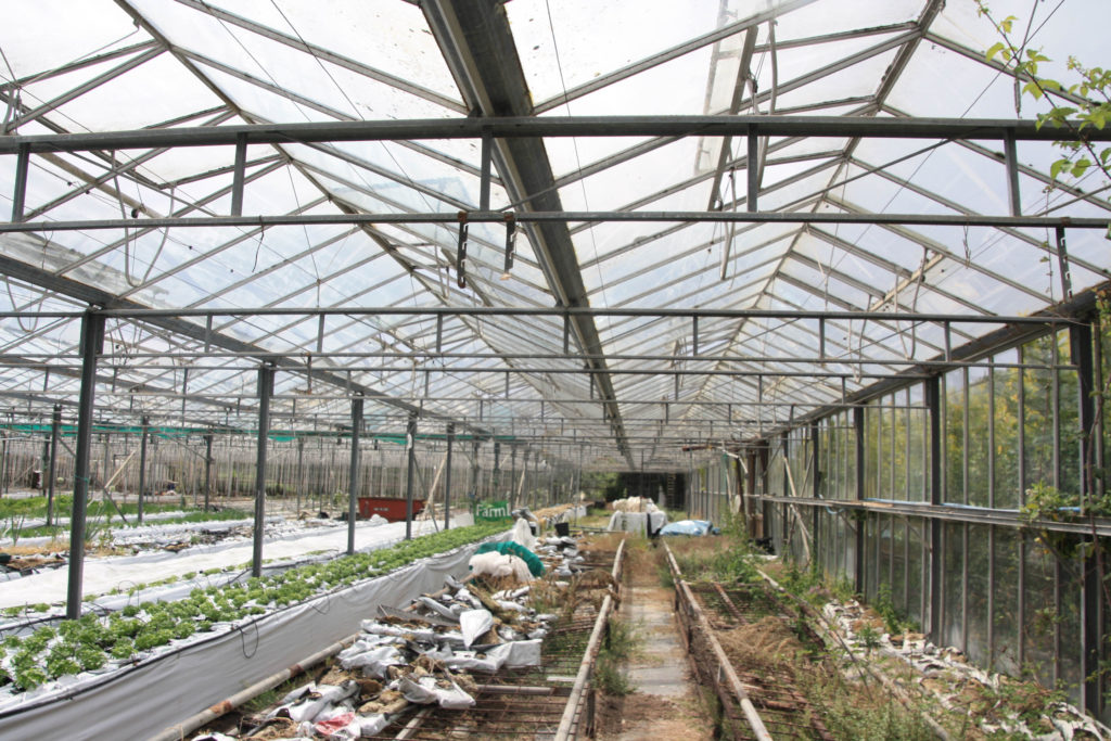
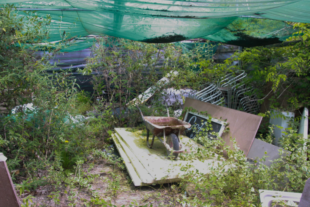
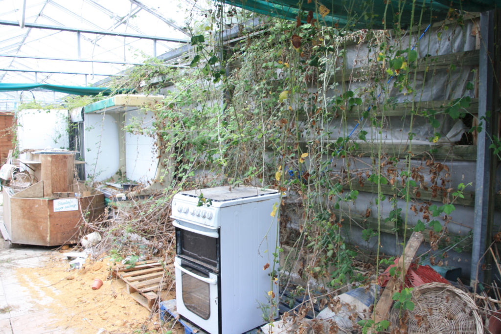
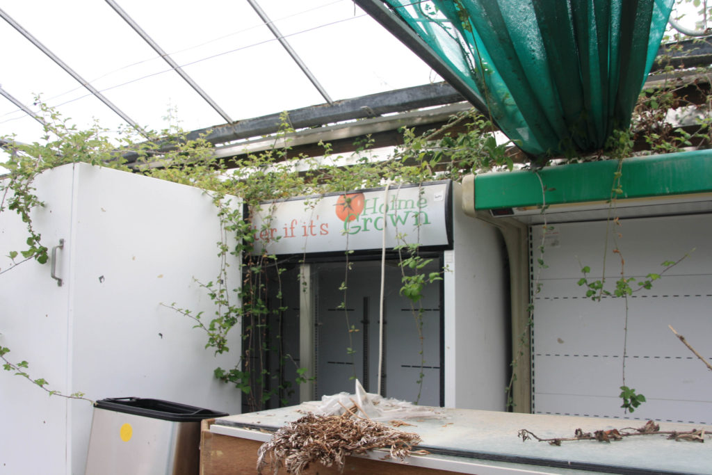
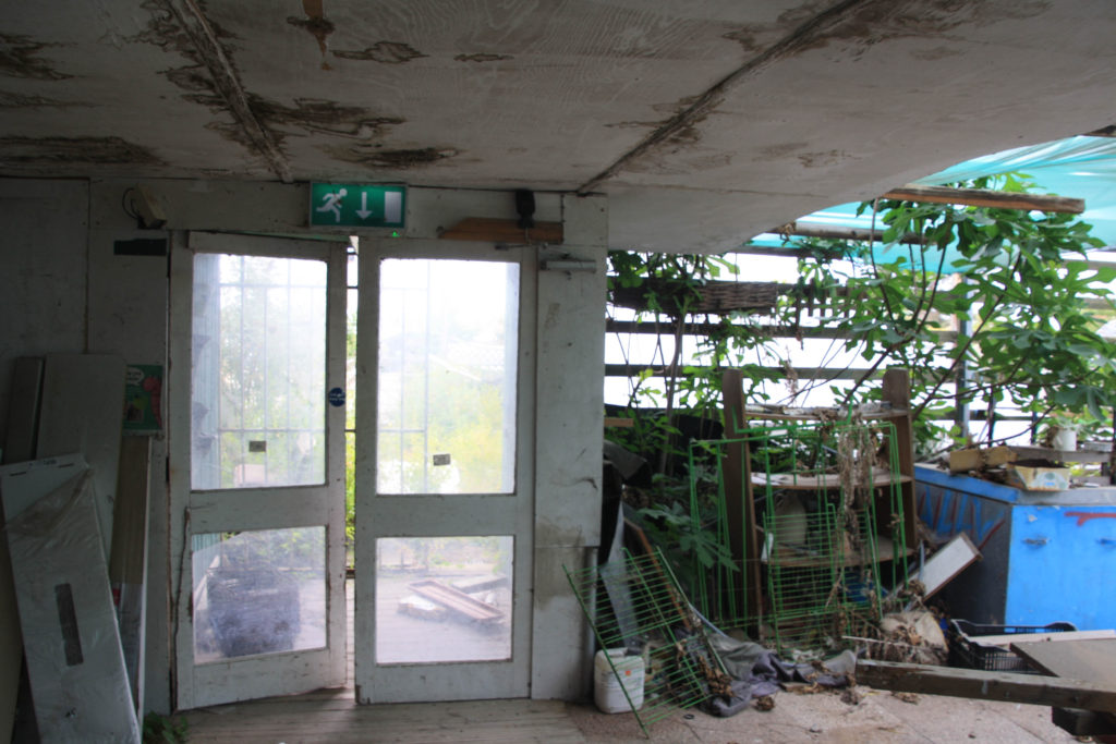
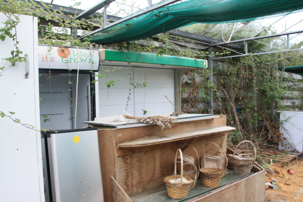
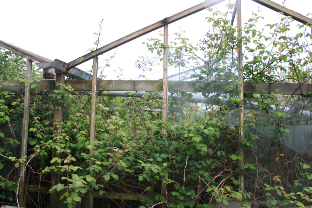
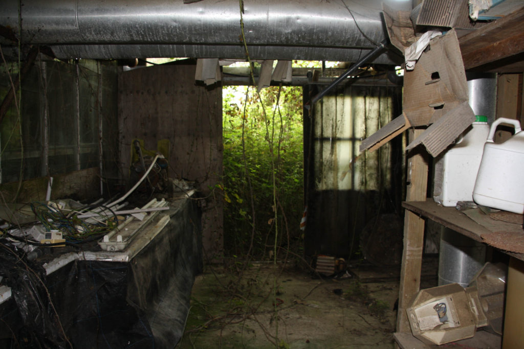
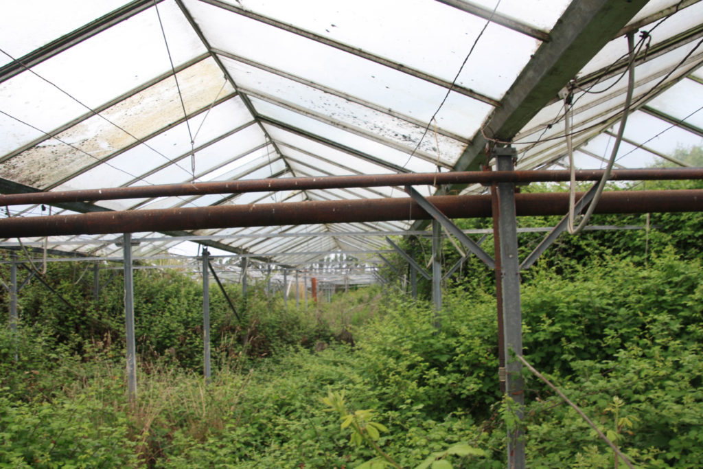
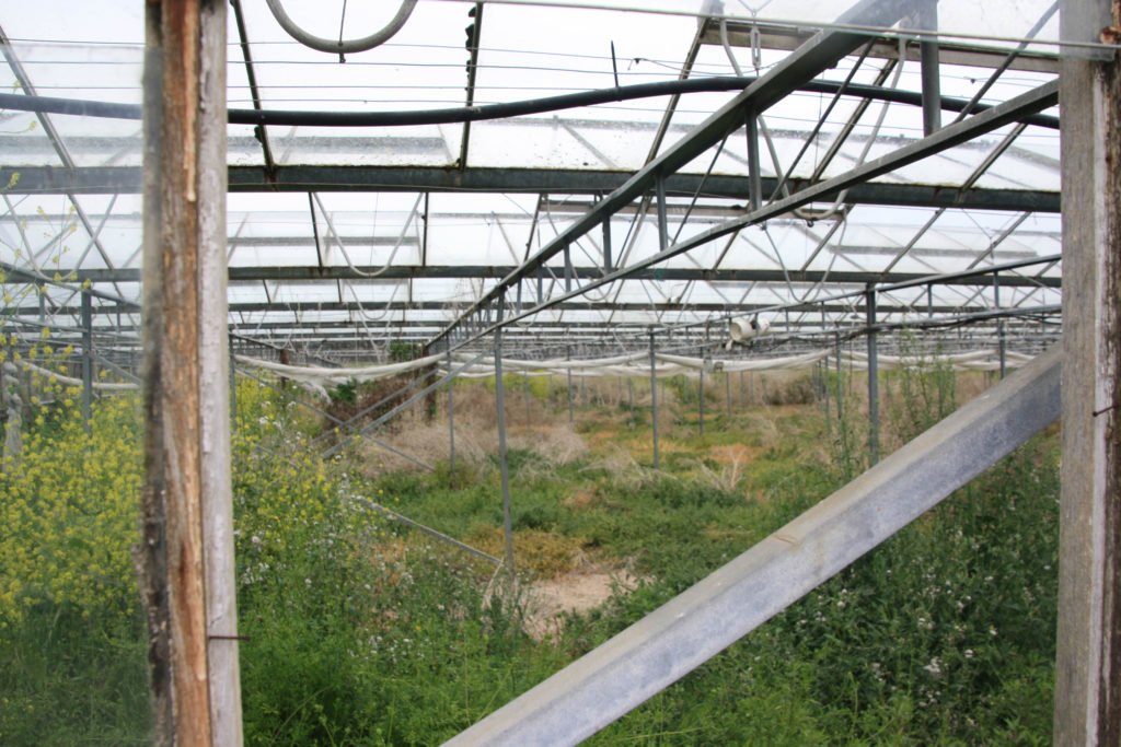
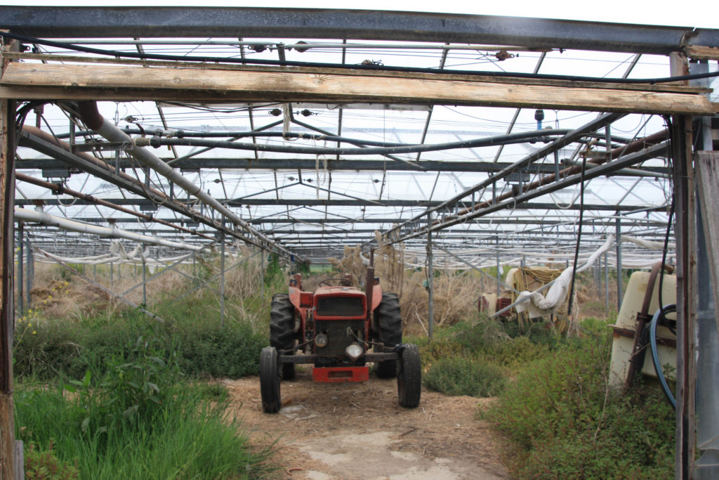
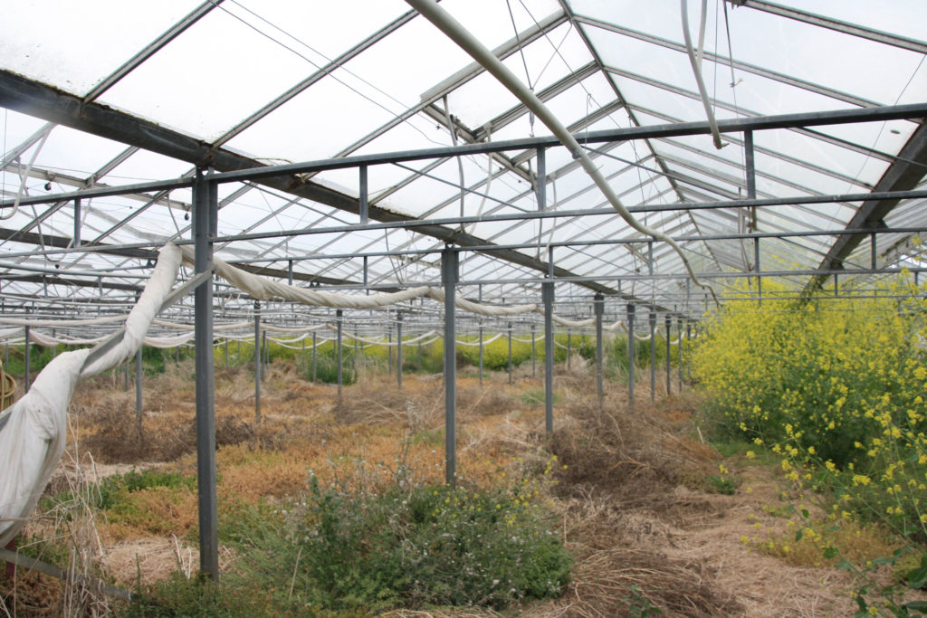
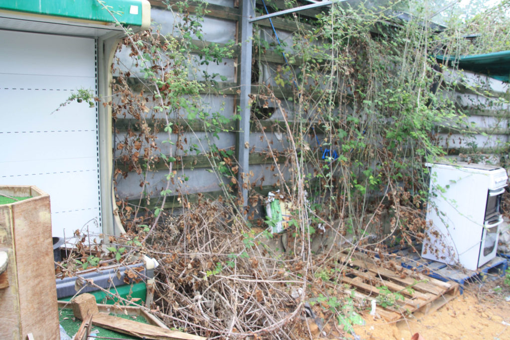
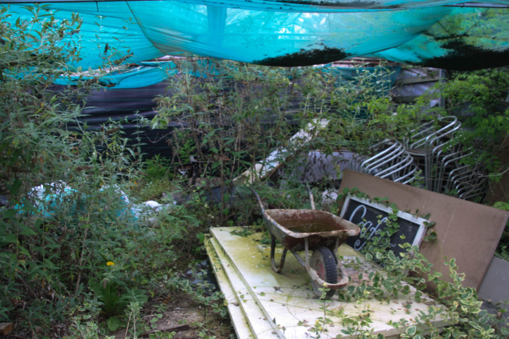
I chose to use these photos because they show what most of the general public don’t see. People don’t see the other side of urbanisation, which is a lot of businesses closing and greenhouse land going unused. Agriculture is slowly becoming a smaller industry every year.

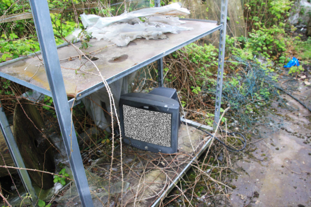
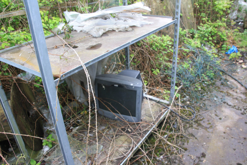
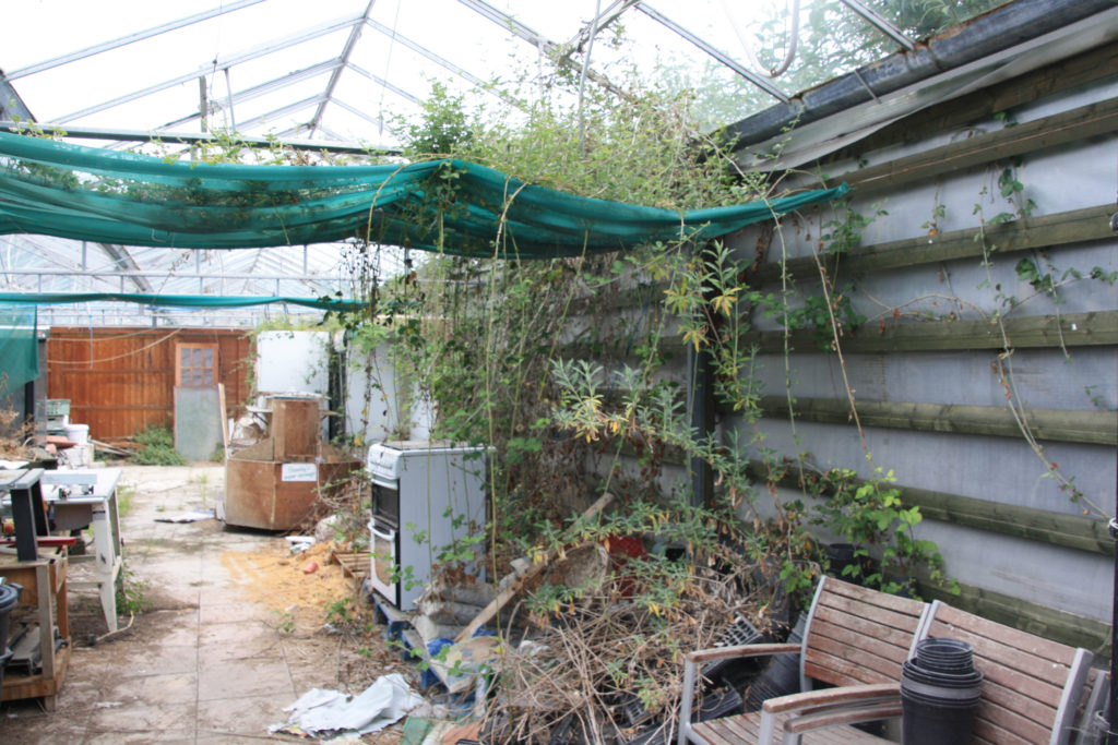
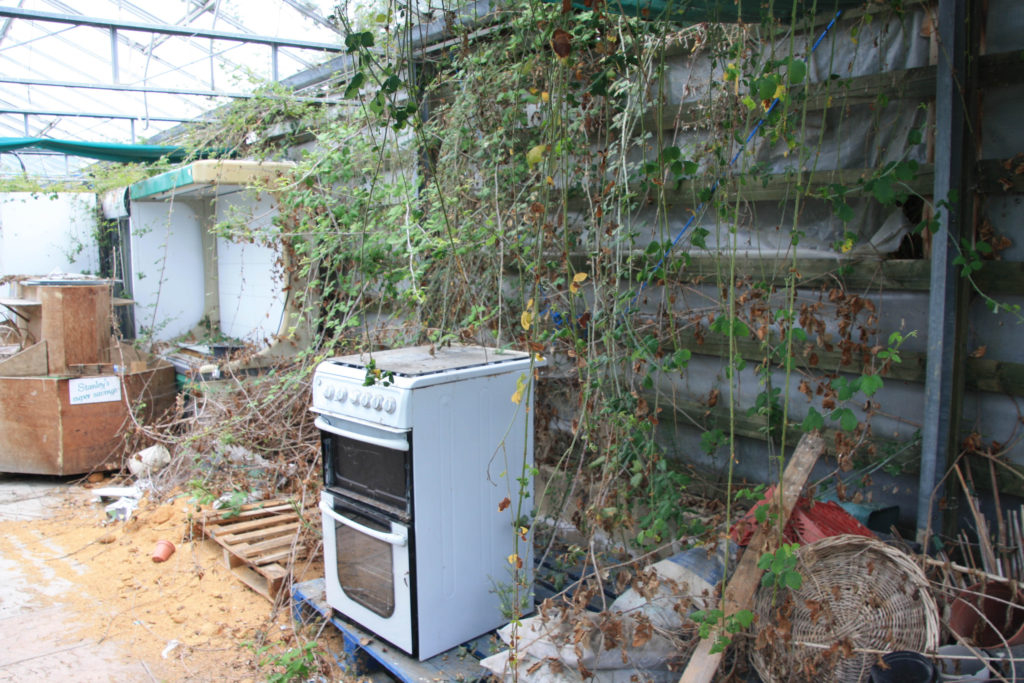
I thought I would photograph this tv because it fits in with the background of overgrown and abandoned greenhouses. The tv represents agriculture in the way that it was such a big thing in the past but now it has been abandoned and replaced by new technology.

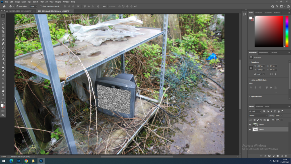
I edited tv static on to the tv because it also represents the past. Tv static doesn’t really show up on new tv’s. This also creates a good looking effect. The tv also represents agriculture at the moment in the way that it is turned on but doesn’t have any signal/Agriculture is still alive in Jersey but not getting the help it needs to become a big industry again.

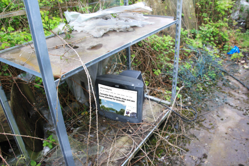
The picture edited onto the screen in this photo is an animation of what Holme Grown is planning to look like in the future. They want to build a modern care home where I took the photos of the greenhouses, and also a medical cannabis farm. This shows the evolution of agriculture, as Holme Grown used to just be tomato farms. However, they are abandoning the idea of growing food for people and instead growing cannabis to help people who are prescribed it.

anthropocene photoshoot 1- Ocean plastic polliution

For this idea I was highly inspired by Jersey because of its love and appreciation for our beaches. Jersey beaches however, are still a victim of ocean pollution, although a smaller amount of plastic waste is washed up on our shores, the plastic waste is still a problem.

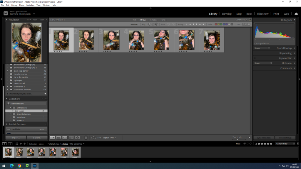
I began by putting in place a star system to select some of my favourite images
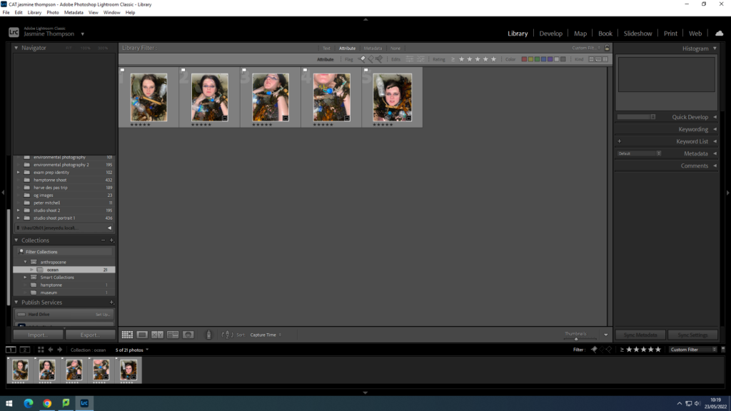
I then used the flag system to select the images i will use which I previously rated with the star system.

Editing

I began my editing process in photoshop, i did this as i needed to initially add more plastic onto my image.

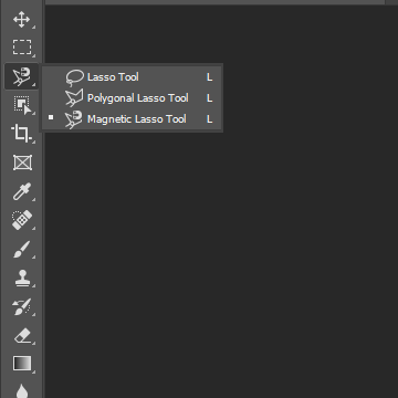
I began by using the magnetic lasso tool to cut out separate images of plastic which i had collected from the beach. I took images of these separately to allow more freedom e.g. movement, placement, size
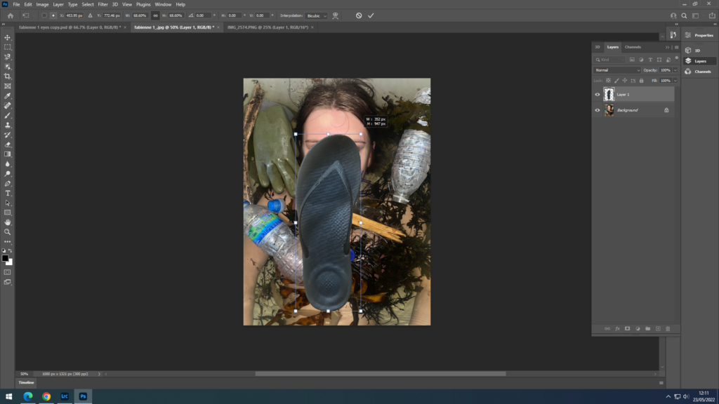
I then used the CTRL-T method to reshape and re-angle the image I was adding on
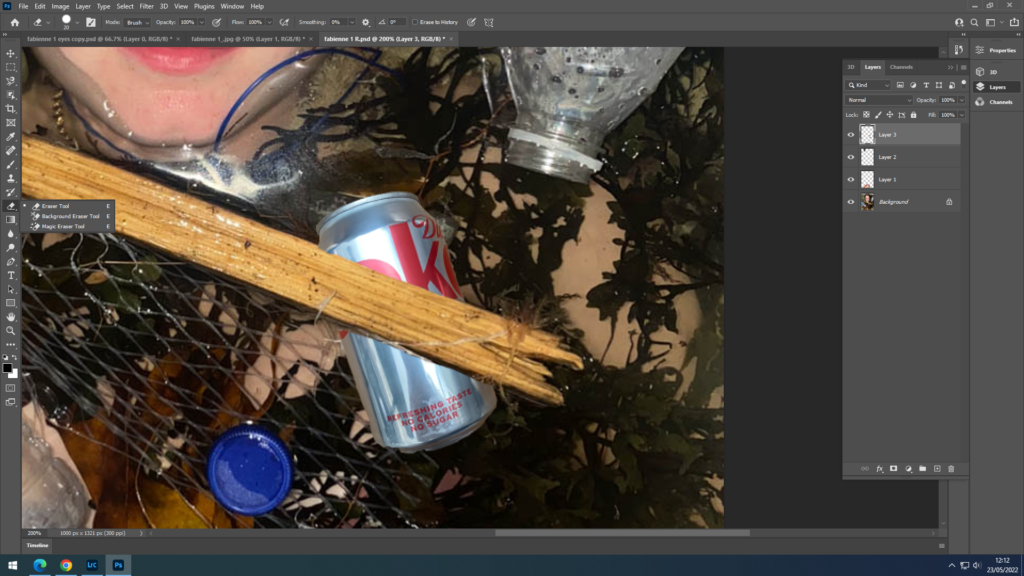
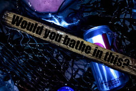
I then used the eraser tool to manipulate the image e.g. the coke can now under the drift wood. And to also make any slight adjustments or corrections.
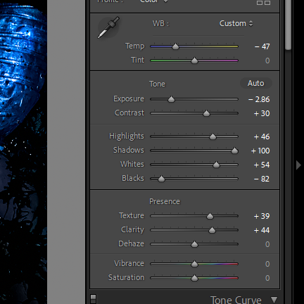
In adobe Lightroom, I wanted to create a dark, ominous image while also including the feeling of the ocean e.g. blue shades. I used a vignette to create a dark tunnel like illusion around the image emphasising depth.
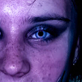
I used the adjustment tool to edit small details within the image, for example… i fixed the eyes to get rid of the red eye also made the yes look brighter and blue.
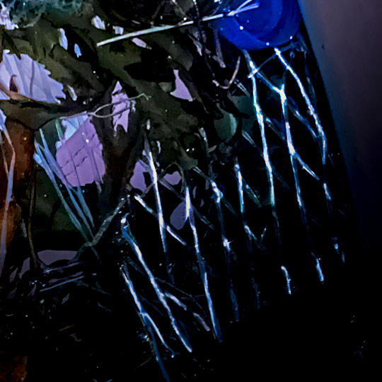
I also used the adjustment tool to add finer details, such as a higher exposure on this plastic netting so it wouldnt blend so much into the black.
I decided to include text within my image, inspired by Barbra Kruger. I am using quotes which are inspired by ocean pollution to fit my theme.

Editing Experiments

Inspired by Aaron Siskind

——- EXPERIMENT #1 ——-

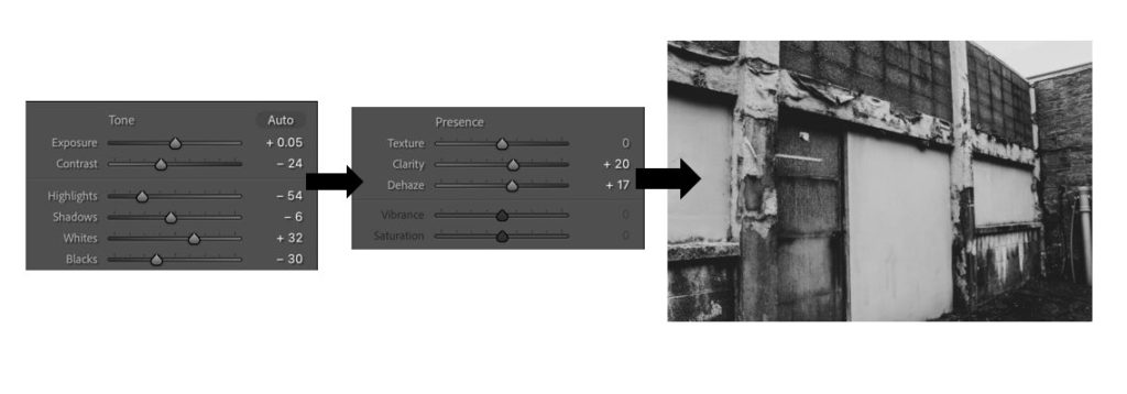
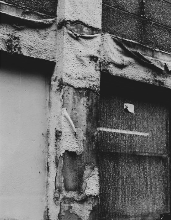
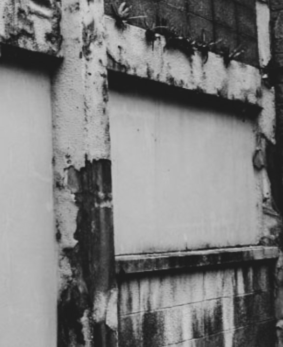
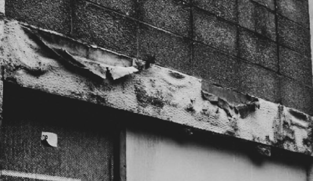
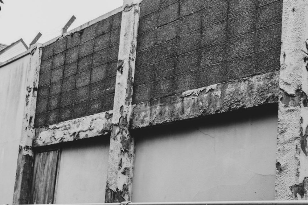
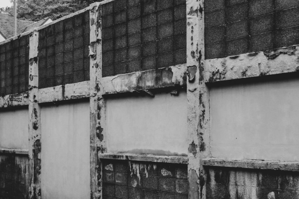
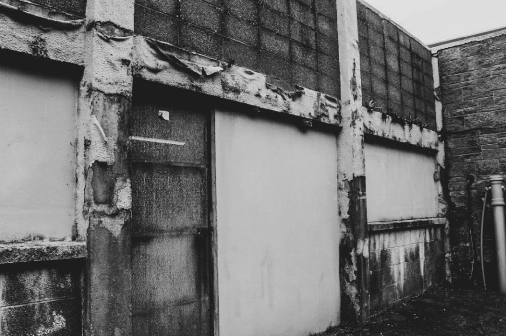
For my first experiment, I chose to apply a black and white filter, such as the ‘Flat’ filter, on top of this image followed by a few more adjustments to make the image a lot more textured. I was inspired by Aaron Siskind whilst editing this image and wanted to secure a similar abstract photograph. I then cropped it in different areas of the photograph, like that of Siskind, but I still wasn’t very satisfied with the result.

Cropping experiments ————–

Black and white experiments ————–

I tried experimenting with all the best images I took at this certain location. I definitely thought that the texture of the peeling material, looked extremely similar to that of Siskind, however I am not very happy with the results and prefer for it to be edited in a different manner.

Inspired by Yves Marchand, Romain Meffre

——- EXPERIMENT #2 ——-

For my second experiment, I wanted to take on the inspiration of Yves Marchand and Romain Meffre. To achieve this type of style I had to apply the ‘Vintage Instant’ filter and adjust the settings to my liking until I was happy with how it looked. I particularly liked how dishevelled everything looked after I edited it this way, making it almost look as if it was among a dystopian-like world.

I much preferred this way of editing compared to my first experiment as I just prefer how uncanny everything looks with the other inserted rather than the image purely being black and white. I preferred this particular image to be linked more in the way of looking like the work of Yves Marchand and Romain Meffre rather than Aaron Siskind. The image I took was a full image rather than a close up, abstract type of photograph so I thought it was better to have these inspired by Yves and Romain.

Coloured experiments ————–

Here are my final experiments inspired by Yves and Romain. I think I’m going to go along with these versions over the black and white photographs.

Photo editing – Anthropocene

before
after

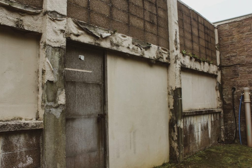
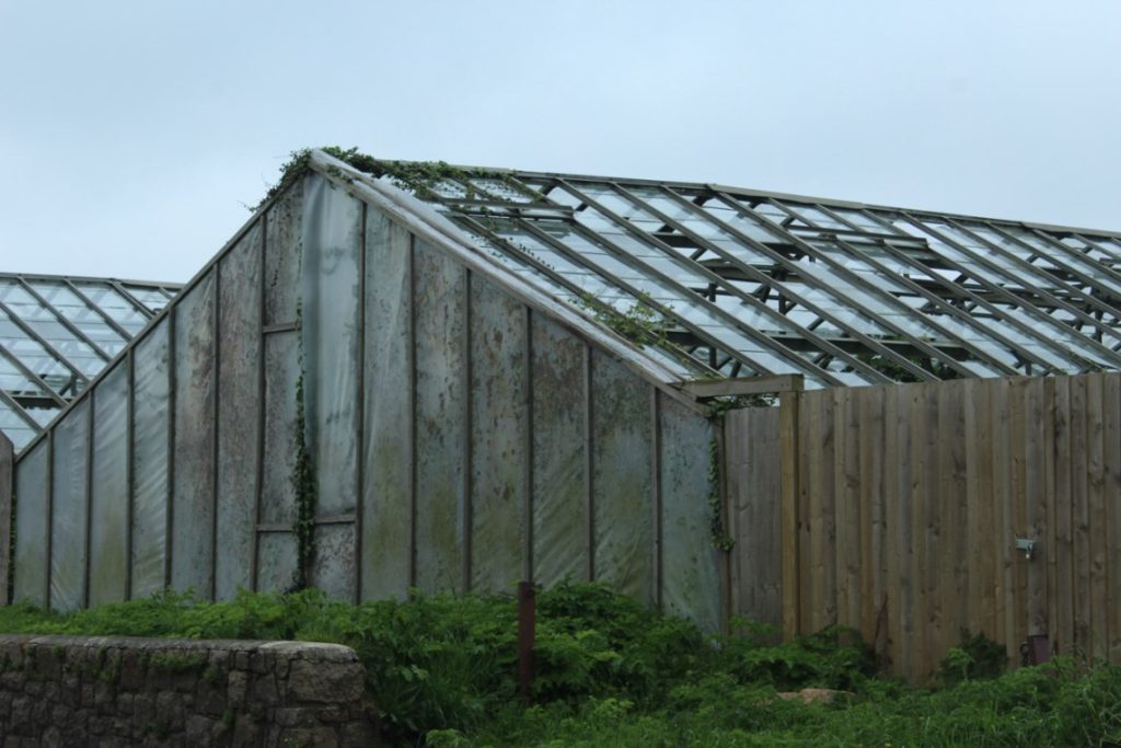
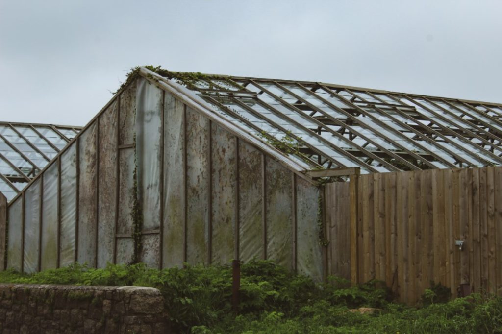
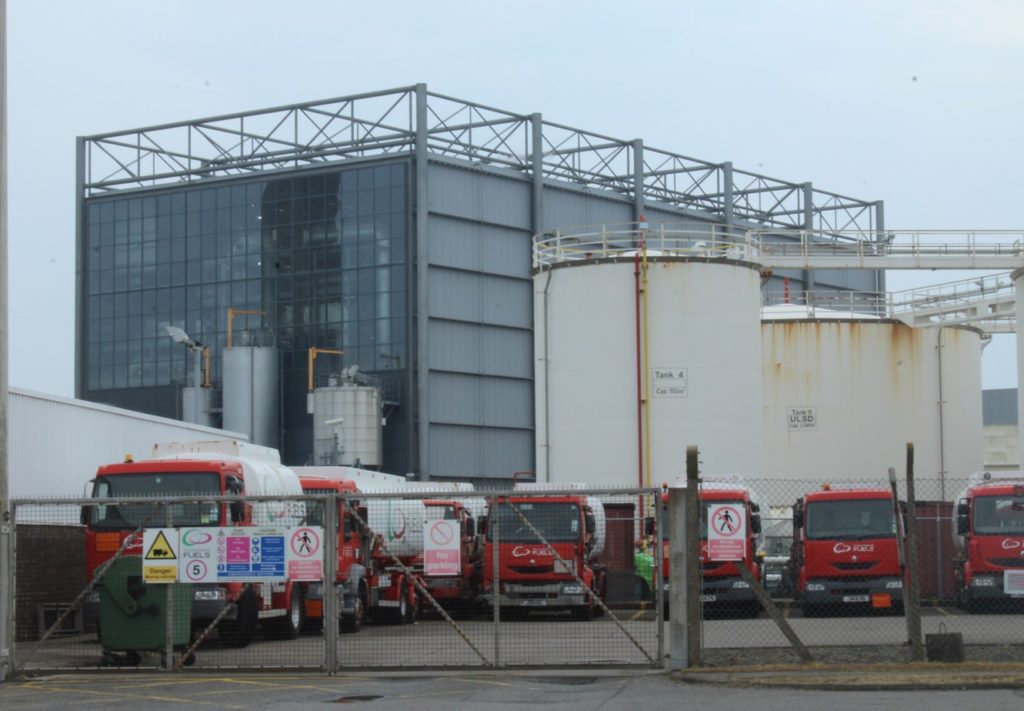
I’ve made very subtle changes to this image, but I wanted to make the colours a bit more vibrant in the photograph. To achieve this, I applied the ‘Vintage instant’ filter in the creative section. I then adjusted a few other aspects such as the exposure, shadows and more, until I was happy enough with how it looked.

before
after

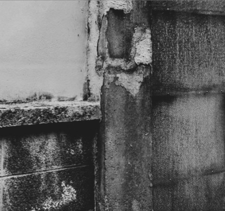
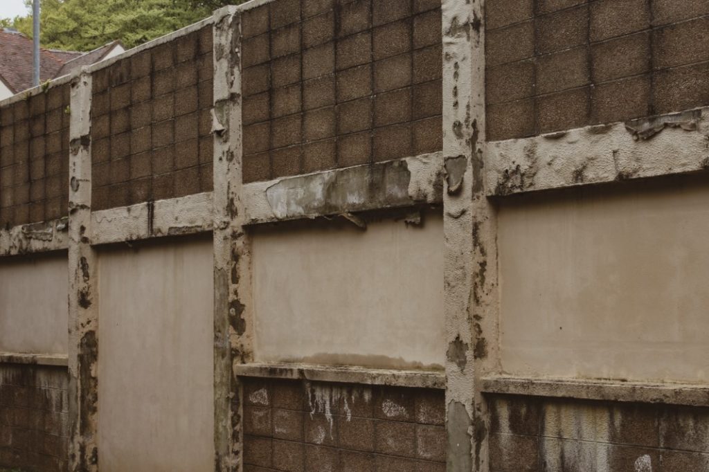
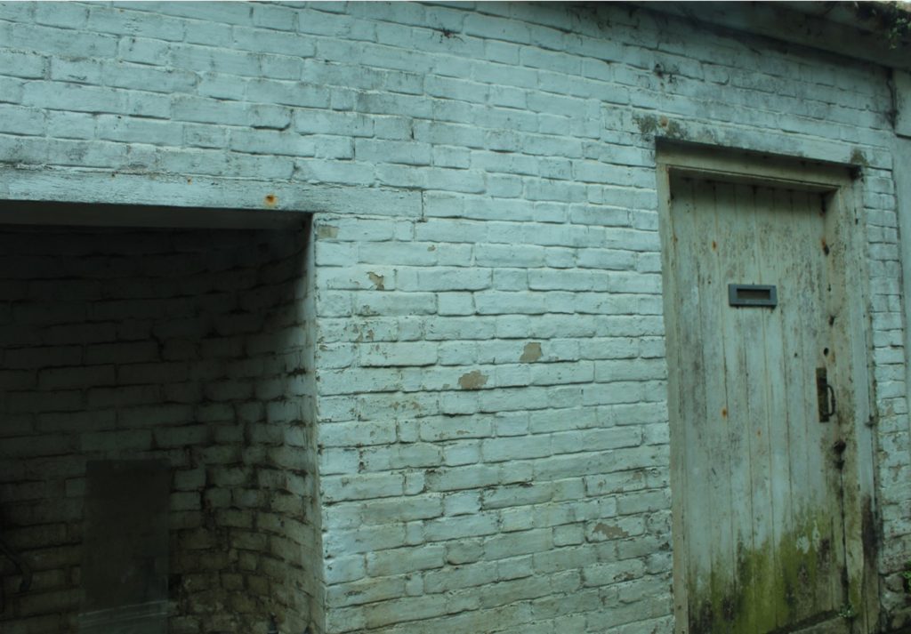
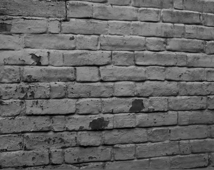
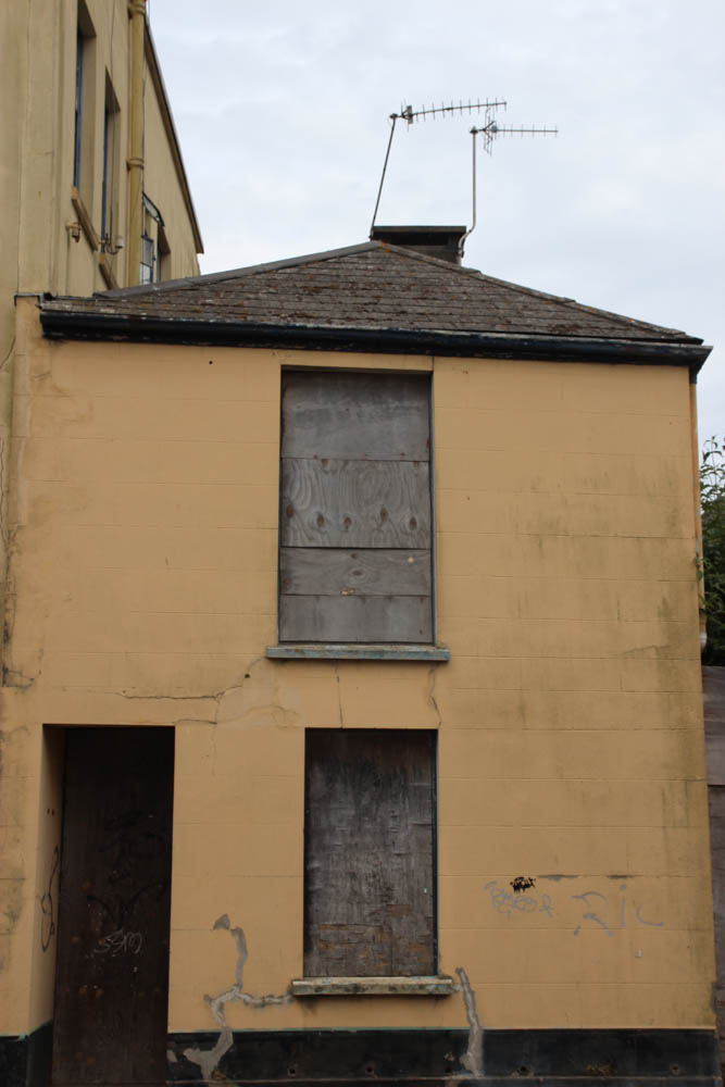
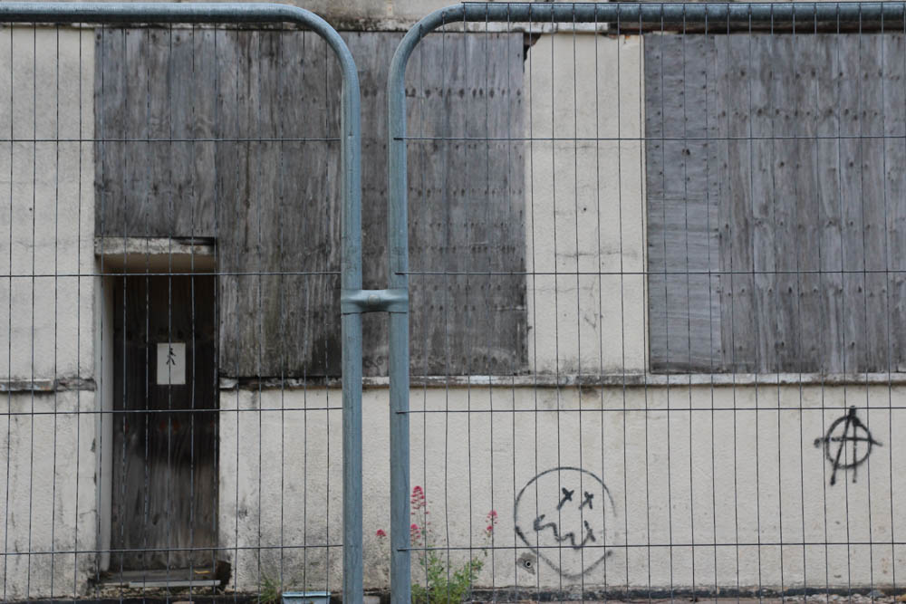
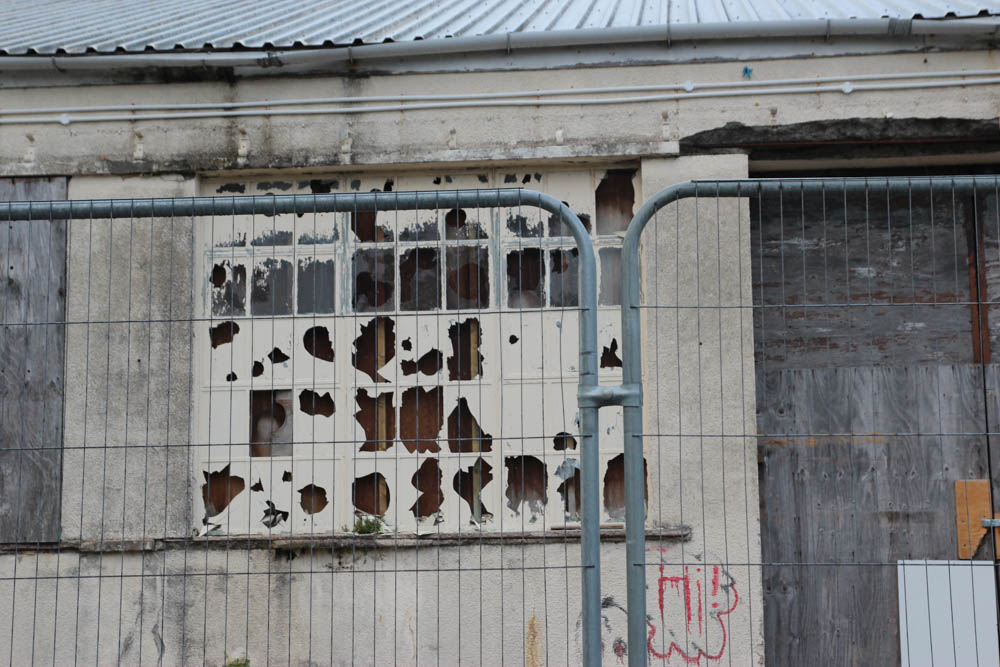
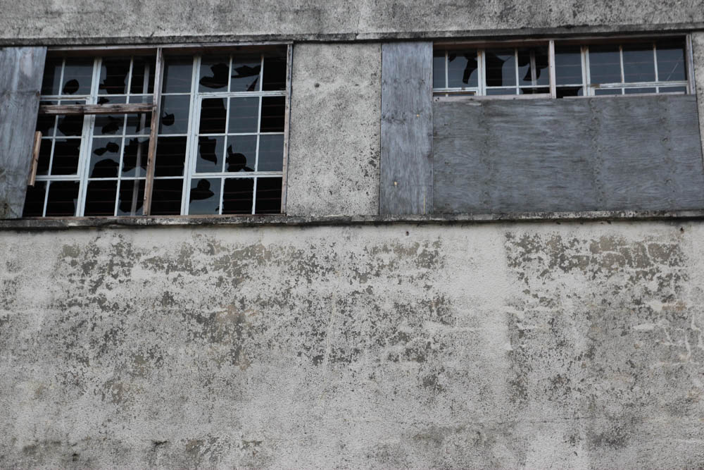
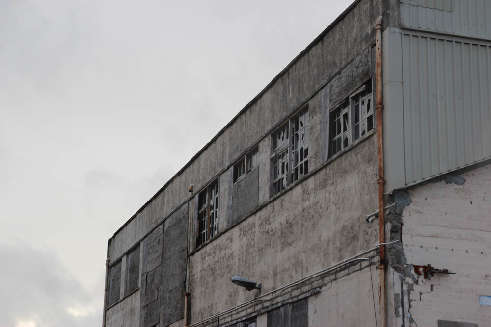
What I have done here is I have cropped the pictures down to a small section of the brick wall so that it can easily display the textures and obvious signs of decay on the building itself. After I cropped it, I added on the ‘High contrast’ black and white filter and adjusted a few other areas such as exposure and shadows.

before
after

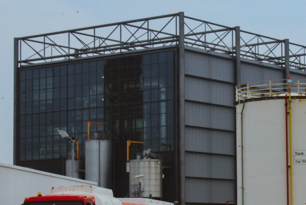
Once again, I have used the ‘Vintage instant’ filter on this image much like the first edit I did. I have also cropped the image down to make it look much cleaner and less cluttered.

Anthropocene image editing + experimentation

Image editing

This involved editing and getting the best images that represented urbanisation in Jersey and putting them with other images that go together. I sorted them into 2 groups:

The rise of urbanisation in Jersey

The fall of agriculture in Jersey

Experimentation

This image has an empty alt attribute; its file name is IMG_0891-1024x683.jpg

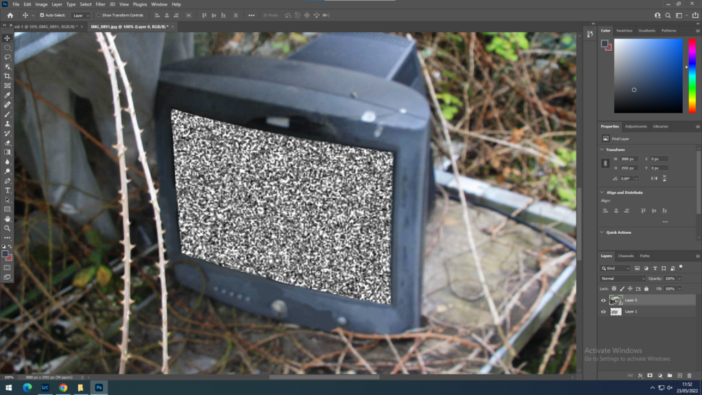
My idea is to experiment with this photo of an old tv. The first thing I edited was a static screen onto the tv.

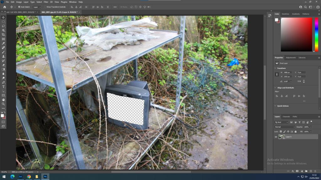
To do this I roughly erased the area of the screen using the eraser tool

This image has an empty alt attribute; its file name is image-275-1024x576.png

I then got an image of tv static online and copied it into photoshop. I placed it where the screen is.

This image has an empty alt attribute; its file name is image-276-1024x576.png

Then I zoomed in and cleaned up the borders of the area I had erased. I also painted over the plants that were going over the screen before using the eyedropper tool. This was so it did not look like the plants had been cut off

This image has an empty alt attribute; its file name is image-335-1024x576.png

Final products:

I did the same thing with another image, this time I used an article from the JEP about the plans for Holme Grown and how they are planning to replace the old greenhouses with a care home and a cannabis farm.

anthropocene case studies

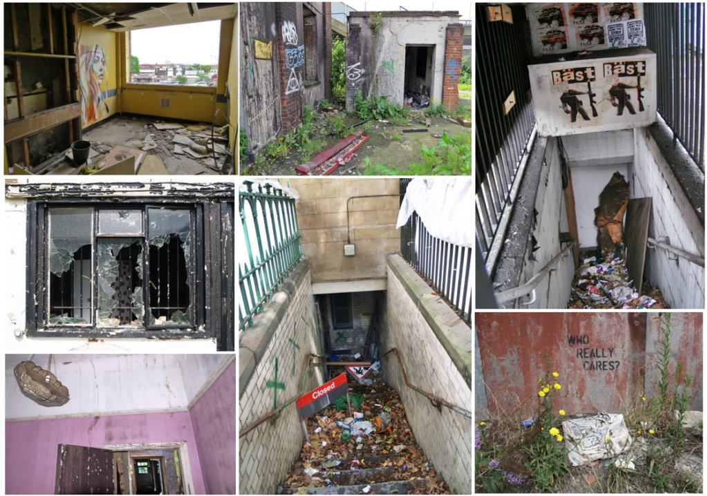
A montage of photos from Talling’s website, Derelict London.

PAUL TALLING

Paul Talling is a london-based photographer who, for 19 years, has been photographing London’s derelict places and documenting it on his nationally-recognized website, Derelict London. He began taking photos in 2003, after witnessing an abandoned candle factory being demolished. This fascinated Talling and he soon developed an interest in photographing abandoned places. His objective in his images are to show the darker side of London and find the emotion in derelict areas. He later released a book about his work which went on to have good reviews from critics.

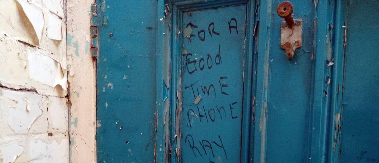
Looking for a good time with Ray. Picture of public toilet graffiti in London
“Although it has quainter pleasures, much of the appeal of Paul Talling’s excellent little book Derelict London is in how it seems to trace the skeleton of a dead city while it is still in apparently rude health.In a city so devoted to making fast money, and busily fighting a one-way class war under the rubric of “regeneration”, sweeping undesirables and their buildings away to the outskirts, it is almost comforting that relics and ruins still cling on to its landscape, throwing workaday time into a spin. As much as it is an inadvertent vision of how London might look after a catastrophe,   Derelict London is valuable as a document of the one going on right in front of us.” – A review from a critic.

Talling includes graffiti and vandalism in his photos to capture the humour and to show the past travels people have been on whilst exploring the ghostly beauty of abandoned places. I am inspired by Talling’s work because of the stark reality of his photos – he shows the decay of buildings and doesn’t sugar coat it, in a way his photos are almost candid because he photographs exactly what meets the eye – I plan to use his method of photography whilst doing my 2nd photoshoot of abandoned places.

IMAGE ANALYSIS

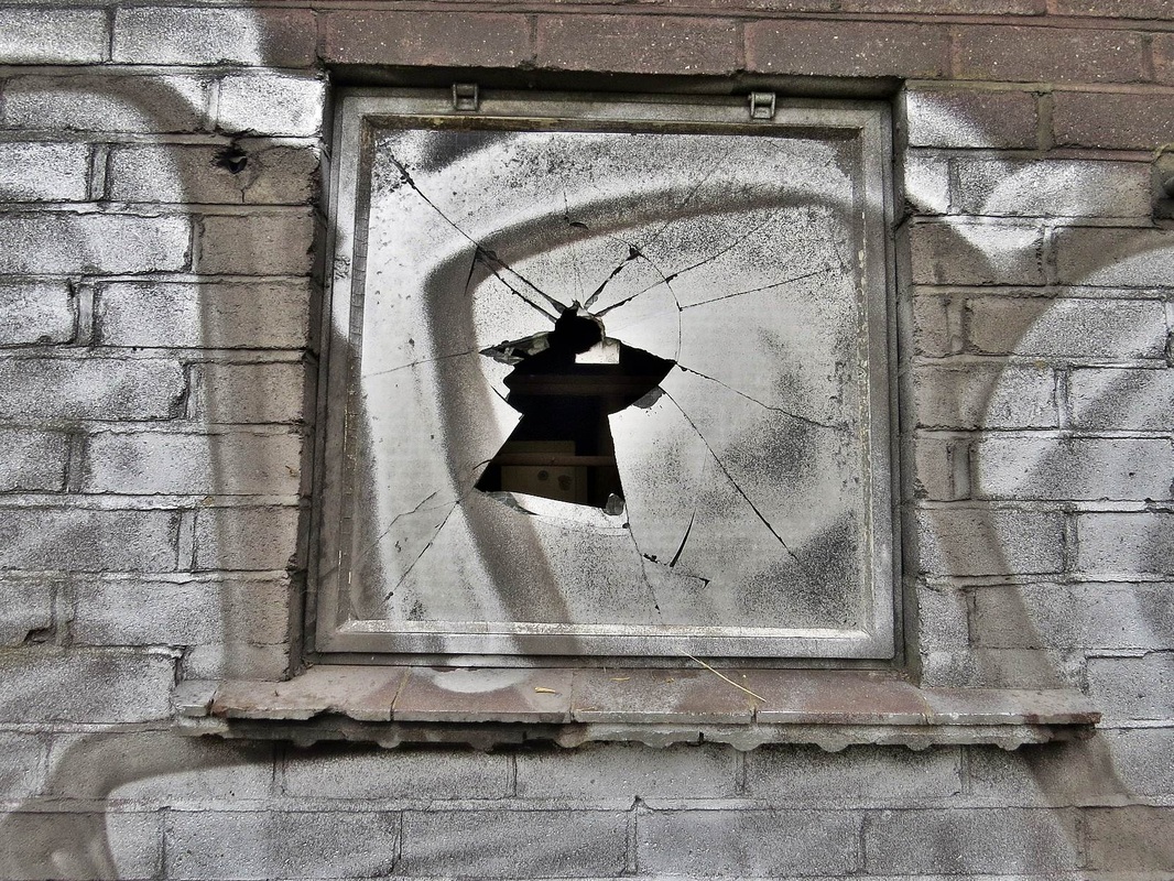
This image was taken as part of Tallings abandoned offices collection. The image appears to be of an old window which has since been covered by the graffiti as a reminder that mankind has an ever-changing impact not just on nature but on their own creation. The photo is predominantly grey with a few lighter/darker shades, but the main focus of the image is the crack in the centre of the window – not only does the colour make a sharp contrast from the other dynamics of the image, but it also sets an atmosphere and might make the viewer curious as to what’s behind the window. From a viewers perspective, the cracked window represents the peacefulness of a derelict place being destroyed by break-ins and vandalism.

BERND AND HILLA BECHER

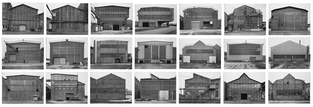
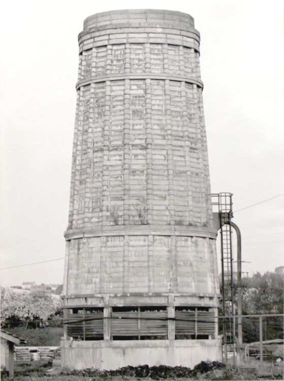
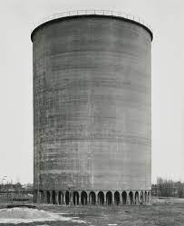
Hilla Becher was a German artist born in 1931 in Siegen, Germany. She was one half of a photography duo with her husband Bernd Becher. They photographed industrial structures including water towers, coal bunkers, gas tanks and factories. Their work had a documentary style as their images were always taken in black and white, and never included people or any other background ‘noise’. They exhibited their work in sets or typologies, grouping of several photographs of the same type of structure. The are well known for presenting their images in grid formations. 
Their work is among the most impactful and influential of architecture photography because it spreads a message. They were often labelled as conceptual artists and influenced minimalist and conceptual artists like Ed Ruscha, Carl Andre and Douglas Huebler. As professors of The Dusseldorf School of Photography, they influenced a generation of German photographers who were their students (including Andreas Gursky, Thomas Ruff and Thomas Struth.)

Becher’s work overlooked beauty and the relationship between form and function. Both subjects addressed the effect of industry on economy and the environment, which has inspired me for my anthropocene project – I plan to photograph buildings in the same way they did, showing how the simplicity of their works have underlying meanings that show the effect industrial architecture is having on the changing environment.

IMAGE ANALYSIS

Düsseldorf School — blog — benedict flett

This image is called Duisburg-Bruckhausen, Ruhrgebiet, and was taken in 1999. It captures two opposites of a man-made environment in one photo – one one side, you have row after row of houses and cars, decorated with few fragile trees. However, on the other side you have big industrial power plants with toxic steam coming out of the chimney to show the dangerous effect we are having on polluting the Earth’s air and damaging the environment. The photo being in black and white furthermore shows this, the dark colours creating a bleak and chaotic atmosphere with the power plants looming over the houses below.

Selections and Best Images

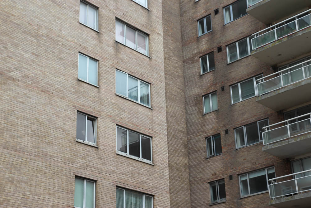
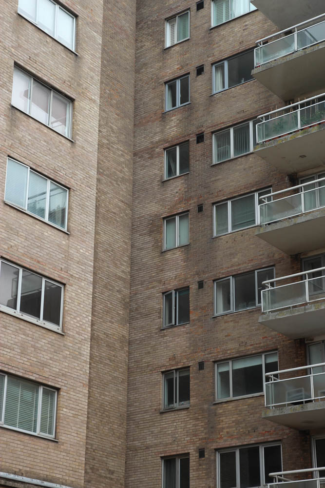
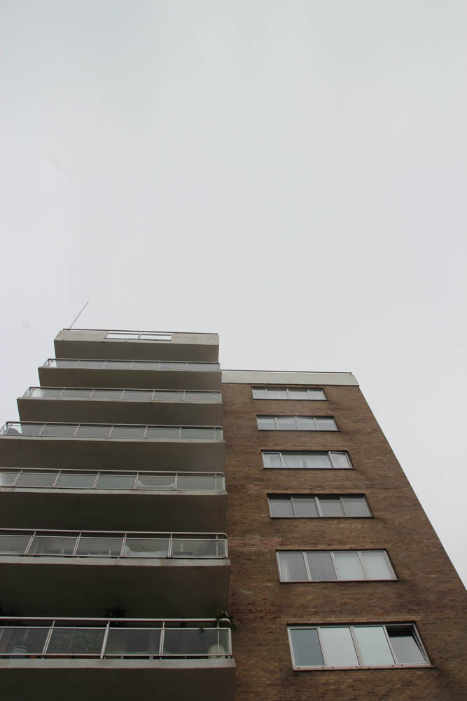
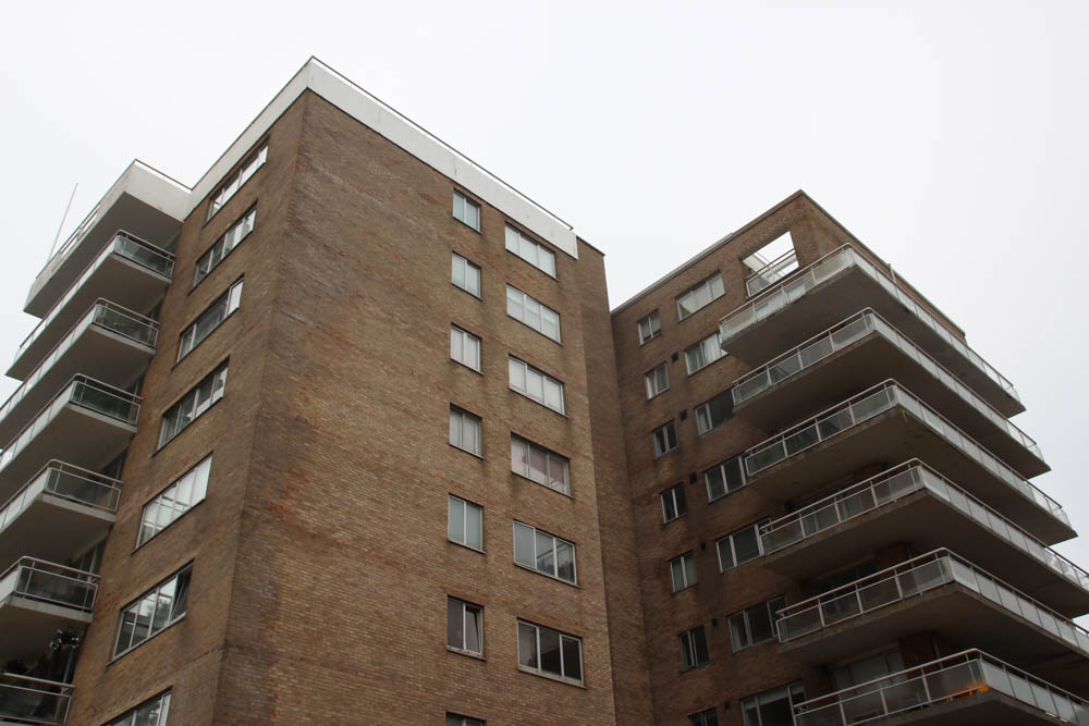
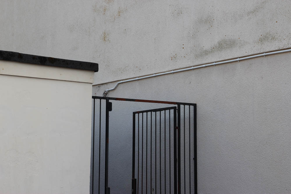
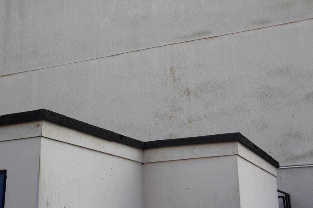
In Lightroom, as part of my selection process, each location’s best images have their own colour label. Before labelling my images, I used the P and X tools on my keyboard to either flag or hide my better and worse images, to help me make smaller selections with my colour labels. When I was selecting my best images, I was looking for straight images, with clear and sharp focus. I was also looking for images that were the correct exposure – this was an issue with the bright but cloudy weather – I found both over and under exposure in my images. Also, I was looking for images with a composition which was even and balanced – however this can be helped in my editing process.

Shoot 1

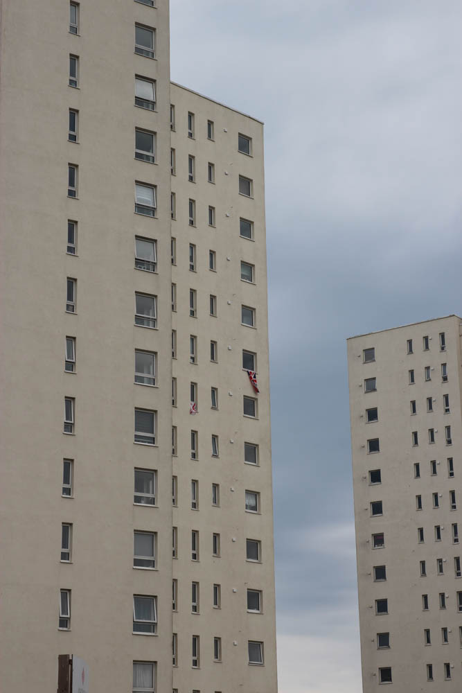
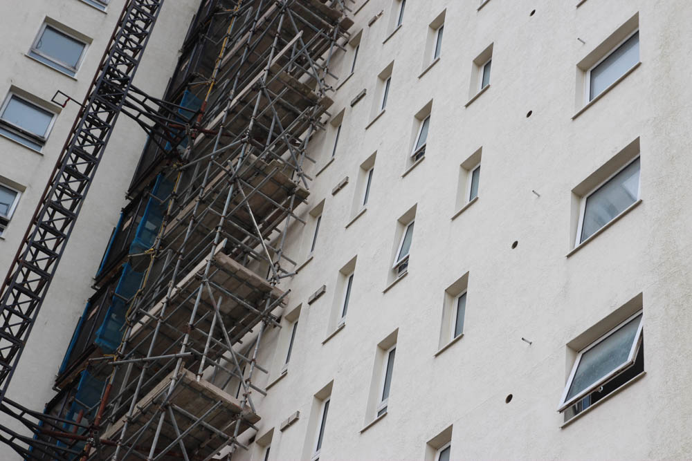
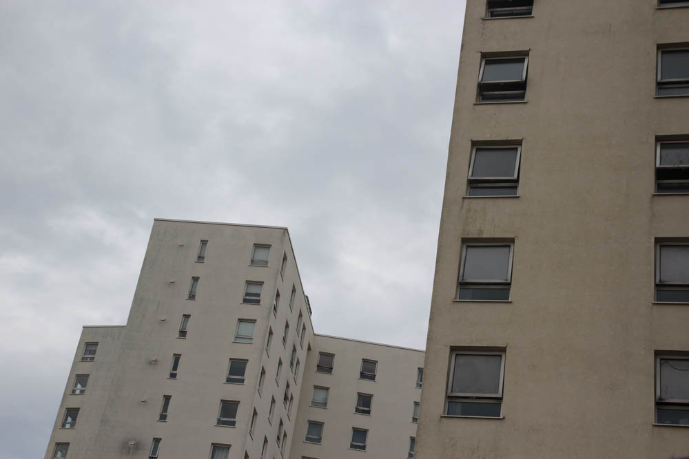
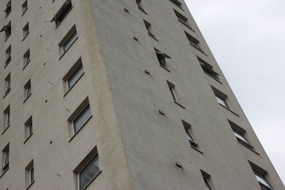
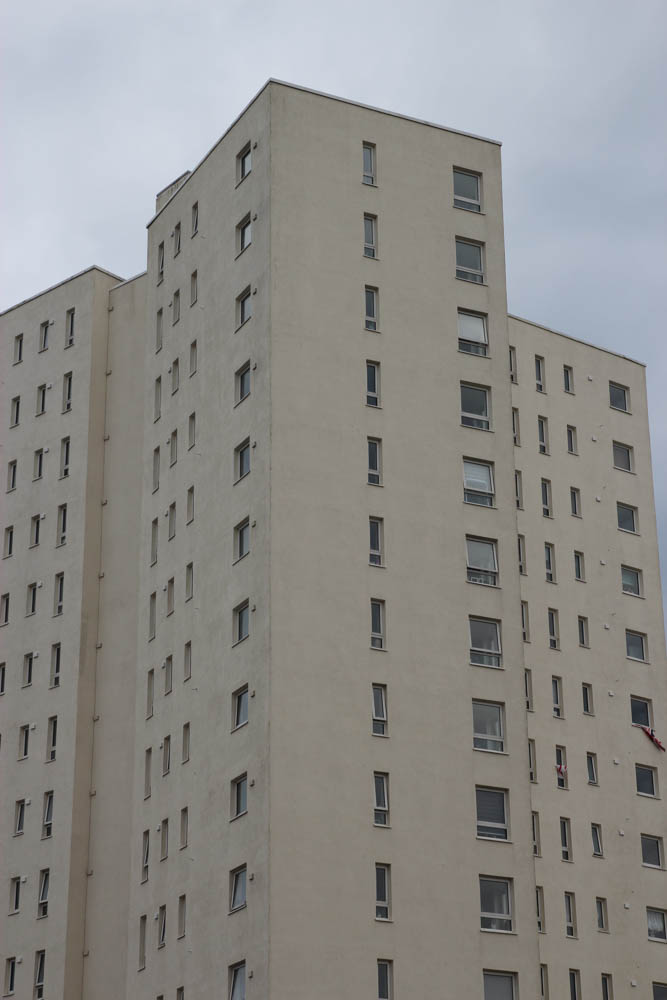
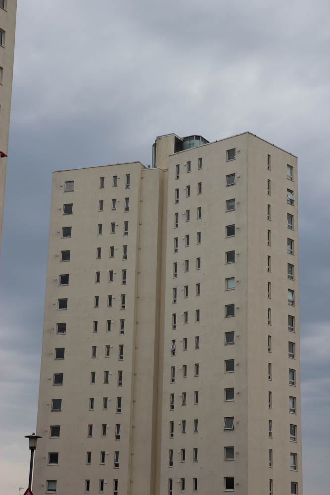
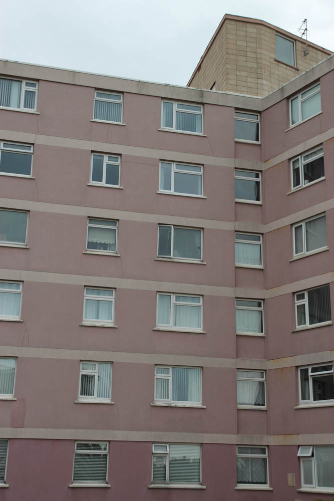
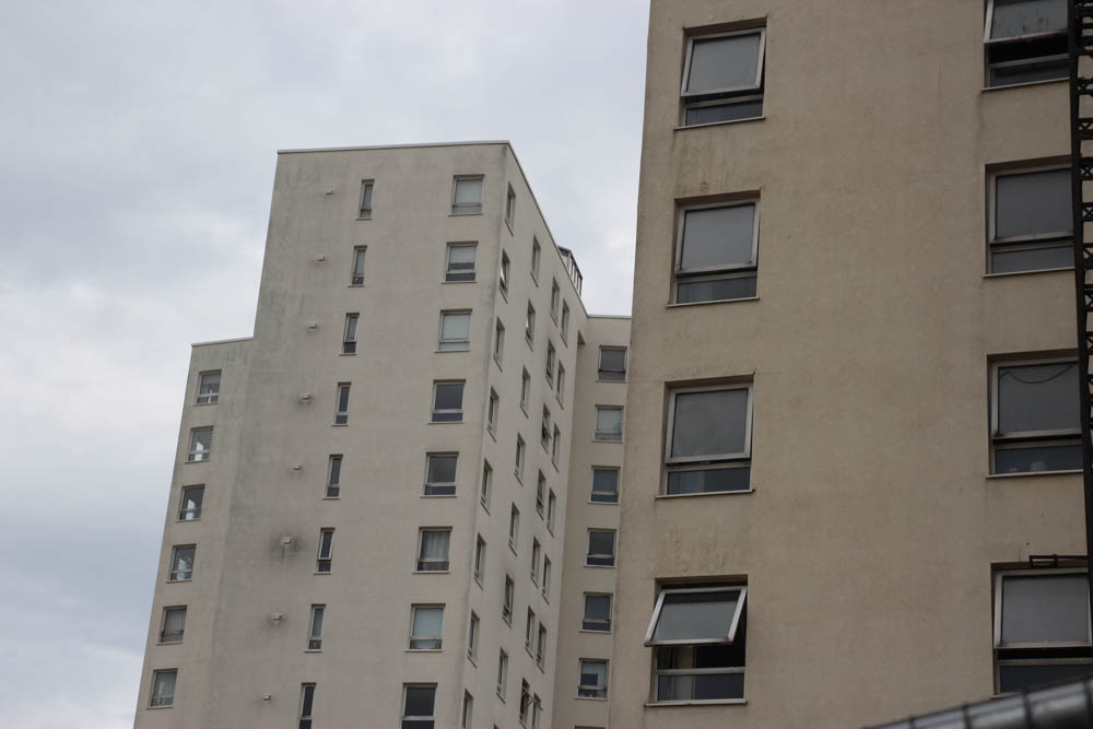
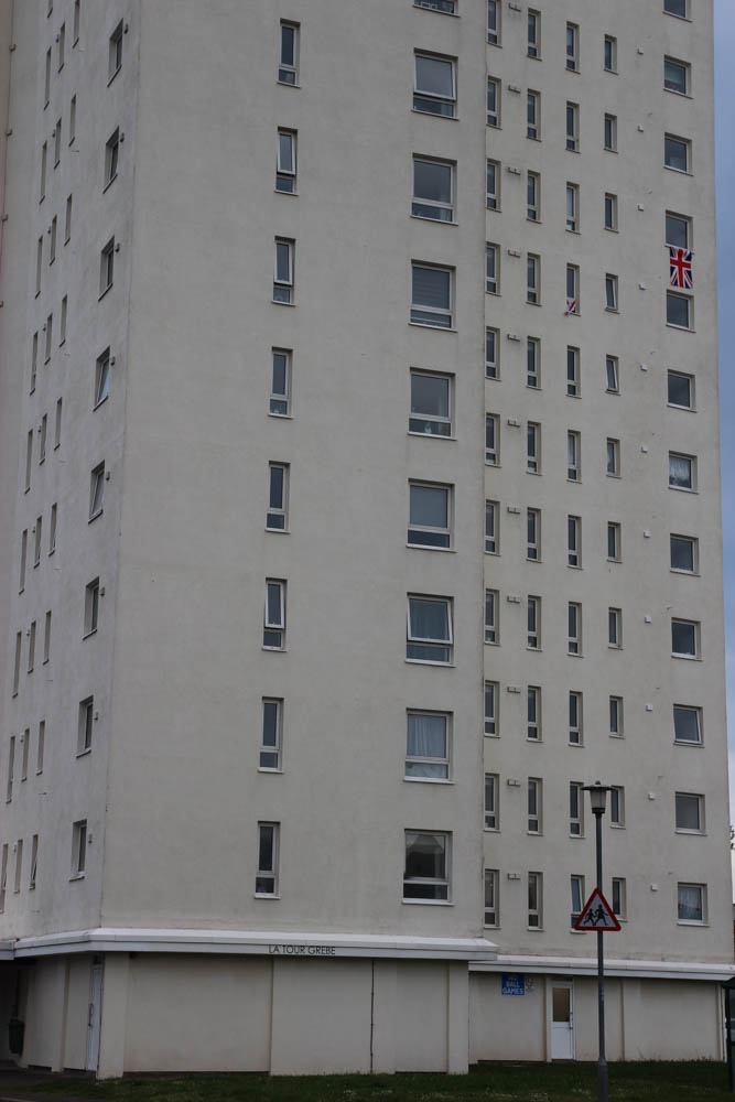
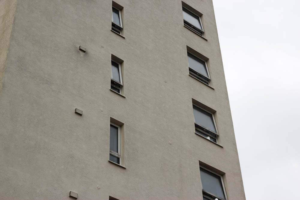
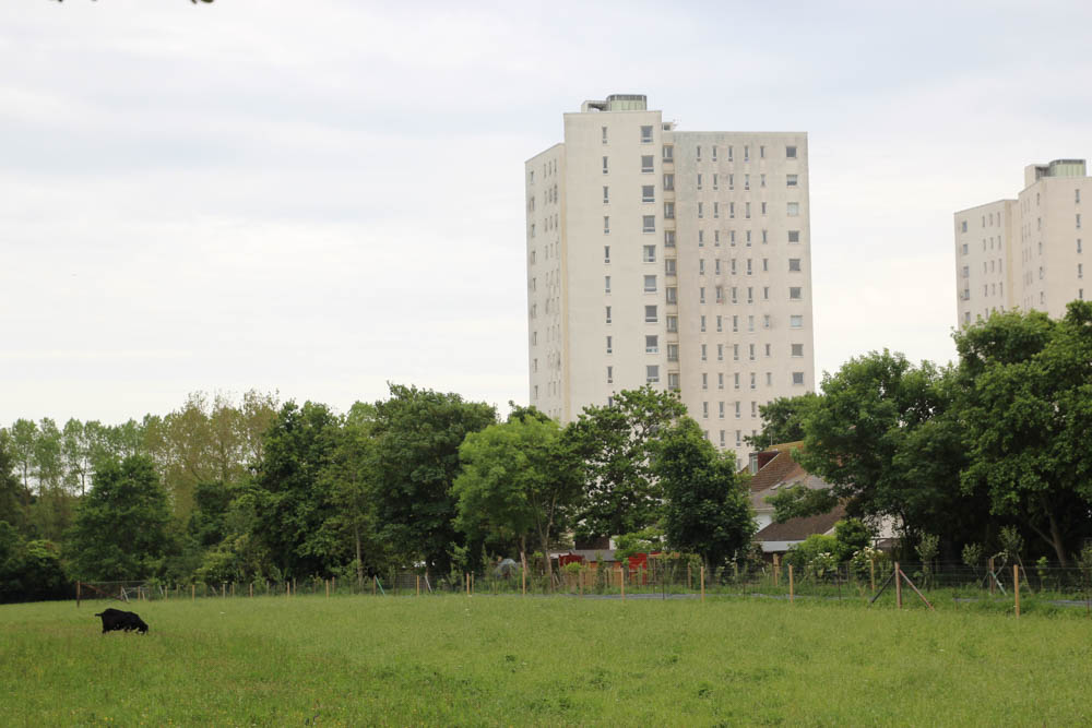
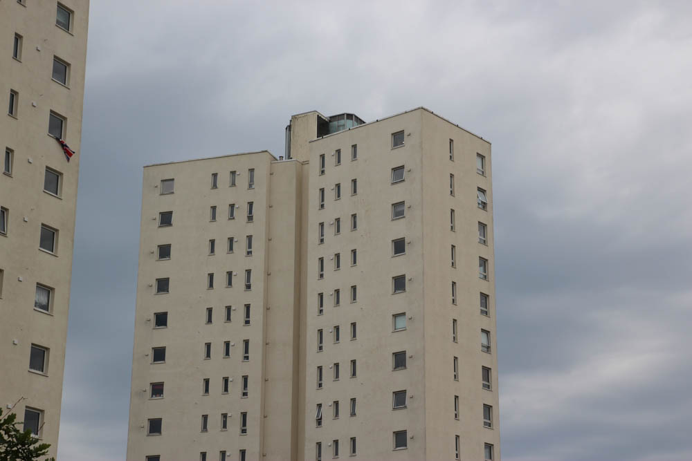
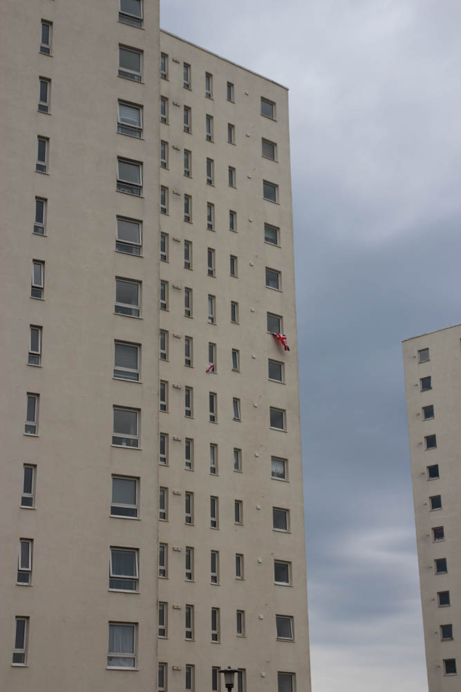
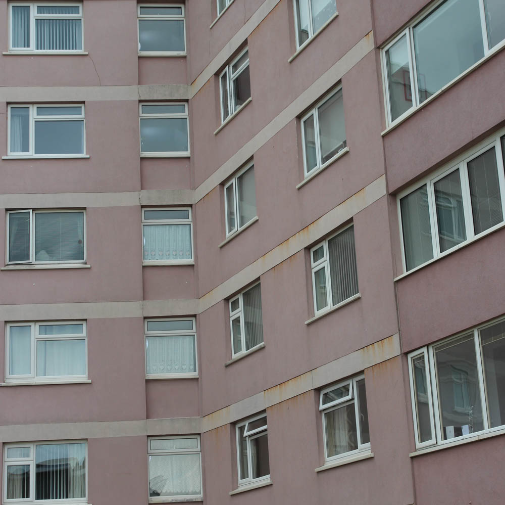
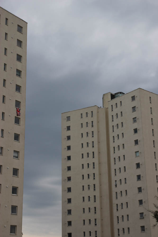
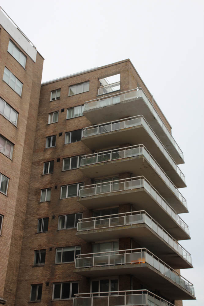
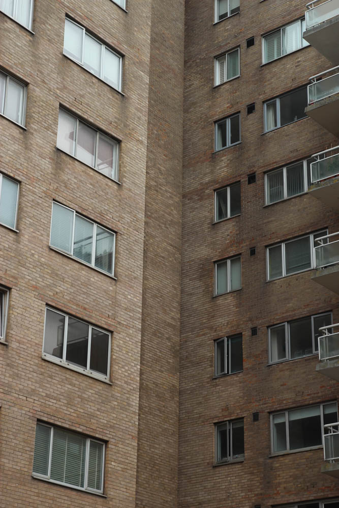
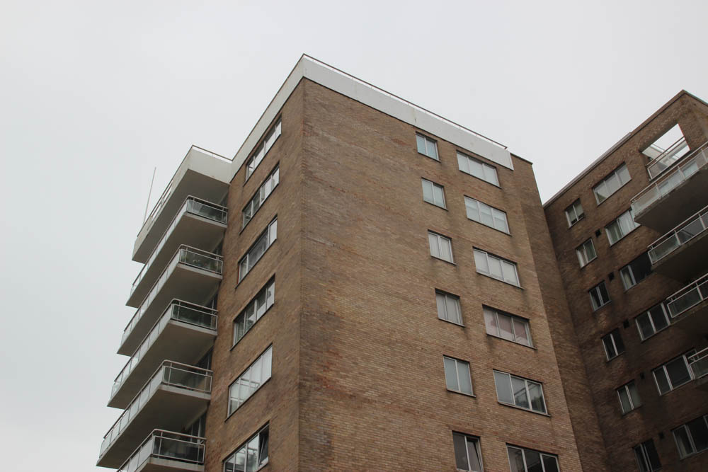
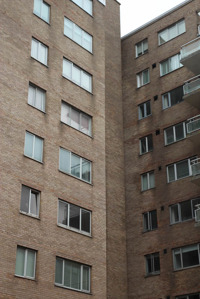
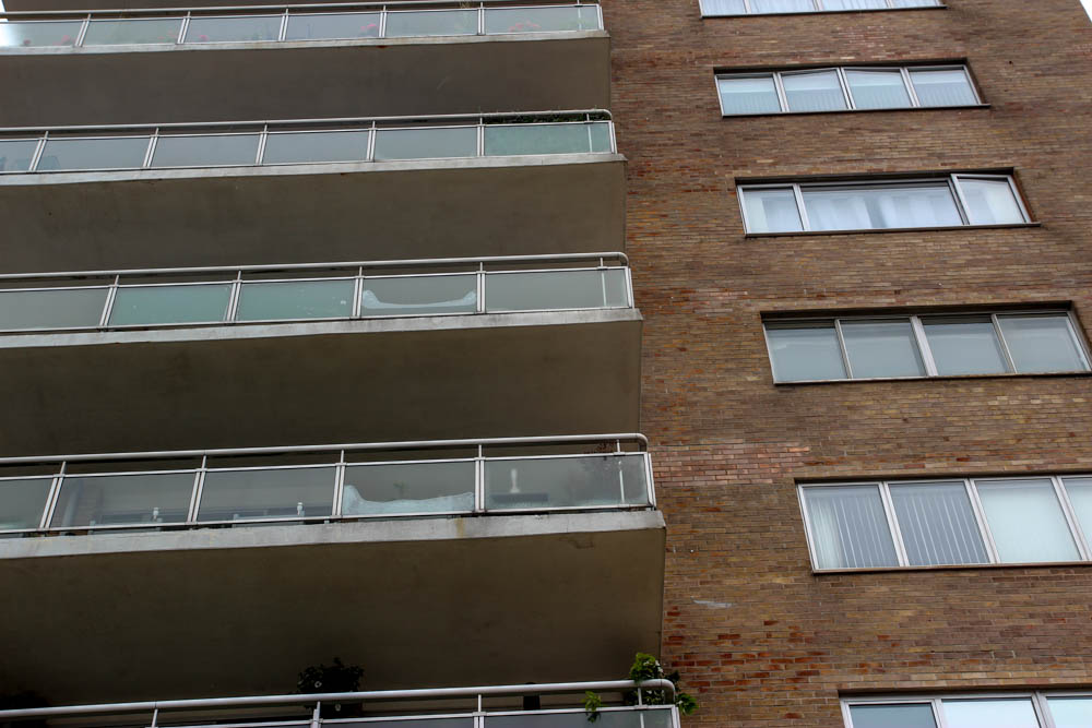
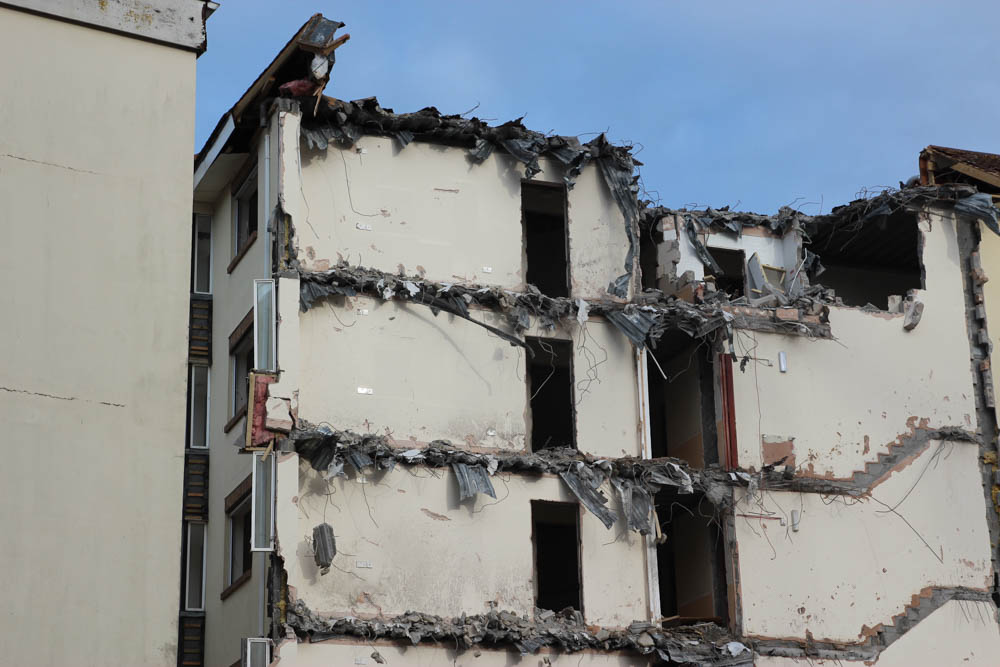
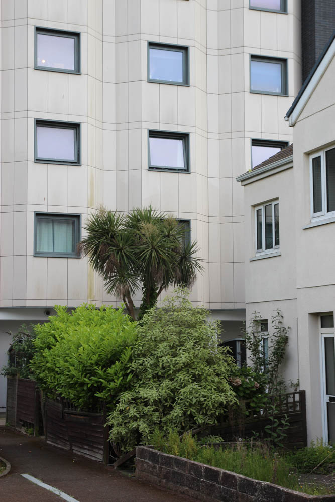
Below are my best images from my photoshoot of housing blocks/estates. I have separated them by location with a colour label within their folder.

Le Marais

My best images for this location were labelled with a blue colour label.

Marina Court

My images for this location were labelled with a yellow colour label.

The Cedars (next to the tunnel)

My images from this location were labelled with a purple colour label.

Shoot 2

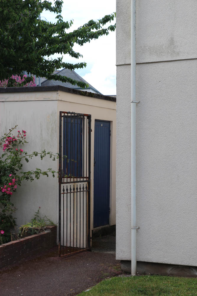
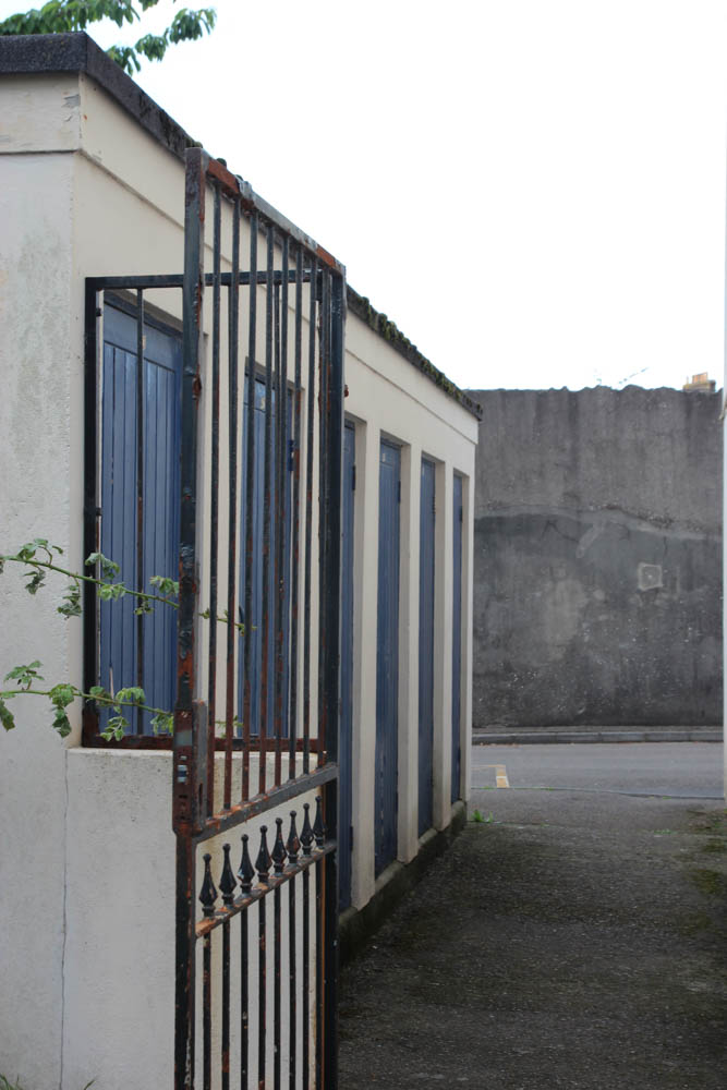
These are my best images from my second photoshoot of derelict and industrial buildings. My best images from this shoot were also colour labelled based on the type/location of image.

Ann Street Brewery

My best images are labelled green for this location.

Ann Street / housing

My best images are also labelled green for this location.

Department for Infrastructure Building

My best images are also labelled green for this location too.

Finance/ office buildings on the Esplanade

My best images are labelled red for this part of the photoshoot.

Shoot 3 – development of my previous two shoots

Images of specific housing and flats

Labelled blue in Lightroom.

Buildings

Labelled Green in Lightroom.

Warehouse

Labelled red in Lightroom.

Image Selection

Flag and Rating System

To help me narrow down which images I like out of the chunk that I have, I used the ‘flag’ tool on Lightroom which allows me to put little flags in the corners of the photos that I like the most. This helps me identify which photos I will consider editing and using as my final images. The next step that I will take to lessen the number of photos to choose from is to rate them which will allow me to pick the best photos to edit and have as my final images. To rank them there are five stars underneath each photo where you can put how good you think they are (5=very good, 1=Bad). For me, most of my final images are 4s and I improve them with editing whereas I don’t pick the photos rated 1 or 2 as they wouldn’t make it into the final edit. I enjoy using both these tools as they are quick and easy to use but still help when narrowing down photos.

Refined Image Selection

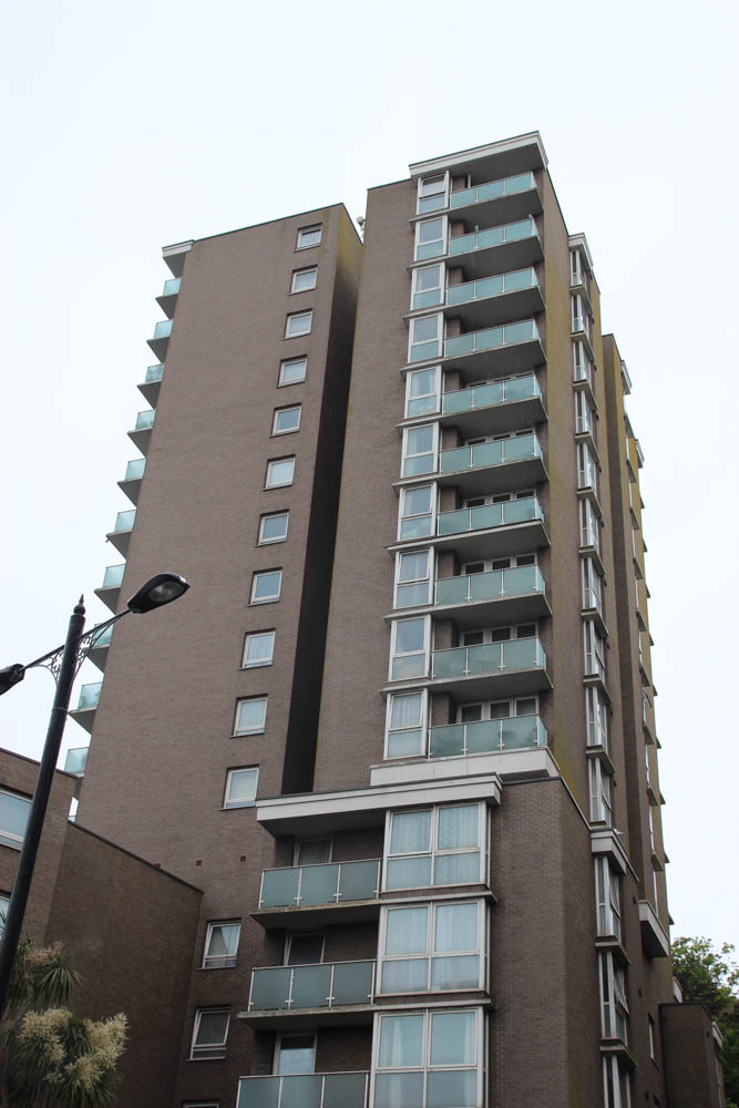
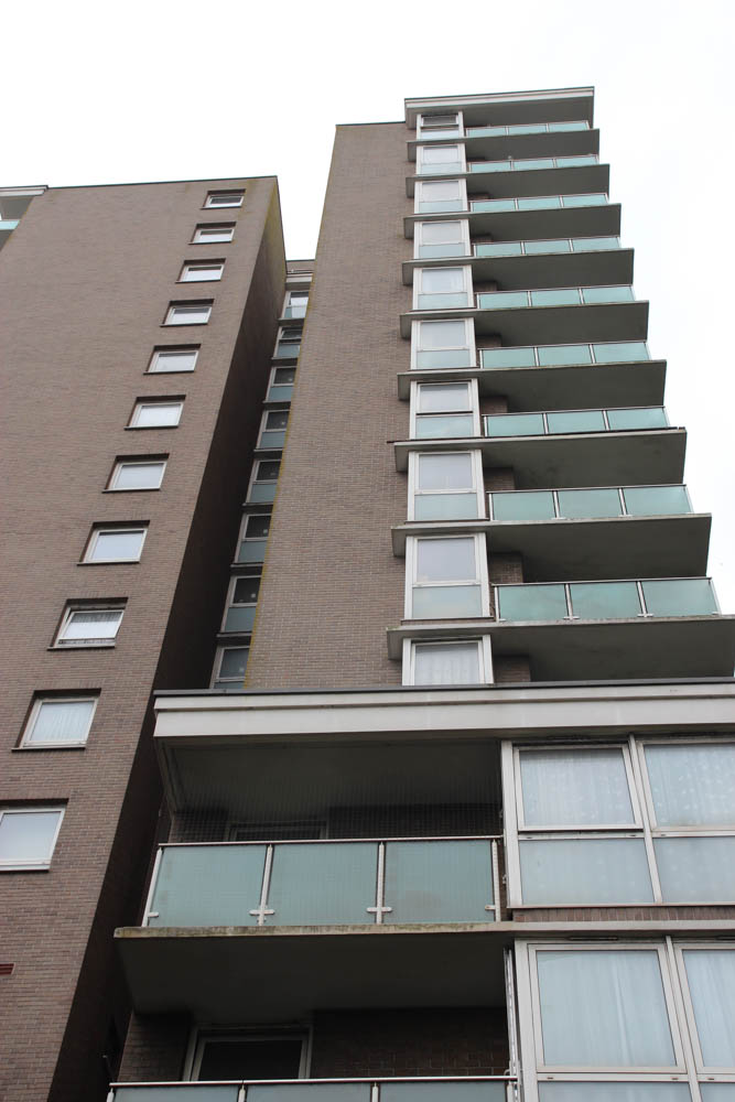
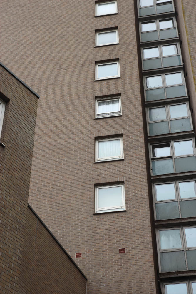
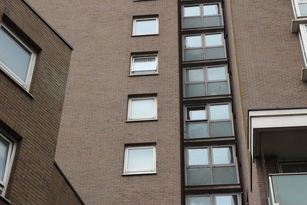
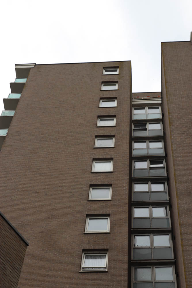
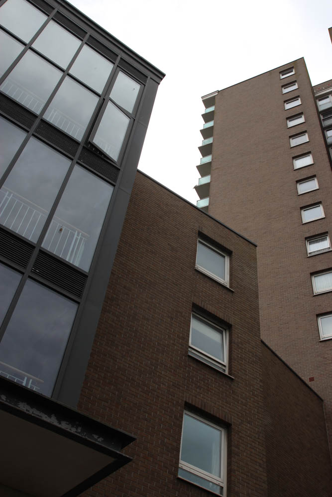
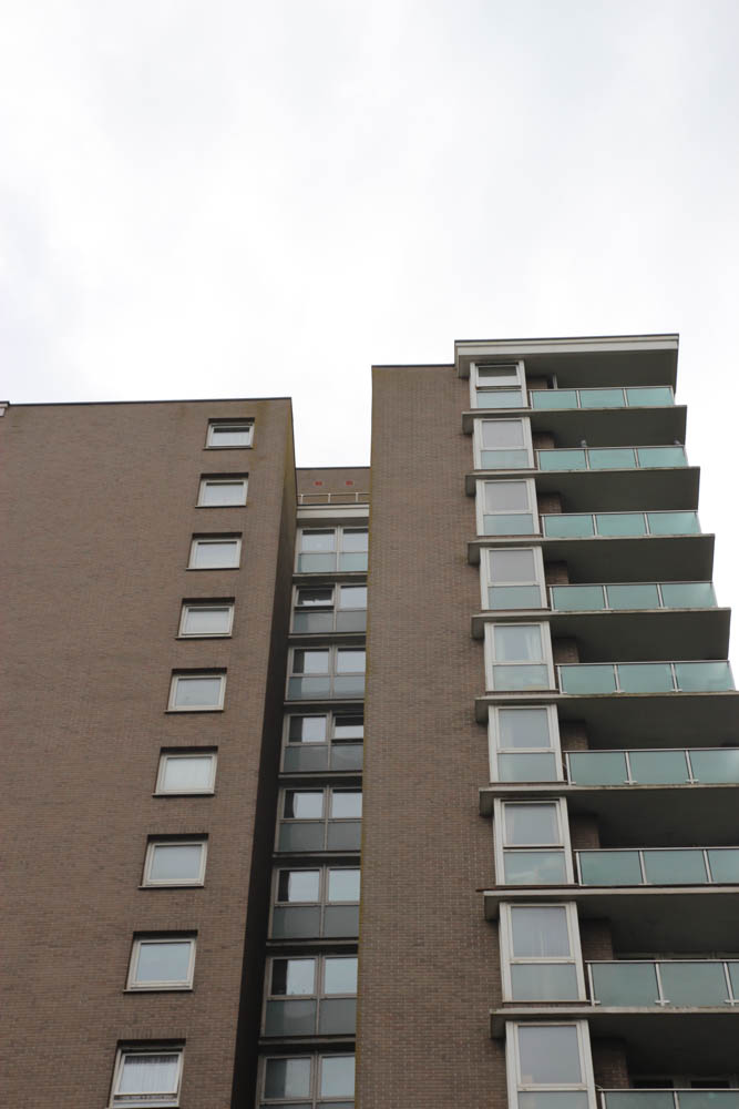
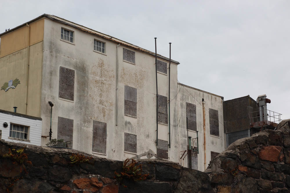
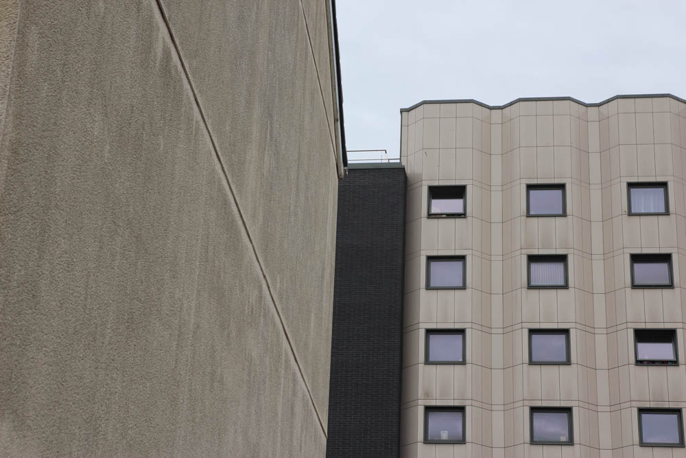
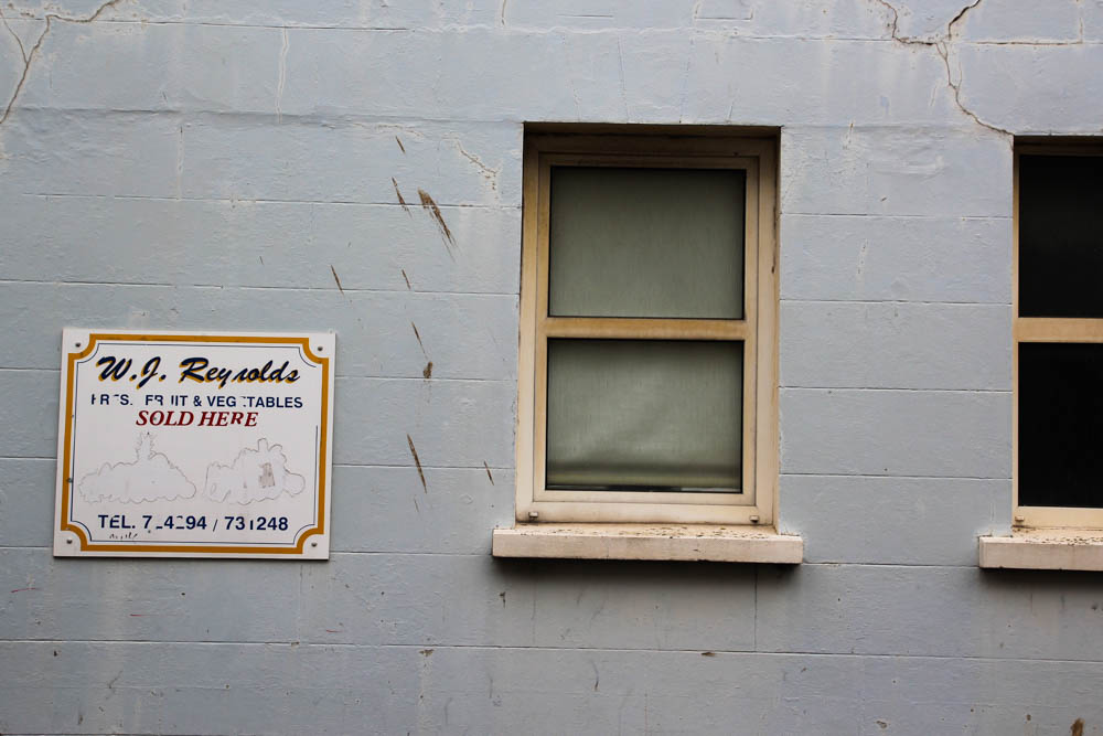
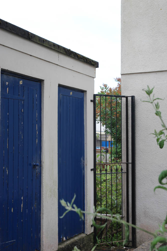
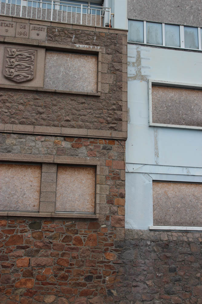
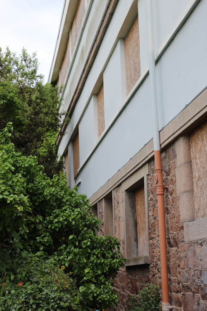
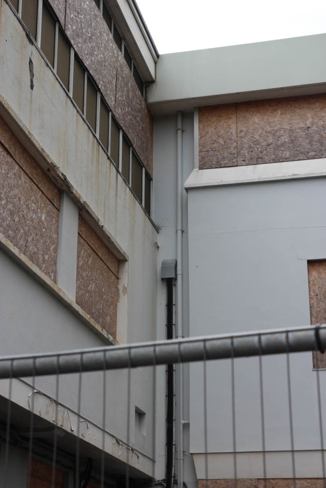
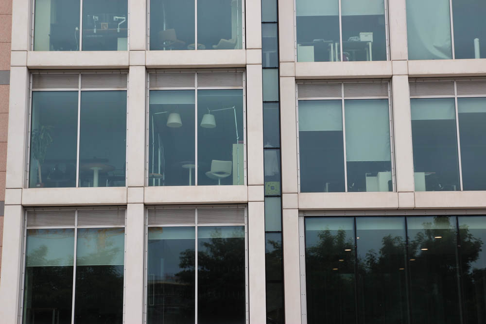
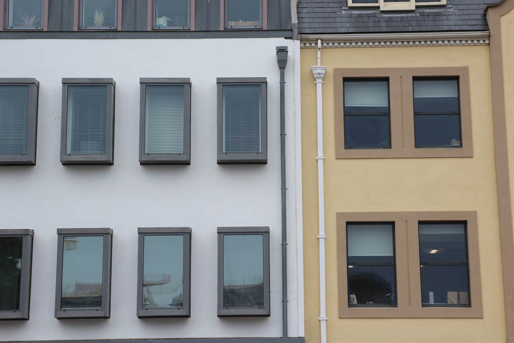
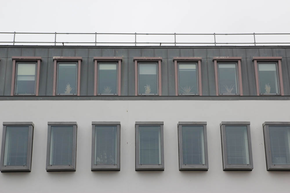
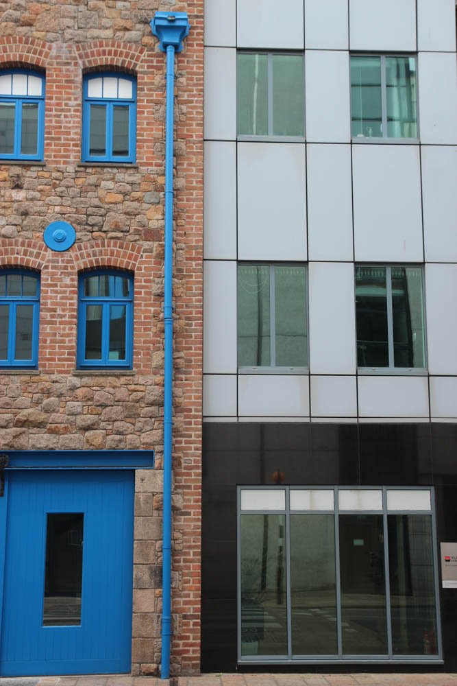
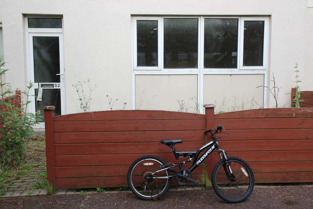
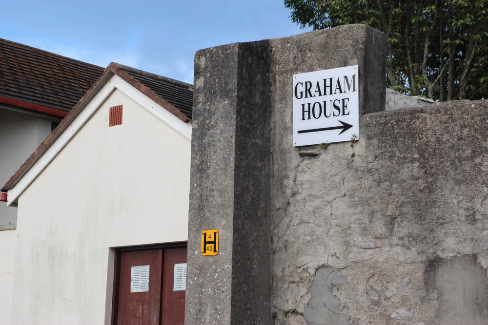
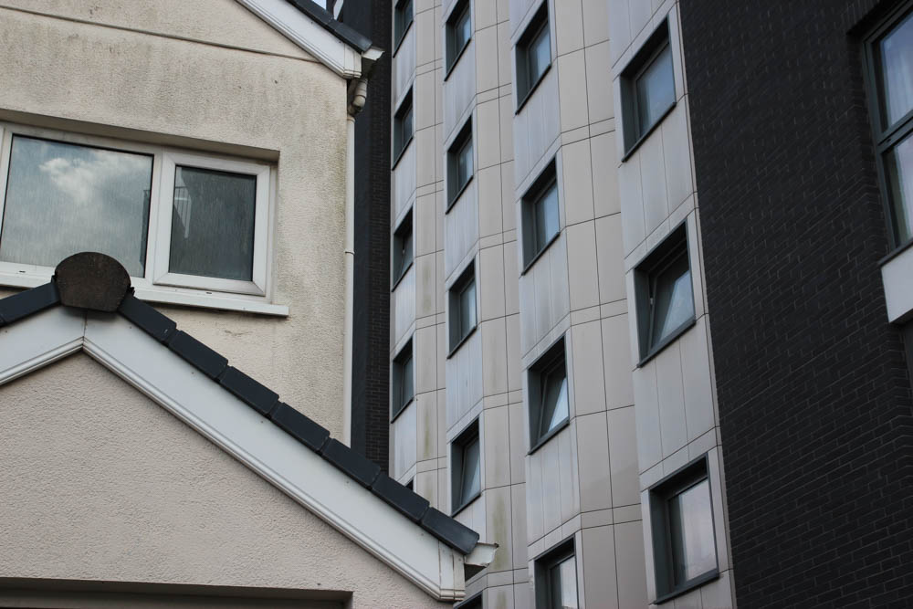
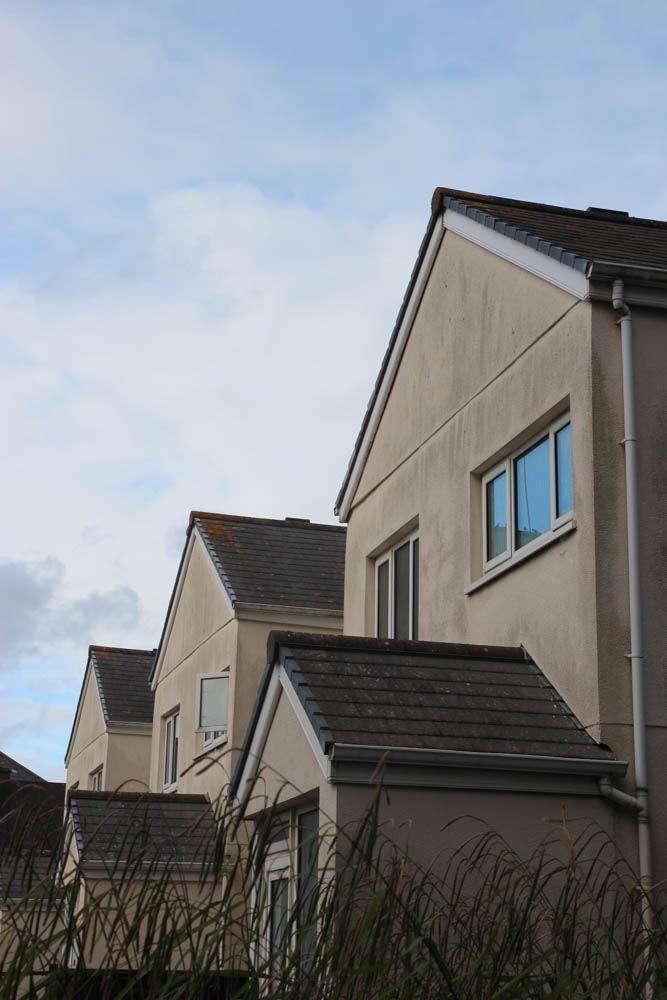
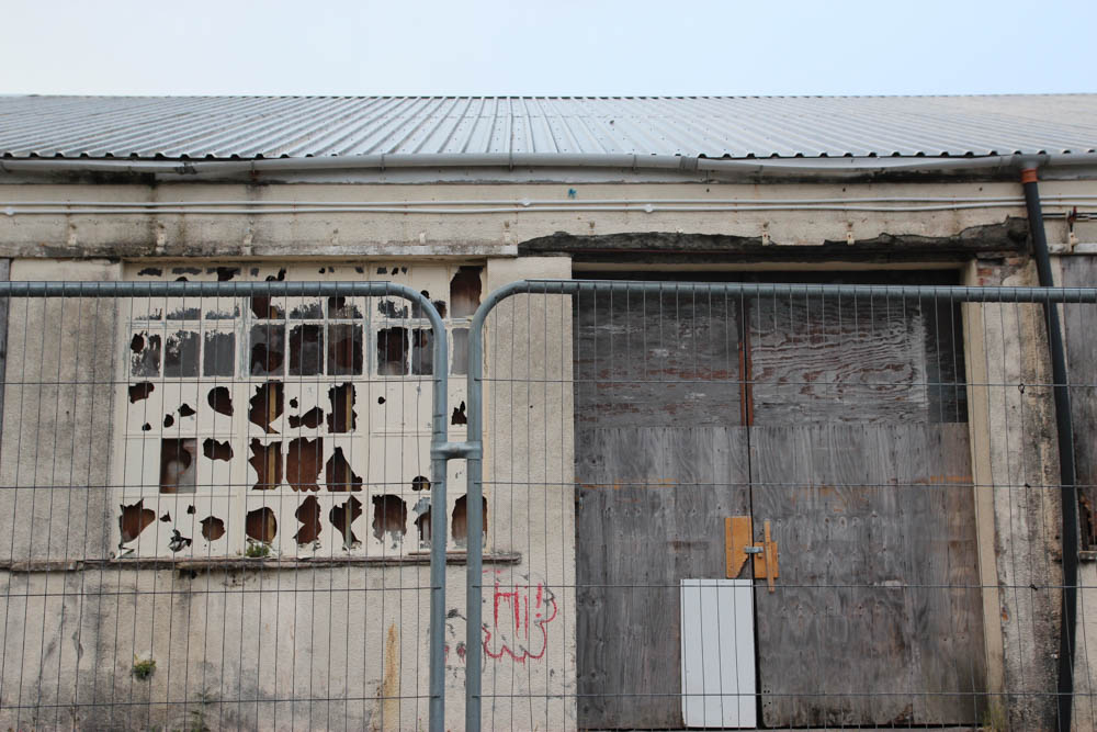
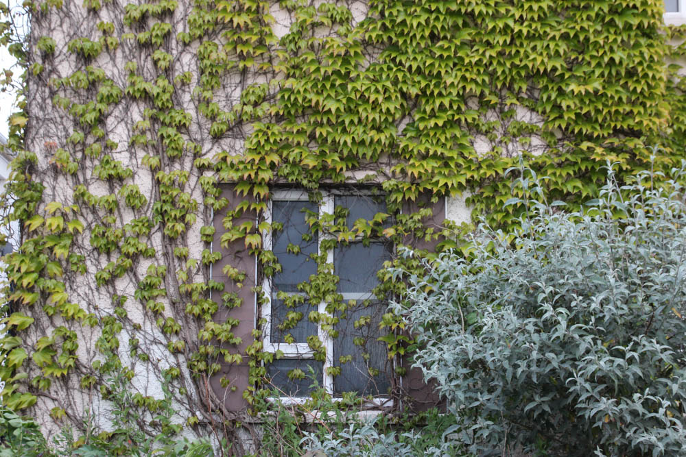
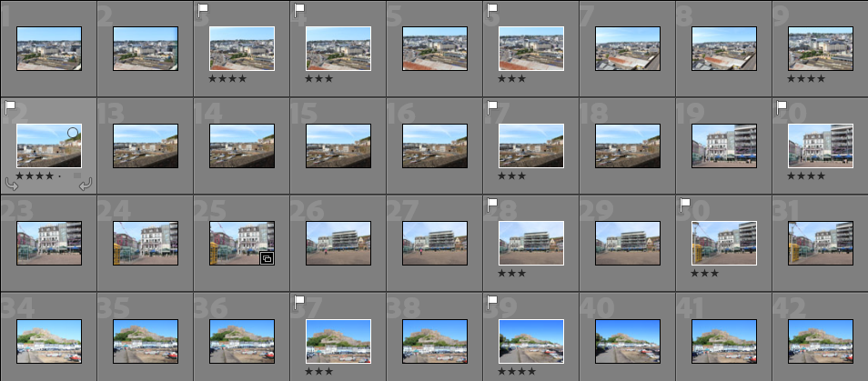
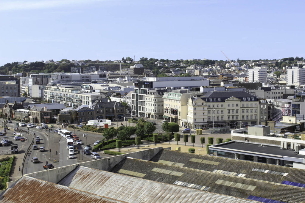
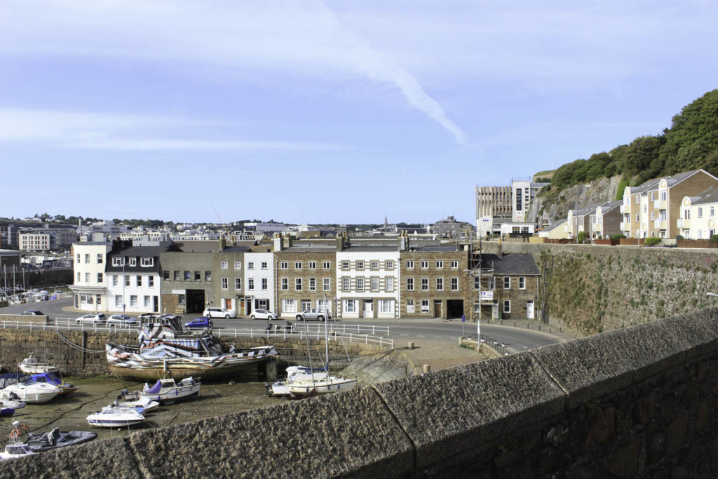
I have picked eight photos from my first photo shoot (2 of each place) that I think could be part of my final images. The photos were either taken with a wider angle so it shows more of its surroundings or they are more refined photos that only show the building/place. I wanted to try and get a very similar angle to the older photos that I have chosen to compare these to, but some were not accessible so I tried to get the closest I could while still trying to get a close replica of the old photo.

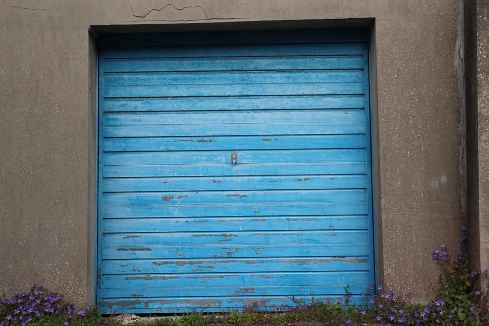
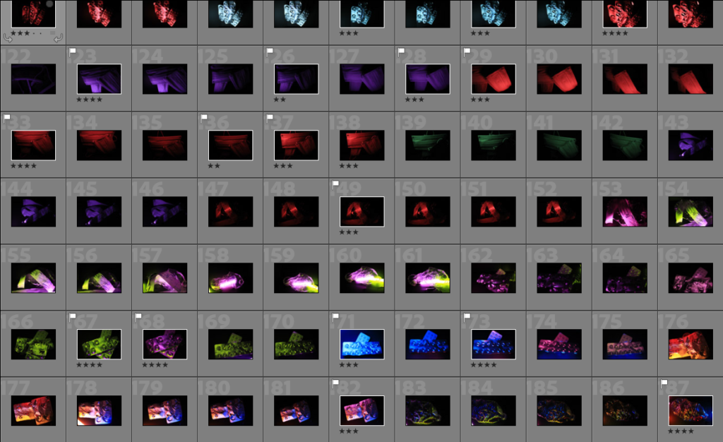
I have chosen ten photos from my second photoshoot that might be part of my final images after editing. I have tried to incorporate as many colours from the photoshoot to make a wide variety of photos and I have also tried to get a good amount of photos from each object so there aren’t loads of repeats of the same colour and object. Even though I have got a few photos of the medicine packaging I think with them being different textures and having them be taken at different angles it still gives me a wide range to work with while editing. In some of them, I have used two colours for one object because I used glow sticks, which has given me a new set of lighting for this phot-shoot.

P2 Anthropocene best shots and why

4 best shots I will use and why –

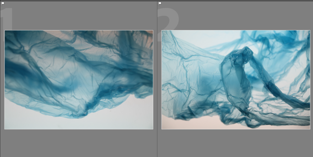
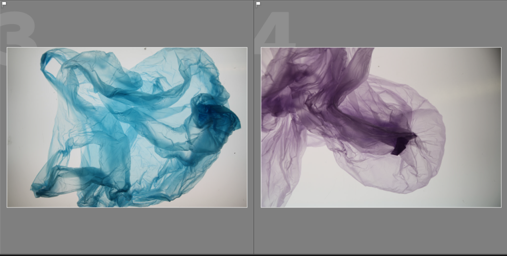
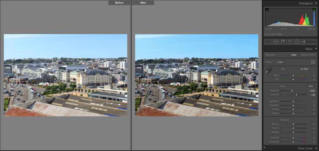
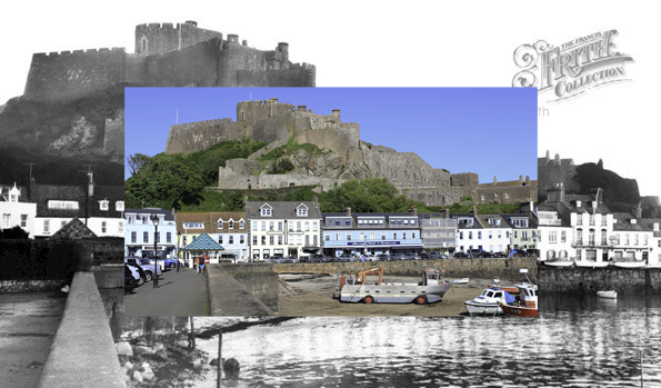
1 – I have chosen this photo to edit further in Adobe Lightroom because I think that it is a similar representation to an iceberg/glacier, which is similar to Naomi Whites work where she makes objects/places out of plastic bags in her work and then I will manipulate this further in photoshop through experimentation with other photographs and how it may work in different tones/filters.

2 – I chose this one because I like how the plastic bag looks as if it is floating underwater and the creases and folds gives it a texture of it being in the sea, which I really like as it can be seen as if it is a piece of debris floating around and I will experiment with this further through editing the tones, contrasts, lighting, etc and getting rid of any blemishes it might have from the lightbox.

3 – For this photo, I chose it because I think that it looks as if it is a jellyfish which is moving freely in the ocean due to the way the plastic bag has been positioned and I think that this is a good way to manipulate it with photos, from this photoshoot and the one before to show the harmful effects plastic debris has caused to the oceans. On photoshop I will also fine tune the smaller details from the lightbox where there may be marks on it or darker corners which I want to brighten up.

4 – For this photo, I think that it shares a similarity to number 3 with looking as if it is a jellyfish in the sea because of the way the plastic bag has formed around itself, in photoshop I want to experiment with layering these 2 images or more in various ways because I think that the 2 different colours could look effective together which I really like. I will also crop and brighten the photo to get rid of the darker edge which has happened due to the small surface area of the Lightbox which I was using.