Peter Mitchell
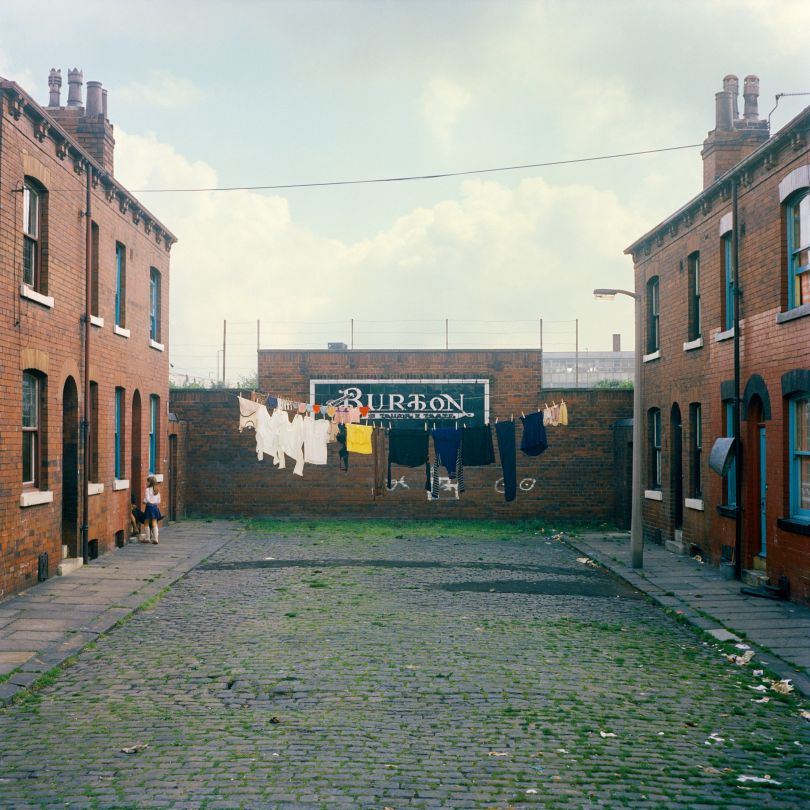
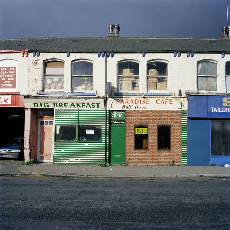
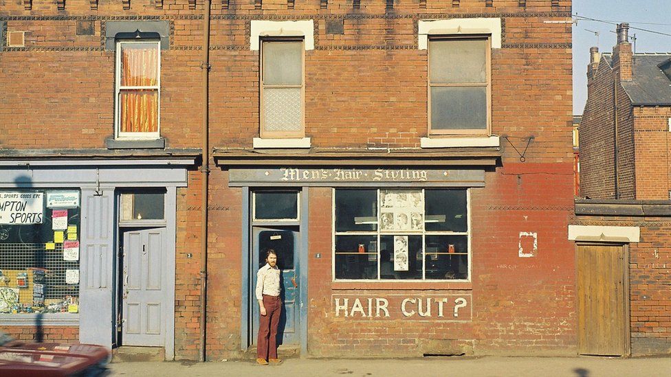
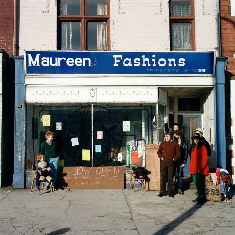
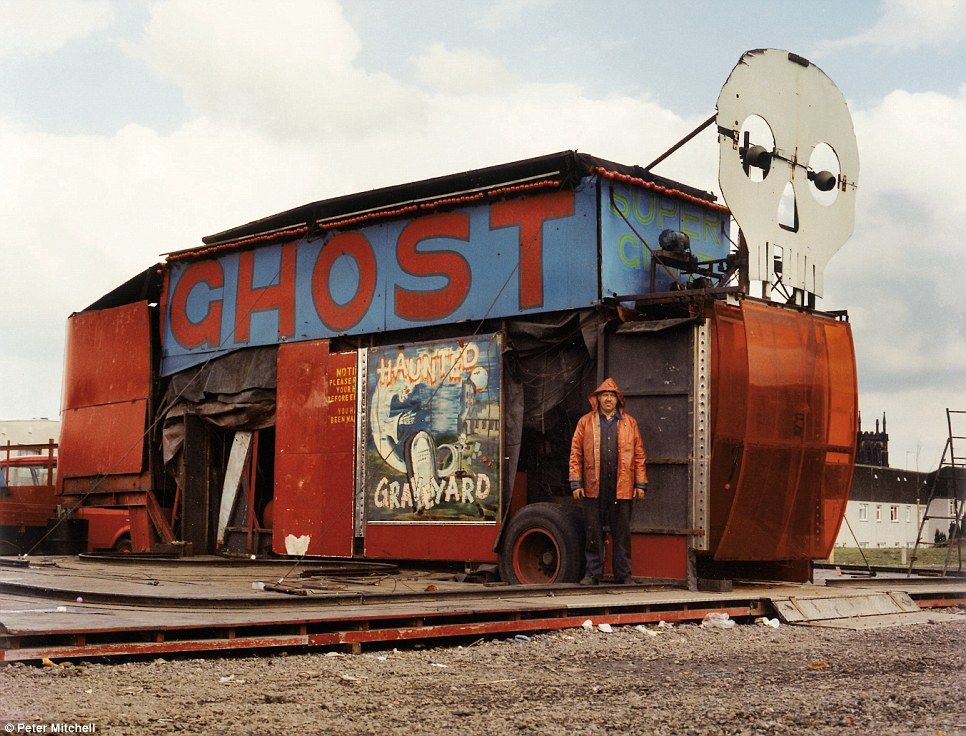
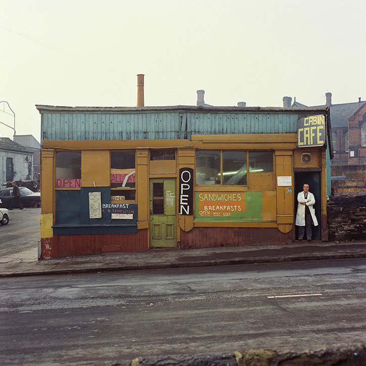
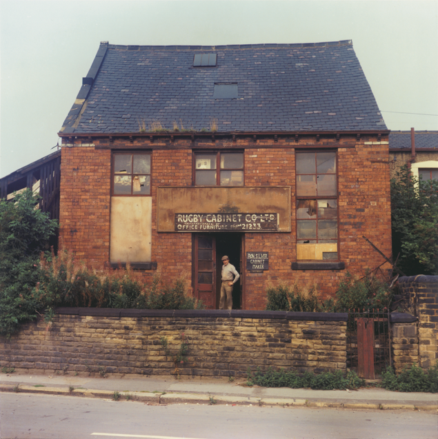
Peter Mitchell, born in 1943, has been quietly building a career for 40 years. Living and working in Leeds for much of his life, Mitchell treats his surrounding with a unique sense of care that is evident in his work. An essential part of the colour documentary scene in the 1970s and ‘80s, Mitchell’s landmark show A New Refutation of the Space Viking 4 Mission at Impressions Gallery in 1979 has had an immeasurable impact on contemporary photographic culture. Mitchell has never been a prolific publisher of work; 1990’s Memento Mori examined the dramatic impact of the Quarry Hill redevelopment project in Leeds and his long overdue monograph, Strangely Familiar, published in 2013, features formal portraits of Leed’s people and their places of work. Mitchell’s latest work, Some Thing means Everything to Somebody, is an eccentric autobiography told through inanimate objects silently observed by scarecrows. By pairing an intensely personal collection with the symbolic ‘Everyman’, Mitchell has produced something that is not only autobiographical but the representation of what a lifetime can mean.
“It is as if Peter Mitchell has taken the atmosphere and mood of Edward Hopper’s famous painting and established it as a matter of documentary fact in the north of England at a moment when collapse can lead to further desolation or possible renewal. So these beautiful pictures are drily drenched in history – social, economic and photographic.”
– Geoff Dyer
Strangely Familiar
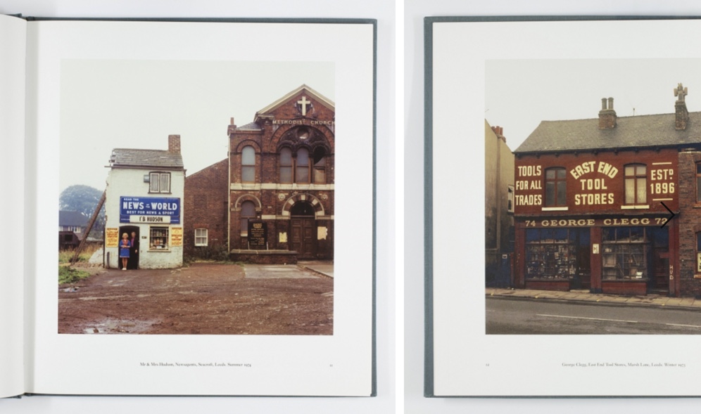
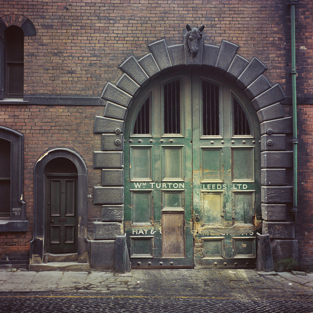
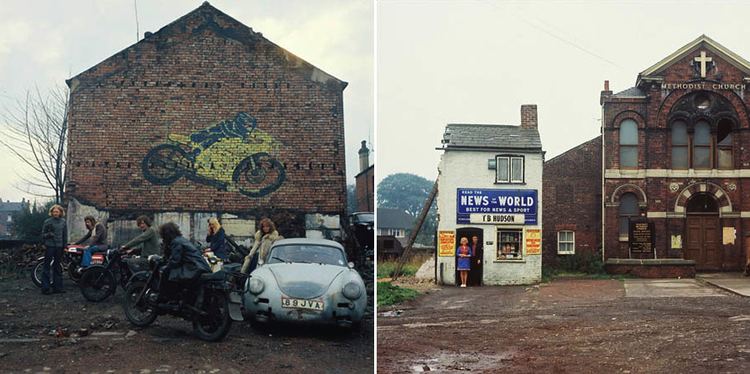
In the 1970s, Mitchell was working as a truck driver in the English city of Leeds, and he photographed the city during his rounds. This work depicts the factories and small shop owners of Leeds, all photographed in a very formal manner with the aid of a stepladder.
In 1979, the photographs were shown at Mitchell’s one-person exhibition at Impressions Gallery in York; this was the first landmark color photography exhibition in the UK. The work was later included in the seminal exhibition ‘How We Are: Photographing Britain’ at Tate Britain in 2007. Strangely Familiar presents 47 color plates, beautifully printed on matt paper and playing off of the artist’s accompanying texts. The book opens with an introduction by Martin Parr.
Early Sunday Morning
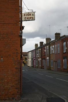
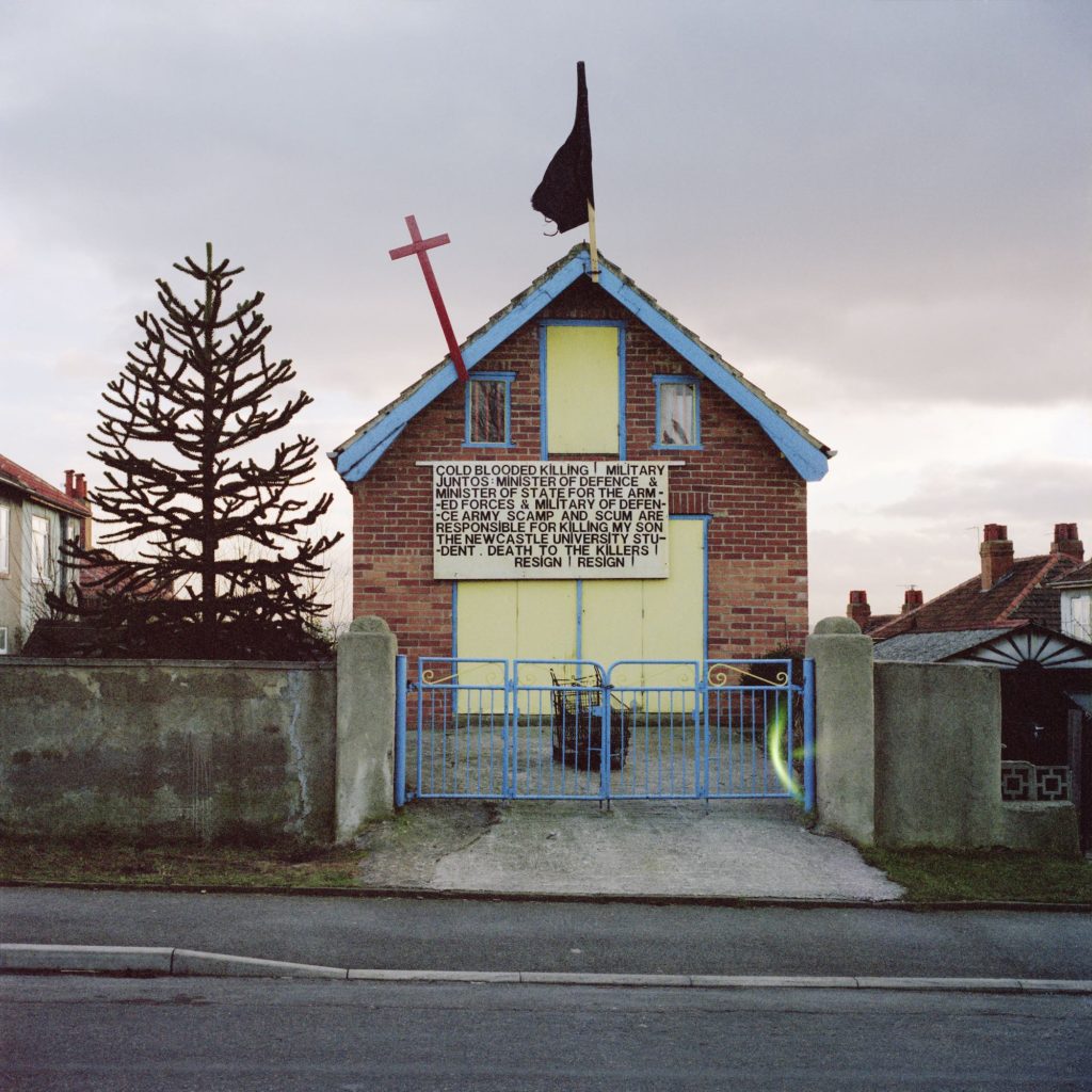
Early Sunday Morning, edited and sequenced by John Myers, shows a different Leeds to Mitchell’s earlier publications. It is neither the sombre look at destruction seen in Memento Mori, nor the detached view of ‘the man from mars’ of A New Refutation of the Viking 4 Space Mission, but a more intimate document of Mitchell’s own Leeds.
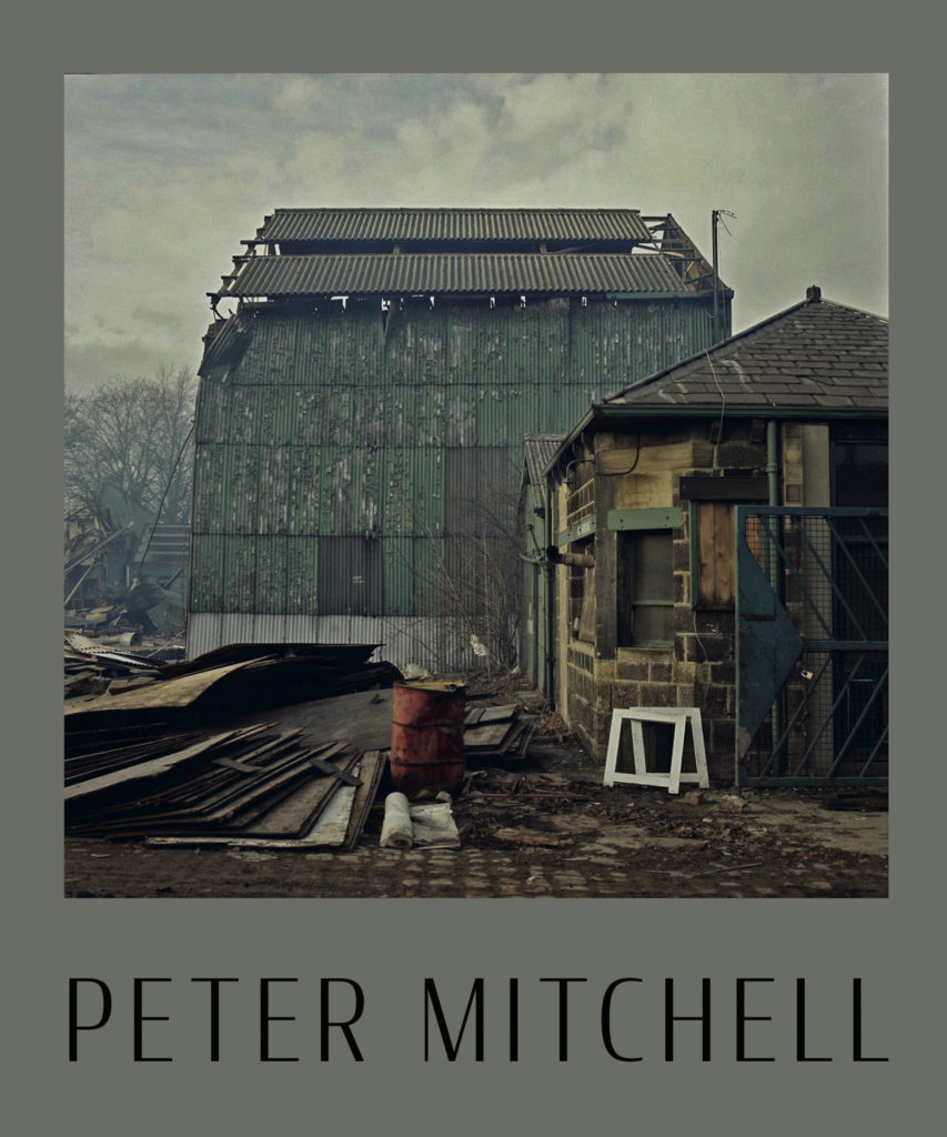
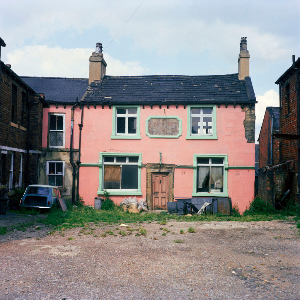
The book reveals the layers of the city’s history, exposed by the changes to the urban landscape that epitomised the 1970s and 80s. Hundred-year-old terraces and cobbled streets sit flanked by concrete flats, with newly cleared ground to either side are presented with Mitchell’s typical graphic framing.
Link to my work
Peter Mitchell’s work links to my project as I plan to photograph the mundane, in a documentary style, just like Peter Mitchell. I plan to photograph normal, everyday parts of Jersey that are overlooked by the government
Sharon O’Neill
Founder Sharon O’Neill is a lens-based artist and curator. Her work and research explore the ordinary world through which the fabric and details of a place or community are revealed. Her work has a strong emphasis on collaboration, particularly with the development and research of archives, both familial and historical and with curating. Sharon has a Master’s Degree in Photography from the University of Brighton and has exhibited nationally as part of an emerging talent exhibition entitled ‘Into View’ with her work being showcased in national and international media.
In 2015 she was shortlisted for the Photo London & Magnum Photos Graduate Photographers Award. In 2016 she received Arts Council funding to bring together a major exhibition Blueprint for Living that was featured as part of the 2016 London Festival of Architecture and supported by RIBA. Alongside her photographic work, Sharon has also spent the majority of her career as a Photo Editor for national newspapers and magazines in which she has commissioned, researched, curated and produced many bodies of work and archives and has extensive knowledge and contacts within the world of photography, journalism and the arts.
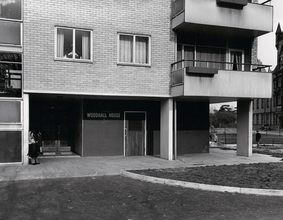
The ‘flats’ collection
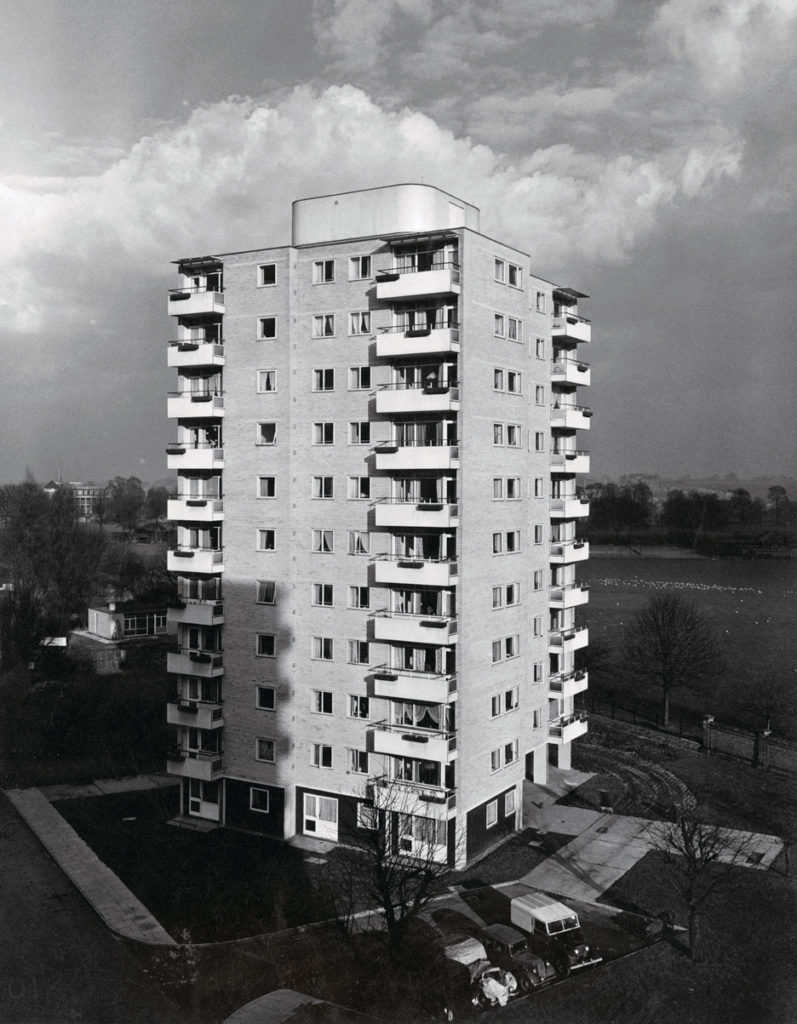
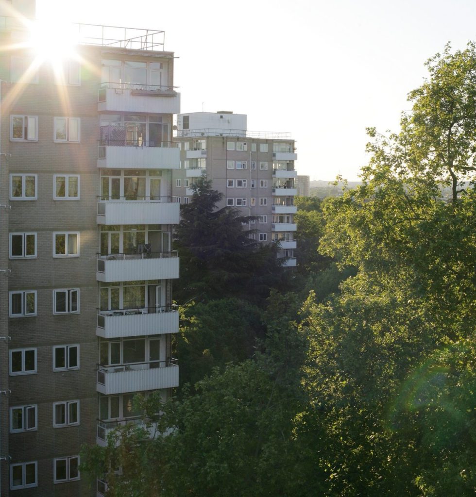
Part of London County Council’s massive post-war house building programme to provide needed homes for working-class families, the five blocks on The Fitzhugh Estate in Wandsworth were designed by Sir John Leslie Martin, principal architect of the Royal Festival Hall, and completed in 1956.
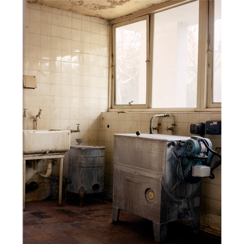
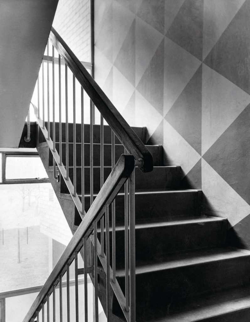
Through her research and with archive and contemporary photographs, she explores Martin’s themes of modernism, environmentalism and the ‘power’ of a well-designed home to improve everyday life, as demonstrated in his writing and books from the 1930s and the flats built in the 1950s and asks: ‘Has the power of his ideas stood the test of time as the current residents live in the future of his 1930s vision and are there anything we can learn as we begin to emerge from our ‘lockdown’ world?’
Link to my work
60 years after John Leslie Martin completed the Fitzhugh Estate in London, photographer Sharon O’Neill visited to see if the project lived up to its promises. This housing estate was, in post-war Britain, considered a very desirable place to live. – Sharon, 60 years later, went back to the same estate to document how the flats were in the more modern-day. When she went back to photograph, these flats had become an “undesirable” place to live. This was because, in the 1980s, the dismantling of the council housing in the UK began. I want to comment on the “undesirability” in my images, and I like the comparison element of Sharon O’neill’s images. This is why I have chosen to photograph places such as De Quetteville Court, the old (and new) flats which have been replaced with newer, more ‘desirable’ housing. This is not the same comparison, but I am drawing my inspiration for a lot of my project from Sharon O’neill’s work on comparing two pieces of opinion/time.
https://www.dezeen.com/2016/06/19/blueprint-for-living-sharon-oneill-photography-post-war-housing-estate-london-festival-architecture/ – a link to an article about this collection.
Collage Artists
Laura Romero
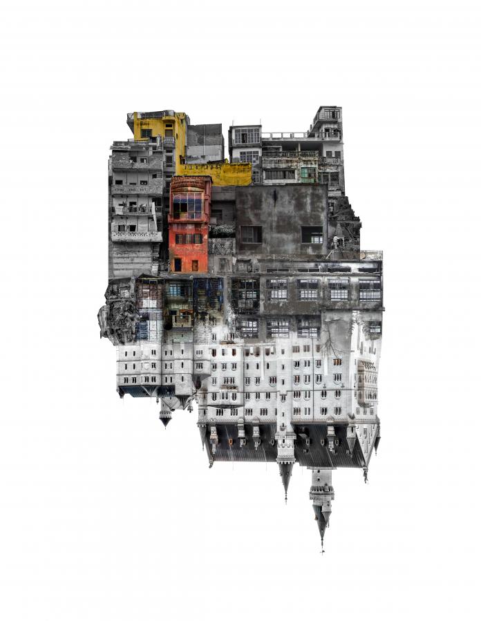
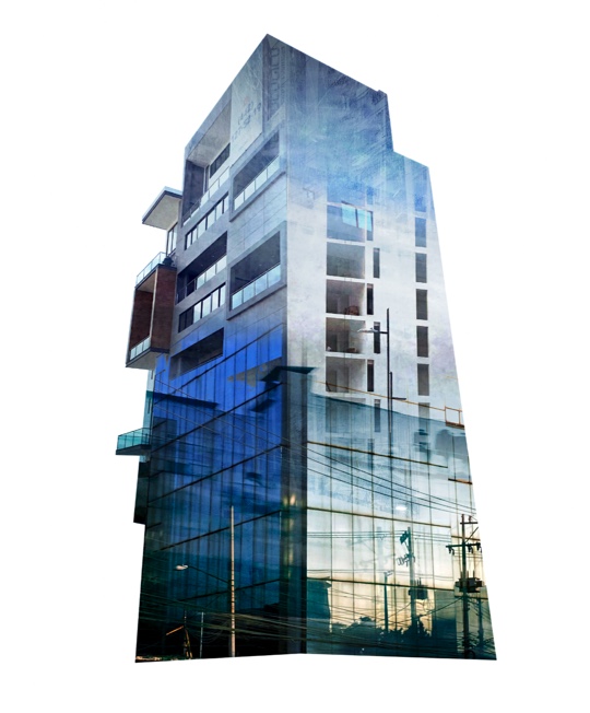
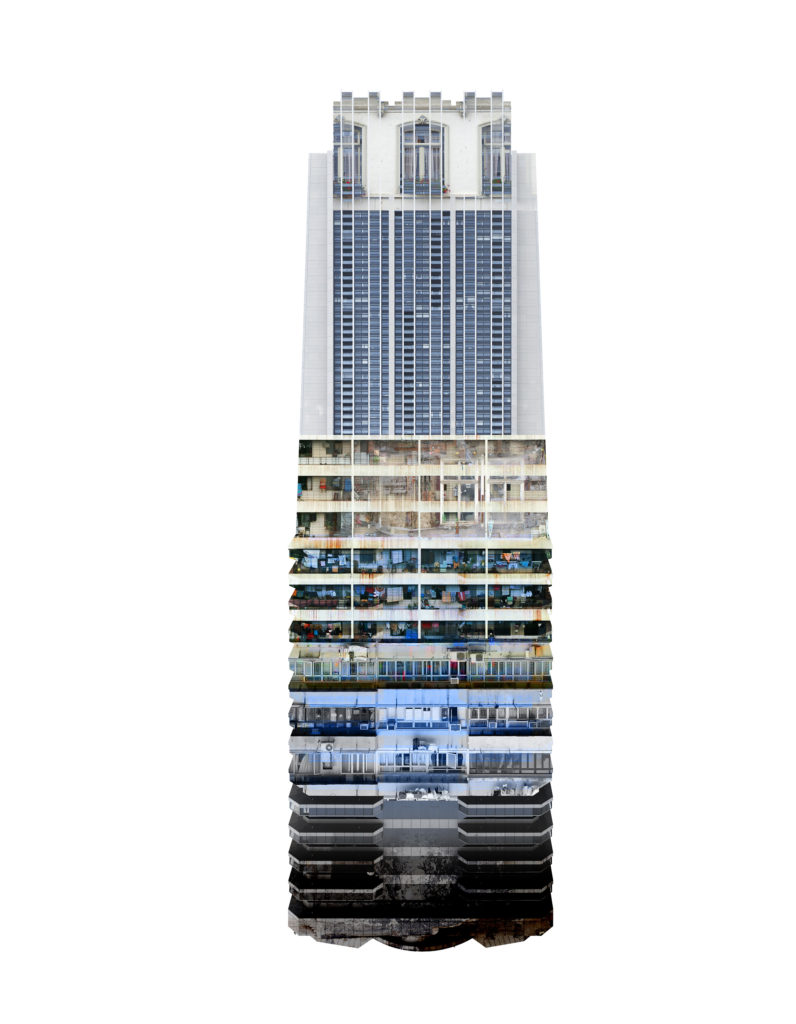
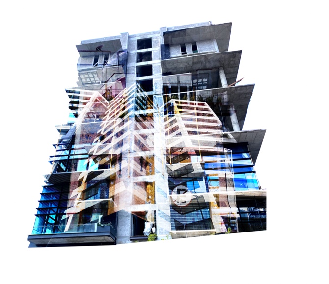
Laura Romero is a Spanish artist and photographer, who was born in Madrid in 1976. She now lives in Mexico, where she explores her home environment and surroundings. She began as an artist at 11 with oil paints and drawing. She studied fine arts at University and says in an interview that this was something she always wanted to dedicate herself to, but to combine it with design. She considers her work to be very intimate, as she tells a story with her images about everyday life and everyday experiences. She intends to provoke the audience to take a second closer look at ordinary things that generally go unnoticed.
Her international participation has been outstanding, appearing in art fairs from Hamburg to Istanbul, Madrid, and Paris, among others. Both her individual and her collective work have been exhibited around the world.
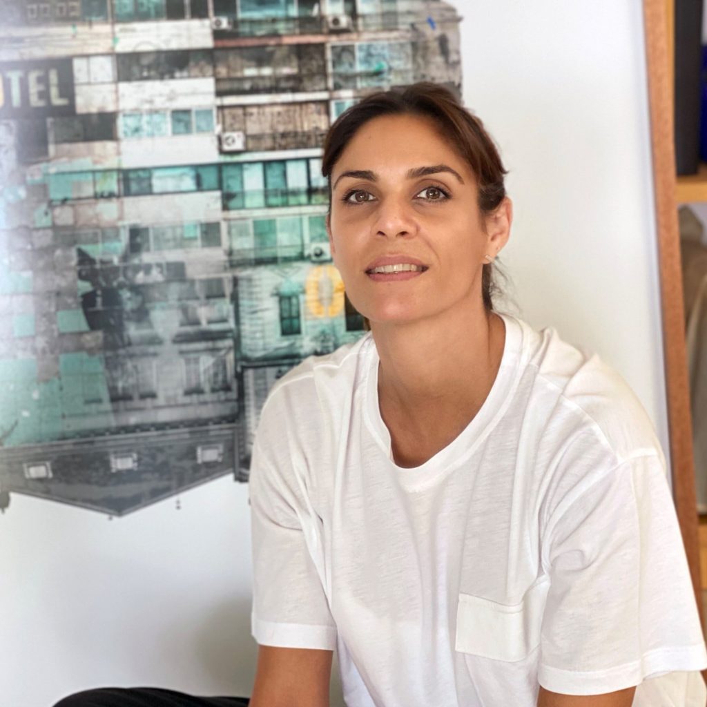
“I consider my work to be quite intimate. Under the scope of my own experiences, I elaborate a story about everyday life, I expose situations we all face day to day. My intention is to bait the audience into taking a second, closer, look; it is an invitation to reflect on everything that goes by in our journey unnoticed.”

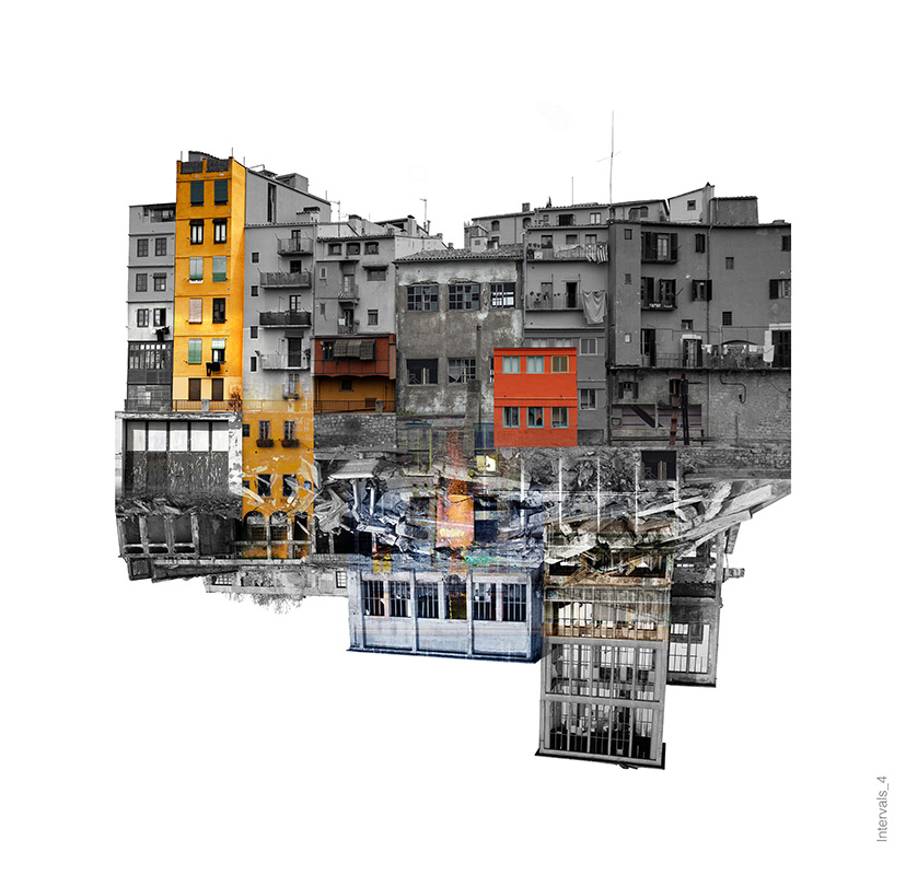
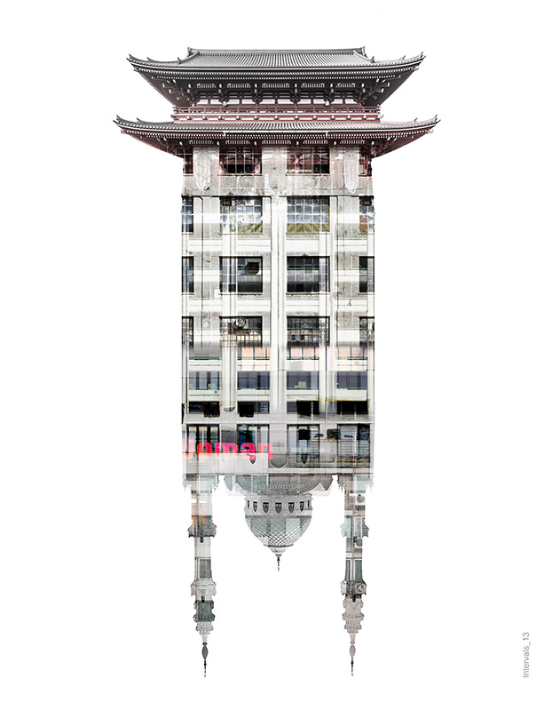
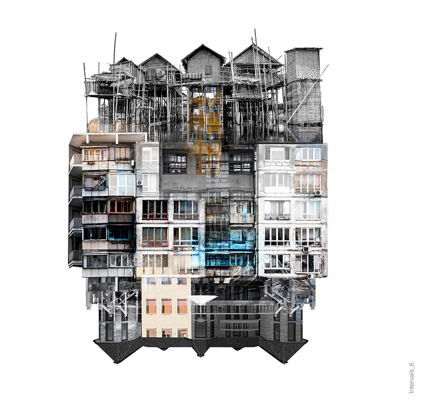
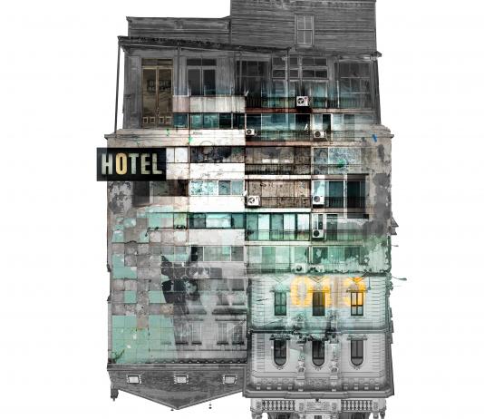
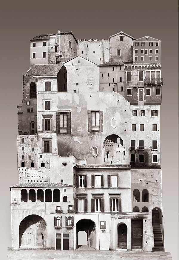
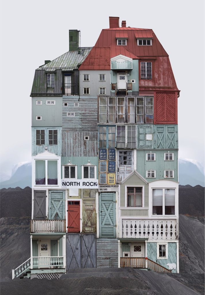
This image is part of Laura’s collection titled “Intervals”. The tones in this image were mostly muted, but with areas of brighter colours, for example, the bottom of the image to the right of the image, with the bright yellow and blue tones. This blue tone is seen throughout the image also, for example, lower down on the left of the building, and on the top right. These areas create natural links – leading lines in the image. The eye is drawn first of all to the top right, then down to the left, as the hotel sign is the biggest focal point in the image. It is then drawn from each corner slowly back and forth down to the bottom of the image. The white background of the image causes the outlines of the buildings that have been collaged together to stand out, which highlights the irregular shape and layout of the image’s composition. The use of different windows in this image creates a sense of repetition, even if they are all combined from different buildings. With the idea of combining multiple different buildings and placing them on top of each other using multi-exposure effects, the image links to a sense of clutter and overcrowding in this environment, therefore linking it to Anthropocene.
Intervals
https://www.altiba9.com/artist-interviews/laura-romero-digital-photographic-art – a link to an interview with Laura Romero.
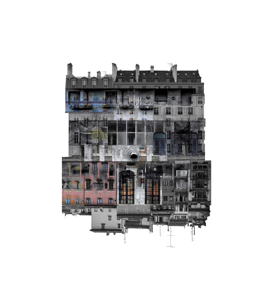
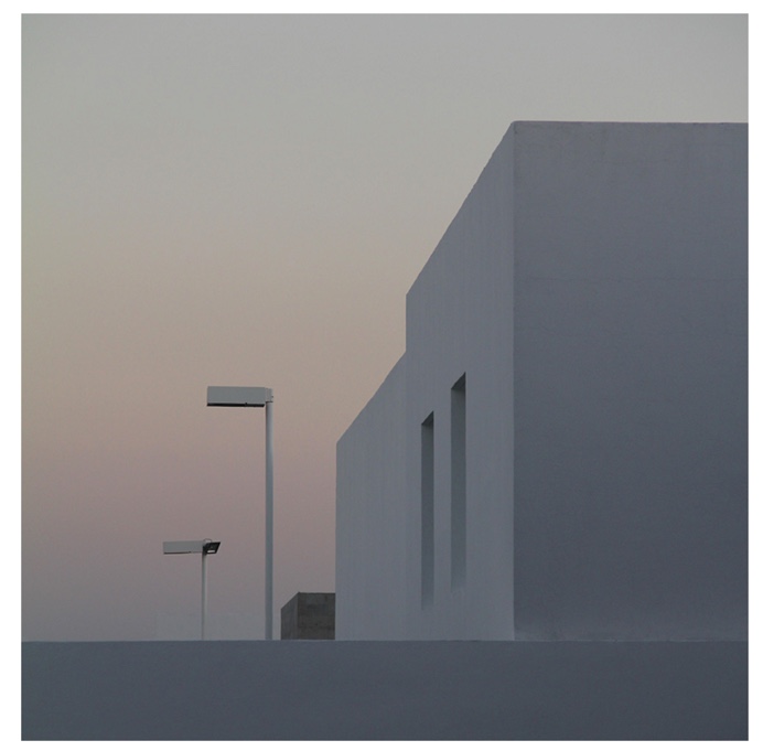
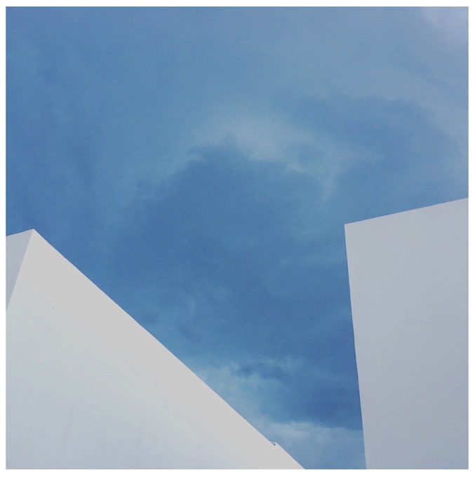
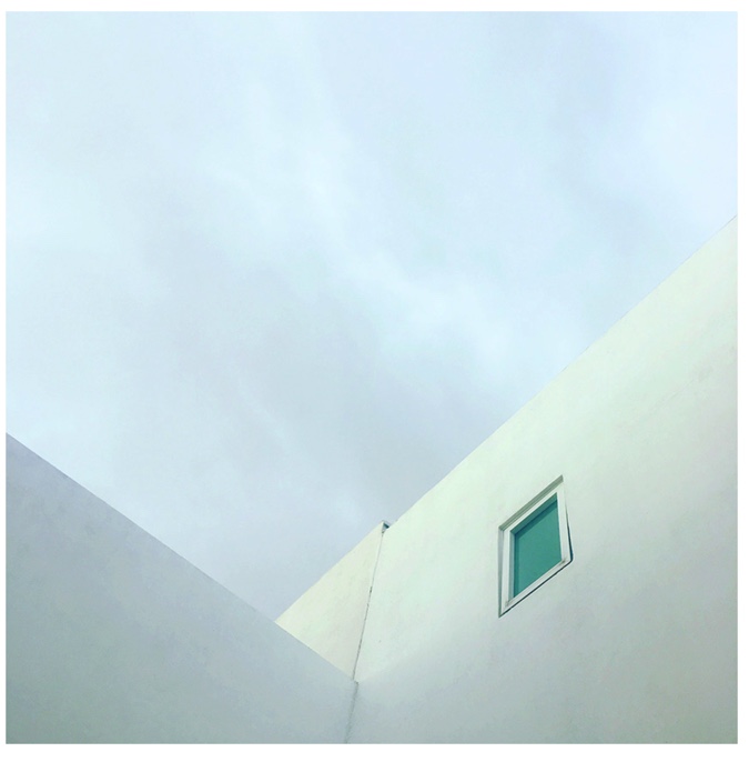
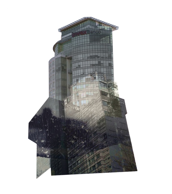
The images I plan to use of Laura Romero as my inspiration is from the “Intervals” collection. Laura has been working with her city for a long while. She likes to “question” the territory in which she lives, and through her works, she builds “a new identity”. The cities she works with represent a part of her own identity and the identity of those around her. In her collages, she attempts the reframe and remake the facades of buildings, and society in a way.
Habitual Scenarios
The work in Scenarios (Mexico 2016-2018) is a journey to the inner self, an exercise of introspection that emerges from change. In this work, the artist Laura Romero explores her form of space under the scope of the diverse scenarios and places she walks every day. It is through this look that she accomplishes formulate an adaptation that identifies her with the place where she dwells, thus personalising them –and making it possible for the scenario to speak on her behalf.
A memory of space and a time
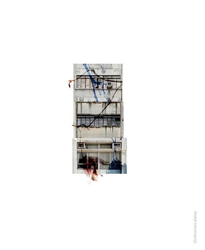
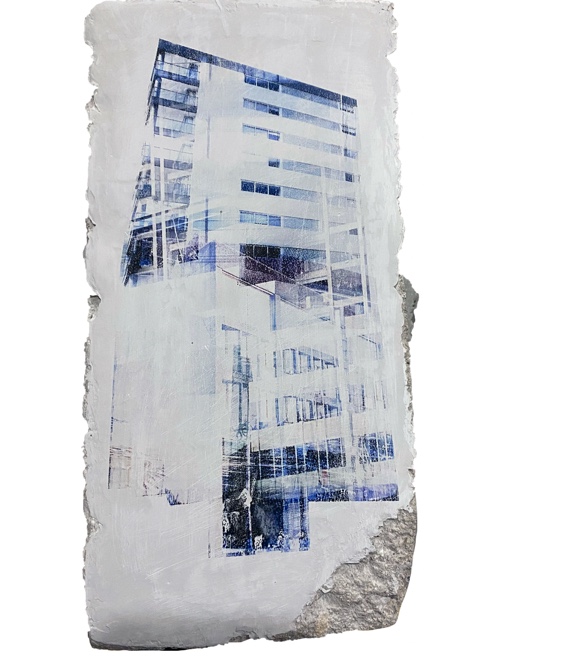
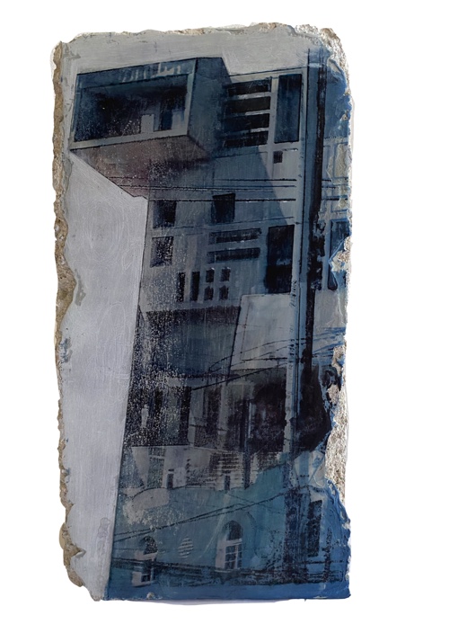
In this collection, Laura placed different buildings onto each other, with some being put onto concrete – this shows the theme of looking more closely at everyday buildings once more, which is also shown in the Intervals collection. The memory of space and time collection will also influence my work as I think it links closely with the other collection, and I like how it features the theme of altered landscapes.
Anastasia Savinova
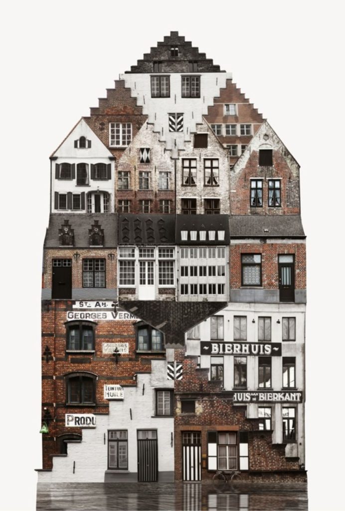
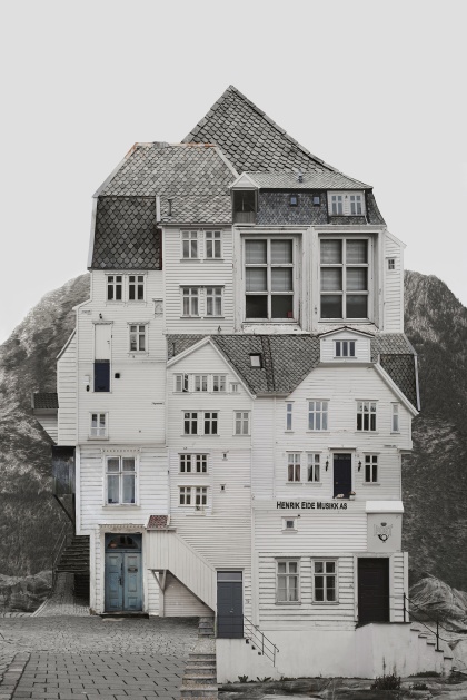
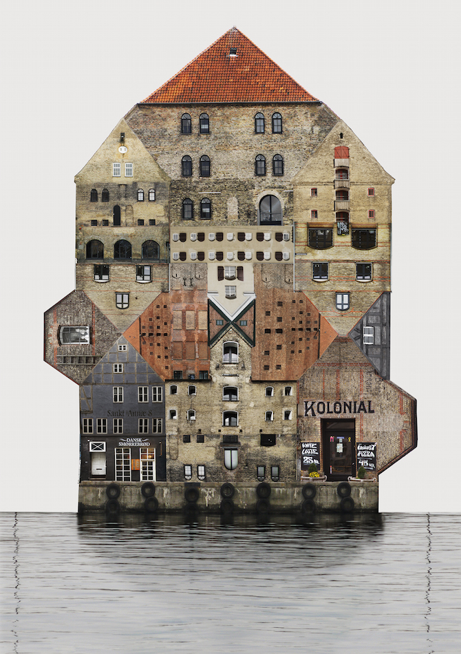
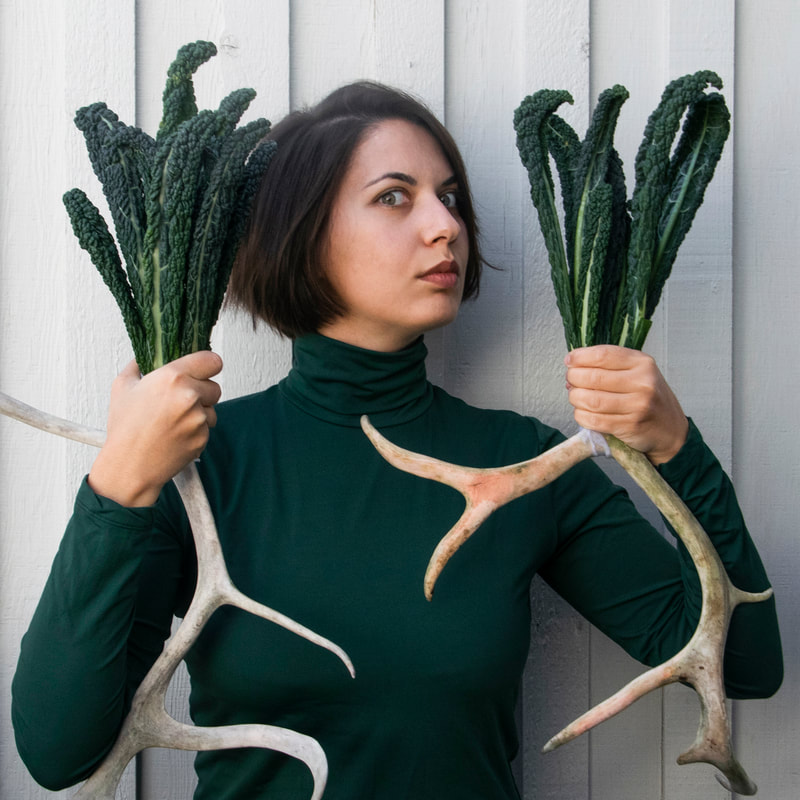
Russian born artist Anastasia Savinova is now based in Sweden creating architectural masterpieces through digital processing. The artist’s work is constantly circling juxtapositions; the house and nature, walking to find new landscapes and digital rendering to create the images, the documented photographs processed together to make something unnatural.

She describes her work in an interview –” In my practice, I work with different media: photography, drawing, rubbing, video, sound, performance, found object, text and sculpture and so on. I love the flexibility of this. There is always room for experiment and play. I truly admire artists who can focus on something specific, let’s say printmaking, and work with it the entire life and improve and learn every single aspect of this. I’m myself never clear with definitions. There is a lot of fun and spontaneity, but also some challenges in that, of course. One day I want to dance and the next day I want to make sculptures. It happens that sometimes I don’t get done either and get frustrated. But I “trust the journey” and want to keep this flexibility and naïve curiosity.”
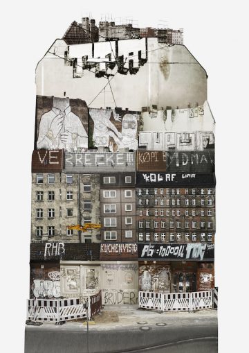
Genius Loci
Genius Loci is a journey to a multitude of places, urban and rural, inhabited and people less, accessible and secluded. The project explores the character and the spirit of the place. Each work is a visual archive, where one picture concentrates the essence and the feeling of a visited site. Streets and mountain passes encounter on the road and off-road are a rich source of visual information such as form, colour and texture; at the same time, all the encountered environments contain something incorporeal.
Ancient Romans believed that every place has a protective spirit – genius loci; in contemporary usage, genius loci refers to a location’s specific atmosphere and the way it is experienced. Each work is composed of numerous photographs of buildings and landscape forms that are authentic for a studied area. These works balance documentary and fiction, factual and imaginary spaces, and become keepers of the memory and the spirit of the Place.
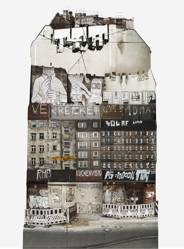
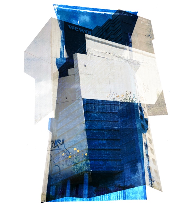
This image is in the Genius Loci collection, compiled from images of Berlin. This image has lots of brown and grey tones, maybe symbolising the darker aspects of the city – Anastasia does this by photographing the unseen parts of cities, and the backs of buildings. There is a sense of repetition in the image, with all the different types of rectangular shapes in the windows – as well as the overall shape of the image with creates contrast – the bright white background helps the image itself to stand out more. There is a use of perspective in these images – some buildings are very large for example in the middle of the image to the right. However, at the top of the image, there are smaller buildings that are minuscule in comparison to the others. I think that the focal points within this image are the bits of graffiti, which contrast with the rest of the colours in the image with their bright white lettering.
Sideway encounters
https://vimeo.com/anastasiasavinova – a link to Anastasia’s Vimeo page, where she posts videos of her art and video work.
Sideway Encounters part of the project focuses on places in-between: sheds and barns and other constructions, discovered during long road trips, at times abandoned and ruined, secretly hidden outside the towns or solemnly standing in the middle of nowhere, lost in vast fields of grass or dusty roadsides, juxtaposed with powerful nature.
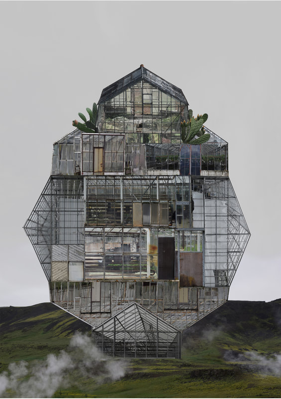
Sometimes these constructions are found side by side with animals, which often seem to be the only rulers out there. These large-scale collages visualize a particular atmosphere, the breath of these poetic and enigmatic “in-between” places. Roadless Encounters pictures places, where no road reaches, one can only get there by walking for days: mountain refuges and ruins, forest huts and ancient shelters.
My artists’ influence on my project
I plan to incorporate the idea of collage and multi-exposure effects which are seen in the work of both these artists into my Anthropocene. The concept of the housing crisis on the island as well as overpopulation and industrialisation in my images through my photos of housing, as well as commercial buildings, joined together like my two artists. I like the idea of collaging my images by hand, using ripping and rough edges, but also might experiment with photoshop. Also, I’m interested in the way Laura Romero prints her images onto concrete, and I like the idea of using printing with ink in my project.
Photoshoot plan
I am going to do my first photoshoot of industrial buildings in St Helier, such as finance buildings, as well as others. For my second photoshoot, I am taking pictures of housing blocks, with graffiti/artwork on some to emulate the work of my artists. I am planning to edit a few of my images in black and white, and the rest in colour – this is because I plan to collage/layer them, and this will help this idea to work. My other option is to create a zine of my images, editing in black and white only.
| Genre | Location | Props | Idea | Lighting | Camera Settings | |
| Photoshoot 1 | Landscape | St Helier | Possibly a tripod | Anthropocene – Industrialisation of Jersey | Natural – bright | Landscape, manual |
| Photoshoot 2 | Landscape | St Helier, St Clements, St Saviours | Tripod | Anthropocene – Overpopulation and housing crisis | Natural – bright | Landscape, manual |
| Photoshoot 3 | Landscape | Saint Helier | Anthropocene – vacant buildings, housing crisis | Natural | Landscape, close up, manual |

