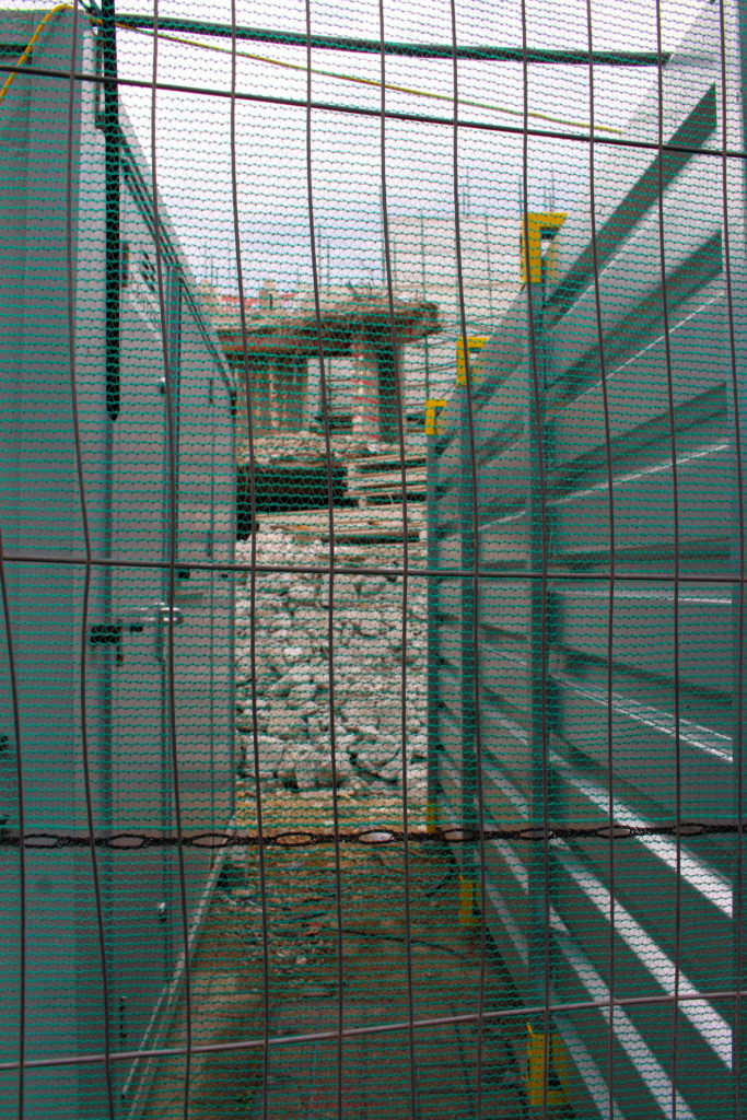
1st Edit:
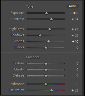
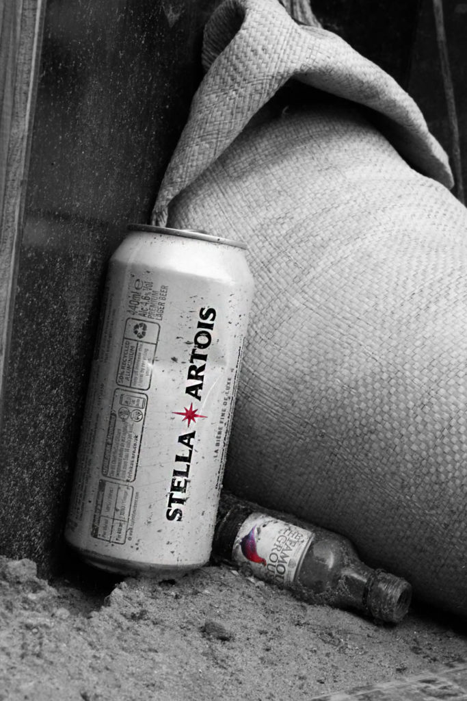
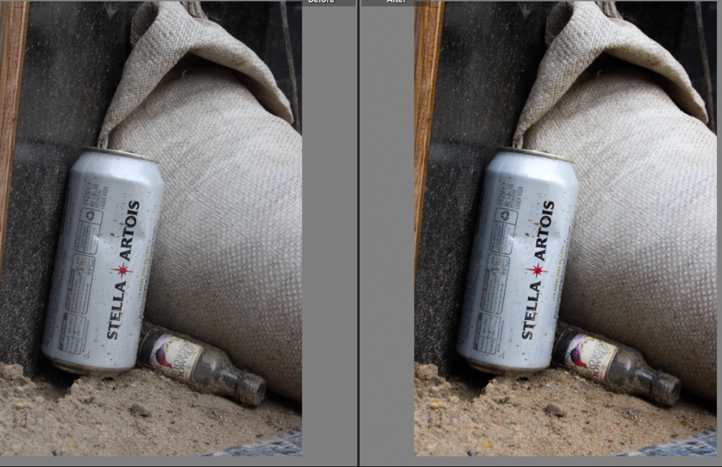
I edited this image on lightroom by increasing the saturation, contrast and some other settings.
I then took the image into photoshop because I wasn’t satisfied with the result. I duplicated the layer and turned my main one in to monochrome. I used the magnetic lasso tool (on the second layer) to select the star on the can and the bird on the bottle (one at a time) and then I left clicked and chose ‘layer via copy’. I hid my second layer and was left with a black and white image with red accents. At the end, I used the sharpen tool on the can and bottle to make them stand out more.
I did this because I didn’t like the original colours of the image and because black and white was too plain.

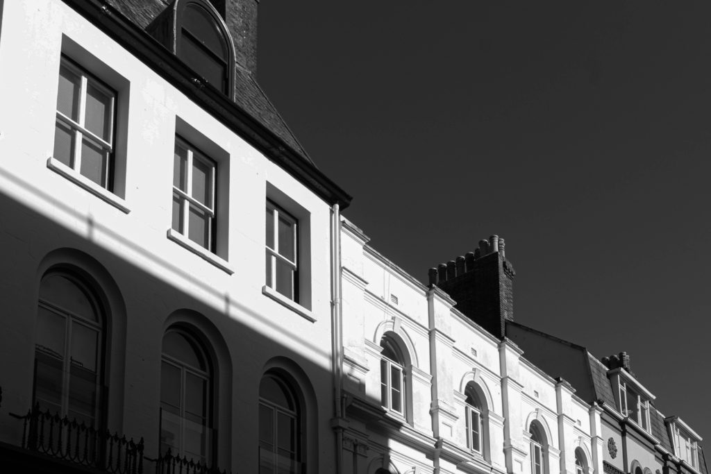
I imported all of my images into lightroom and put them in a new collection that I named ‘Anthropocene’. After doing my selections, I used the develop section to edit some of them. I mostly turned them black and white and played with the settings. (contrast, exposure, highlights etc.)
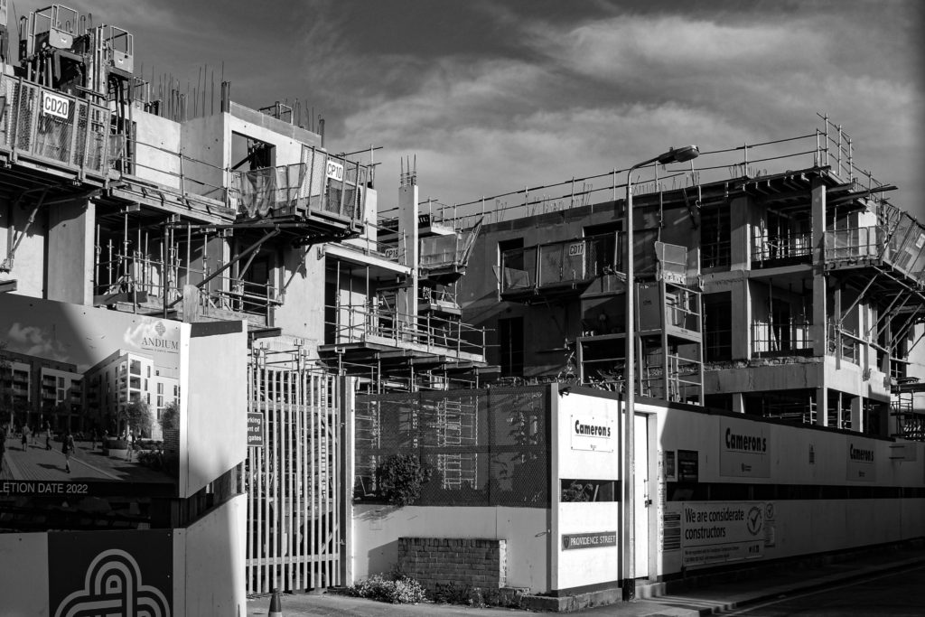
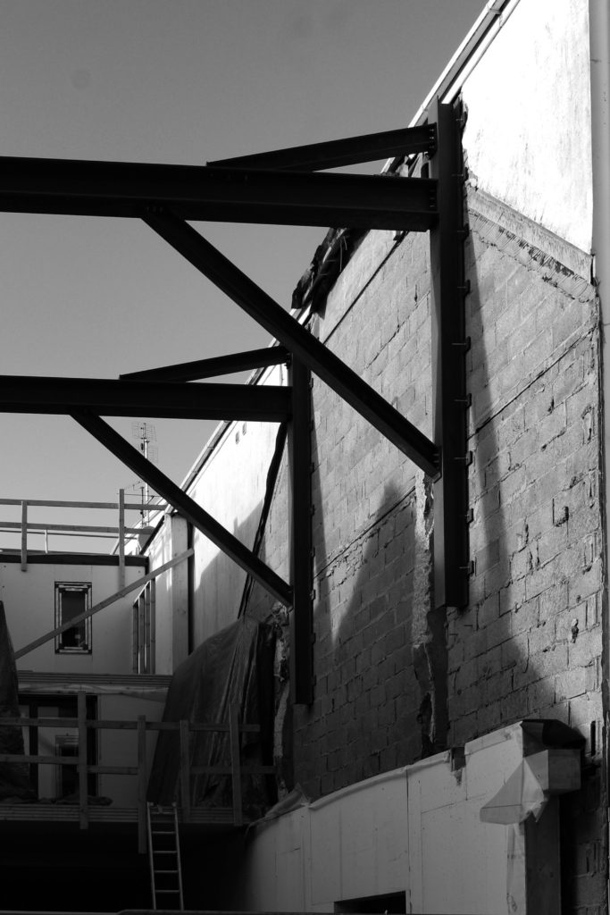
2nd Edit:

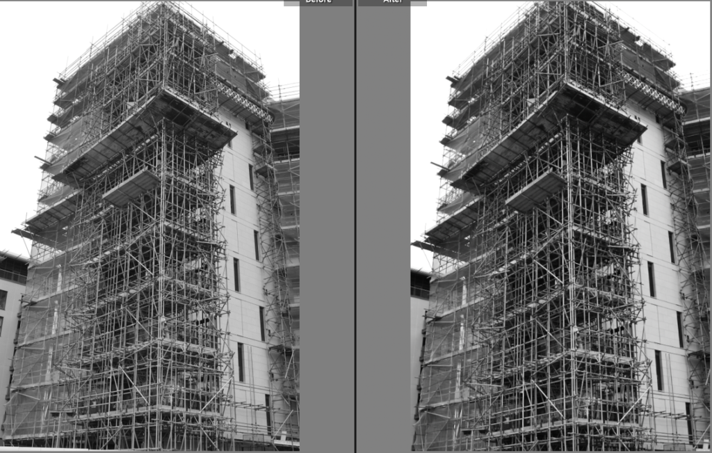
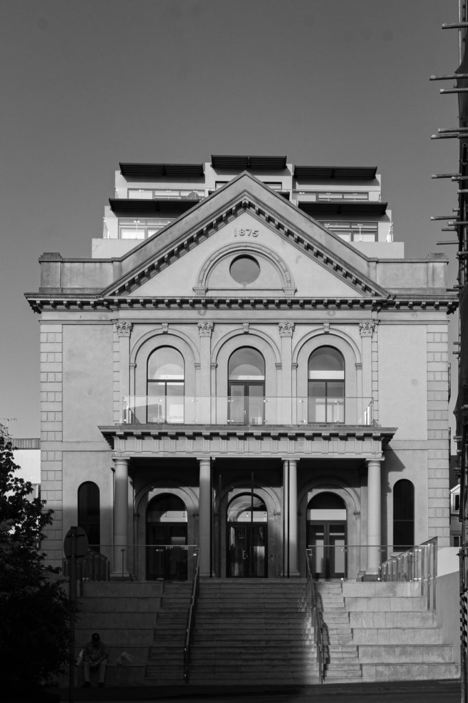
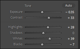
I didn’t do much to this image as it was already black and white and I liked the way it looked because of the composition. I just played around with the contrast and some other settings to make the details stand out more. I also straightened the image. Overall, I like this image because of the scaffolding, it makes the image look way more interesting because of all the lines.
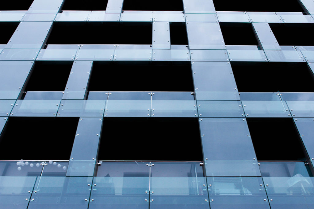
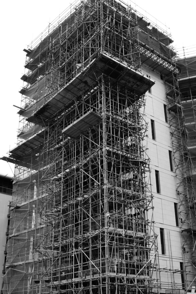
3rd Edit


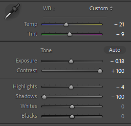
I didn’t like the colour of this image and thought it wasn’t vibrant enough so I lowered the temperature and tint to get this blue colour. I liked it this way as it looked more like glass. I then turned the contrast all the way up to accentuate the the lines and inside of the building. At the end, I turned the shadows all the way down to make it even darker. I like the way it turned out because it kind of reminds me of Keld Helmer Petersen’s work.
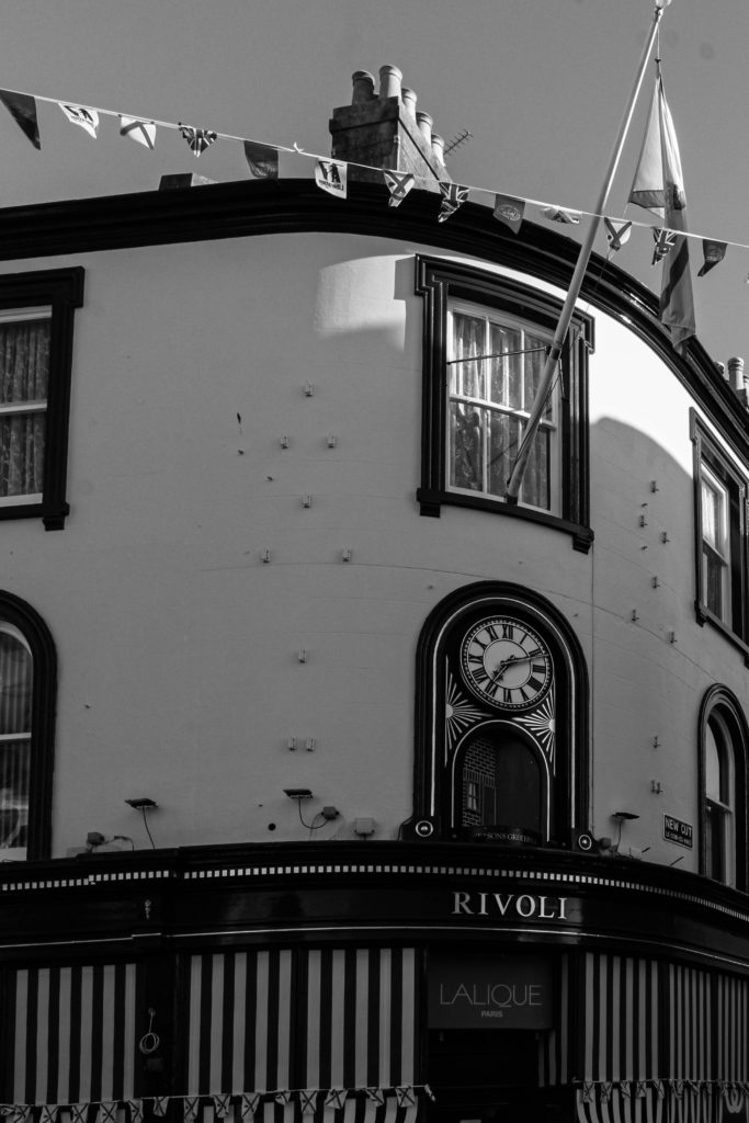
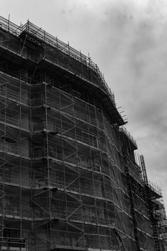
4th Edit:

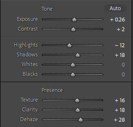
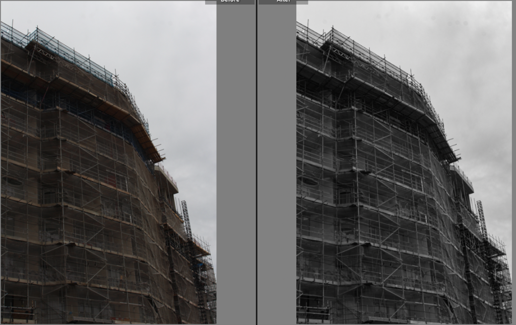
I liked the overall look of this image so I didn’t change it too much. I turned it in black and white because I thought it looked better and simpler that way. Then I played around with the settings to make the lines of the scaffolding stand out more. Turning up the dehaze gave the sky some texture which I liked because it made it look more interesting that just having a plain white background.
Edits:

