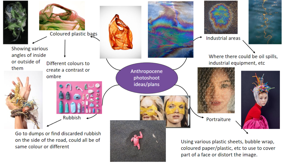
Mind map –

This is my mind map of ideas to carry out for my photoshoot for the theme of Anthropocene. I think that this is a really broad theme which I will enjoy because it allows a lot of creativity, I have decided to focus on coloured plastic bag photography as I think that it can create beautiful patterns and illusions while also using something that damages the environment and is a huge problem towards the Anthropocene. It can be used as a way to highlight the importance through difference colours such as red, for danger, or blue, for the sadness which it creates.
Mood board –

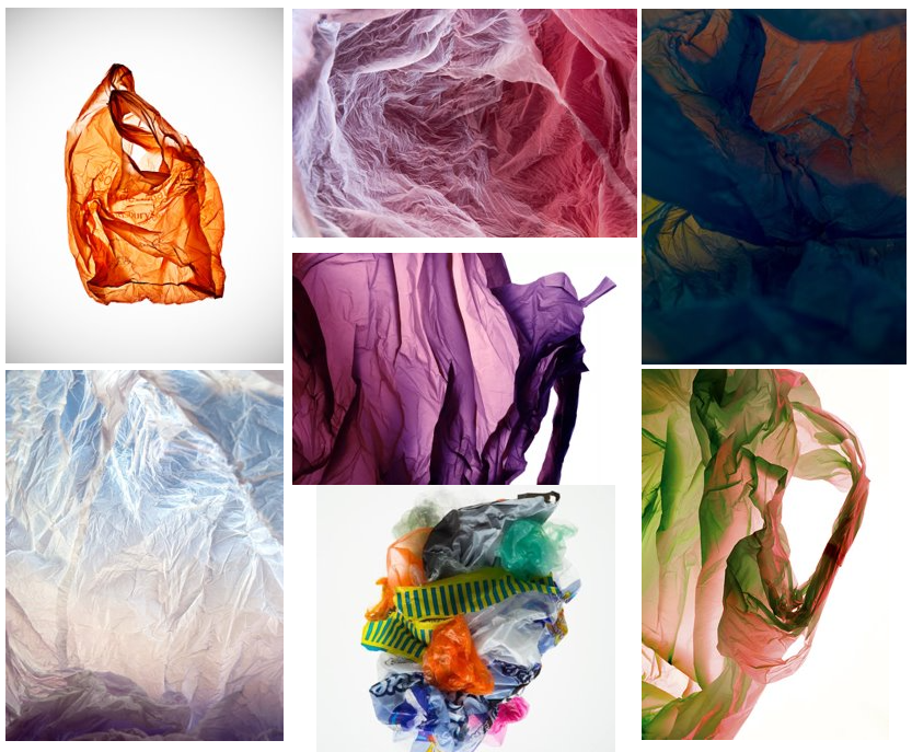
Further more on focussing on plastic bag photography, I have created this mood board to better explain the inspiration which I will be using in my photoshoots and how I will expand on this in my own way. These photos mainly come from exploring the work from the photographer, Vilde Rolfsen and Naomi White.
Photoshoot ideas –
For my photoshoot, I will create a mini studio out of plain white card to have a crisp background for the photos and I will be using coloured plastic bags that I’ll experiment layering with by placing them on top of each other to create a mix or illusion of an Ombre of colours to highlight certain problems with the dangers of plastic bags, I then will use a flashlight underneath the plastic bags to create a main point to focus on in the photo as it can create the illusion of a tunnel or centre. I will experiment with the f-stop while taking photos which will help darken/lighten the pictures and highlight the creases well in the plastic bags, making them more defined.
My second photoshoot, I will focus on taking pictures in the style of Naomi White of plastic bags. I will create this by using a lightbox to create a bright white background which will contrast well against the coloured plastic bags and experiment with different angles and changing the colours of the bags used as well. I will also use a infinity curve as another way to experiment with having a plain white background, I think that this way will make it look nice and smooth whereas the lightbox won’t have as big of a surface area.
