Keld Helmer-Petersen
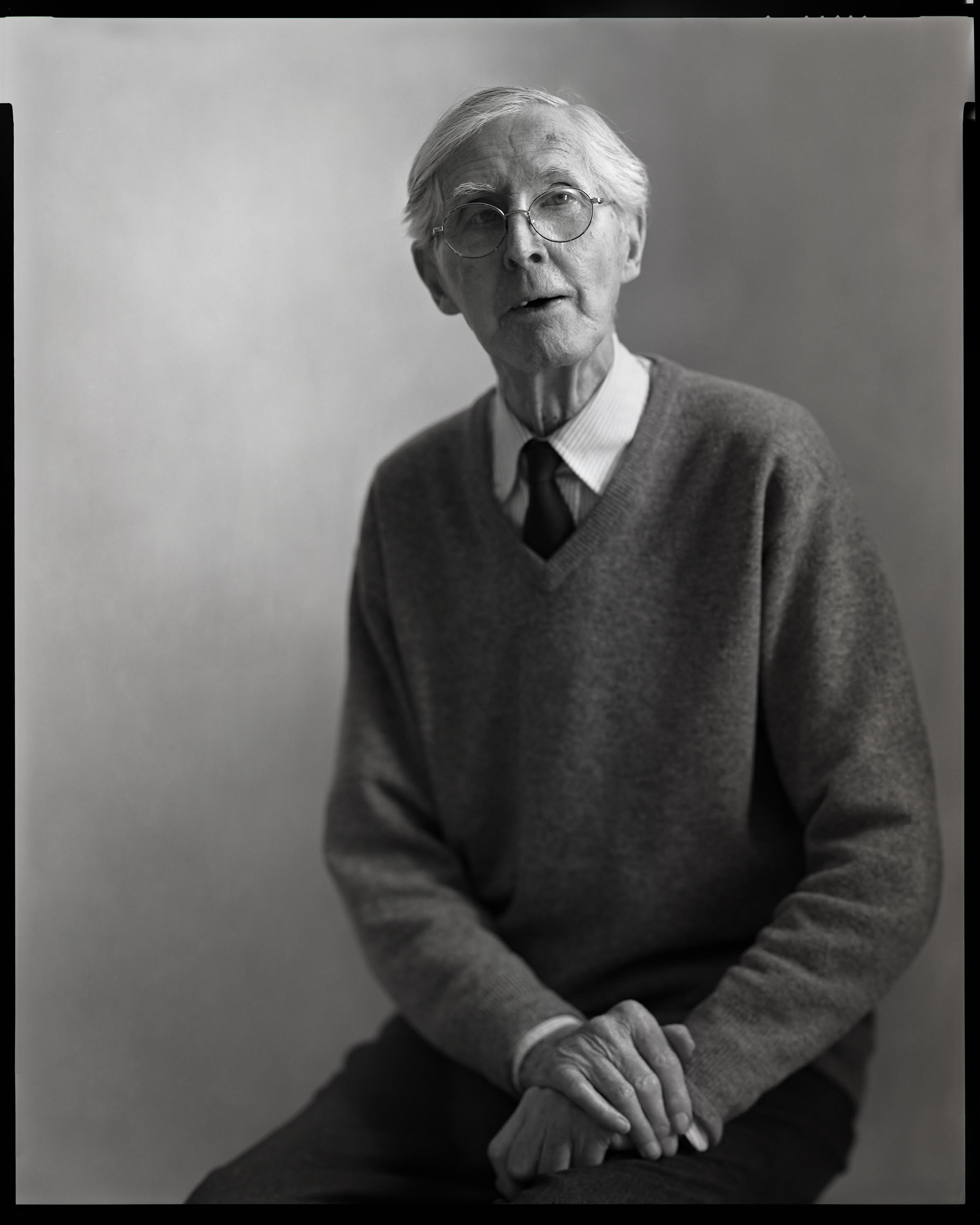
Keld Helmer-Petersen was a Danish photographer who explored industrial/modern areas, architecture and structures throughout his 70 years-long photography career. He liked to experiment with the medium of photography, which is made clear with his photographs, despite the fact that they shared similar subjects. He is a self-taught photographer whose career started in 1938 after being gifted a camera, which inspired him to take to photographic manuals and photobooks to learn more about the medium. He had joined several photography clubs and worked with several architects and artists who explored similar art forms (such as sculpting) which allowed him to form a circle of artists that created several exhibitions of their work. In 1948, Helmer-Petersen had published his first photobook ‘122 Colour Photographs’ which had gained international success and attention, dubbing it as one of the pioneering examples of art photography in colour.
Image Analysis

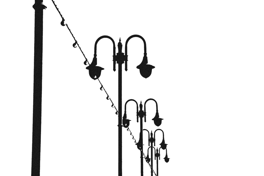
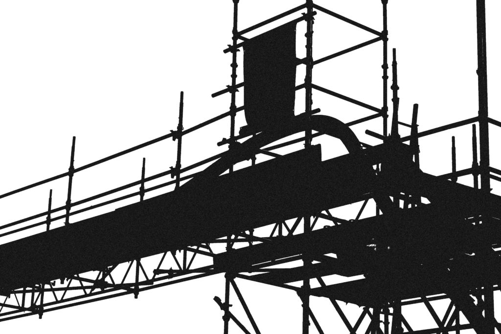
Here is likely an example of one of his experimental photographs, I think this because the way he uses contrast to create vivid, undetailed yet recognisable shapes is very unconventional for photography at the time. I think this contrast gives the image an unnatural, man-made aesthetic, which was likely done intentionally to perhaps make a statement on mankind’s affect on nature, and therefore landscape photography as a whole.
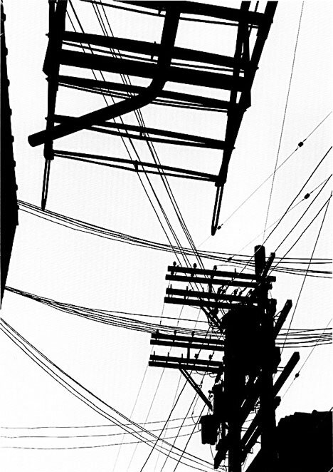
This image uses strong lines and regular shapes to make up the subjects within the image, giving it a very industrial look. To me, the focal point is the large object positioned at the top of the image, I think this because of its size, as well as the clear contrast in the image. I like the way the wires connecting the larger objects fills up the blank, white spaces in the image, it gives the image a chaotic, almost restricting, look which I think works really well in an industrial-themed image.
My own Experiments
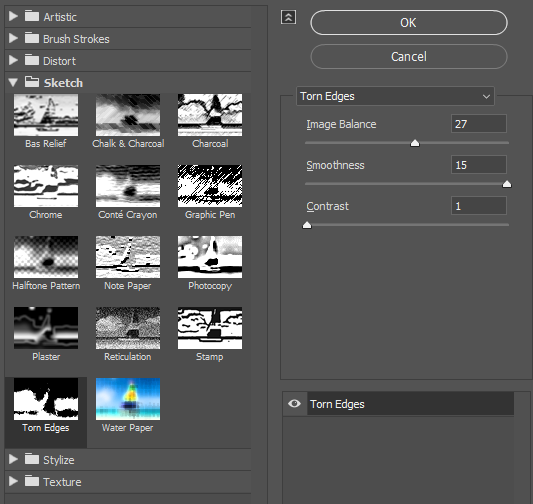
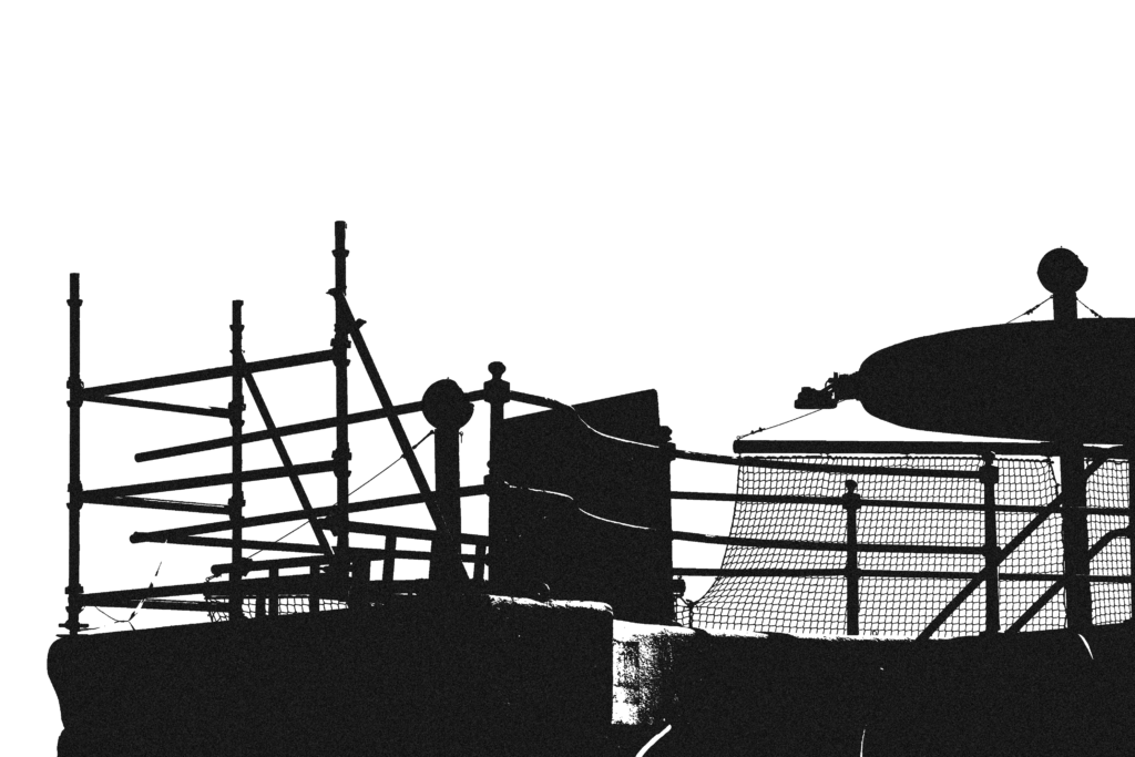
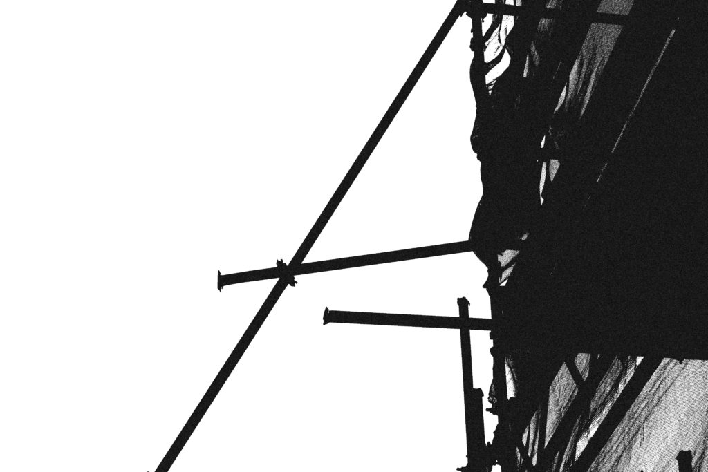
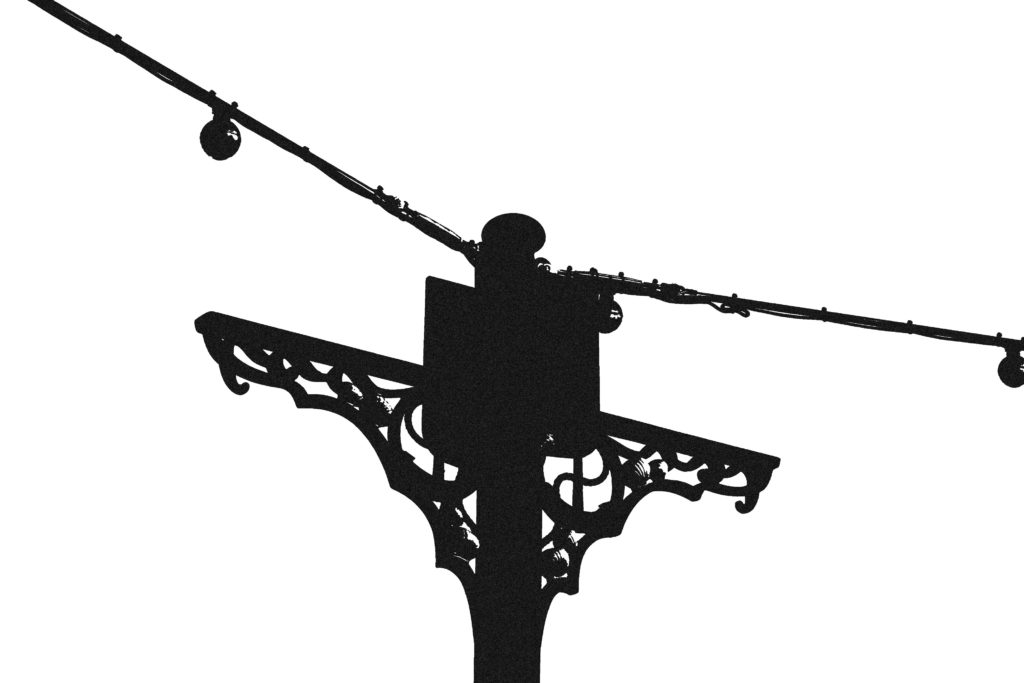
Here I used the Filter Gallery tool in Photoshop to mimic the style of the image from Helmer-Petersen’s work. With these settings I think the images bear a close resemblance.
Comparison
I like the way my image and Helmer-Petersen’s both use straight lines and regular shapes to make up the main structures in the image. My image has more open space within it compared to Helmer-Petersen’s since his photograph uses wires to fill up those spaces, I like both looks since a more open image gives it more room to breathe/makes it more readable.

