

For this photoshoot I walked around Havre des Pas and La Collette and took pictures of the urban and industrial buildings and structures around that area.
Contact Sheets
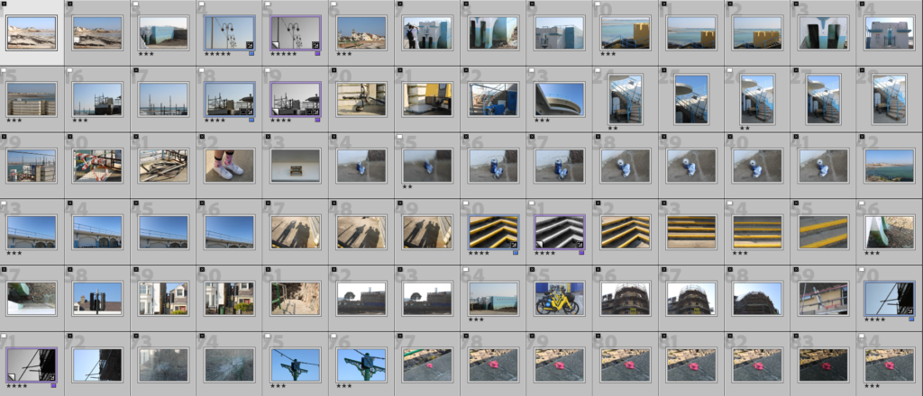
Contact Sheets of my Best Images
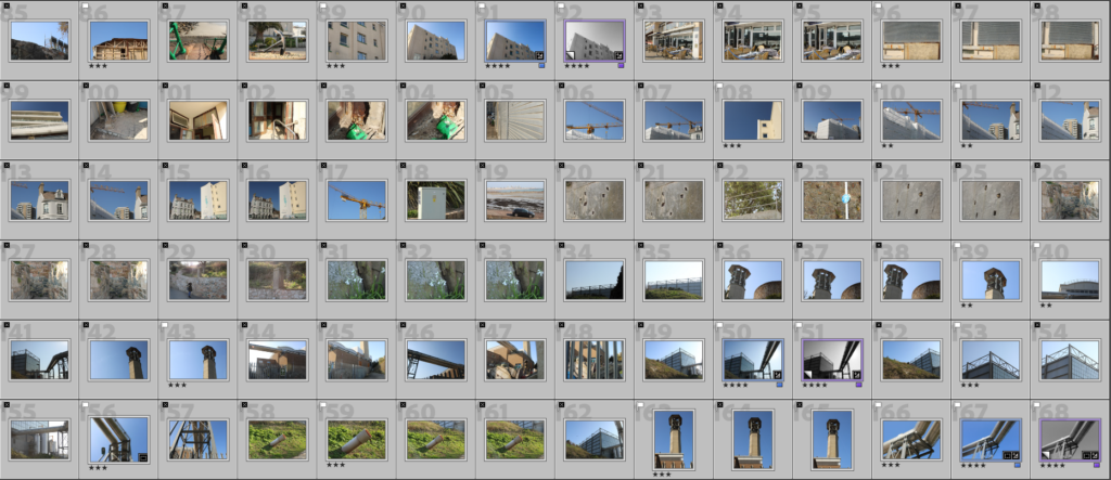
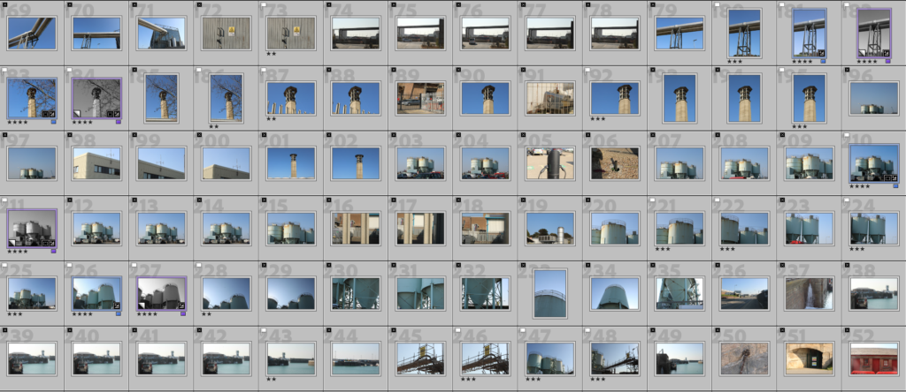
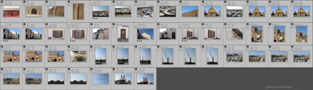
Final Edited Images
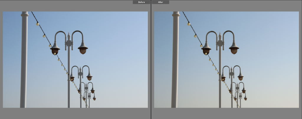
I chose this as a final image because I like its composition. I think that the clear sky helps the shapes of the lamps become more apparent, as it provides a clear background that doesn’t draw much attention to itself, allowing the focus to be placed on the lamps. When editing, I made the image slightly warmer to make the little colour that is seen on the lamps stand out more, as well as to make the sky (specifically in the lower-right) a soft yellow, giving the overall image more colour.
I chose this image because I think the shapes created by the railings, gate and other objects, gives the image a very urbanised look. I think the shadow in this image creates a strong contrast between the objects and the clear sky, putting more of a focus on the urban part of the image. Like the previous image, I made the tone of the image slightly warmer when editing to give the image slightly more colour, putting more of an emphasis on the browns and oranges seen on some parts of the objects.
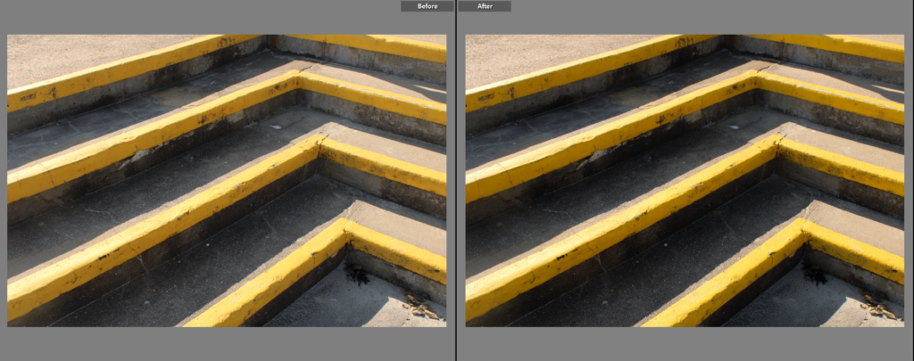
I chose this as a final image because I think that the dark-grey, shaded parts of the steps contrasts nicely with the bright yellow lines on the edges on the steps. In addition, I think the bright yellow helps give the image a unique, yet urban look. I think the regular lines created by the steps also gives the image a less natural look, these lines also draw your eyes to the right of the image, where arguably more contrast and colour can be seen.
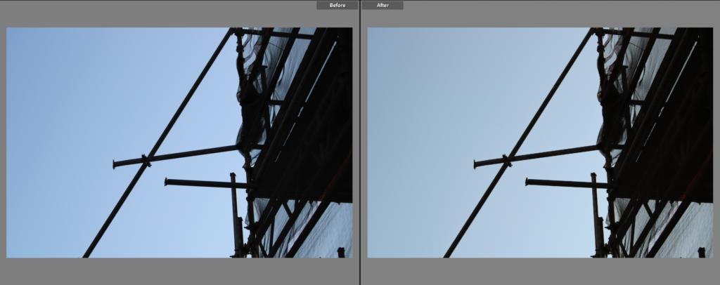
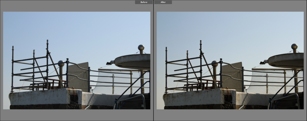
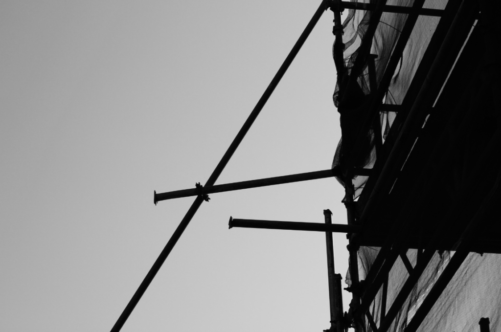
I chose this as a final image because I think the dark scaffolding creates shapes that have a distinct ‘urban’ feel, as straight lines and regular shapes creates an unnatural aesthetic. The scaffolding poles also act as leading lines, that lead the viewer towards the larger shape on the right of the image, this makes the left and right side of the look image completely different. I also like how the scaffolding creates a very stark contrast with the brighter, clear sky.
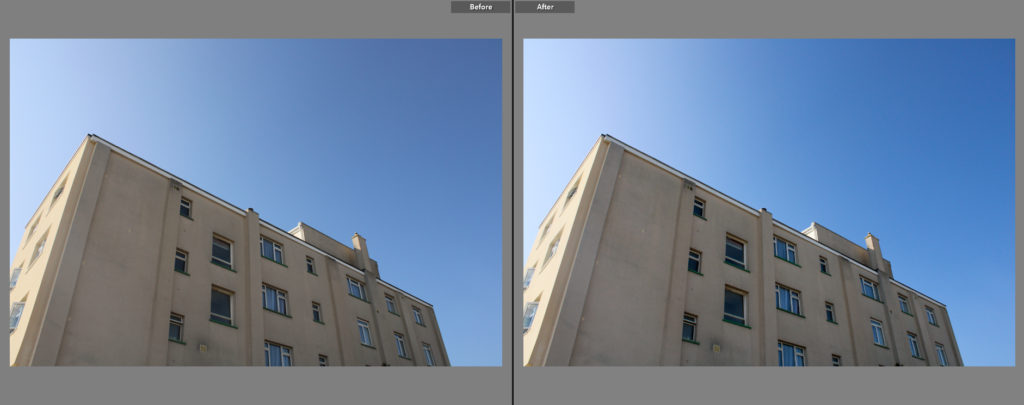
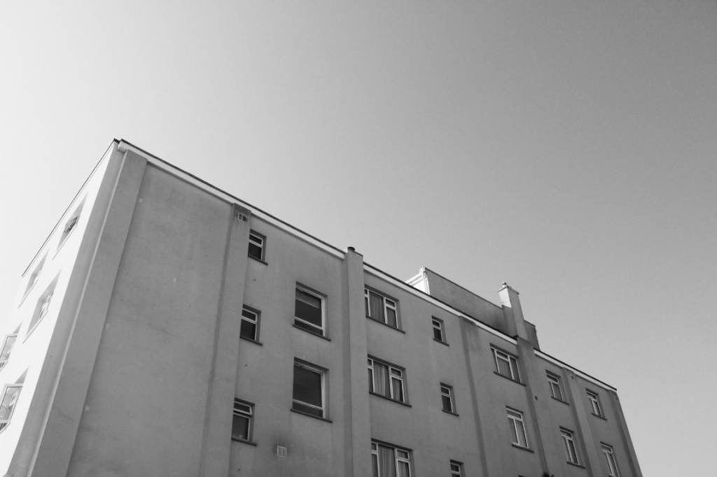
I chose this as a final image because I think the simplicity of the shape(s) of the building (the shape of the building itself, as well as the shapes inside it eg. the windows) gives the image an urbanised aesthetic. The colours in this image are limited, which, to me, gives it a more ‘simple’ look. The blues in the sky and windows match nicely with the beige colour of the building. When editing I made the image slightly colder to make the blues in the sky and on the building stand out a little bit more.
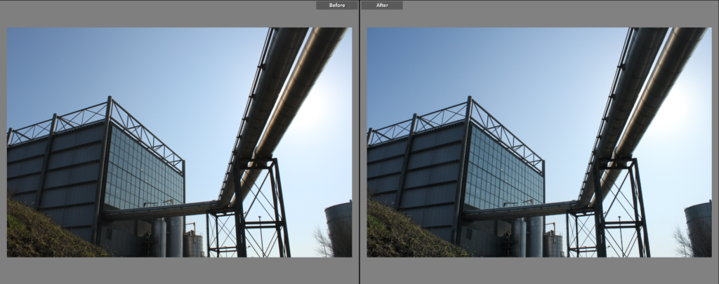
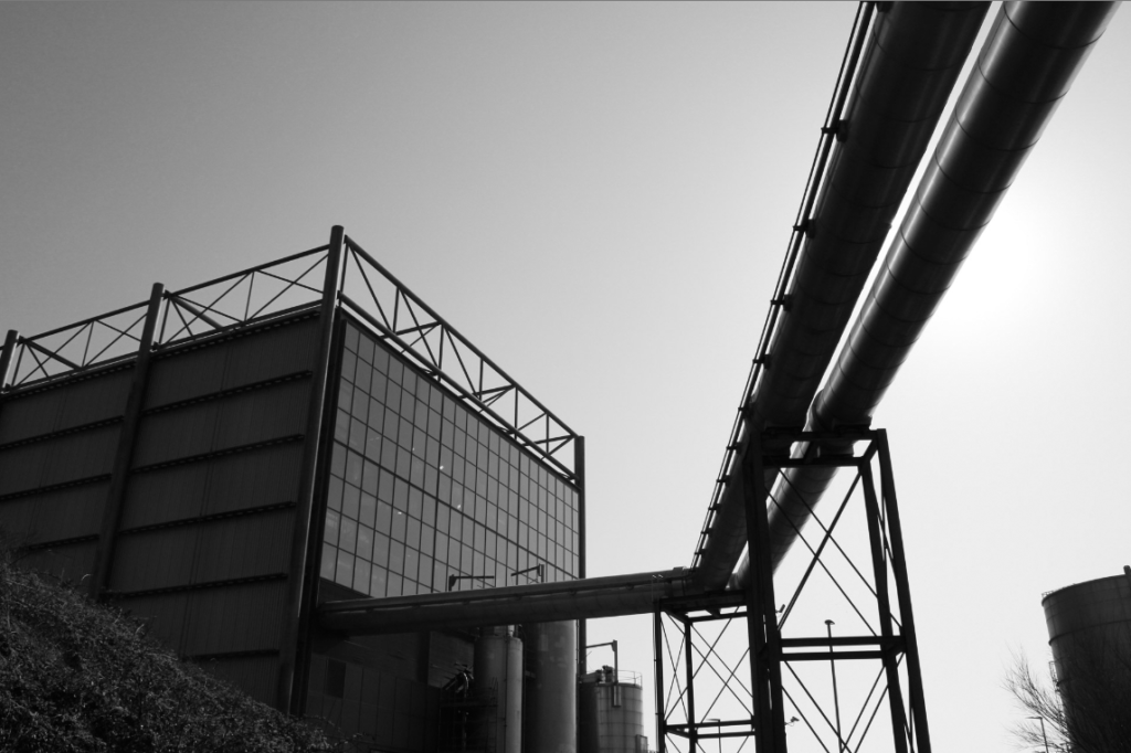
I chose this as a final image because I think it has an interesting composition, with the pipe leading into the building on the bottom-left creating an interesting shape that divides the image. This image has a lot of blues and greys, this paired with the straight lines the image uses gives it a modern/urban look. I like how the pipes obscure the sun, giving the pipes a shadowed underside that creates contrast from the sky and the pipes themselves.
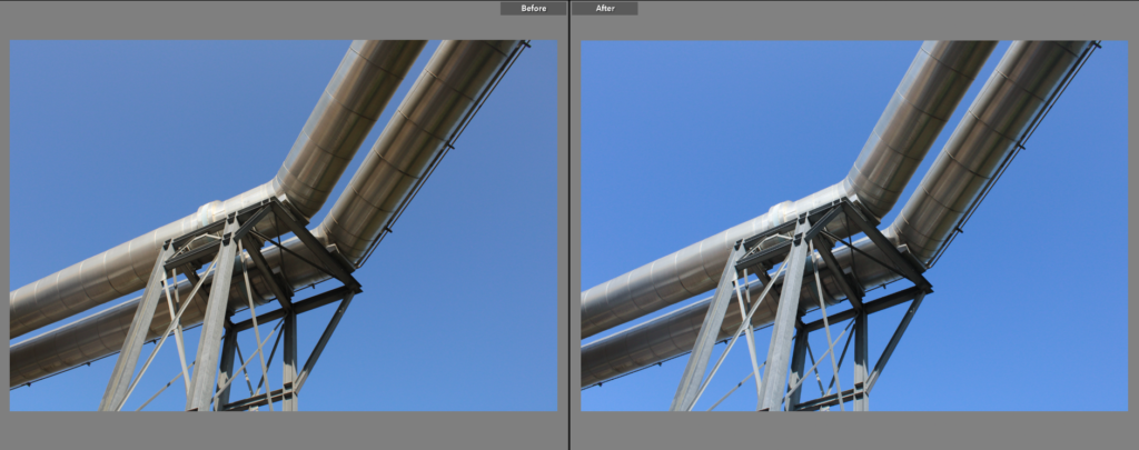
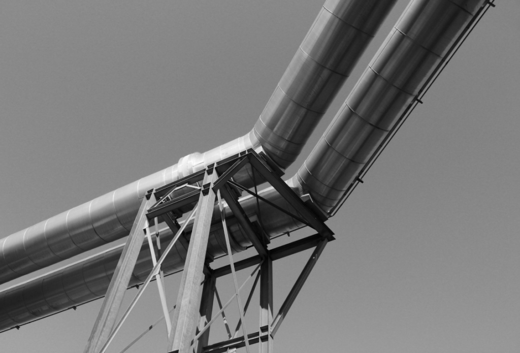
I chose this as a final image because I think the simplicity of the image, with a plain blue sky as the background I think it adds emphasis to the pipes. The darker tone of the pipes makes it stand out in the blue background their difference in tone creates a contrast. When editing I made the tone of the image more cold to give the pipes a more silver colour, making it pair nicely with the blue background.
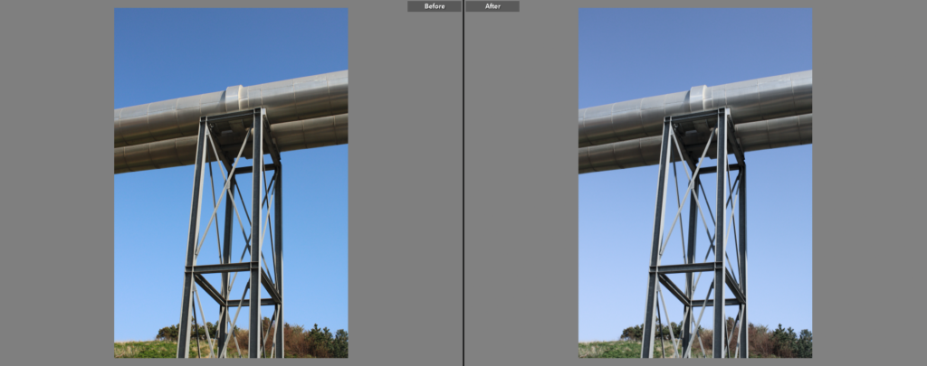
I chose this as a final image because I think it has an interesting composition, with the structure covering a large part of the image, leading you from the bottom and sides of the image into the middle. I think a portrait orientation was appropriate for this image as it makes the structure look taller by putting emphasis on the legs of the structure. When editing, I made the image slightly colder to give the metal a more urban, cold look.
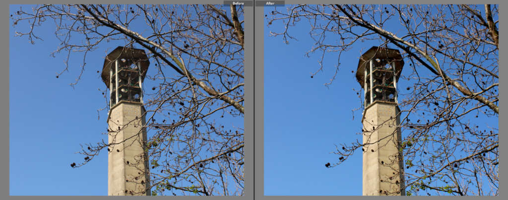
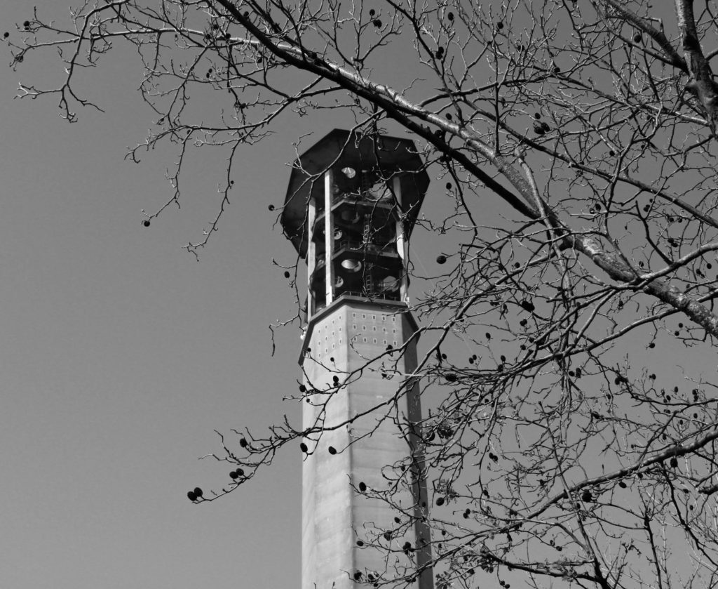
I like this image because of how the urban tower in the midground contrasts thematically with the natural tree in the foreground. I think it is interesting how the tower and the tree share a similar colour, while the background is fully blue. I also like how the urban structure is made up of straight, regular lines, which contrast greatly with the flowing lines created by the tree.
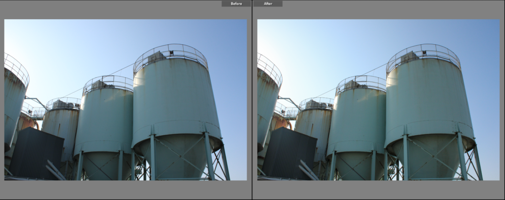
I chose this as a final image because I like the composition of the image. The structure has leading lines pointing towards the largest/closest part of it, acting as the focal point of the image, which is positioned in the top right of the image, following the rule of thirds. I think it is interesting how the blue of the structure is contrasted by a complementary orange created by the rust, it gives the image an urban look.
Comparison to Henry Wessel
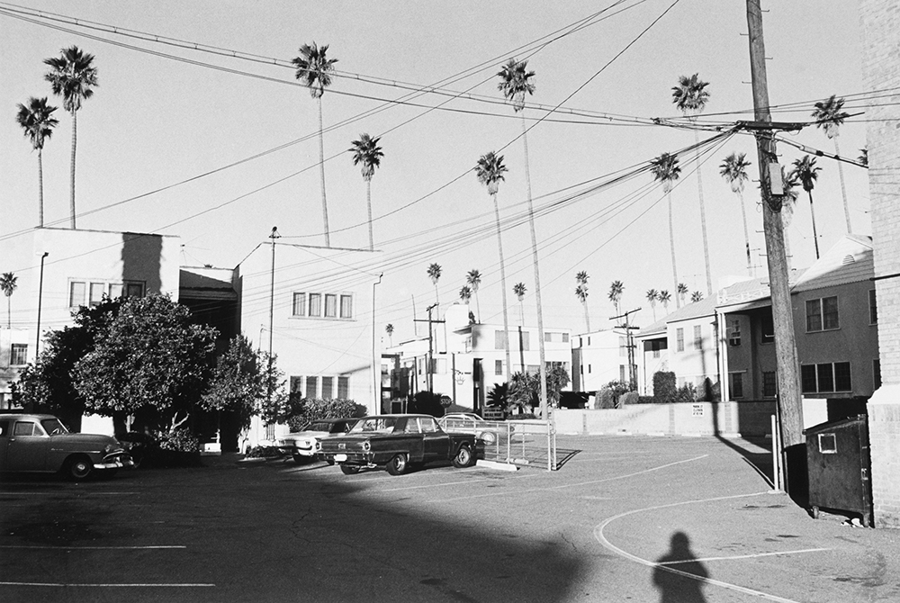
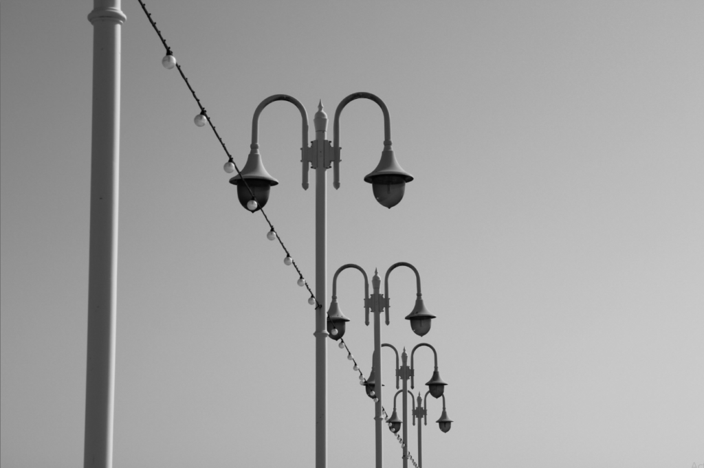
I chose to compare this image to Henry Wessel’s work because I think the clear sky and inclusion of plant life creates a nice link between the two images. I decided to make my images black and white to mimic the black and white images in the New Topographics exhibition. Wessel’s image is far more exposed, due to the climate Wessel took images of. The two images have different viewpoints, with my image pointing more upwards, exposing more of the sky, while Wessel’s is more level, as expected for a landscape image. Wessel’s image focuses more on an entire scene, with multiple images and trees being shown in the picture, while my image focuses more on a single building.