Lewis Baltz
Lewis Baltz (September 12, 1945 – November 22, 2014) was a visual artist and photographer who became an important figure in the New Topographic movement of the late 1970s. His work has been published in a number of books, presented in numerous exhibitions, and appeared in museums such as the Museum of Modern Art.
Born in Newport Beach, California, Baltz graduated with a BFA in Fine Arts from San Francisco Art Institute in 1969 and held a Master of Fine Arts degree from Claremont Graduate School. He received several scholarships and awards including a scholarship from the National Endowment For the Arts (1973, 1977), the John Simon Guggenheim Memorial Fellowship (1977).

Lewis Baltz 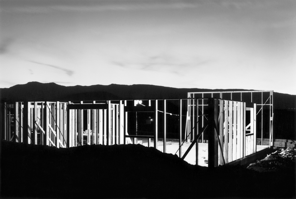
His work
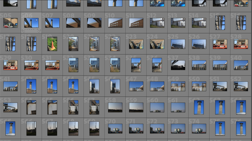
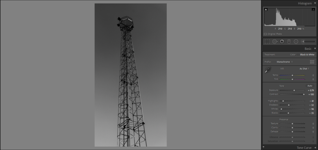
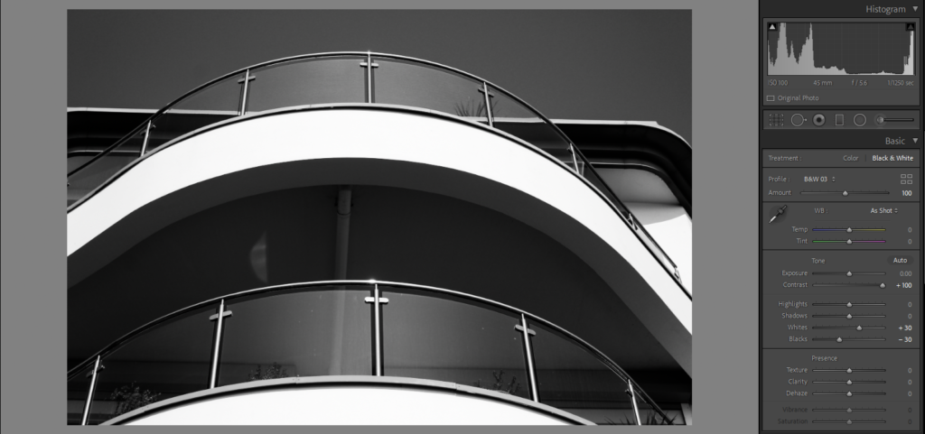
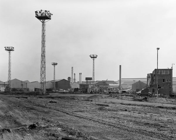
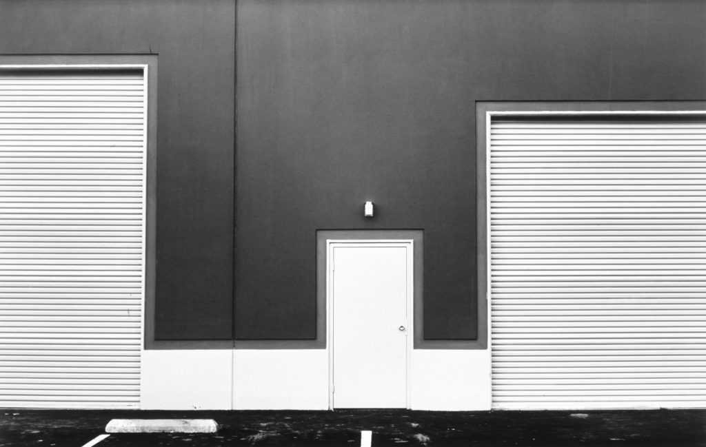
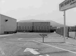
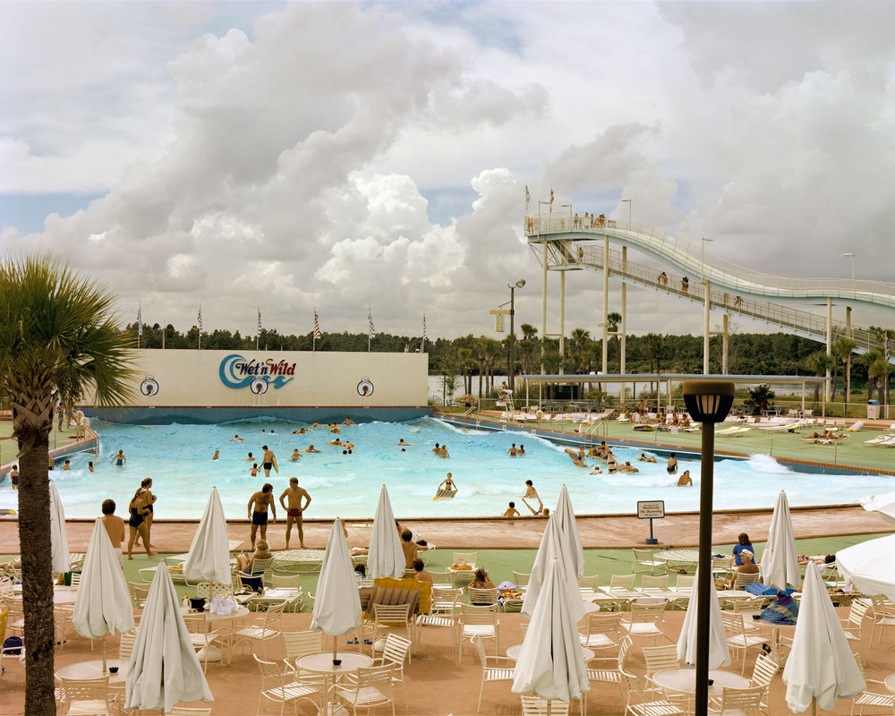
His books and exhibitions, his “topographic work”, such as The New Industrial Parks, Nevada, San Quentin Point, Candlestick Point (84 photographs documenting a public space near Candlestick Park, ruined by natural detritus and human intervention), expose the crisis of technology and define both objectivity and the role of the artist in photographs.
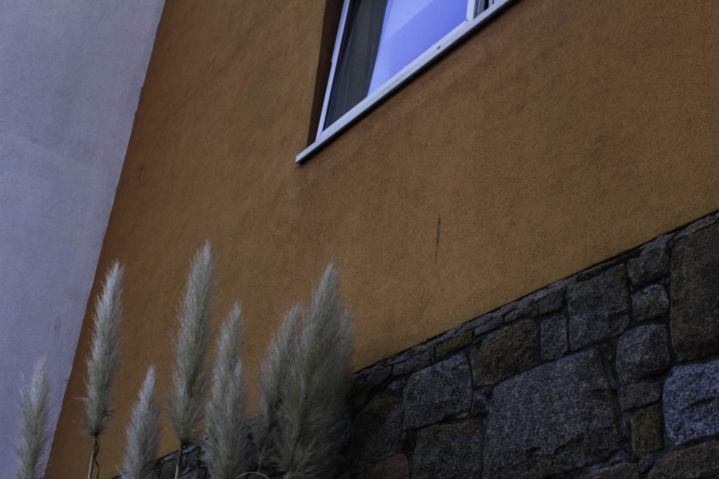
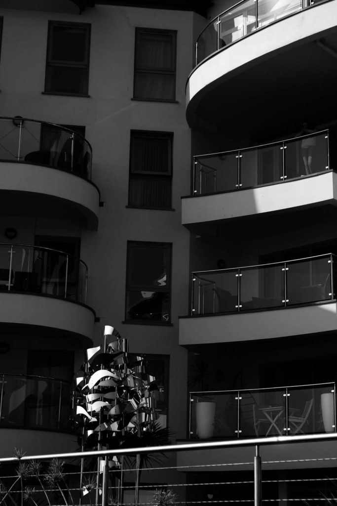
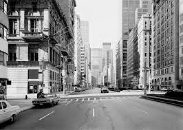
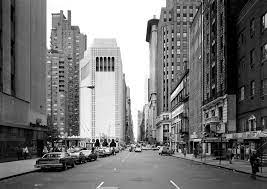
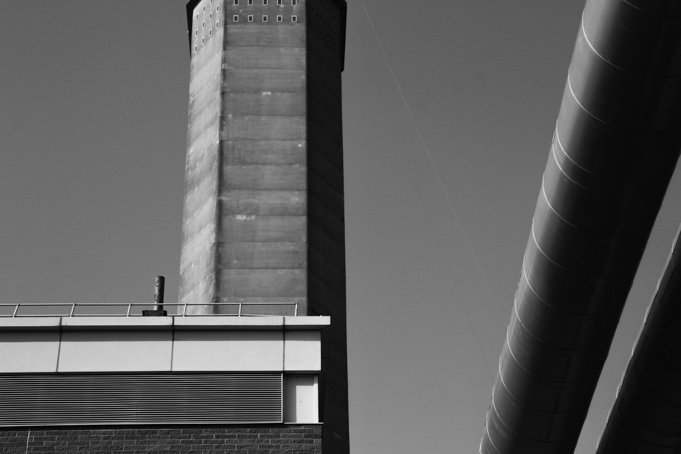
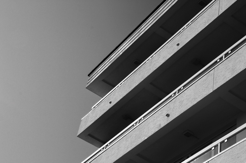
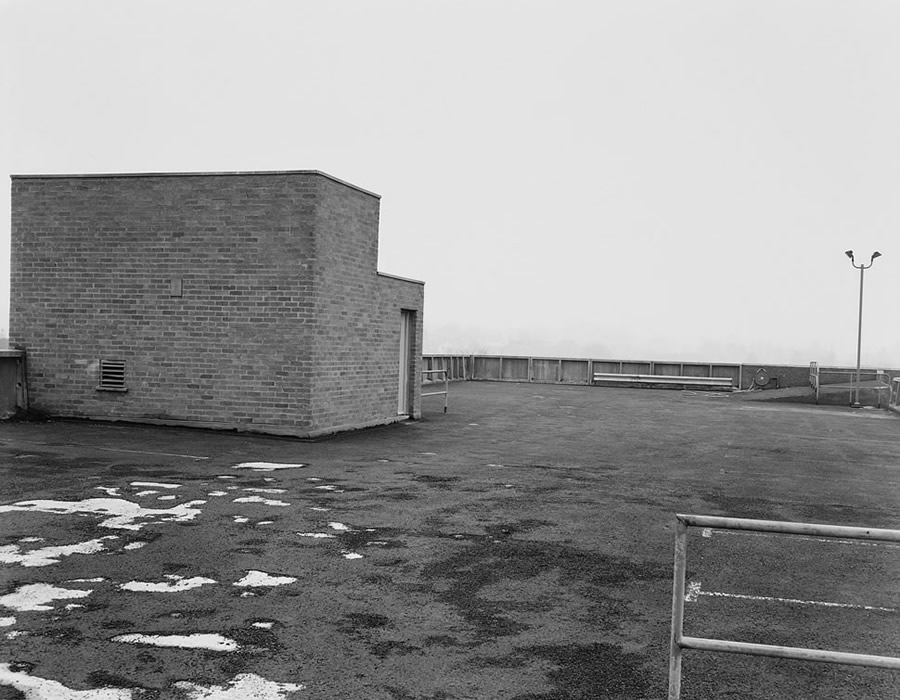
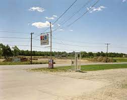
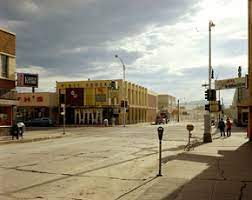
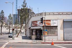
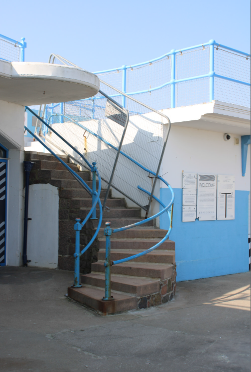
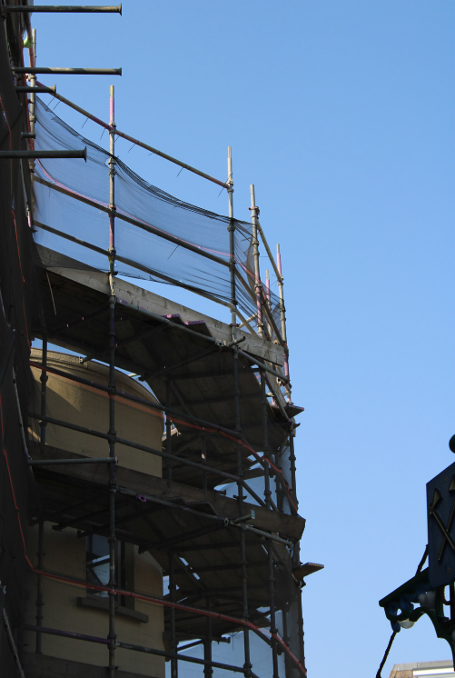
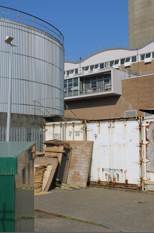
His work is focused on searching for beauty in desolation and destruction. Baltz’s images describe the architecture of the human landscape: offices, factories and parking lots. His pictures are the reflection of control, power, and influenced by and over human beings. His minimalistic photographs in the trilogy Ronde de Nuit, Docile Bodies, and Politics of Bacteria, picture the void of the other.
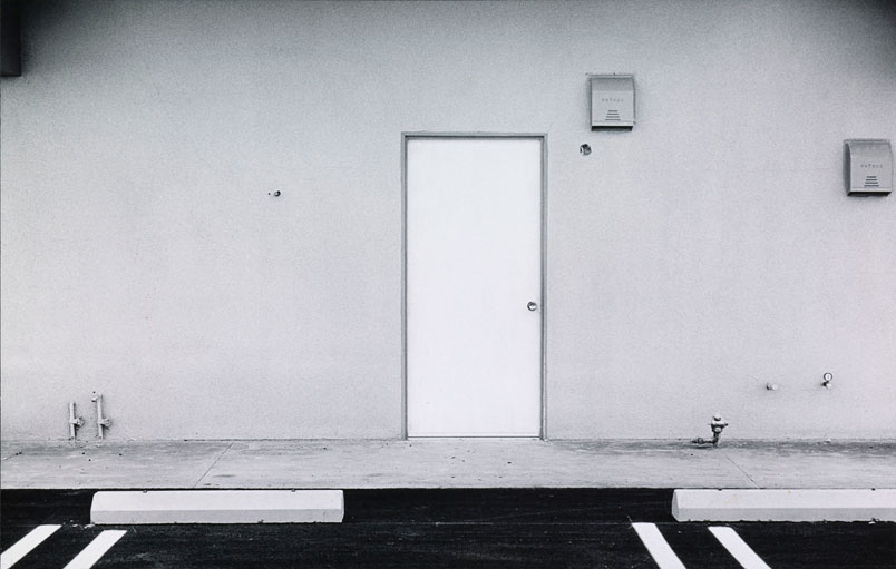


What I like about his work: I think that the simpleness of his work makes him more memorable and along with the monochromatic photography, this makes more unique pieces. I also like that for this time this type of photography was to demonstrate the affects of mankind on the natural environment and his work demonstrates this well as the builders are the main focal point of the images.
Image Analysis

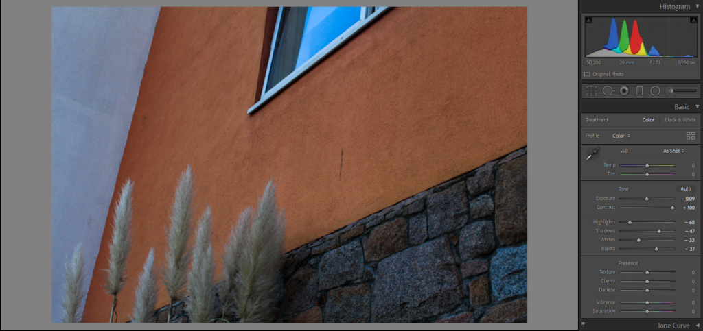
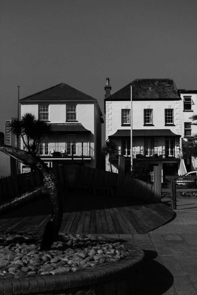
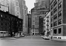
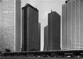
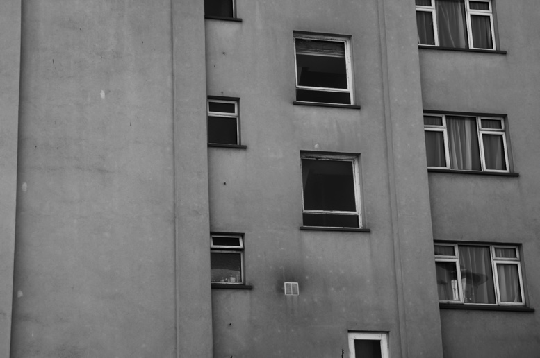
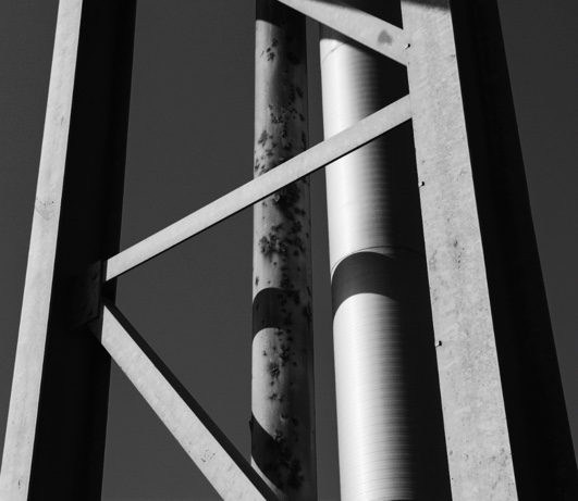
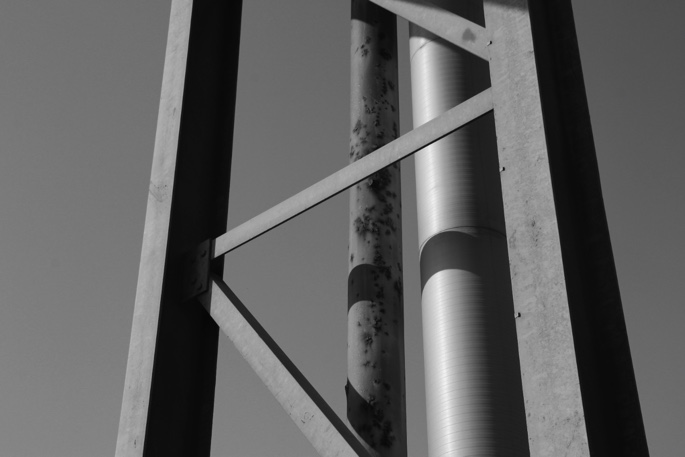
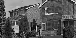
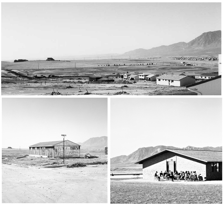
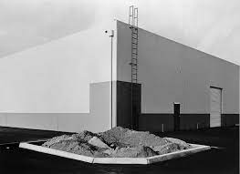
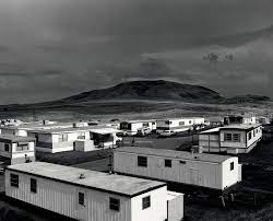
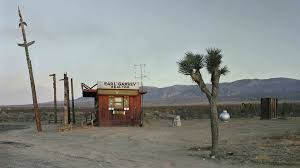
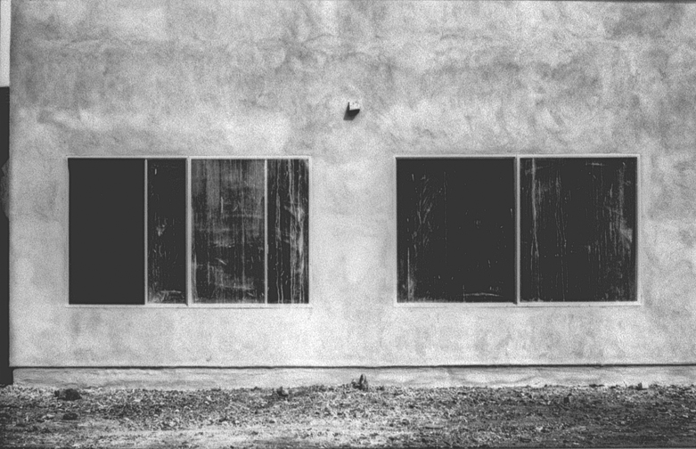
I have selected this image to analyse as I think the overall composition of the image is one of its main strengths, as it means that the silhouette of the mountain is the background of the image and that the main houses in the front create a focal point for the image. Furthermore, I think the lighting of this image brings and all of its features and makes it more cohesive as the lighting from under the roof trim of the house means that strong shadows are created, as the brightness of the lighting in the sky creates contrast between it and the outline of the mountains.
Additionally, I think that the clarity of the image makes it stand out more as the details in the brickwork of the building and even the blinds in the windows creates contrast. This is shown as theres lots of details within the foreground of the photograph and this lack in the background, however this is not a negative as it demonstrates the rule of thirds, as the pavement, housing and mountains/ skyline and very clearly separated in this piece. It’s also important to note how important the different shapes and lines are within this image, as the vertical lines contradicts with the horizon created but the mountain, and the squares and rectangles contrast with the smooth natural landscape. This is a good example of The New Topographic’s work as their is a manmade contrast created with the lighting in this image, as a somewhat natural contrast between the housing and landscape further away in the image.