Urban Landscapes Photoshoot-

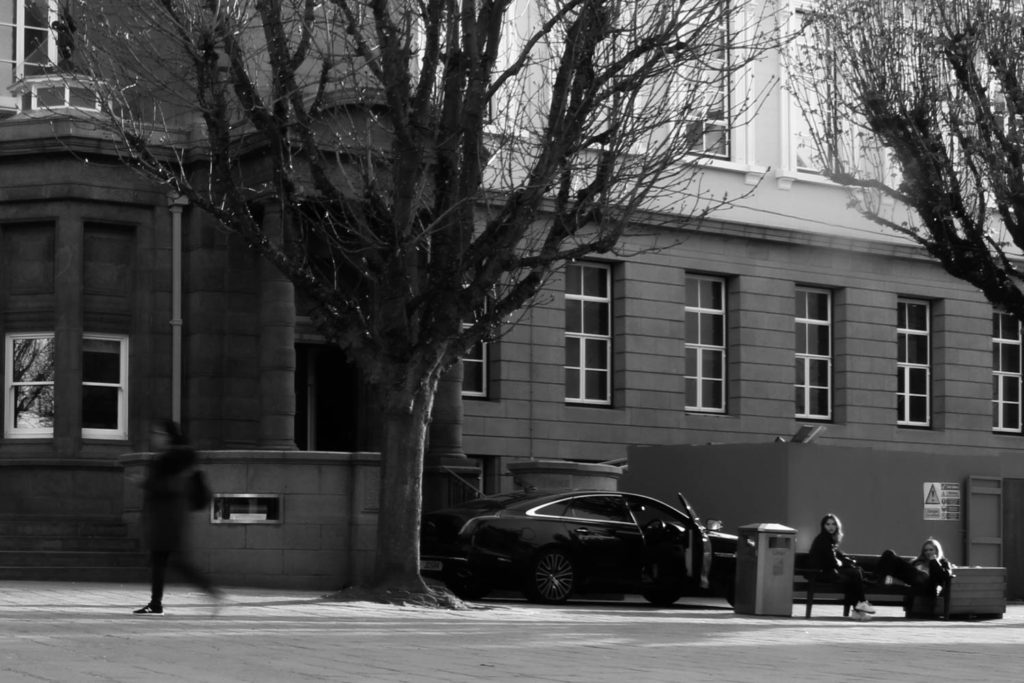
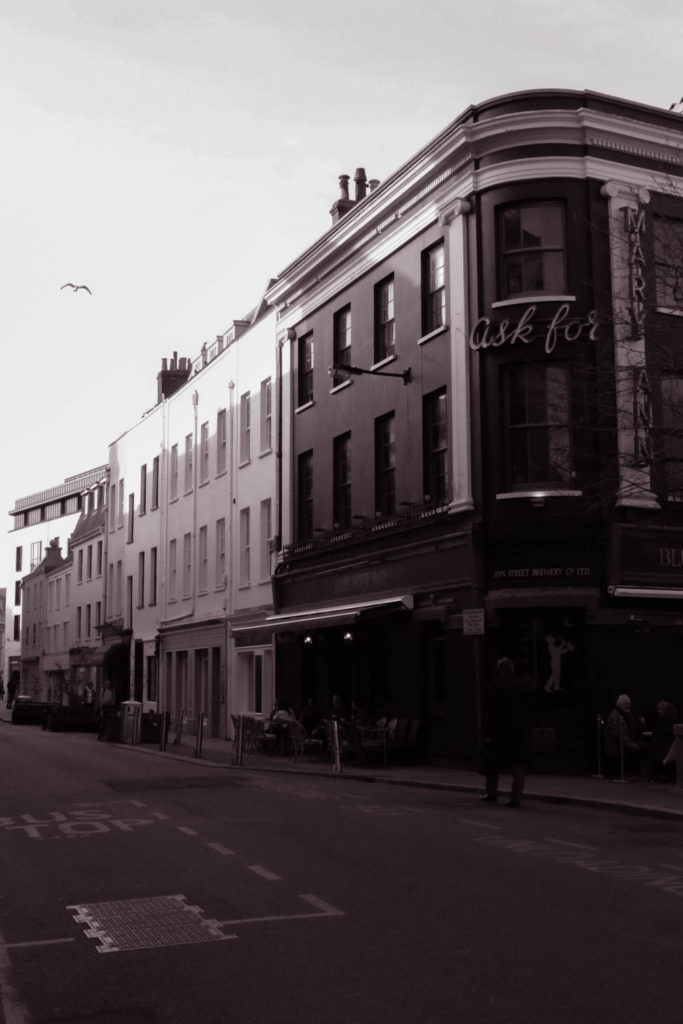
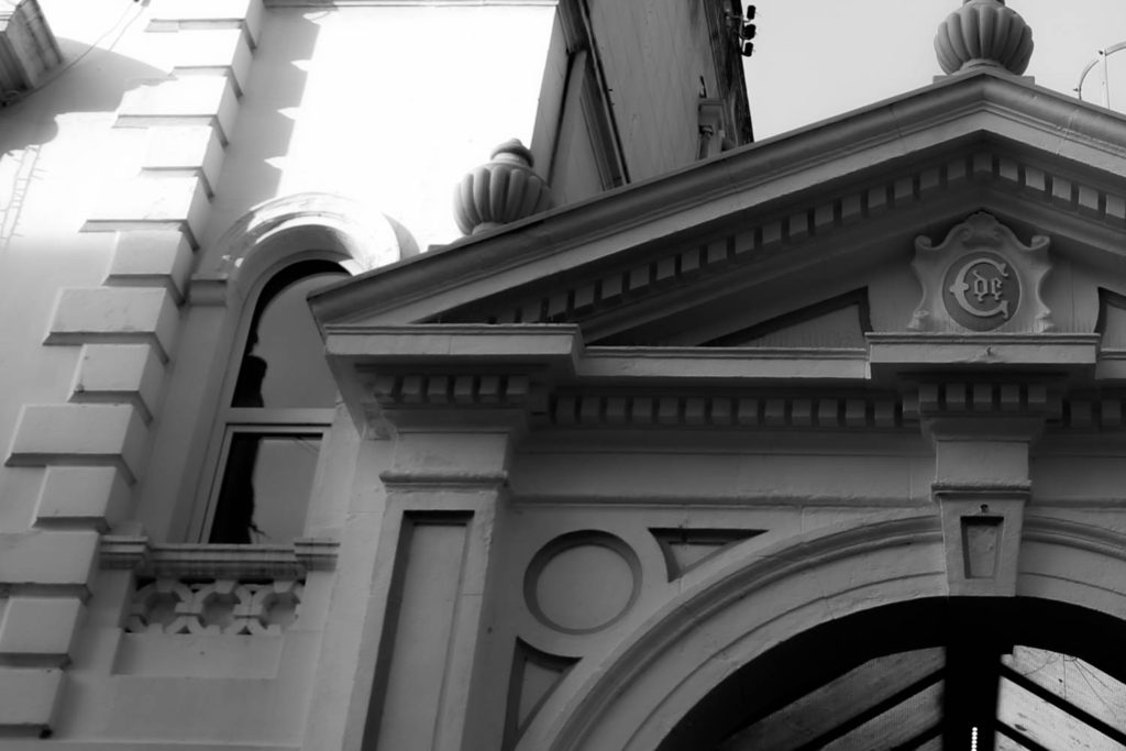
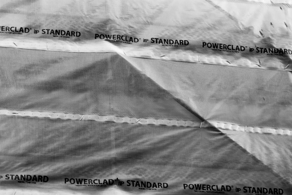
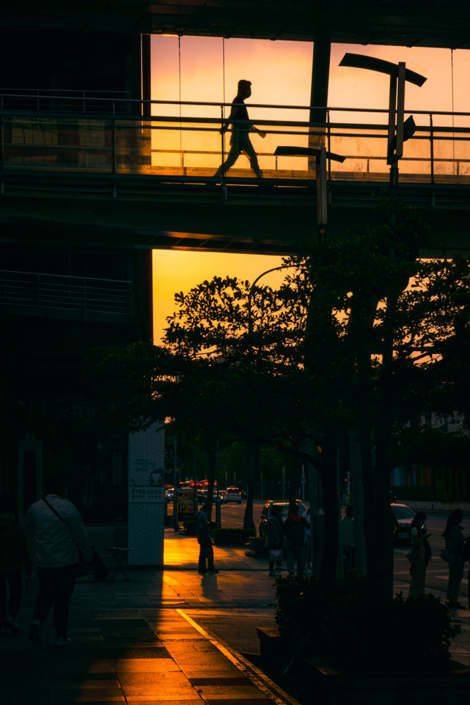
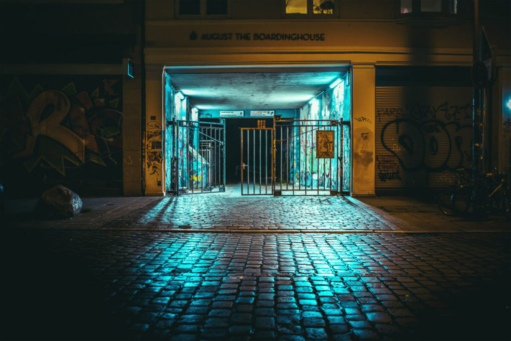
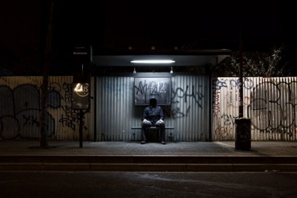
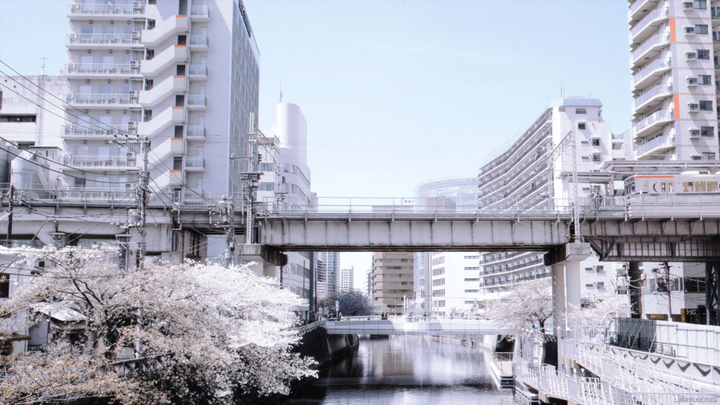
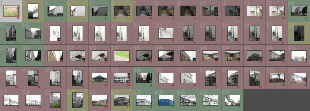
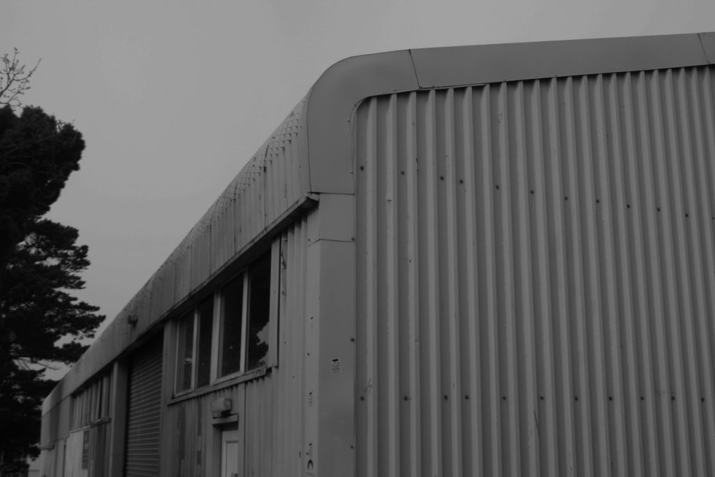
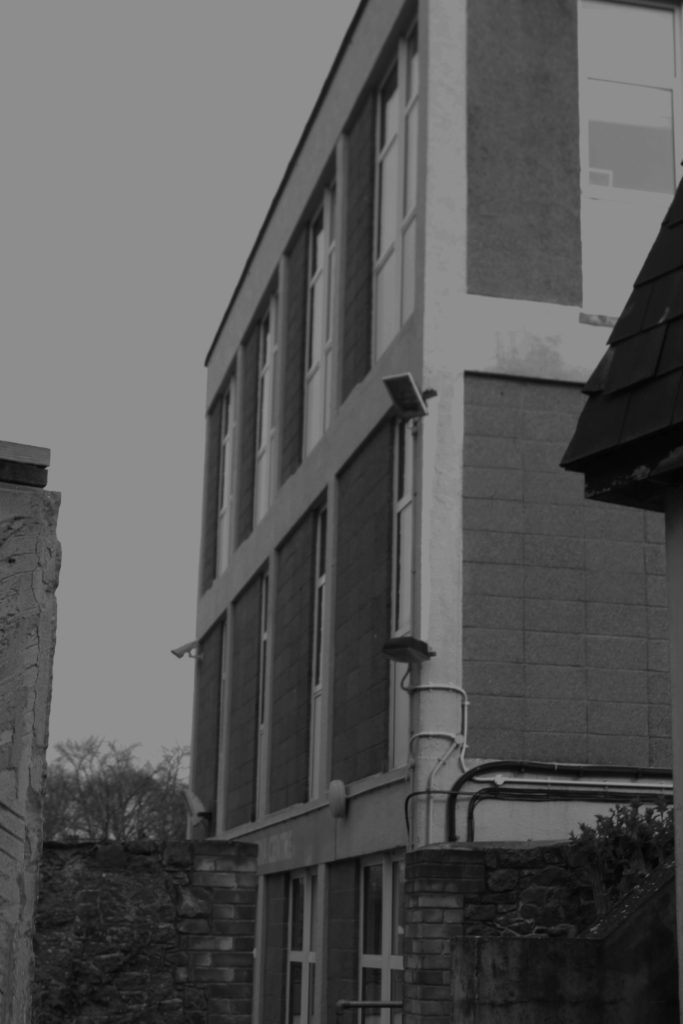
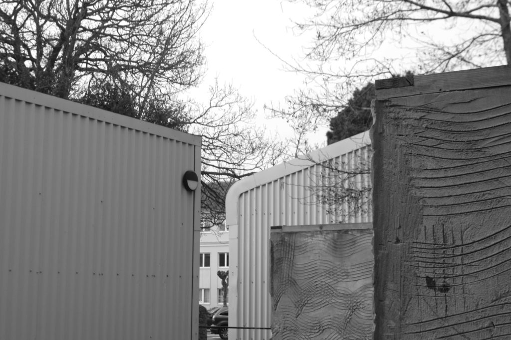
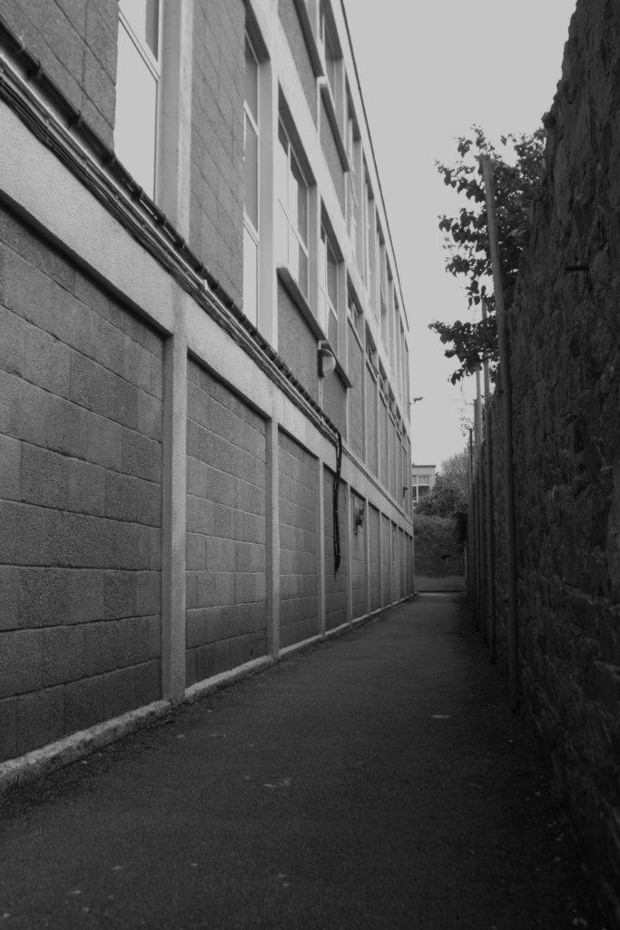
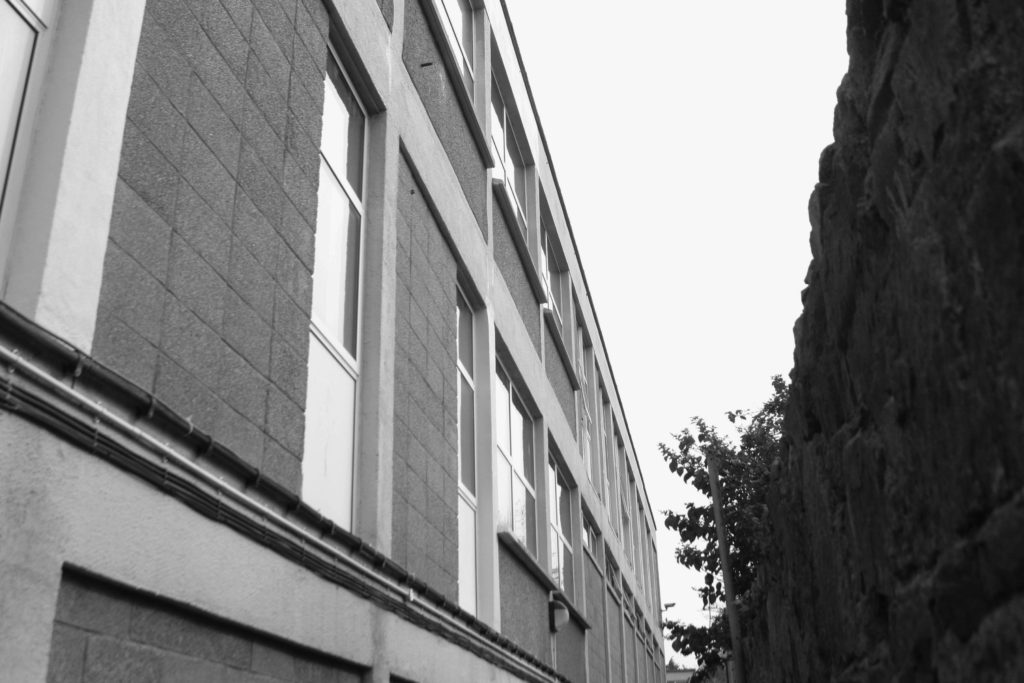
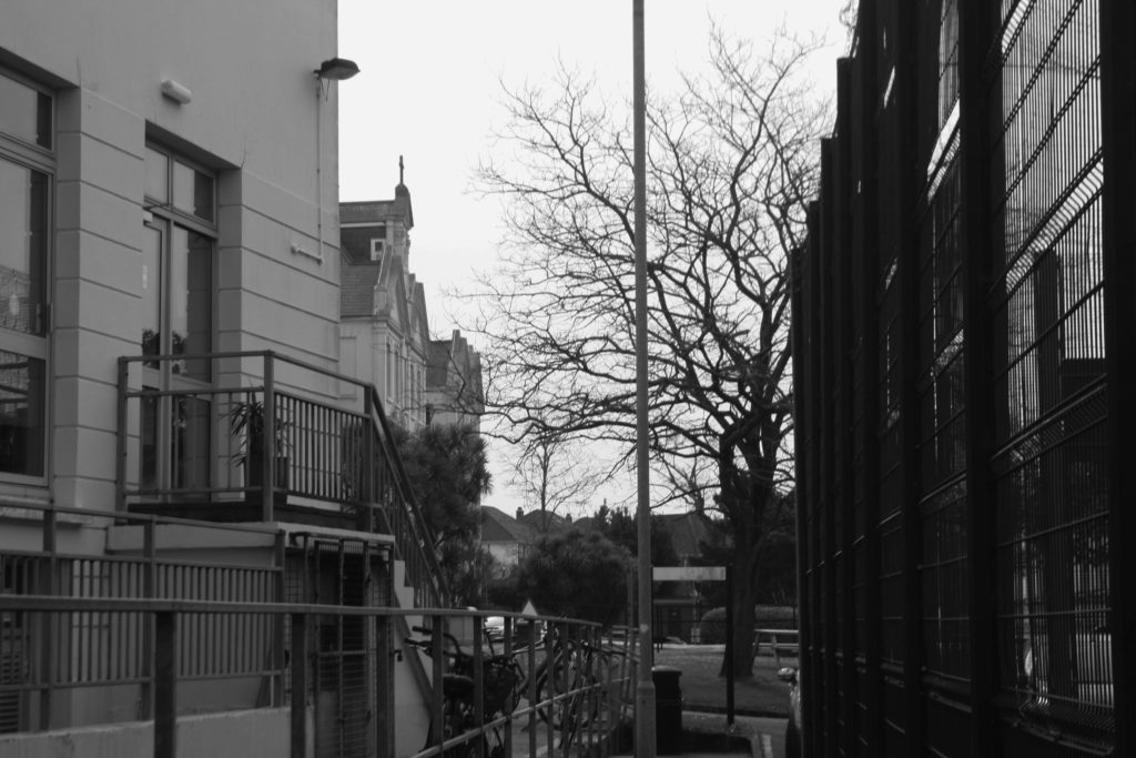
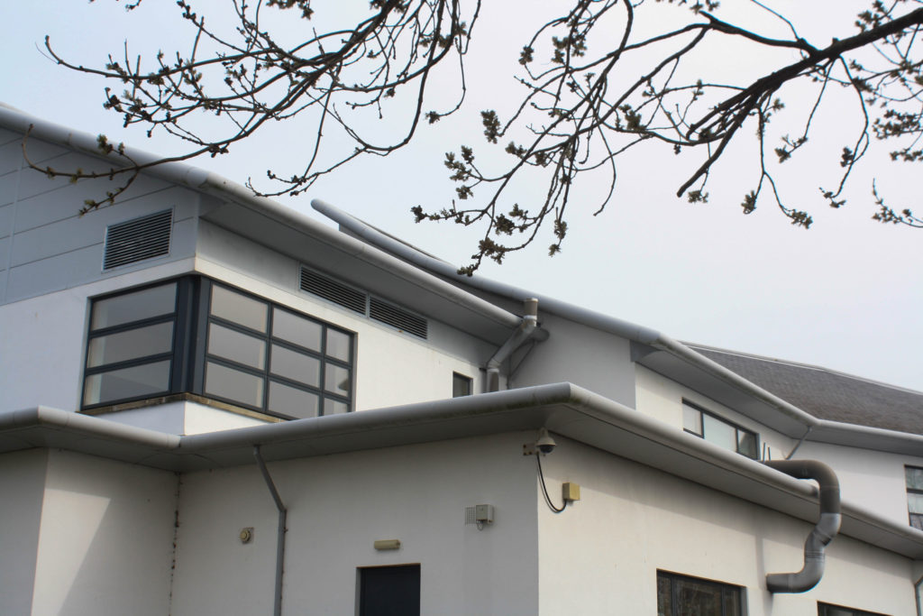
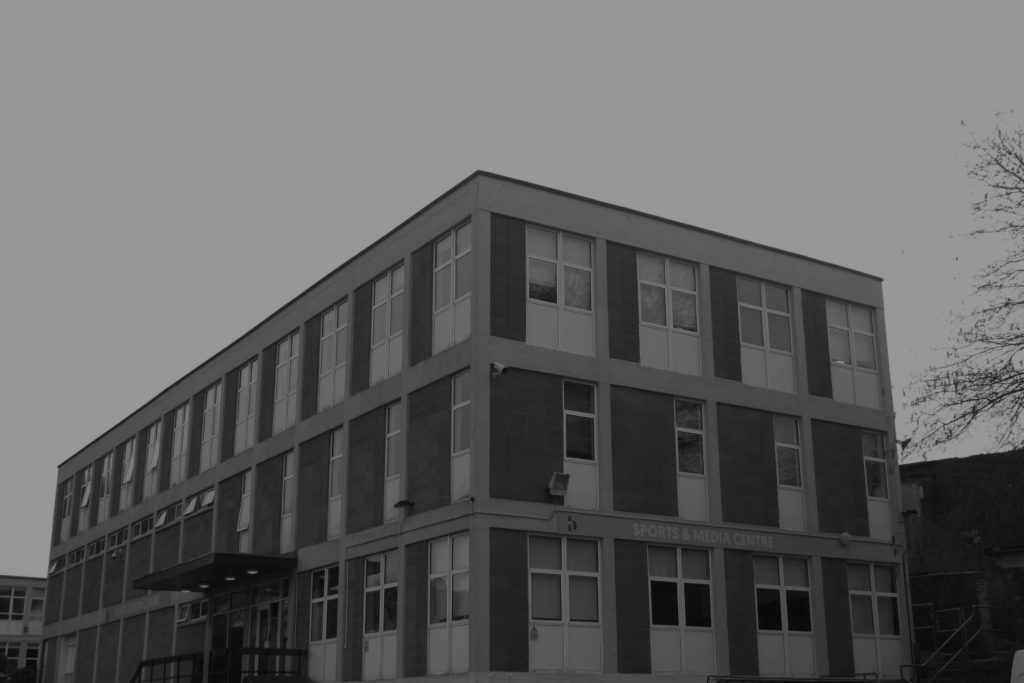
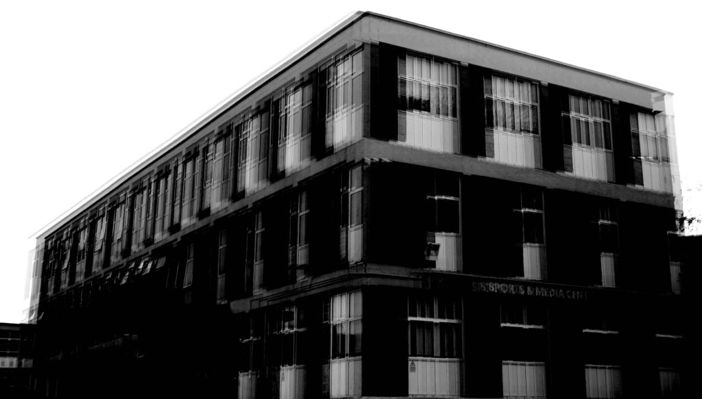
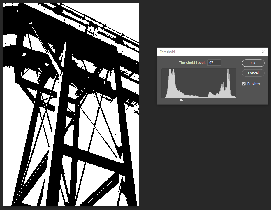
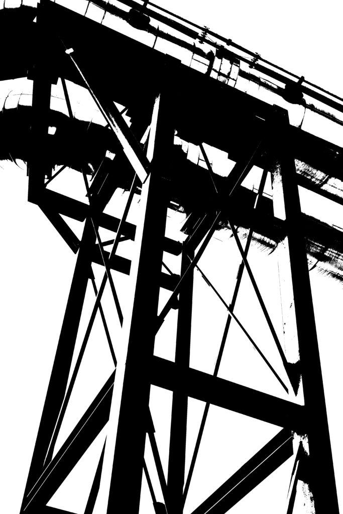
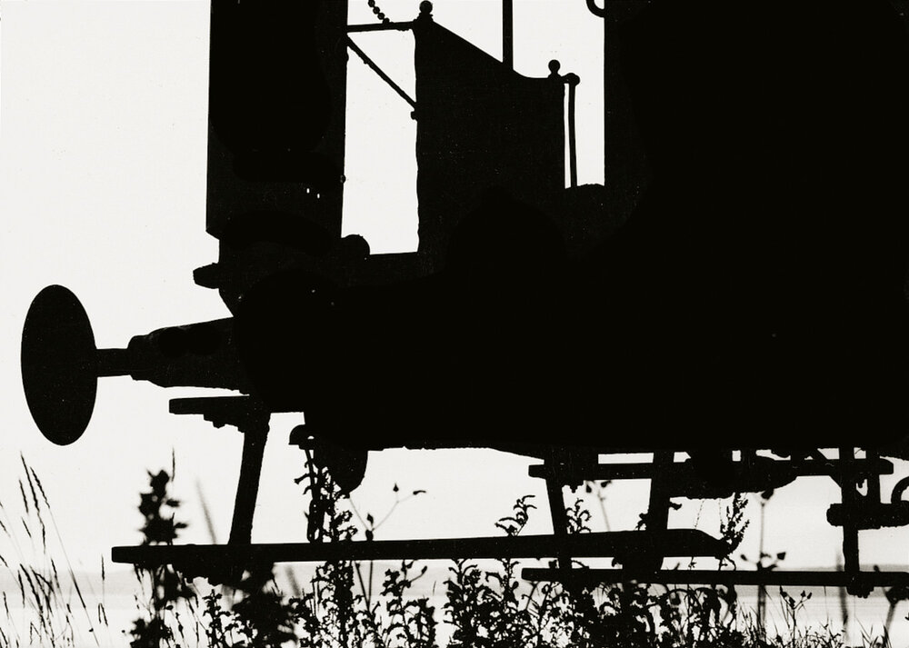
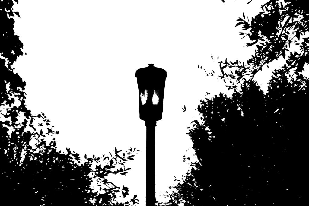
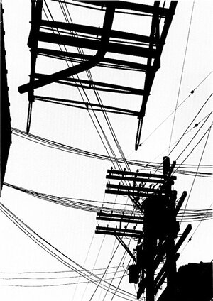
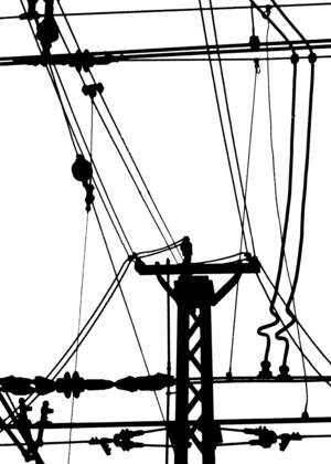
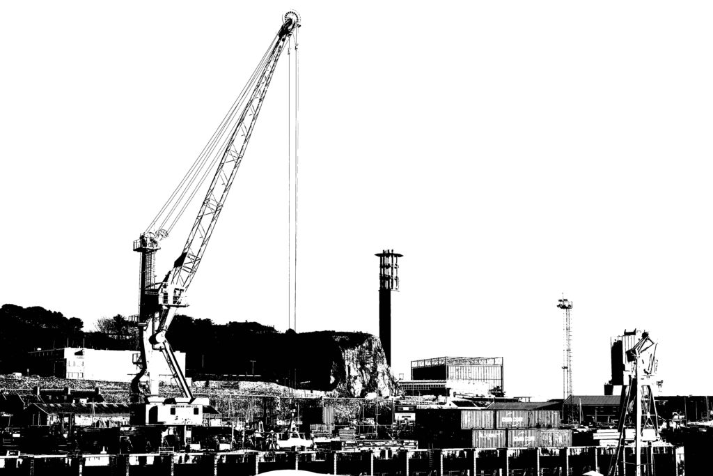
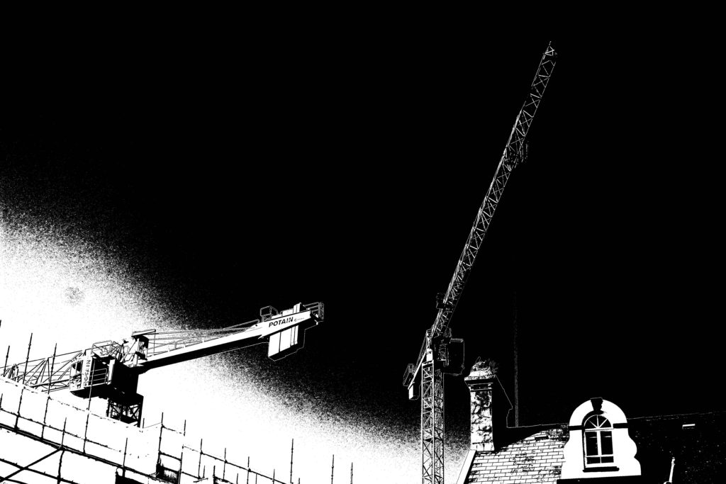
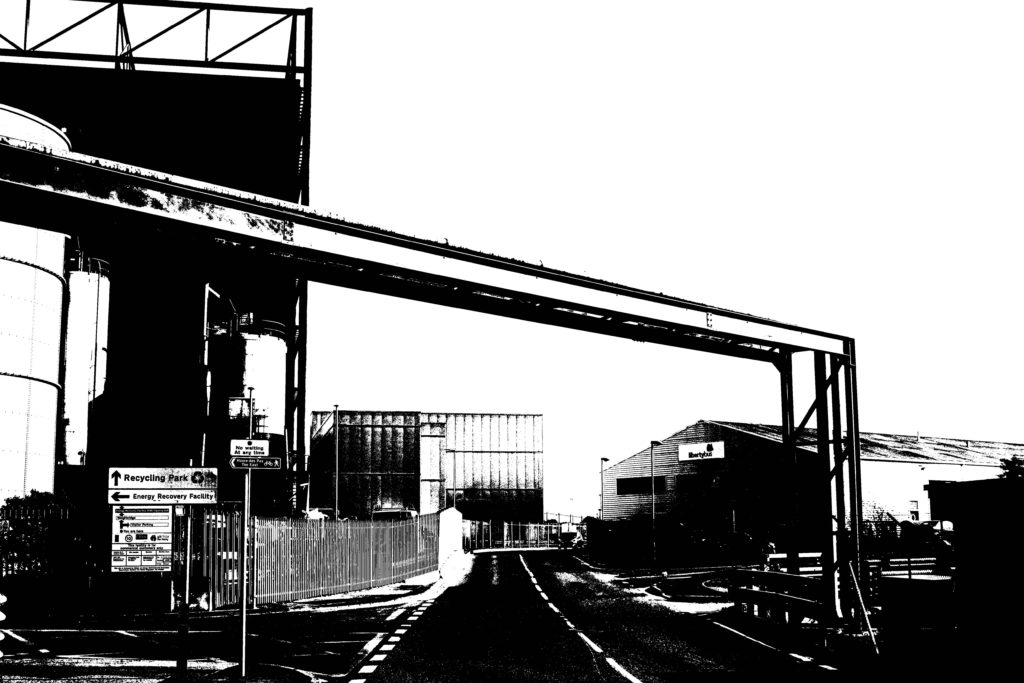
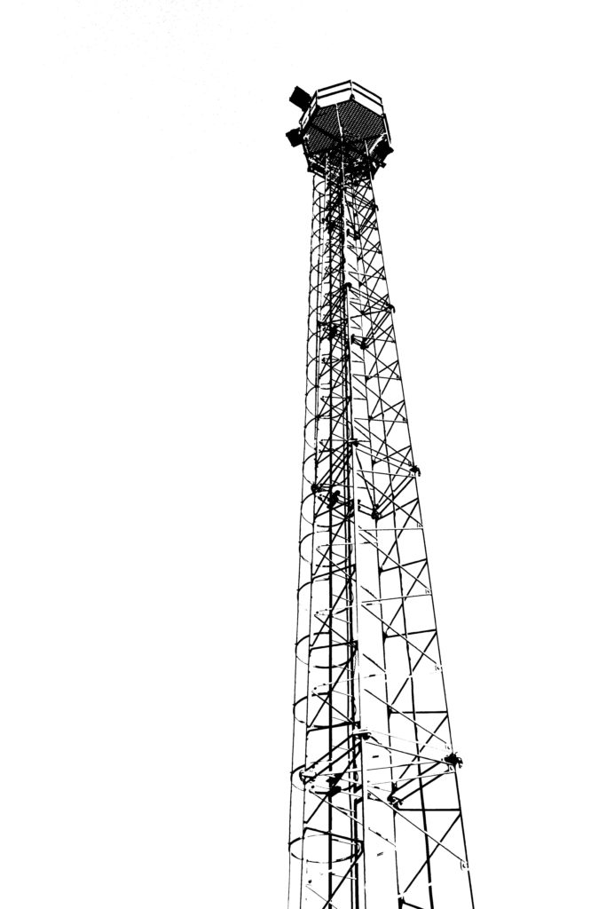
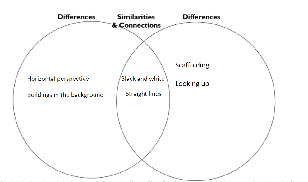
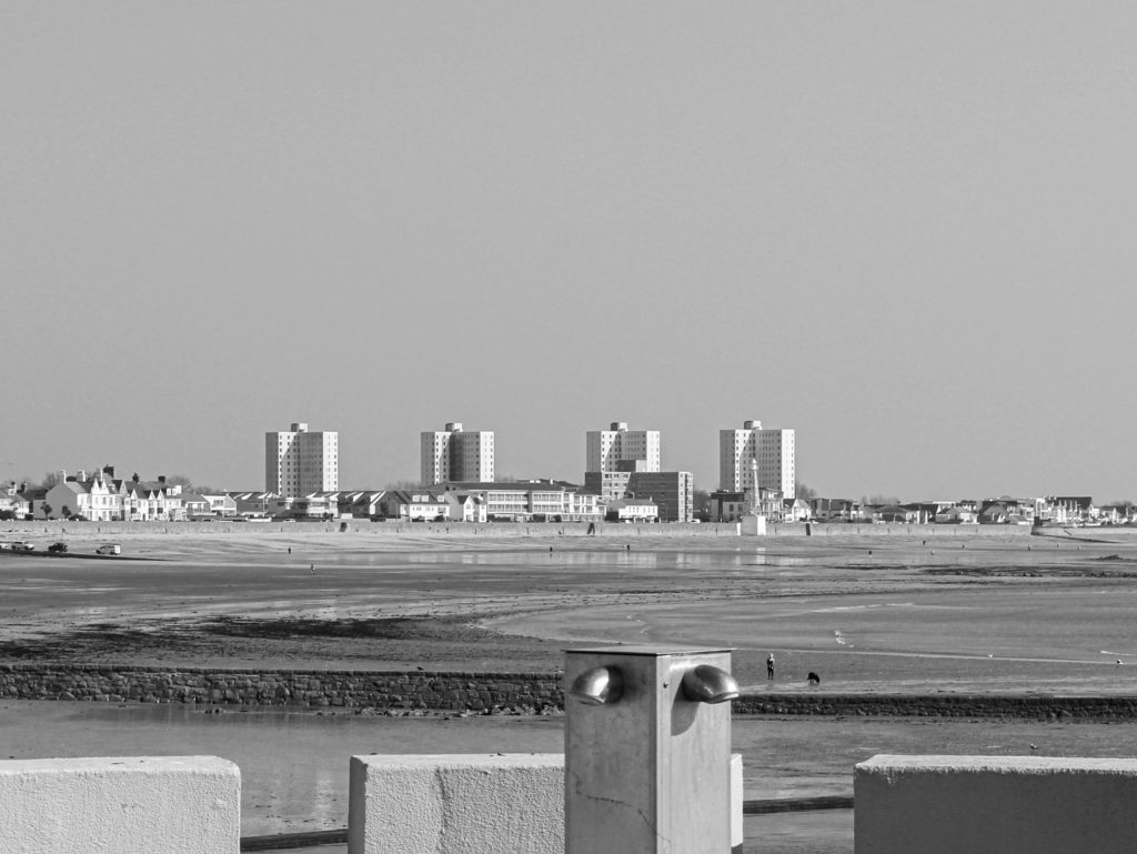
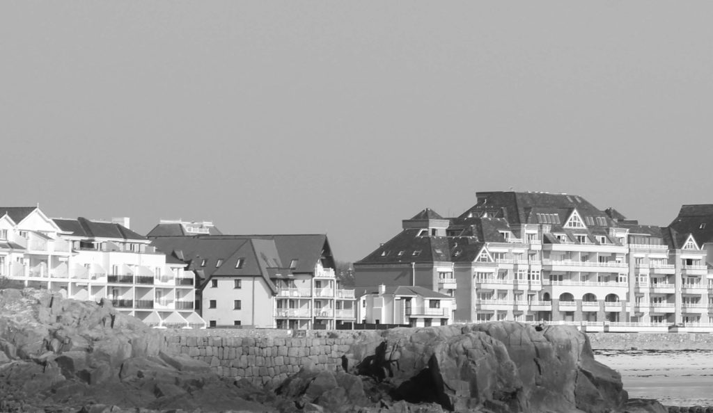
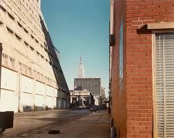
I was less organised for my shoot that I wanted to be, as I was sick when I originally wanted to do one. I ended up taking pictures while walking through town after school.

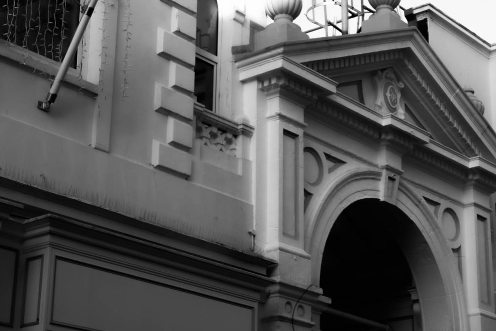
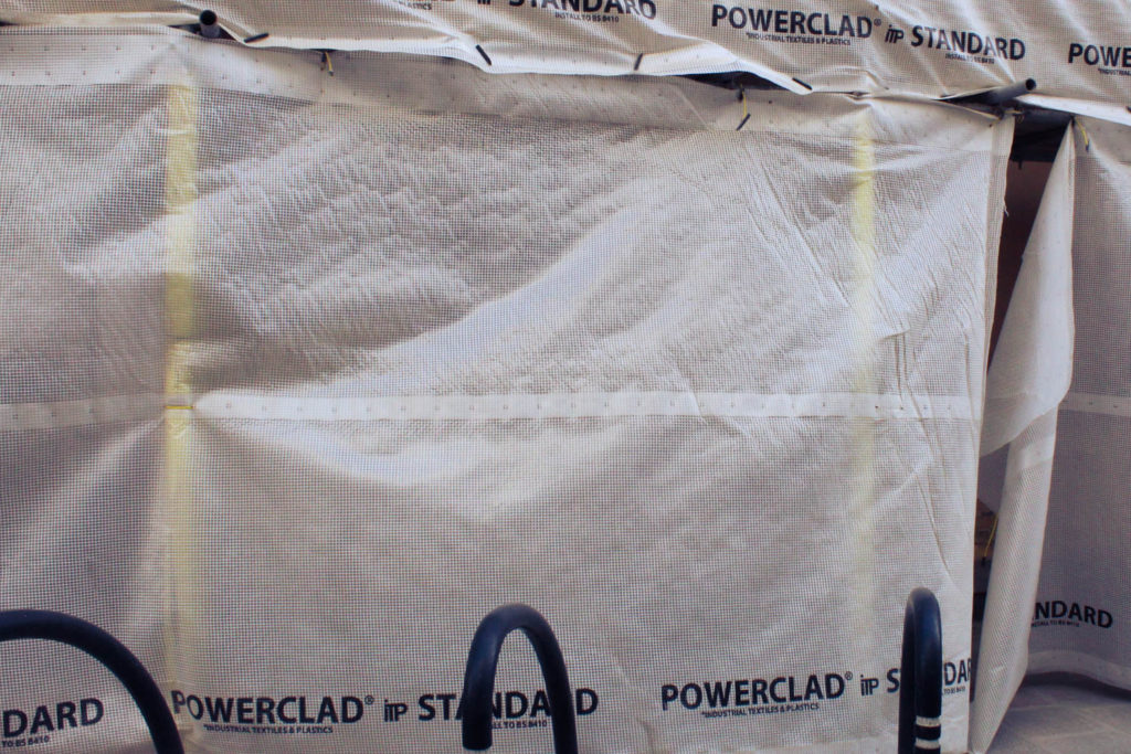
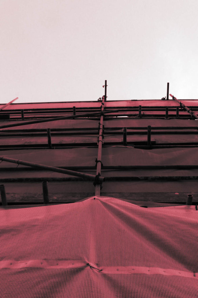
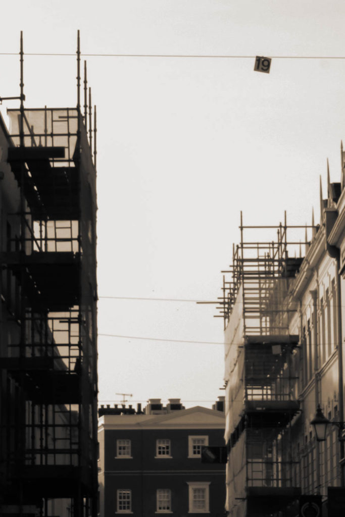
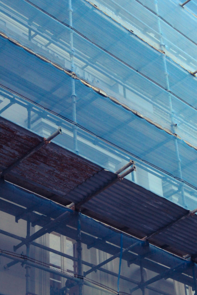
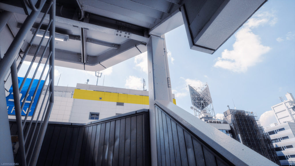
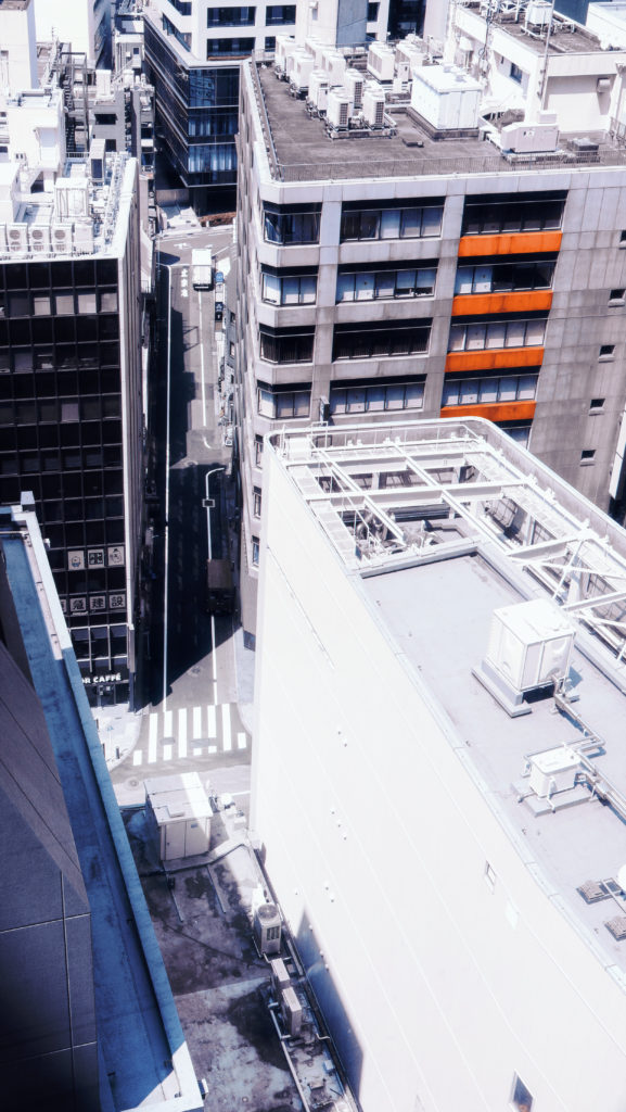
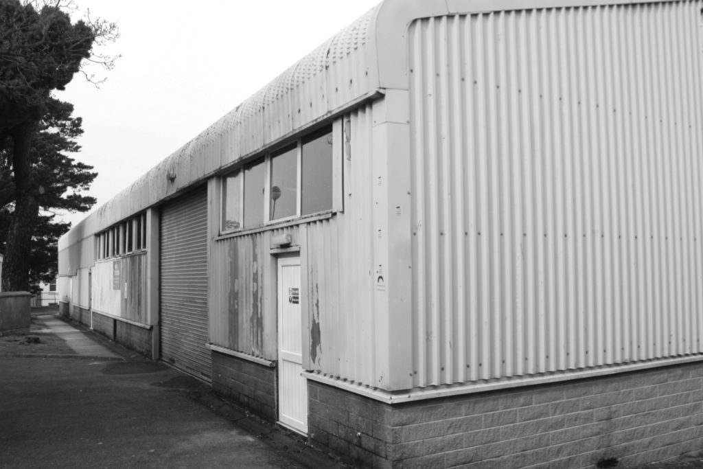
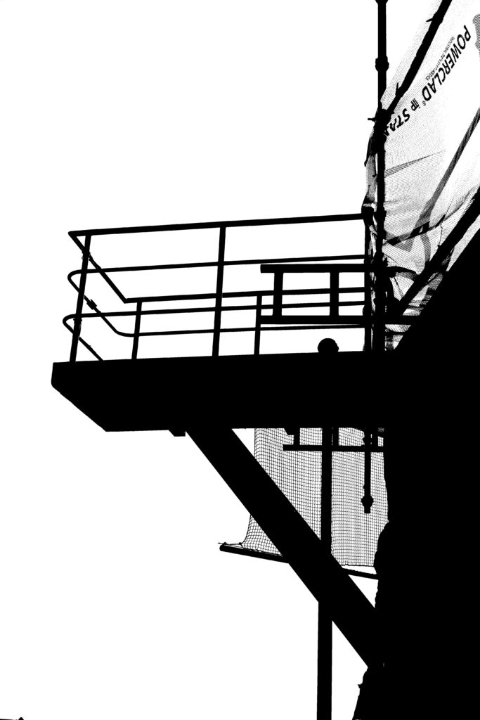
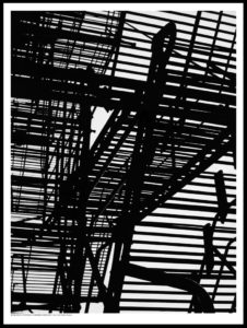
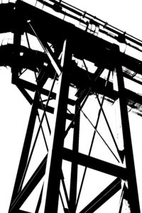
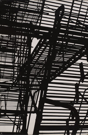
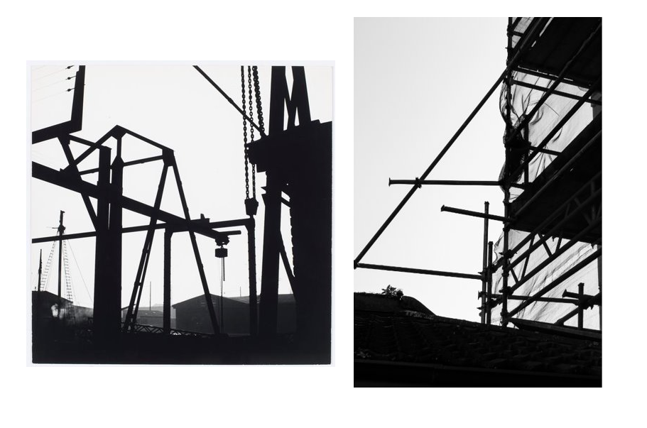
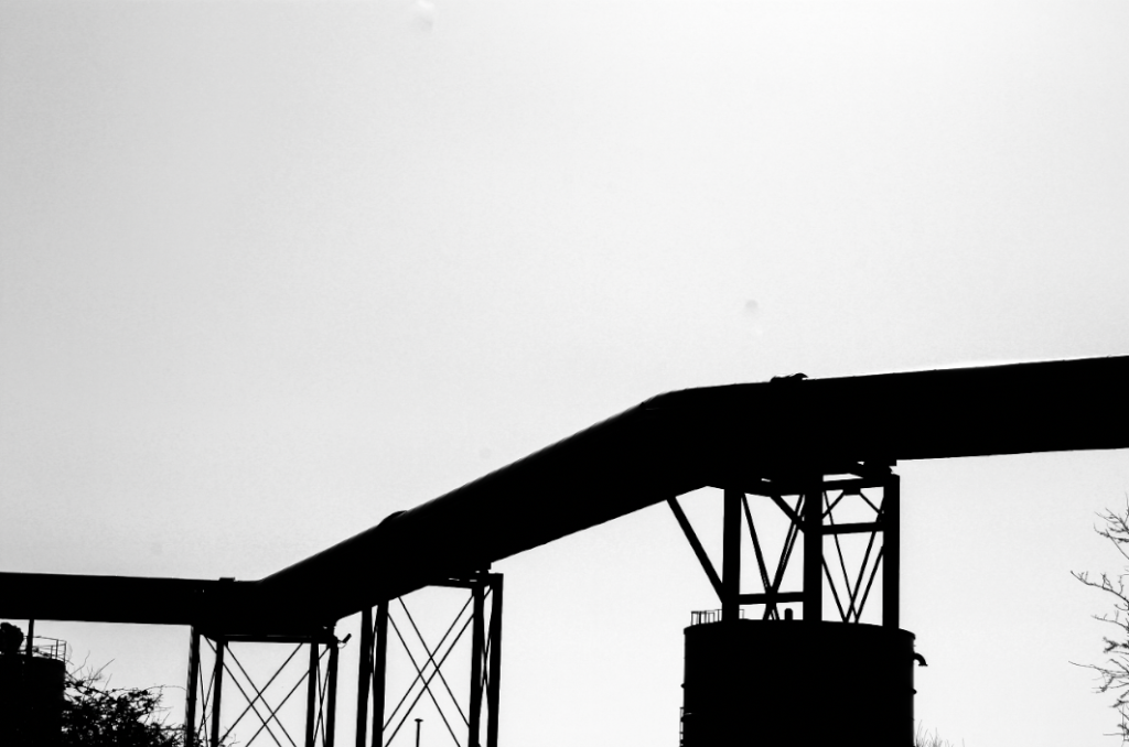
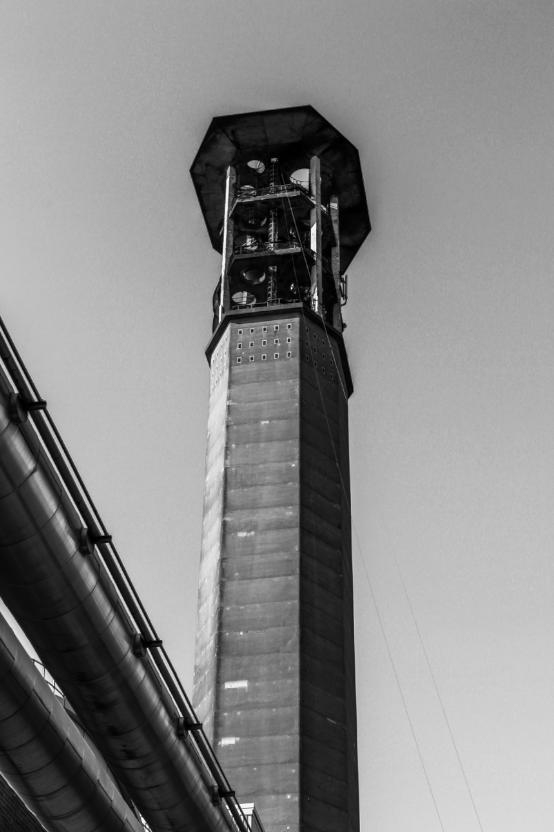
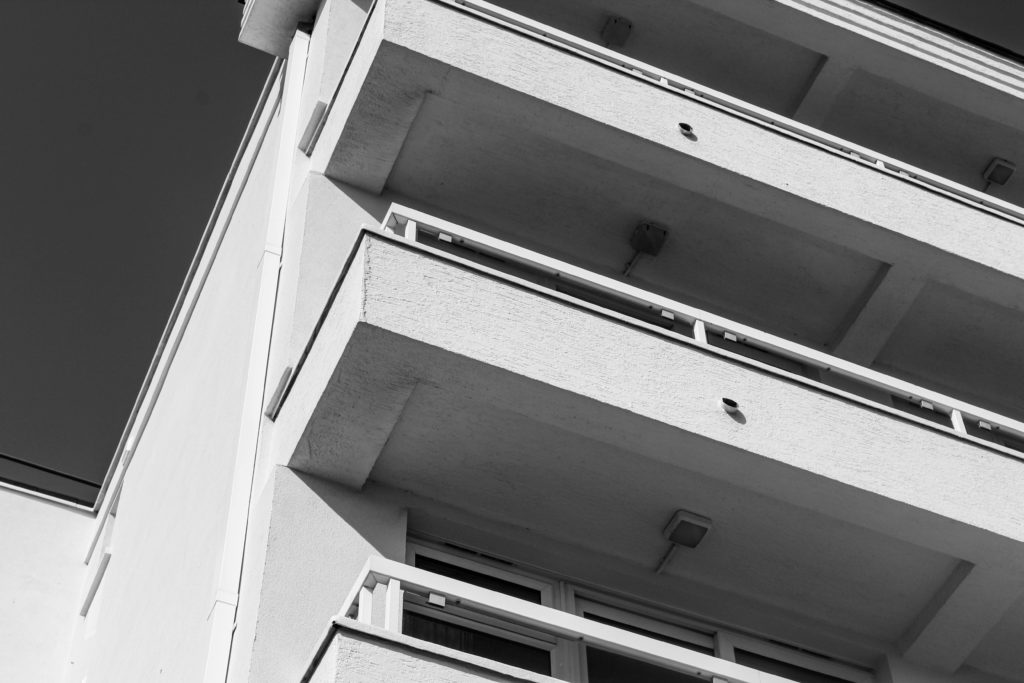
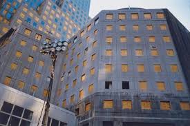
I took pictures of some of the buildings I saw, including some that were in development and covered in scaffolding. I like how the scaffolding pictures look and took some similar pictures on the Havre Des Pas photo walk.

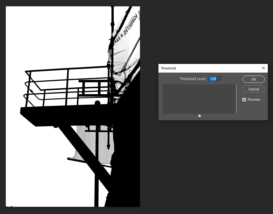
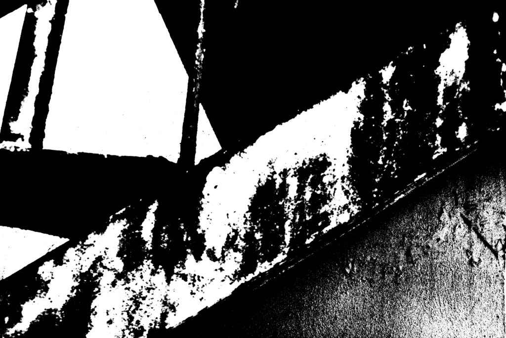
For my edits I wanted to be more experimental, I made some of my images black and white and increased the contrast. I then hue shifted them to they had a bright overwhelming colour, I particularly like the red scaffolding image as it looks unique and contrasts a normal monochrome image.

Night Photography

Exposure Bracketing

Exposure bracketing means that you take two more pictures: one slightly under-exposed (usually by dialling in a negative exposure compensation, say -1/3EV), and the second one slightly over-exposed (usually by dialling in a positive exposure compensation, say +1/3EV), again according to your camera’s light meter.

  • Use a tripod
  • Use slow shutter speeds (experimenting with TV Mode / Shutter speeds)

Photoshoot plan

I plan to take photos of…

  • St Helier- Buildings around King Street and the crossroads
  • Rows of houses
  • Industrial Areas
  • Multi-story Car Parks- Minden Place -Greenstreet
  • Building sites and Scaffolding
  • Demolition sites
  • Underpass / overpass
  • Tunnel
  • The Waterfront
  • Harbour
  • Fort Regent

Contact Sheets

about:blankGalleryDrag images, upload new ones or select files from your library.UploadMedia Library

Liam Wong

https://www.liamwong.com/

Image Analysis

This image has an empty alt attribute; its file name is LiamWong_Kyoto_NightsArtboard1-1024x576.jpg

New Topographics

New topographics was a term coined by William Jenkins in 1975 to describe a group of American photographers (such as Robert Adams and Lewis Baltz) whose pictures had a similar banal aesthetic, in that they were formal, mostly black and white prints of the urban landscape

Joe Deal

Image Analysis

I like how this image doesn’t have much negative space within the photograph however, is has a large range of tones this image looks like it was taken roughly mid-day. There’s lots of tones within this image from the dark trees to the bright house in the near distance which portrays a sense of a deeper meaning to the image. The House and the fencing give the image geometric shapes which are a bright colour which juxtaposes the hectic darkness of the winding branches. There isn’t much negative space within this photograph making it rather busy.


Contact Sheets

Experimentation

Editing in the style of Keld Helmer-Petersen

For this work, I will be attempting to edit in the style of Keld Helmer-Petersen. I will be choosing two photos, which I think are successful and will work well in his style where he uses sharp edges to create abstract shapes and bringing them into photoshop where I will edit them and then I will compare them to his work and see which one I like more and I think shows a better influence of huis work to mine.

Editing in photoshop #1 –

First I brought the photo into photoshop and chose the effect “Threshold” which transforms it into a graphic, abstract effect.
I then brought the brightness down to make it slightly darker and brought up the contrast which created this effect from where the plastic has been wrapped around the pole to give the photo some more dimension which I really like.
This is my final image which I created and I really like it because I think that Helmer-Petersen’s influence is clearly seen within this piece but as I decided to add another level of dimension to the photograph I think that it adds another layer of abstract as you are able to faintly see where the plastic wraps around the pole and the faint pattern of it in the background as well, giving it more depth.

Editing in photoshop #2 –

I brought this picture into photoshop and used the “Threshold effect” to change it into a graphic, abstract black and white effect.
To add some more dimension to the photo I changed the brightness and contrast which adds a small effect that the metal is shiny which can be seen, I really like this.
I think that this is successful with the way that it turned out because I like how the metal tubes appear as if they are shiny as it is able to give them another layer of depth and make them seem more industrial and defined so that they don’t get lost within the white.

Comparison to Keld Helmer-Petersen –

I enjoyed working in the style of Keld Helmer-Petersen and chose this photo of my work as my most successful edit which I completed to compare with Keld Helmer-Petersen’s work because I really like how both of the photos have sharp, bold and black lines which shows the structure of the object well but also creates the illusion which you don’t really know what it actually is because the lines are quite vague with their descriptions so it leaves a lot to the imagination, which I think creates a successful edit in his style as the photos aren’t quite clear in what they are which is what I wanted to incorporate in to my work as well. I also like how my photo has different layer to it to make the industrial object appear shiny because I think that it helps to break up the solid black lines and give the photo that extra layer of dimension and individuality as it won’t be the same on another photo due to the lighting from the sun and the weather whereas Petersen’s work uses more bold, black and defined lines which I didn’t really like.

keld helmer-peterson

Portrait of KHP, Copenhagen 2007. Photo: Kristine Funch.

Keld Helmer-Peterson was a Danish photographer, widely known for his lead role in abstract photography in the 1940s. His career spanned 70 years and he had strong interest in modern architecture and industrial areas, primarily focusing his work on structures and parts of buildings i.e scaffolding or framework.

Architecture and design played a great role in Helmer-Petersen’s work, both professionally and as an artistic field of interest. From 1952 to 1956, he worked with photographer Erik Hansen, after which he established his own studio specializing in architecture and design photography. Peterson also released a series of books documenting his photography, both in colour and black + white, such as 122 colour photographs, Fragments of the City and Black Noise, which was part of a series of three books that showed his abstract style of photography.

KELD HELMER-PETERSEN

Keld Helmer-Peterson had an abstract way of taking images – the final product would consist of mostly black, with a white background to illuminate the silhouette like the photo above. On photoshop we used our urban landscape images to replicate Petersen’s work. To do this, i took my photo and used the Threshold tool to change the tones of my image, using a slider tool to add more black/white shades to the image. The final product represented an abstract art piece.

Example #1 of my final images – i think it gives a nod to his work but in a more dramatic way – the black and white tones highlighted the texture of the wall and stairs in two different ways, whilst the poles in the background stand out very much like in his work. Comparing it to the photo above, Ptersens work has more defined shapes whilst mine has more defined edges with a blend of tones in the middle.
Example #2 – this photo draws my attention because of the contrast between the lamppost and the sky much like in Petersens work, this image involves block colours and sharp lines.

KELD HELMER-PETERSEN

Keld Helmer-Petersen is a Danish photographer. He was an international pioneer in colour photography and was a central figure in not only Danish but also European modernist photography. Helmer-Petersen’s career spanned 70 years and he had strong interest in modern architecture, industrial areas and structures. He started photographing in 1938, when he was given a camera as a high school graduation gift. He studied the graphic and abstract effects of a photograph in particular. He was self-taught and studied technical manuals, journals and photobooks.

Throughout Keld Helmer-Peterson life he maintained a strong interest in international trends, not just photography – but also art, literature, film, music and architecture. However, he wasn’t only inspired by them, but also collaborated and socialised with architects, artists, writers and musicians as a natural part of his work as a photographer.

From 1950 to 1951, Helmer-Petersen studied at the Institute of Design art school in Chicago. Helmer-Petersen’s stay at the legendary Institute of Design came about because of his first photobook ‘122 Colour Photographs’ published in 1948. It gained international attention and was recognised as one of the pioneering examples of art photography in colour. Chicago’s impact on his artistic development was clearly showcased in the book ‘Fragments of a city’ published in 1960 where the photographs were taken in the city of Chicago.

Up until the 1990s he was busy photographing urban environments and industrial areas in the outskirts. He was particularly interested in the area around the harbourside in his hometown of Copenhagen.

My Editing

Here I have tried to edit some of my photos in a similar way that Keld Helmer-Petersen published his. I used the industrial images from the photography work do this and I edited them in photoshop by using the threshold style of editing. I like how the colours and tones are simple but are intensified by the different elements of the photos, like the cranes and the different angles of lines that built them or the darker, more bold structures that standout against the white and lighter sky. I really like how you can see all the little details of the structures and landscapes as the harsh black is more eye-catching against the white.

peter mitchell

Peter Mitchell (born 1943) is a British documentary photographer, known for documenting Leeds and the surrounding area for more than 40 years. Mitchell’s photographs have been published in three monographs of his own. His work was exhibited at Impressions Gallery in 1979, and nearly thirty years later was included in major survey exhibitions throughout the UK including at Tate Britain and Media Space in London, and the National Science and Media Museum in Bradford. Mitchell’s work is held in the permanent collections of the Royal Photographic Society and Leeds Art Gallery.

I will be inspired by Peter Mitchell, in particular his photography project titled ‘early Sunday morning’ this project, which was later published as a book focused on the changing landscapes and urbanisation of Leeds, England, Mitchell captured the layers of the city’s history, exposed by the changes to the urban landscape that epitomised the 1970s and 80s. Hundred-year-old terraces and cobbled streets sit flanked by concrete flats, with newly cleared ground to either side are presented with Mitchell’s typical graphic framing.

Early Sunday Morning – Peter Mitchell

This image has an empty alt attribute; its file name is image-250.png
This image has an empty alt attribute; its file name is image-251.png
This image has an empty alt attribute; its file name is image-252.png
This image has an empty alt attribute; its file name is image-253.png

havre de pa shoot

I took 292 images then spent a long time going through them using the rating system to find the best suited to my artist reference.

final outcomes

Keld Helmer-Petersen was a Danish photographer who achieved widespread international recognition in the 1940s and 1950s for his abstract colour.

keld helmer-petersen Jack Cornwall

the first image is a specific style from Keld helmer-petersen that inspired me to edit my own images in this style. i did this by incresing the blacks and shadows in the image to show the most contrast between the overexposed white sky and the underexposed scaffolding which creates a black and white effect.

Jack Cornwall

I liked her style so I continued to edit more of my photos into her style. this image is of a duct running from the furnace. I thought the supports holding up the duct would look good in this style, that is why i chose to edit this image in this way.

Jack Cornwall

this image is of the underside of the duct taken from inside the support so that I could get a very symmetrical view. I decreased the highlights in this mage to give more contrast between the ducts and the sky behind. i like the way all the different shaded of greys contrast against each other giving a good amount of depth to the image.

Jack Cornwall

this image was taken from underneath the duct looking up to give a looming perspective of the chimney. i made sure took multiple images of from this perspective some with out the duct but I decided that the duct provides depth to the image showing a foreground (the duct) a mid ground (the chimney) and a background (the sky).

Jack Cornwall

I like this image because the contrast between the hard white shapes against the vast dark expanse of the sky. I positioned my self dead on with the building to get more of a dead pan effect then situated the building slightly of centre of the image to give more contrast to the darker coloured sky against the building.

Jack Cornwall

this image shows the barriers at Hav de pa and expanse of land to le Marie flats. i like the way the text is so bold which contrast to the rest of the image which is less sharp. the flat barrier also frames up the horizon which then highlights the development of the land and the high rise flats protruding from the horizon. i positioned these four buildings above the righting to draw your attention from the text up to the building with the large expanse of sandy midground in-between. I converted this image into black and white to give more contrast to the image.

Jack Cornwall

this image shows a very industrial side of the island. I took this image from behind the large spiked fence keeping people out of this industrial area. I like the perspective it gives to the image. i took different images where the chimney was in focus instead but I then decided that I like the this image more because of the less sharp background contrast to the sharp fences.

The new topographics

What was the purpose of New Topographics?

“A turning point in the history of photography, the 1975 exhibition New Topographic signalled a radical shift away from traditional depictions of landscape.”

Robert Adams

Robert Adams | Photography and Biography

Robert Adams is an 84 year old photographer who has spent many years of his life documenting the damage that humans have done to the American west. Adams grew up in New Jersey, Wisconsin, and Colorado. research suggests that Adams was very fond of the outdoors and has a very close relationship with his father. When he was 25 Adams was a collage English teacher. this meant that during his long summer holidays he had a lot of time to spend outdoors and this is when he discovered photography. During the 1970s and 1980s he produced a number of books that highlighted the suburbs of Colorado. Robert Adams focused mainly on the mixture of the natural world and the influence that humans have had upon the natural landscape.

My Images in response to the new thermographic and Robert Adams

urban landscapes

An urban area, or built-up area, is a human settlement with a high population density and infrastructure of built environment. Urban areas are created through urbanization and are categorized as cities, towns, conurbations or suburbs.

mood board

Joel Meyerowitz

Joel Meyerowitz is an American street, portrait and landscape photographer. He began photographing in colour in 1962 and was an early advocate of the use of colour during a time when there was significant resistance to the idea of colour photography as serious art.

 his early work consisted mainly of black-and-white street photographs made with a Leica, by 1976 he had turned primarily to colour photographs of architectural light and space made with a large-format view camera.

examples of his work
New York City, 1978

I like the use of tones in this image and how the urban environment around is eye catching such as the empire state building that can be seen at the end of the horizon. The use of low shutter speed it shows how New York is busy and full of life as down the street you can see the pedestrians walking towards the foreground.