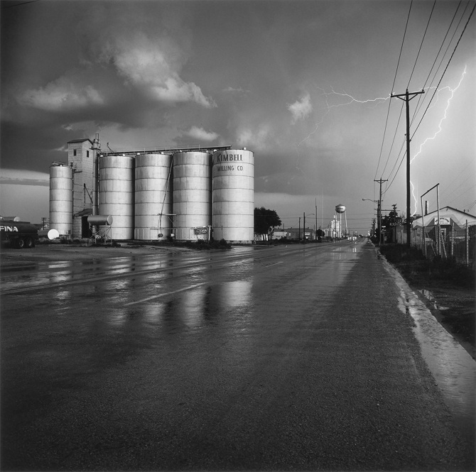
Frank Gohlke 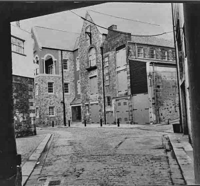

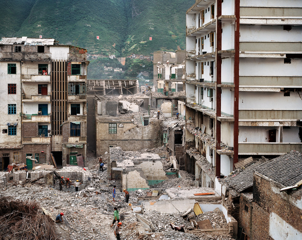
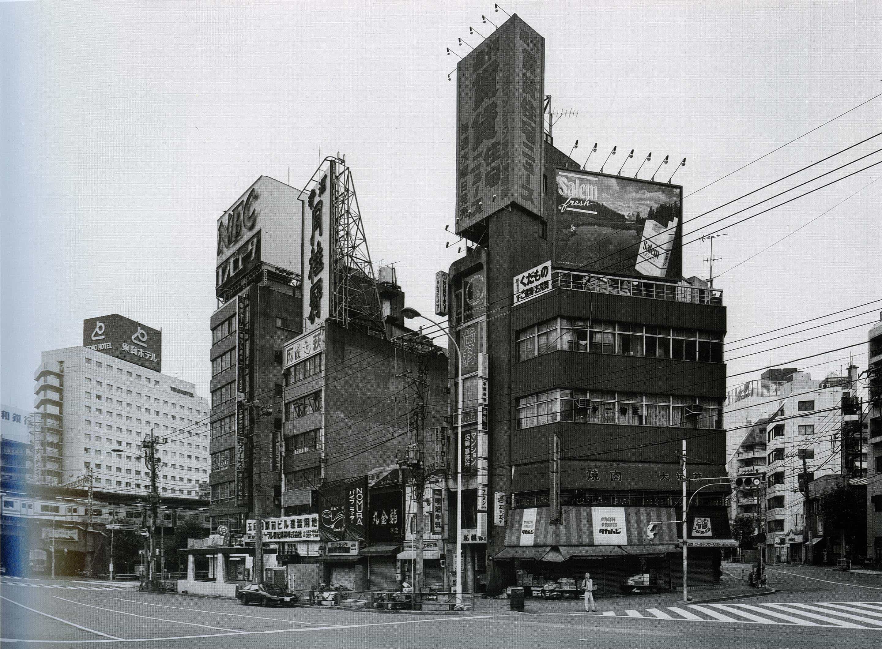
Suzhou Jie, Daoxiangyuan, Haidian District, Beijing, 2004 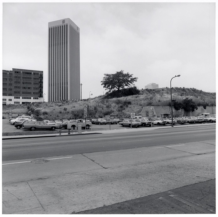

Bernd Becher and Hilla Becher 
Joel Sternfeld


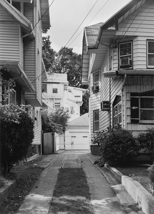


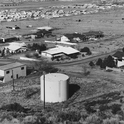
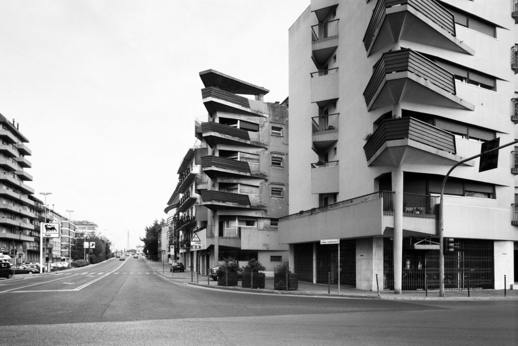
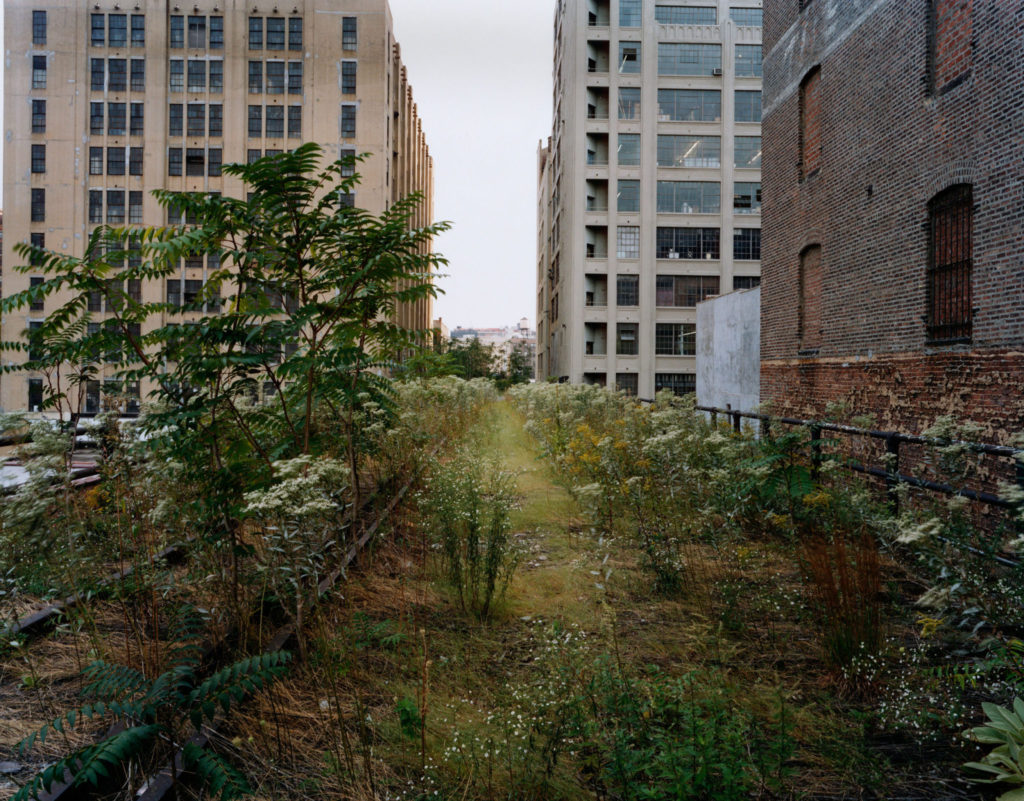
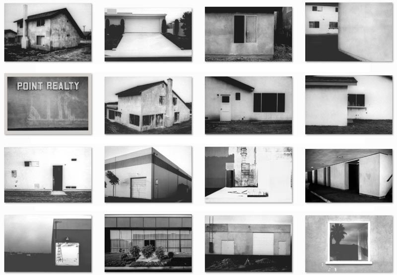
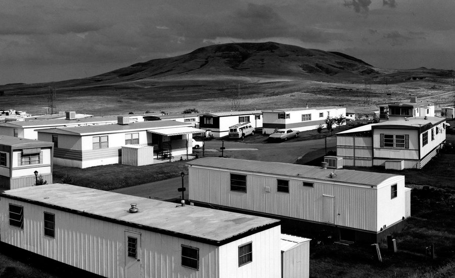
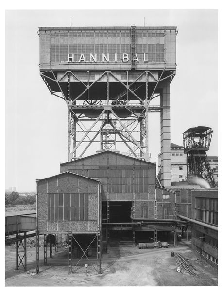
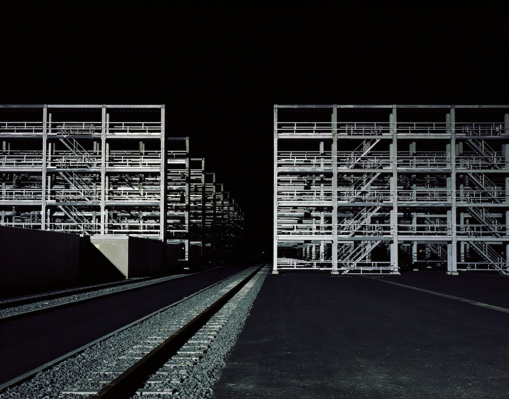
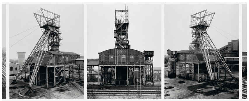
New topographics was a term coined by William Jenkins in 1975 to describe a group of American photographers (such as Robert Adams and Lewis Baltz) whose pictures had a similar banal aesthetic, in that they were formal, mostly black and white prints of the urban landscape
The photographer were inspired by the man-made, selecting subject matter that was matter-of-fact. Parking lots, suburban housing and warehouses were all depicted with a beautiful stark austerity, almost in the way early photographers documented the natural landscape.
What was the topographics a reaction to?
Topographics are a reaction to the tyranny of idealised landscape photography that elevated the natural and the elemental.
Examples of the new topographic



What is urban photography?
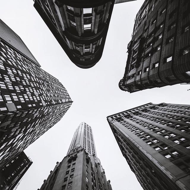
Urban photography is a broad term describing photography that showcases all aspects of an urban environment, combining elements of many other types of photography, including portrait, fine-art, landscape, and architecture photography as well as photojournalism.
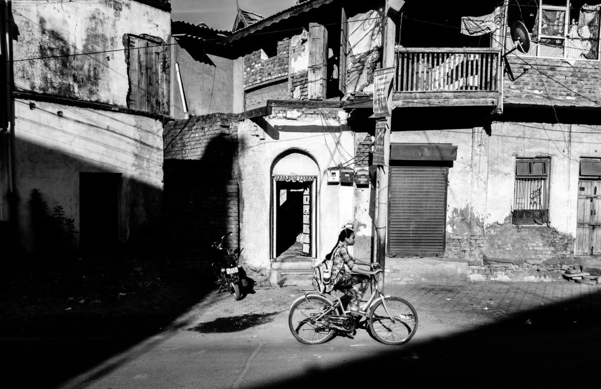
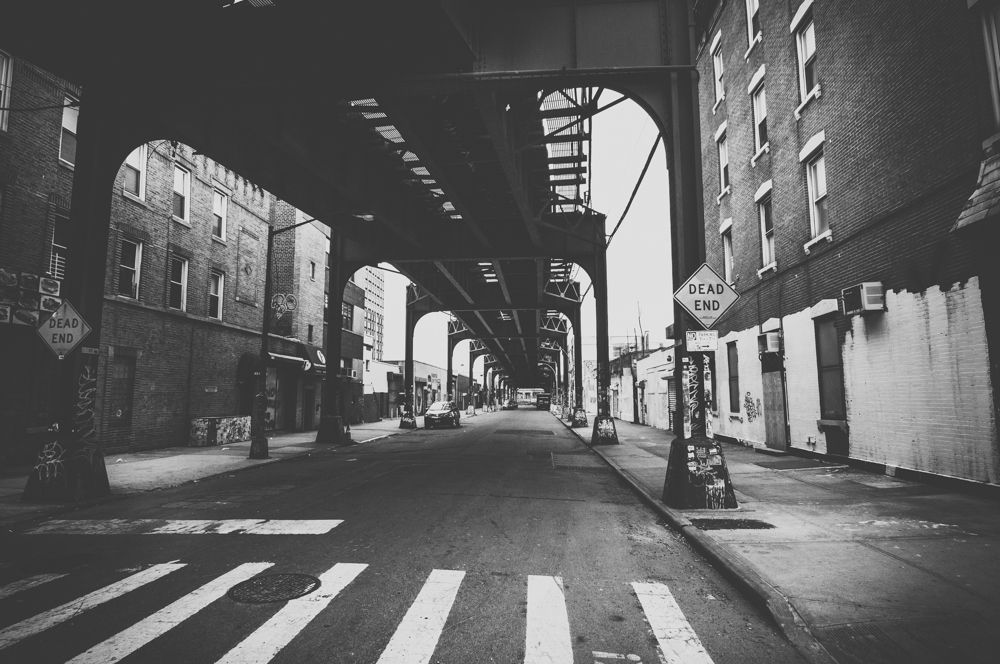


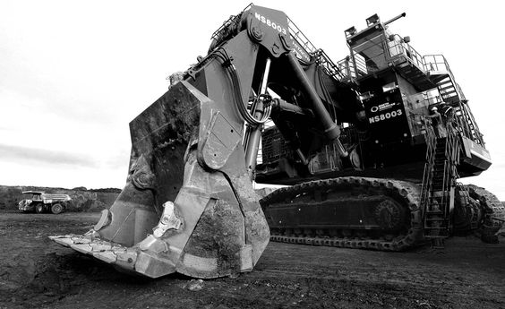

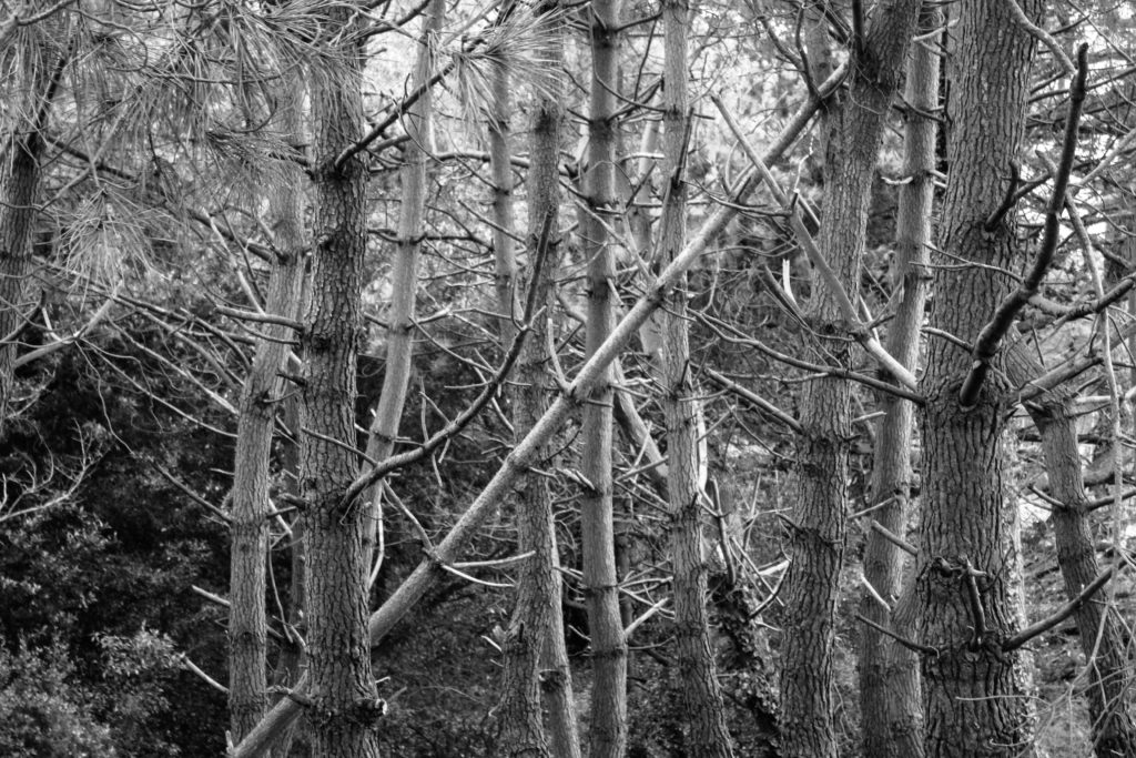
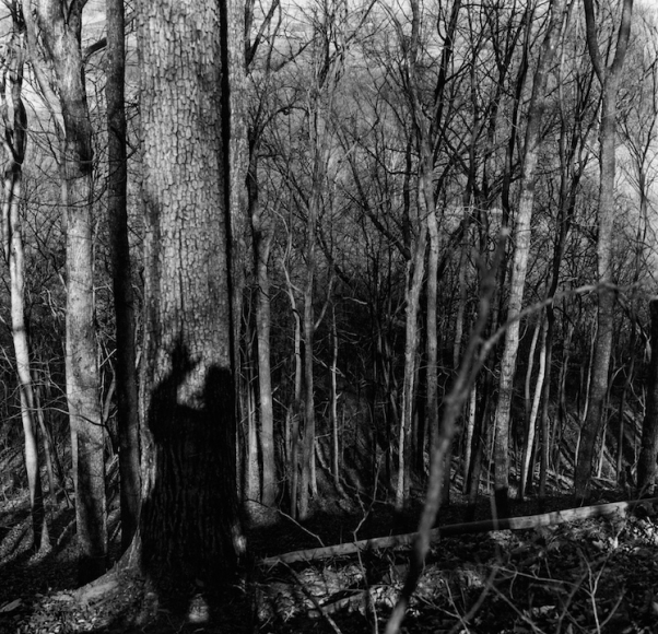
| Ralph Eugene Meatyard (differences) | Similarities | My own photographs (differences) |
| Includes props such as people and cars | Cluttered inclusion of trees | Slightly more close up images |
| Include more of the landscape | Similar shades of greys, blacks and whites | Mainly focused on smaller sections |
| Includes a person’s shadow | Both in black and white | More detail shown in the trees |
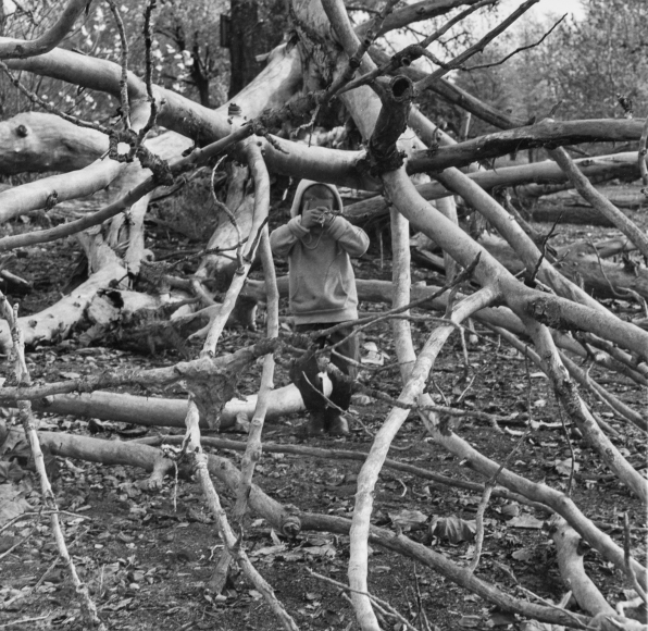
Both images (my own photography and that of Ralph Eugene Meatyard) share many similarities and differences. To compare these images, I can first see that both images include the use of a cluttered abundance of trees, swarming and filling up the entire photograph. Although in my image, all the trees are slightly wider and more detailed than the ones in Eugene Meatyard’s. His image has darker trees in the background whilst my image has every tree being more or less the same shade of grey.
I have also noticed that both images are in black and white and contain very similar shades and tones of both colours. I have however noticed, that Eugene’s Meatyards image is slightly more far away so you get the entire length of the tree whilst in my photo you can see that I’ve only captured a smaller portion of the trees. Eugene Meatyard’s also includes someone’s shadow whilst mine on the other hand, does not.
Eugene Meatyard tends to include props in his photographs whether it be landscape, portrait, or any other form of photography. He includes people into his photos, cars, shadows, masks and loads more. I have only captured the trees itself and left it at that.

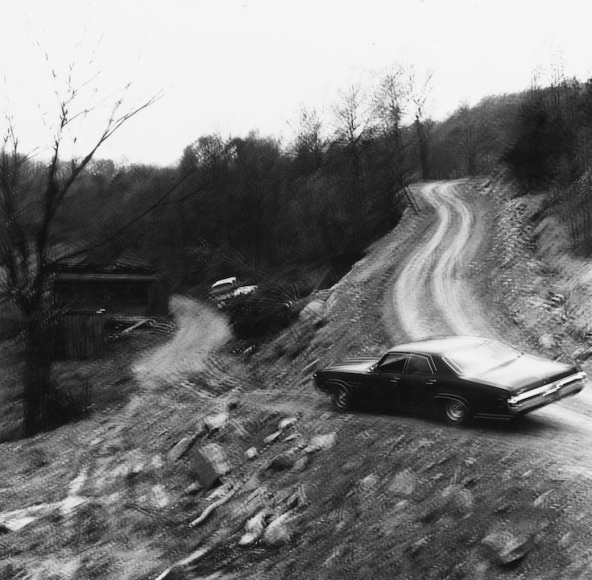
These photos have a very similar sense of imagery due to the wavy tracks that were created in both. However, Eugene Meatyard’s is more of the entire landscape and is much blurrier than of mine.
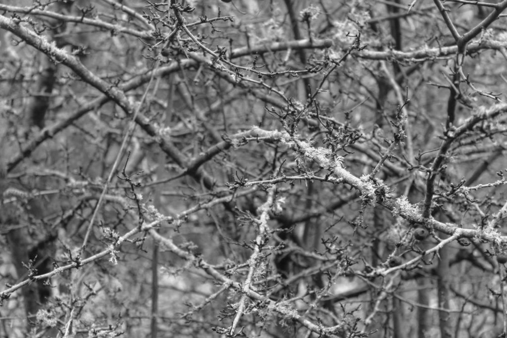
These images are both similar themselves in the sense they both focus around the structure of the jagged and messy tree branches, but they are different in the sense that I’ve captured a picture of smaller branches close up and just focused on that, whilst the other image includes a child and is also focusing on bigger pieces of a tree. They do both however, have the same shades of black and white.
Final images
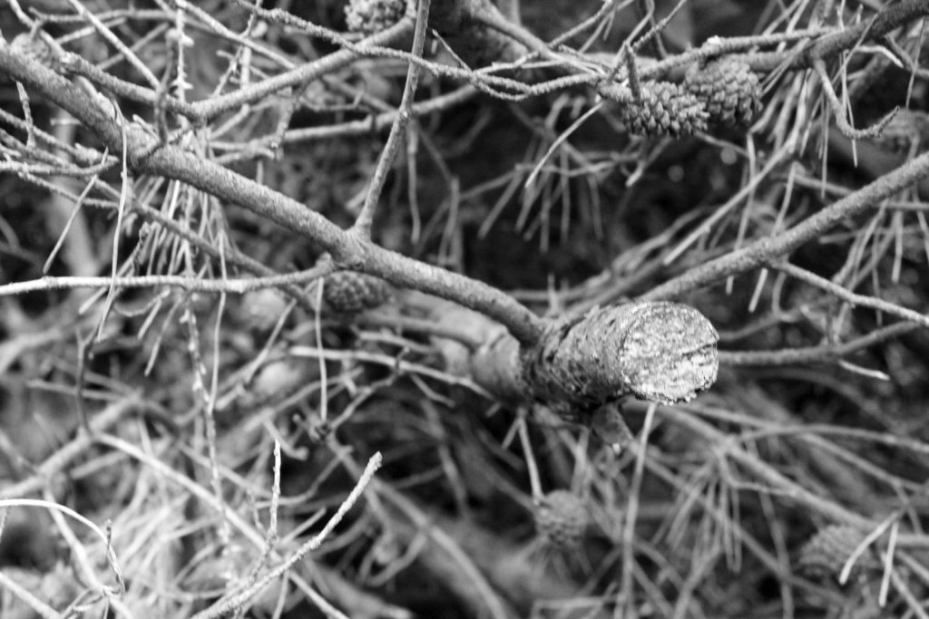


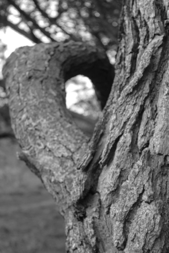
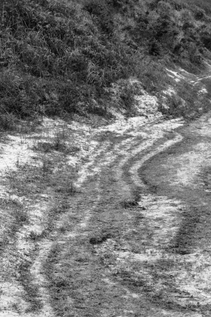
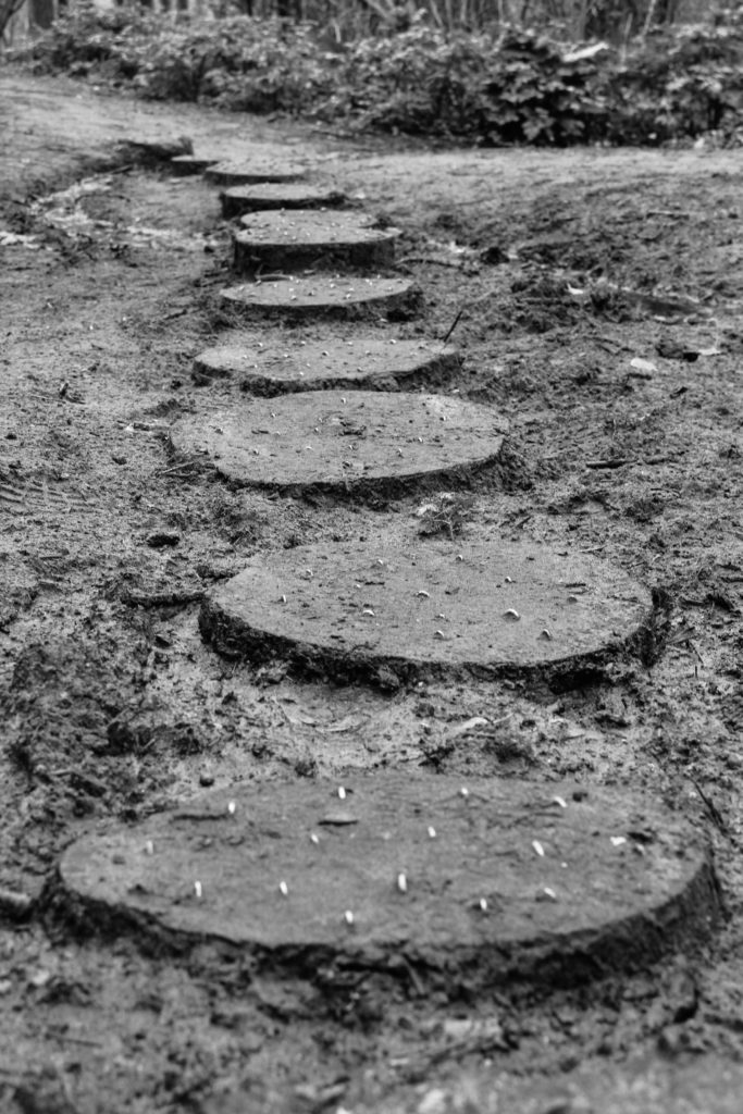

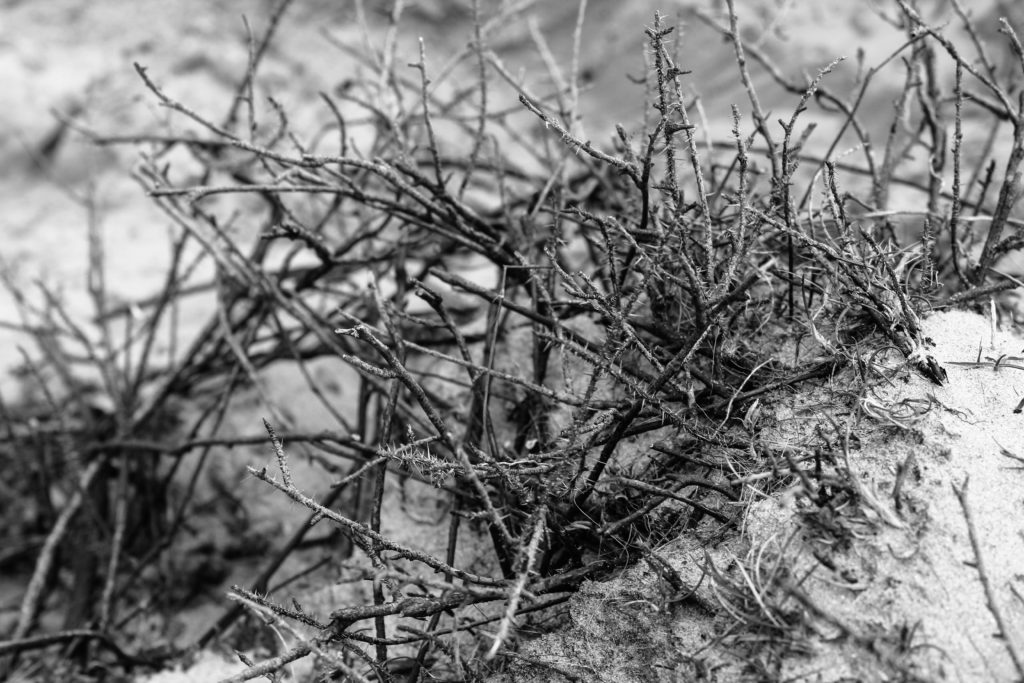
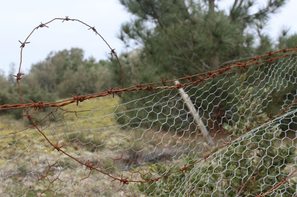
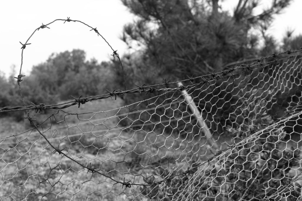
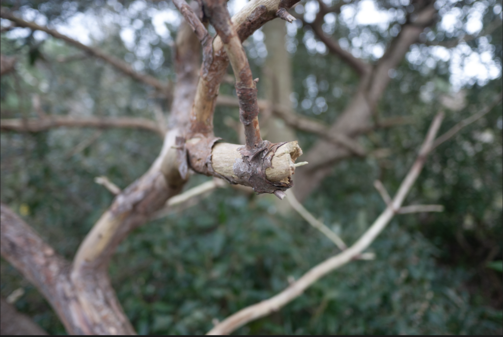
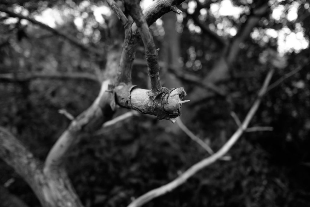
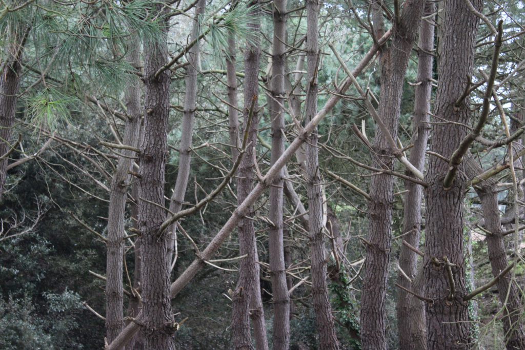

What I did here for my rural photography was I added a black and white filter on lightroom classic and adjusted the contrast slightly to my liking. I chose the filter labelled ‘B&W low contrast’ and adjusted it so that it didn’t turn out too dark or too light.
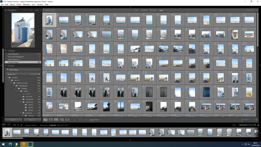
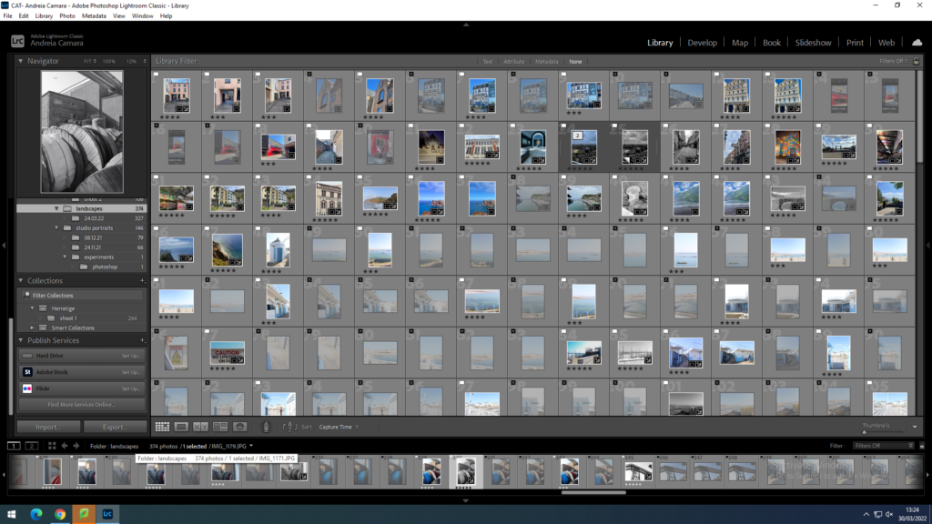
I imported my photos into Lightroom to start my editing process
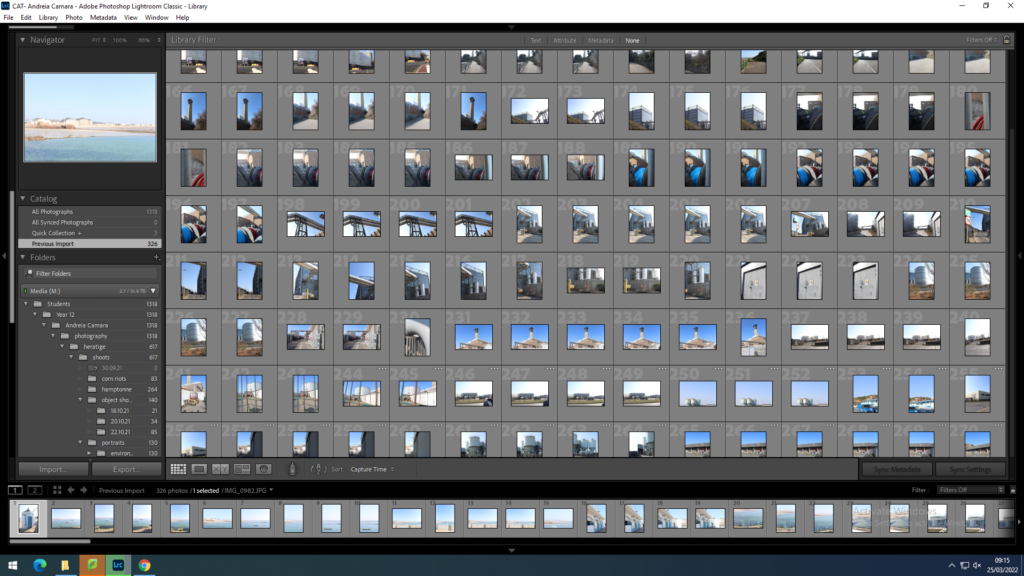
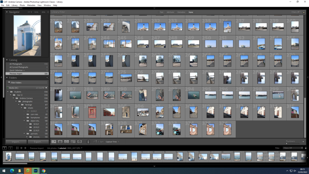
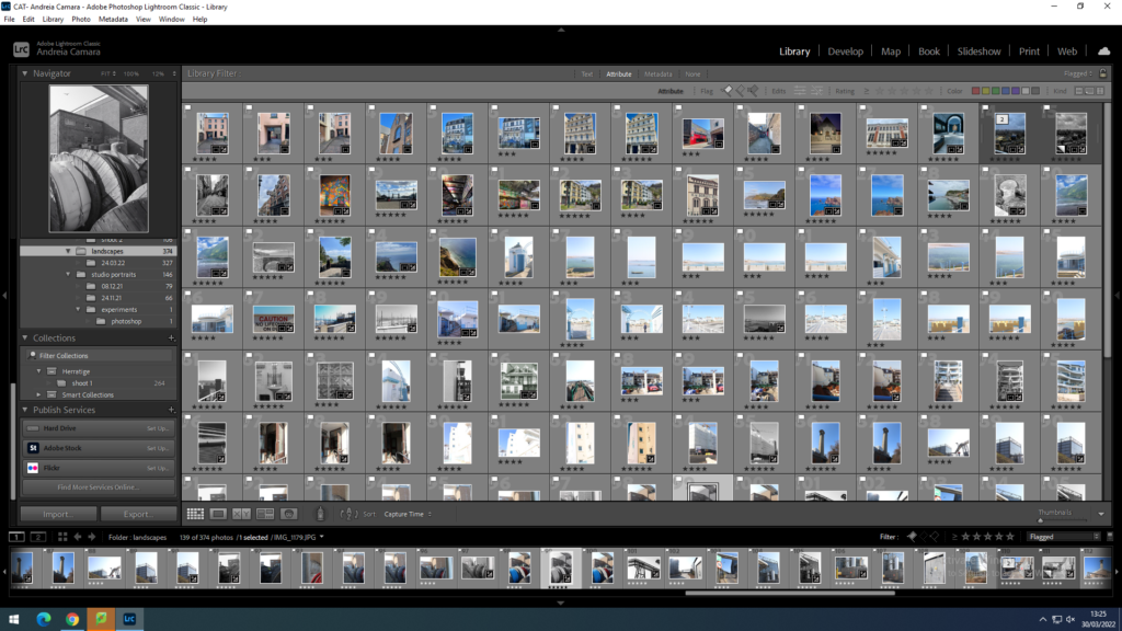
I then flagged my best images using p and x and then set up my staring system 5 being the best 3 being the worst
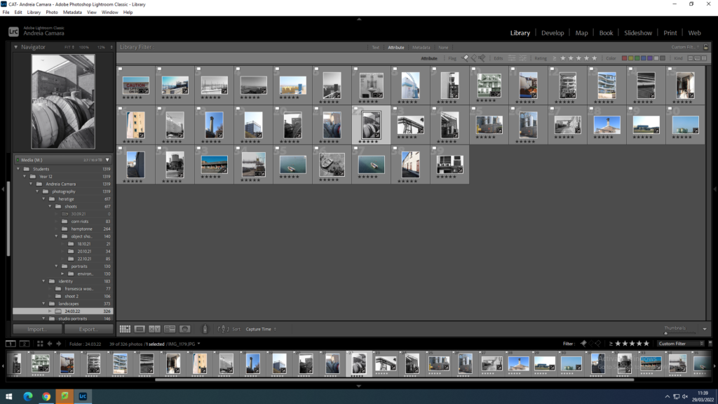
Then I went into develop mode and began the editing process I began by cropping images and then fixing the exposure and contrast of the images.
urban industrial
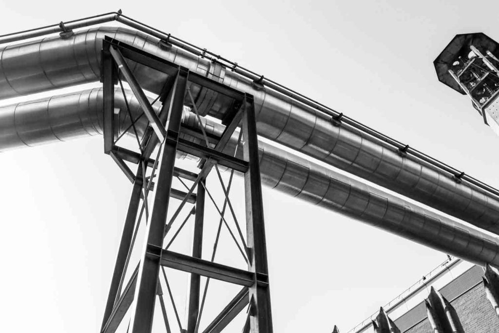
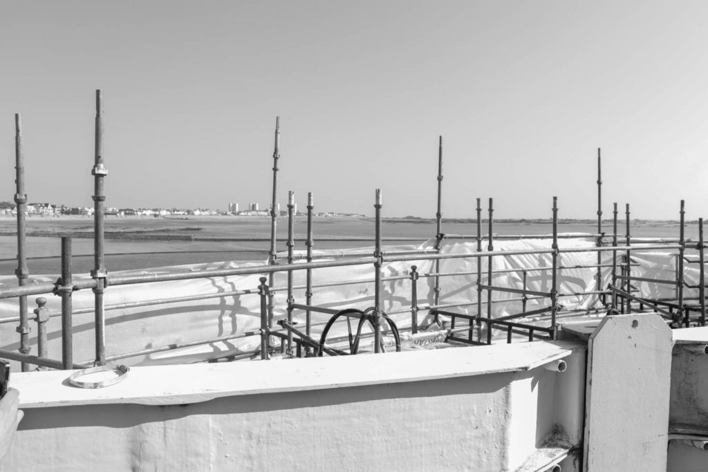
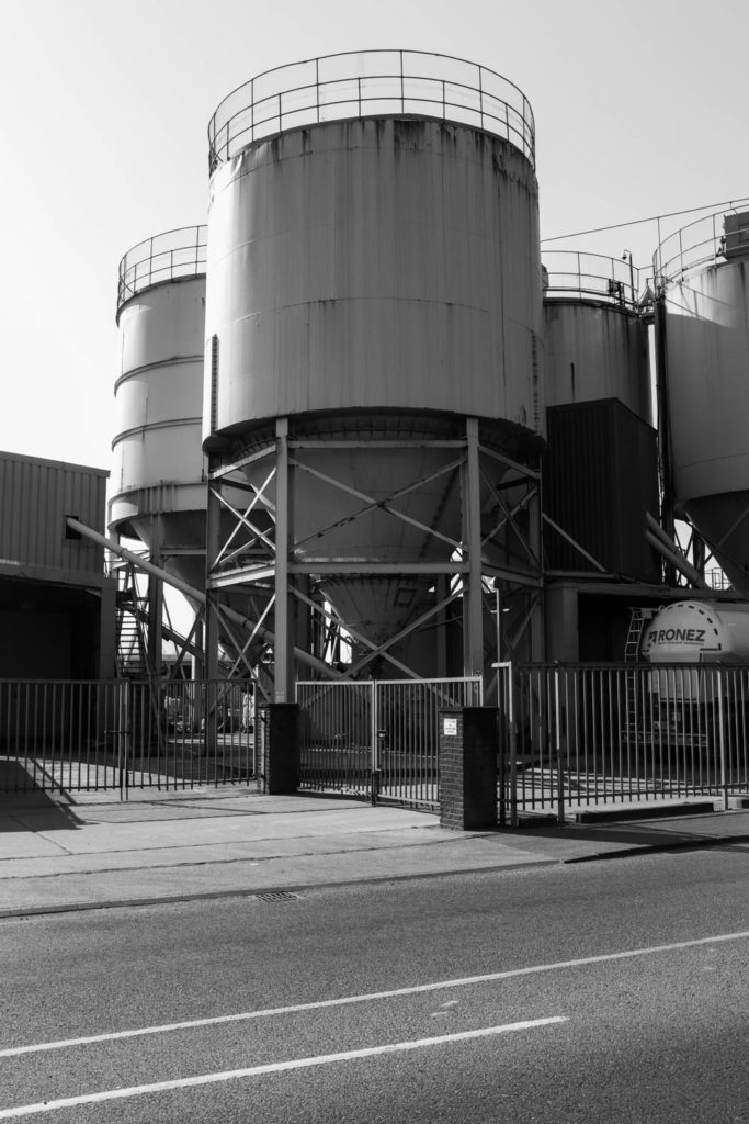
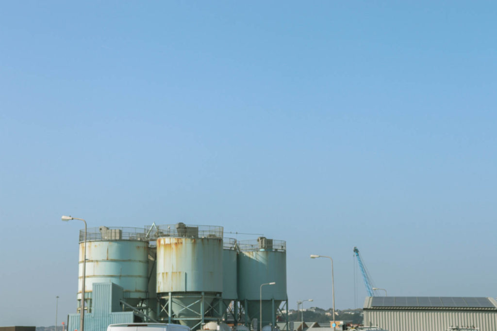
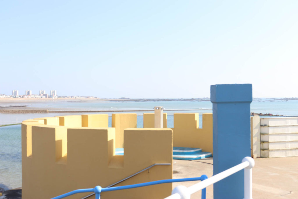
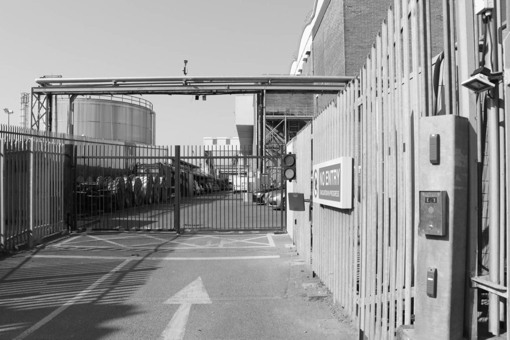
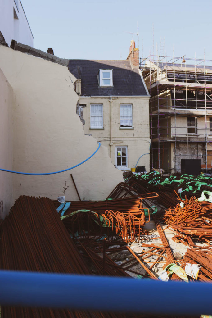
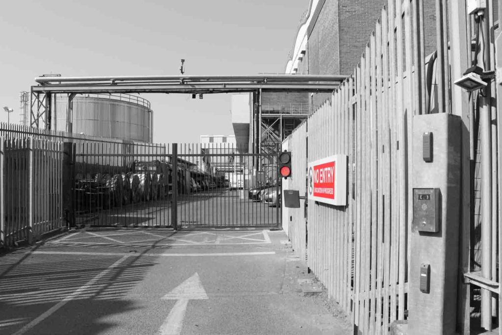
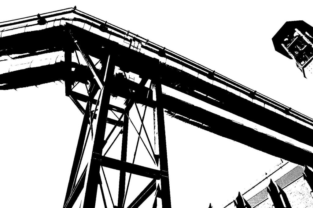
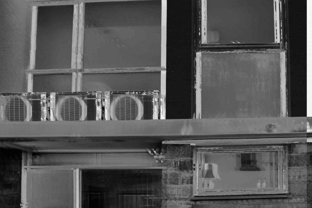


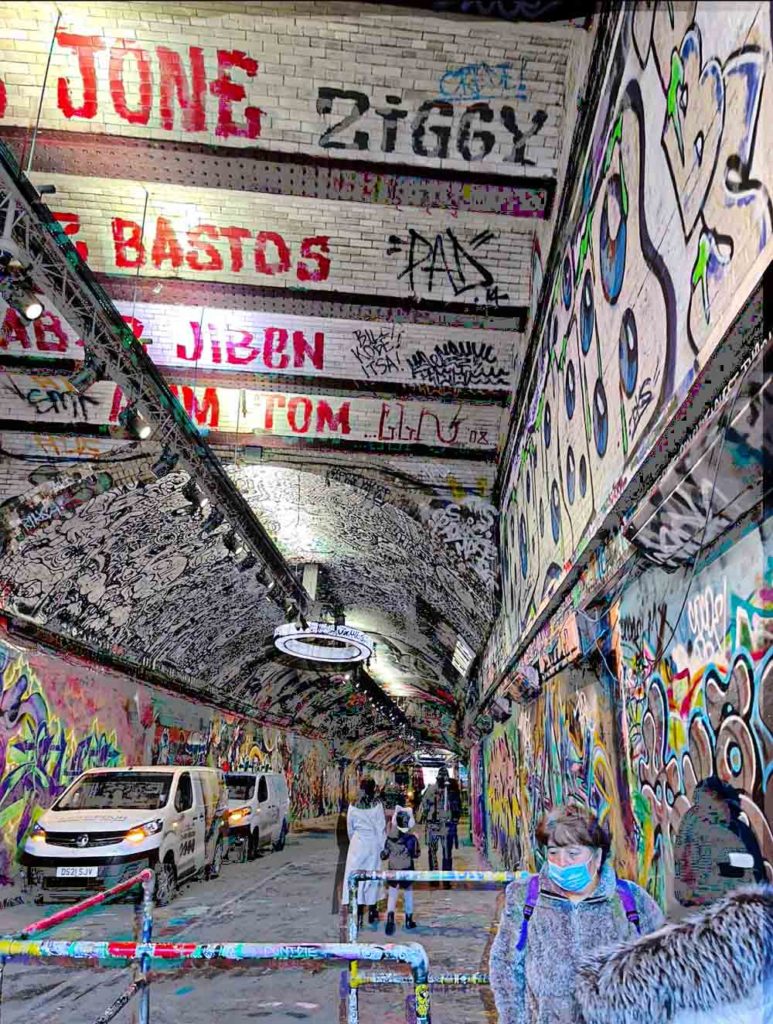
The photograph on the right was captured by Lewis Baltz, one of the photographers involved in The New Topographics, the photograph on the left was captured by me. Lewis Baltz image depicts the outside of a factory building, a stack of blocks can be seen in the image as well as a door and a ladder going up the building. My image on the right depicts a cave full of structural supports which have been vandalised with graffiti, the image portrays the impact that humans have had on nature. Both images have been shot in black and white although mine does contain traces of colour to add more life into the photo and make it more interesting for a viewer. The texture of the subjects captured in both images can be argued to be very similar also.
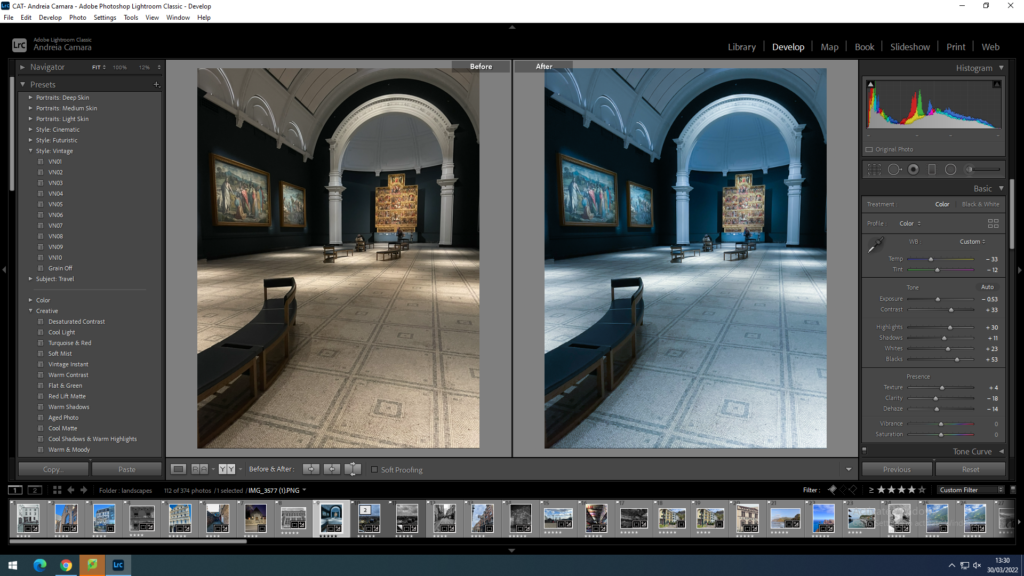
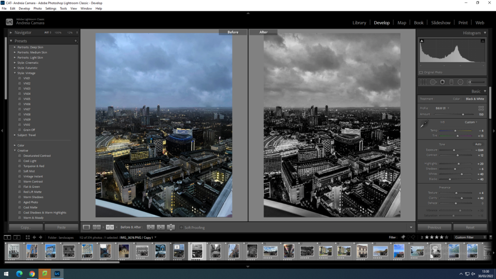
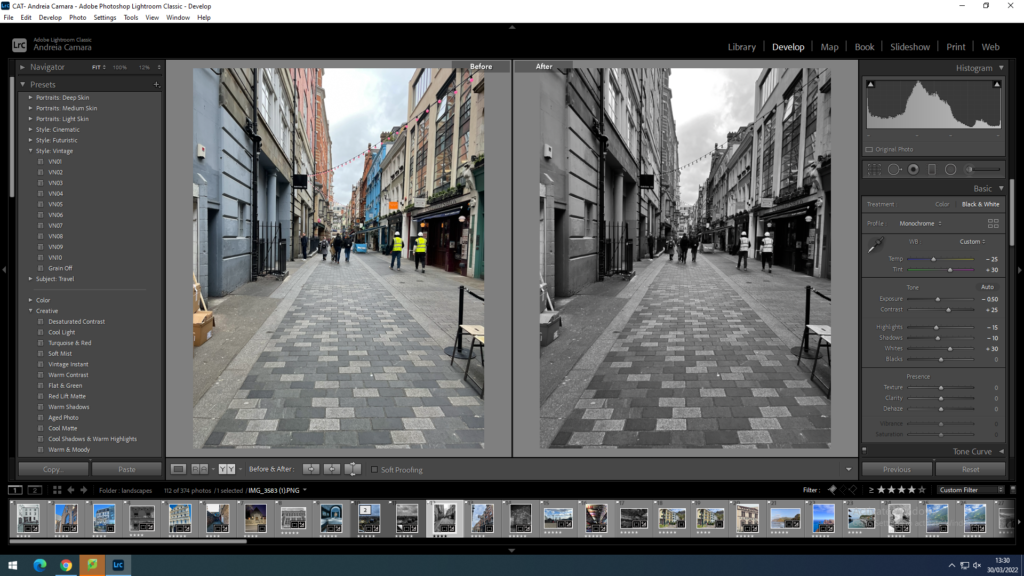
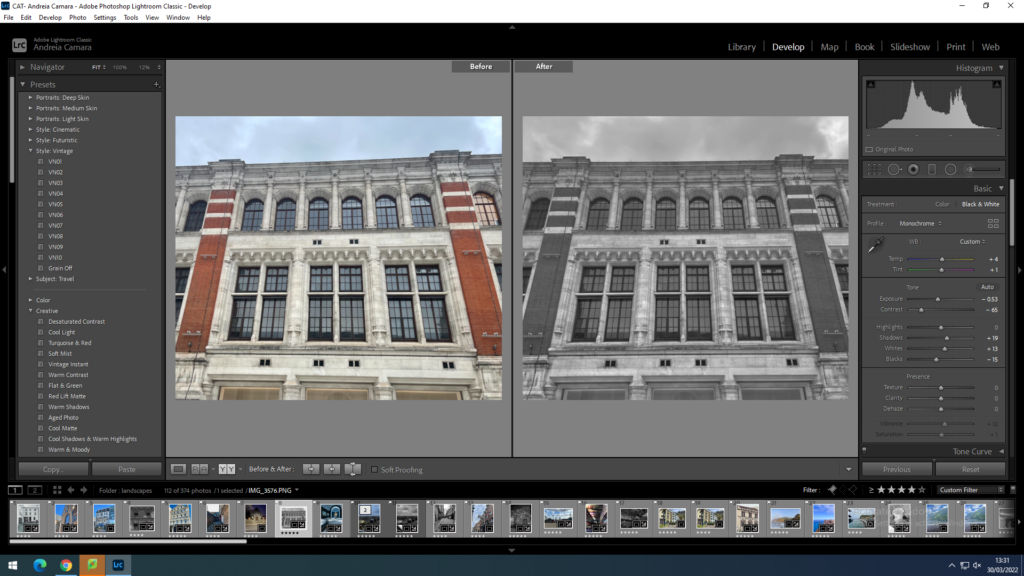
These images were taken throughout London which I think is fitting for this project as it is a very man altered urban city filled with different cultures and many interesting buildings such as skyscrapers, museums and many of these have modern architecture infiltrated into them.
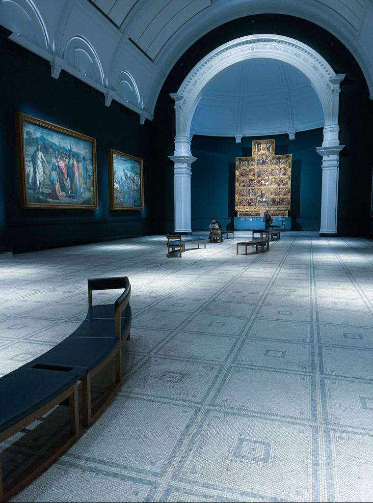
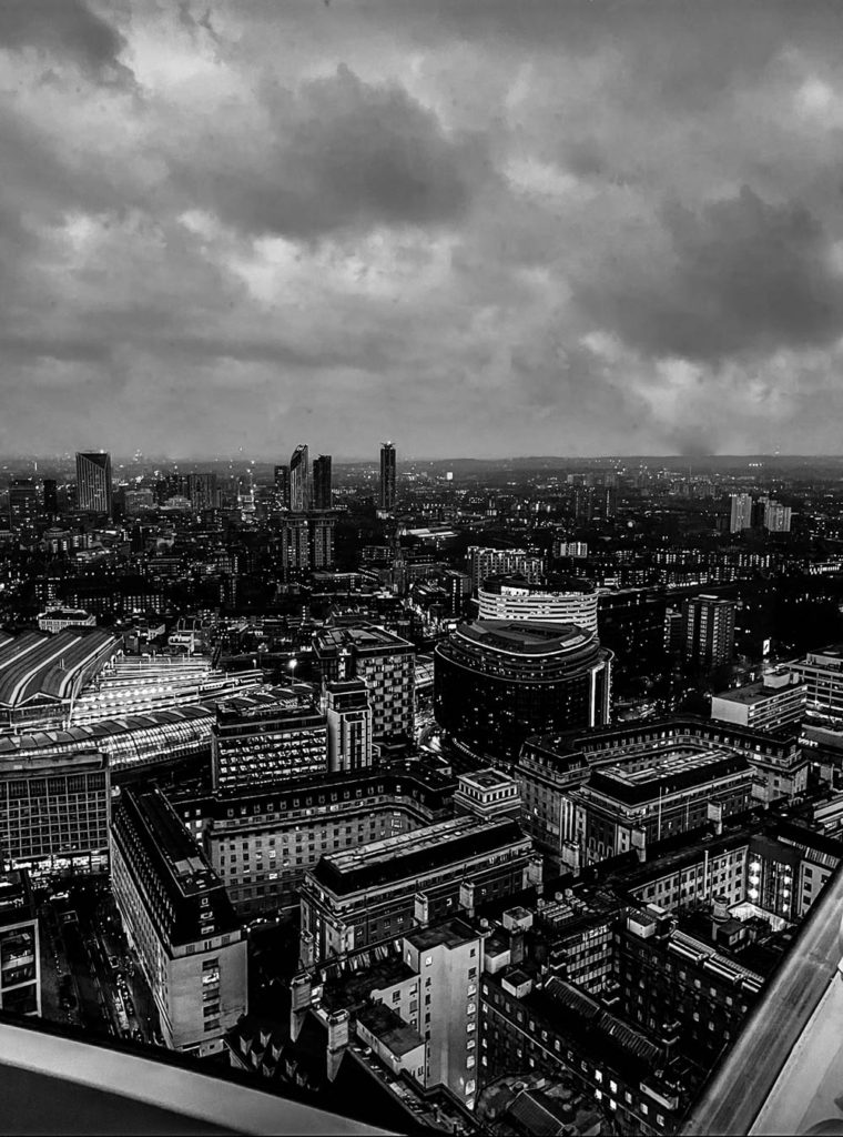
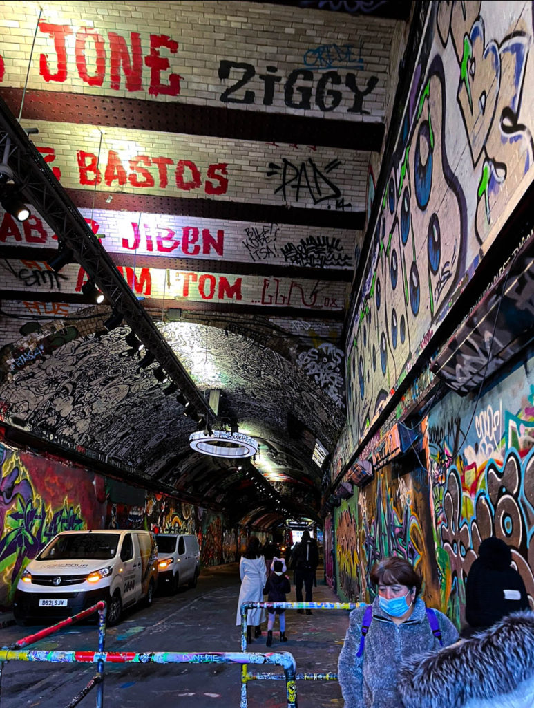
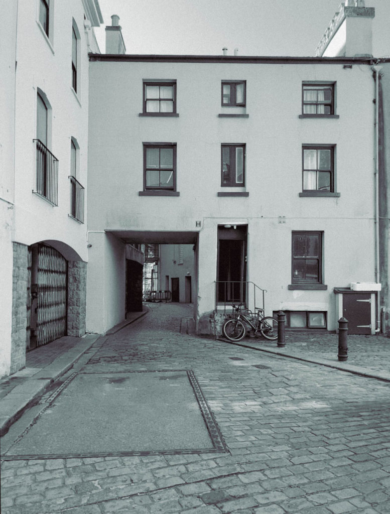
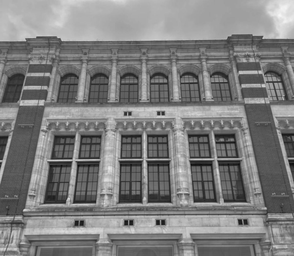
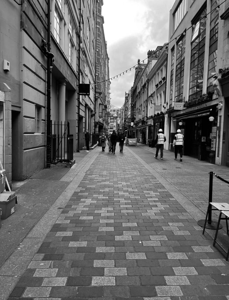
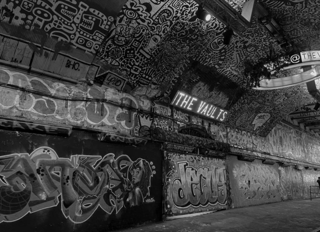


I really like how the tones in these two images juxtapose each other as one shows the lighter side to London’s architecture and the one in black and white shows a more refined view of the cities skyline as the more prominent shadows pull more focus to how the cities buildings are laid out.
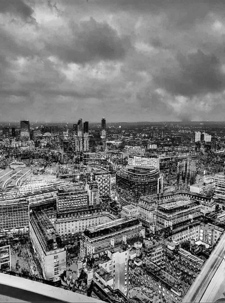
Then I went into photoshop and made a copy of my background layers for both images and then used the exclusion filter to make the whites in the buildings stand out then I moved around the copy of the layer to add a double exposure effect on the images.
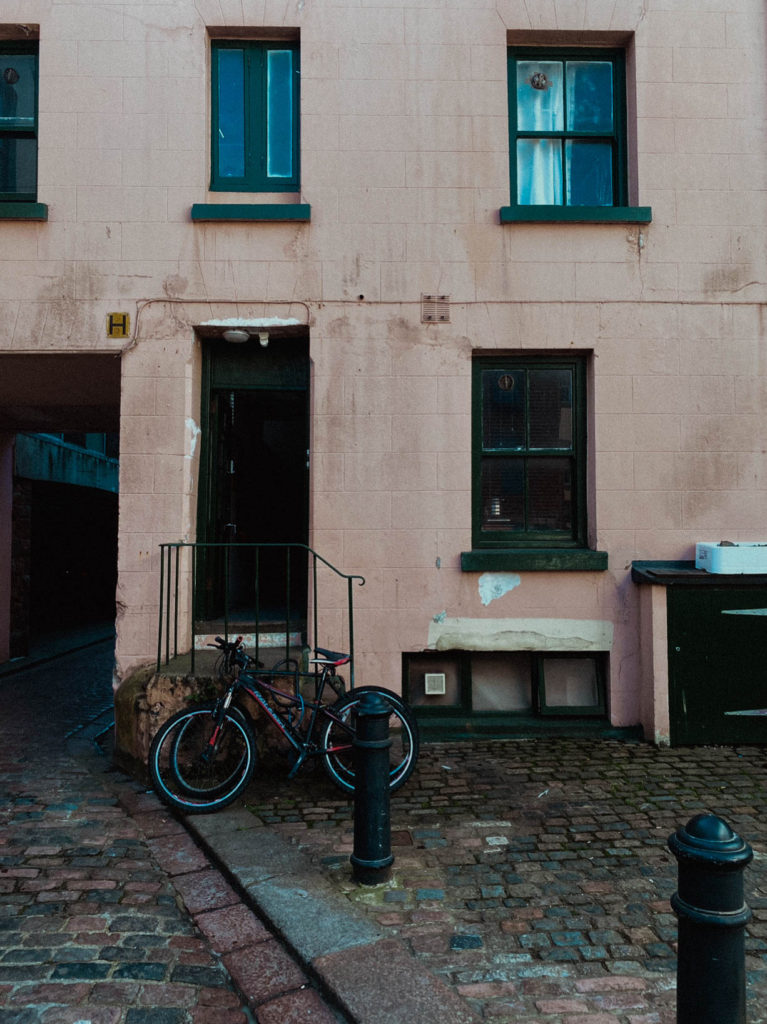
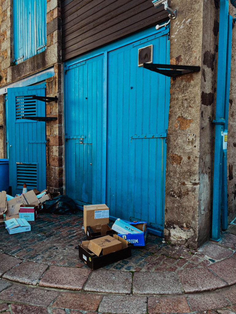
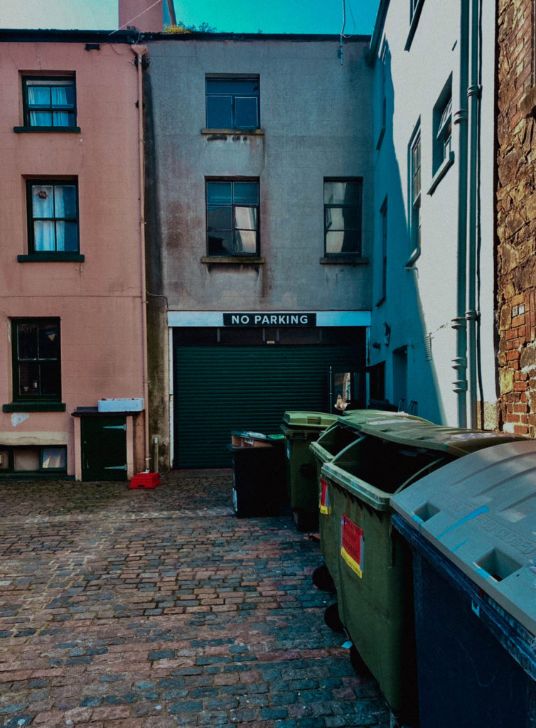
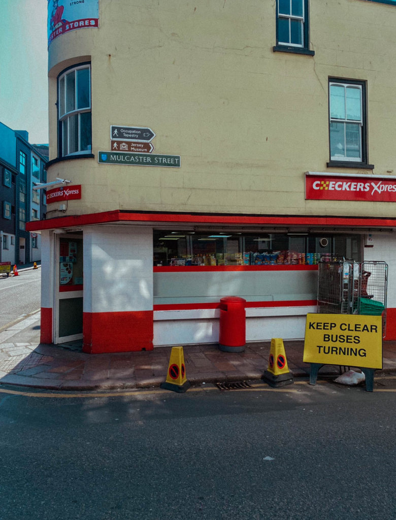
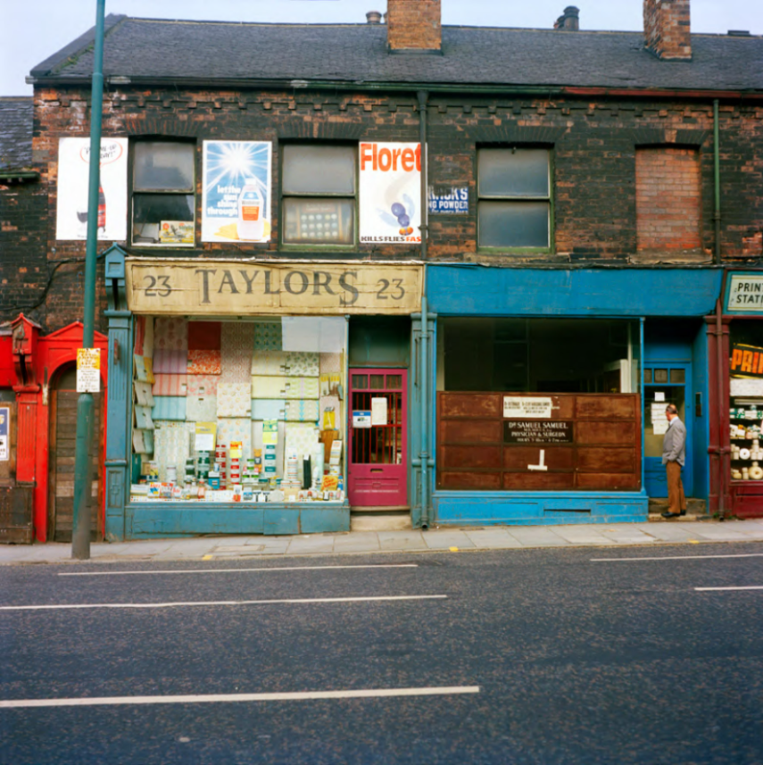
I captured a range of images which were inspired by British Photographer, Peter Mitchell. I attempted to emulate Mitchells Editing styles by adjusting things such as, saturation, vibrancy and added a grain effect to emphasise the 1970s zeitgeist.
Mitchells images for reference

My images
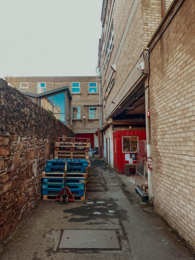
In this image, I think I captured the vibrancy similar to that in various of Mitchells images.
