Comparison to Ansel Adams

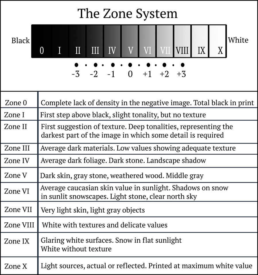
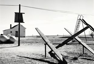
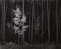
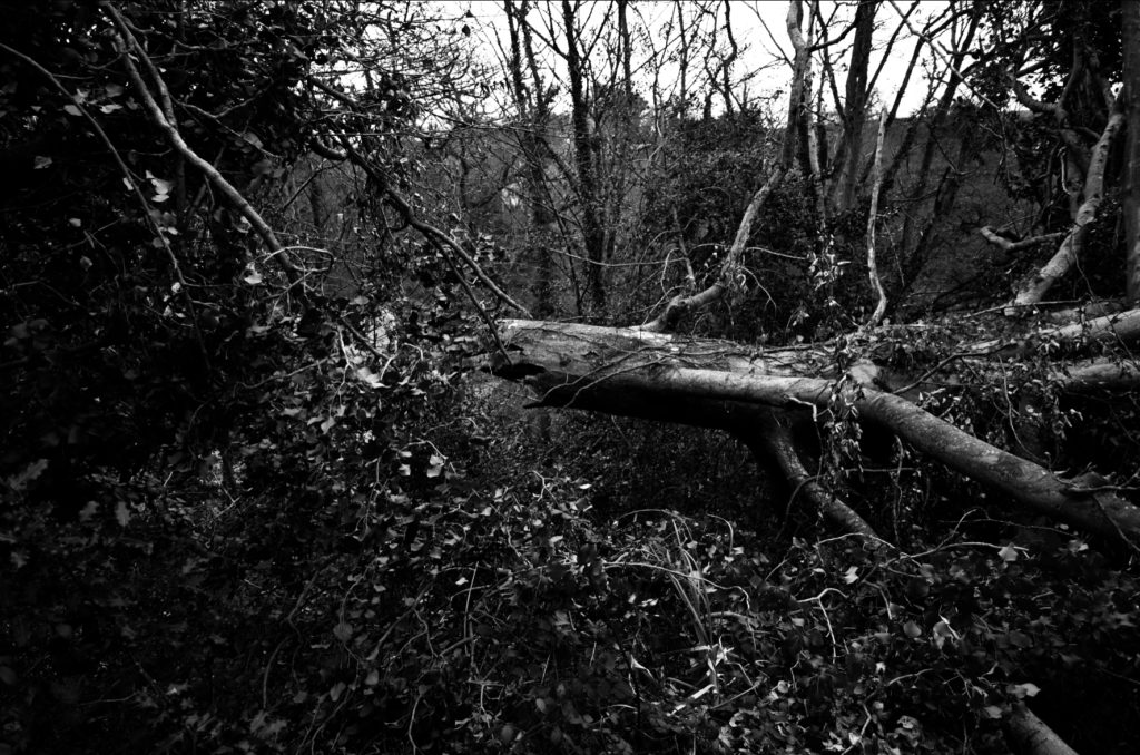
I think that my work was successfully able to show similarity towards Ansel Adams work. I have chosen to compare these 2 photos, as they both involve nature and include natural, woody, grassy, mossy values which create an earthy atmosphere. I think the similarities between the pictures such as the use of a woodland area, involving trees where both can use the background to create this dark and scary abyss but then use the tree branches/trunks to be able to bring some light into the photos as if it is showing and creating a feeling of hope. I also used “The zone system” which is also seen clearly in Ansel Adams work as you can see how we both have experimented with the 12 different tones of black and white within each of our photos. However, my photo uses a bright background whereas Ansel Adams doesn’t, personally I like this as I think that this helps to frame the nature and create a focus to how the natural course has been broken as you can see the broken tree trunk which could’ve been due to weather. It also helps to break up the darker tones to the lighter tones so that they don’t get lost in one another and create a break between them.

I really enjoyed working in the style of Ansel Adams and would use him for inspiration for “rural” landscapes in my photography because his work is unusual yet is able to highlight dangers which humans have created and show the world in a beautiful way but also be able to create a scary atmosphere through the use of the black and white filter which he uses.

Editing and final outcomes #2

For these edits I was working in the style of Galen Rowell in my photography where he focuses on the beauty of nature through the beautiful bright colours which the sky and plants are able to create and how it can change a landscape through the use of sunsets/sunrises. I liked working in Galen Rowell’s style because it allowed me to experiment and try different ways of editing a photo to bring out the colours in them which I really enjoyed doing.
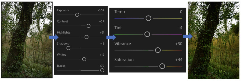
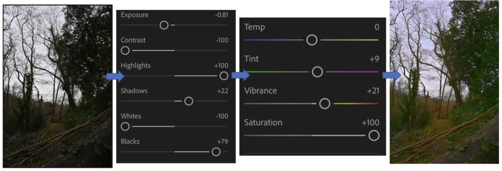
Throughout editing these photos I enjoyed it a lot because I was able to experiment with different colours and how to manage their vibrancies and how they may appear. This is because I found that while editing it was very easy to overexpose the image while I was changing the contrasts, exposure, highlights, whites, colours and their temperatures. I also found out how adding small bits of colours to the photos makes the colours be able to be bright and extremely vibrant because it changes the whole feeling of the photo, as many of the originals were gloomy and dark due to the weather but after they were edited, they came to life and created a happy and exciting atmosphere.
My favourite edit which I completed that I think is most successful and similar to Galen Rowell’s is the 1st one because I like how the sky turned out within the vibrancies of the blues and greens which work well together, I achieved this by bringing the contrast down so that the sky became darker then bring up the highlights which brings out the brighter colours in photos. I also like how I’ve been able to create hues of gold to come through small holes in the grass through bringing up the saturation and changing the temperature of the photo to make the sunlight appear golden through the cracks and where it can be seen in the corner. I also like in the photo how the grass is the main focus of the photo, as it creates an earthy and natural feel to the photo as it looks out on to the horizon. I think that this helps to frame the photo as the clouds create a sharp line of division and then the grass surrounds the bottom.
The photo which I think is the least successful which I created through editing is the 2n one, this is because I think that the natural landscape and whiteness in the background doesn’t work well together to bring out a vibrant, colourful landscape which would be similar to Galen Rowell’s work. If I were to try to edit this picture again I would try to make the sky appear to be a better, more defined blue as due to the weather on the day when these pictures were taken the clouds create this overexposed look as a background which is difficult to work with because it washes out the rest of the photo, which I don’t want to happen. Therefore if I was to create the effect that there is a sky behind it as in many of Rowell’s work, the sky is the main focus along with the surroundings.

I really enjoyed editing in the style of Galen Rowell as I was able to experiment with bringing colour into my work through different ways as each picture is different within the filter which I have created for them. I preferred working in Ansel Adams style with black and whites along with “The Zone System” because you are able to create a drastic, emotional atmosphere within one photo and raise awareness for the wildlife and nature.

Editing and final outcomes #1

Throughout my edits which I will complete on Adobe Lightroom by selecting them and creating new versions so that I am able to compare to the original and Ansel Adams work through the use of his “The Zone System” which is used in photography, where the photo has been turned into black and white, to show the variety of grey scaled colours which you should be brining in the create a perfect contrasted look.

I really liked how these edits turned out because I think that it shows how I have experimented in different ways with the various filters on Adobe Lightroom of black and white, similar to Ansel Adams work, I was able to change the intensity of the filter and experimented with the different ways I could create a large contrast between the grey/white/black colours which I used through the use of Ansel Adams “The Zone System”.

I really enjoyed creating these because I was able to experiment with the large scale of filters which can be found in Adobe Lightroom and then change them to how I thought was fitting by changing the contrast/highlights/exposure etc. If I were to do do these again I would take pictures at various times of day so that the background wouldn’t create an over exposed look which would be casted on to the photo, which many of my pictures had which I found very hard to work with.

My favourite edit that I think is my most successful and similar to Ansel Adams work which is the last one, this is because of how the tree has fallen and you can see the rip from the trunk and how it is dangling off the side of the hill. It creates a dystopian atmosphere for the photo as it isn’t something that you see very commonly and can see how the wildlife has welcomed this in, as if it is a natural occurrence, as many plants have began to grow on to and around it. I also like in this edit you can see a range of grey scaled colours, many of which are found on “The zone system” which shows how I have considered this in photoshop to make sure there is a similarity to Ansel Adams work. This is clear to see on the trunk where I have been able to highlight various places of it where the nature hasn’t been able to take over yet, compared to the surrounding leaves which are seen around it because they appear very dark in colour which helps to create this image of a frame to highlight how this tree has been destroyed due to the weather through the dark abyss which surrounds this tree.

I think that my least successful photo is first edit which I attempted. This is because I left too much grey in the middle of the photo and there is barely any other colours around it which can contrast/highlight against it. If I were to try this edit again I would focus more on the clouds to make them appear darker and more drastic to create a feeling of gloominess on to the photo. I would also try to highlight the plants through the whites/highlights/contrast while editing which would make them appear more in focus more and easier to see as they aren’t able to be seen clearly due to the lighting and therefore this makes it look like a large, dark mark across the photo as there is no dimension to it to add that level of development to the photo to make sure that this effect of having something in the foreground to focus on rather than the background, so that it doesn’t get lost which it has done.

Robert Adams Case Study

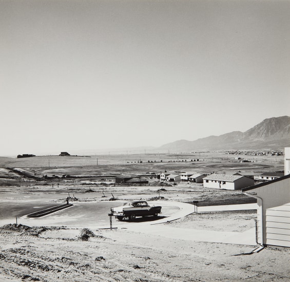
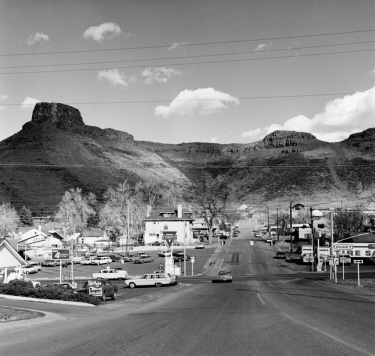
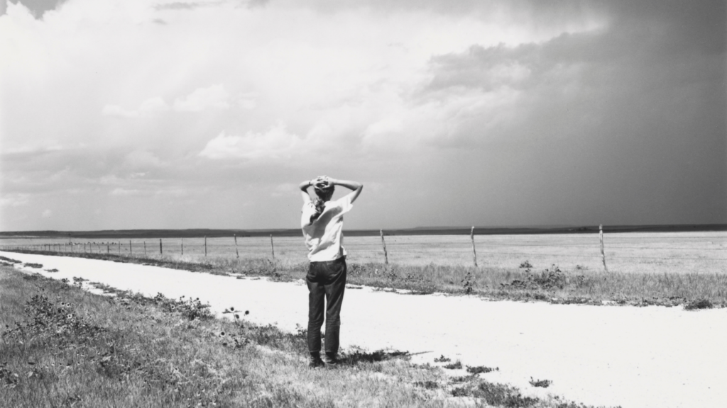
Robert Adams born in 1937 New Jersey, is an American photographer who’s work is focused on the changing landscape of the American West. Adams moved to a suburb in Colorado with his family in 1954, this is where much of Adams photos and work are based. His work first became popular in the mid-1970s through his participation in the New Topographics exhibition. In the 1970s and 1980s Adams produced a series of books such as, The New West, Denver, What We Bought and Summer Nights these books focused on expanding suburbs along Colorado’s landscape, these books pictured huge rural developments but also the surviving light, size and shape of the natural world. 

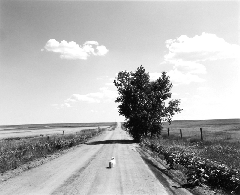
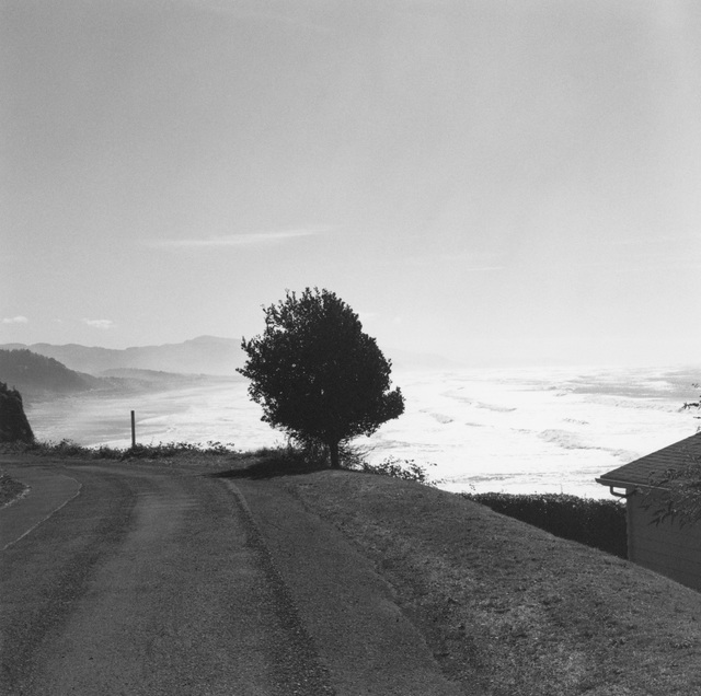
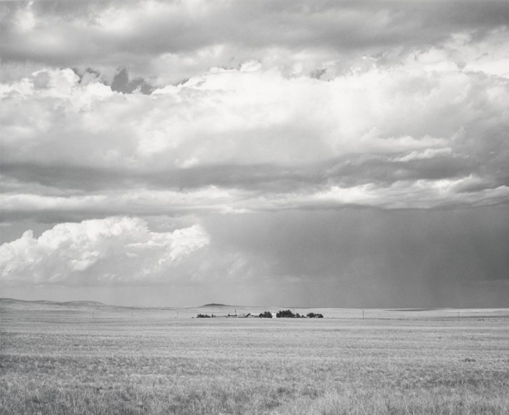
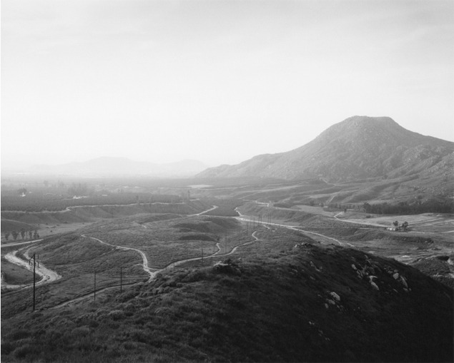
Robert Adam’s work

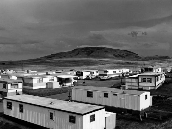
Robert Adams photos portray how the new post-war developments of the modern world have spilled into the old American west. The photos show above depict newly developed buildings and structures that are still surrounded by nature and the old landscape, suggesting that nature is still around us all the time no matter how much humans build. The photos are all shot in black and white, which perfectly matches the locations that they are taken in, barren and empty expanses of land with small marks of human life and buildings.

This photograph, taken in 1973 by Adams, depicts a mobile home estate in Colorado, with a huge mountain and barren landscape behind. Its almost as if Adams has put two images together, the top being the natural landscape of the world, and the bottom half being the ugly buildings that humanity have ruined the landscape with. Like all of Adams other photos, this photo is shot in black and white, which adds to the whole image. The lack of colours emphasize the vast location where the photo is taken, and adds to the separation between nature and man-made.

Romanticism Landscape – Artist Reference

Ansel Adams

Ansel Adams was an American landscape photographer and environmentalist known for his black and white images of west America as well as helping find Group f/64, advocating “pure” photography (sharp focus, use of the full tonal range of a photograph), he went on to develop an image making system called the Zone System through the deep understanding of how tonal rage is recorded and developed, resulting in clear, deep images. Ansel was a environmental conversation advocate and conveyed this through his photography.

redwoods bull creek flat ansel adams
Redwoods, Bull Creek Flat, California, 1960
moonrise hernandez ansel adams
Moonrise, Hernandez, New Mexico, 1941
ansel adams half dome blowing snow
Half Dome, Blowing Snow, Yosemite National Park, California, 1955

In 1916, at 14 years old, Adams photographed Yosemite National Park and developed his work at the Sierra Club where he would come back every summer of his life. In 1925 he became the director of the club till 1971. In 1980, President Jimmy Carter awarded Adams the Presidential Medal of Freedom for “efforts to preserve this country’s wild and scenic areas, both on film and on earth.”

Image analysis

This image by Ansel Adams presents the Grand Teton National Park in Wyoming. In the foreground we can see trees as well as the river which makes a good strong line, leading our eyes from the foreground, through the midground, all the way to the mountains and clouds in the background. The shot is taken from afar which distances the viewer and shows how small we are as humans in comparison to nature, it puts the power of the sublime in perspective and makes the viewer respect it. The image being black and white also creates a detaching effect by contrasting two colours; dark shades such as black feel further away than lighter shades. Humans don’t tend to see in black and white so this change of perspective can distance it from reality. A pallet of colours can often distract the viewer from the subject thus you can convey the meaning of a photograph in a more powerful manner using a monochrome format. This photo was taken using a natural light source, considering the clouds we can assume it was dull and cold light. The dark clouds contrast well with the bright clouds The textures, lines and shapes, such as the ripples in the water, appear more prominent since black and white create such a powerful contrast, this makes the photograph look harsh and cold. There is a lot of grey in the photograph which makes the tone sombre and dark. The overall mood is heavy and melancholic.

robert adams

Who is he?

An American photographer who has focused on the changing landscape of the American West. His work first came to prominence in the mid-1970s through his book The New West and his participation in the exhibition New Topographics: Photographs of a Man-Altered Landscape in 1975.

 In the 1970s and 1980s he produced a series of books, The New West, Denver, What We Bought, Summer Nights which focused on expanding suburbs along Colorado’s Front Range, books that pictured heedless development but also the surviving light, scale, form, and silence of the natural world. He also examined this mixture of humanity’s imprint and nature’s resilience in the wider western landscape he has also occasionally published smaller, sometimes more personal volumes.

His work

These photographs are what I am going to mainly base mine on, following his widely spread landscapes.

Urban Landcsapes-

The New Topographics

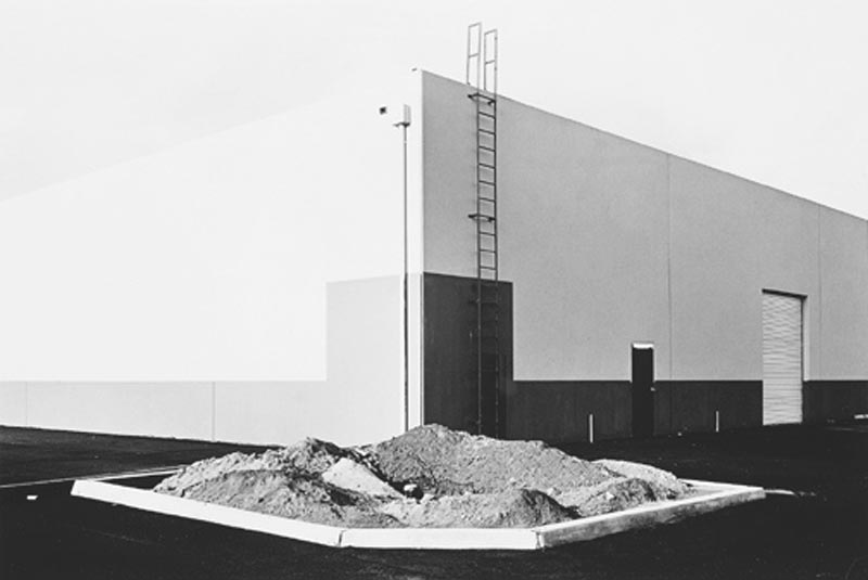
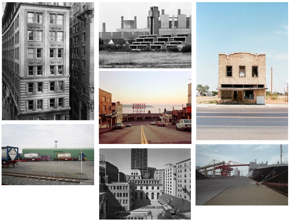
The New Topographics was a term developed in 1975 by William Jenkins, used to describe a group of (mainly American) Urban landscape photographers. Their work was mostly in black and white, and looked at the relationship between human development and the natural world. Some notable members of this group include Robert Adams, Lewis Baltz, Nicholas Nixon, and Bernd and Hiller Becher. Their works are often in a deadpan or banal aesthetic, used to show the rigid, stark design of industrial construction.

Robert Adams
Lewis Baltz
Sze Tsung Leong

Rut Blees Luxemburg Case Study

Rut Blees Luxemburg is a German-born, British Photographer. Her images are mostly of Urban Landscapes at night, using vibrant colours and unique lighting to create unique and memorable images.

Nach Innen / In Deeper 1999.

An image taken by Luxemburg in 1999. It is of some city steps while it is raining and night. The water reflects a harsh city light juxtaposing the dark concrete of the stairs and walls, making it look like there is a waterfall of light. These playful and unique compositions contrast the stark industrial architecture of many cities and perfectly fits the goal of the New Topographics movement. There are no people in this image, only the remainders of some footsteps being swallowed by the rain, making the audience feel isolated and lonely, as well as making them to experience the sublime, the footsteps being washed away as a reminder of how small humanity really is in comparison to nature, even in a big city.

my landscape final images

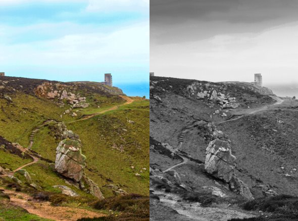
i edited this image until i was happy with how it looked then i made a virtual copy and changed the copy to black and white to see which one would be better because a lot of the examples i looked at where black and white.

this images was taken along the grosnez coast line which has the tallest cliffs in jersey. i also experimented with putting this in black and white aswell

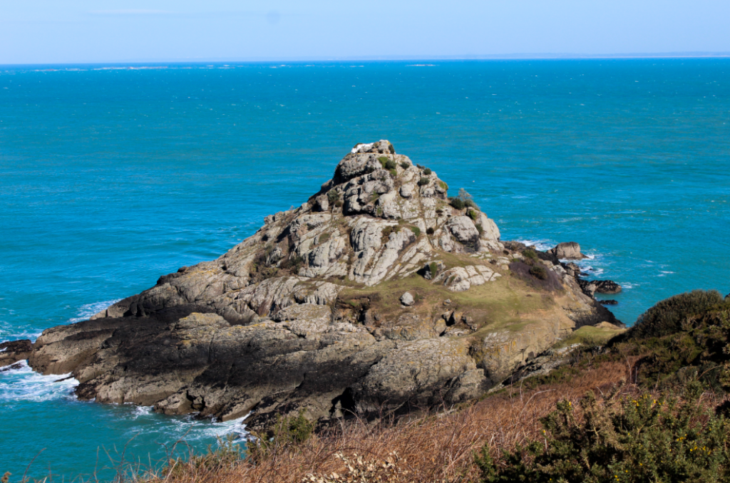
this image is of the pinacle in gorsnez i used the gourse bush to give depth to the images with a forground a mid ground and the swell breaking in the background. i also experimented with putting this image in black and white

this image is of white rock with the vibrance turned up to show of the beatiful blues in the background of the image. the forgroun of the headland gives depth to the image and the swell around the rock outline the focal point and the pointey shape of the rock brings your focal pooitn from the bottom up to the white rock on the top.

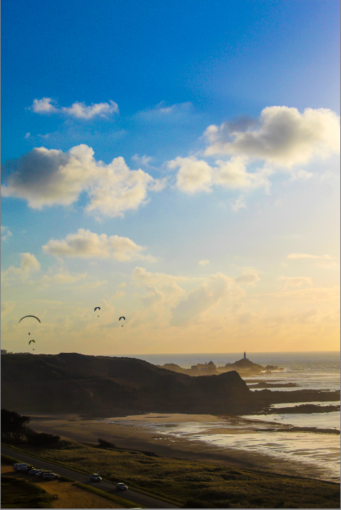
this mages shows the the beach of le Braie in the foreground the Hedland in the midground and Corriere lighthouse in the background. I liked the effect the sea spray created mist around the headland and the lighthouse. I edited this image bring out a wider range of colours in the sky to highlight the paragliders.

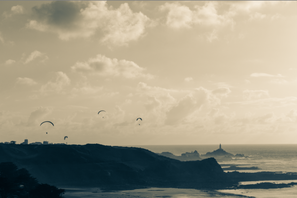
i experimented with a similar image taken in landscape, that I put in two tones because I looked the effect it gave between the darker bottom of the image and the lighter tones in the sky.

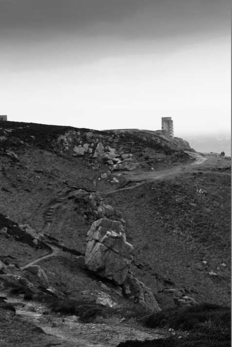
i think this is my best image from rural landscapes bec asue it captures the a large expanse with the focal point of the image goes to the larger boulder in the center of the frame the bunker in the background also helps add depth to the image with a background and midground and forground.

JOEL STERNFELD

Joel Sternfeld is an American fine-art colour photographer. He is noted for his large-format documentary pictures of the United States and helping establish colour photography as a respected artistic medium. Sternfeld’s work is held in the collection of the Museum of Modern Art in New York.

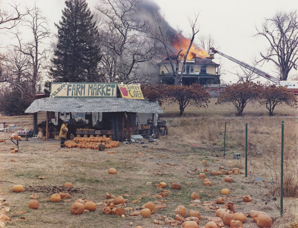
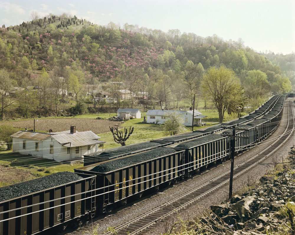
Joel was influenced by the roadside photography of Walker Evans, Sternfeld’s projects document people and places with an exacting sense of colour that visually rhymes with the subject matter, as seen in his seminal series American Prospects (1987). “No individual photo explains anything.

Even though Joel Sternfeld isn’t your typical “street photographer” he started off as one. Although he was inspired by his contemporaries at the time and started off shooting with a 35mm Leica (like everyone else) he eventually branched out and found his own voice shooting large-format 8×10 colour landscape photographs.

American Prospects – Book by Joel Sternfeld

American Prospects is a book that was first published in 1987 and was produced by Joel Sternfeld. The book contains 152 pages and 71 images all displayed in the same way. All the images that are in the book all have similar features such as a slight natural location with a few man-made structures throughout. The book usually costs around £85-£100.

Joel Sternfeld American Prospects ARTBOOK | D.A.P. 2020 Catalog Books  Exhibition Catalogues 9783958296695

new topographics

new topographical photography show the beauty in the mundane, reflection of the increasingly suburbanised world. reaction to the tyranny of idealised landscape photography that elevated the natural and the elemental.

 Robert Adams, Bernd and Hilla Becher, Lewis Baltz, Joe Deal, Frank Gohlke, Nicholas Nixon, John Schott, Stephen Shore, and Henry Wessel Jr are all the people that started the new topographical movement. 1975 exhibition New Topographic signalled a radical shift away from traditional landscapes.

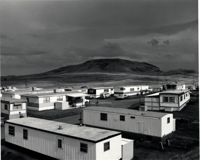
Robert Adams -Mobile-Homes-1973

This image was taken by Robert Adam and I like the juxtaposition between the foreground of the man made harsh white boxes and the background of the rolling hills with smooth organic shapes along the horizon. image is like a before and after because it shows the earth as it was the unnatural shapes humans have produced that litter the earth.

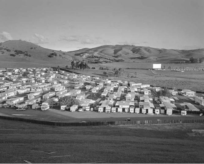
John Schott: Mobile Homes 1975-1976

This image has a wider angle which shows more of the organic environment which makes the sea of white boxes look out of place. this images shows the natural foreground with a man made midground and a natural background which greatest a sandwiching affect which makes the mobile homes look even more out of place.

This is my mood bored of different new topographic images that will inspire me to take images around Jersey