keld helmer-peterson

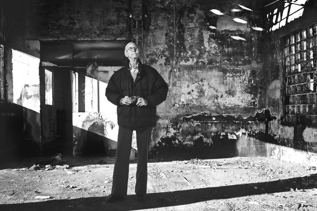
Portrait of KHP, Copenhagen 2007. Photo: Kristine Funch.

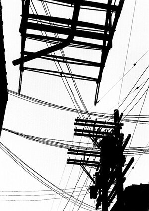
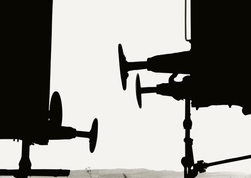
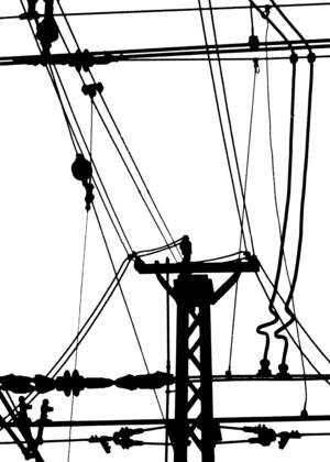
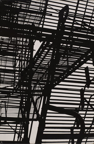
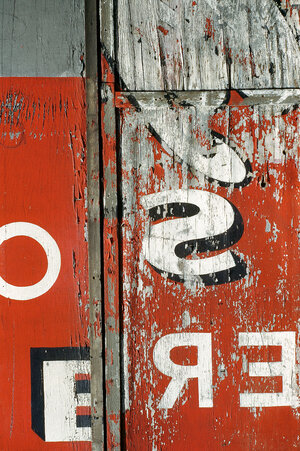
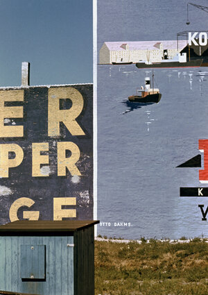
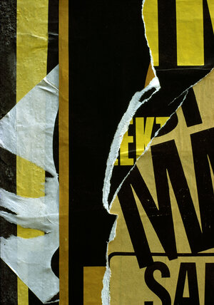
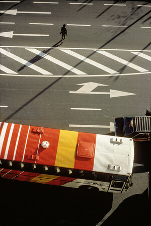
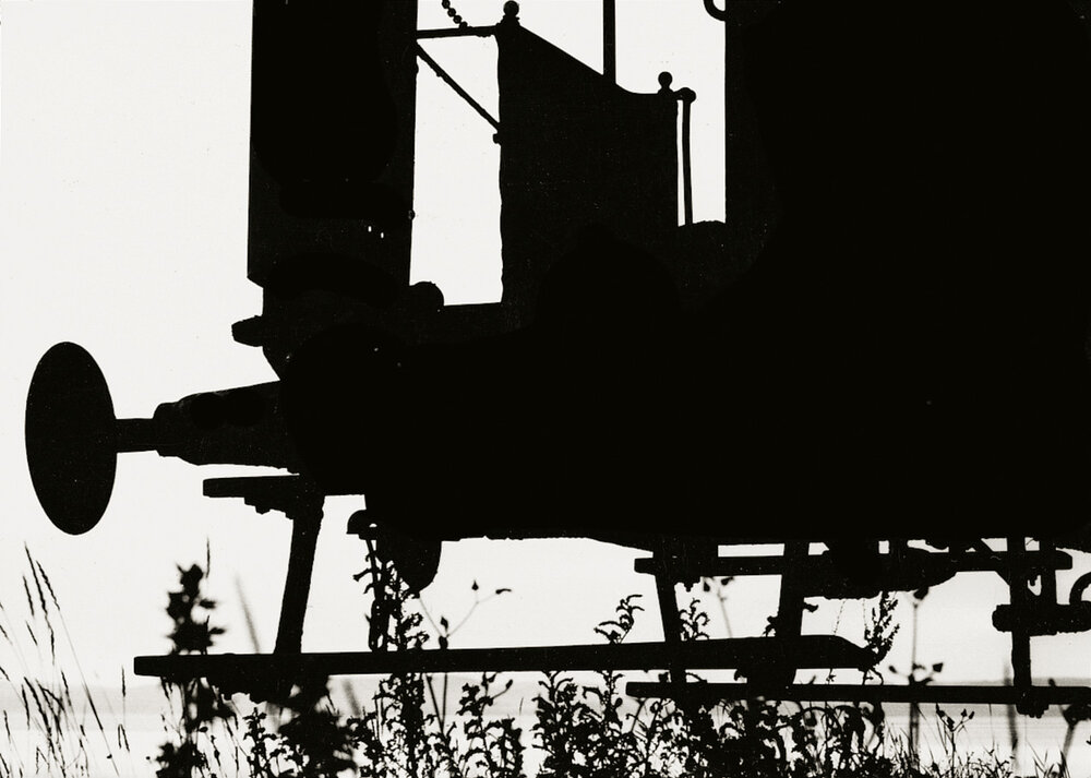
Keld Helmer-Peterson was a Danish photographer, widely known for his lead role in abstract photography in the 1940s. His career spanned 70 years and he had strong interest in modern architecture and industrial areas, primarily focusing his work on structures and parts of buildings i.e scaffolding or framework.

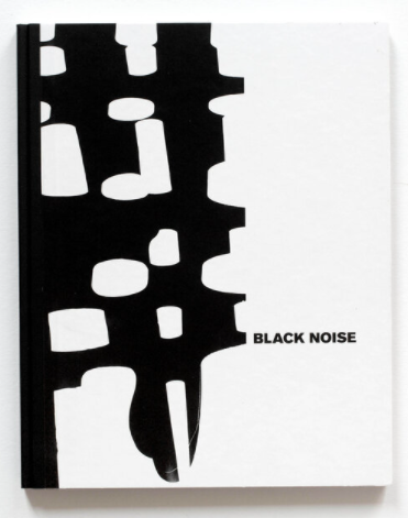
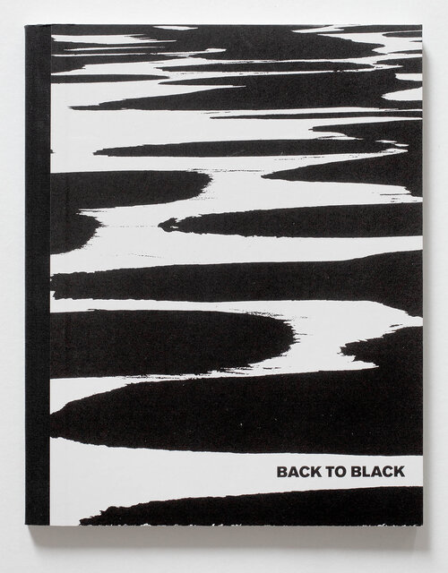
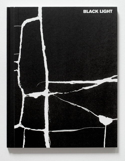
Architecture and design played a great role in Helmer-Petersen’s work, both professionally and as an artistic field of interest. From 1952 to 1956, he worked with photographer Erik Hansen, after which he established his own studio specializing in architecture and design photography. Peterson also released a series of books documenting his photography, both in colour and black + white, such as 122 colour photographs, Fragments of the City and Black Noise, which was part of a series of three books that showed his abstract style of photography.
KELD HELMER-PETERSEN

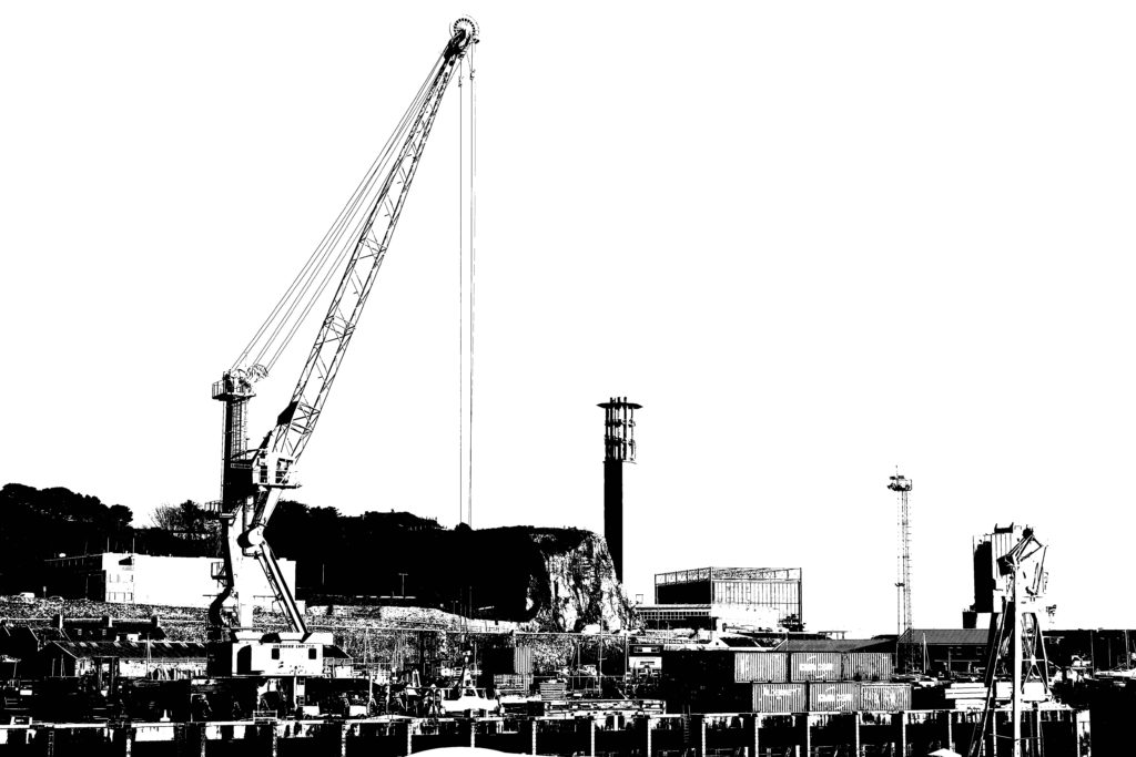
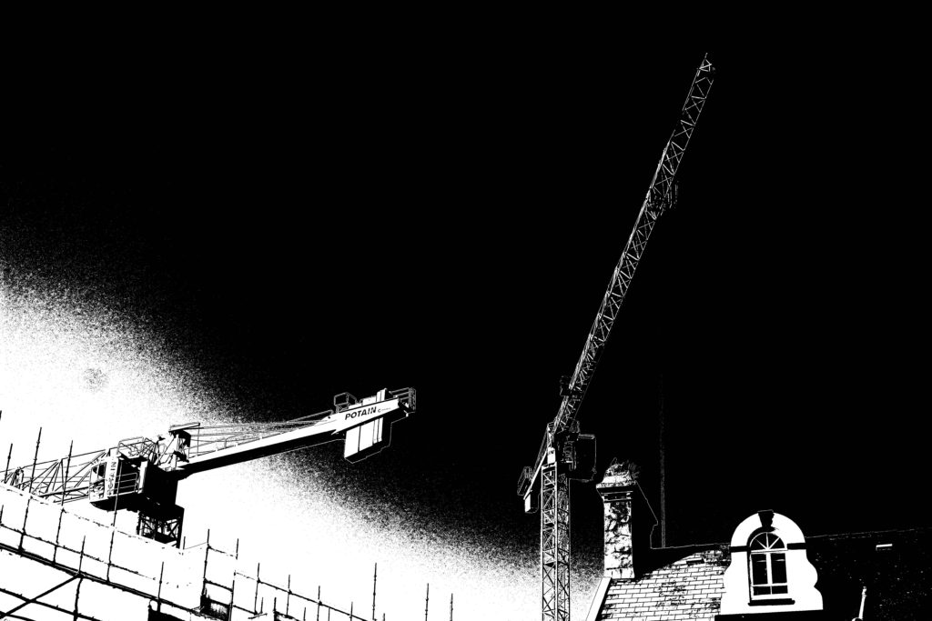
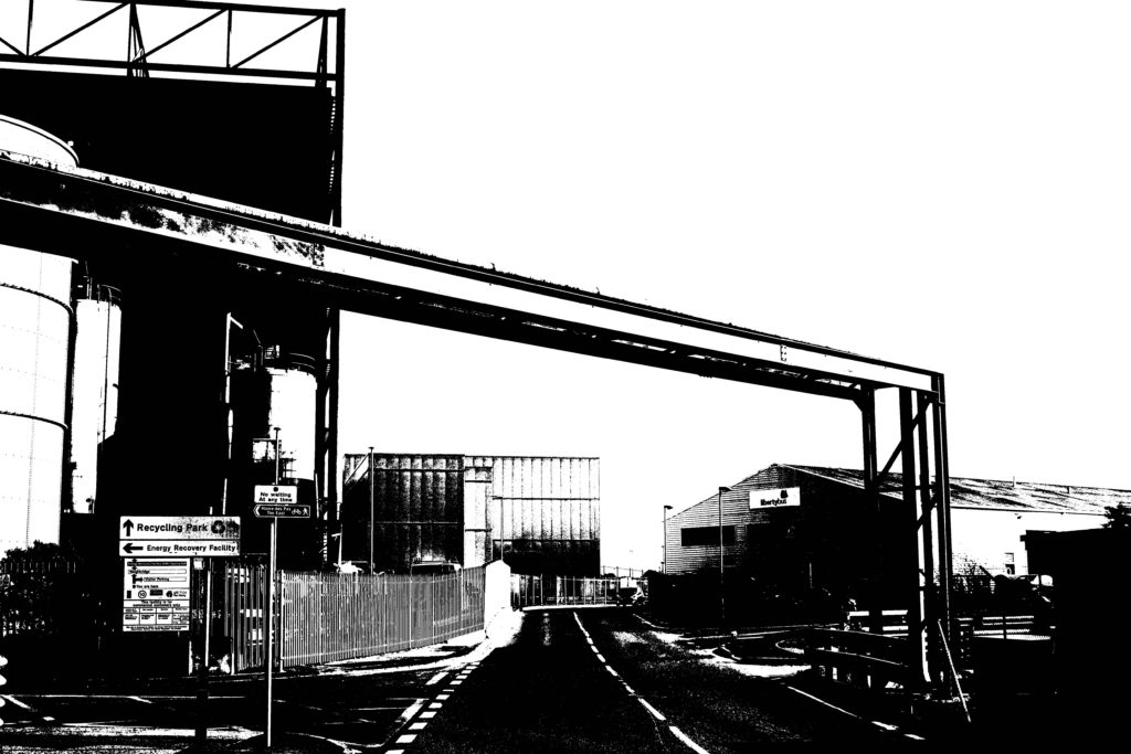
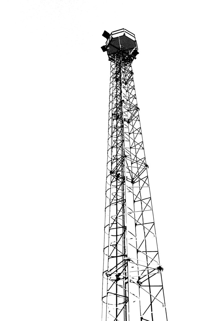
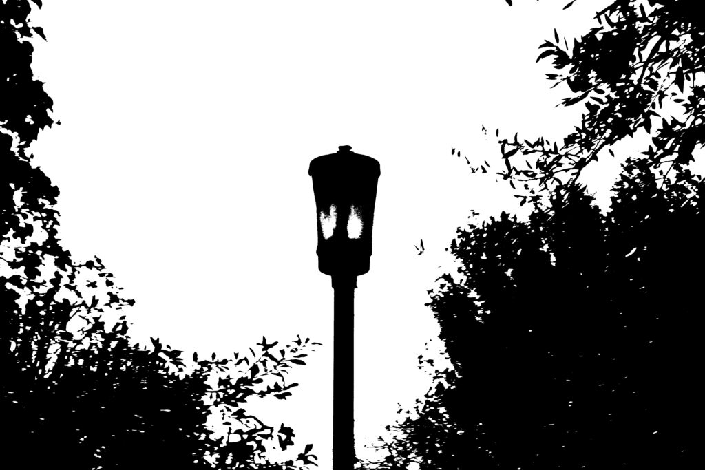
Keld Helmer-Peterson had an abstract way of taking images – the final product would consist of mostly black, with a white background to illuminate the silhouette like the photo above. On photoshop we used our urban landscape images to replicate Petersen’s work. To do this, i took my photo and used the Threshold tool to change the tones of my image, using a slider tool to add more black/white shades to the image. The final product represented an abstract art piece.
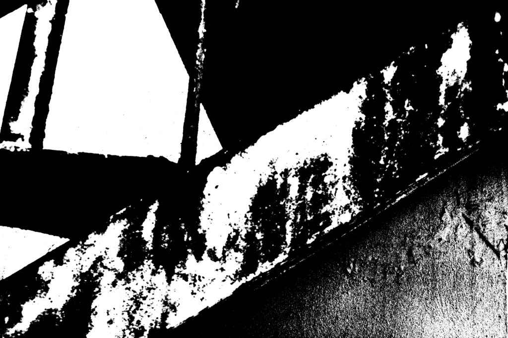
Example #1 of my final images – i think it gives a nod to his work but in a more dramatic way – the black and white tones highlighted the texture of the wall and stairs in two different ways, whilst the poles in the background stand out very much like in his work. Comparing it to the photo above, Ptersens work has more defined shapes whilst mine has more defined edges with a blend of tones in the middle.
Example #2 – this photo draws my attention because of the contrast between the lamppost and the sky much like in Petersens work, this image involves block colours and sharp lines.

KELD HELMER-PETERSEN

Keld Helmer-Petersen is a Danish photographer. He was an international pioneer in colour photography and was a central figure in not only Danish but also European modernist photography. Helmer-Petersen’s career spanned 70 years and he had strong interest in modern architecture, industrial areas and structures. He started photographing in 1938, when he was given a camera as a high school graduation gift. He studied the graphic and abstract effects of a photograph in particular. He was self-taught and studied technical manuals, journals and photobooks.

Throughout Keld Helmer-Peterson life he maintained a strong interest in international trends, not just photography – but also art, literature, film, music and architecture. However, he wasn’t only inspired by them, but also collaborated and socialised with architects, artists, writers and musicians as a natural part of his work as a photographer.

From 1950 to 1951, Helmer-Petersen studied at the Institute of Design art school in Chicago. Helmer-Petersen’s stay at the legendary Institute of Design came about because of his first photobook ‘122 Colour Photographs’ published in 1948. It gained international attention and was recognised as one of the pioneering examples of art photography in colour. Chicago’s impact on his artistic development was clearly showcased in the book ‘Fragments of a city’ published in 1960 where the photographs were taken in the city of Chicago.

Up until the 1990s he was busy photographing urban environments and industrial areas in the outskirts. He was particularly interested in the area around the harbourside in his hometown of Copenhagen.

My Editing

Here I have tried to edit some of my photos in a similar way that Keld Helmer-Petersen published his. I used the industrial images from the photography work do this and I edited them in photoshop by using the threshold style of editing. I like how the colours and tones are simple but are intensified by the different elements of the photos, like the cranes and the different angles of lines that built them or the darker, more bold structures that standout against the white and lighter sky. I really like how you can see all the little details of the structures and landscapes as the harsh black is more eye-catching against the white.