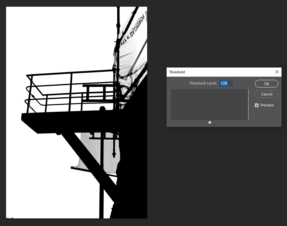
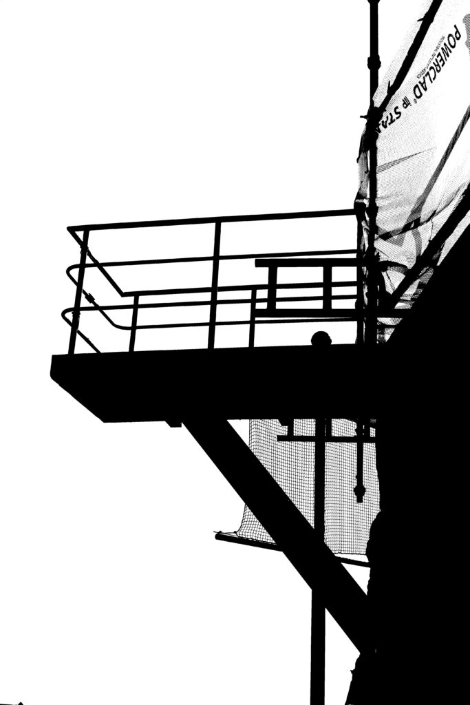
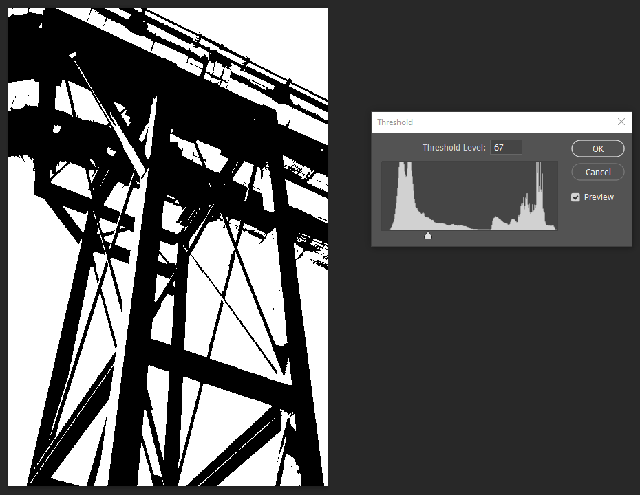
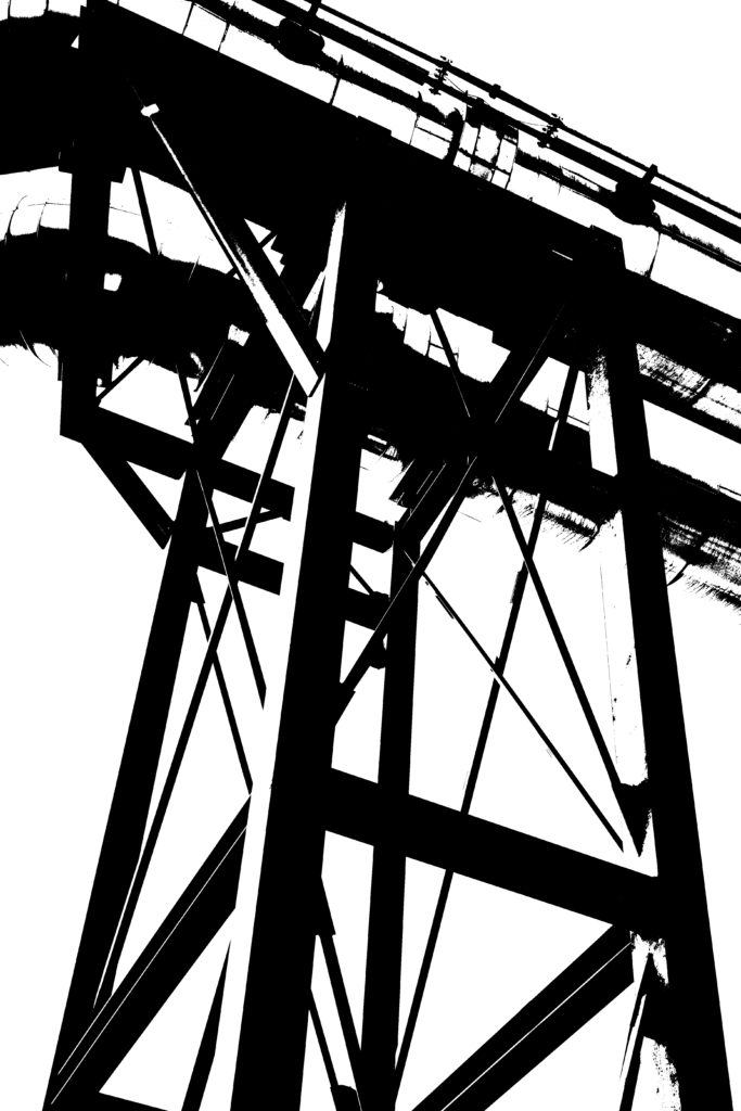
For this work, I will be attempting to edit in the style of Keld Helmer-Petersen. I will be choosing two photos, which I think are successful and will work well in his style where he uses sharp edges to create abstract shapes and bringing them into photoshop where I will edit them and then I will compare them to his work and see which one I like more and I think shows a better influence of huis work to mine.
Editing in photoshop #1 –

Editing in photoshop #2 –

Comparison to Keld Helmer-Petersen –
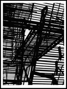
Keld Helmer-Petersen’s work 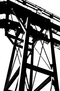
My work
I enjoyed working in the style of Keld Helmer-Petersen and chose this photo of my work as my most successful edit which I completed to compare with Keld Helmer-Petersen’s work because I really like how both of the photos have sharp, bold and black lines which shows the structure of the object well but also creates the illusion which you don’t really know what it actually is because the lines are quite vague with their descriptions so it leaves a lot to the imagination, which I think creates a successful edit in his style as the photos aren’t quite clear in what they are which is what I wanted to incorporate in to my work as well. I also like how my photo has different layer to it to make the industrial object appear shiny because I think that it helps to break up the solid black lines and give the photo that extra layer of dimension and individuality as it won’t be the same on another photo due to the lighting from the sun and the weather whereas Petersen’s work uses more bold, black and defined lines which I didn’t really like.
