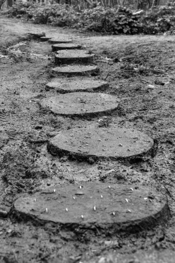
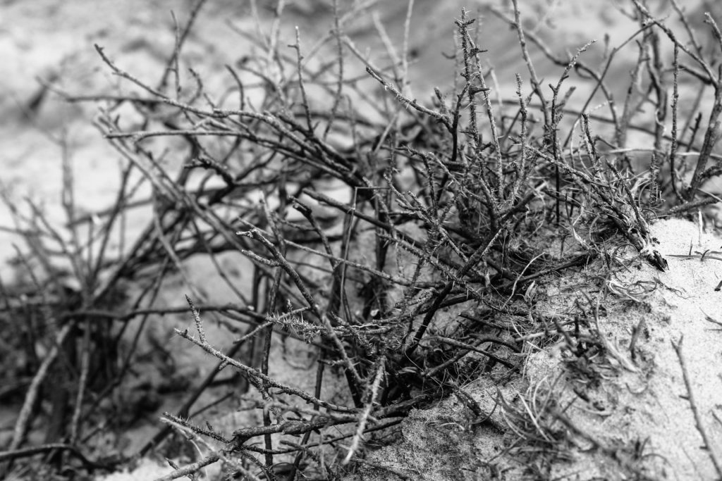
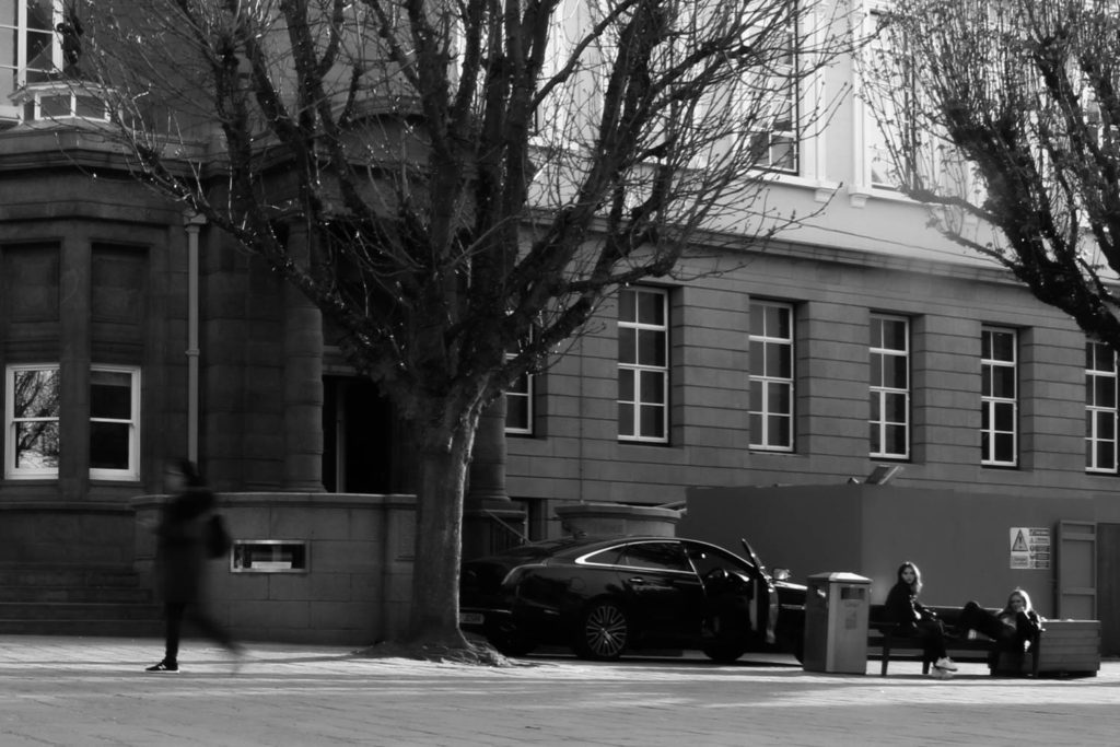
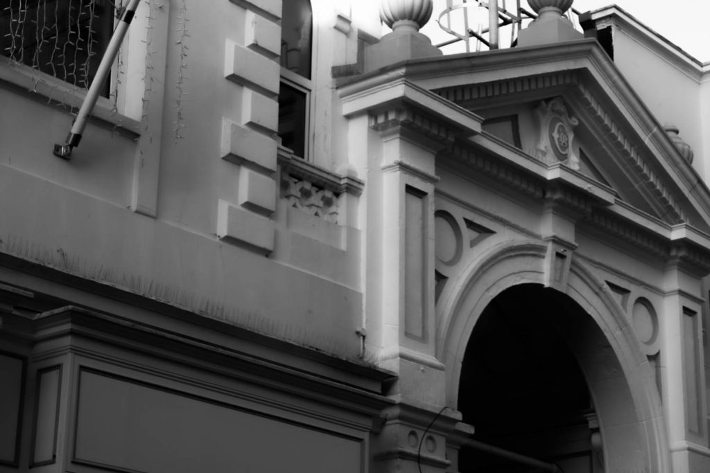
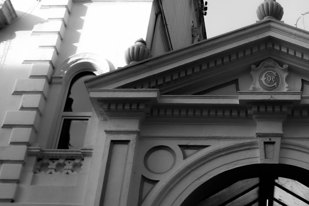
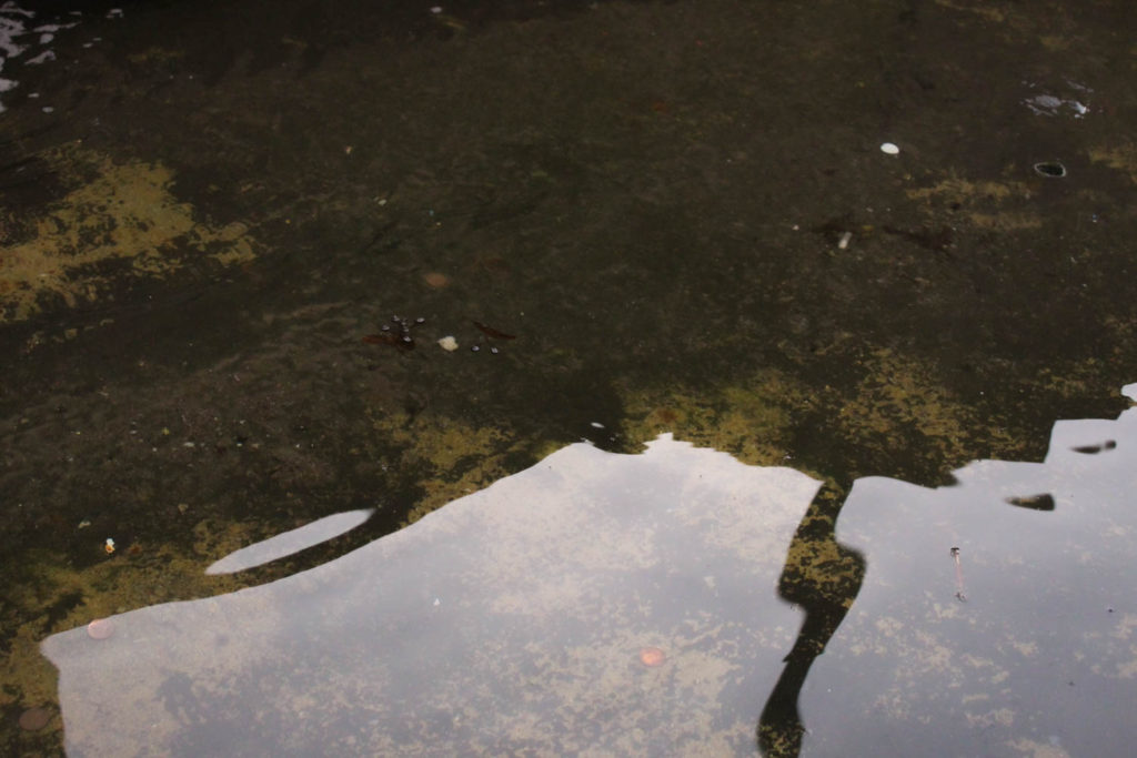
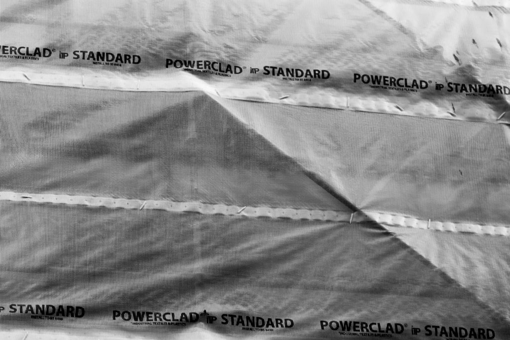
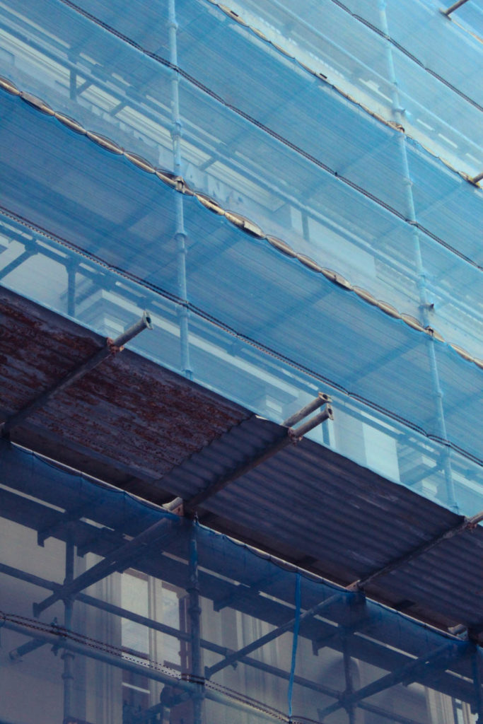
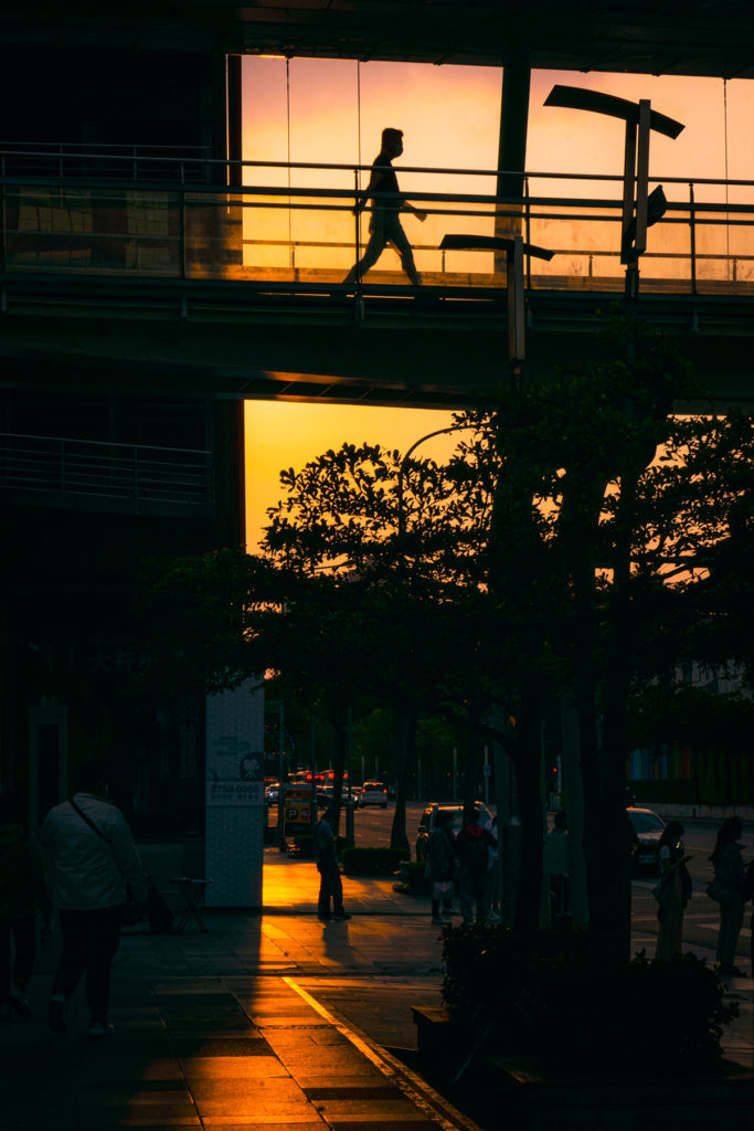
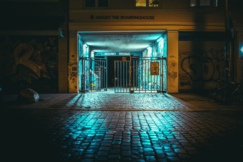
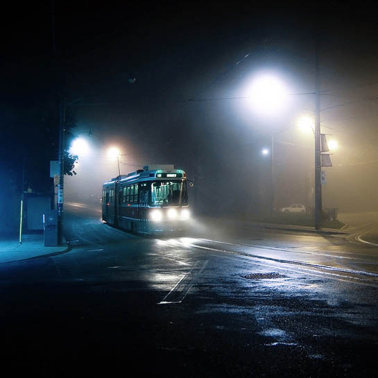
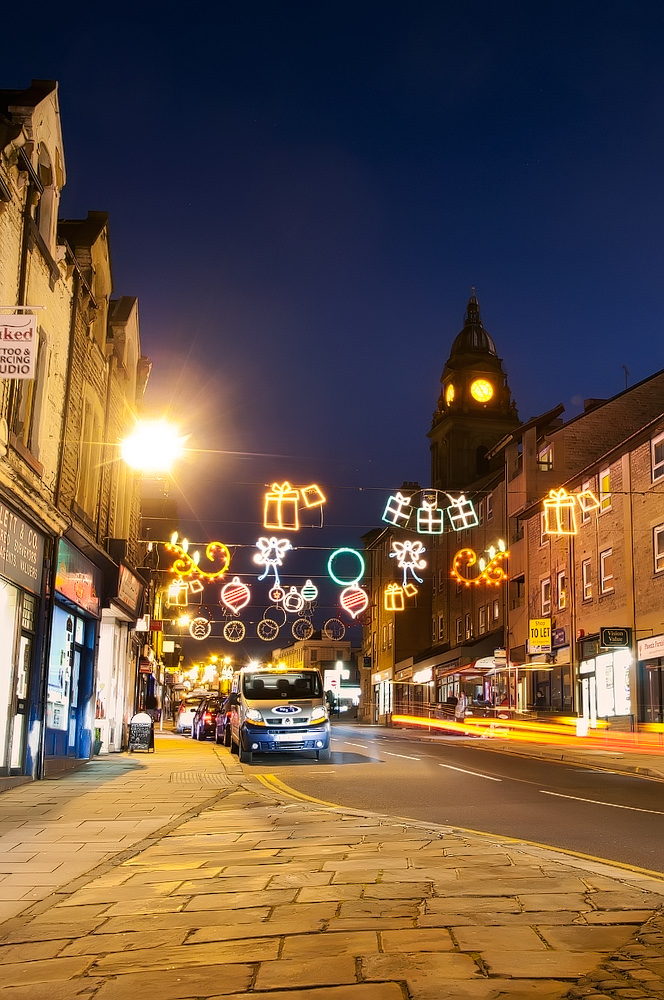
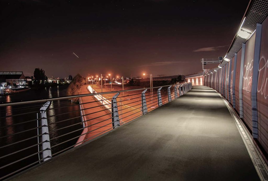
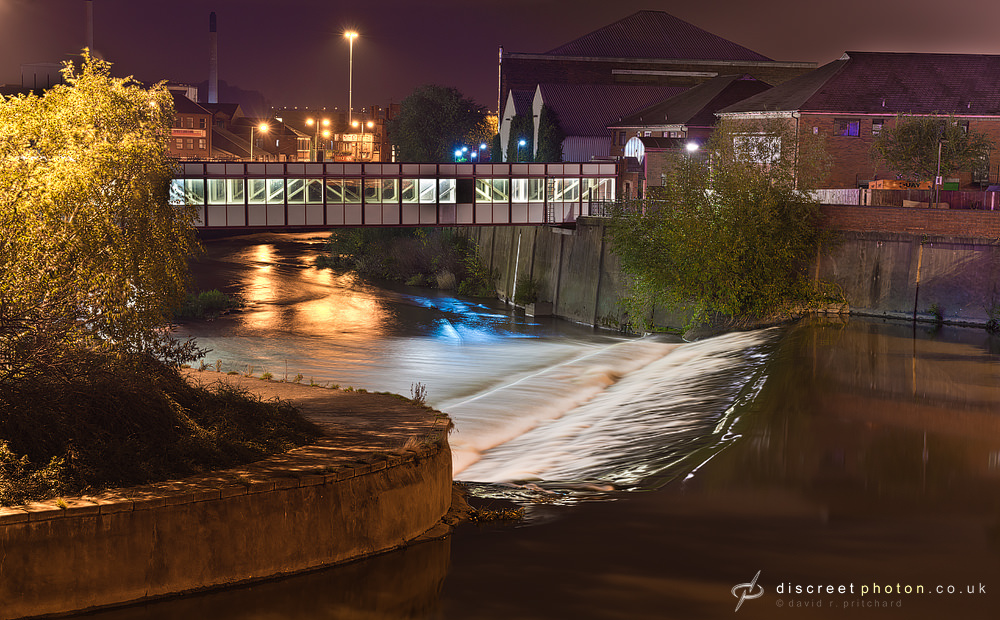
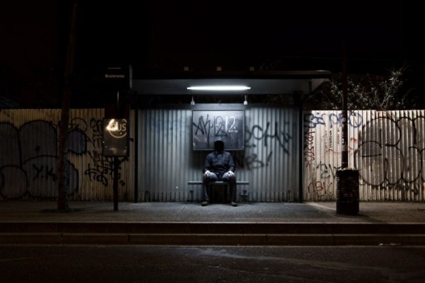
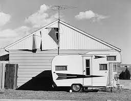
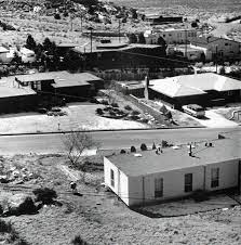
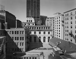
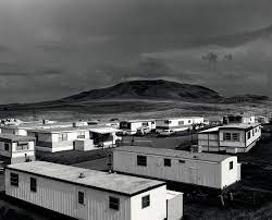
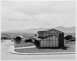
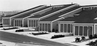
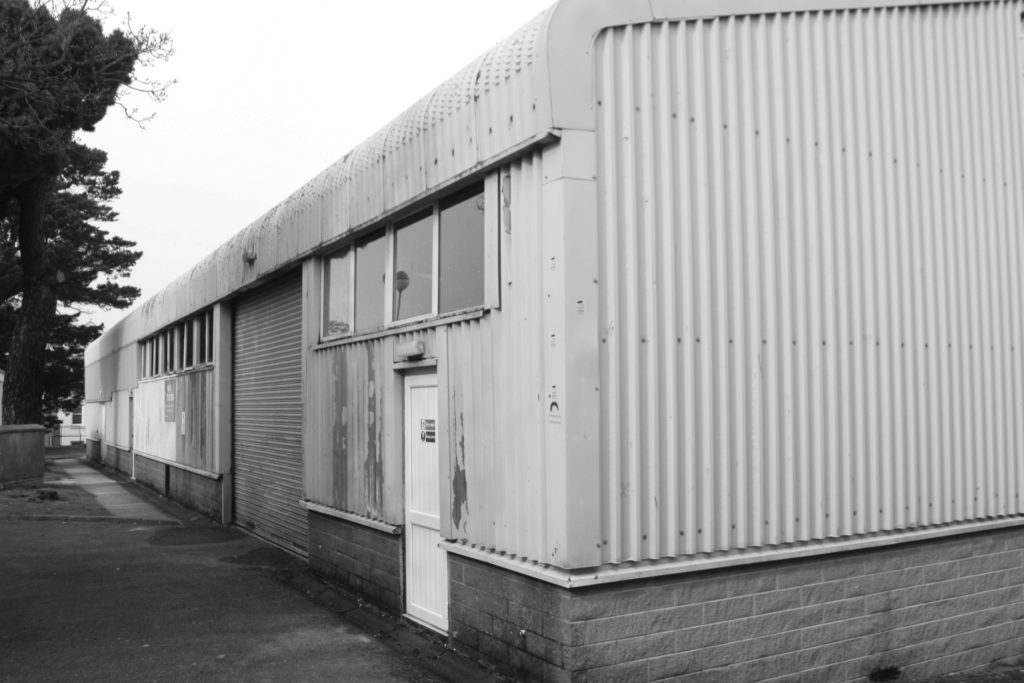
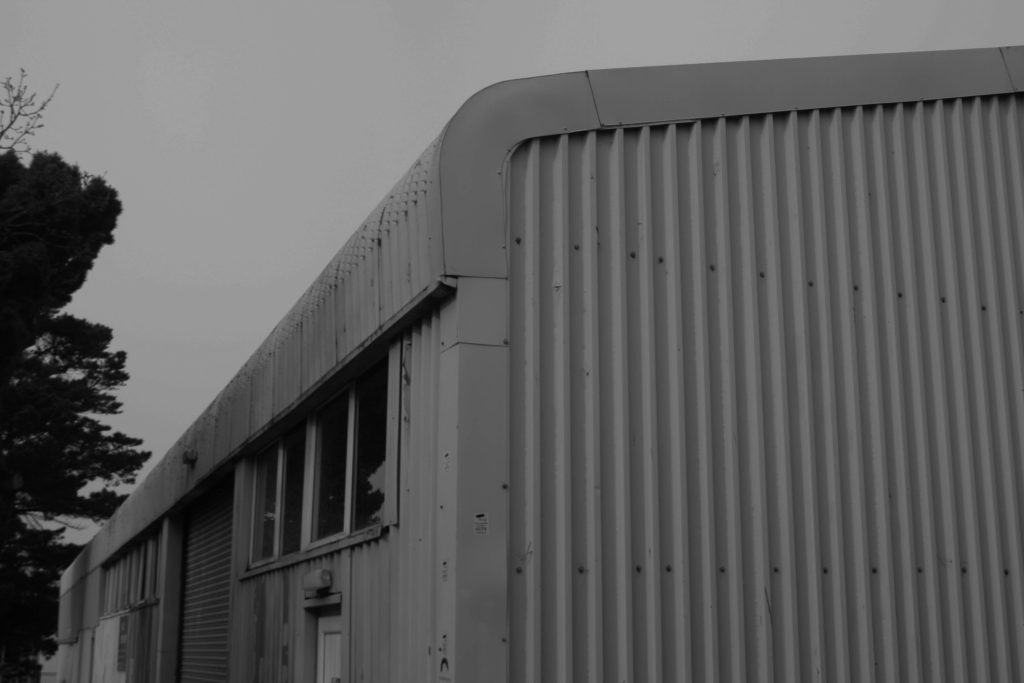
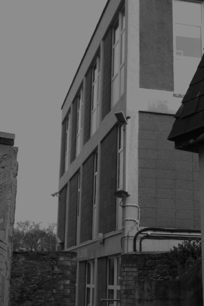
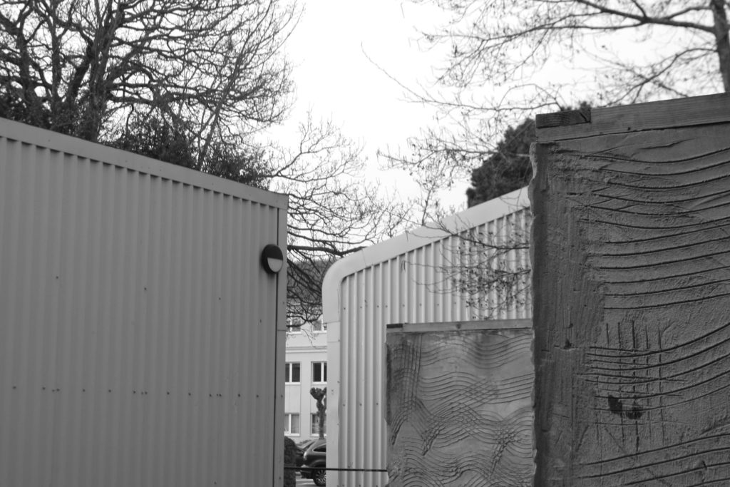
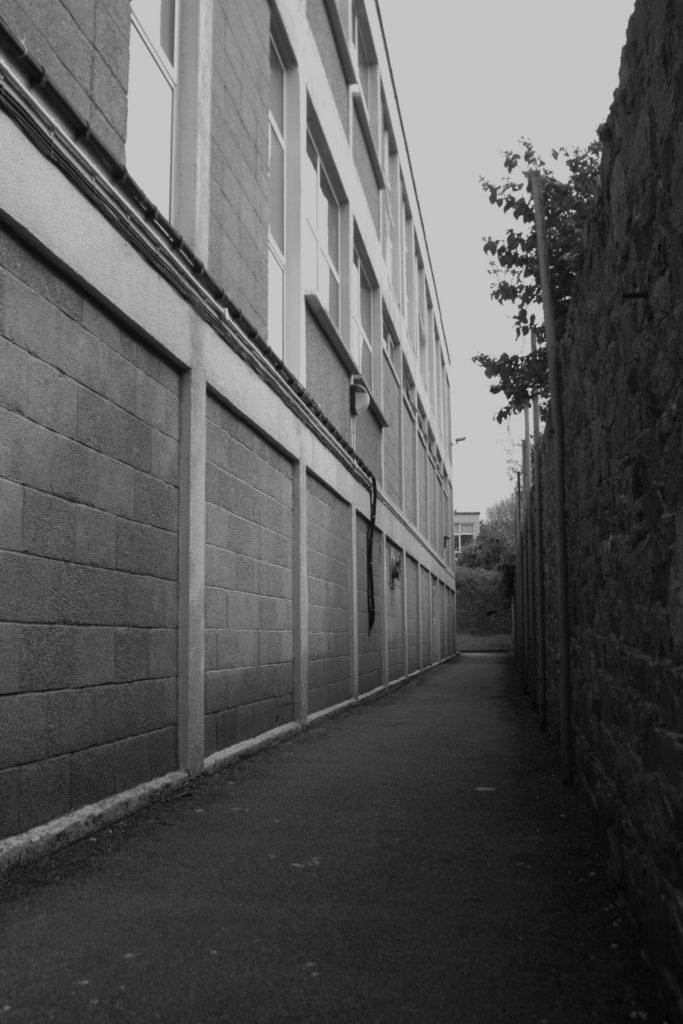
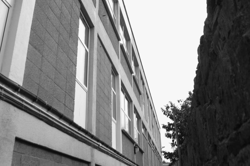
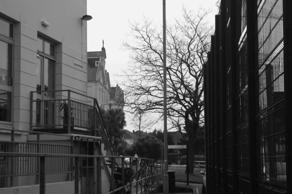
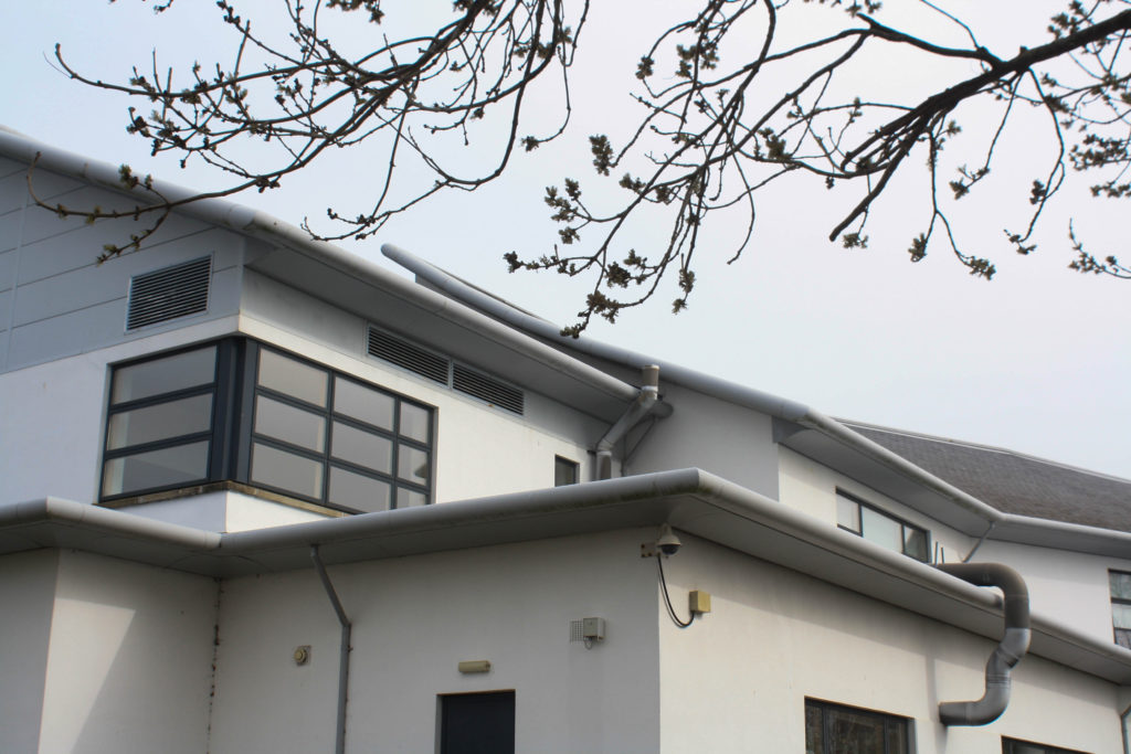
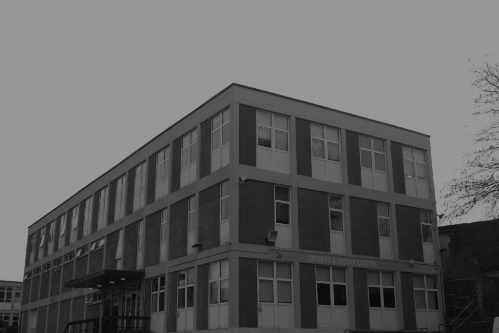
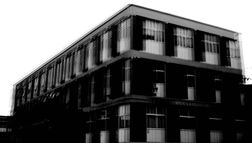
Final images
Daily Archives: March 30, 2022
Filters
Photo editing – rural
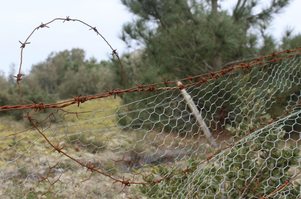
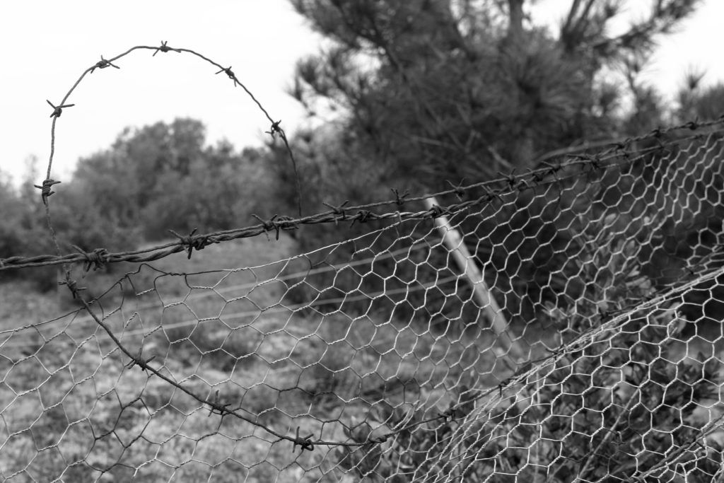
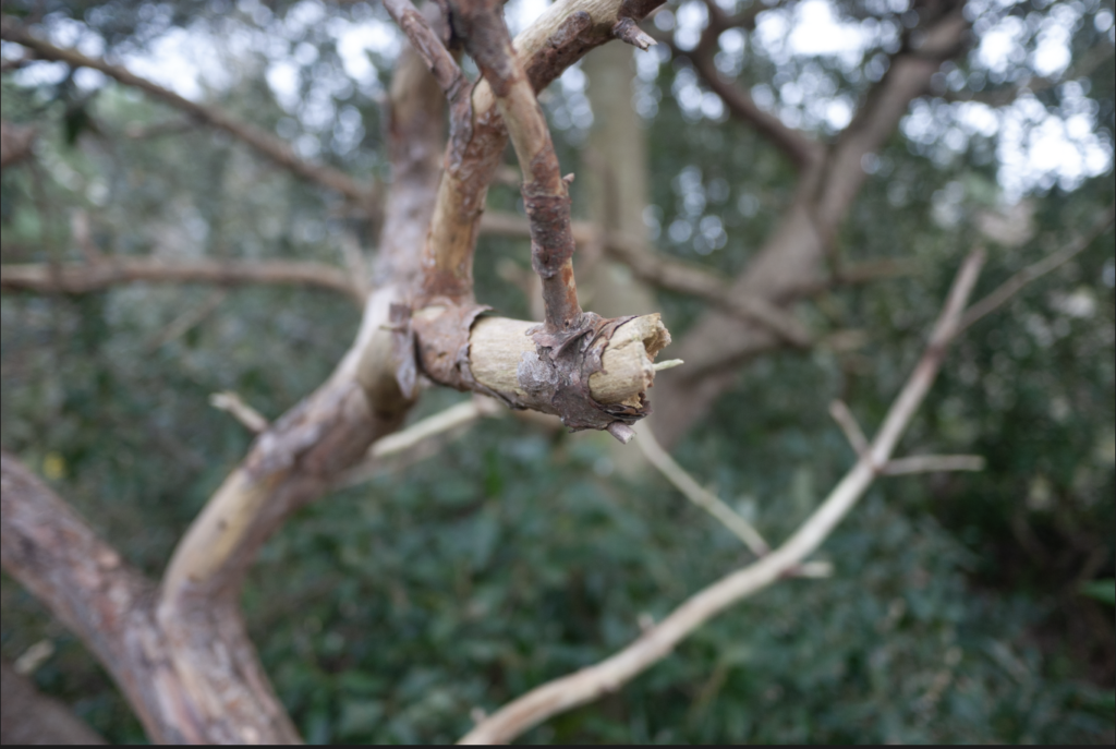
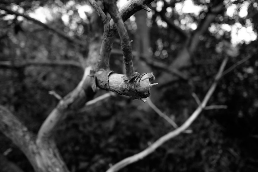
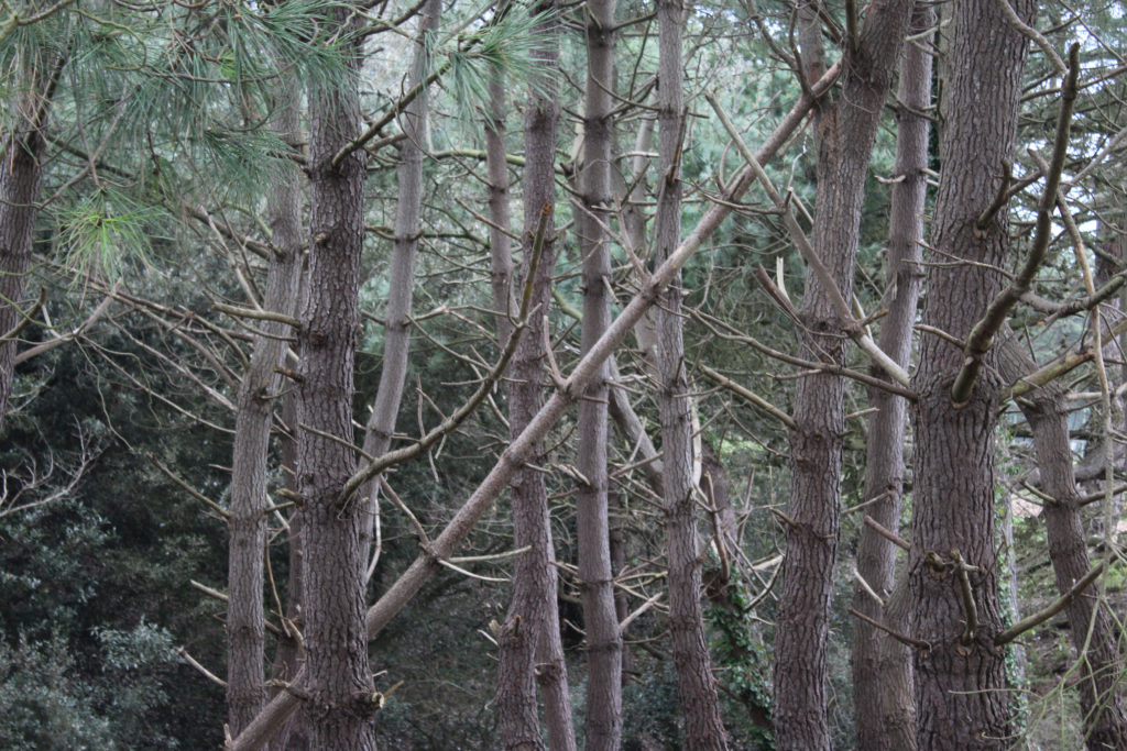

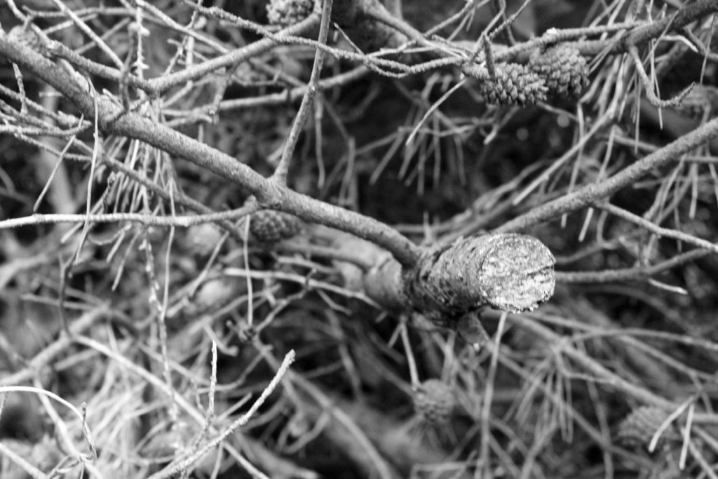
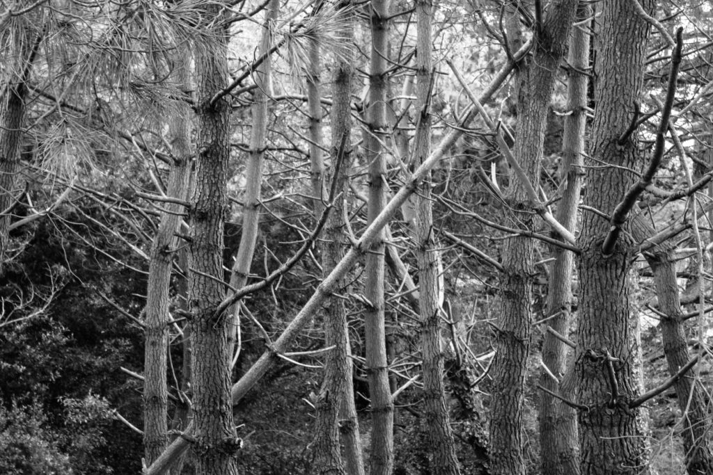
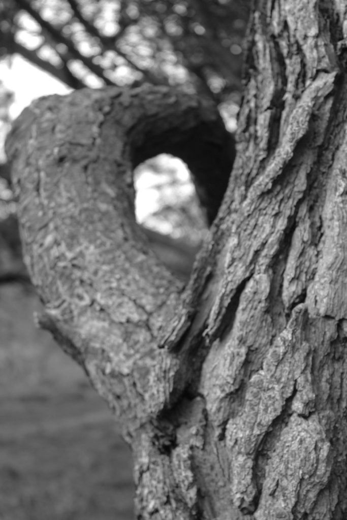
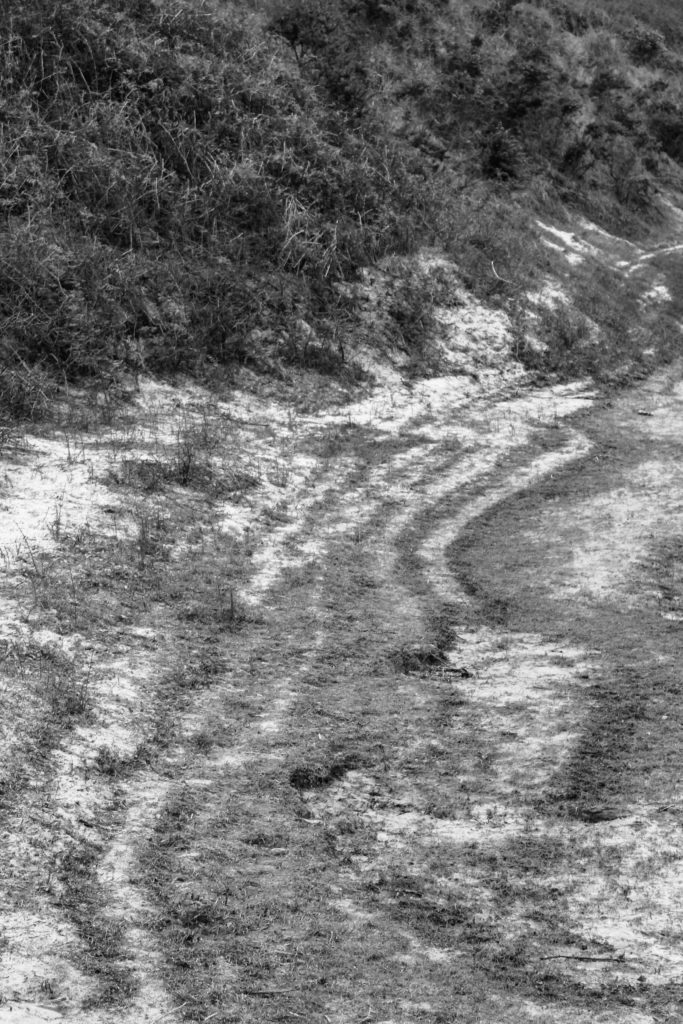
What I did here for my rural photography was I added a black and white filter on lightroom classic and adjusted the contrast slightly to my liking. I chose the filter labelled ‘B&W low contrast’ and adjusted it so that it didn’t turn out too dark or too light.
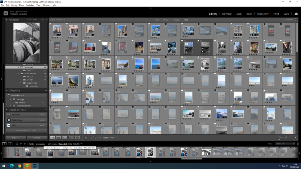
contact sheet shoot 2 industrial lanscapes
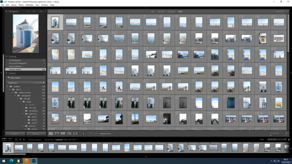
I imported my photos into Lightroom to start my editing process
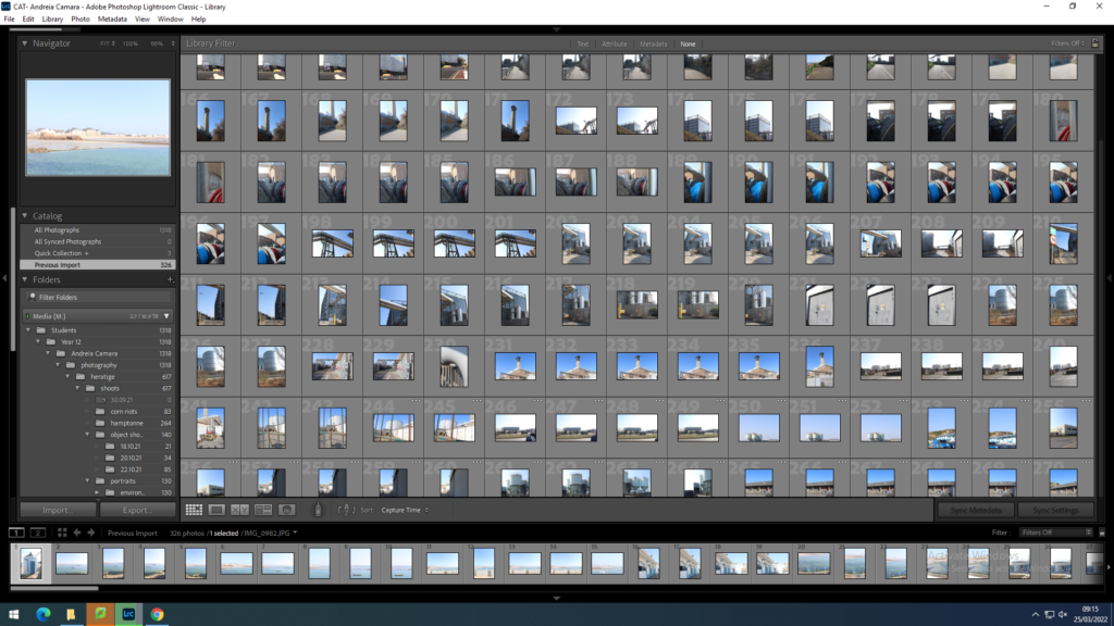
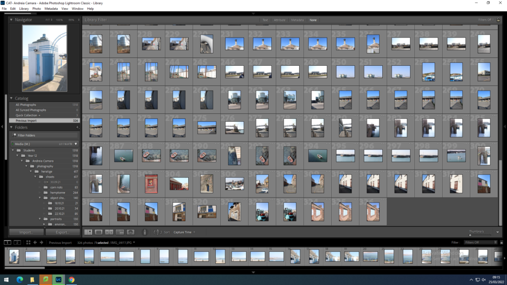
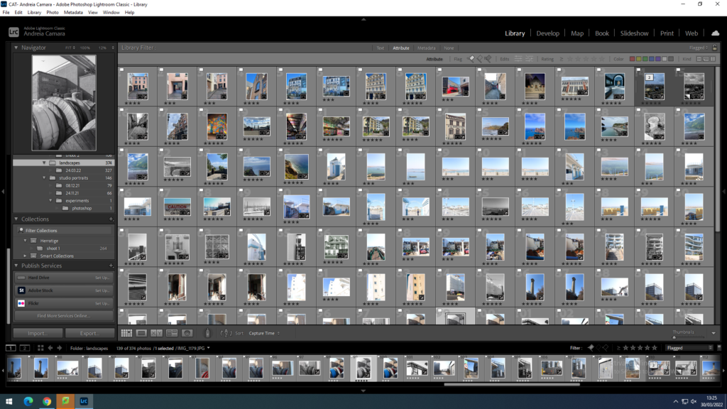
I then flagged my best images using p and x and then set up my staring system 5 being the best 3 being the worst
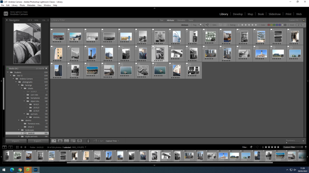
Then I went into develop mode and began the editing process I began by cropping images and then fixing the exposure and contrast of the images.
final images
urban industrial
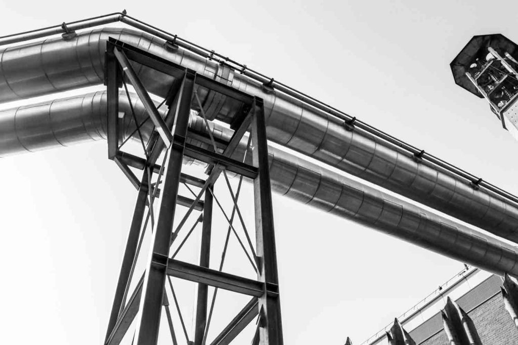
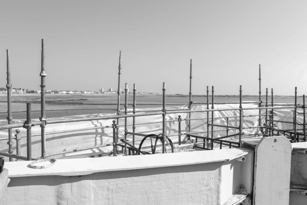
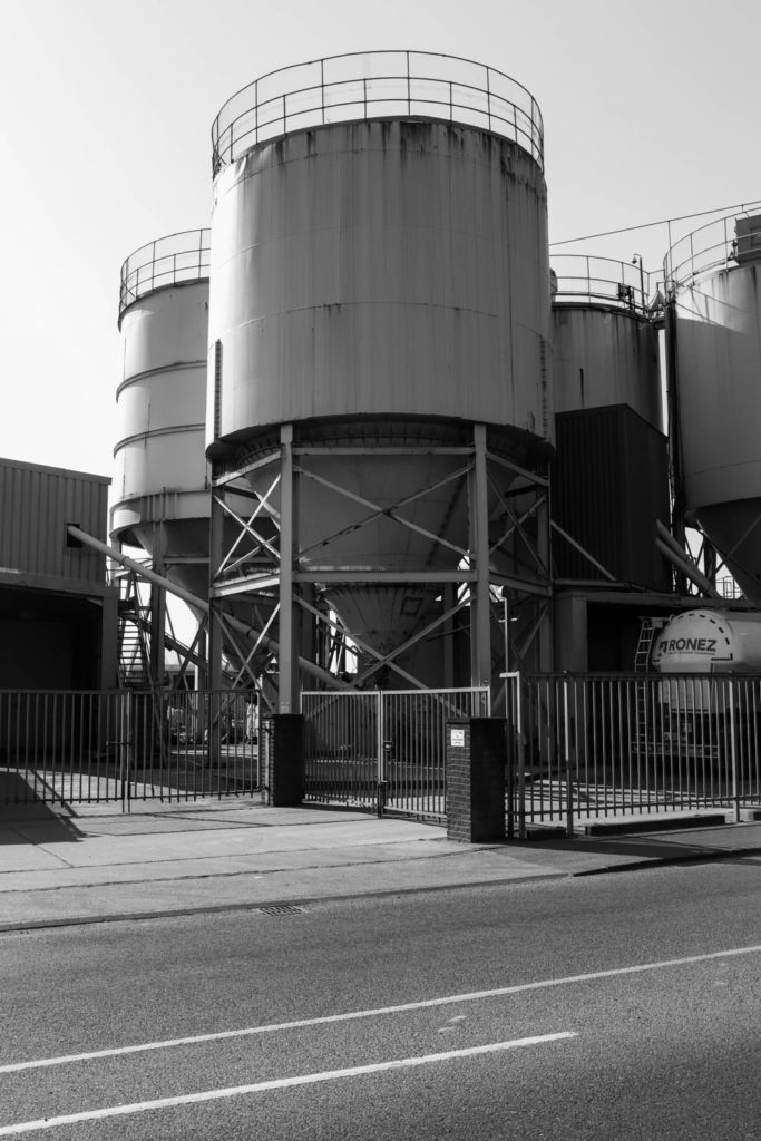
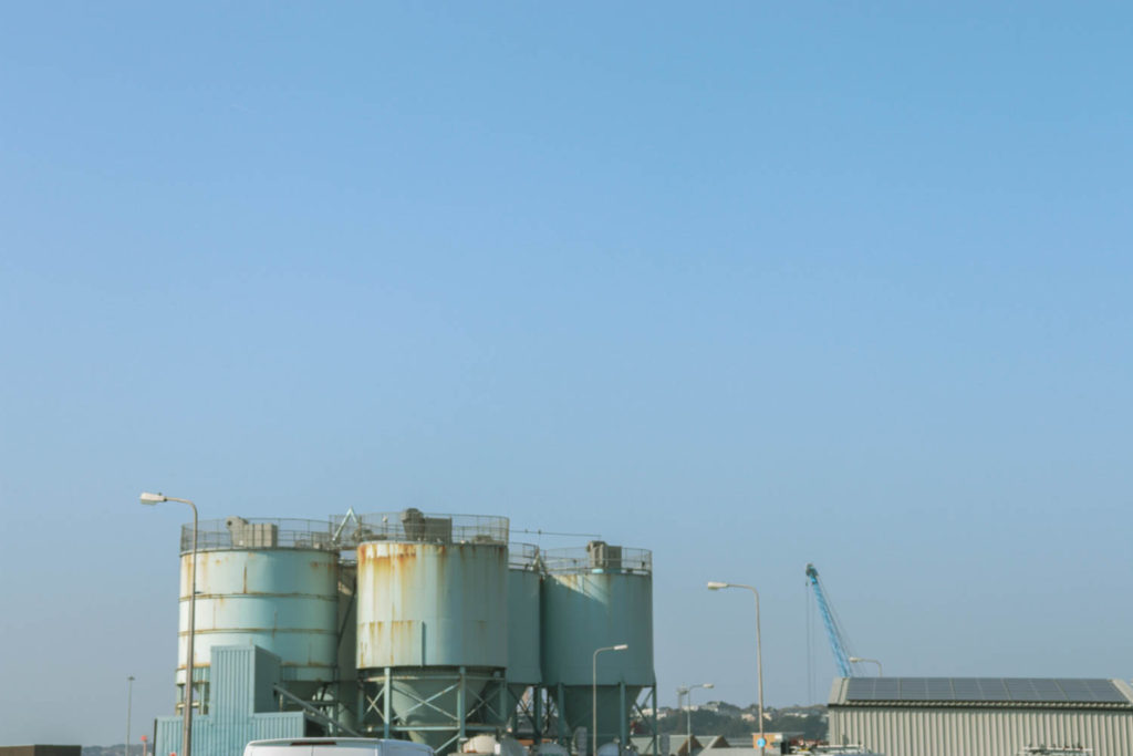
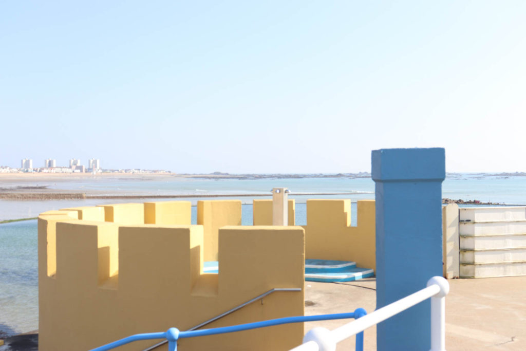
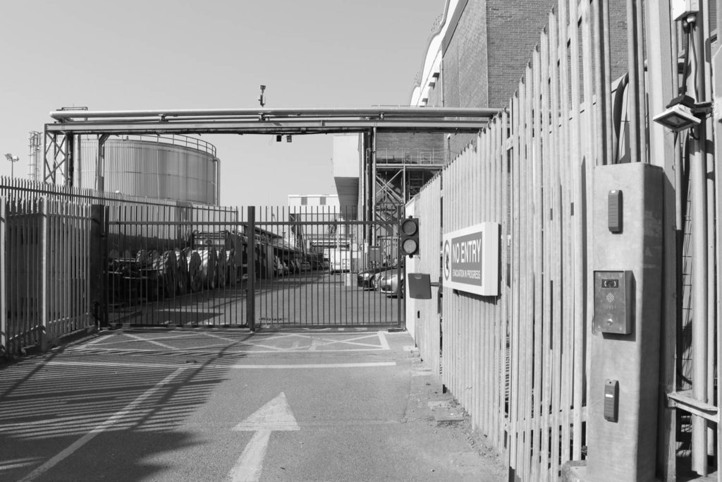
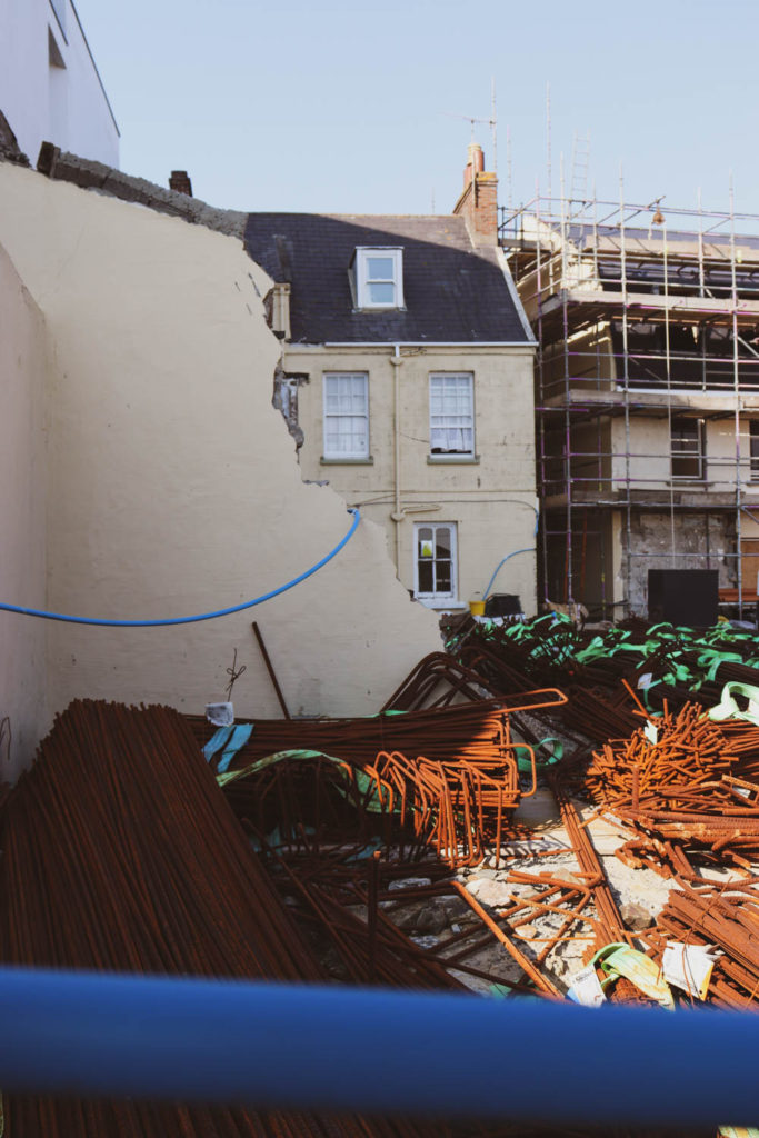
edits on photoshop
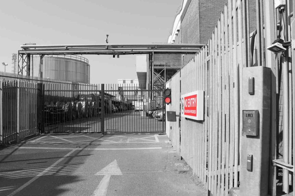
New Topographic visual comparison
Visual comparison Lewis Baltz

Lewis Baltz, The Industrial Park Near Irvine 
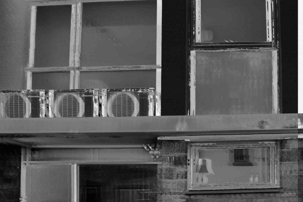
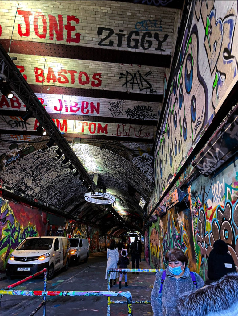
The photograph on the right was captured by Lewis Baltz, one of the photographers involved in The New Topographics, the photograph on the left was captured by me. Lewis Baltz image depicts the outside of a factory building, a stack of blocks can be seen in the image as well as a door and a ladder going up the building. My image on the right depicts a cave full of structural supports which have been vandalised with graffiti, the image portrays the impact that humans have had on nature. Both images have been shot in black and white although mine does contain traces of colour to add more life into the photo and make it more interesting for a viewer. The texture of the subjects captured in both images can be argued to be very similar also.
urban landscapes shoot 1
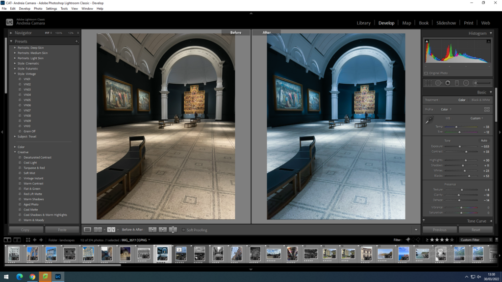
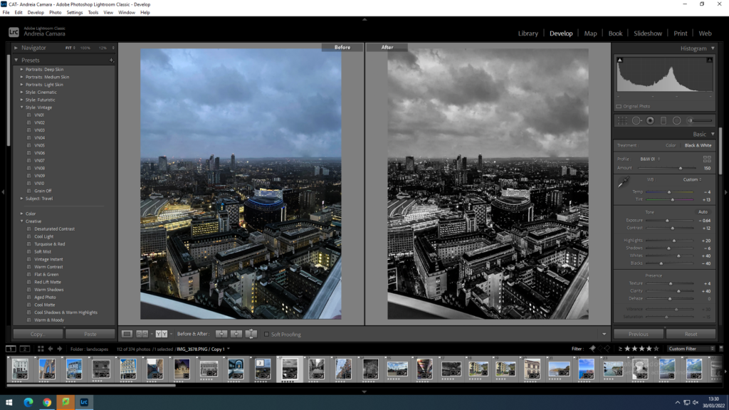
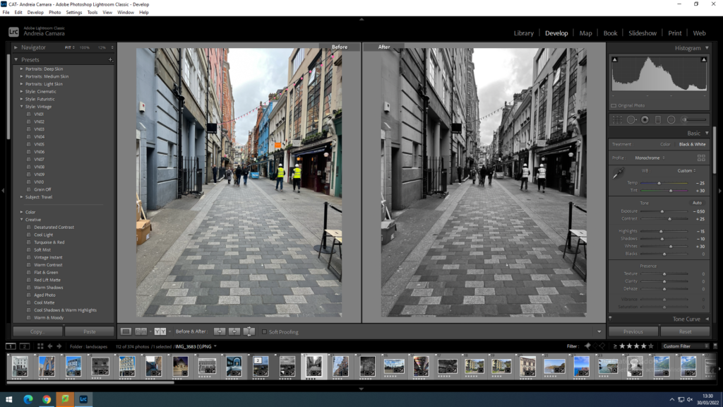
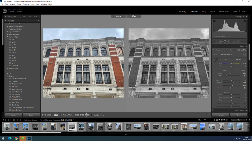
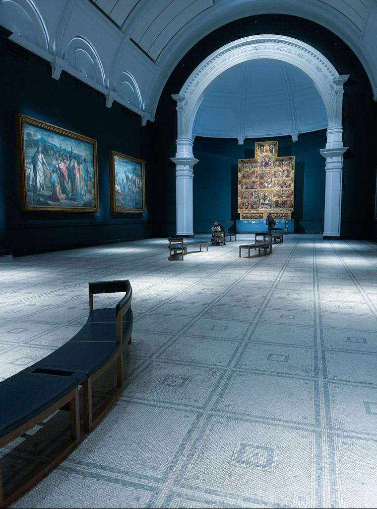
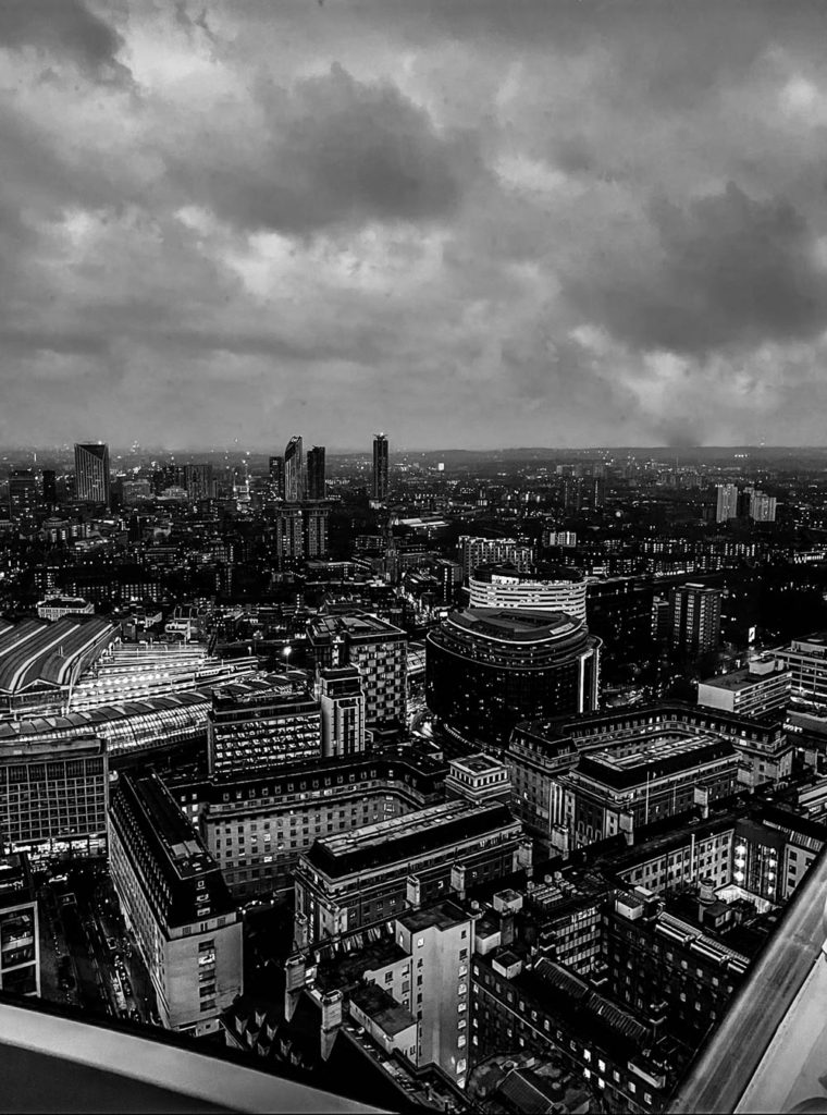
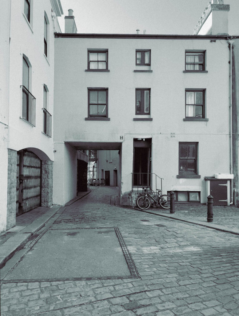
These images were taken throughout London which I think is fitting for this project as it is a very man altered urban city filled with different cultures and many interesting buildings such as skyscrapers, museums and many of these have modern architecture infiltrated into them.
final images
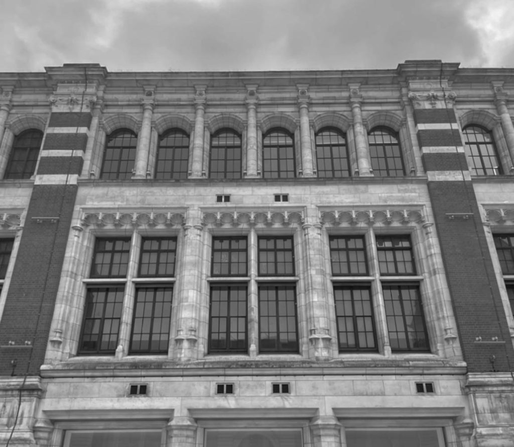
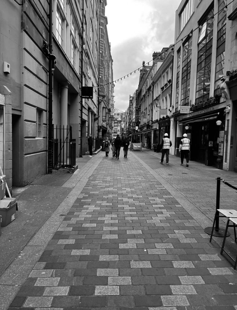
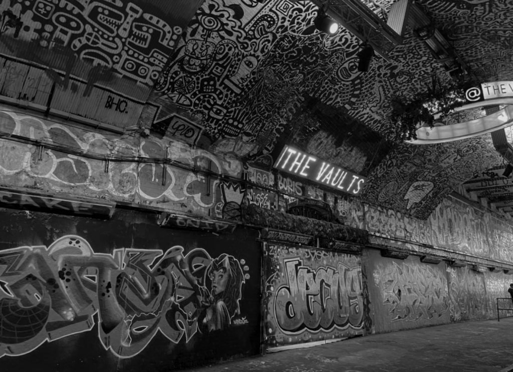
final edits in photoshop
I really like how the tones in these two images juxtapose each other as one shows the lighter side to London’s architecture and the one in black and white shows a more refined view of the cities skyline as the more prominent shadows pull more focus to how the cities buildings are laid out.
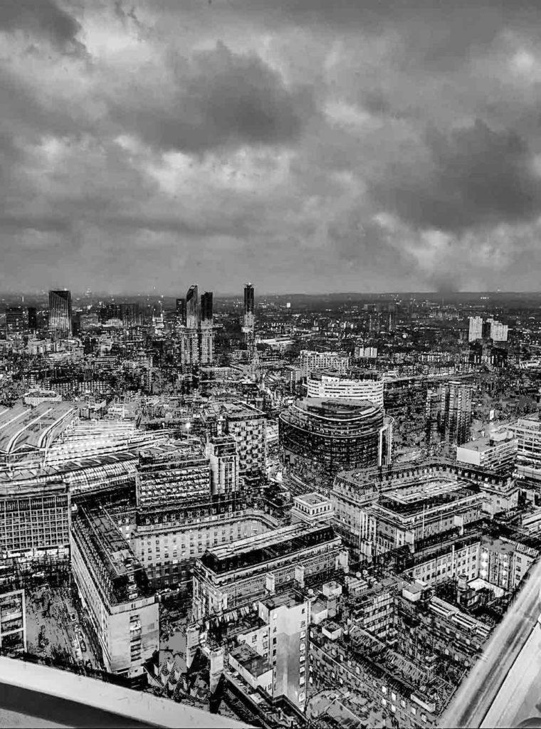
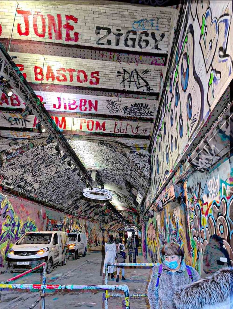
Then I went into photoshop and made a copy of my background layers for both images and then used the exclusion filter to make the whites in the buildings stand out then I moved around the copy of the layer to add a double exposure effect on the images.
Peter Mitchell Responce
I captured a range of images which were inspired by British Photographer, Peter Mitchell. I attempted to emulate Mitchells Editing styles by adjusting things such as, saturation, vibrancy and added a grain effect to emphasise the 1970s zeitgeist.
Mitchells images for reference
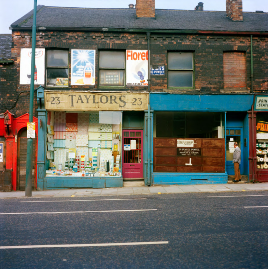

My images
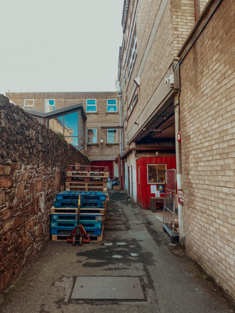
In this image, I think I captured the vibrancy similar to that in various of Mitchells images.
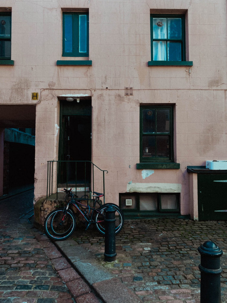
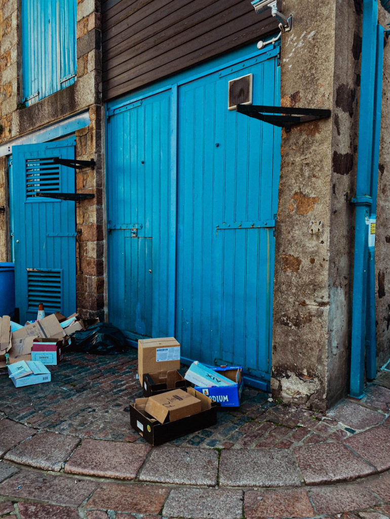
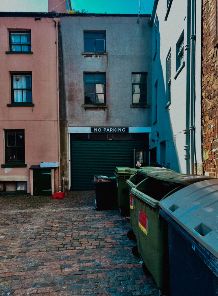
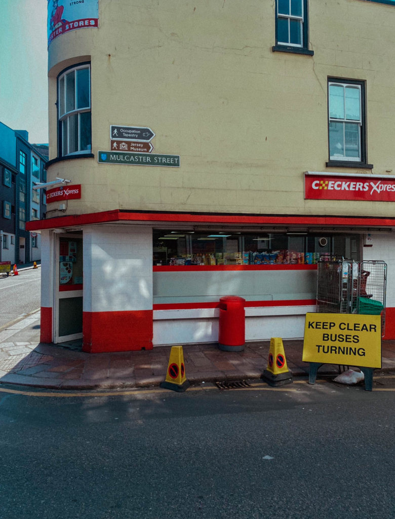
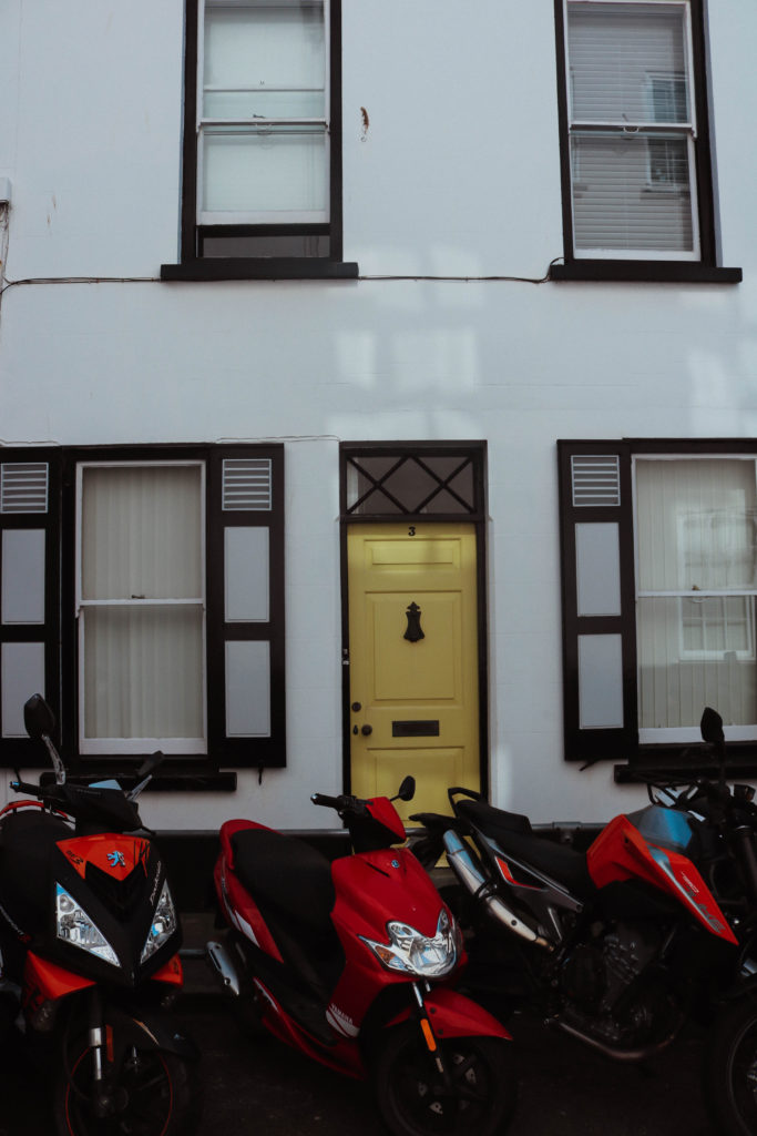
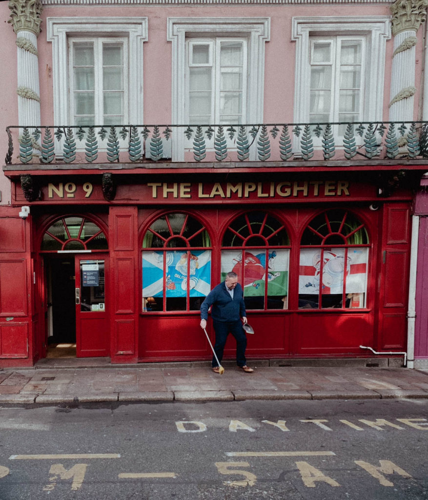
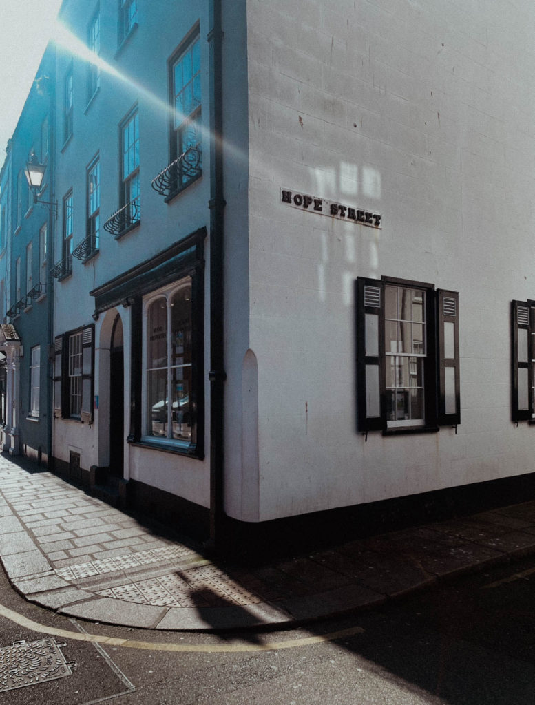
Urban Landscapes Photoshoot-
I was less organised for my shoot that I wanted to be, as I was sick when I originally wanted to do one. I ended up taking pictures while walking through town after school.
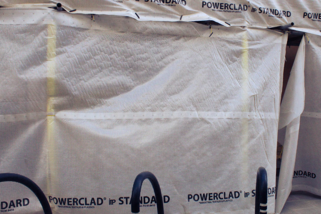
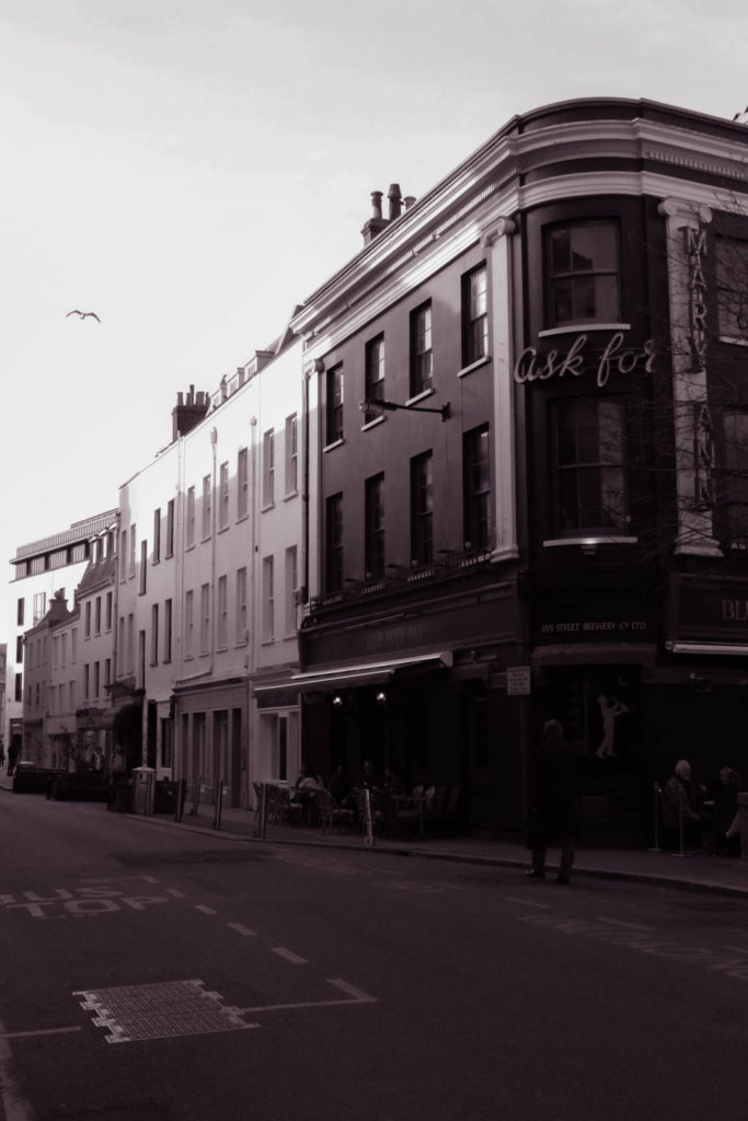
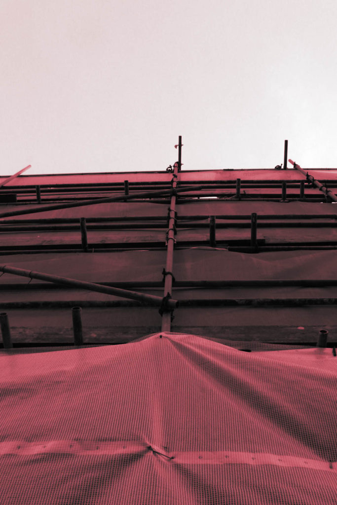
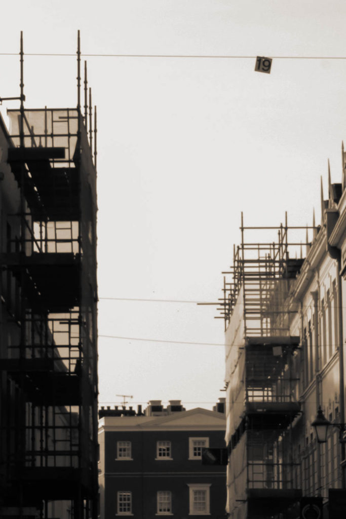
I took pictures of some of the buildings I saw, including some that were in development and covered in scaffolding. I like how the scaffolding pictures look and took some similar pictures on the Havre Des Pas photo walk.
For my edits I wanted to be more experimental, I made some of my images black and white and increased the contrast. I then hue shifted them to they had a bright overwhelming colour, I particularly like the red scaffolding image as it looks unique and contrasts a normal monochrome image.
Night Photography
Exposure Bracketing
Exposure bracketing means that you take two more pictures: one slightly under-exposed (usually by dialling in a negative exposure compensation, say -1/3EV), and the second one slightly over-exposed (usually by dialling in a positive exposure compensation, say +1/3EV), again according to your camera’s light meter.
- Use a tripod
- Use slow shutter speeds (experimenting with TV Mode / Shutter speeds)
Photoshoot plan
I plan to take photos of…
- St Helier- Buildings around King Street and the crossroads
- Rows of houses
- Industrial Areas
- Multi-story Car Parks- Minden Place -Greenstreet
- Building sites and Scaffolding
- Demolition sites
- Underpass / overpass
- Tunnel
- The Waterfront
- Harbour
- Fort Regent
Contact Sheets
about:blankGalleryDrag images, upload new ones or select files from your library.UploadMedia Library
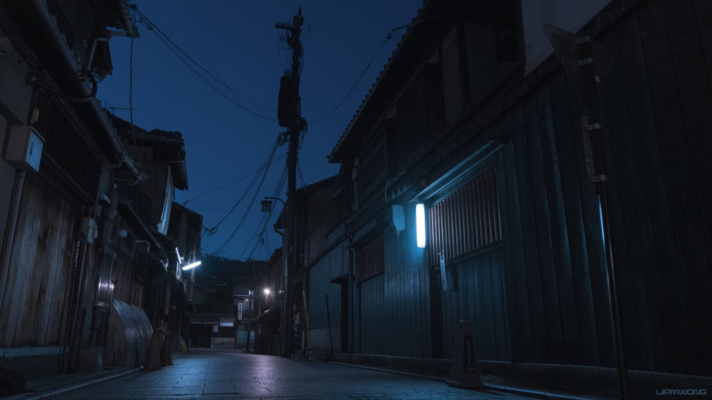
Liam Wong
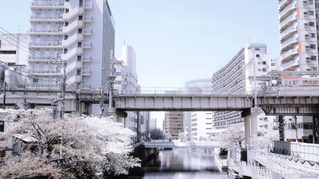
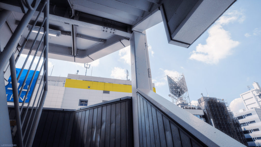
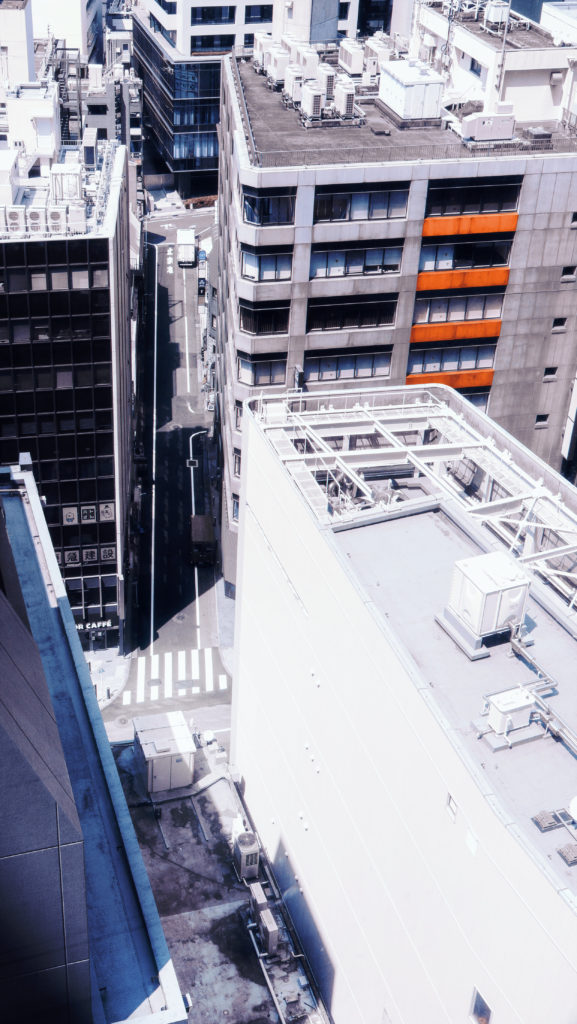


Image Analysis
New Topographics
New topographics was a term coined by William Jenkins in 1975 to describe a group of American photographers (such as Robert Adams and Lewis Baltz) whose pictures had a similar banal aesthetic, in that they were formal, mostly black and white prints of the urban landscape
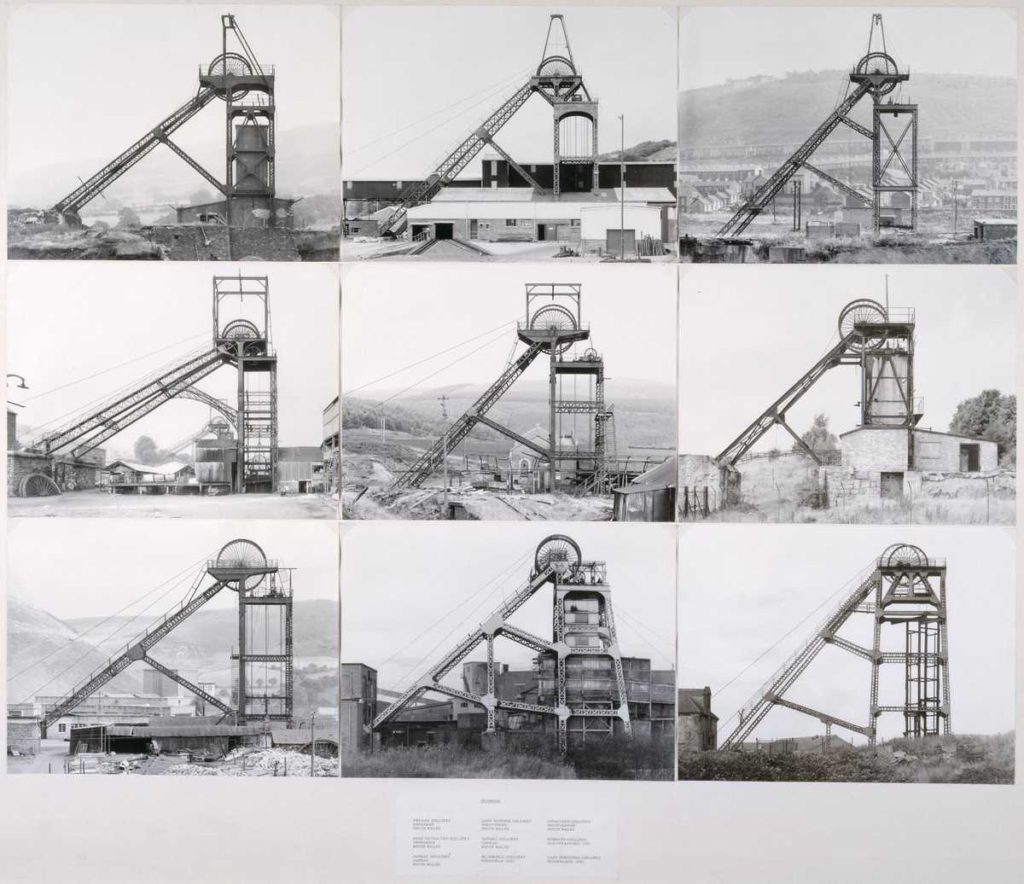
Pitheads 1974 Bernd Becher and Hilla Becher 1931-2007, 1934-2015 Purchased 1974
The New Topographic image are stark, beautifully printed images of this mundane but oddly fascinating topography was both a reflection of the increasingly suburbanised world around them, and a reaction to the tyranny of idealised landscape photography that elevated the natural and the elemental.
Joe Deal
While working on his thesis for his MFA degree in the 1970s Deal started teaching at the University of California, Riverside, where he helped establish the UCR/California Museum of Photography. In 1989, he became dean of the School of Art at Washington University in St. Louis. He was named to serve as provost of the Rhode Island School of Design in Providence, Rhode Island 1999, and lived there for the remainder of his life.
In the mid-1970s, Deal was one of ten photographers chosen to participate in the “New Topographics: Photographs of a Man-Altered Landscape” exhibition curated by William Jenkins at the International Museum of Photography at George Eastman House. Deal contributed 18 black and white photographs to the exhibit in a 32 cm × 32 cm format. Many of the photographs Deal submitted featured homes newly constructed against the desolate landscape of the American Southwest.
He continued photographing the human effect on the landscape in The Fault Zone, which featured images combining human and geologic effects on the area surrounding the San Andreas Fault. Subdividing the Inland Basin featured suburban areas east of Los Angeles and Beach Cities focused on Pacific Ocean communities in Southern California. West and West: Reimagining the Great Plains featured photographs of the grid pattern of much of the Midwestern United States and was on exhibit at the University of Arizona‘s Center for Creative Photography in Tucson, Arizona after opening at the Rhode Island School of Design and being presented at New York City’s Robert Mann Gallery.
A ten-year resident of Providence, Rhode Island, Deal died at a hospice there due to bladder cancer at age 62 on June 18, 2010. He is survived by his wife, Betsy Sara Ruppa, and a daughter, Meredith Deal.
Image Analysis
Contact Sheets
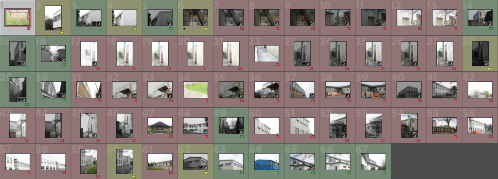
Experimentation
Editing in the style of Keld Helmer-Petersen
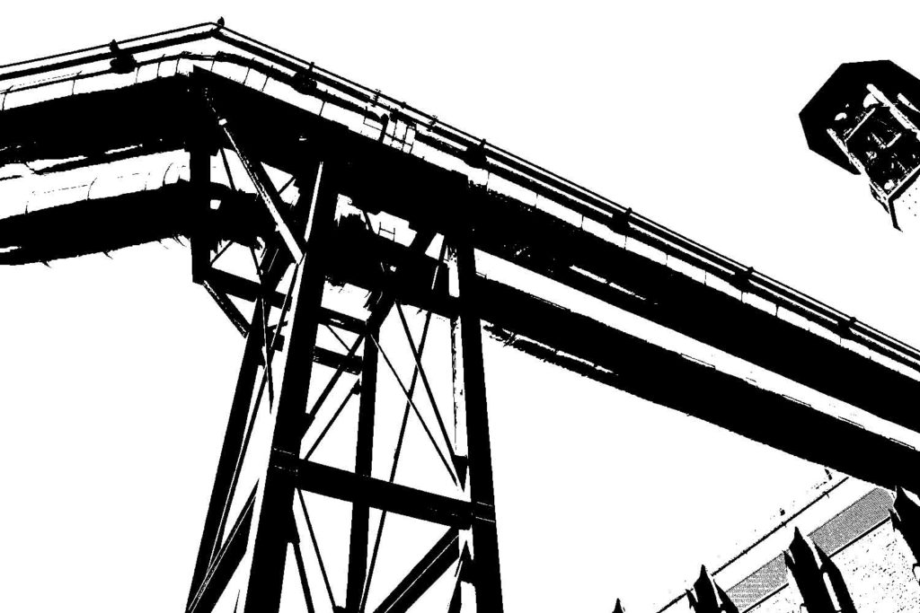
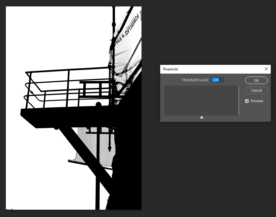
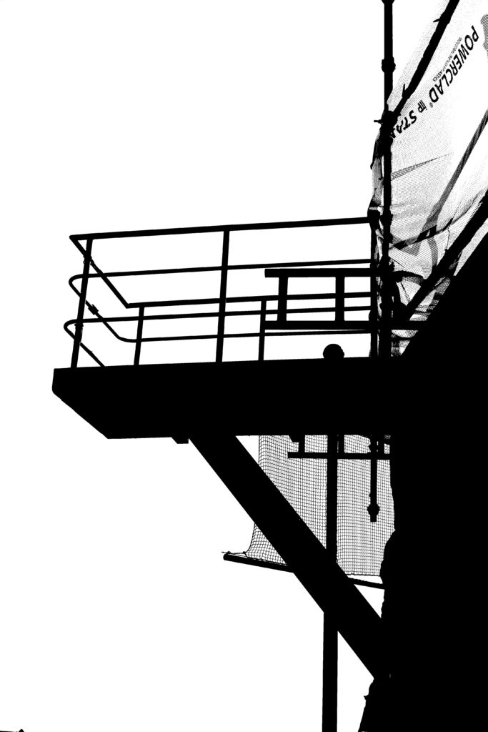
For this work, I will be attempting to edit in the style of Keld Helmer-Petersen. I will be choosing two photos, which I think are successful and will work well in his style where he uses sharp edges to create abstract shapes and bringing them into photoshop where I will edit them and then I will compare them to his work and see which one I like more and I think shows a better influence of huis work to mine.
Editing in photoshop #1 –

Editing in photoshop #2 –
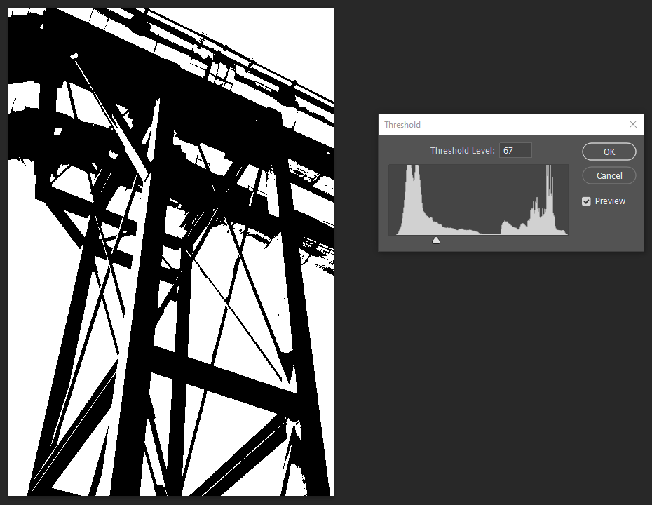

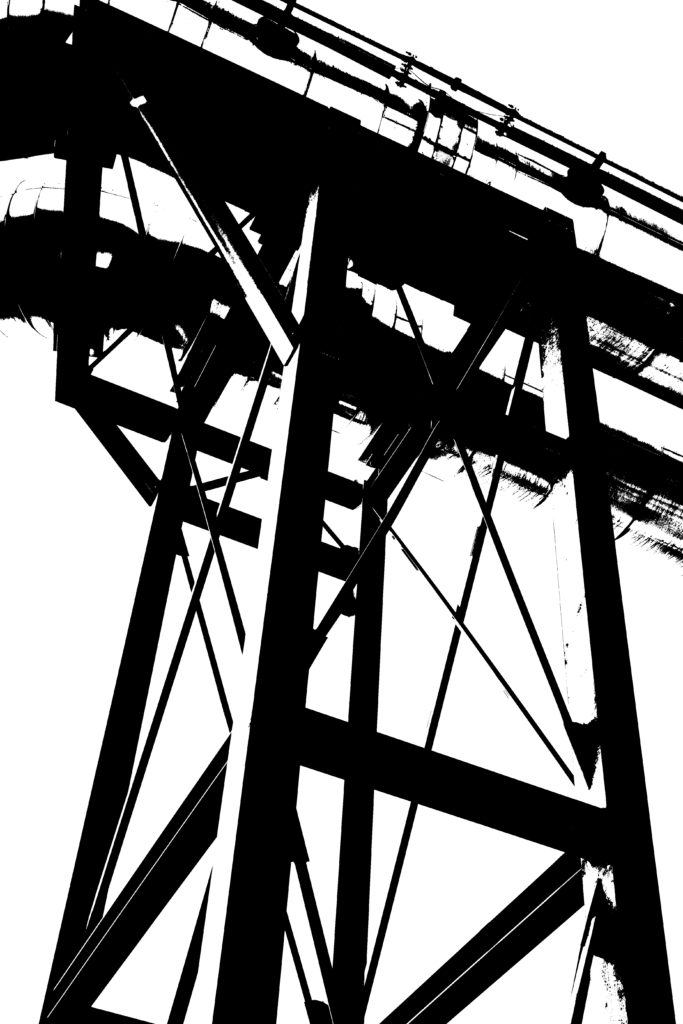
Comparison to Keld Helmer-Petersen –
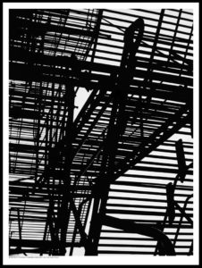
Keld Helmer-Petersen’s work 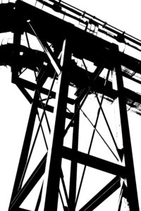
My work
I enjoyed working in the style of Keld Helmer-Petersen and chose this photo of my work as my most successful edit which I completed to compare with Keld Helmer-Petersen’s work because I really like how both of the photos have sharp, bold and black lines which shows the structure of the object well but also creates the illusion which you don’t really know what it actually is because the lines are quite vague with their descriptions so it leaves a lot to the imagination, which I think creates a successful edit in his style as the photos aren’t quite clear in what they are which is what I wanted to incorporate in to my work as well. I also like how my photo has different layer to it to make the industrial object appear shiny because I think that it helps to break up the solid black lines and give the photo that extra layer of dimension and individuality as it won’t be the same on another photo due to the lighting from the sun and the weather whereas Petersen’s work uses more bold, black and defined lines which I didn’t really like.

