


I took 292 images then spent a long time going through them using the rating system to find the best suited to my artist reference.
final outcomes
Keld Helmer-Petersen was a Danish photographer who achieved widespread international recognition in the 1940s and 1950s for his abstract colour.
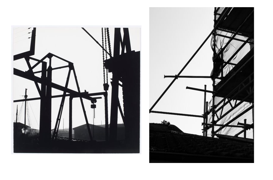
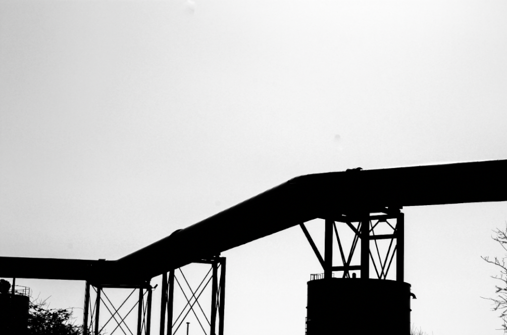
the first image is a specific style from Keld helmer-petersen that inspired me to edit my own images in this style. i did this by incresing the blacks and shadows in the image to show the most contrast between the overexposed white sky and the underexposed scaffolding which creates a black and white effect.
I liked her style so I continued to edit more of my photos into her style. this image is of a duct running from the furnace. I thought the supports holding up the duct would look good in this style, that is why i chose to edit this image in this way.

this image is of the underside of the duct taken from inside the support so that I could get a very symmetrical view. I decreased the highlights in this mage to give more contrast between the ducts and the sky behind. i like the way all the different shaded of greys contrast against each other giving a good amount of depth to the image.
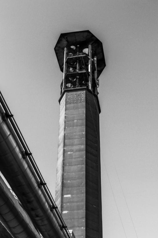
this image was taken from underneath the duct looking up to give a looming perspective of the chimney. i made sure took multiple images of from this perspective some with out the duct but I decided that the duct provides depth to the image showing a foreground (the duct) a mid ground (the chimney) and a background (the sky).

I like this image because the contrast between the hard white shapes against the vast dark expanse of the sky. I positioned my self dead on with the building to get more of a dead pan effect then situated the building slightly of centre of the image to give more contrast to the darker coloured sky against the building.

this image shows the barriers at Hav de pa and expanse of land to le Marie flats. i like the way the text is so bold which contrast to the rest of the image which is less sharp. the flat barrier also frames up the horizon which then highlights the development of the land and the high rise flats protruding from the horizon. i positioned these four buildings above the righting to draw your attention from the text up to the building with the large expanse of sandy midground in-between. I converted this image into black and white to give more contrast to the image.

this image shows a very industrial side of the island. I took this image from behind the large spiked fence keeping people out of this industrial area. I like the perspective it gives to the image. i took different images where the chimney was in focus instead but I then decided that I like the this image more because of the less sharp background contrast to the sharp fences.