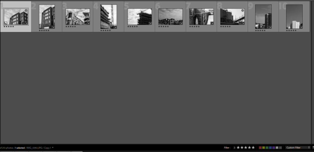
I used the star rating sytems to decide the good from the bad images.

Then I am left with my 5 star images which best relate to new topographics.

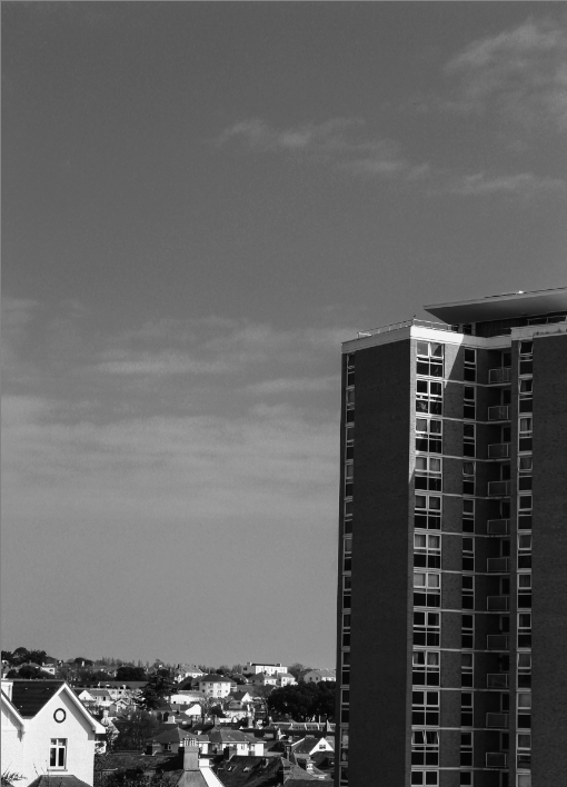
I took this image from the top of MT Bingham of the flats on green street I chose my position carefully to get a higher perspective of and over the surrounding buildings. i positioned the skyscraper slightly of centre of the image to provide juxtaposition to the the rest of the smaller residential buildings. I then used the vertical straightening tool to correct the image and changed the image into black and white to relate to the original photographers of the new topographical movement.

this image shows the contrast between the two different building designs, the contrast between the point triangular design and the curves of the the adjacent building. there is beauty in the straight and the organic cloud shapes which I increased the contrast to bring out. this photo is taken from a lower angle to provide a better perspective to the image. the contrast between the natural and the unnatural link to the movement because it is about the beauty that can be found in the everyday urban environment however i believe there is also beauty to be found in the average day, the pattern made by the clouds showing a unsymmetrical, un even, un predictable motif.

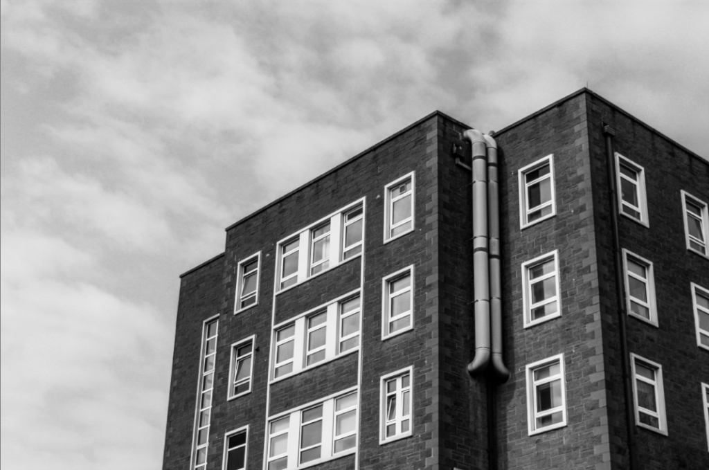
this really like this image because of the contrasting brick work and lighter window frames reinforcing the idea of the beauty in the mundane. this image is of the older wing of the hospital with its ‘boring’ square shapes so i decide to photograph this i would need to find a good angle to show of the best angle to create a god image from a seemingly boring building. i liked that this wall wasn’t flat and it had some depth, i also liked the pipes coming from the building back into the building. i converted this image into black and white to better match the original artists of the the new topographical movement.

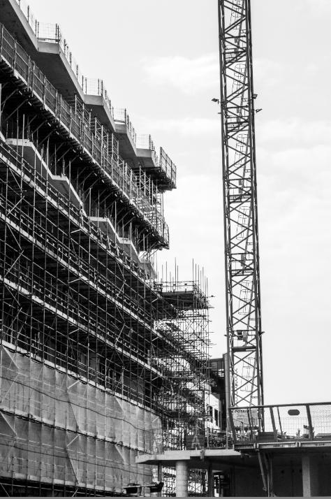
i like this iage becasue a construction site is in the transition between natural

