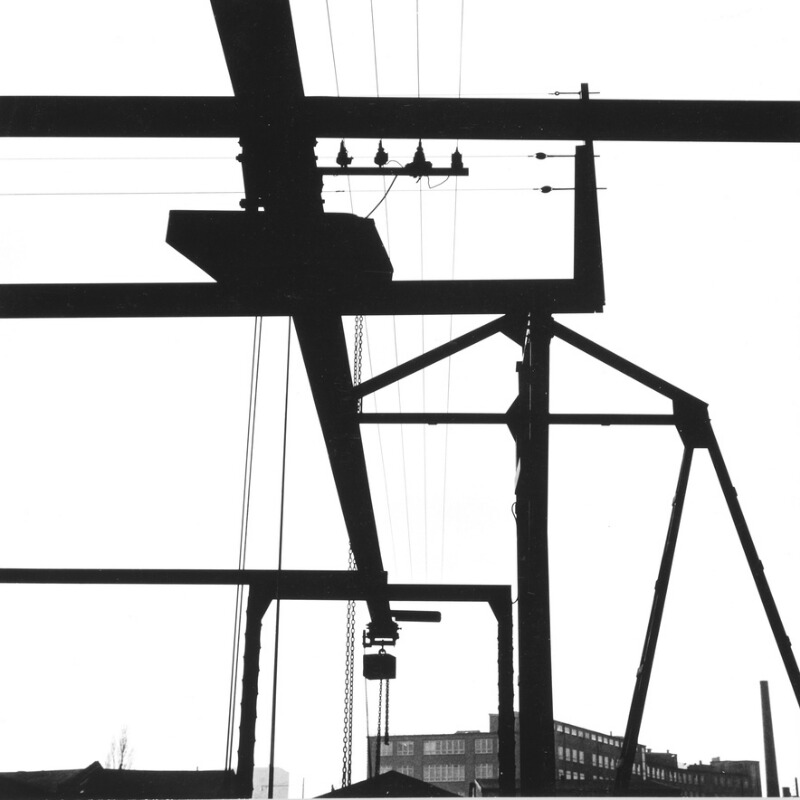
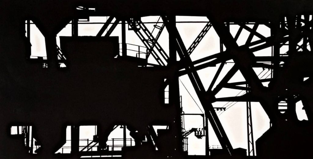
Keld Helmer-Petersen is one of the most influential Danish photographers in the 20th Century. He was an international pioneer in colour photography and was a central figure in not only Danish but also European modernist photography. His career spanned 70 years and he had strong interest in modern architecture, industrial areas and structures. He was very prolific and continuously experimented and challenged the many possibilities of the photographic image.
His efforts have put a mark on photography as an artistic expression. With his keen eye for things that are generally overlooked, Keld Helmer-Petersen opened a door to the hidden beauty of a world, we thought we knew so well.
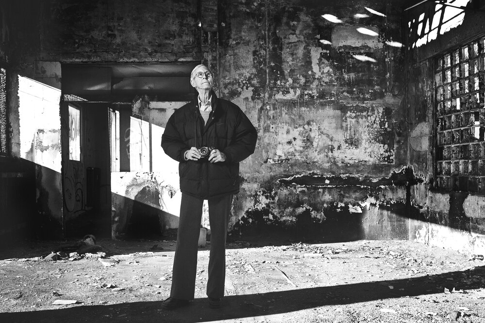
Keld Helmer- Peterson 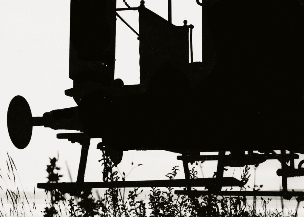
His work
From the 1970s, Helmer-Petersen was preoccupied with the figurative potential in found objects. Like Irving Penn (and at the same time), Helmer-Petersen walked sidewalks, head down, making discoveries among the windswept and downtrodden street refuse. This resulted in works such as the series Deformationer.
Helmer-Petersen’s approach to photography was by and large experimental and explorative. Again and again, he worked on the borders of what we normally consider to be photography. Among other things, throughout his career he worked with “cameraless” photography, the photogram (a darkroom technique in which objects are placed directly on light-sensitive photographic paper). His curiosity about pushing the limits of the media was expressed in several experimental short films, including Copenhagen Boogie from 1949.
My Examples
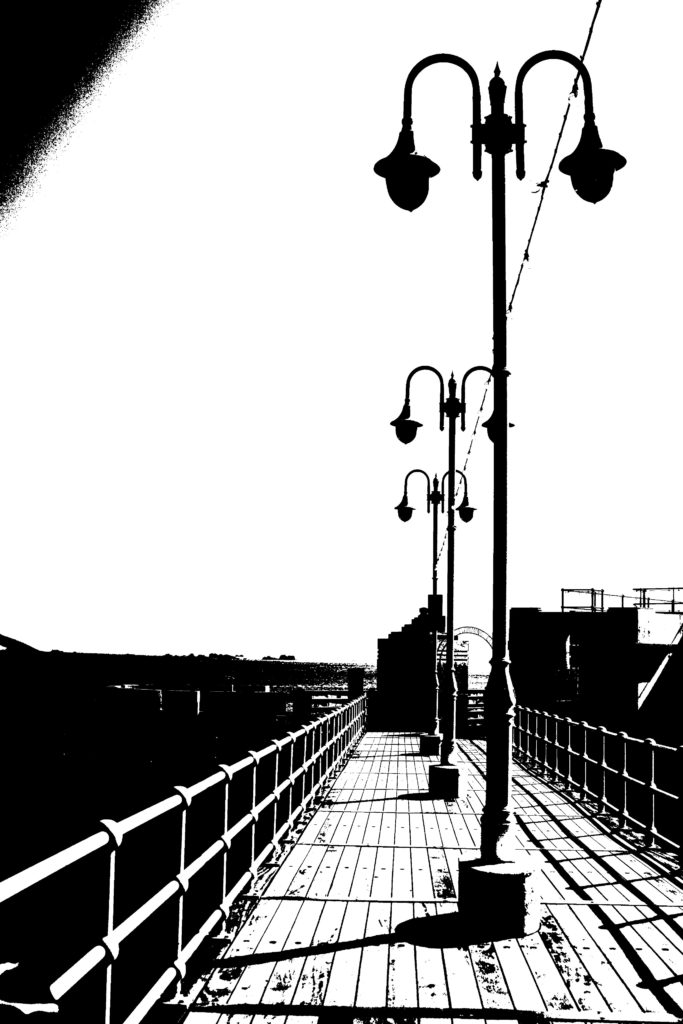
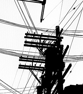
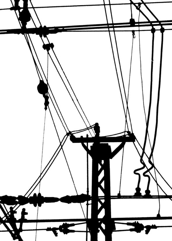
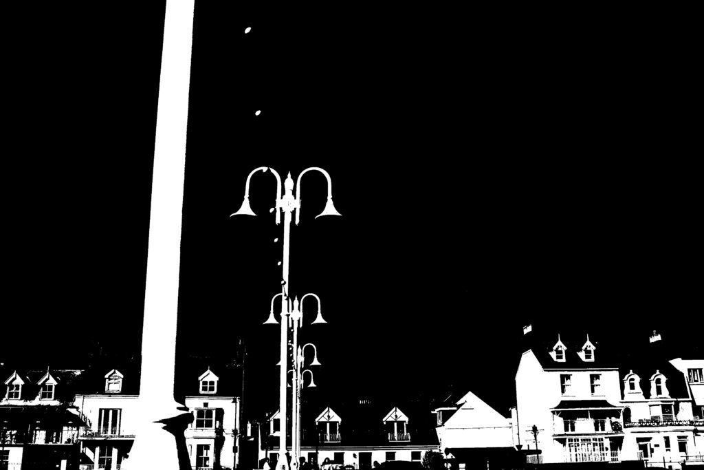
Below I have included my images edited in the same style of Keld Helmer-Peterson’s, I think that this way of editing works well with images that have many bold lines and larger shapes, I found that some of my images didn’t have these features so editing in this way was challenging but overall a success.
Process: After selecting images to open up on Photoshop, I changed the images to black and white at first, then clicked on the Threshold setting where a gage appeared that allowed this setting to e changed up and down, to get the perfect final product there needed to be a good balance between having a plain background and detail in objects and textures in the foreground.
