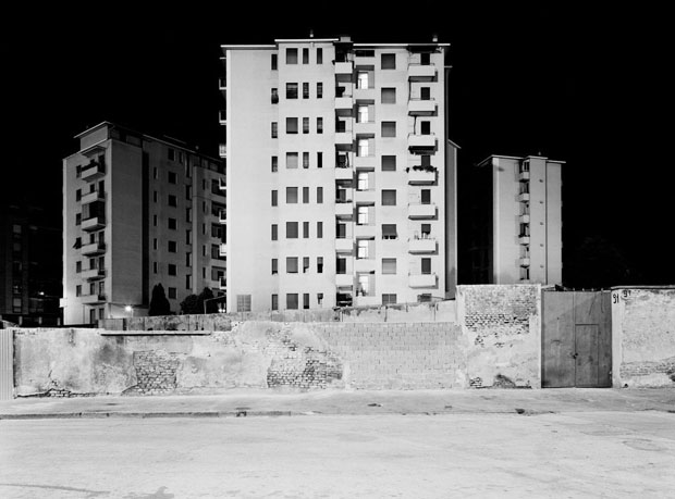
urban landscape

The New Topographics

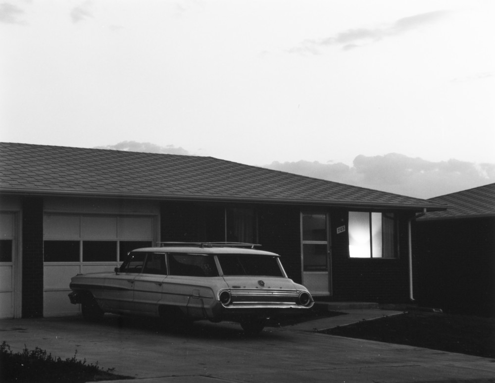
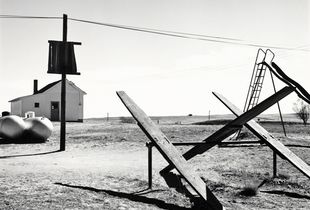
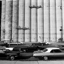
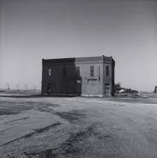
“New Topographics: Photographs of a Man-Altered Landscape” was an exhibition that epitomized a key moment in American landscape photography.

The term Topographics was coined by William Jenkins. The New Topographics creating a turning point of moving away from the traditional depictions of landscape photography. New Topographics placed an emphasis on the industrial and increasingly suburbanised world. An exhibition at the International Museum of Photography in Rochester, New York featuring these photographers also revealed the growing unease about how the natural landscape was being eroded by industrial development. New Topographics gained a varied response from the public:

“I don’t like them—they’re dull and flat. There’s no people, no involvement, nothing.”

“At first it’s stark nothing, but then you look at it, and it’s just about the way things are.”

“I don’t like to think there are ugly streets in America, but when it’s shown to you—without beautification—maybe it tells you how much more we need here.”

New Topographics focused on capturing the changing world and changing landscapes, in contrast to landscape artists such as Ansel Adams who based there studies on preserving the natural landscape and used they’re images in hope of protecting these sights from industrial change.

New Topographics, although rarely containing people within the images, represented the human impact on the landscapes, through the use of man made buildings, perhaps leading people to care and concern more for the natural environment and landscapes. However, new Topographics can also be seen as beautiful. Their stark, beautifully printed images of this mundane but oddly fascinating topography was both a reflection of the increasingly suburbanised world around them, and a reaction to the tyranny of idealised landscape photography that elevated the natural and the elemental.

the New topographics

The New Topographics

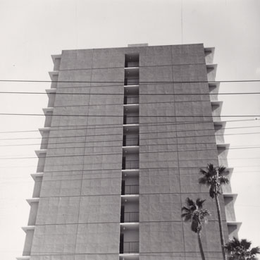
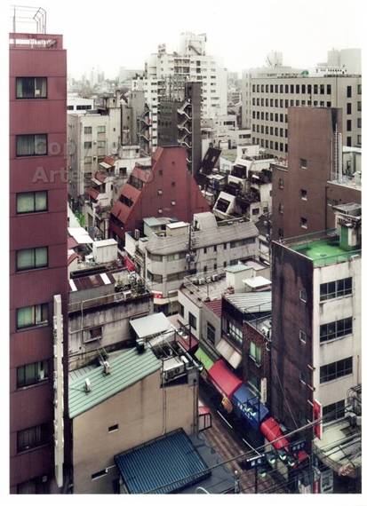
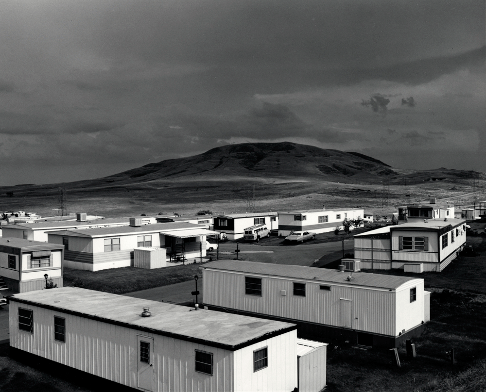
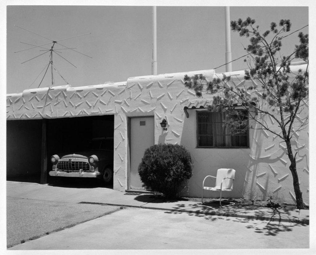
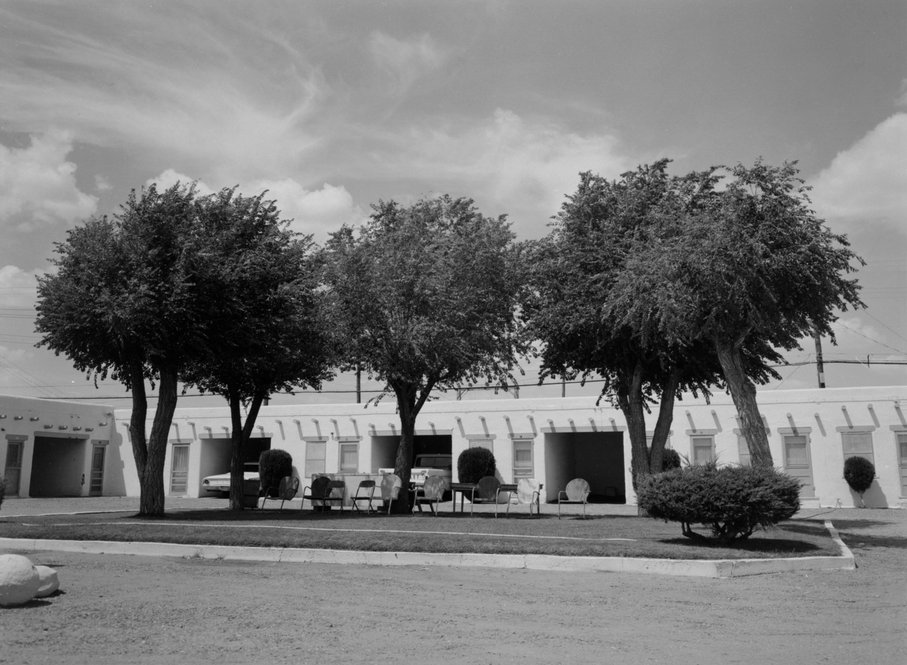
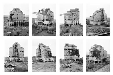
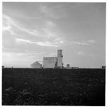
‘New Topographics’ was a term used by William Jenkins in 1970 to refer to a group of photographers whose urban landscape photos all had similar formal and black and white aesthetics. They were known for having an ‘anti-aesthetic’ as they took formal photos of America’s landscape as it was without romanticising it. This was as they wanted to shift away from traditional landscape photography and draw attention towards how natural landscapes were being overtaken by manmade structures.

Some of their work includes:

Bernd and Hilla Becher
Robert Adams
Robert Adams
Robert Adams
Frank Gohlke
Frank Gohlke
Frank Gohlke
Lewis Baltz
Lewis Baltz

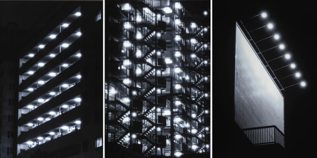
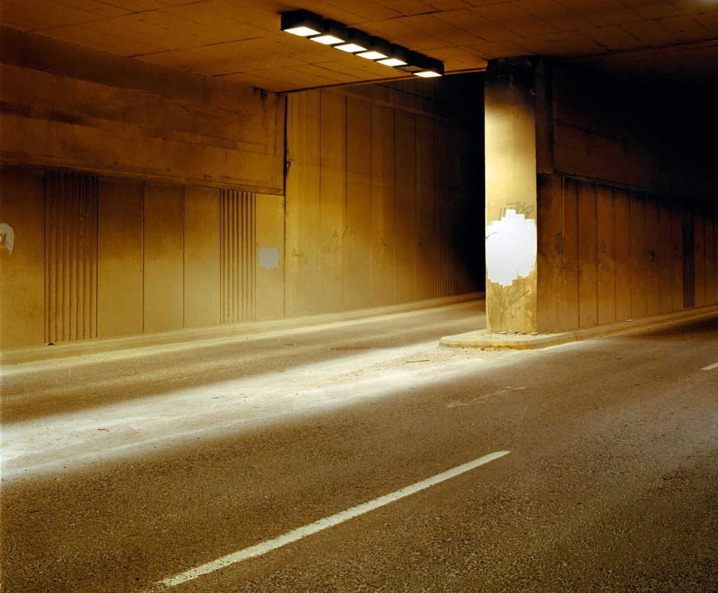
keld helmer-peterson

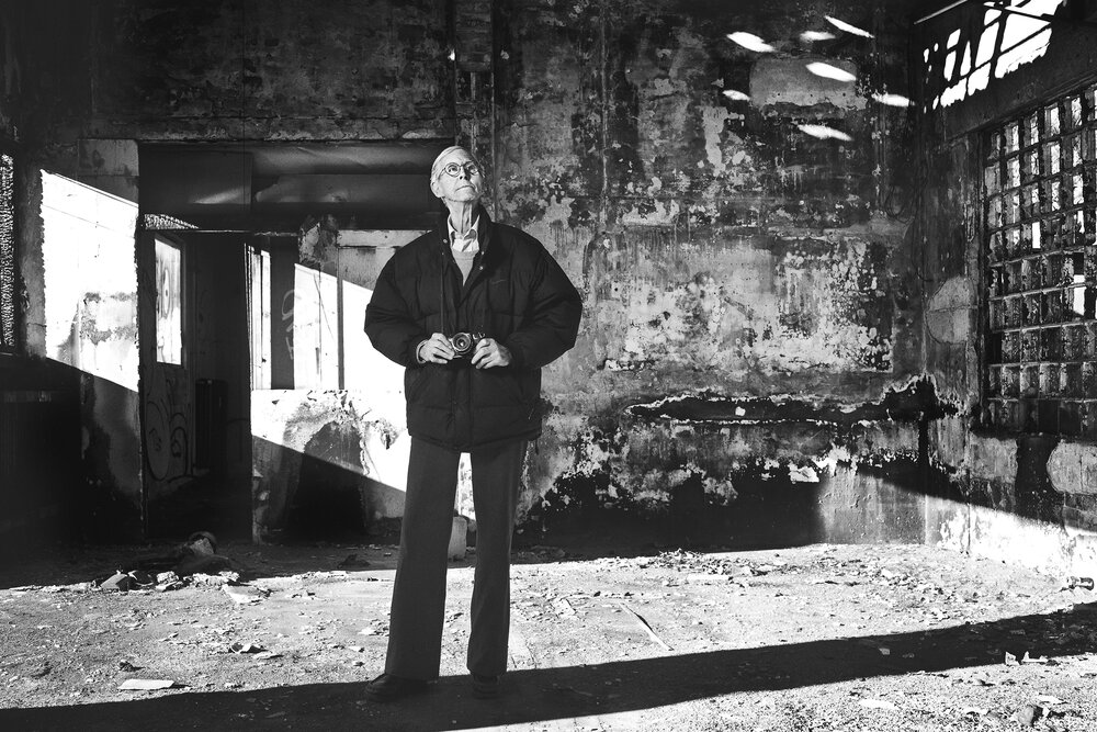
Keld Helmer-Petersen is one of the most influential Danish photographers in the 20th Century. He was an international pioneer in colour photography and was a central figure in not only Danish but also European modernist photography. His career spanned 70 years and he had strong interest in modern architecture, industrial areas and structures. He was very prolific and continuously experimented and challenged the many possibilities of the photographic image.

His efforts have put a mark on photography as an artistic expression. With his keen eye for things that are generally overlooked, Keld Helmer-Petersen opened a door to the hidden beauty of a world, we thought we knew so well.

From the 1970s, Helmer-Petersen was preoccupied with the figurative potential in found objects. Like Irving Penn (and at the same time), Helmer-Petersen walked sidewalks, head down, making discoveries among the windswept and downtrodden street refuse. This resulted in works such as the series Deformationer.

Helmer-Petersen’s approach to photography was by and large experimental and explorative. Again and again, he worked on the borders of what we normally consider to be photography. Among other things, throughout his career he worked with “cameraless” photography, the photogram (a darkroom technique in which objects are placed directly on light-sensitive photographic paper). His curiosity about pushing the limits of the media was expressed in several experimental short films, including Copenhagen Boogie from 1949.

My Examples

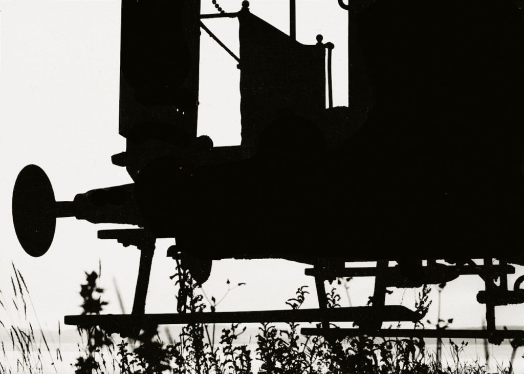
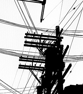
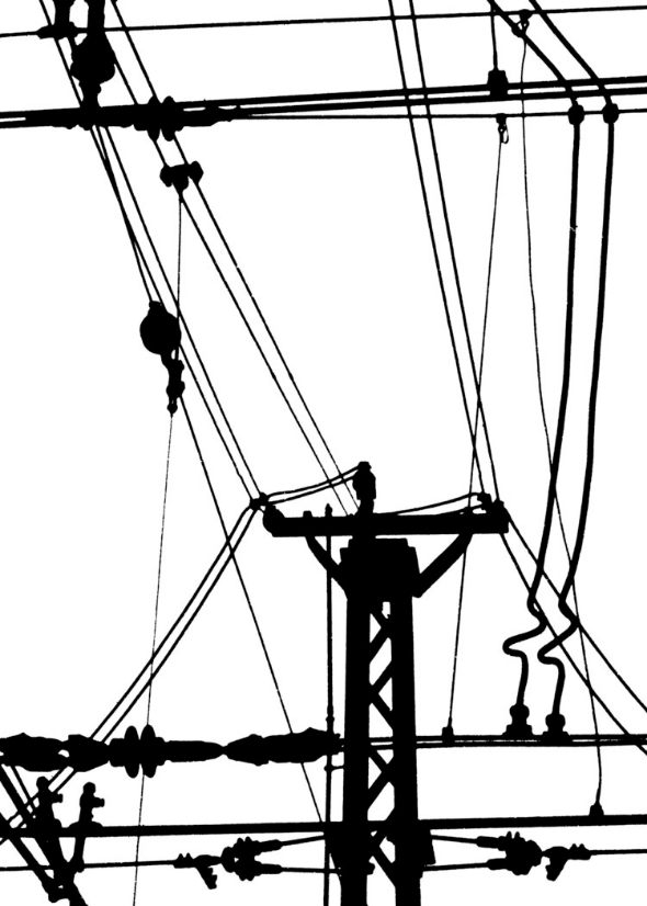
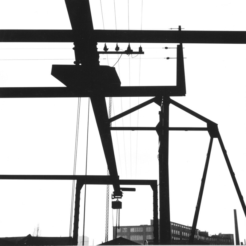
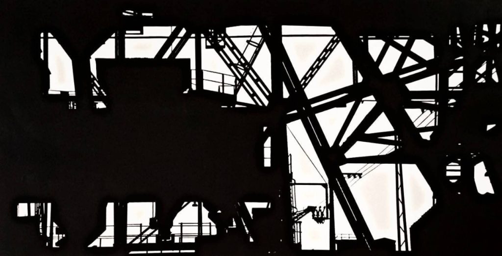
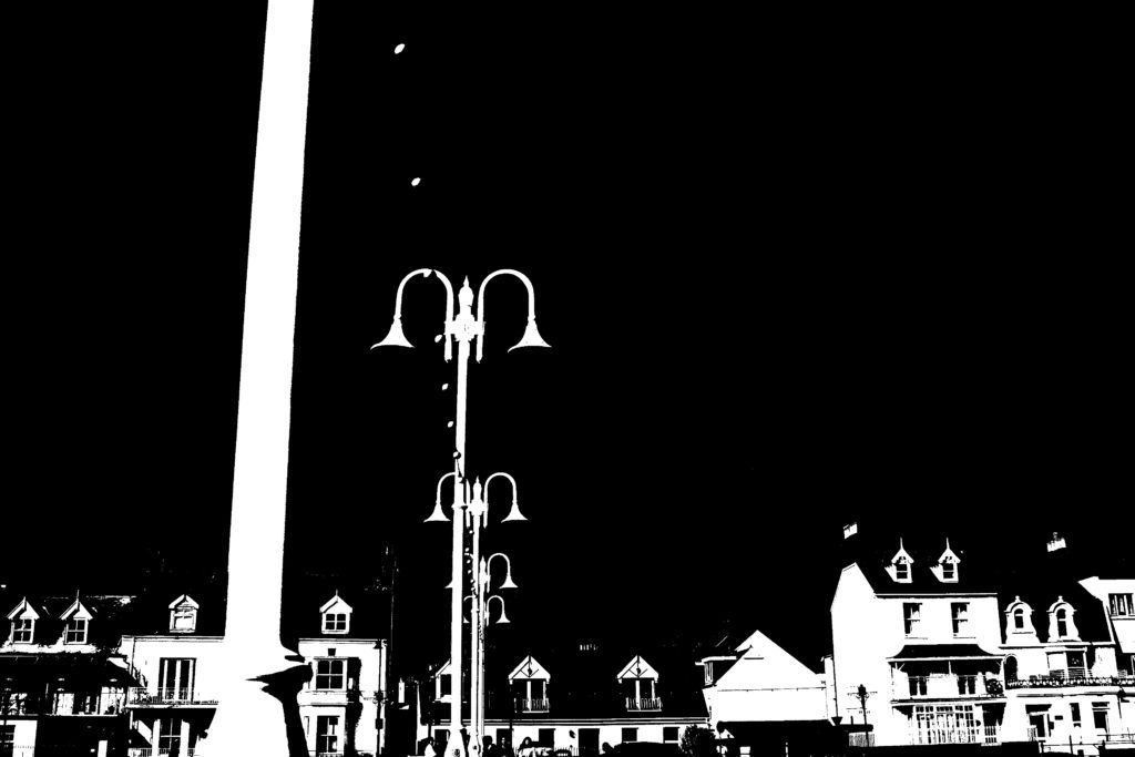
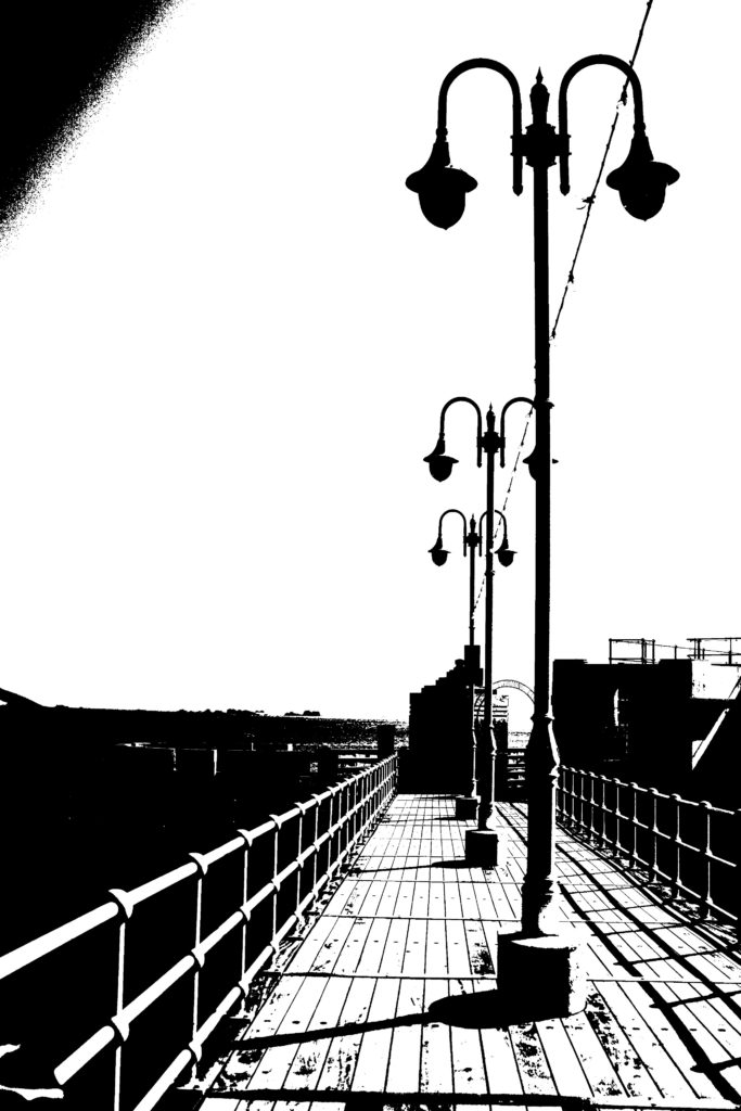
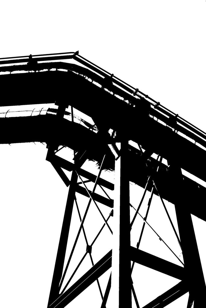
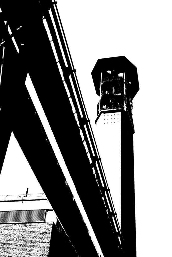
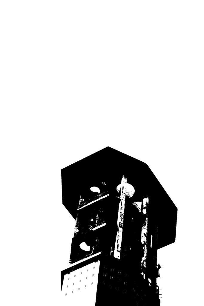
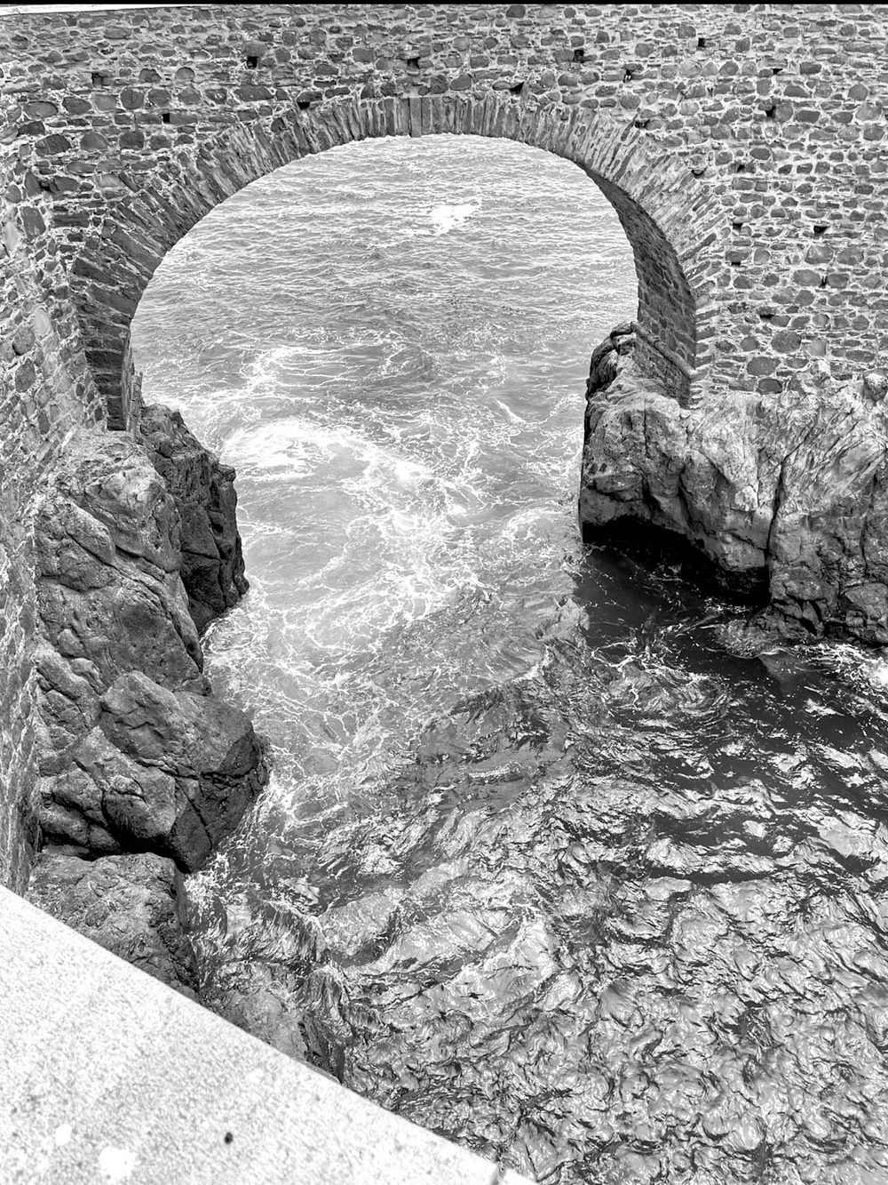
Below I have included my images edited in the same style of Keld Helmer-Peterson’s, I think that this way of editing works well with images that have many bold lines and larger shapes, I found that some of my images didn’t have these features so editing in this way was challenging but overall a success.

Process: After selecting images to open up on Photoshop, I changed the images to black and white at first, then clicked on the Threshold setting where a gage appeared that allowed this setting to e changed up and down, to get the perfect final product there needed to be a good balance between having a plain background and detail in objects and textures in the foreground.

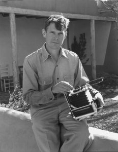
eliot porter (rural photographer)

Eliot Porter's Photographic Process – Land and Lens
Eliot Porter

About

 He began to photograph birds and landscapes with a Kodak box camera as a child. In 1933 he was powerfully moved by the photographs of Ansel Adams, who encouraged him to work with a large-format camera.

Throughout his career, he also travelled and photographed locations of cultural significance. The locations that he photographed were Utah, California, Maine, Antarctica, Iceland, East Africa, Mexico, Egypt, China, Greece, and Czechoslovakia. 

 His work

He developed a vision of the landscape that looked closer, caught the natural chaos of the wild but in a way that showed the hidden structures. He is the forefather of colour landscape photography.

He would frequently intensify blues, greens and reds while enriching the texture of trees, rocks and flowing streams to give his images a painterly aesthetic.

keld helmer response

Keld Helmer

Keld Helmer-Petersen is one of the most influential Danish photographers in the 20th Century. He was an international pioneer in colour photography and was a central figure in not only Danish but also European modernist photography. His career spanned 70 years and he had strong interest in modern architecture, industrial areas and structures. He was very prolific and continuously experimented and challenged the many possibilities of the photographic image

Keld Helmer-Petersen is recognised as a pioneer of colour photography. His self-published book 122 Colour Photographs, appeared in 1948. The photographs were ground-breaking in their use of colour as subject and their abstract qualities. As Martin Parr observes ‘…for the 1940s it was sensational – way ahead of its time.’

I don’t want my pictures to ‘look like something’. They should just look like pictures.

    Keld Helmer-Petersen, Life, November 28, 1949

​But significantly, over a career that spanned six decades, the vast majority of Helmer-Petersen’s work involved black and white photography – often portraying a very graphic sensibility achieved by exposing high-contrast film negatives.

editing process

final images

As well as experimenting with high contrast black and white images, I also experimented with colour gradients and invert to really bring out the shape of the industrial buildings.

rural landscapes shoot

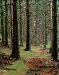
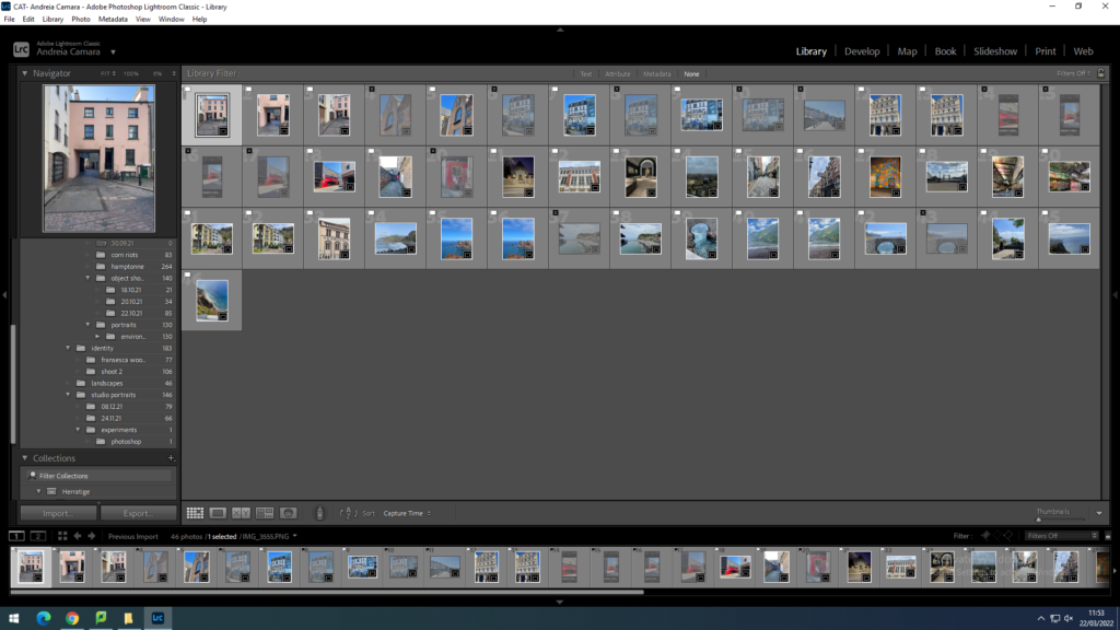
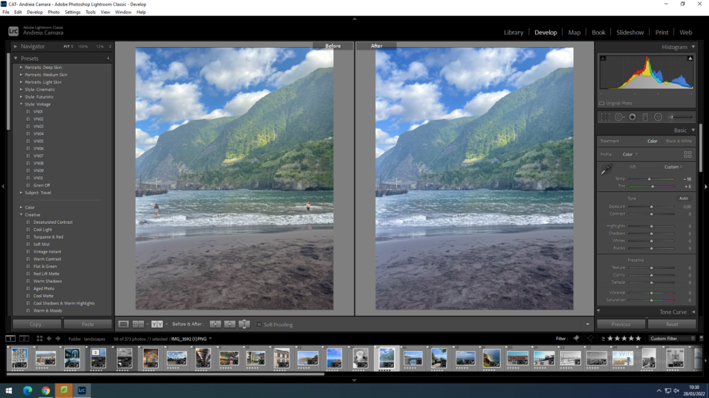
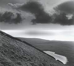
I imported my images into light room and used a flagging system using p and x inspired by romanticism and rural landscape photography inspired by Fay Godwin’s work

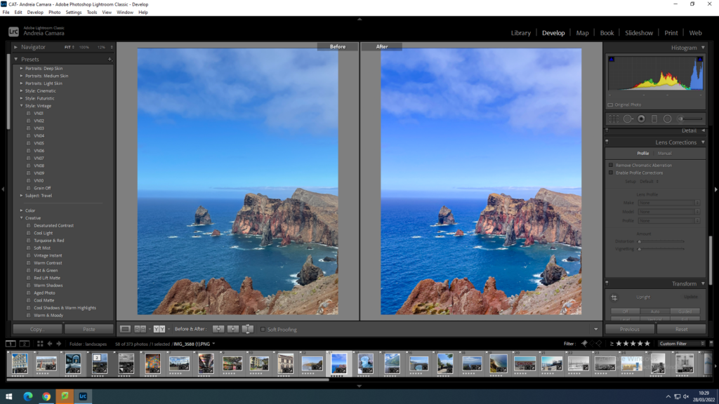
I then went through the editing process for each image adjusting WB, contrast and exposure
I also cropped the images
Made some black and white to add contrast
I also used the transform tool in order to straighten up the images

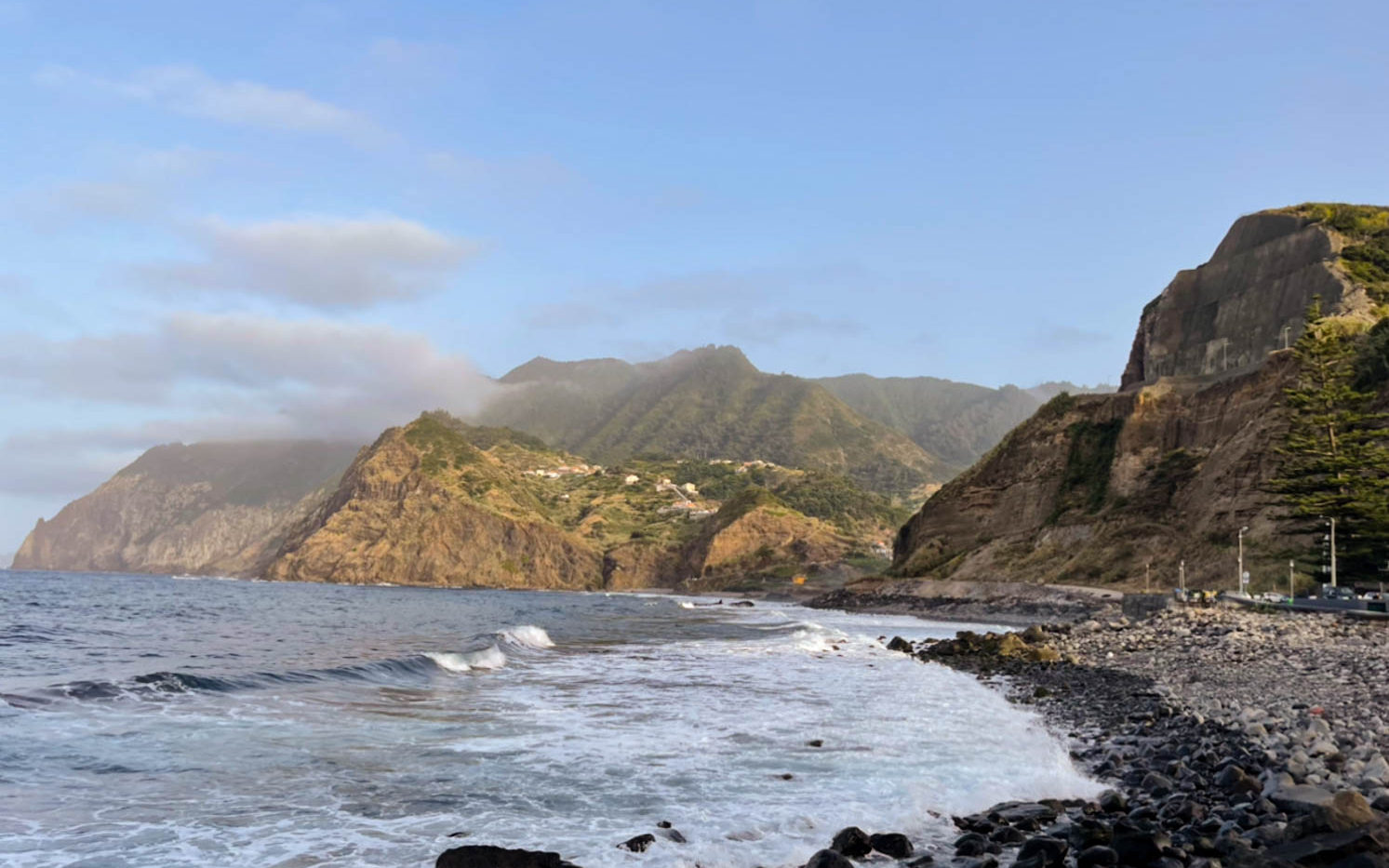
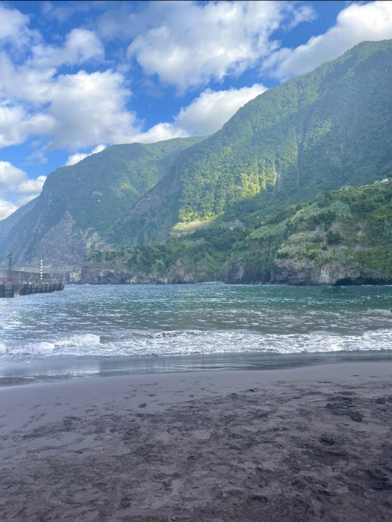
Final images

comparison with Godwin’s work

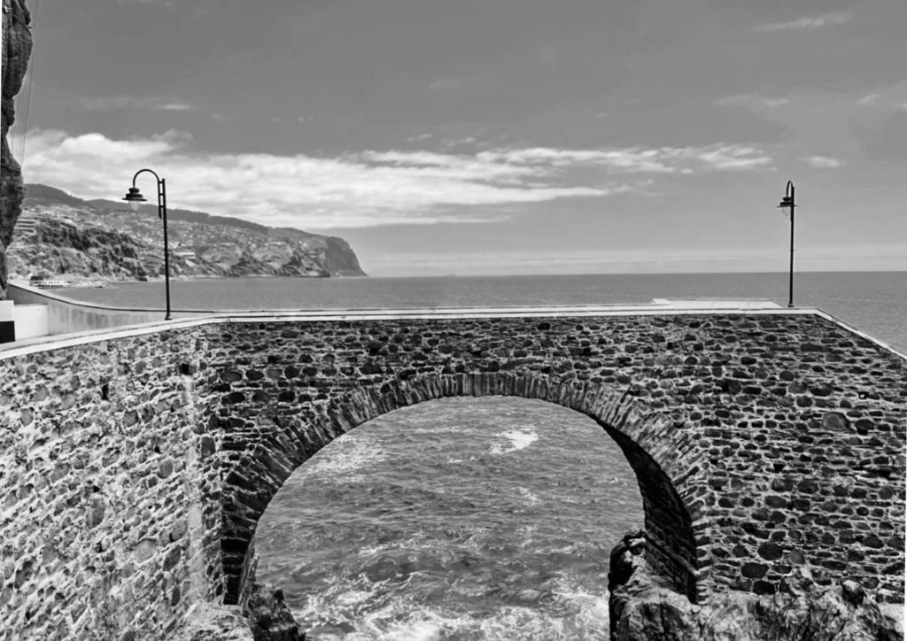
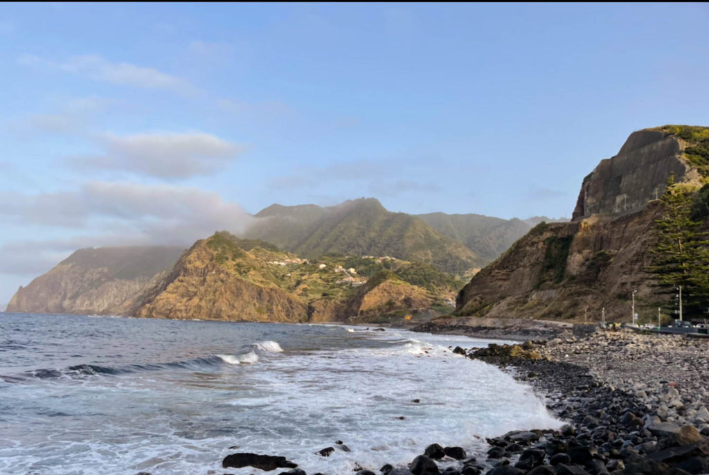
Although my image isn’t in black and white I think I was able to capture a pretty similar image with the cliff face being the main focal point I was also able to capture the textures in the image similarly to Fay over all I think I managed to capture a similar romanticised aspect of a softness in the image.

KELD HELMER-PETERSEN

Keld Helmer-Petersen stayed at the art school, institute of Design, in Chicago. He was both a student and a guest teacher and his future work was influenced immensely by what he learned at school. He developed a graphic black and white aesthetic.

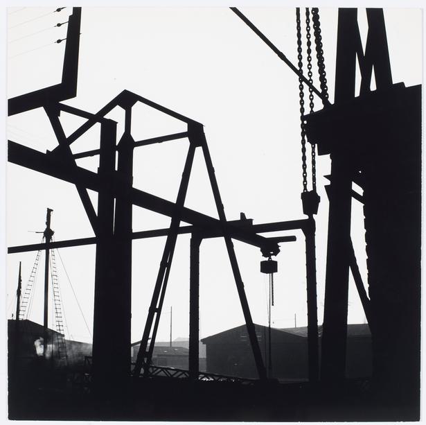
He grew increasingly experimental, engaging in abstract studies of light in urban spaces as well as in the darkroom. He turned silhouettes and fragments of wires and steel constructions into rhythmic, dynamic patterns. Upon his return to Copenhagen, he continued in his graphic style, finding the steel world of Chicago reflected in harbour areas and railways.

photoshoot plan

places to take photos in jersey :

  • old brewery
  • king street
  • le maraes
  • way bridge
  • car parks
  • St Aubin’s town
  • old St Helier
  • red houses
  • playing grounds (fb/tennis courts)
  • fort regent

for my first photo shoot I will go down to St. Helier and try to photograph new buildings and old buildings in the back lanes of the town and try capture aspects of different peoples lives and how they use the town. then ill go down old trinity hill and photograph the old fashioned buildings.

new topographics final images

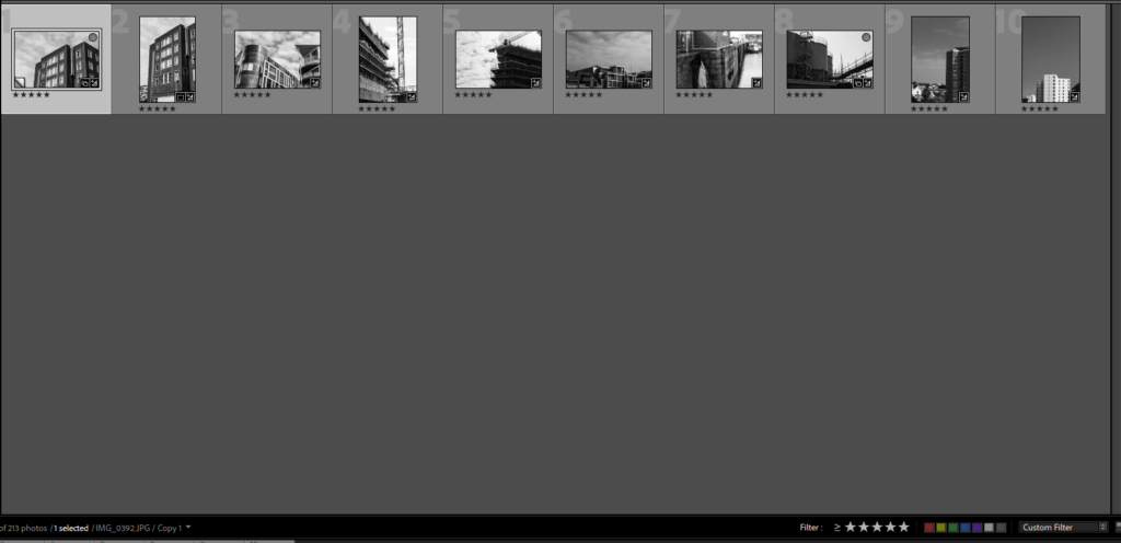
I used the star rating sytems to decide the good from the bad images.

Then I am left with my 5 star images which best relate to new topographics.

I took this image from the top of MT Bingham of the flats on green street I chose my position carefully to get a higher perspective of and over the surrounding buildings. i positioned the skyscraper slightly of centre of the image to provide juxtaposition to the the rest of the smaller residential buildings. I then used the vertical straightening tool to correct the image and changed the image into black and white to relate to the original photographers of the new topographical movement.

this image shows the contrast between the two different building designs, the contrast between the point triangular design and the curves of the the adjacent building. there is beauty in the straight and the organic cloud shapes which I increased the contrast to bring out. this photo is taken from a lower angle to provide a better perspective to the image. the contrast between the natural and the unnatural link to the movement because it is about the beauty that can be found in the everyday urban environment however i believe there is also beauty to be found in the average day, the pattern made by the clouds showing a unsymmetrical, un even, un predictable motif.

this really like this image because of the contrasting brick work and lighter window frames reinforcing the idea of the beauty in the mundane. this image is of the older wing of the hospital with its ‘boring’ square shapes so i decide to photograph this i would need to find a good angle to show of the best angle to create a god image from a seemingly boring building. i liked that this wall wasn’t flat and it had some depth, i also liked the pipes coming from the building back into the building. i converted this image into black and white to better match the original artists of the the new topographical movement.

i like this iage becasue a construction site is in the transition between natural

Urban Landscape photohoot 1/2


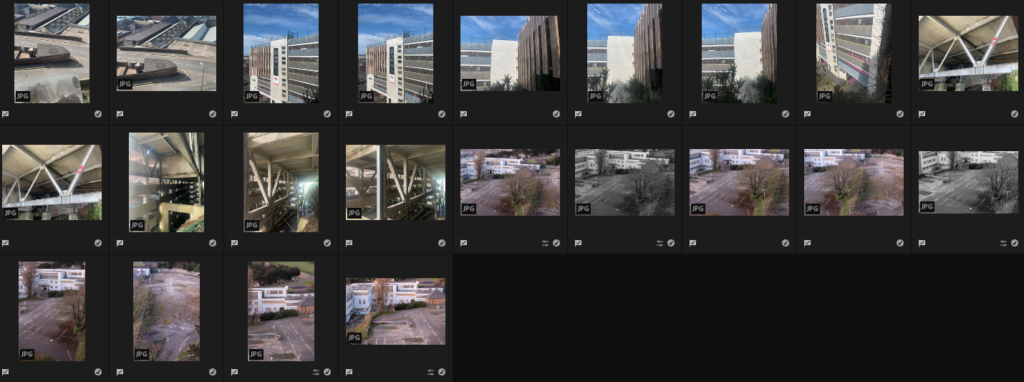
For these photoshoots I went to two locations next to each other to try and get ariel views of abandoned and disused places. One set was taken during early evening and the second was taken during sunset hence the different lighting.


These are my final selections after I had gone through and chosen photos which I had framed well, adjusted focus correctly and which I feel have reflected the idea of urban landscape.