Image selection and editing

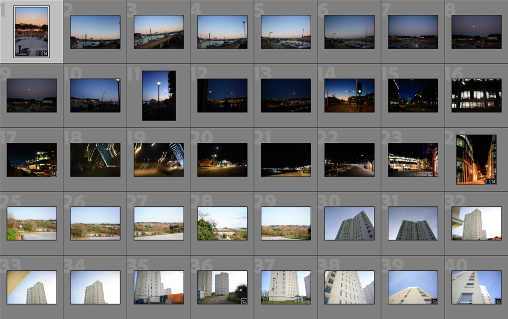
Contact Sheets and Photoshoot Plans

Below I have gone through and selected the best of my images, I have demonstrated all three of my photoshoots through these separate contact sheets, I have also included the plans above the contact sheets so the layout is clear.

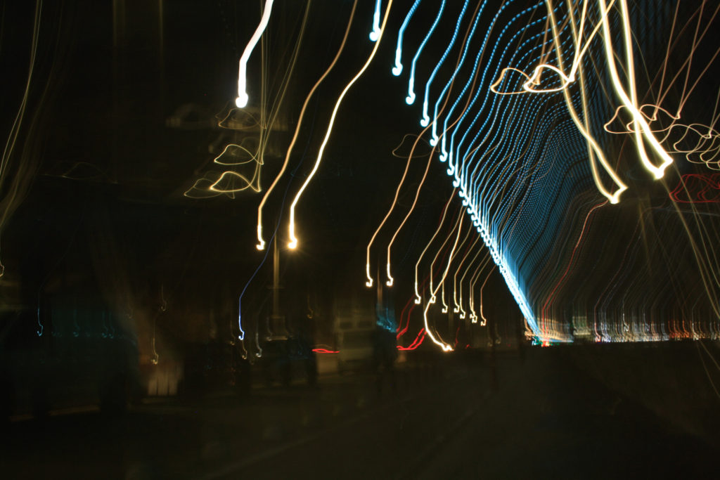
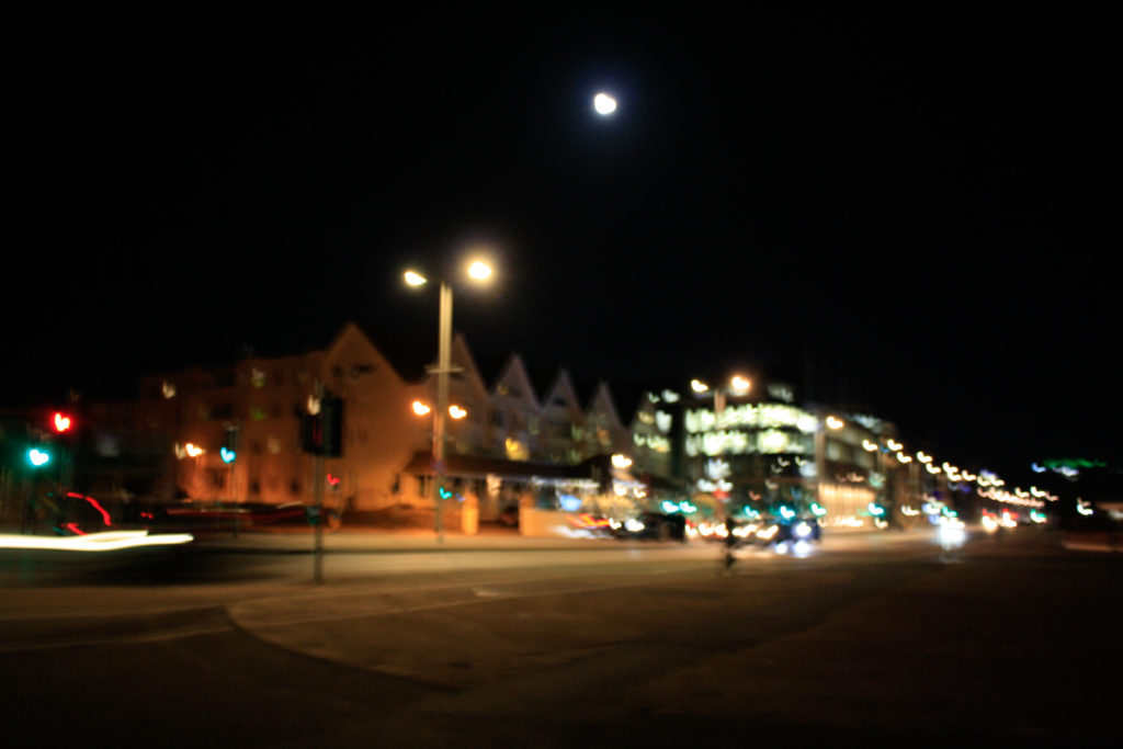
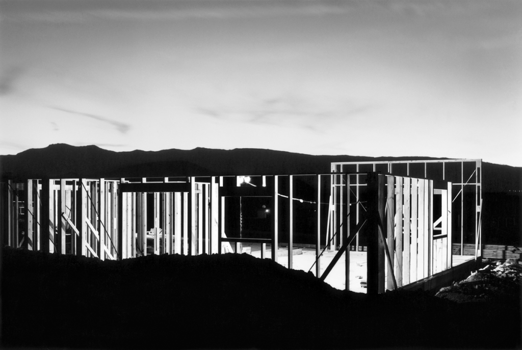
Photoshoot 1: was based around the harbour and along the avenue, the aim of doing this photoshoot at night was so that I could change the shutter speed to create interesting lines of light throughout my photos, and so that industrial buildings could be contrasted with their light sources.

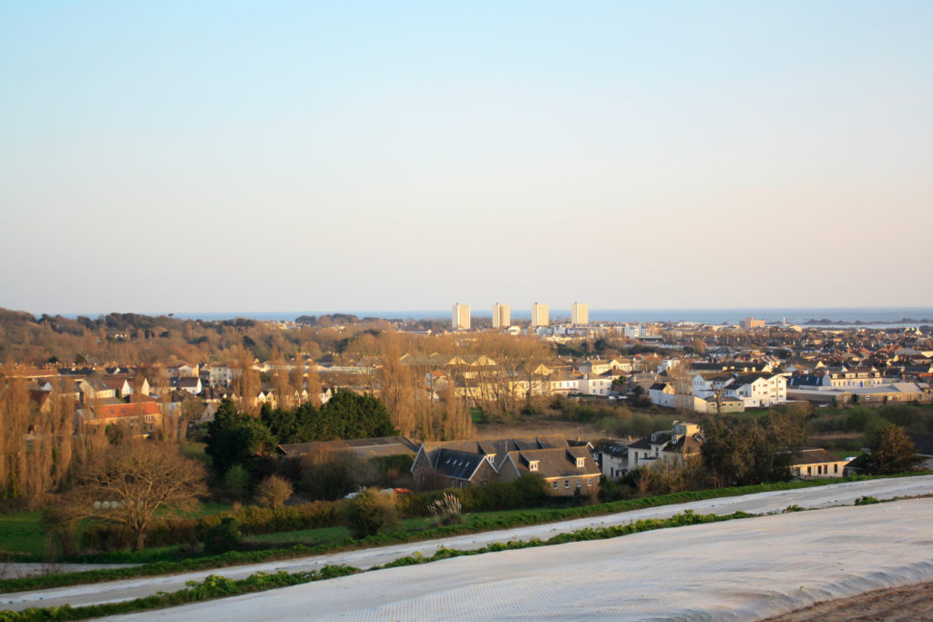
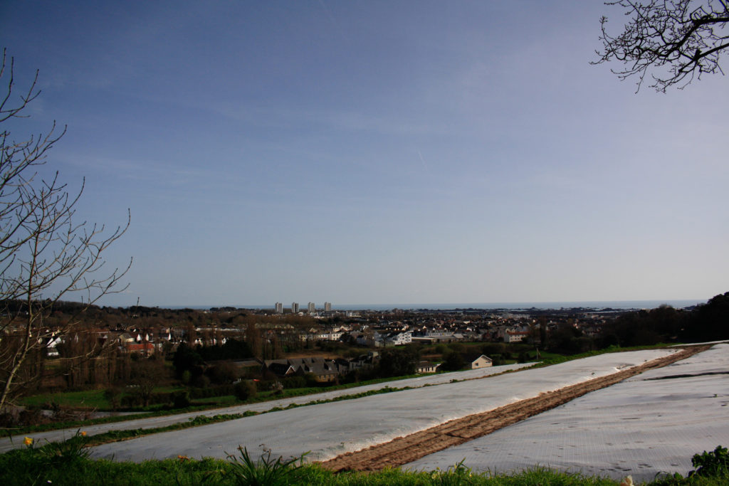
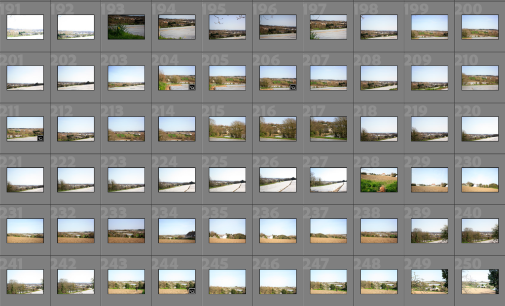
Photoshoot 2: My second photoshoot was based in the fields around my house, these potato fields made for good places to photoshoot as theres is a contrast between natural landscape and manmade housing. I took these photographs during the late afternoon in an attempt to get more golden lighting.

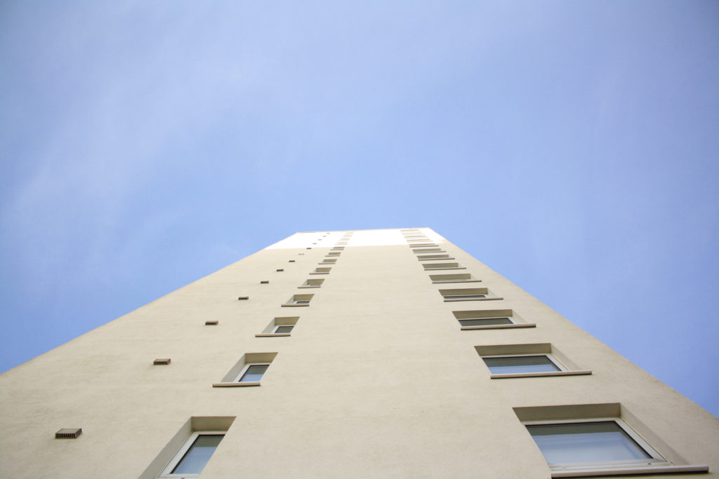
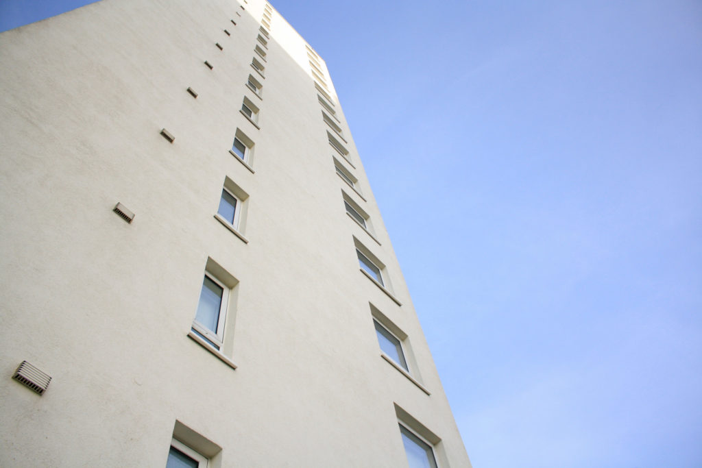
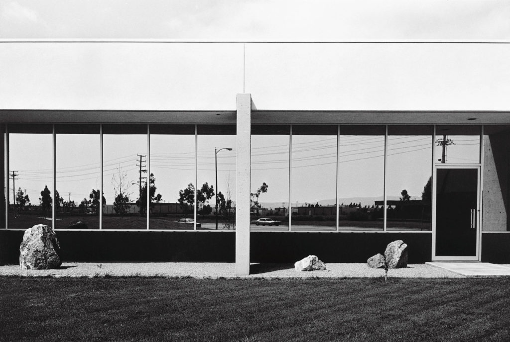
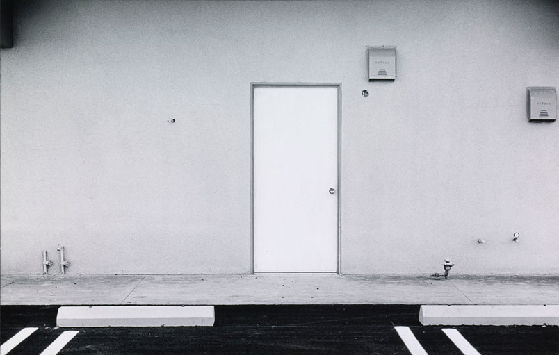
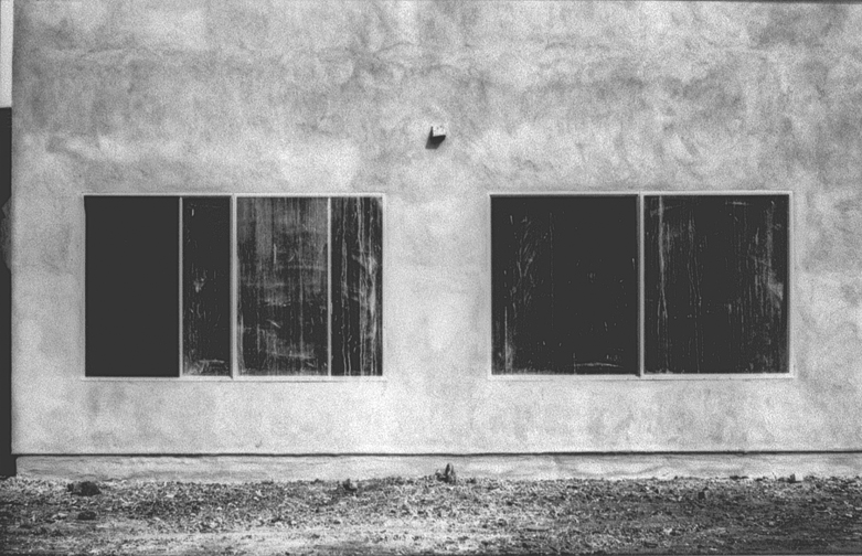
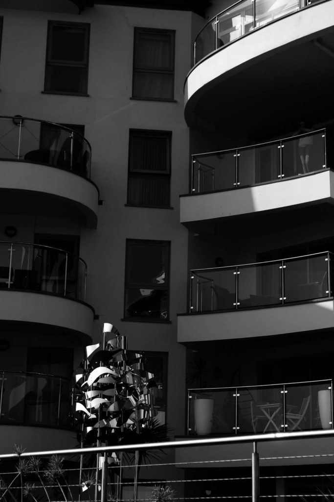
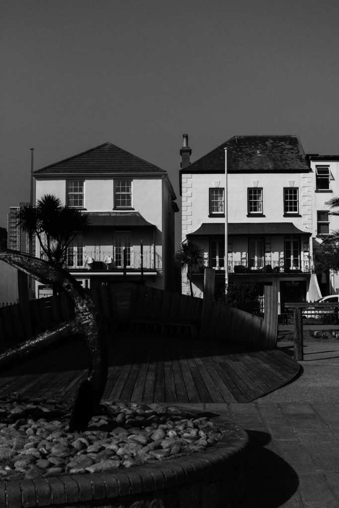
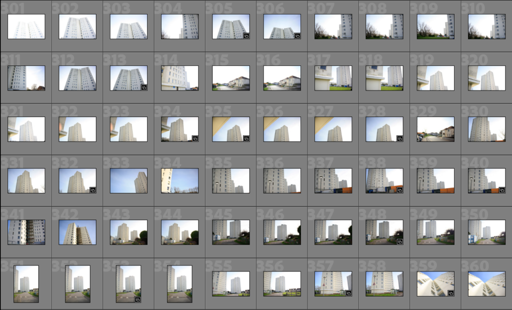
Photoshoot 3: This photoshoot was based in and around La Mare flats in St Clement, I think that this gave me a good opportunity to photograph industrial landscapes and this links in very well with The New Topographic project. All of the straight lines and symmetry in these images make them more aesthetic.

Final Collection

Here I have created a quick collection of some of my best images from my photoshoots, I think i will add to this when editing and picking my final images but these have the most potential.
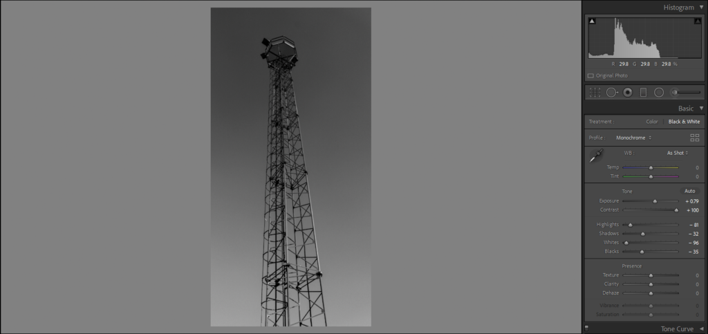
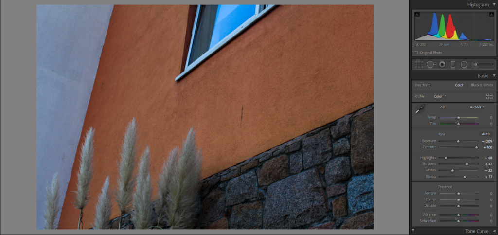
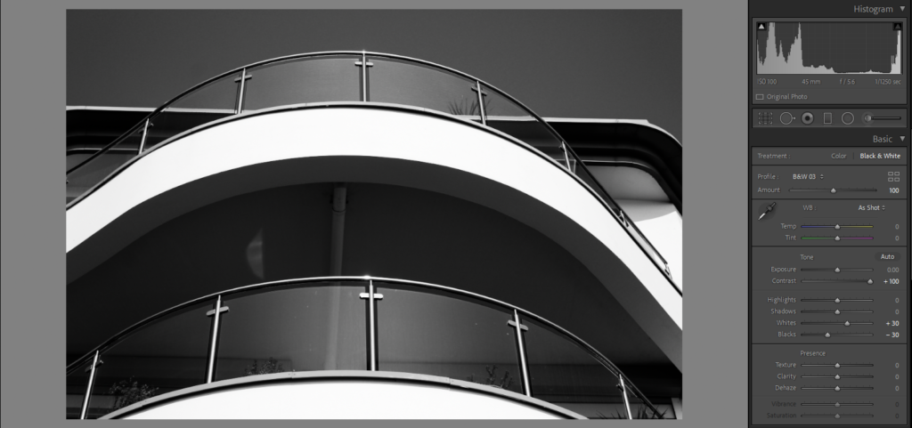
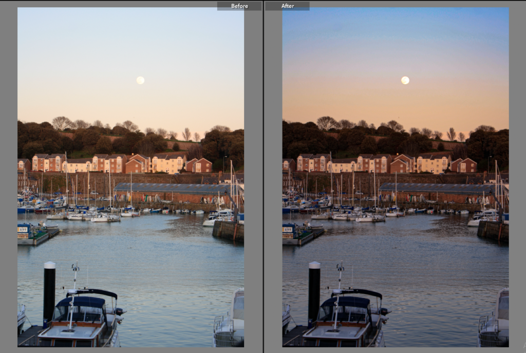
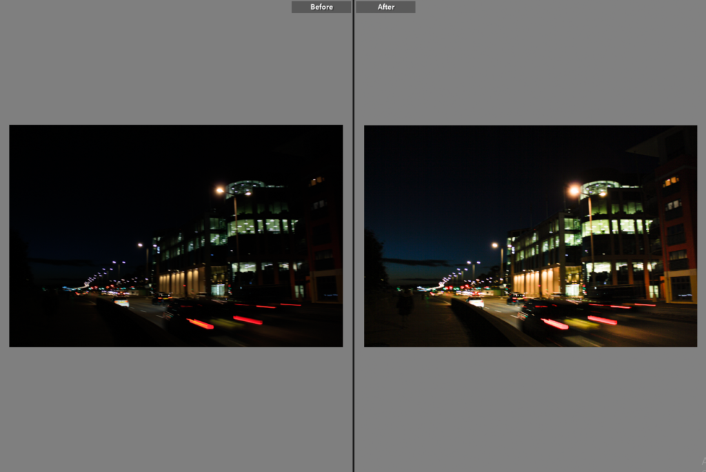
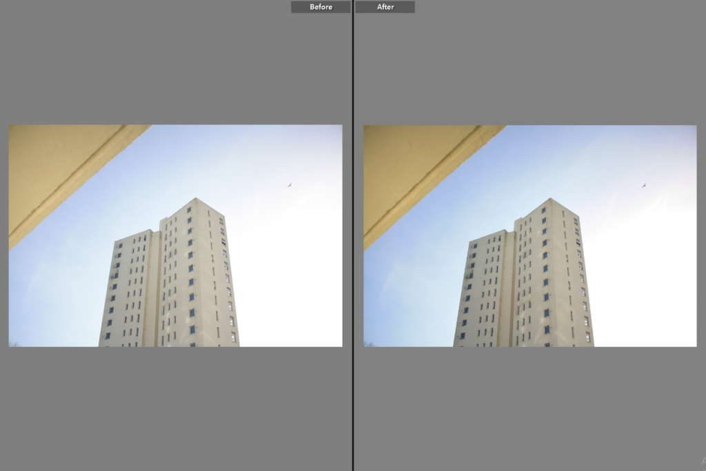
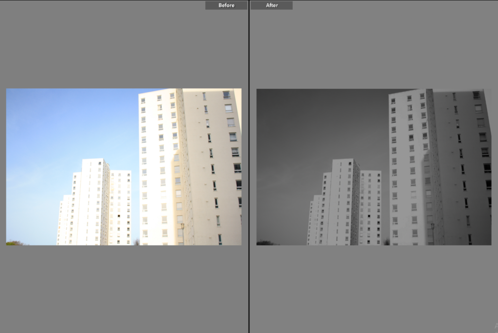
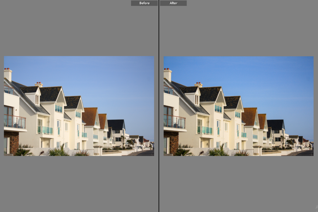
Editing

Below I have edited some of the best images from my created collection, and I have screen shotted parts of Lightroom to show how the images have been edited. In the develop section I have shown the before and after editing so the process I have gone through to change these images is clear. I have decided despite sticking to the romanticism theme I am not going to edit all my images to monochromatic, as I think that the colour and lighting in some of these photographs only needs to be enhanced.
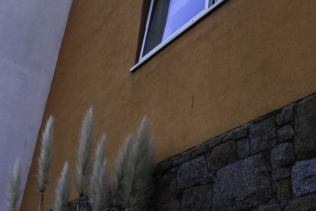
More Images

Here I have included some more of my good images, as I think that they should be shown on my blog but they do not need editing unless they are changed to black and white as one of my final images. This gallery is to show more of my work from all three of my photoshoots.

new topographic artist

Lewis Baltz

Lewis Baltz (September 12, 1945 – November 22, 2014) was a visual artist and photographer who became an important figure in the New Topographic movement of the late 1970s. His work has been published in a number of books, presented in numerous exhibitions, and appeared in museums such as the Museum of Modern Art.

Born in Newport Beach, California, Baltz graduated with a BFA in Fine Arts from San Francisco Art Institute in 1969 and held a Master of Fine Arts degree from Claremont Graduate School. He received several scholarships and awards including a scholarship from the National Endowment For the Arts (1973, 1977), the John Simon Guggenheim Memorial Fellowship (1977).

His books and exhibitions, his “topographic work”, such as The New Industrial Parks, Nevada, San Quentin Point, Candlestick Point (84 photographs documenting a public space near Candlestick Park, ruined by natural detritus and human intervention), expose the crisis of technology and define both objectivity and the role of the artist in photographs.

His work is focused on searching for beauty in desolation and destruction. Baltz’s images describe the architecture of the human landscape: offices, factories and parking lots. His pictures are the reflection of control, power, and influenced by and over human beings. His minimalistic photographs in the trilogy Ronde de Nuit, Docile Bodies, and Politics of Bacteria, picture the void of the other.

What I like about his work: I think that the simpleness of his work makes him more memorable and along with the monochromatic photography, this makes more unique pieces. I also like that for this time this type of photography was to demonstrate the affects of mankind on the natural environment and his work demonstrates this well as the builders are the main focal point of the images.

Image Analysis

Lewis Baltz - Nevada - Exhibitions - Joseph Bellows Gallery

I have selected this image to analyse as I think the overall composition of the image is one of its main strengths, as it means that the silhouette of the mountain is the background of the image and that the main houses in the front create a focal point for the image. Furthermore, I think the lighting of this image brings and all of its features and makes it more cohesive as the lighting from under the roof trim of the house means that strong shadows are created, as the brightness of the lighting in the sky creates contrast between it and the outline of the mountains.

Additionally, I think that the clarity of the image makes it stand out more as the details in the brickwork of the building and even the blinds in the windows creates contrast. This is shown as theres lots of details within the foreground of the photograph and this lack in the background, however this is not a negative as it demonstrates the rule of thirds, as the pavement, housing and mountains/ skyline and very clearly separated in this piece. It’s also important to note how important the different shapes and lines are within this image, as the vertical lines contradicts with the horizon created but the mountain, and the squares and rectangles contrast with the smooth natural landscape. This is a good example of The New Topographic’s work as their is a manmade contrast created with the lighting in this image, as a somewhat natural contrast between the housing and landscape further away in the image.

Urban Landscapes

Photoshoot 1For my first photo shoot, I went down to the harbours and the block of flats near there. I went around 5:30 so that there was still good lighting.
Photoshoot 2For my second photoshoot, it was the photography walk around Havre de pas and La Collette also near the harbour, this was from 2:20 – 3:20 with good lighting.

Contact Sheets

Photoshoot 1

The day I went to the harbour it was sunny, with a bright blue sky which made a nice background to the photos. There are a few repeated photos as the sun was slowly starting to set so I kept having to change different settings on the camera to get the right lighting.

Photoshoot 2

For this photoshoot, it was also a sunny day, with little clouding so there are no shadows in the photos and they also have a bright blue background from the sun. I tried to get a lot of different photos as I did not need to adjust the settings a lot as the lighting stayed the same a lot of the time.

Editing

For my black and white edit, I have increased the contrast and only slightly increased the exposure to give the structure a darker look and have the background give an ombre type effect going from a dark grey into a lighter one. As I wanted it to be a darker image I have also decreased highlights, shadows, whites and blacks to get this edit. For the photo of the flats, I have increased the contrast up to 100 to get a brighter orange and extenuate the brick beneath it. I have increased the shadows and blacks also to try and help this as I really like the brighter orange against the white wall next to it.

Similar to the black and white edit I did above I have increased the contrast but in this one, I did touch the exposure as I felt that if I decreased it the photo would be too dark and if I increased it the photo would be overexposed. I also didn’t adjust the highlights of shadows and I felt that only the white and black needed to be adjusted the get the effect that in I wanted. For the photo on the left, I wanted to keep it in colour to show the bright blue of the sky. For this edit, I increased the exposure to 58 to give the photo a more vibrant look and make the blue pop. I also decreased the highlights because I wanted the harsh line between the shadowed side and the lit side to be obvious and easily noticeable.

Final Images

I chose the top left photo as one of my final images as I think that the colours all go together as the cream building sits nicely with the brighter blue of the sky. I also like the contrast between the two sides of the building and the harsh line going down the middle. I also like how there are small elements of blue in the different windows which I think helps the photo look more put together. I also think that it looks better having a little bit of the top cut off as there is not as much sky distracting from the building. I chose this to be one of my final images for the middle photo because I really like the contrast between the darker parts of the image and the brighter whites on the balconies.