
After selecting my images in lightroom and organising them with colour coding, I edited them.
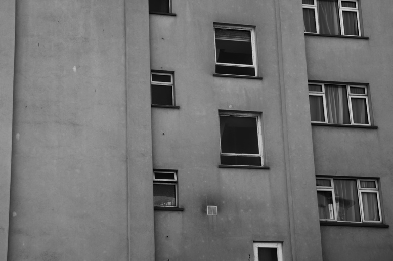
Havres Des Pas and Housing Images
I edited most of these images in Black and White, with high contrast and grain added – this was to emulate the style of my chosen artist, John Myers. I edited a few images in both colour and black and white, as I wanted to create two versions to see which I liked better.


Here I edited my image in colour and black and white, as I wasn’t sure which I liked best. I think that black and white help to show the different shapes in the building, as well as highlight shadows. However, I think that the version in colour helps to show contrast between the different tones, as well as highlighting the overall shape of the building in contrast to the bright blue in the sky.

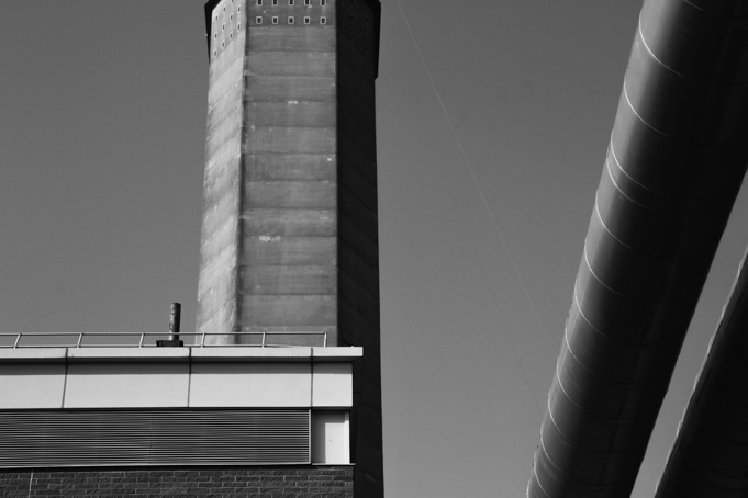
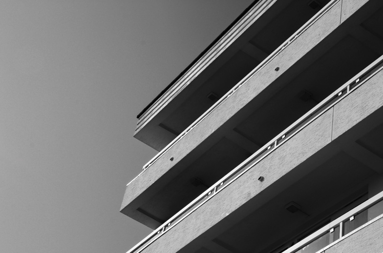
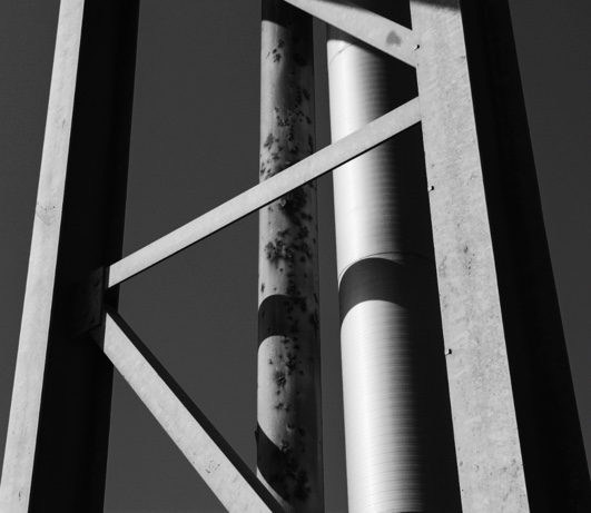
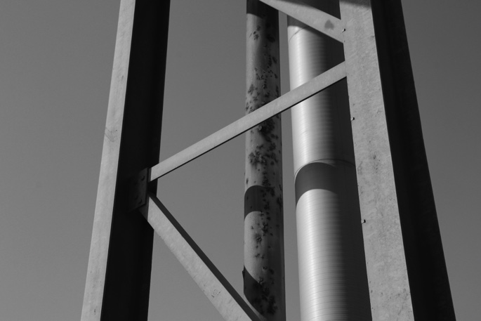
Machinery and Abstract Images
Again, for these images, I edited in black and white with strong contrast, adding blacks and decreasing highlights.
Here I have produced two different edits -In the one on the left, I have used “B and W landscape” preset on lightroom, and on the right I had used my own editing. I prefer the edit on the left because the higher levels of contrast, and my use of cropping which improves the composition.

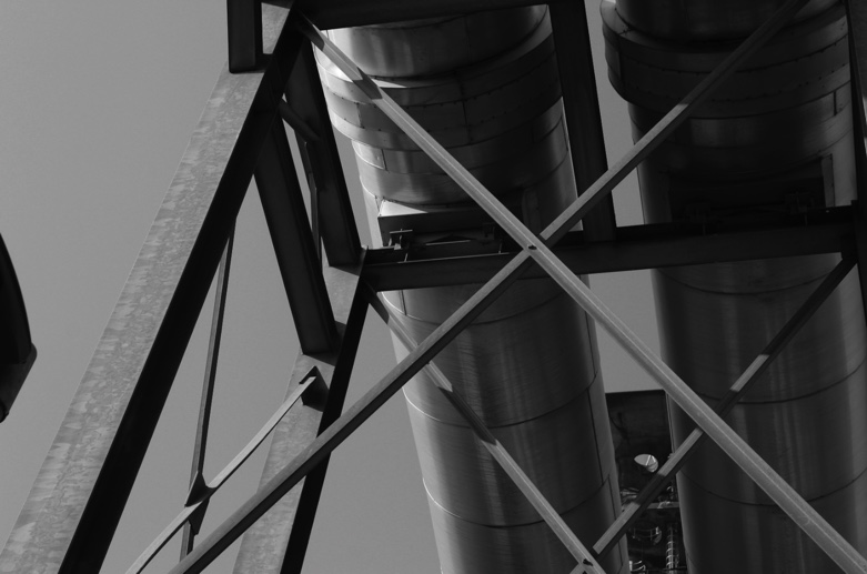
In this edit, I used dramatic editing to accentuate the use of shadow and line – I used high contrast, slightly decreased the exposure and highlights, increased the blacks in the image, and added grain.


Here I have produced two different editing styles – with presets on lightroom – the left is “landscape B and W” and the right is “Sepia toned B and W”

Typology Images
After selecting the images to use for my typologies in the style of Berndt and Hilla becher, I edited them in black and white with high contrast. I then imported them into photoshop, where I created a new A3 document for each piece. I then sized all my images the same, and placed them with equal borders in my desired layout.
Final typologies

I think my typologies were partly successful, but I found that I didn’t have as many images that would work well in the style of typologies as I thought. If I was to do this shoot again, I would make sure to capture more fronts of buildings with straight-on angles with the same amount of zoom, so the pictures fit together more cohesively in my final edits.
