Editing and Final Images

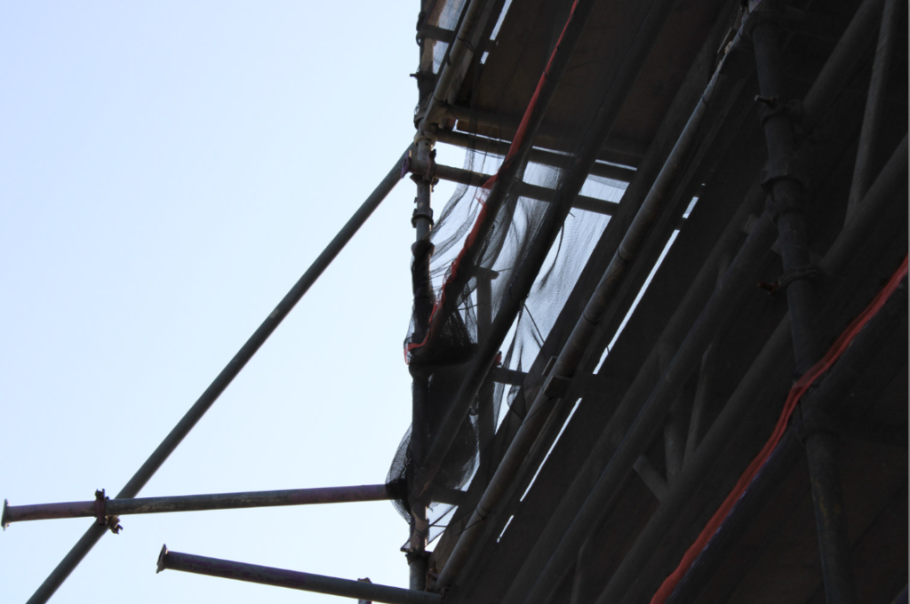
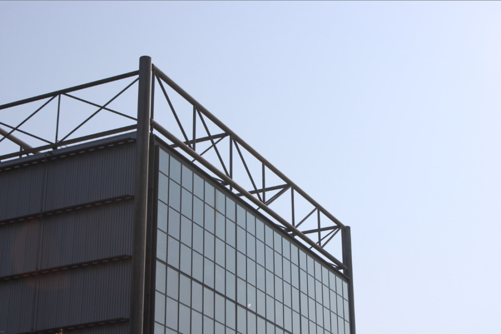
After selecting my images in lightroom and organising them with colour coding, I edited them.

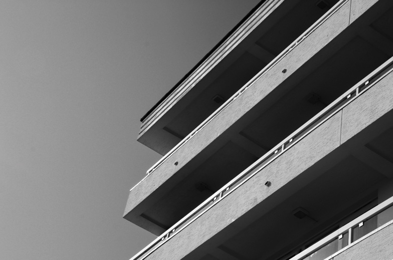
Havres Des Pas and Housing Images

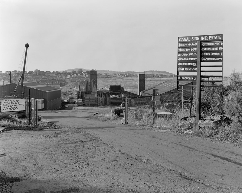
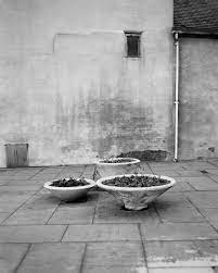
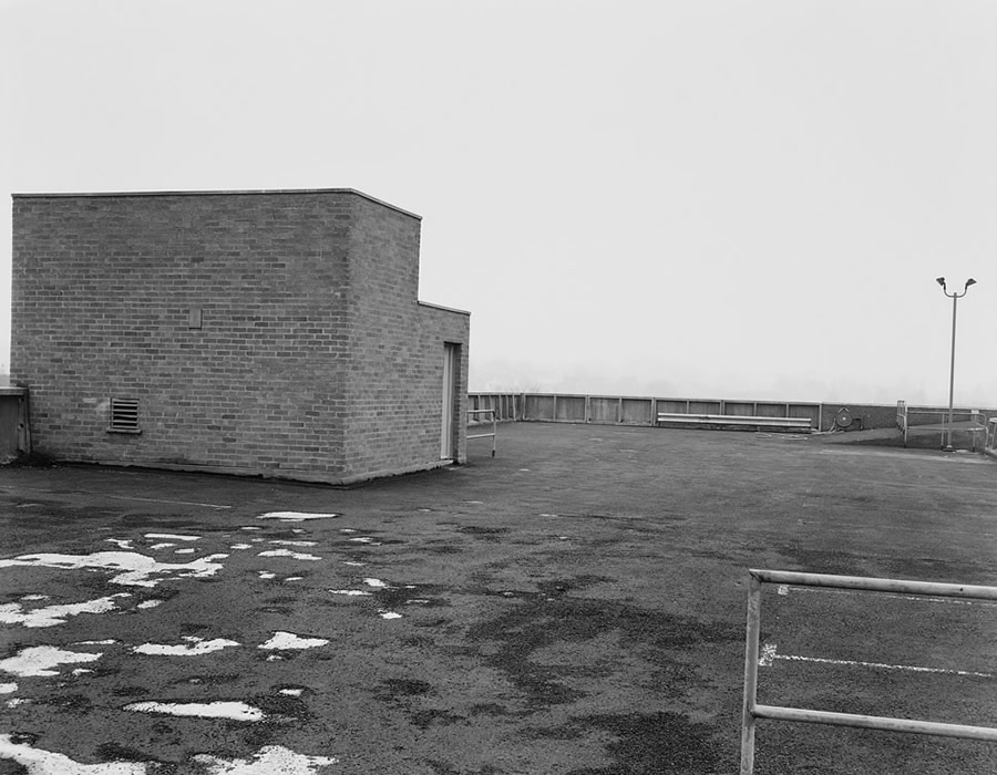
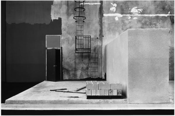
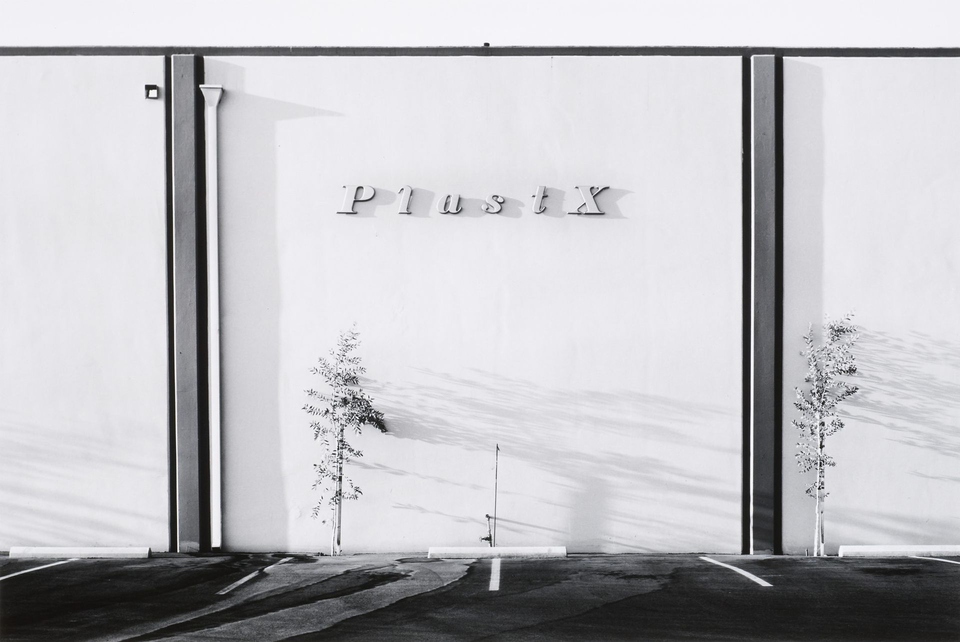
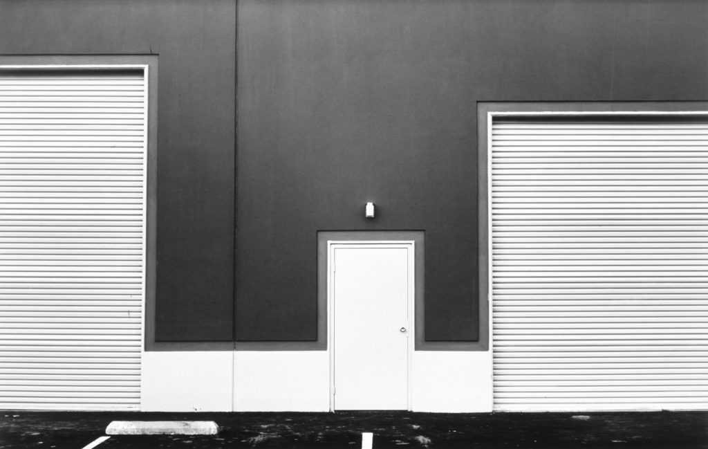
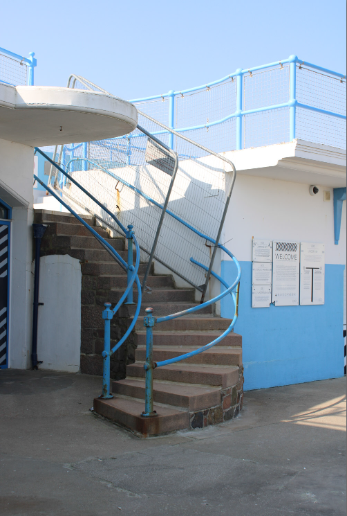
I edited most of these images in Black and White, with high contrast and grain added – this was to emulate the style of my chosen artist, John Myers. I edited a few images in both colour and black and white, as I wanted to create two versions to see which I liked better.
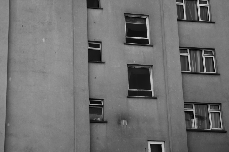
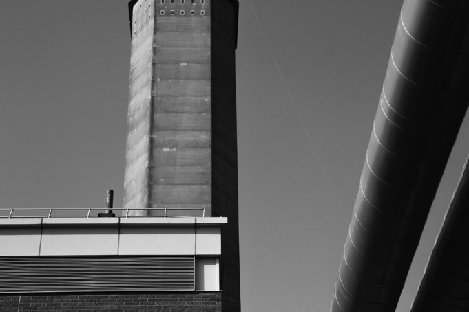
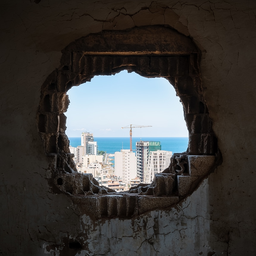
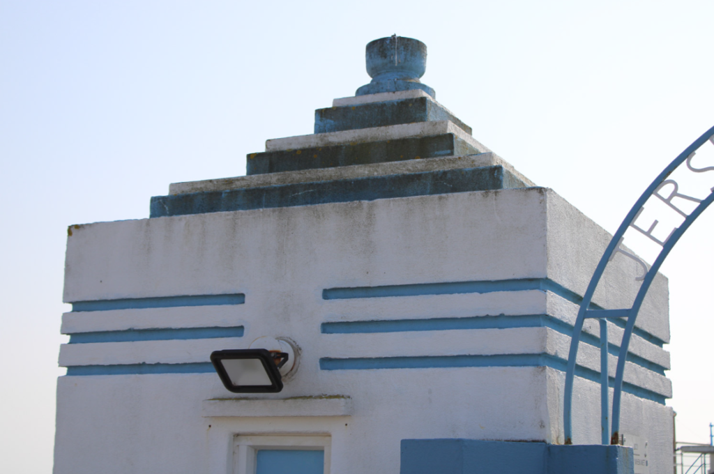
Here I edited my image in colour and black and white, as I wasn’t sure which I liked best. I think that black and white help to show the different shapes in the building, as well as highlight shadows. However, I think that the version in colour helps to show contrast between the different tones, as well as highlighting the overall shape of the building in contrast to the bright blue in the sky.

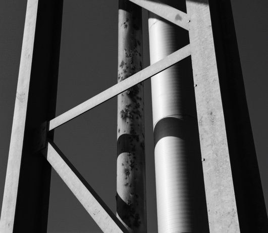
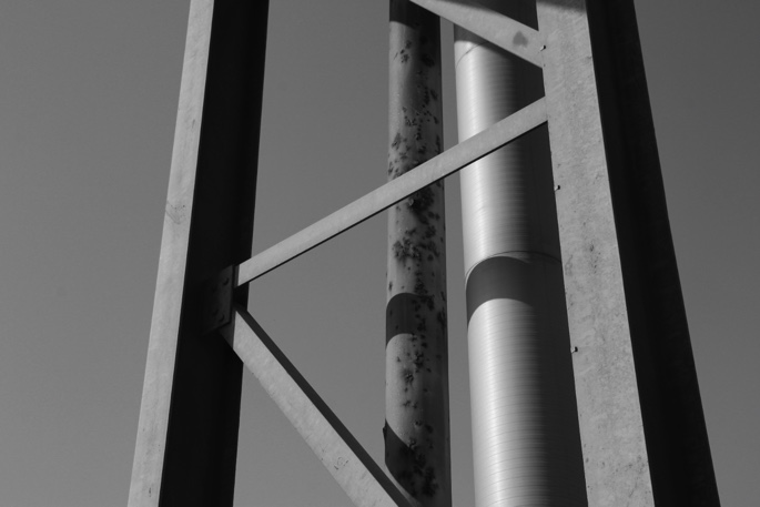
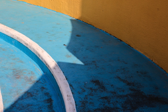
Machinery and Abstract Images

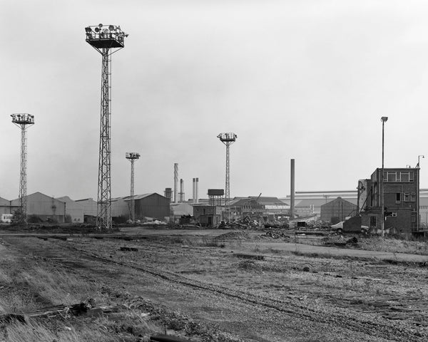
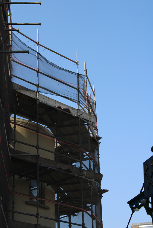
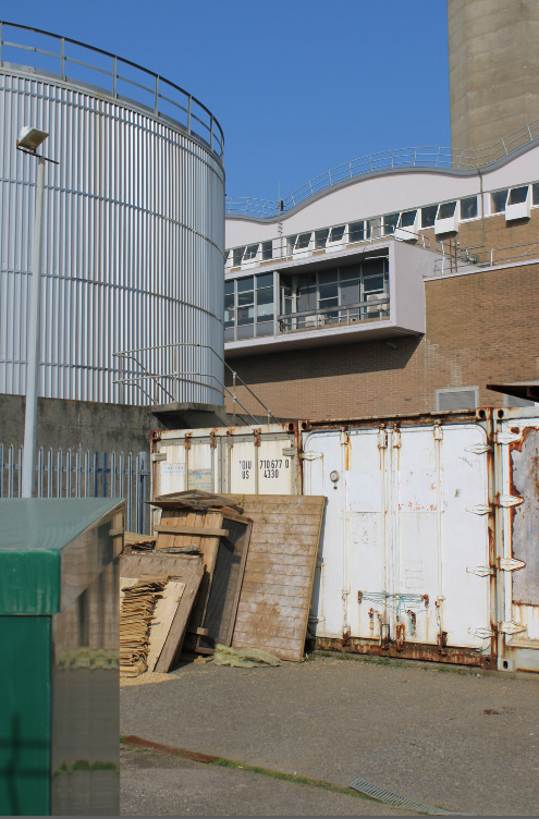
Again, for these images, I edited in black and white with strong contrast, adding blacks and decreasing highlights.

Here I have produced two different edits -In the one on the left, I have used “B and W landscape” preset on lightroom, and on the right I had used my own editing. I prefer the edit on the left because the higher levels of contrast, and my use of cropping which improves the composition.
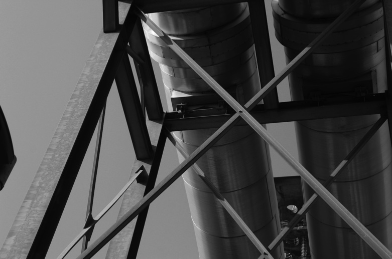
In this edit, I used dramatic editing to accentuate the use of shadow and line – I used high contrast, slightly decreased the exposure and highlights, increased the blacks in the image, and added grain.

Here I have produced two different editing styles – with presets on lightroom – the left is “landscape B and W” and the right is “Sepia toned B and W”

Typology Images

After selecting the images to use for my typologies in the style of Berndt and Hilla becher, I edited them in black and white with high contrast. I then imported them into photoshop, where I created a new A3 document for each piece. I then sized all my images the same, and placed them with equal borders in my desired layout.

Final typologies

I think my typologies were partly successful, but I found that I didn’t have as many images that would work well in the style of typologies as I thought. If I was to do this shoot again, I would make sure to capture more fronts of buildings with straight-on angles with the same amount of zoom, so the pictures fit together more cohesively in my final edits.

John Myers Artist Reference and Photoshoot Plan

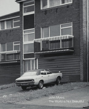
John Myers

John Myers’ remarkable, yet little-known, photographs present a tableau of life in the West Midlands of the 1970s as it has never been seen before.   In line with renewed interest in American landscape photography of the 70s, The New Topographics, Myers’ black-and-white portrait and landscape photography is attracting significant critical attention after going almost unnoticed for over 20 years.


Working in Britain’s post-industrial Midlands from 1973-1981, Myers created an archive of the unspectacular that attracted attention at the time but then lay undisturbed for 30 years until a chance meeting with a curator. A solo show at Birmingham’s Ikon Gallery followed in 2011, kick-starting a comprehensive reappraisal at his work that’s resulted in more solo shows and several publications.

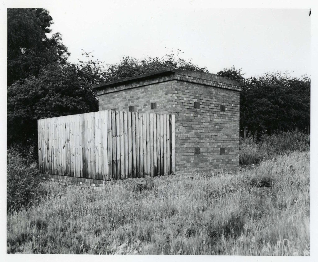
‘Landscape’ in its broadest sense can be used to describe Myers’ documentation of suburban life in his native West Midlands – the housing estates, blocks of flats, cul-de-sacs, garages, electricity substations and unsmiling portraits of the people that populated his local area. Myers evokes the streetscapes and uncomplicated certainties of Britain in the 1970s and the profound economic dislocation that took hold at the beginning of the 1980s.  

His new book, Looking at the Overlooked, is a glorious compendium of “the claustrophobia of the suburban landscape in the 1970s”. Focusing on substations, shops, houses, televisions, and so-called “landscapes without incident” – or as Myers puts it, “boring photographs” – the images are all recorded with a deadpan aesthetic that’s won Myers comparisons to the celebrated New Topographics movement in the USA.

His representations of mundane features of the urban environment are quite similar to work made in the States (Adams, Gohlke, Baltz). He was a typologist (television sets, electricity substations) before the Bechers made the term their own. Furthermore, his environmental portraits of ordinary Stourbridge residents owe something to Sander and Arbus but in their static, deadpan qualities also look forward to much work made in the 1990s and beyond (Dijkstra, Hunter, Struth).

“Heath Lane” – part of John Myers’ collection named “Boring Photos”

This is one of John Myers’ images from his collection of 1970s images named “Boring Photos”, taken in black and white. The tones in this image are quite soft, with little contrast and a dull, flat sky. There is slight contrast in the tree and bush to the right and left of the image, which creates a little depth in the image. The use of line in this image is clear – all leading lines take the eye to the outside or edge of the image. For example, in the foreground, the horizontal line of the pavement splits the foreground and background up, which demonstrates the use of the rule of thirds in this image. Furthermore, the other obvious leading line in this image is the vanishing point in the background. The line of the field or hill in the background creates a solid contrast between the sky and the darker tones of the field. The uneventful composition and quiet mood of the image could suggest the lack of prospects in the area in which the image was taken or a “boring” town to live in. This would have been part of the reason Myers would have photographed this scene, as his interest in the developing face of middle-class Britain and the mundane link closely to this image.

Photoshoot plan

Shot typesGenre EquipmentLightingCamera settings
Photoshoot 1 – La ColletteWide-angle, landscape, and portrait, Straight on in the same way for TypologiesIndustrial landscapes, TypologiesCameraNatural – bright and sunnyLandscape, Manual
Photoshoot 2 –Wide-angle, portrait, and landscape, abstract, birds eyeThe New Topographics, Urban LandscapesCamera, tripodNatural, brightLandscape, manual
Photoshoot Plan

I am planning to do 2 shoots – one at and around La Collette, on our guided photoshoot, and another around St Helier, and possibly St Brelade. In my first shoot, I will focus on industrial landscapes, and I’m planning to take typology like images, to emulate the work of the Bechers. In my second shoot, I am planning to capture housing blocks, roads and estates to try and capture images like John Myers. I’m planning to then edit my images in black and white, and a few in colour.

Romanticism Rural Landscapes Plan

Mood board

8 Ansel adams ideas | ansel adams, ansel adams photography, black and white  landscape

Plan:

Shooting during a sunset, a sunrise or at night in a full moon is a good idea because it will really bring out the darks and the whites like all the romanticism visual arts, the strong contrast will help to convey the power of the sublime. A cloudy, rainy, foggy and windy day would also be a good setting for the shoot as it would present nature at its finest. Photographing a path in the woods or a side road would make a good lines in the photograph.

Potential shoot locations:

devils hole, fern valley, grantez headland, any ruins, bunkers, forests, the sea, lighthouses, cliffs, sand dunes.

the new topographics

New topographics was a term invented by William Jenkins in 1975 to describe a group of American photographers (such as Robert Adams and Lewis Baltz) whose pictures had a similar minimal aesthetic, in that they were formal, mostly black and white prints of the urban landscape. Most images consisted of man-made objects in nature and run – down buildings, predominantly focused on textures.

New topographics was a reaction to idealised landscape photography that elevated the natural and the elemental, much like Ansel Adams’ work. New topographics emphasized man vs nature in form of photography, showing how urban areas and buildings had taken over nature, but photographed in a way that covered the ugly side of built-up areas and presented urban landscapes to look just as beautiful as nature.

ROBERT ADAMS

Robert Adams: The New West | AnOther

Robert Adams is one of the most important figures of modern American photography; a key figure in the New Topographics movement. He photographs in black and white, usually during daytime, of urban areas that are typically deserted, save for a few people that make an appearance in his work. Adams’ monochrome style was influenced by 19th-century photographers like Timothy O’Sullivan, William Henry Jackson and Carleton Watkin, who also focussed on the landscape of the West (in its more primitive state) as well as Lewis Hine, Edward Weston, Dorothea Lange and Ansel Adams, all of whom married social and aesthetic concerns in their work. 

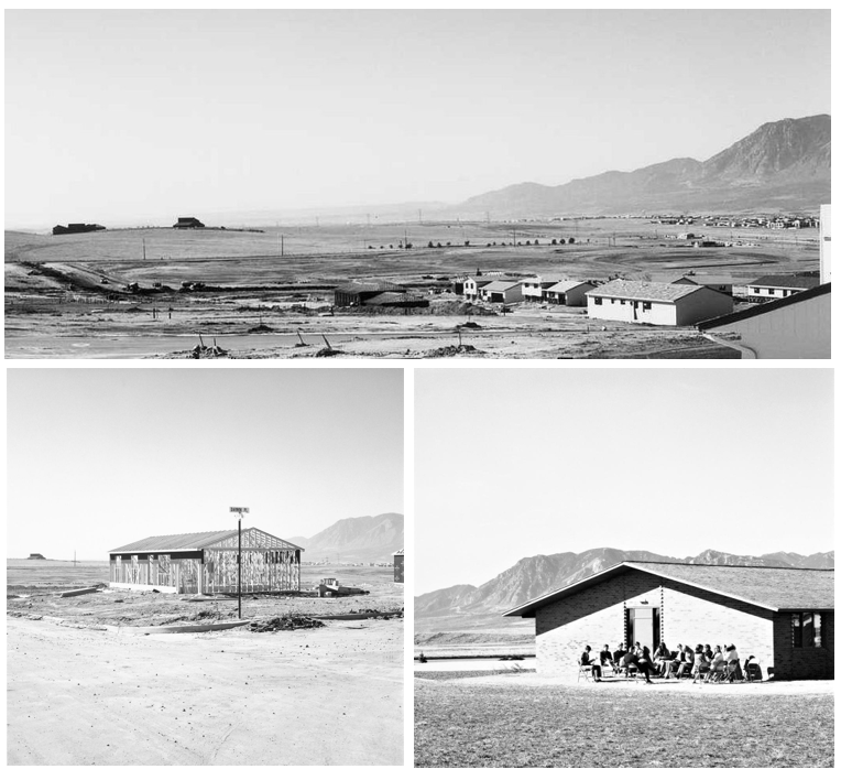
Photos from Adams’ The New West collection, 1974.

The turning point in Adams’ career was the creation of his photo-essay, The New West, in 1974. Divided into five sections, the book takes us along the Colorado Rocky Mountains, with photos of the entire suburban Southwest. Starting from the empty streets and street signs, Robert Adams takes the viewer on a journey with him, finishing his book in the suburbs with the rapidly growing streets of houses and mobile homes in a sparse stretch of land, before presenting us with an entire town of these compact white caravans, which appear tiny and somehow insignificant against the backdrop of the towering mountains and an omnipresent sky to show the nature found amongst urban landscapes. 

LEWIS BALTZ

American Landscape Photographer Lewis Baltz Dead at 69

Whilst Robert Adams’ photography style combined nature with man-made landscapes, Baltz’ style of work is entirely urban. He made photographs in series focused on a particular theme and published them in book form, as in The New Industrial Parks Near Irvine, California (1975), Nevada (1978) and Park City (1981). His work, like Adams, challenges the tradition of western landscape photography by presenting a less innocent view of the landscape. Baltz’s perception of the landscape reveals the effects of twentieth-century culture and suburban development on the nation’s topography.

One of his most famous works, The New Industrial Parks is part of a series developed in the 1970s deals with wide-ranging cultural and philosophical questions about the growing urban landscape. By focusing his attention on the familiar, Baltz created a powerful work in his critical photographic approach to the built environment.

MY PLAN

My plan for urban landscape photos is to focus on decaying or derelict buildings/constructions as i’ve always been drawn to them and now have the chance to photograph them. I chose some photos of abandoned places that i both like and appeal to the theme of new topographics. I also plan to photograph busy, urban areas like town or parks. My images will be in black and white to mimic photographers of the new topographics era and i will try to eliminate any unnecessary objects in the photos to give a miminal approach like Lewis Baltz’ work.

The New Topographics

“New Topographics: Photographs of a Man-Altered Landscape” was an exhibition that epitomized a key moment in American landscape photography. The term “New Topographics” was coined by William Jenkins in 1975 to describe a group of American photographers (such as Robert Adams and Lewis Baltz) whose pictures had a similar banal aesthetic, in that they were formal, mostly black and white prints of the urban landscape.

Many popular photographers that were linked to New Topographic were inspired by the man-made, selecting subject matter that was matter-of-fact. Parking lots, suburban housing and warehouses were all depicted with a beautiful stark austerity, almost in the way early photographers documented the natural landscape.

These photographers began to move away from traditional landscape photographs of natural views and started photographing what replaced them, unromanticised views of stark industrial landscapes, suburban sprawl, and everyday scenes which are not usually given a second glance. 

Joel Sternfeld

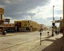
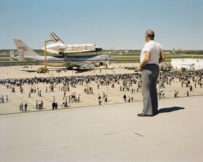
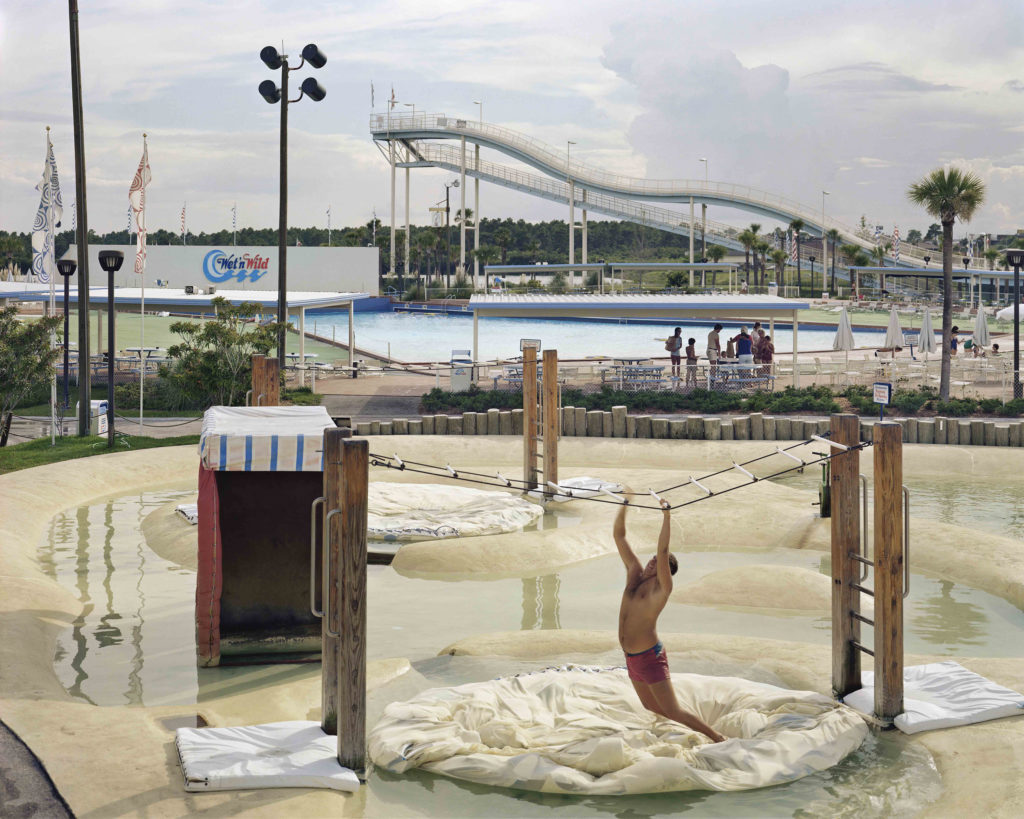
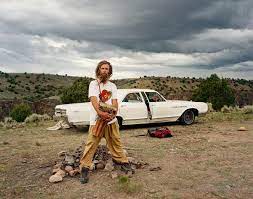
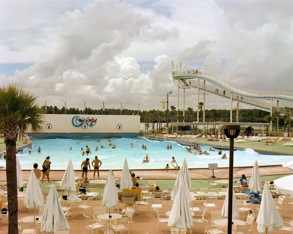
Joel Sternfeld is an American fine-art colour photographer. He is known for his large-format documentary pictures of the United States and helping establish colour photography as a respected artistic medium. Sternfeld began taking colour photographs in 1970 after learning the colour theory of Johannes Itten and Josef Albers. Colour is an important element of his photographs. Joel Sternfeld produced many books but one of his most popular being American Prospects.
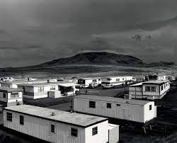
American Prospects (1987) is Sternfeld’s most known book and explores the irony of human-altered landscapes in the United States. To make the book, Sternfeld photographed ordinary things, including unsuccessful towns and barren-looking landscapes. Sternfelds work looks more into utopic and dystopic possibilities of the American experience which is mainly shown through his pieces in this book. Walker Evans was a big role model for Sternfeld and much like Evans he continued working in the tradition of American naturalist colour photography. Seen through his lens, the late-1970s’ America oscillates between artificial, nostalgic paradises and crude reality.
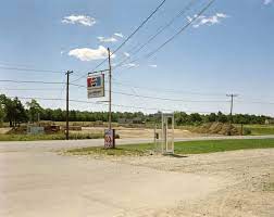
“I picked this title because the word ‘prospect’ has several meanings in English: first, it means ‘view.’ In New England, when a new farm is being built, care is taken to give the farmer’s wife a nice view from the kitchen window (nice for the women, right?). ‘Prospect’ also means ‘seen from above, perspective,’ which goes well with my working method. But it also signifies possibility, hope, future, like when you prospect for gold, you hope to find something…,” Stated Sternfeld

What was the new topographics a reaction to?

Their stark, beautifully printed images of this mundane but oddly fascinating topography was both a reflection of the increasingly suburbanised world around them, and a reaction to the tyranny of idealised landscape photography that elevated the natural and the elemental.

Photoshoot 2

Contact Sheets

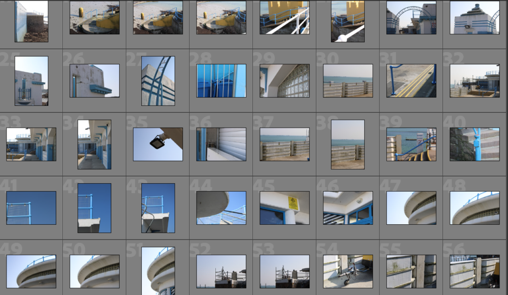
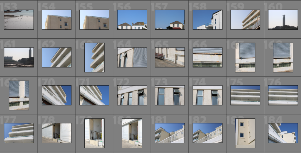
When taking these photos, I made sure to use a variety of angles and distances to get a range of different images.

Contact sheet
Contact sheet
Contact sheet
Contact sheet

Best Shots

I went through all of my images and decided which ones I liked best and thought could be enhanced through editing to look even better.