I started by going through my best shots and edited the ones I thought I could enhance via editing.
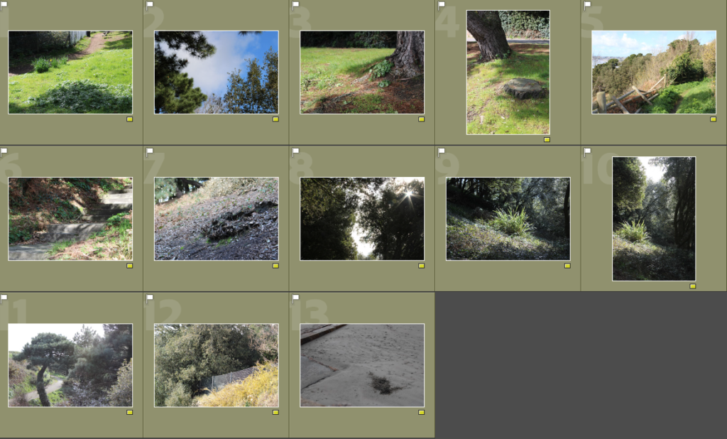
Edits
I felt inspired by Roger Fenton’s work so I attempted to make my image looks similar to his through editing.
—-Edit 1: ————————
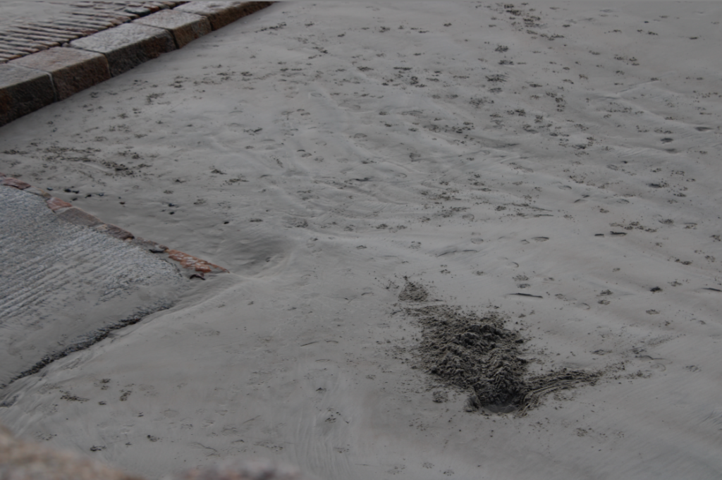
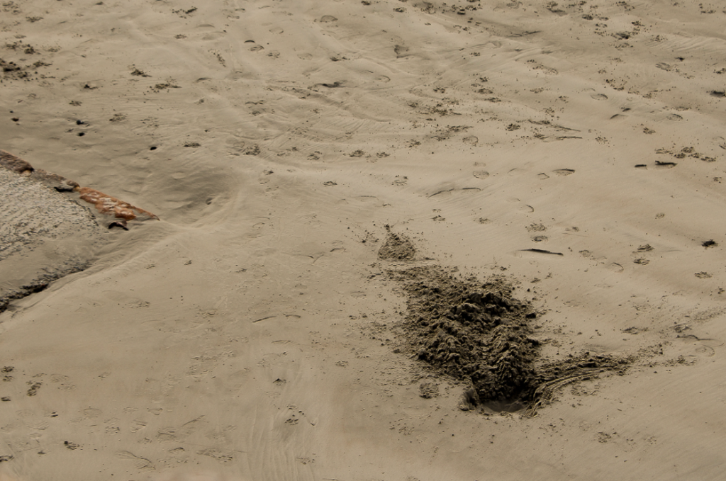
In order to create this edit, I cropped the image slightly in order to draw more attention to the dug up sand [the main focus of the image]. From there, I increased the temperature of the photo and increased the saturation slightly, giving the image a yellow tint. I decided that in order to improve my edit further, I would increase the sharpness and contrast which helped the smaller details within the image stand out more.
—-Edit 2: ————————
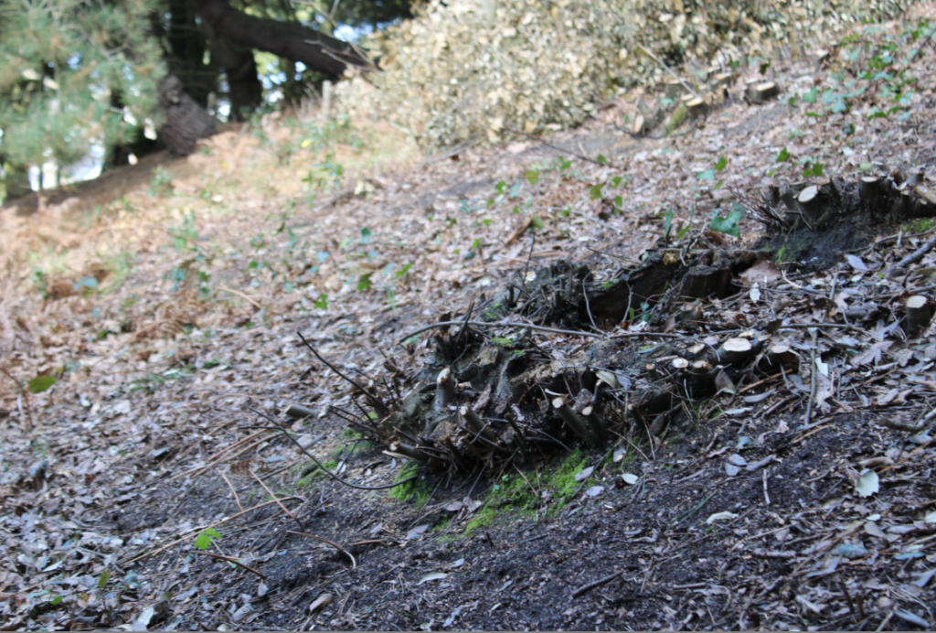
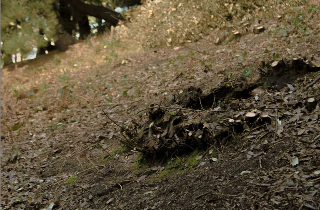
I started this edit by increasing the temperature, making the image warmer. I then decreased the contrast and shadows which allowed the yellow highlights to stand out more without distracting from the main focus of the image. Finally, I finished my edit by increasing the sharpness which allowed the image to be seen clearly.
—-Edit 3: ————————
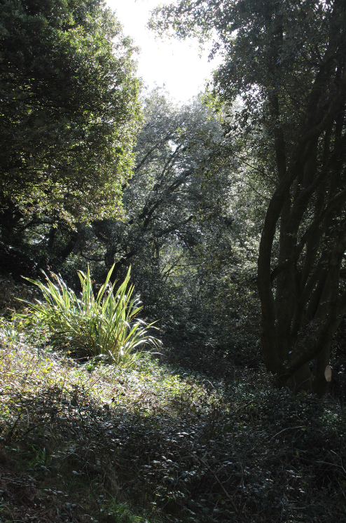
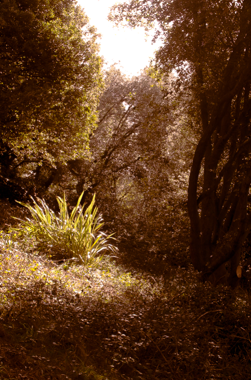
I began this edit by increasing the temperature of the image, however, I didn’t like the way it looked so I tinted the shadows orange and pink in order to exaggerate the shadows so they wouldn’t be drowned out by the rest of the image. Next, I lowered the exposure of the image slightly along with the contrast to create a softer look. I then finished off my edit by increasing the sharpness and highlights, adding a bit of contrast between the different yellow tones in the image.
—-Edit 4: ————————
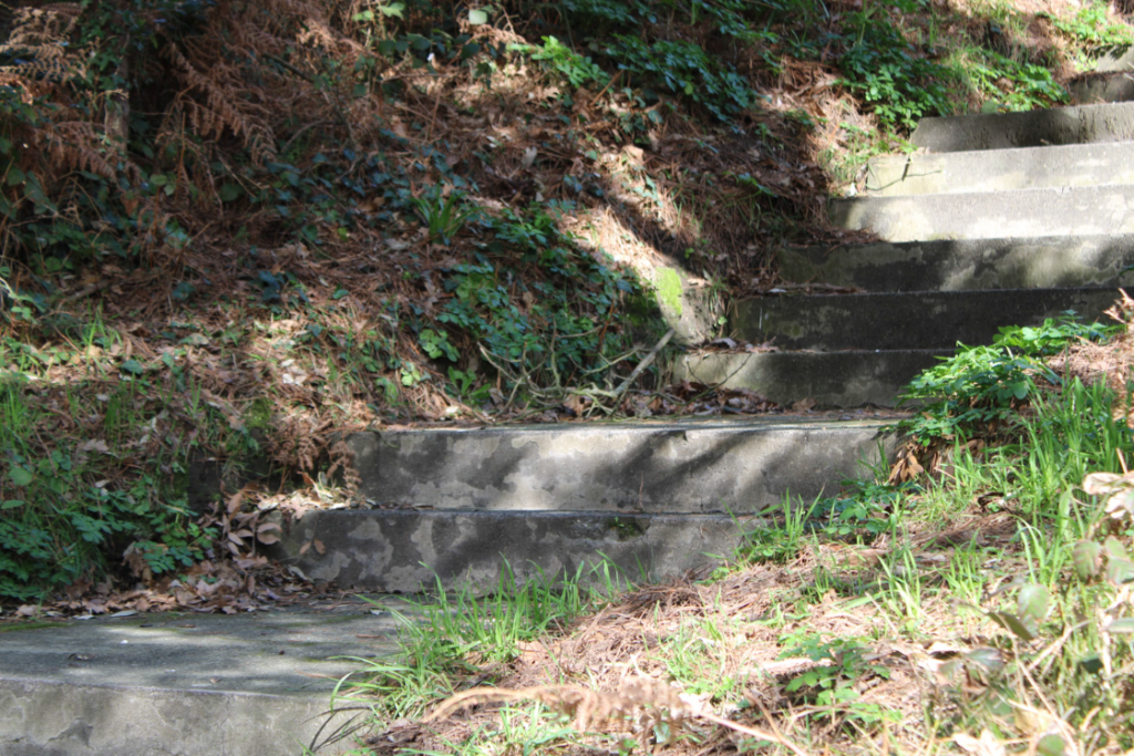
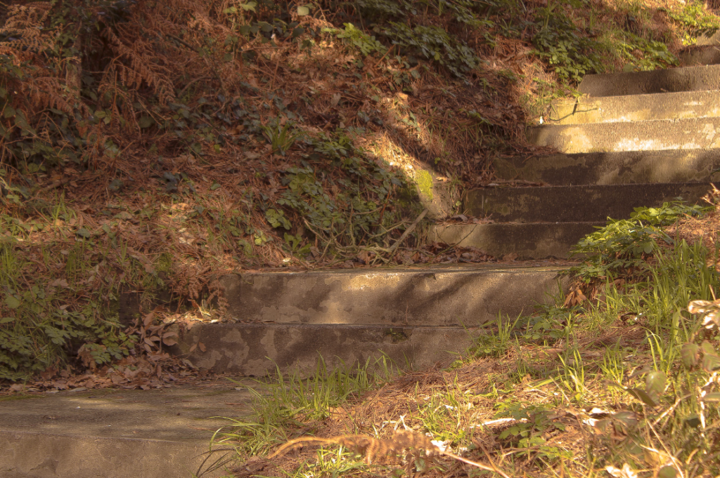
I made this edit by tinting the highlights yellow and the shadows orange which made the colours in the image blend together nicely. I increased the exposure of the image slightly before decreasing the contrast as it made the shadows in the image look a little softer and made the highlights look a little more golden. I finished off the edit by increasing the sharpness which made the foreground clearer and kept the rest of the image somewhat soft-looking.
—-Edit 5: ————————
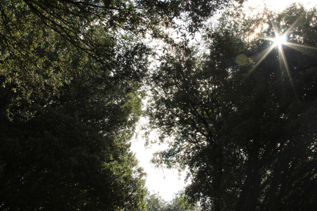
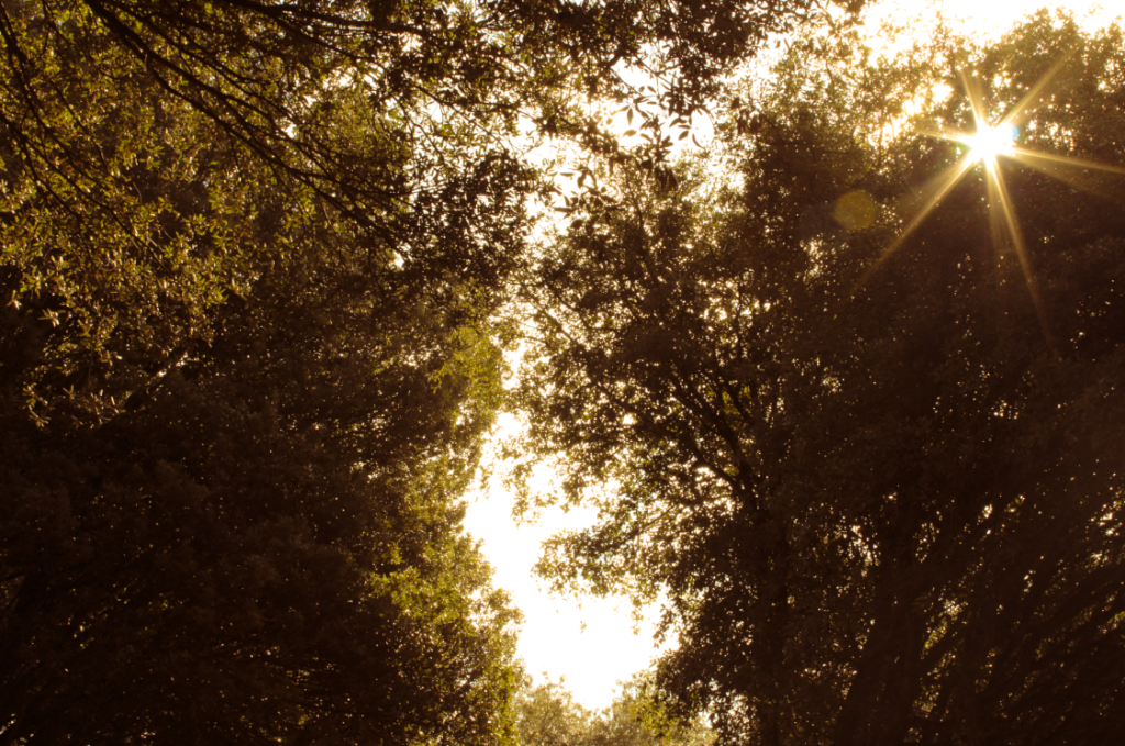
I began this edit by increasing the temperature, tinting the midtones yellow and the shadows orange. This created a variety of yellow tones within the trees which made the image feel warmer and slightly aged. Then, I decreased the contrast a little as I wanted the shadows to look slightly softer whilst still allowing some of the details within the trees to remain dark and hidden. I finished the edit by increasing the sharpness and the vibrance of the image, causing the yellows to really pop out.

Once you have completed your photo walk from Havre Des Pas to La Collette you should aim to make comparisons with photographers and their work
Your image selection and editing may be guided by this work…and you must show that you can make creative connections.
Albert Renger Patszch and The New Objectivity
https://www.atlasofplaces.com/photography/new-objectivity/
Keld Helmer Petersen
https://www.keldhelmerpetersen.com/1950-1959