The Tetons and Snake River, Grand Teton National Park, Ansel Adams
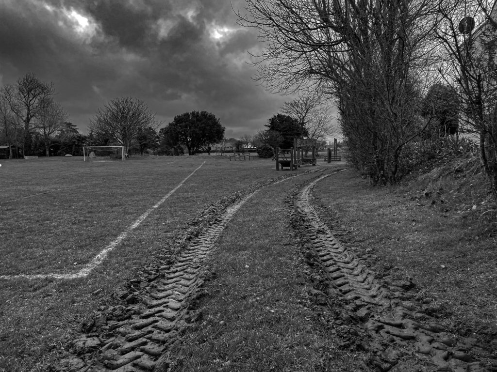
On the left is my image taken in St Ouens on a stormy day. On the right is an image taken by Ansel Adams which was captured in Wyoming.
Both of these images have many similarities and some differences. To compare these images, I first saw the way the mud tracks from my image and the river in the second image have very similar features such as, they both start at the bottom of the photo and turn out of the range of the landscape captured. Also, both images are displayed in black and white which has a very good effect on images that display colours of green and brown. Another similarity is that if both images werent in black and white they would both have a very similar colour scheme including colours such as, green, white, brown and grey.
I have also noticed a few differences between the two images. One of these differences is that my image has many man-made things such as, football field, playground, and the tractor mud tracks, however in Ansel Adams image all scenery displayed is natural with no man-made structures in range of sight. I also noticed the image by Ansel Adams shows a lot of landscape which is hidden by the shadows and in my image it only has a small range captured.
The New Topographics was a term coined by William Jenkins in 1975 to describe a group of American photographers (such as Robert Adams and Lewis Baltz) whose pictures had a similar banal aesthetic, in that they were formal, mostly black and white prints of the urban landscape.
For “New Topographics” William Jenkins selected eight then-young American photographers: Robert Adams, Lewis Baltz, Joe Deal,[6]Frank Gohlke, Nicholas Nixon, John Schott,[7]Stephen Shore, and Henry Wessel, Jr. He also invited the German couple, Bernd and Hilla Becher, then teaching at the Kunstakademie Düsseldorf in Germany. Since the late 1950s the Bechers had been photographing various obsolete structures, mainly post-industrial carcasses or carcasses-to-be, in Europe and America. They first exhibited them in series, as “typologies”, often shown in grids, under the title of “Anonymous Sculptures.” They were soon adopted by the Conceptual Art movement.
I started by going through my best shots and edited the ones I thought I could enhance via editing.
Contact sheet of my best shots
Edits
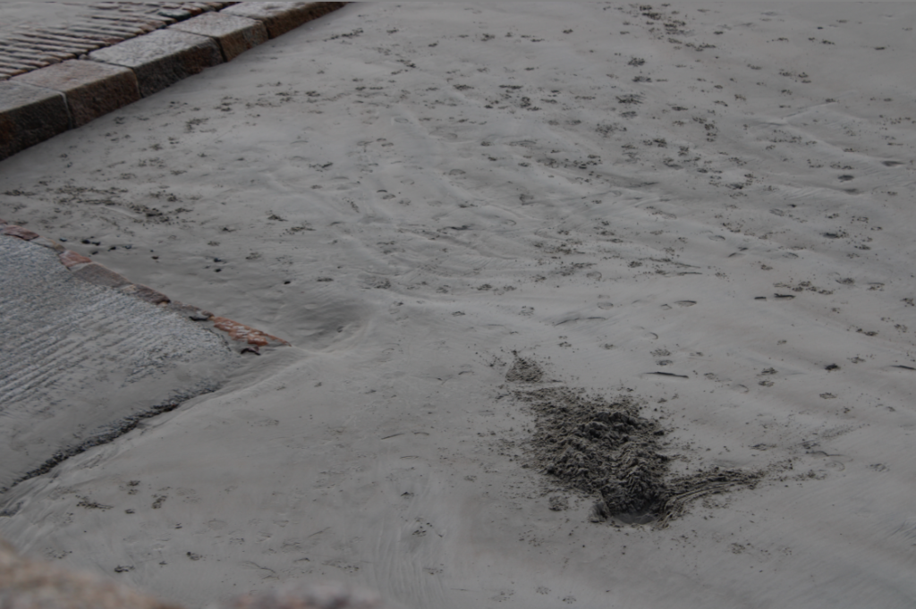
I felt inspired by Roger Fenton’s work so I attempted to make my image looks similar to his through editing.
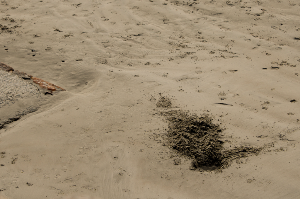
—-Edit 1: ————————
My Original Photo
My Edit
In order to create this edit, I cropped the image slightly in order to draw more attention to the dug up sand [the main focus of the image]. From there, I increased the temperature of the photo and increased the saturation slightly, giving the image a yellow tint. I decided that in order to improve my edit further, I would increase the sharpness and contrast which helped the smaller details within the image stand out more.
—-Edit 2: ————————
My Original Photo
My Edit
I started this edit by increasing the temperature, making the image warmer. I then decreased the contrast and shadows which allowed the yellow highlights to stand out more without distracting from the main focus of the image. Finally, I finished my edit by increasing the sharpness which allowed the image to be seen clearly.
—-Edit 3: ————————
My Original Photo
My Edit
I began this edit by increasing the temperature of the image, however, I didn’t like the way it looked so I tinted the shadows orange and pink in order to exaggerate the shadows so they wouldn’t be drowned out by the rest of the image. Next, I lowered the exposure of the image slightly along with the contrast to create a softer look. I then finished off my edit by increasing the sharpness and highlights, adding a bit of contrast between the different yellow tones in the image.
—-Edit 4: ————————
My Original Photo
My Edit
I made this edit by tinting the highlights yellow and the shadows orange which made the colours in the image blend together nicely. I increased the exposure of the image slightly before decreasing the contrast as it made the shadows in the image look a little softer and made the highlights look a little more golden. I finished off the edit by increasing the sharpness which made the foreground clearer and kept the rest of the image somewhat soft-looking.
—-Edit 5: ————————
My Original Photo
My Edit
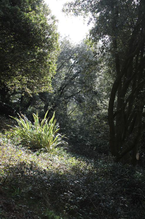
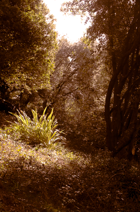
I began this edit by increasing the temperature, tinting the midtones yellow and the shadows orange. This created a variety of yellow tones within the trees which made the image feel warmer and slightly aged. Then, I decreased the contrast a little as I wanted the shadows to look slightly softer whilst still allowing some of the details within the trees to remain dark and hidden. I finished the edit by increasing the sharpness and the vibrance of the image, causing the yellows to really pop out.
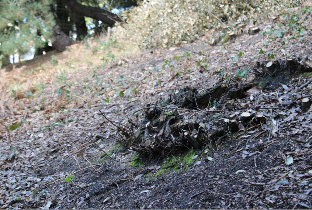
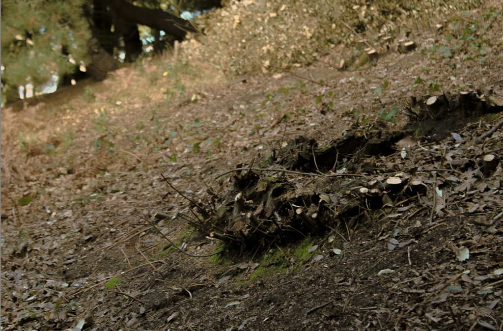
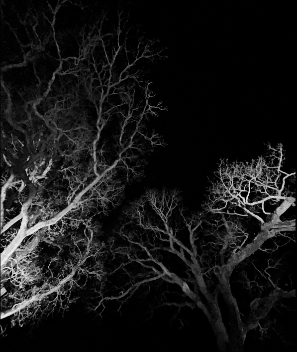
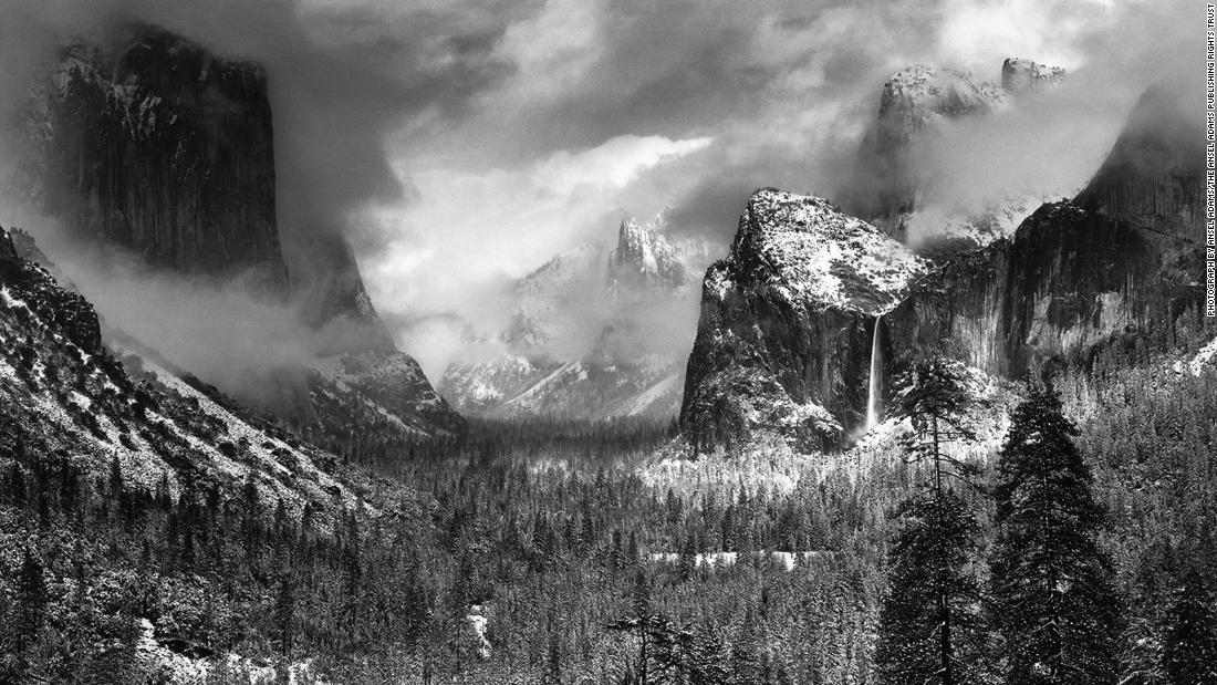
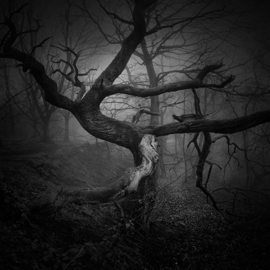
The two images of Ansel Adams’ above have similar characteristics of my image below. There are a wide variety of tonal values in all images, my image perhaps has less greys and only a sharp contrast between almost pure white and pure black. My image has less definition/ is not in as sharp as a focus, this could be changed by changing the aperture setting, which secures greater depth of field (i.e. Ansel Adams often shot in an aperture setting of f64). My image is also really intriguing to me as the perception of the image presents itself as an optical illusion, with some questioning over what the image actually is, whether it be a close up photo of roots or trees from afar, Adams’ image of roots gives this same effect where the tangled roots look almost scalic and alive rather than just being roots.
Ansel Adams was a an American photographer and environmentalist throughout the 1900’s who was extremely well known for his work on landscapes and use of sharp focus in order to capture crisp images that included huge variety of tones, adding incredible depth and contrast to his photos. He often captured black and white images of rural landscapes in the American West, in particular Yosemite National Park, as he wanted to promote conservation of wilderness.
Adams received his first camera in 1916 at age 12, a Kodak #1 box brownie camera, on a visit to Yosemite National Park and proved to be a talented photographer. He continued creating impressive landscapes all throughout the 1920s after becoming a custodian for the Sierra Club’s Lodge at Yosemite National Park.
Lodgepole Pines, Lyell Fork of the Merced River, Yosemite National Park [Ansel Adams, 1921]
‘Monolith, the Face of Half Dome‘ was the landscape that Adams considered his “first really fine photograph” and is also his most famous photo due to the intense contrast between the tones, which he enhanced through the use of filters, creating an almost surreal image.
Monolith, the Face of Half Dome, Yosemite National Park, California [Ansel Adams] released in 1927
Analysing Ansel Adams Work
Yosemite national park [Ansel Adams]
In this photo, Adams used the camera in order to create a lot of contrast between everything in frame, capturing a variety of tones which makes every detail within the image stand out without over/under exposing the photo. His use of depth of field has allowed his image to be completely in focus including both the foreground and the background, allowing the beauty of the environment to be clearly in frame. This was due to Adams’ goal of using photography in order to promote the conservation of the environment and wilderness areas which made him pay close attention to how he planned on capturing what was in front of him.