I took around 150-200 photos trying to get a good diverse mix of different rural landscapes.
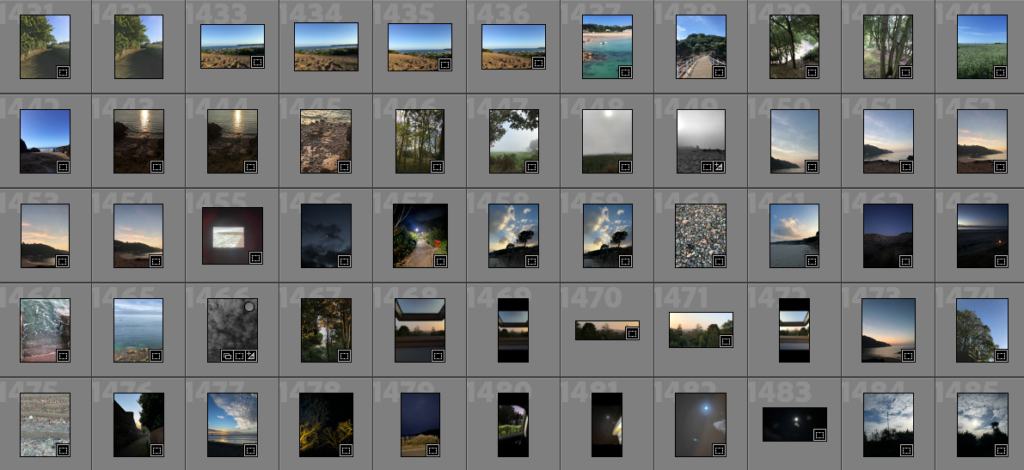
Contact sheets
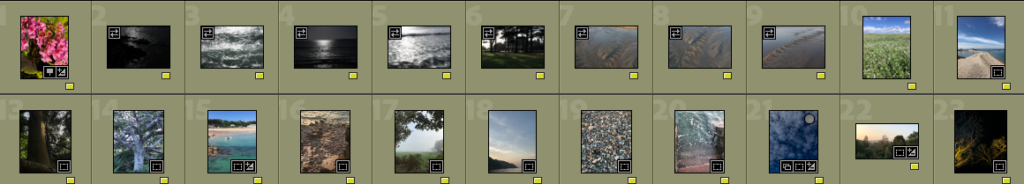
After completing my photoshoots I uploaded my images to Adobe Lightroom Classic and created a category system where I chose my favourite images from each different type of terrain so I could have a variety of images.
The images I was happy with before editing and making further selections
Then I edited the images, choosing between resizing them to concentrate on a main part of the landscape or whether they should be black and white or coloured.
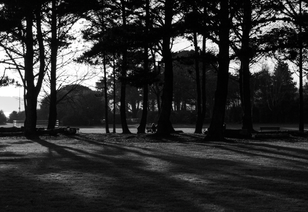
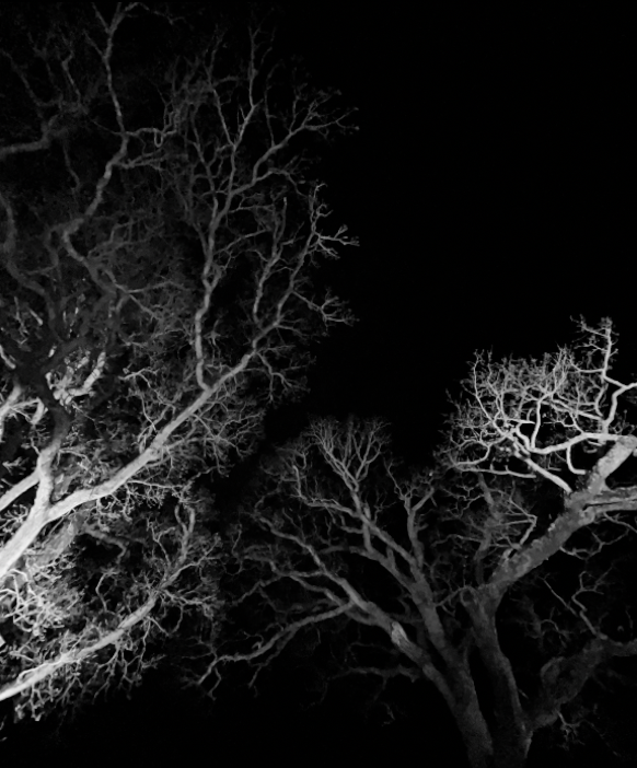
For example, on the image above I changed it to black and white then cropped out an area which was highly overexposed as I wanted to concentrate on the shadows the trees were creating.
As I wanted to concentrate on the shadows I turned up shadows in Lightroom and made the image have more of a contrast between the trees and the sky in the background, I thought this really added more dimension to the image as concentrating on the shadows (which are slanted) versus the trees added an almost optical illusion aspect to the image.
Finished edited image
The editing itself made the image look quite grainy but I really like this look as it incorporates different textures into the image i.e. the pure white blankness of the sky then the diverse tonal contrasts between the greys of the grass.
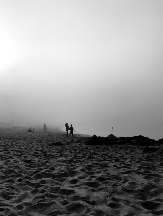
For some images it was hard to decide if I preferred them in black and white or coloured, such as this image of a beach during a foggy day
I did similar editing for my black and white images, making sure to highlight large tonal contrasts in the images as Ansel Adams did, as well as create a very visible textural contrast on images.
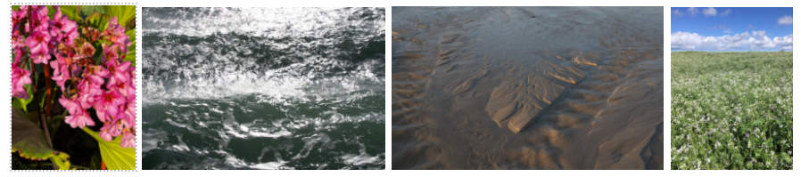
A collection of my coloured images
The majority of my favourite edited images are black and white.
A collection of my black and white images
After editing my images I then narrowed down my selection to my best images, seen below
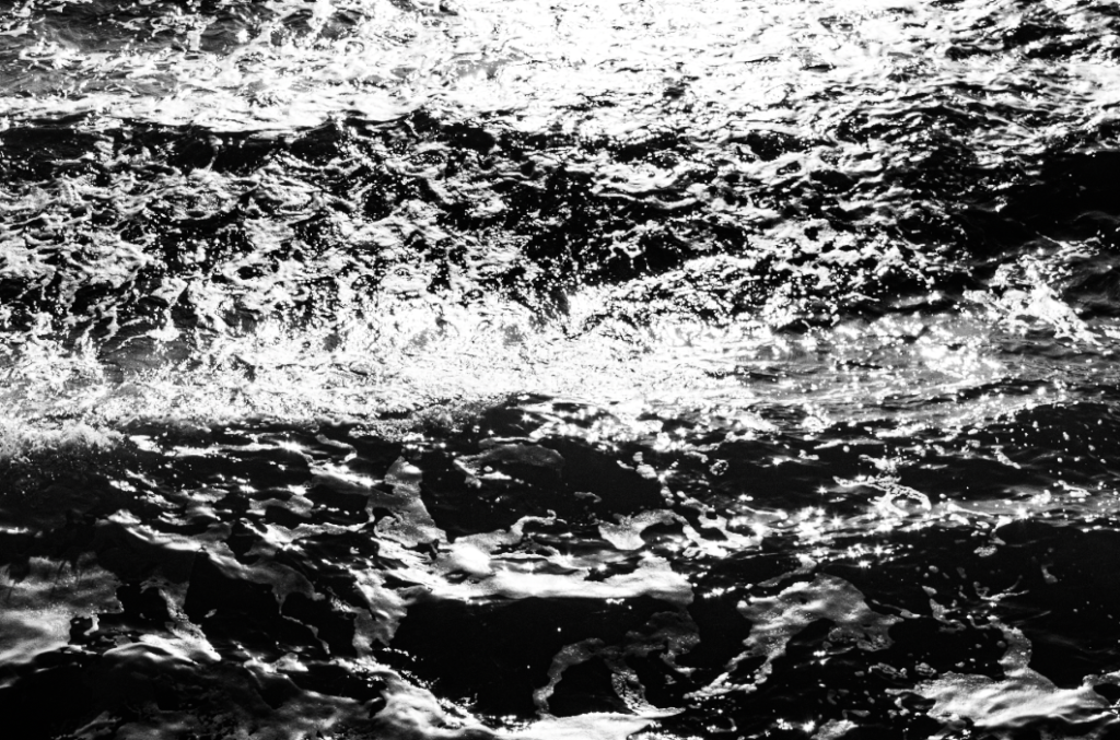
This image of the sea has been edited to highlight tonal contrasts -similarly to Ansel Adams’ images as there is a very large tonal range- and to provide a more abstract perspective of the waves as their texture is heightened
I concentrated on tonal values in this image, the mist creates a wider variety of grey colours- also adding more depth to the image- white the darker forefront of the image with the nearly black trees creates an interesting perspective of the landscape.
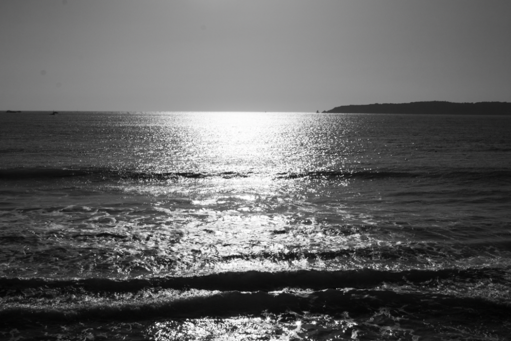
On this image I wanted to concentrate on tonal values and the zone system so I made where the sun is shining on the sea a pure white colour while the edges of the images are darker contrasts of grey and black. I tried to concentrate on the zone system by making sure there was something in every corner of the image while the sun shining on the sea is the main focus of the image. The zone system was somewhat successful except there is nothing in the top left corner of the image, making it look quite plain.
This image of a field has been edited so the clouds and sky are distinct from each other, with the texture of the flowers in the field a main subject contrasted with the softer textures of the clouds. Like other images, I wanted to increase the tonal values in the image.
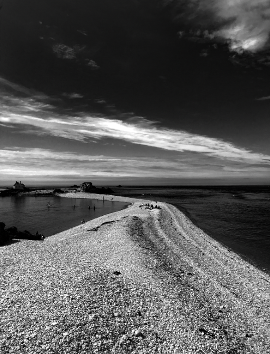
I wanted to accentuate the line of beach through the middle of the image so I made the sea surrounding it have a larger contrast to show the white of the clouds and the stones on the beach. The zone system is also very precedent in this image with the clouds in the image going opposite directions to the path, creating an unusual contrast.
I wanted to concentrate on the shadows to make the image have more of a contrast between the trees and the sky in the background, I think this really added more dimension to the image as concentrating on the shadows (which are slanted) versus the trees added an almost optical illusion aspect to the image.
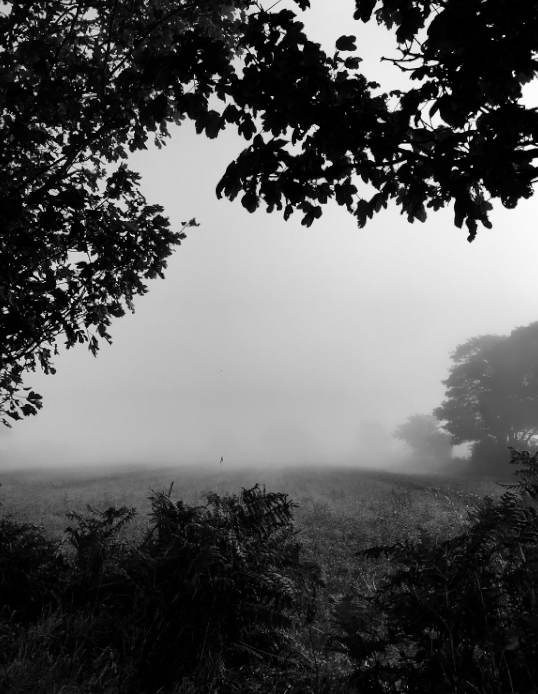
I wanted this image to have a lot of depth, the mist already added this to the image with the tones of the image getting lighter towards the middle of the image providing a large contrast to the blacks and greys of the top and bottom of the image. I believe the zone system as also been successfully used in this image as there is something in every “square” of the image.
I really like this image of looking up at trees as there is a large tonal contrast between the light shining on the trees from below versus the pitch black of the night sky. This image is also really intriguing to me as the perception of the image presents itself as an optical illusion, with some questioning over what the image actually is, whether it be a close up photo of roots or trees from afar etc.
I really like this image of the beach on a foggy day as the texture of the sand is really noticeable while the two figures in the middle are the darkest aspect of the image, drawing attention to them from the high contrast of the light grey sky and sea which blends into each other.