
PHOTO SELECTION + EDITING

Firstly I went through my images and colour coded them, separating the green ones to represent which photos I was using. I wanted to show a range of different landscapes and elements of nature. I was thinking of grouping different images together to show contrast e.g the soft clouds in the photos of the sky juxtaposed by the pebbles on the beach.
The majority of my photos will be in black and white to show my inspirations taken from photographers like Ansel Adams or Minor White however other photos will be in colour to show present day photography and the colour in nature.


BLACK + WHITE PHOTOS
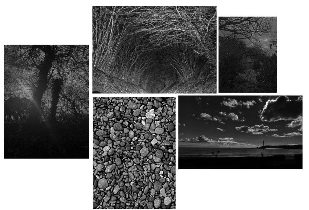
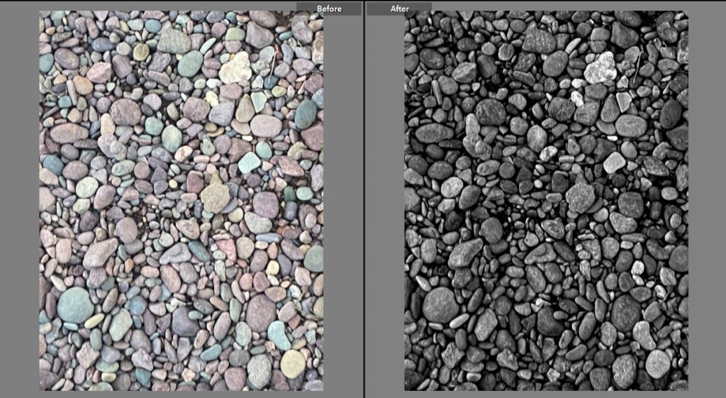
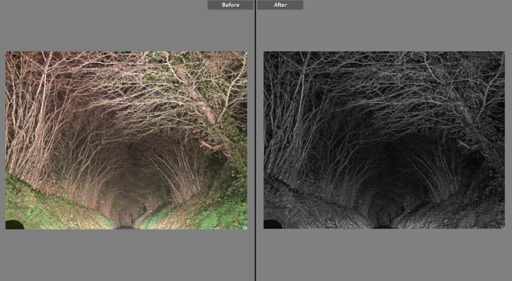
The images i chose to edit in black and white are the ones i think represent my photographer inspirations the best. The original photos didn’t provide enough inspiration for me so alongside turning down the saturation I edited the exposure and contrast to show a clear focal point for some of the photos, for example the image with sky view – I highlighted the clouds and attempted to eliminate the bottom half on the photo to make the focus the light of the clouds contrasting the rest of the image.
My favourite image from my black + white photos is the one of pebbles on the beach, taken at Anne Port. I like this because the pebbles provide different shades which reminds me of Ansel Adams’ zone system. I also like the photo because it shows texture in a different way to my other images.
COLOURED PHOTOS
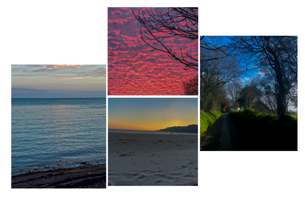
I selected these photos because the colour reminds me of romanticism photography/art and colour being used to bring an image together. I edited most of these by turning the saturation up slightly and lowering the exposure.
My favourite photo from my coloured images is the one of the sea, because to me it looks like a painting, and the yellow tone of the clouds over the sun reminds me of romanticism art/the sublime. Although the sea takes up the majority of the image i’ve made the clouds/sky the focal point because to me it evokes the most emotion.
COMPARING IMAGES
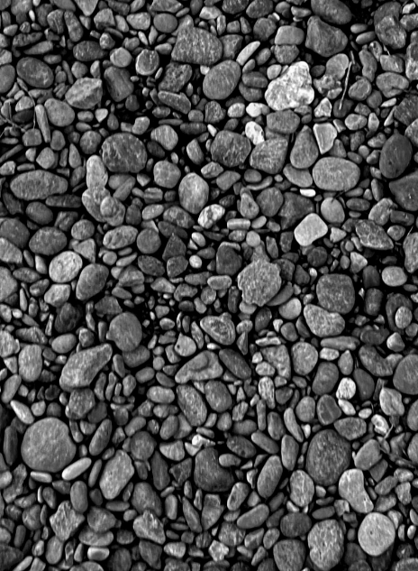
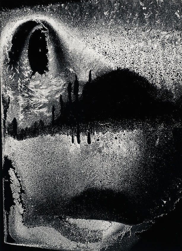
I’ve compared my photo (left) to one of Minor Whites pieces (right) i’ve chose to compare these images because they both present texture in a different way. Both photos are in black and white, however my photo is a harder texture and more defined whereas White’s image is a blur of texture, making it almost difficult to figure out what the photo represents. Both photos show a different range of light and dark tones in different places. However, the image on the right has wider areas of dark or light.