Comparing my work to Roger Fenton’s


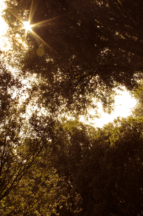
I think our work shares some similarities as we’ve both used trees in our photos in order to frame our image and add character to it – the leaves on the trees create an interesting pattern which makes our images more visually interesting [though the trees are more prominent in my photo]. Along with that, we’ve both used the sky to add contrast to our work, making the shadows more prominent whilst drawing attention towards the other features in our images.
However, there are also a lot of differences between our work. For example, Fenton’s work uses a lower contrast, making the shadows appear lighter, creating a dreamlike feeling due to how light and airy the image looks. I, on the other hand, use a stronger contrast, causing my shadows to appear dark and overpower most of my image which draws attention towards the leaves in the centre of the image that overlap and start to create a pattern.
