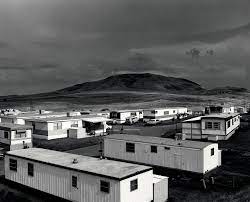
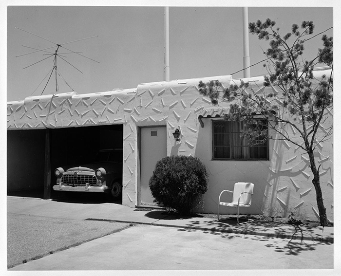
Robert Adams was born in Orange, New Jersey, in 1937. His refined black-and-white photographs document scenes of the American West of the past four decades, revealing the impact of human activity on the last vestiges of wilderness and open space. Although often devoid of human subjects, or sparsely populated, Adams’s photographs capture the physical traces of human life: a garbage-strewn roadside, a clear-cut forest, a half-built house. An underlying tension in Adams’s body of work is the contradiction between landscapes visibly transformed or scarred by human presence and the inherent beauty of light and land rendered by the camera.
photography
Adams’s complex photographs expose the hollowness of the nineteenth-century American doctrine of Manifest Destiny, expressing sombre indignation at the idea (still alive in the twenty-first century) that the West represents an unlimited natural resource for human consumption. But his work also conveys hope that change can be effected, and it speaks with joy of what remains glorious in the West. Adams received a BA from the University of Redlands in California and a PhD in English from the University of Southern California. He has received numerous awards, including a John D. and Catherine T. MacArthur Foundation Award (1994); the Spectrum International Prize for Photography (1995); and the Deutsche Börse Photography Prize (2006). Major exhibitions include San Francisco Museum of Modern Art (2005); Yale University Art Gallery (2002); Denver Art Museum (1993); Philadelphia Museum of Art (1989); and the Museum of Modern Art, New York (1979). Adams lives and works in north-western Oregon.
Urban photography is a broad term describing photography that showcases all aspects of an urban environment, combining elements of many other types of photography, including portrait, fine-art, landscape, and architecture photography as well as photojournalism.
Ideas
The New Topographics
New topographics was a term coined by William Jenkins in 1975 to describe a group of American photographers (such as Robert Adams and Lewis Baltz) whose pictures had a similar banal aesthetic, in that they were formal, mostly black and white prints of the urban landscape.
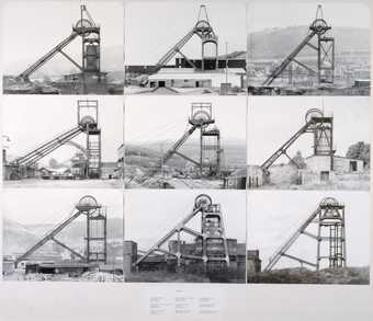
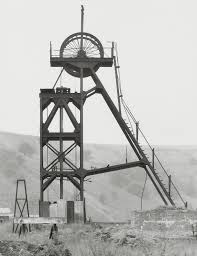
Bernd Becher and Hilla Becher Pitheads (1974)
This piece by photographers Bernd Becher and Hilla Becher (German conceptual artists) consists of pictures of oil pumps in urban areas and are arranged in grids to highlight the formal similarities of each structure. In each image they use the same lighting and straight-on camera angle to give off the image that these things are bland and uniform.
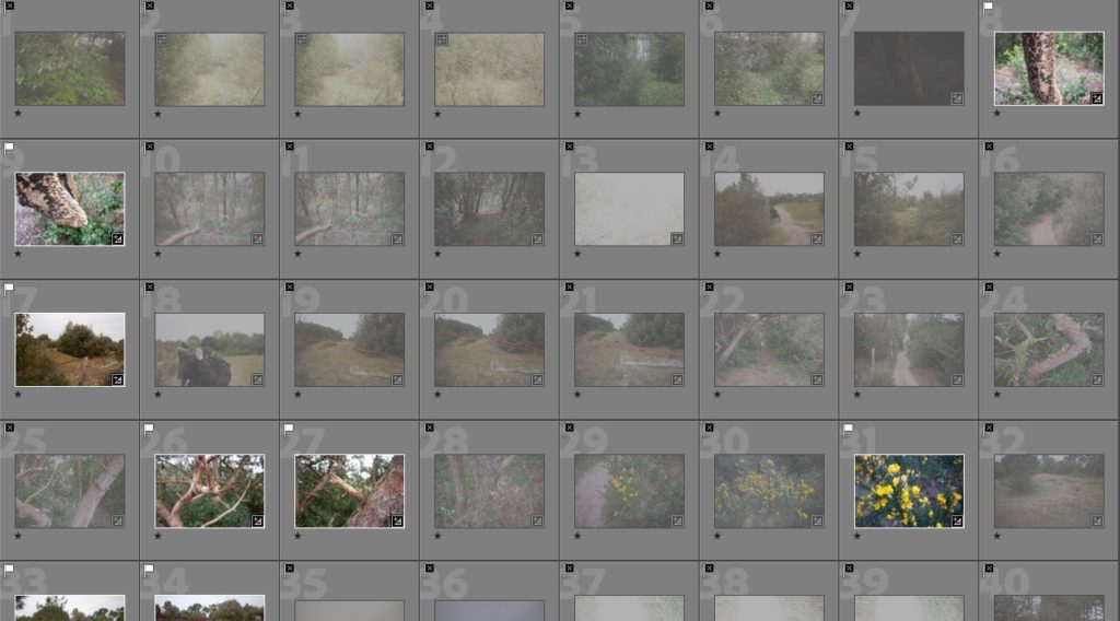
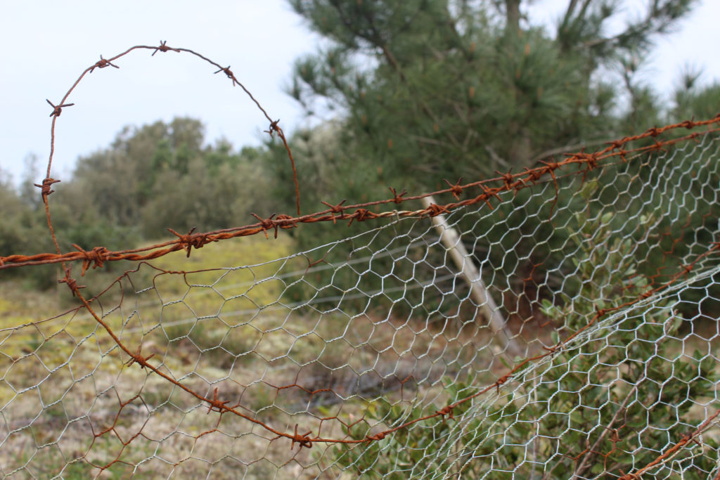
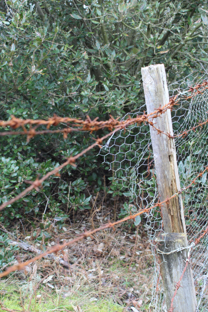
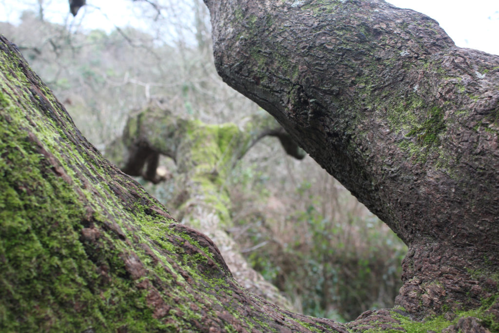
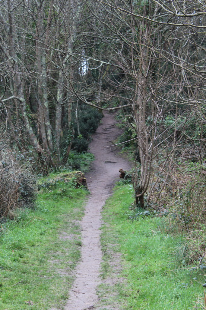
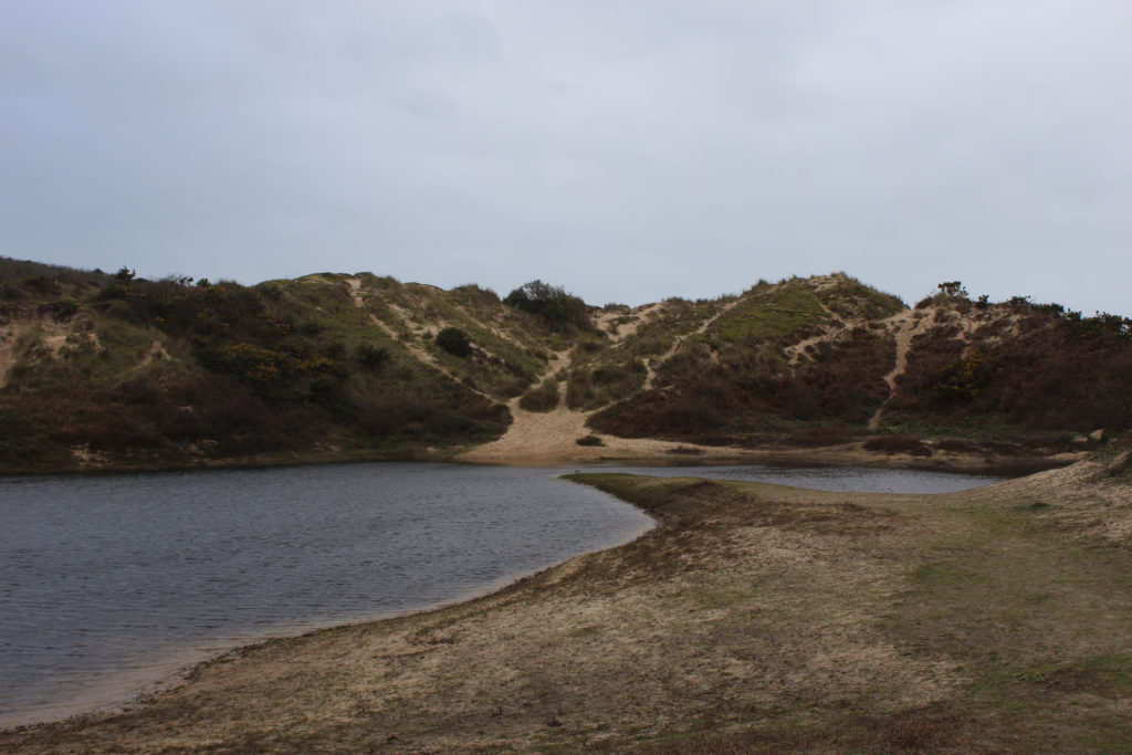
I took around 150-200 photos trying to get a good diverse mix of different rural landscapes.
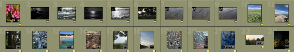
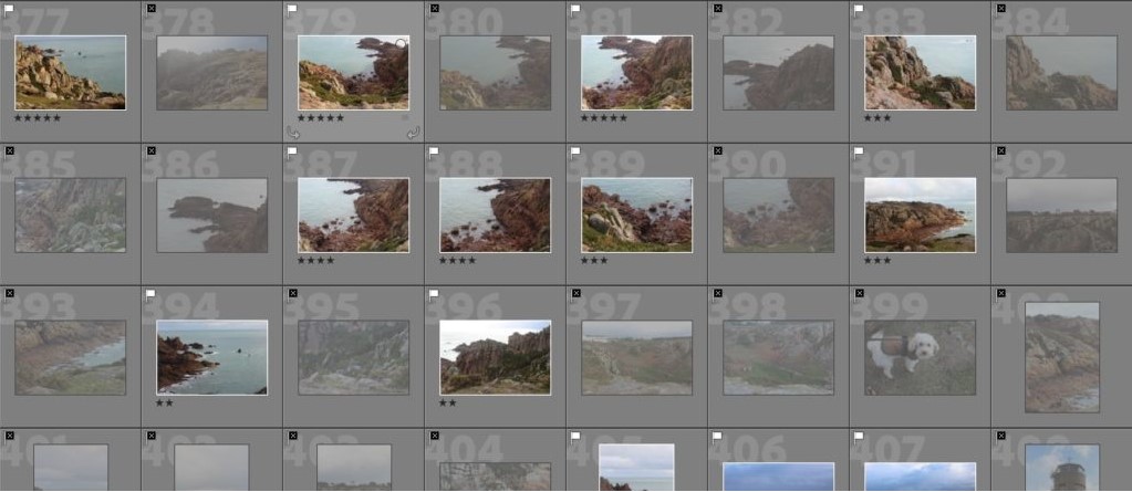
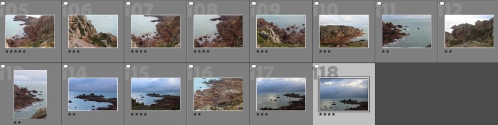
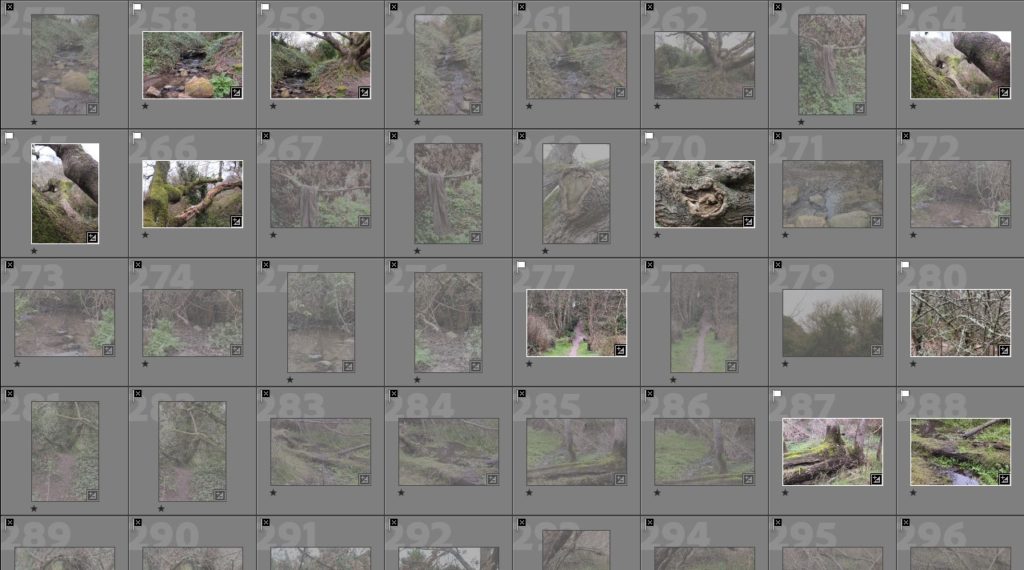
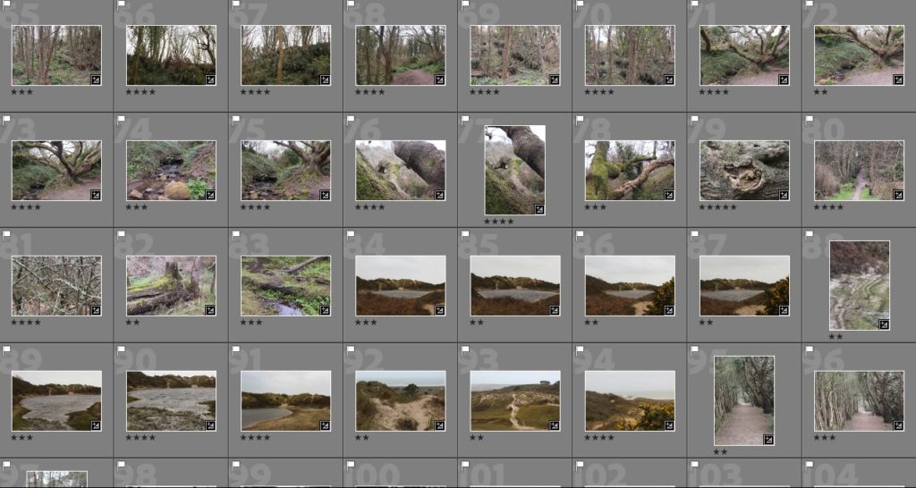
Contact sheets
After completing my photoshoots I uploaded my images to Adobe Lightroom Classic and created a category system where I chose my favourite images from each different type of terrain so I could have a variety of images.
The images I was happy with before editing and making further selections
Then I edited the images, choosing between resizing them to concentrate on a main part of the landscape or whether they should be black and white or coloured.
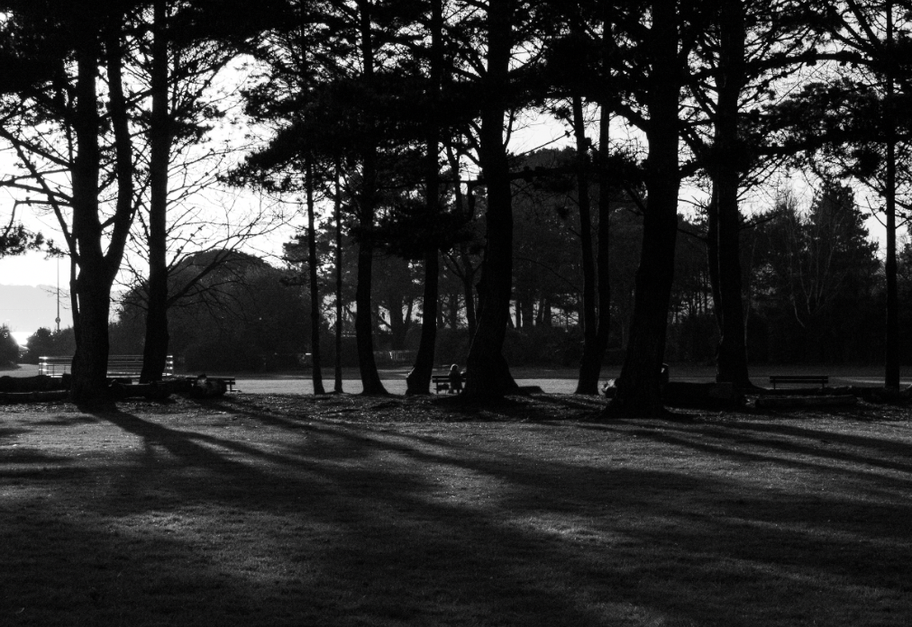
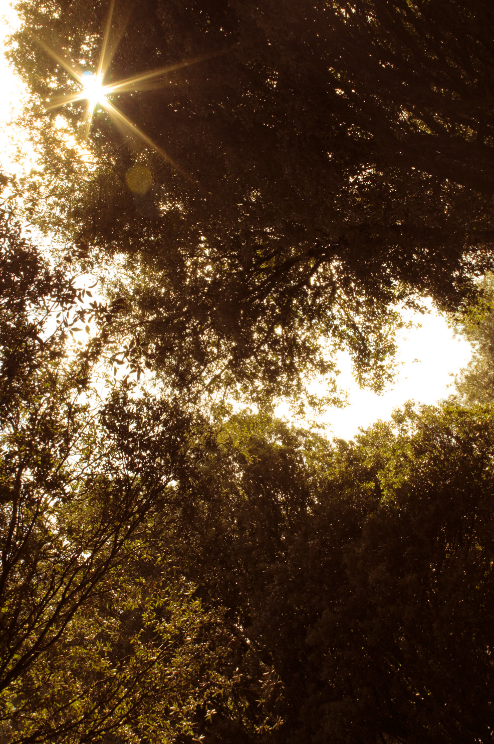
For example, on the image above I changed it to black and white then cropped out an area which was highly overexposed as I wanted to concentrate on the shadows the trees were creating.
As I wanted to concentrate on the shadows I turned up shadows in Lightroom and made the image have more of a contrast between the trees and the sky in the background, I thought this really added more dimension to the image as concentrating on the shadows (which are slanted) versus the trees added an almost optical illusion aspect to the image.
Finished edited image
The editing itself made the image look quite grainy but I really like this look as it incorporates different textures into the image i.e. the pure white blankness of the sky then the diverse tonal contrasts between the greys of the grass.
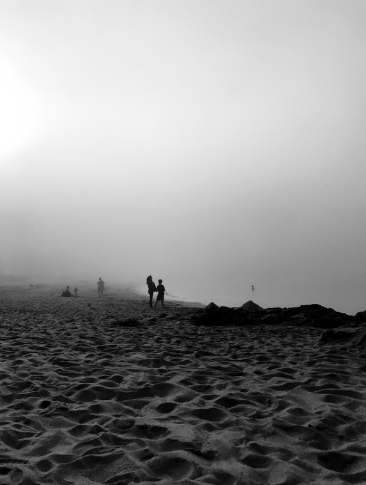
For some images it was hard to decide if I preferred them in black and white or coloured, such as this image of a beach during a foggy day
I did similar editing for my black and white images, making sure to highlight large tonal contrasts in the images as Ansel Adams did, as well as create a very visible textural contrast on images.
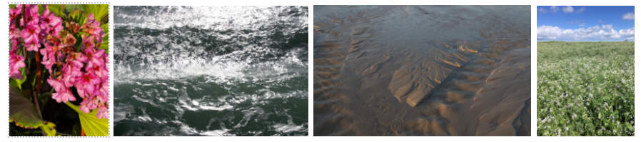
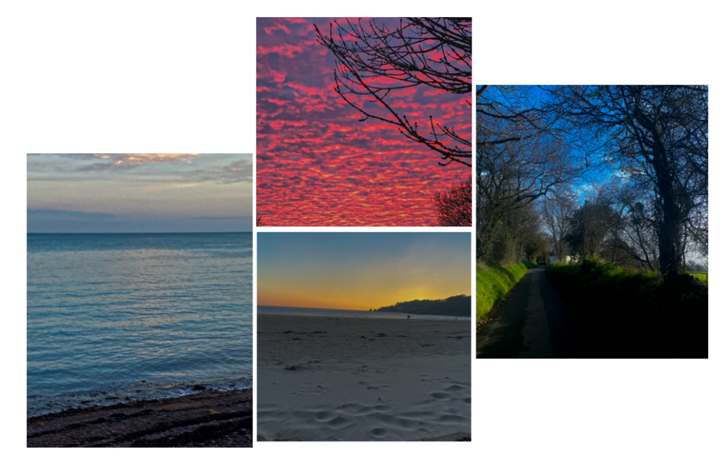
A collection of my coloured images
The majority of my favourite edited images are black and white.
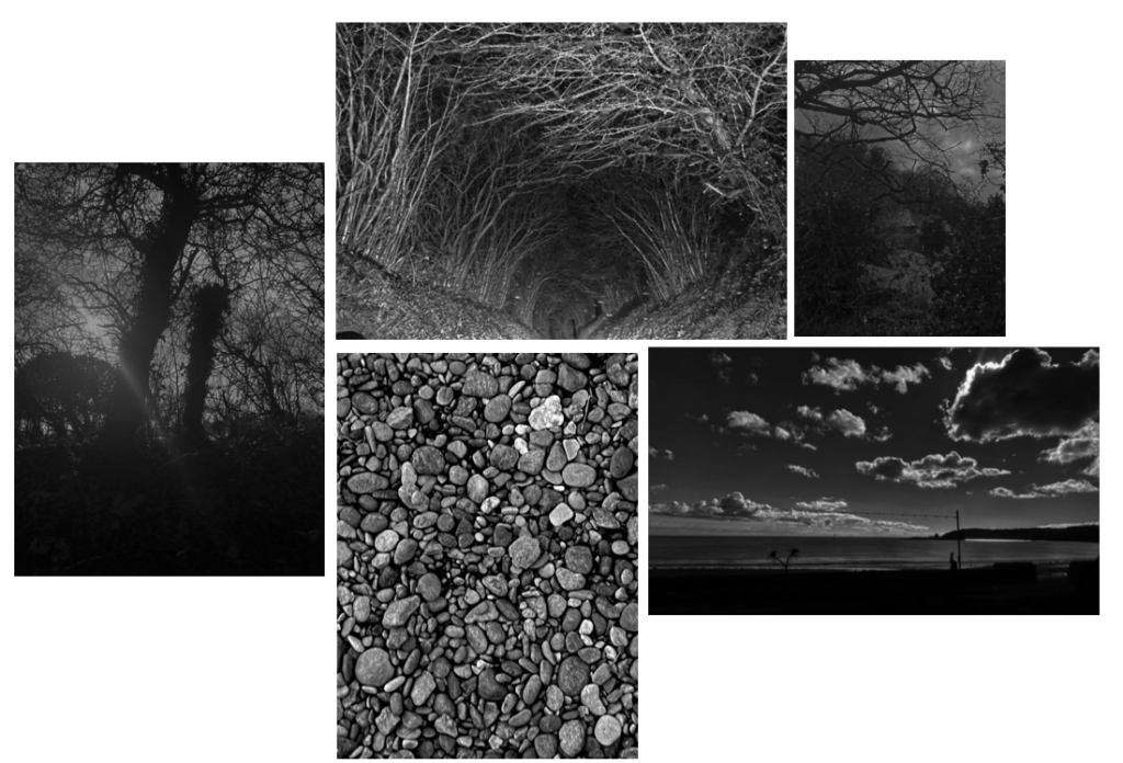
A collection of my black and white images
After editing my images I then narrowed down my selection to my best images, seen below
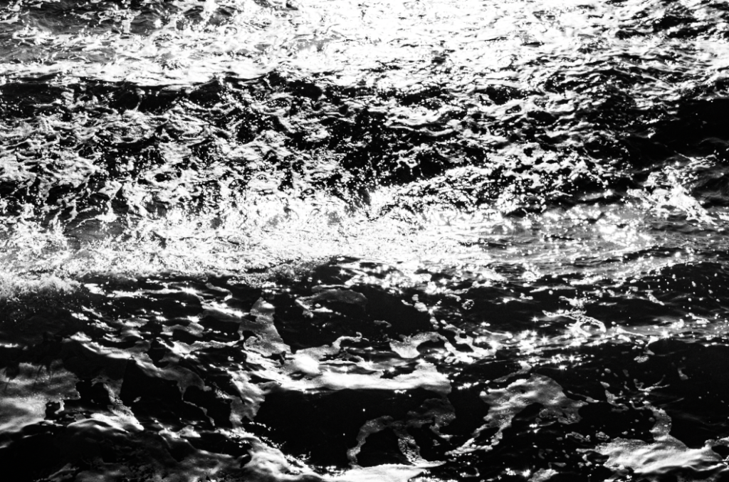
This image of the sea has been edited to highlight tonal contrasts -similarly to Ansel Adams’ images as there is a very large tonal range- and to provide a more abstract perspective of the waves as their texture is heightened
I concentrated on tonal values in this image, the mist creates a wider variety of grey colours- also adding more depth to the image- white the darker forefront of the image with the nearly black trees creates an interesting perspective of the landscape.
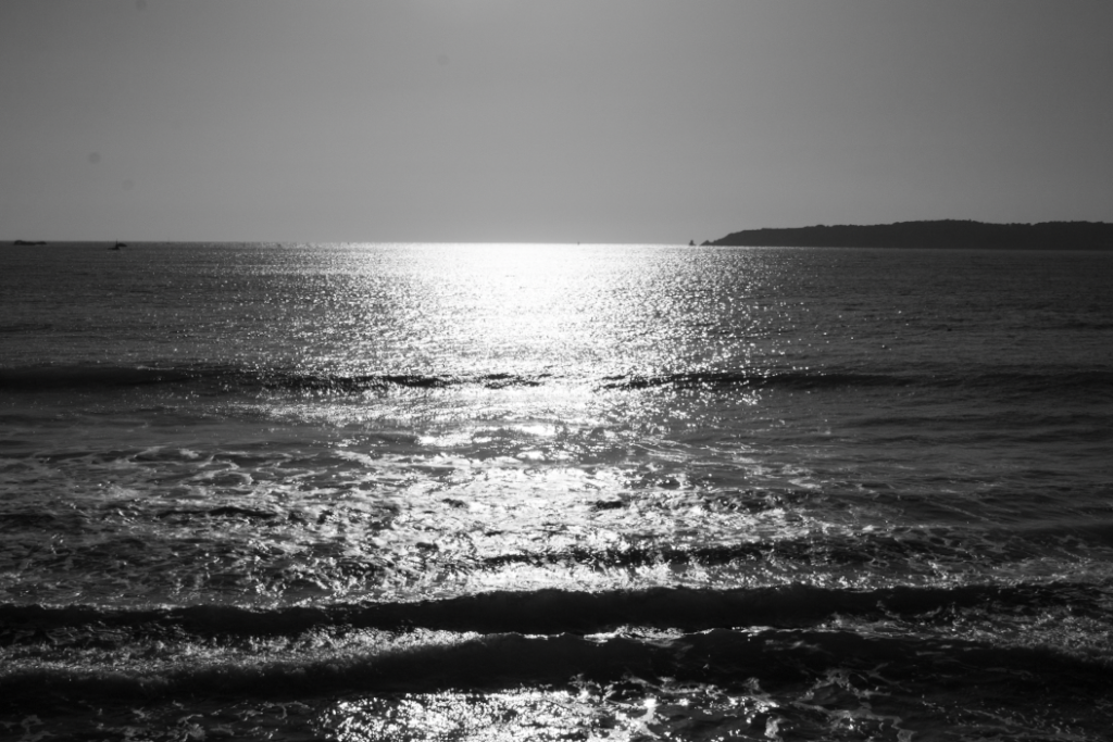
On this image I wanted to concentrate on tonal values and the zone system so I made where the sun is shining on the sea a pure white colour while the edges of the images are darker contrasts of grey and black. I tried to concentrate on the zone system by making sure there was something in every corner of the image while the sun shining on the sea is the main focus of the image. The zone system was somewhat successful except there is nothing in the top left corner of the image, making it look quite plain.
This image of a field has been edited so the clouds and sky are distinct from each other, with the texture of the flowers in the field a main subject contrasted with the softer textures of the clouds. Like other images, I wanted to increase the tonal values in the image.
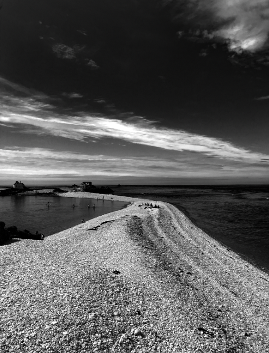
I wanted to accentuate the line of beach through the middle of the image so I made the sea surrounding it have a larger contrast to show the white of the clouds and the stones on the beach. The zone system is also very precedent in this image with the clouds in the image going opposite directions to the path, creating an unusual contrast.
I wanted to concentrate on the shadows to make the image have more of a contrast between the trees and the sky in the background, I think this really added more dimension to the image as concentrating on the shadows (which are slanted) versus the trees added an almost optical illusion aspect to the image.
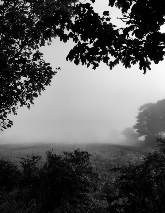
I wanted this image to have a lot of depth, the mist already added this to the image with the tones of the image getting lighter towards the middle of the image providing a large contrast to the blacks and greys of the top and bottom of the image. I believe the zone system as also been successfully used in this image as there is something in every “square” of the image.
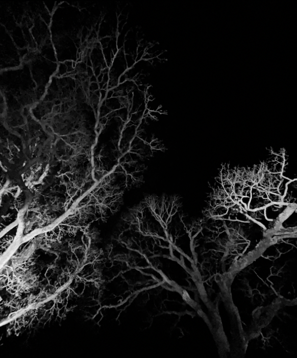
I really like this image of looking up at trees as there is a large tonal contrast between the light shining on the trees from below versus the pitch black of the night sky. This image is also really intriguing to me as the perception of the image presents itself as an optical illusion, with some questioning over what the image actually is, whether it be a close up photo of roots or trees from afar etc.
I really like this image of the beach on a foggy day as the texture of the sand is really noticeable while the two figures in the middle are the darkest aspect of the image, drawing attention to them from the high contrast of the light grey sky and sea which blends into each other.
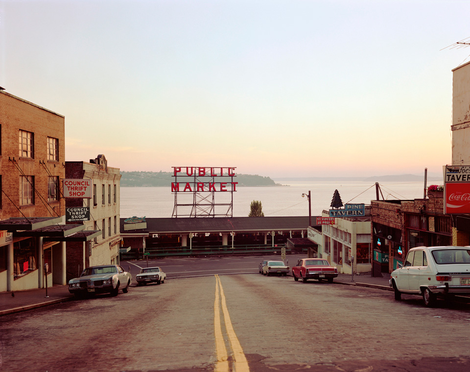
New topographics was a term coined by William Jenkins in 1975 to describe a group of American photographers (such as Robert Adams and Lewis Baltz) whose pictures had a similar banal aesthetic, in that they were formal, mostly black and white prints of the urban landscape. Many of the photographers associated with new topographics including Robert Adams, Lewis Baltz Nicholas Nixon and Bernd and Hiller Becher, were inspired by the man-made, selecting a matter-of-fact subject matter. Parking lots, suburban housing and warehouses were all depicted with a stark austerity, almost in the way early photographers documented the natural landscape.
An exhibition at the International Museum of Photography in Rochester, New York featuring these photographers also revealed the growing unease about how the natural landscape was being eroded by industrial development. The new topographics were to have a decisive influence on later photographers including those artists who became known as the Düsseldorf School of Photography.
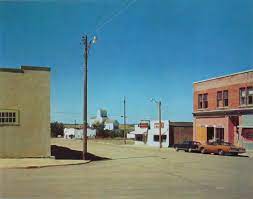
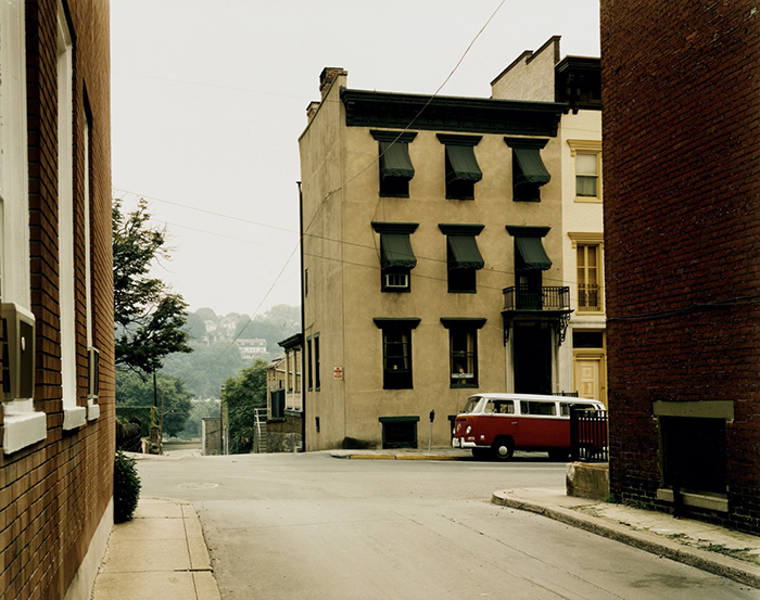
Stephen Shore, Church and 2nd Streets, Easton, Pennsylvania, June 20, 1974, chromogenic colour print.
Before the New Topographics created a shift in landscape photography, photographers such as Ansel Adams presented nature as separate from human presence. Adams photographed scenery in a manner intended to provoke feelings of awe and pleasure in the viewer. He used vantage points that emphasized the towering scale of mountain peaks and embraced a wide tonal range from black to white to record texture and dramatic effects of light and weather. The New Topographics brought the new idea that both nature and human presence exist together more and more, as industry and civilisation expand to cover areas that once existed without the presence of people.
Lewis Baltz
In one way, they were photographing against the tradition of nature photography that the likes of Ansel Adams and Edward Weston had created.
What were the new topographics a reaction to?
The authentic images of the new topographics were a reflection of the increasingly suburbanised world around them, with people and industry growing further out of cities and into the countryside. They were also a reaction to the rules of idealised landscape photography that elevated the natural and the elemental.
A scan of a New Topographics book
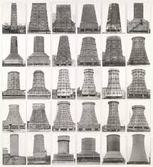
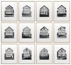
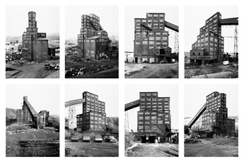
Typologies – Bernd and Hilla Becher
Bernd and Hilla Becher were the only photographers in the group to illustrate nineteenth-century subjects; instead, the husband and wife team, credited with the founding of the Düsseldorf school, documented nineteenth-century industrial decay. The Bechers worked exclusively in black and white, as did all the other photographers in the exhibition, with the exception of Stephen Shore.
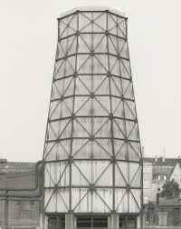
Bernhard “Bernd” Becher, and Hilla Becher, were German conceptual artists and photographers working as a collaborative duo. They are best known for their extensive series of photographic images, or typologies, of industrial buildings and structures, often organised in grids.
Their ‘objective’ methods of taking their images relate to their connection to the new topographics, with their authentic and stark images of industrial structures with vast landscapes behind them – this shows how their surrounding area was affected by industrialisation.
A mood board of Berndt and Hilla’s images
Together, the Bechers went out with a large 8 x 10-inch view camera and photographed these buildings from several different angles, but always with a straightforward “objective” point of view. They shot only on overcast days, to avoid shadows, and early in the morning during spring and autumn. Bernd and Hilla Becher first began their project of systematically photographing industrial structures – water towers, blast furnaces, gas tanks, mine heads, grain elevators and others – in the late 1950s.
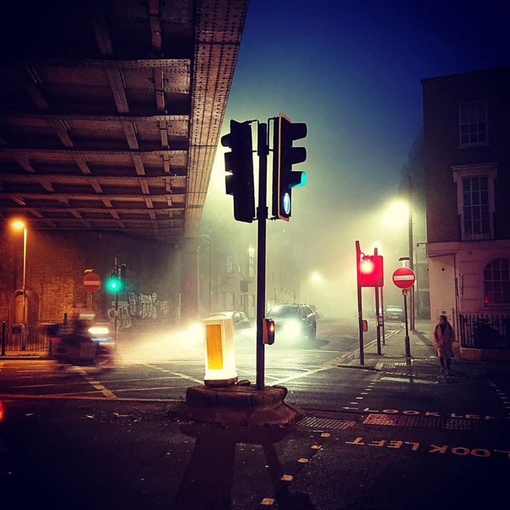
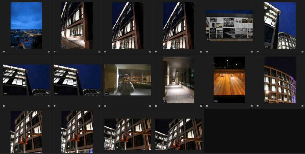
For my first photoshoot, focussing on urban landscapes, I began at the top of fort regent which I didn’t like and then I went into town to the financial district which is full of many office buildings which are very modern which simple square/rectangular shapes. I explored a range of different angles to explore the variety of lightning and shapes which the offices provided. I really enjoyed this because I like how the darker background as I took these during the evening contrasts against the bright, white lights of the building which illuminate it and bring it to life.
These are my best shots which I have chosen from my photoshoot which I chose on Adobe Lightroom by uploading them and then going through them by selecting them by pressing ‘Z’ when I liked a photo and thought it was successful. Next I will be choosing 4 pictures to experiment with and edit on Lightroom in my sleeted photographers styles.
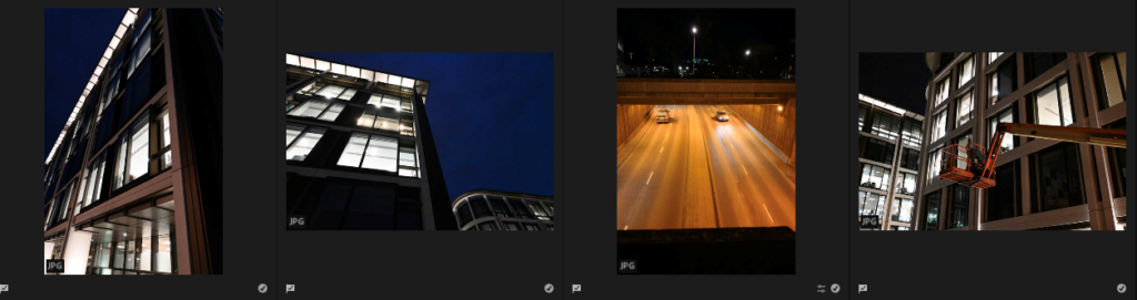
My 4 photos –
Throughout this photoshoot, I gathered 16 photos which I think are my best shots to show a urban landscape which I can edit and experiment on in Adobe Lightroom. I really like how these 4 photos turned out because they are able to be similar to my photographers work, Rut Blees Luxemburg and Thomas Struth, as they both focus on taking pictures of office buildings whereas Luxemburg does this at night which I did for this photoshoot and during the day will be my 2nd photoshoot. I wanted to focus on the angles ad shapes which have been illuminated due to the lighting from the office buildings in this and I really like the photo of the underpass as it shoes 2 cars going opposite ways and the dark, orange lighting makes it look old and rustic. In Adobe Lightroom while editing I’m going to experiment with different filters such as black and white and different ways to crop the photos to make them look unusual and solely focussed on the buildings with little background.
I think our work shares some similarities as we’ve both used trees in our photos in order to frame our image and add character to it – the leaves on the trees create an interesting pattern which makes our images more visually interesting [though the trees are more prominent in my photo]. Along with that, we’ve both used the sky to add contrast to our work, making the shadows more prominent whilst drawing attention towards the other features in our images.
However, there are also a lot of differences between our work. For example, Fenton’s work uses a lower contrast, making the shadows appear lighter, creating a dreamlike feeling due to how light and airy the image looks. I, on the other hand, use a stronger contrast, causing my shadows to appear dark and overpower most of my image which draws attention towards the leaves in the centre of the image that overlap and start to create a pattern.
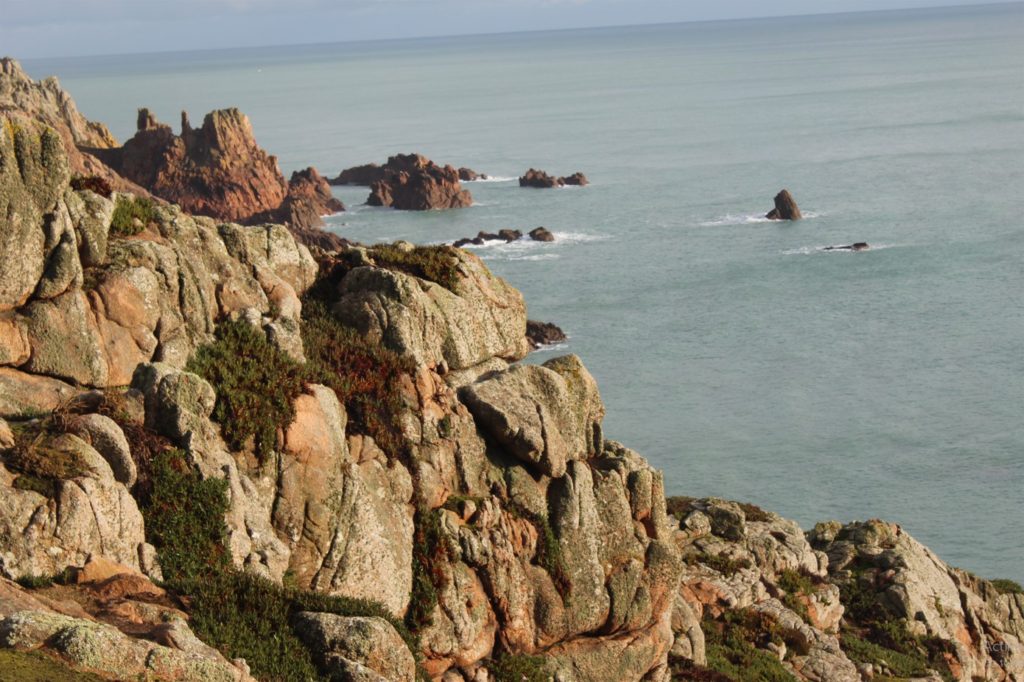
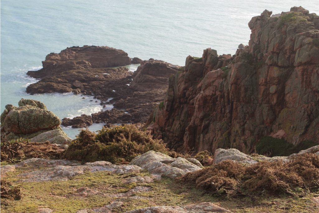
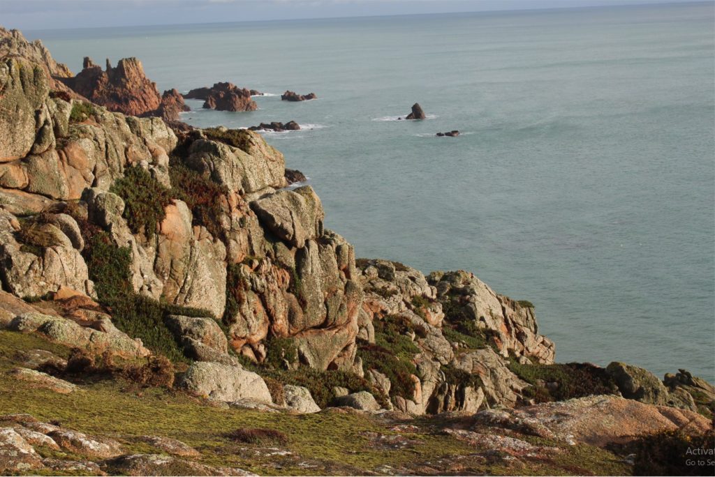
These are the contact sheets I have for my second photoshoot down at corbiere. I thought this would be a perfect location for a more coastal setting for my photographs.
Once again, I have picked and rejected the images that I want to include in my final outcomes after editing and the ones that I don’t want to include in my final pieces.
Key artists from the exhibit include Robert Adams, Bernd and Hilla Becher, Joe Deal, and Stephen Shore.
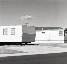
Robert Adams, Tract House, Westminster, Colorado, 1974, George Eastman House collections
What was the importance of the New Topographics show and its movement?
On the one hand, New Topographics represented a radical shift by redefining the subject of landscape photography as the built (as opposed to the natural) environment. To comprehend the significance of this, it helps to consider the type of imagery that previously dominated the genre in the United States.
Robert Adams, Tract House, Westminster, Colorado, 1974, George Eastman House collections
What was the New Topographics a reaction to?
Their stark, beautifully printed images of this mundane but oddly fascinating topography was both a reflection of the increasingly suburbanised world around them, and a reaction to the tyranny of idealised landscape photography that elevated the natural and the elemental
Robert Adams, Tract House, Westminster, Colorado, 1974, George Eastman House collections
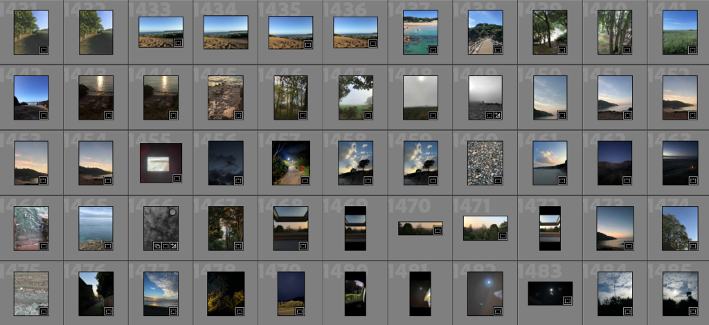
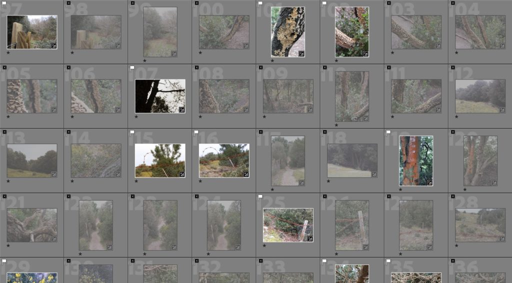
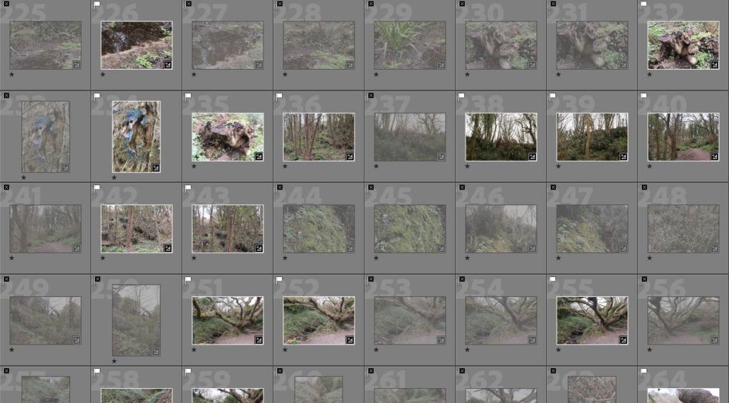
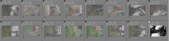
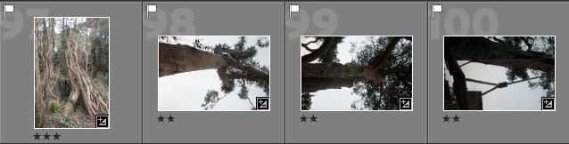
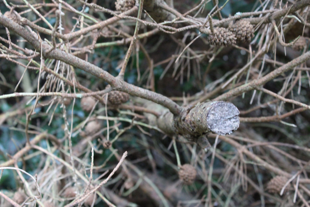
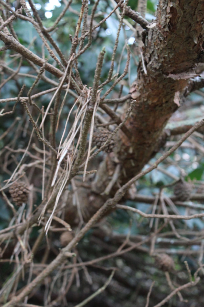
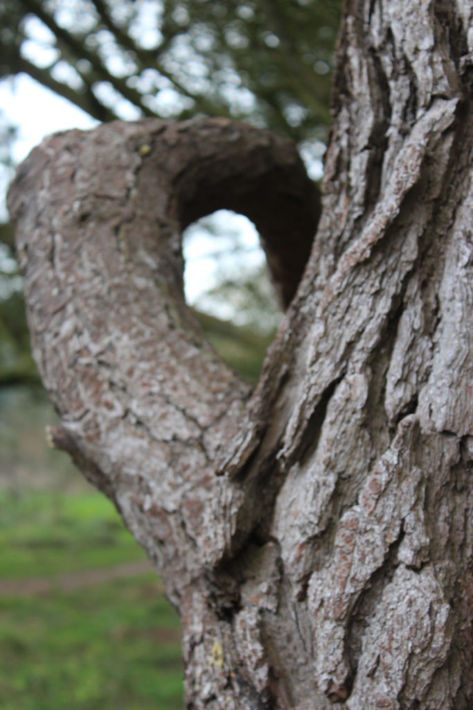
These are my contact sheets for every single photo I ended up taking. I took a really big range of photos so that I would have a really good selection to choose from. For these photos, I ended up going for a walk in St Brelade’s around where the railway walk and the dunes are. I ended up sticking to mainly photos of the woods as I enjoyed the landscape they provided in front of me. I prefer taking photos of dense areas that are also quite cluttered as they present a more interesting image.
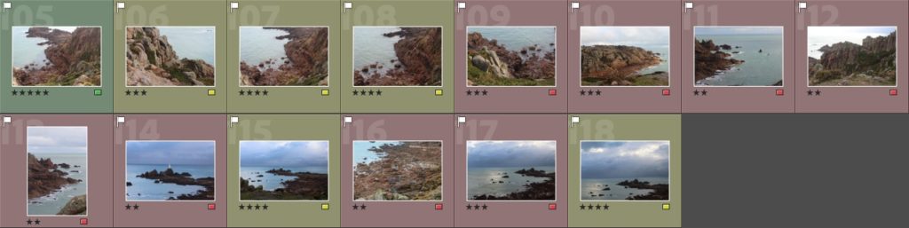
What I did was I picked or flagged all of the images that I wanted to use (pressing p), and then I rejected all the remaining images that I didn’t want to use for my final outcome (pressing x)
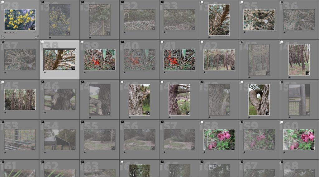
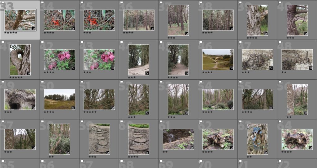
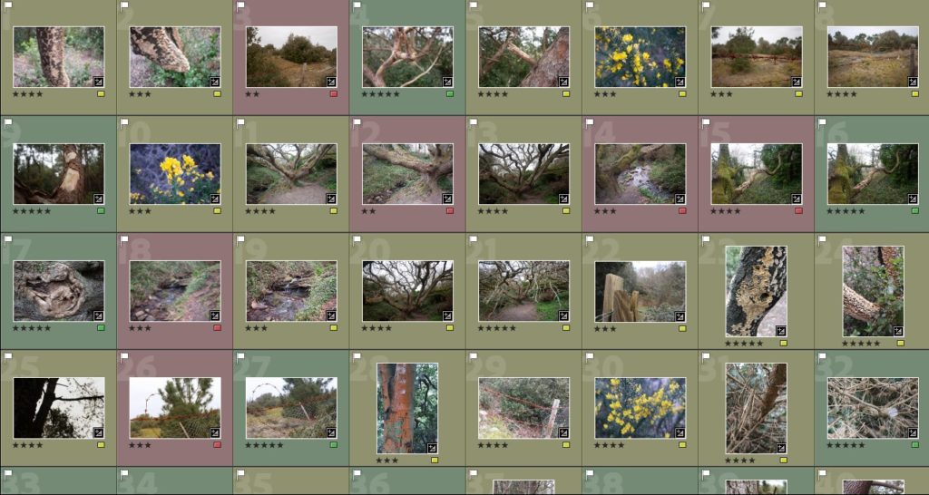
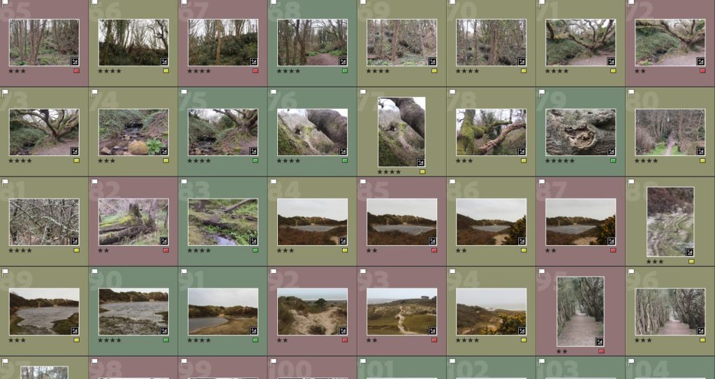
These are all the images I have ended up picking, getting ready to give them a star rating out of 5 and colour code them in order of green (ones I want to use), yellow (ones I might use) and red (ones I will not use).
Firstly I went through my images and colour coded them, separating the green ones to represent which photos I was using. I wanted to show a range of different landscapes and elements of nature. I was thinking of grouping different images together to show contrast e.g the soft clouds in the photos of the sky juxtaposed by the pebbles on the beach.
The majority of my photos will be in black and white to show my inspirations taken from photographers like Ansel Adams or Minor White however other photos will be in colour to show present day photography and the colour in nature.
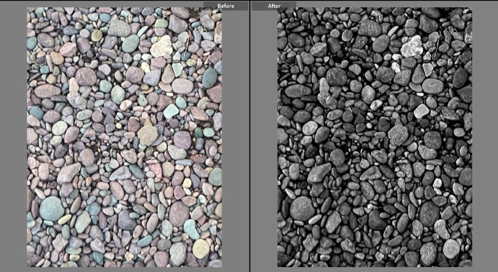
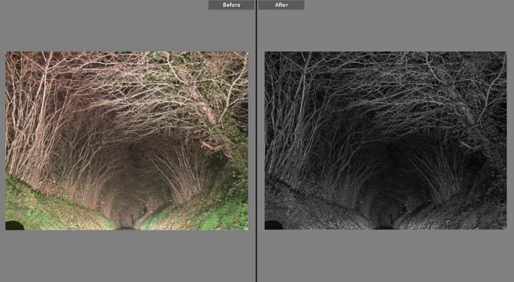
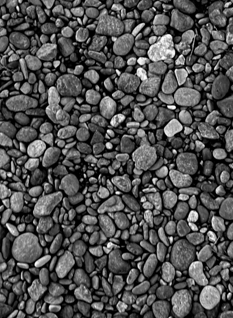
I edited the exposure in this photo to add shading and define tone of the pebbles as i felt the photo in colour lacked emotion.I increased the texture and turned down saturation of the photo to make it darker at the top and lighter at the bottom, this highlights the road that to me looks like a tunnel.For this image i focused on the colour of the sky to contrast my black and white images. I wanted to represent the sublime so i made the sky the main focus by increasing the saturation.This image lacked emotion to me so i made it black and white to almost tell a story – the house behind the tree makes the photo look almost eerie.
BLACK + WHITE PHOTOS
The images i chose to edit in black and white are the ones i think represent my photographer inspirations the best. The original photos didn’t provide enough inspiration for me so alongside turning down the saturation I edited the exposure and contrast to show a clear focal point for some of the photos, for example the image with sky view – I highlighted the clouds and attempted to eliminate the bottom half on the photo to make the focus the light of the clouds contrasting the rest of the image.
My favourite image from my black + white photos is the one of pebbles on the beach, taken at Anne Port. I like this because the pebbles provide different shades which reminds me of Ansel Adams’ zone system. I also like the photo because it shows texture in a different way to my other images.
COLOURED PHOTOS
I selected these photos because the colour reminds me of romanticism photography/art and colour being used to bring an image together. I edited most of these by turning the saturation up slightly and lowering the exposure.
My favourite photo from my coloured images is the one of the sea, because to me it looks like a painting, and the yellow tone of the clouds over the sun reminds me of romanticism art/the sublime. Although the sea takes up the majority of the image i’ve made the clouds/sky the focal point because to me it evokes the most emotion.
COMPARING IMAGES
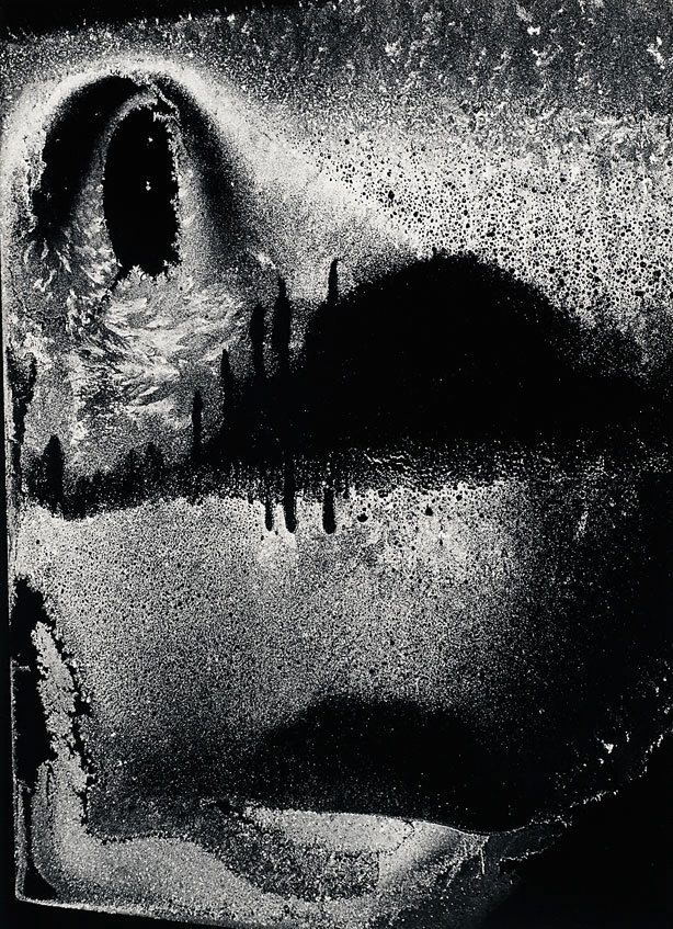
I’ve compared my photo (left) to one of Minor Whites pieces (right) i’ve chose to compare these images because they both present texture in a different way. Both photos are in black and white, however my photo is a harder texture and more defined whereas White’s image is a blur of texture, making it almost difficult to figure out what the photo represents. Both photos show a different range of light and dark tones in different places. However, the image on the right has wider areas of dark or light.