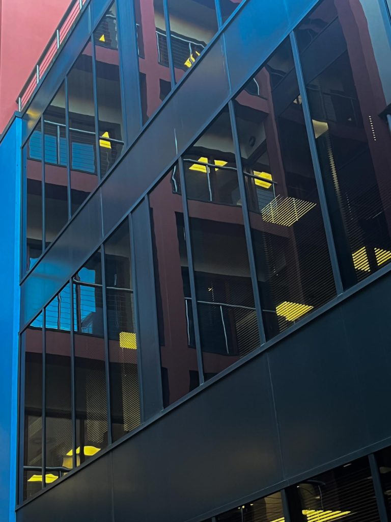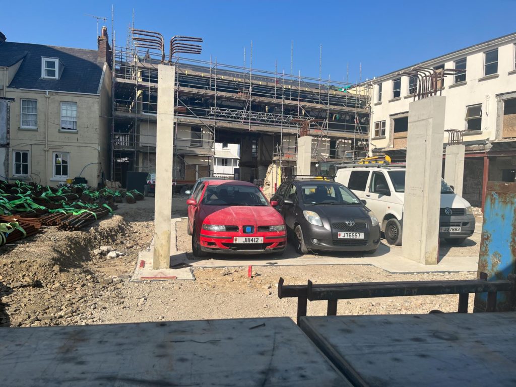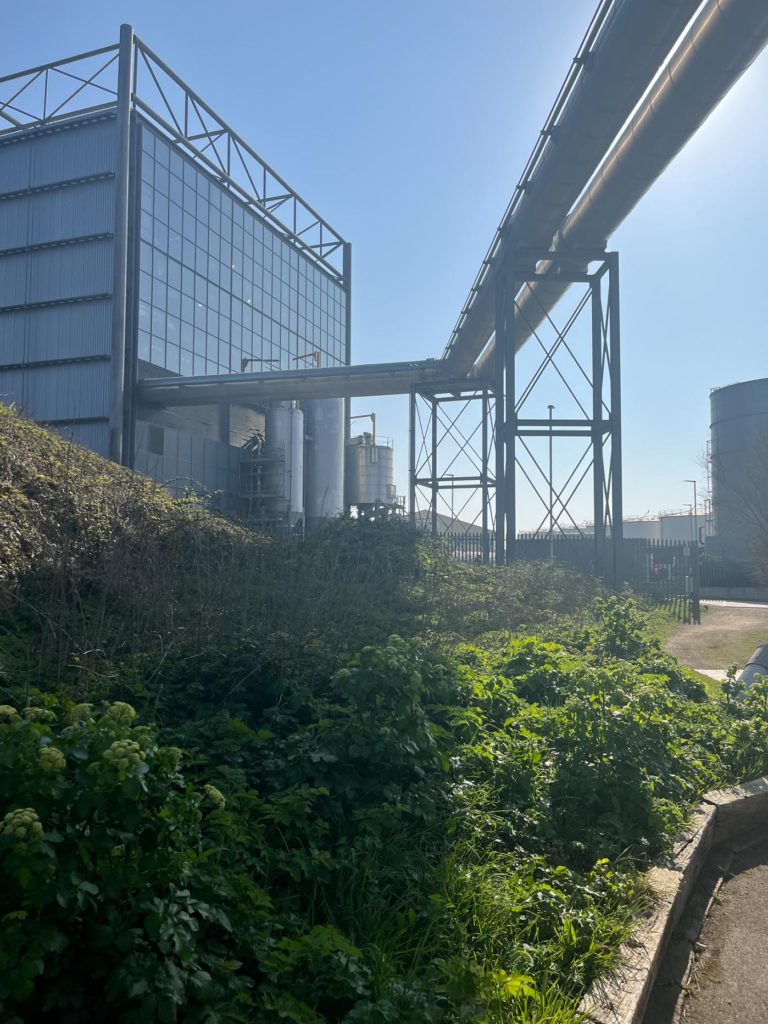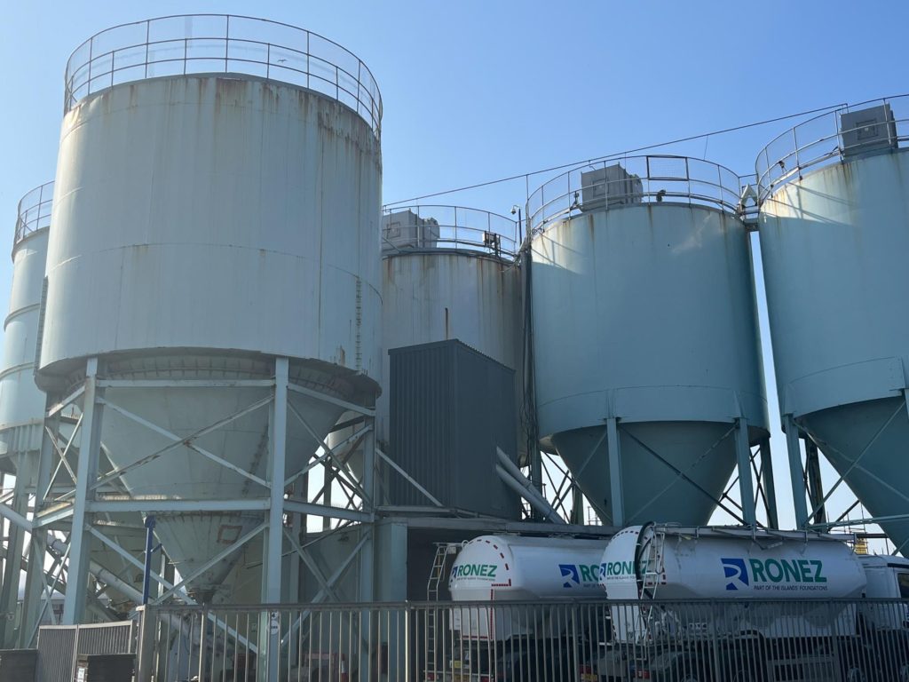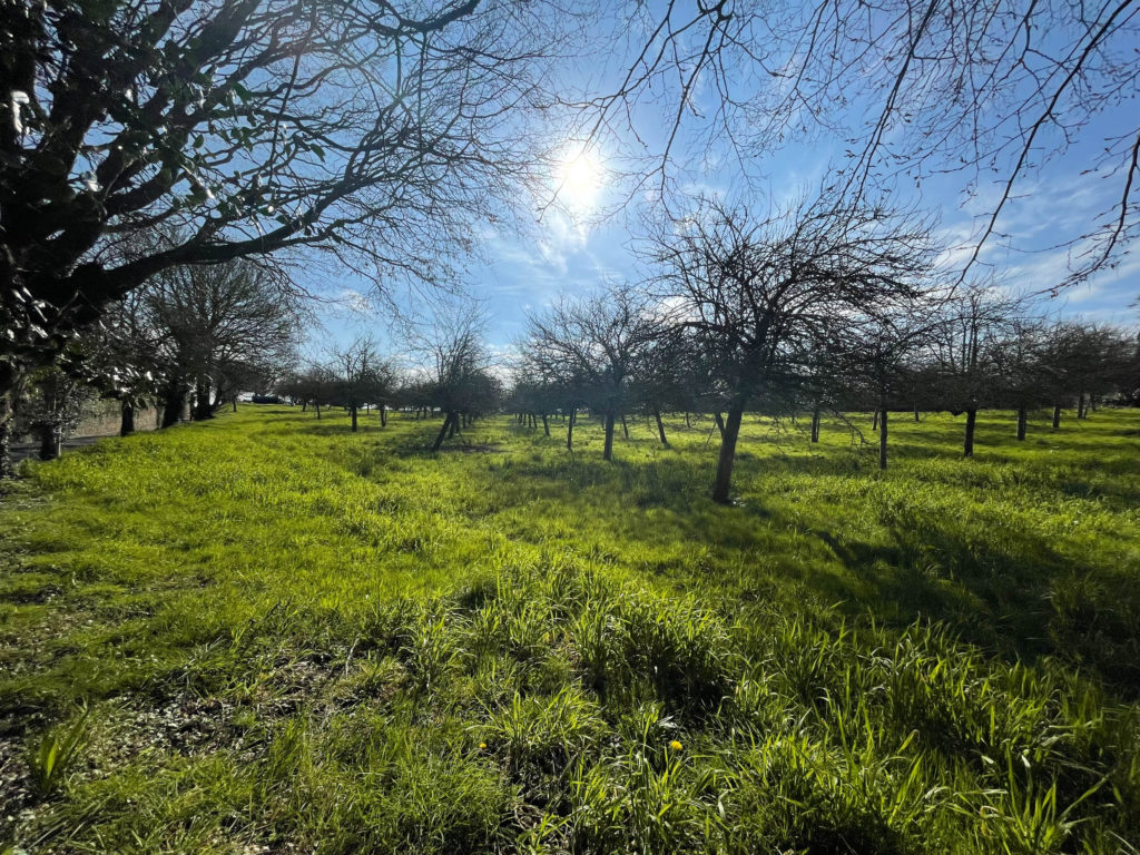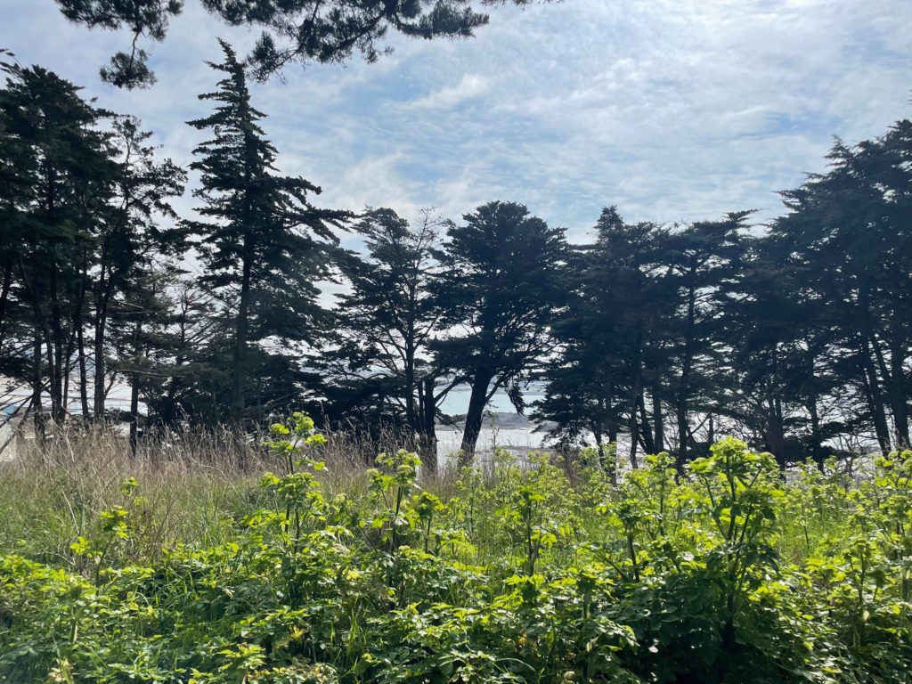
Urban landscape photoshoot

Shoot 1

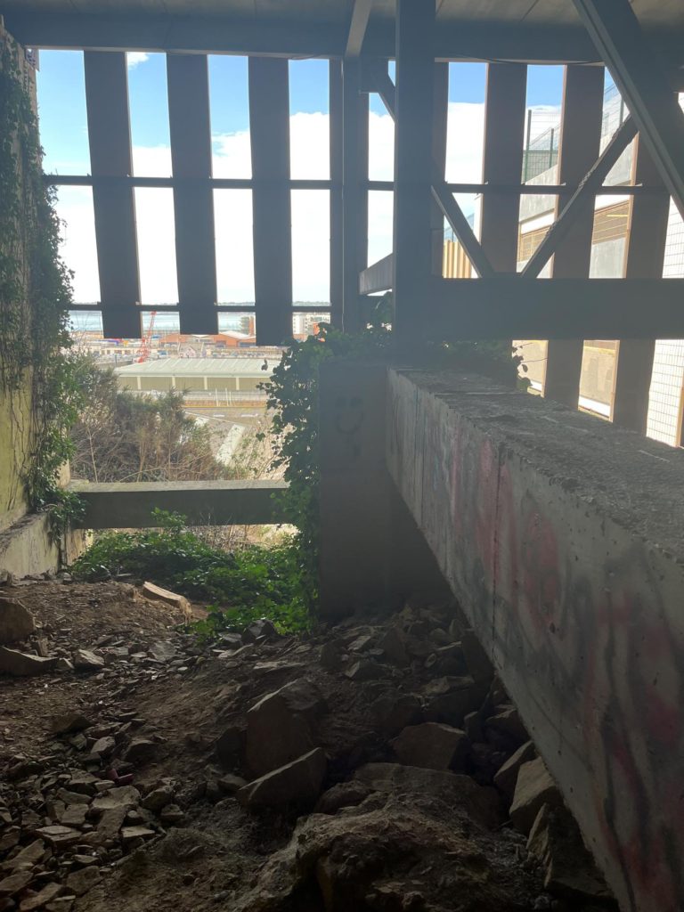
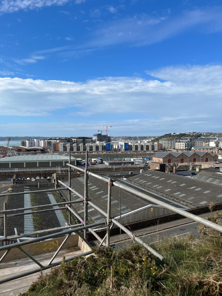
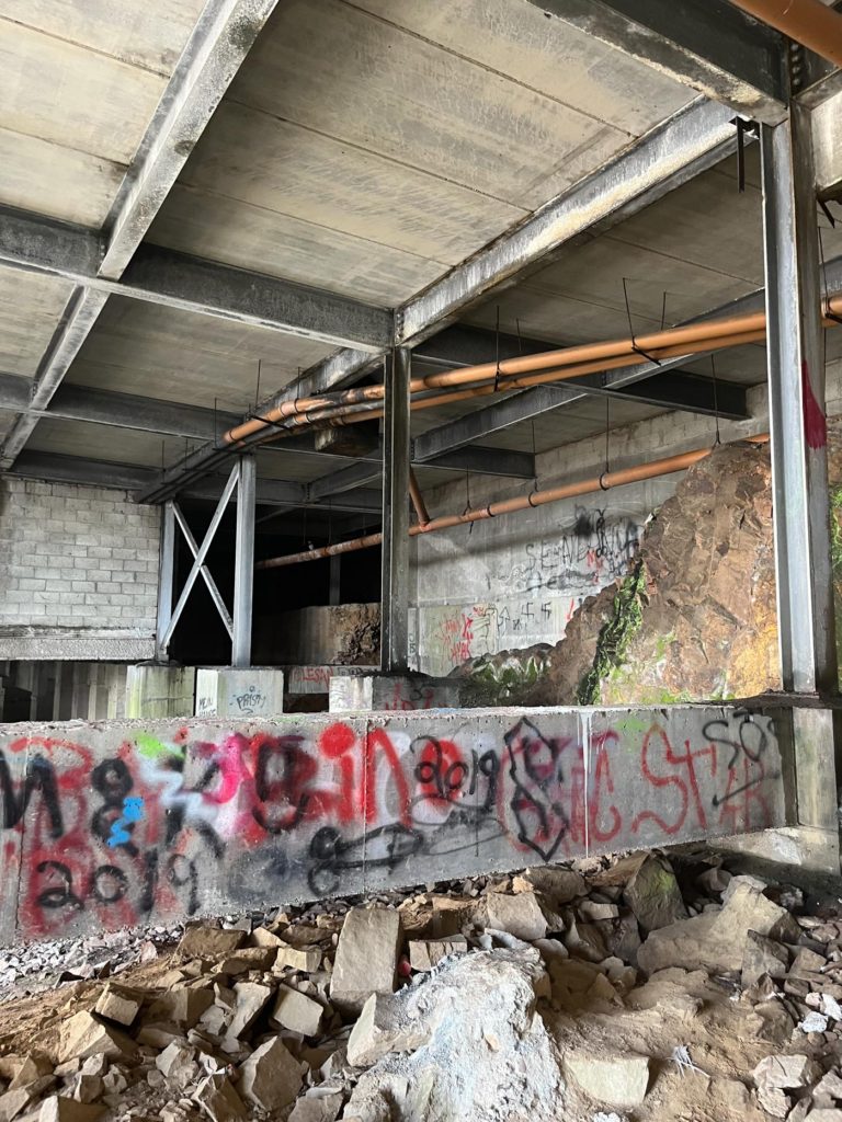
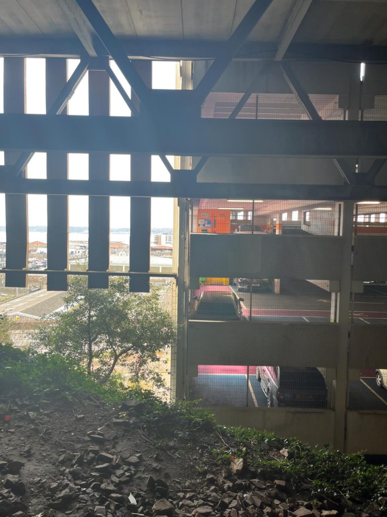
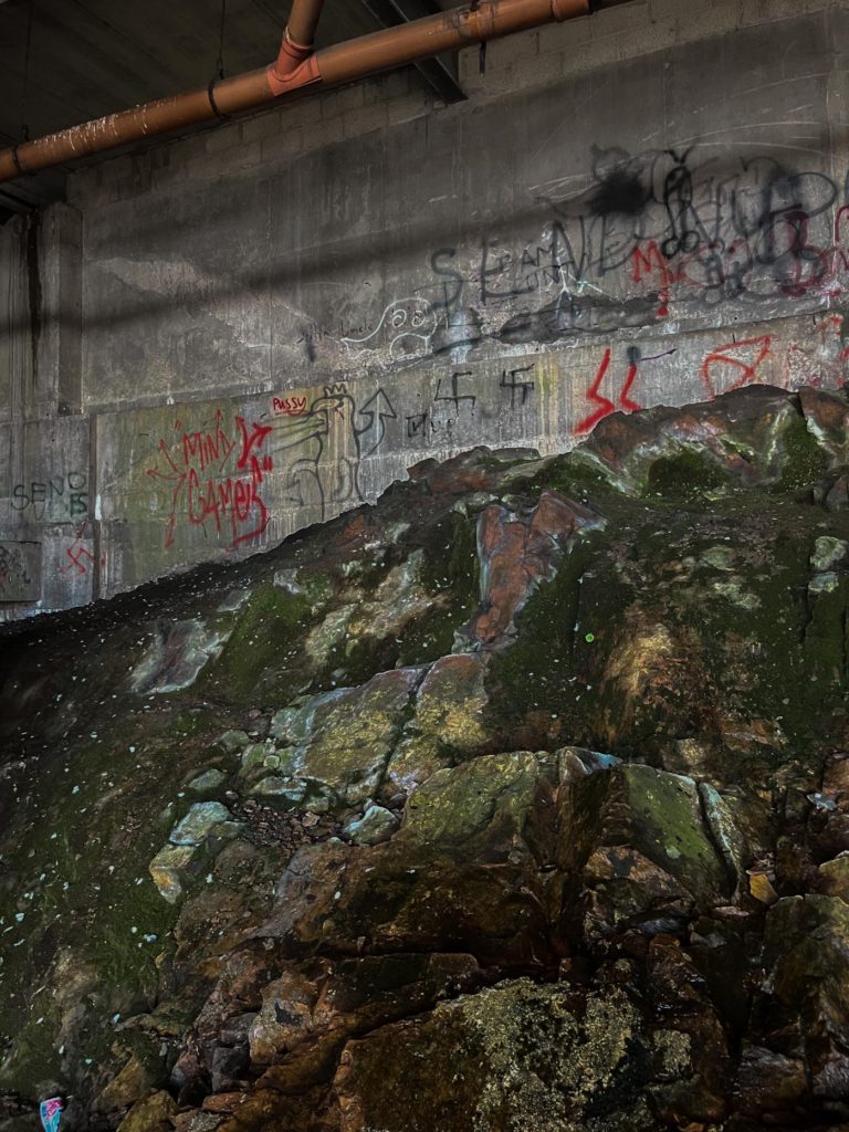
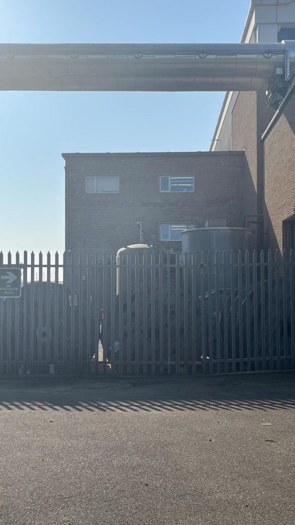
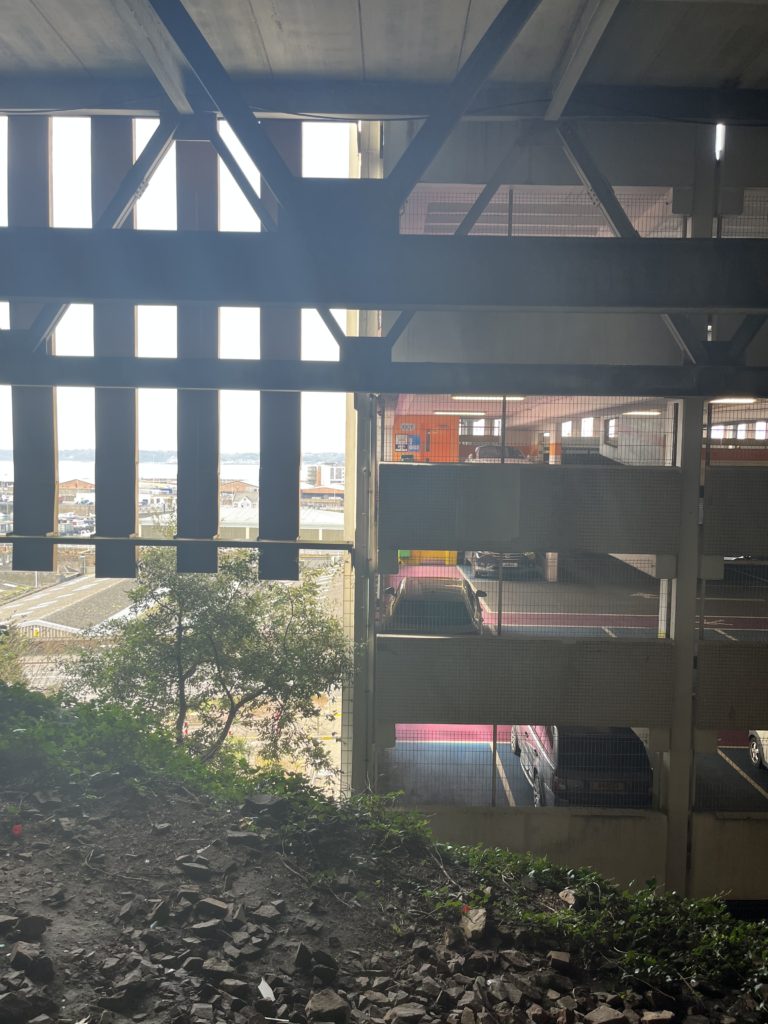
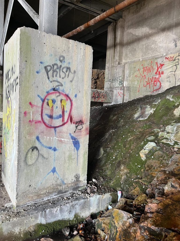
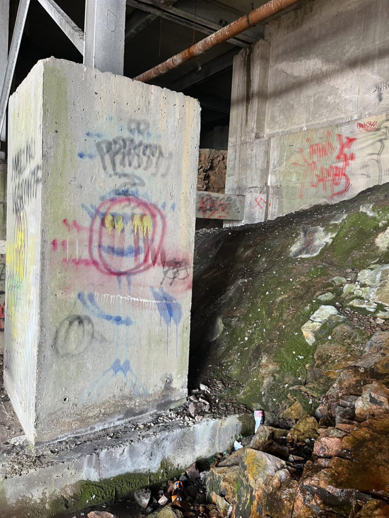
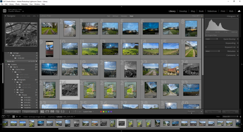
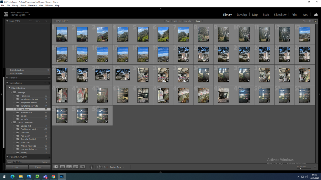
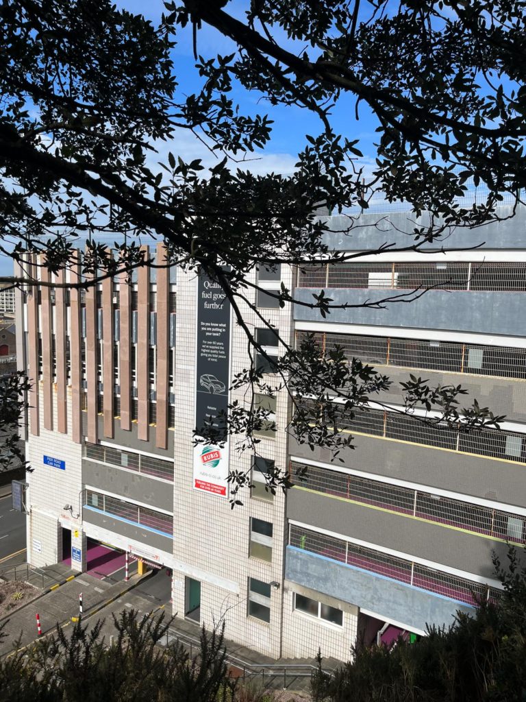
For my first shoot, I took photos on the cliffside of fort regent and down by pier road multi-story carpark, I also took photos behind the carpark by going along the pathway on the cliff edge. I used the flagging system on Lightroom to pick my best and favourite photos to use for editing.
Shoot 2
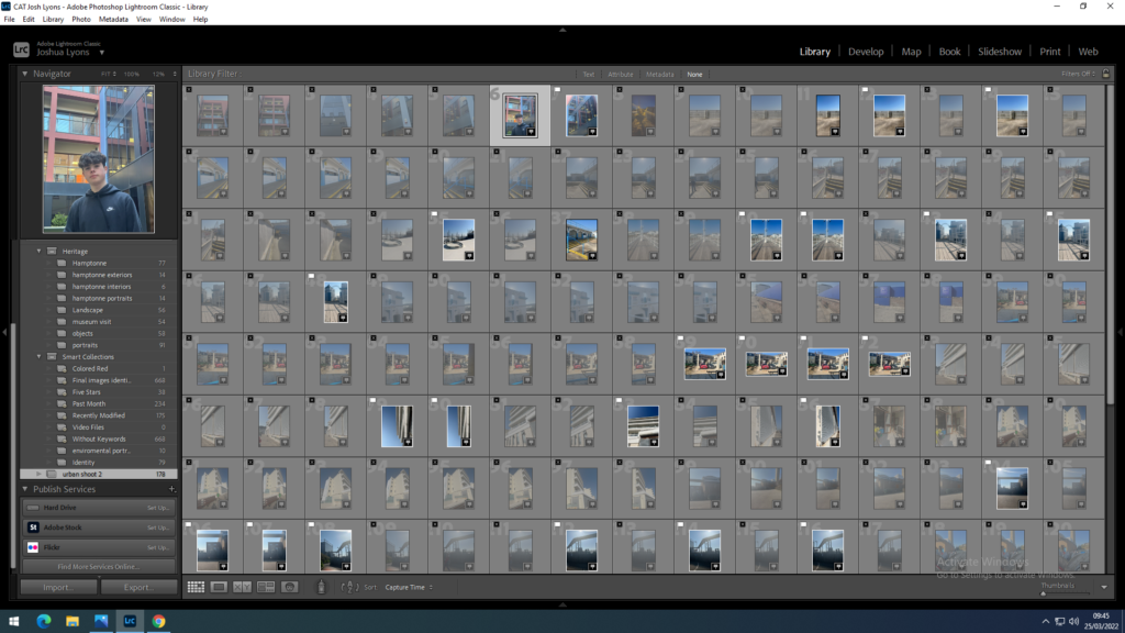
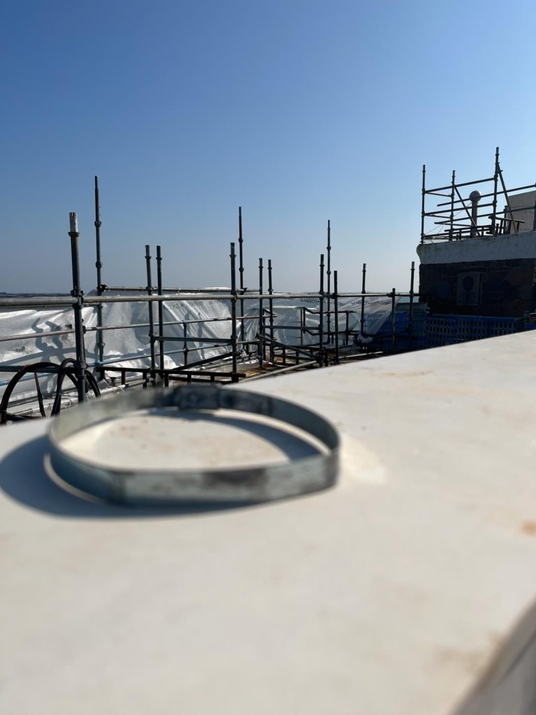
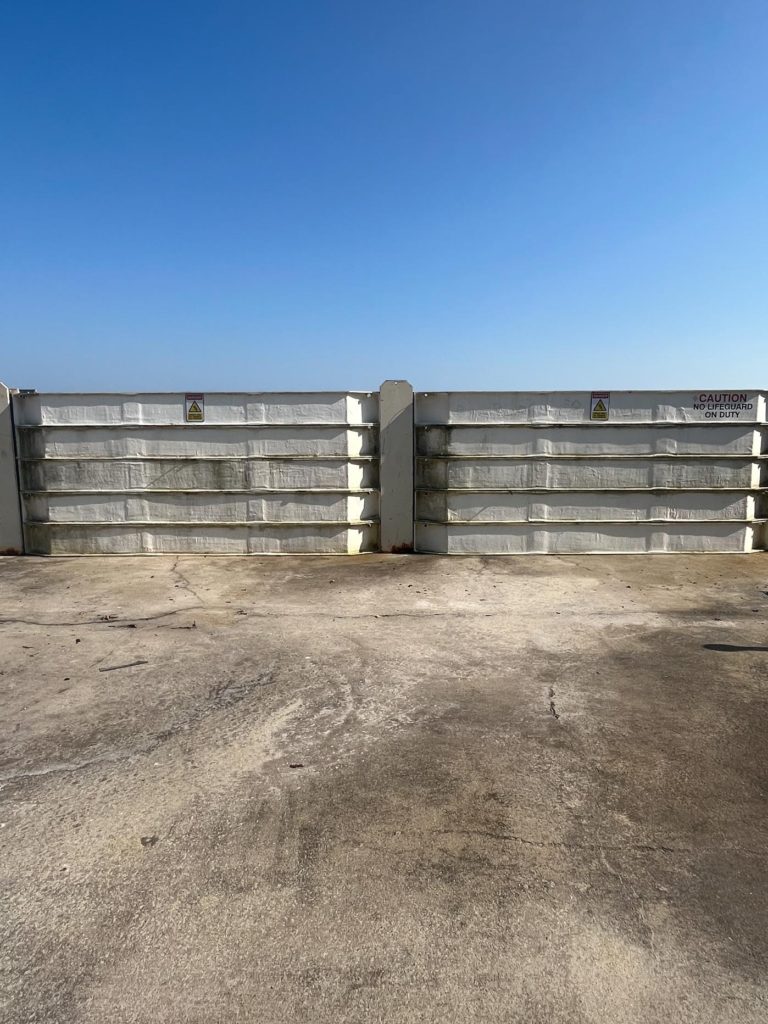
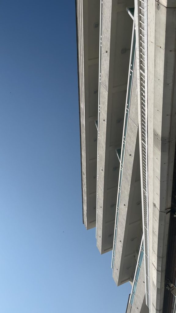
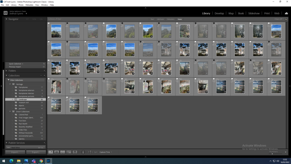
I took a lot more photos on shoot 2 compared to shoot 1, I once again used the flagging system on Lightroom to select my best images.
Best photos Shoot 1

I selected these images because I believe that they portray very well how a man-made urban landscape has a huge impact on nature and the natural landscape on the Earth, these were the best photos I took from shoot 1 out of the 55 photos take.

Best Photos Shoot 2

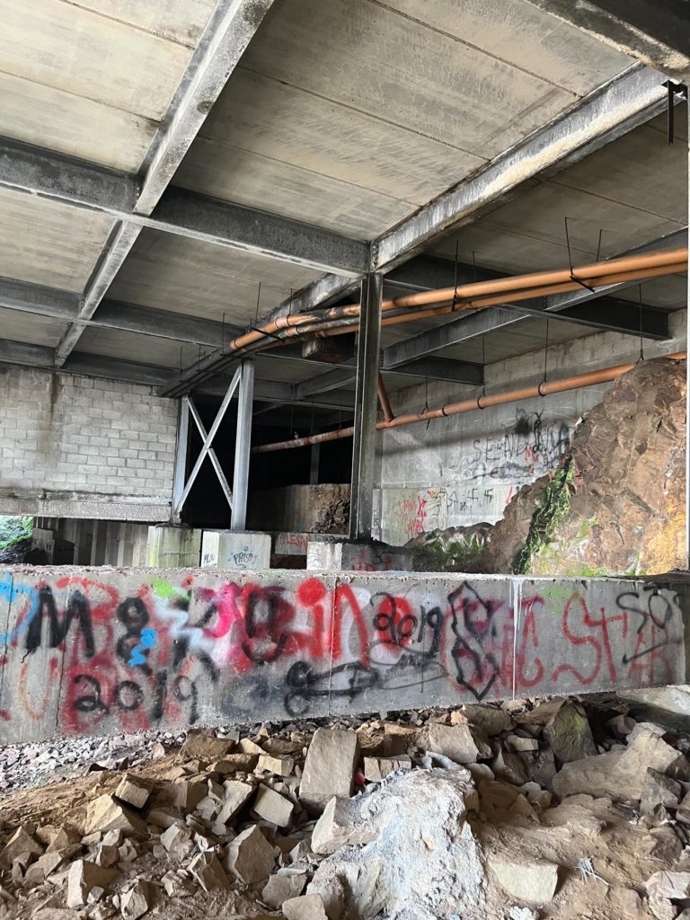
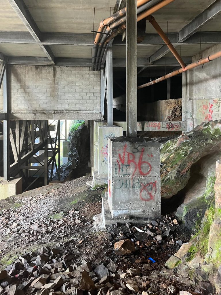
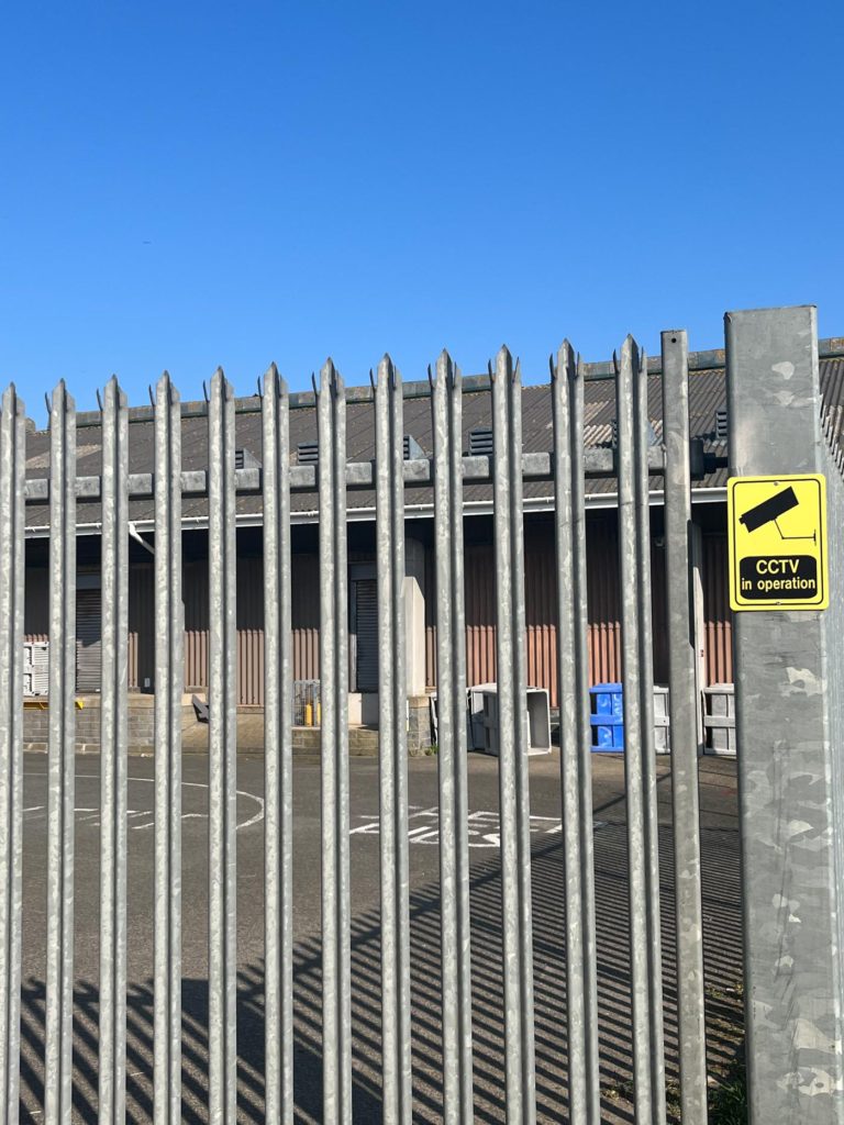
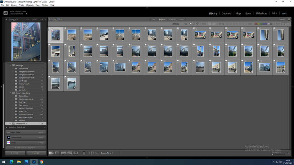
These were my favourite images from my second photo shoot, I like them the most as I believe these are the best images I took that portray an urban landscape the best.

Lightroom Edits

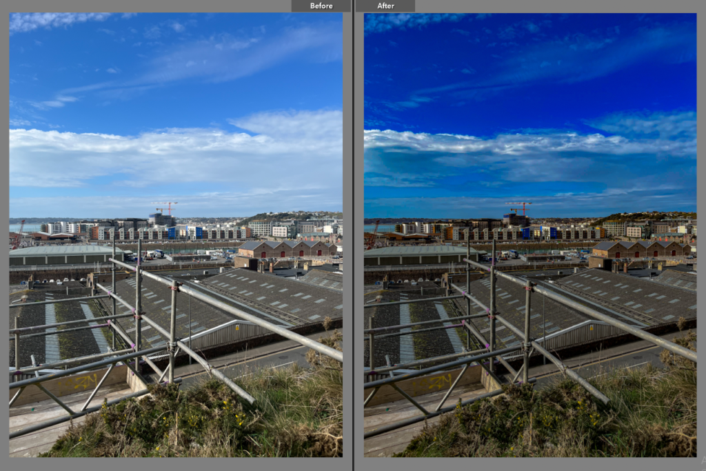
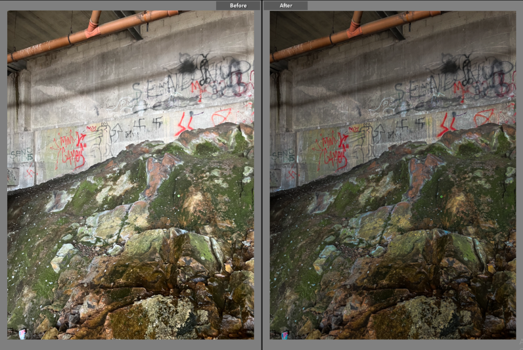
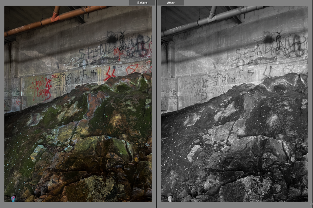
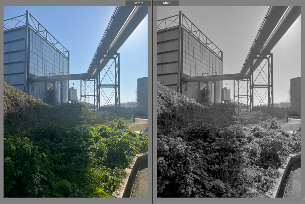
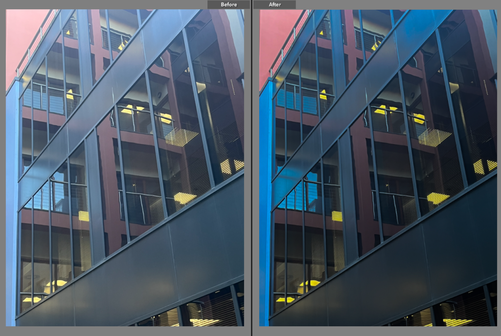
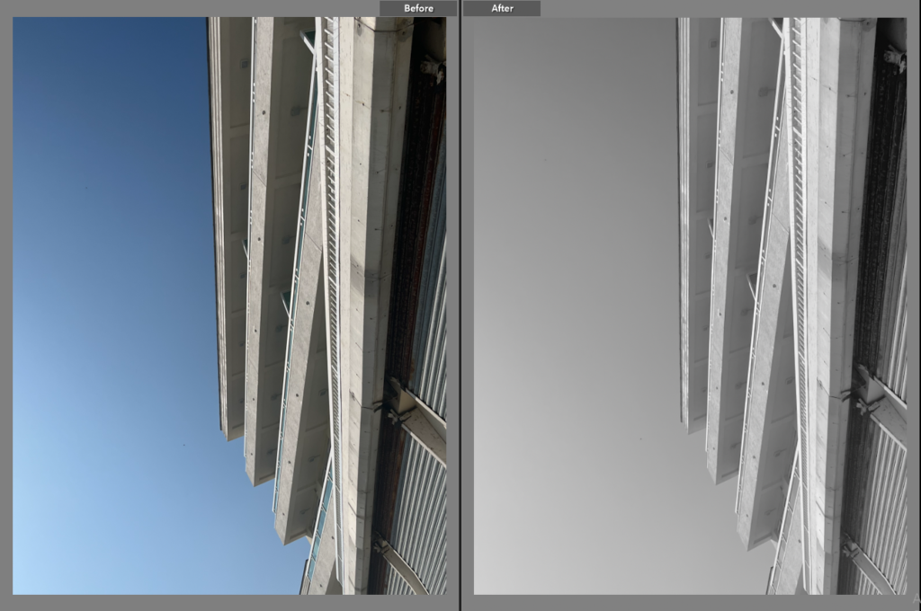
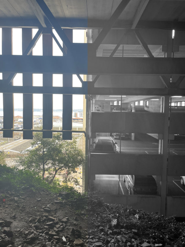
I used a before and after image on Lightroom to show the difference between the original image and the edited version of the image. Most of the Lightroom edits consisted of changing the contrast and exposure to make the images brighter/darker. I did this as some of the images cane out too bright or too dark and I wanted the images to look a lot more effective.

Shoot 1

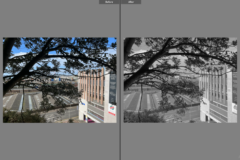
Once I edited the exposure and contrast of this image, I created a virtual copy of it to create a black and white version of the image as well, which is below.

Shoot 2

Photoshop Edits

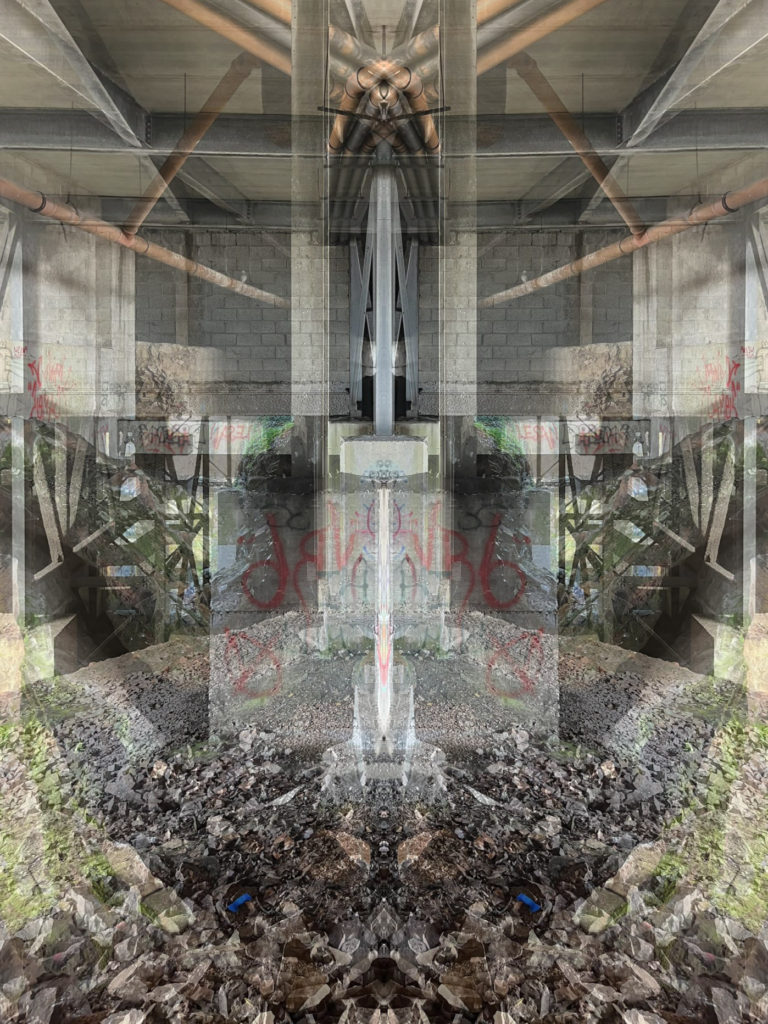
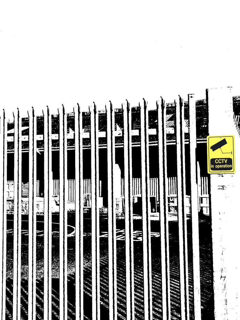
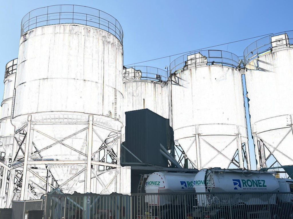
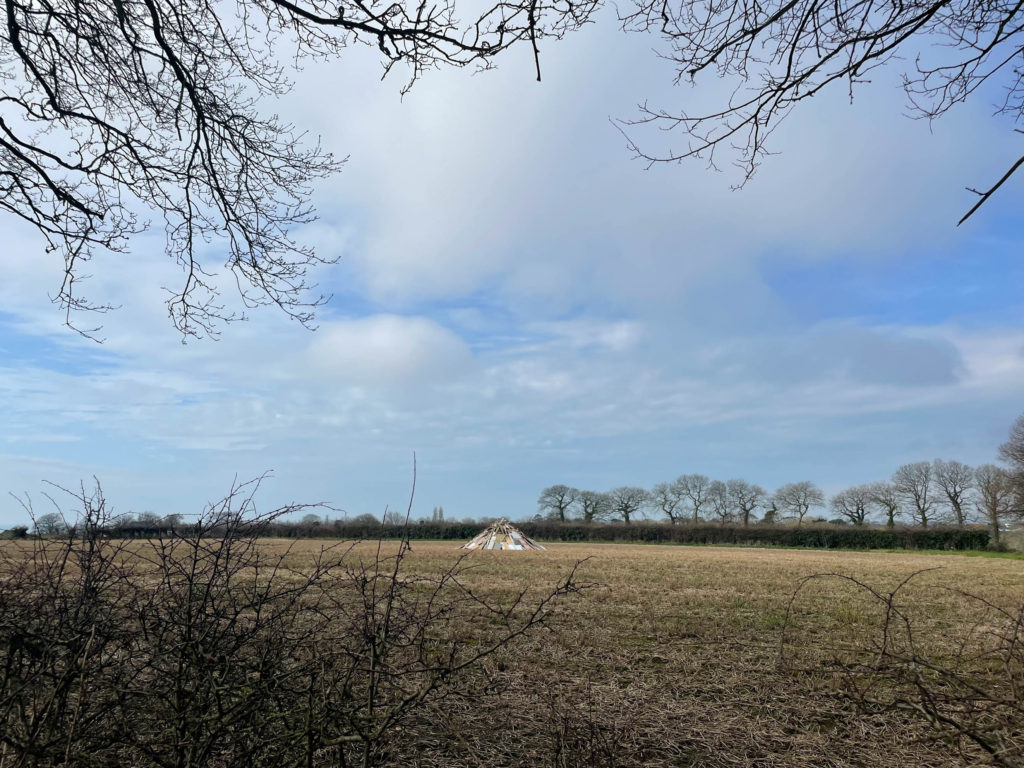
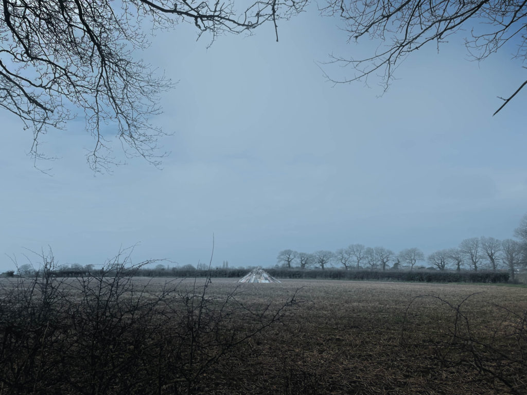
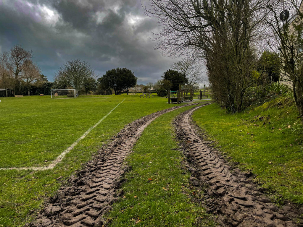
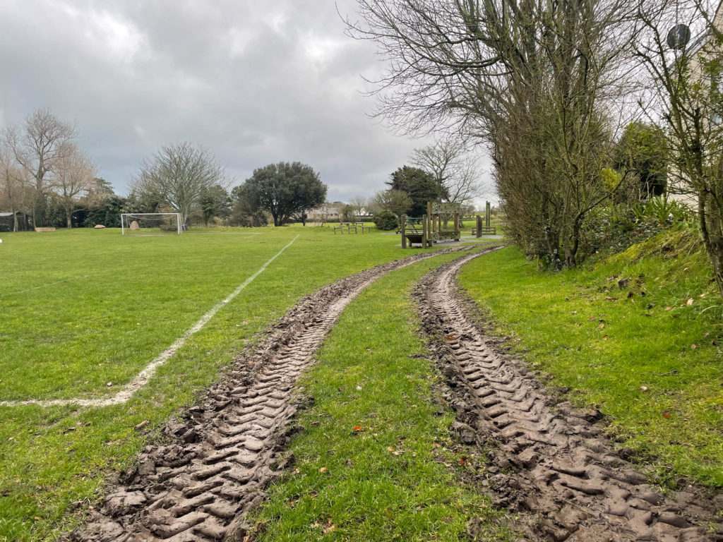
On photoshop, I experimented with introducing black and white into the images while also keeping parts of colour in the photo to create a unique and interesting effect. Original photos are on the left while the edited photo is on the right. I also experimented with a double exposure effect to create some unique and interesting images.

Shoot 1

Shoot 2

LANDSCAPE PHOTOGRAPHY IMAGES

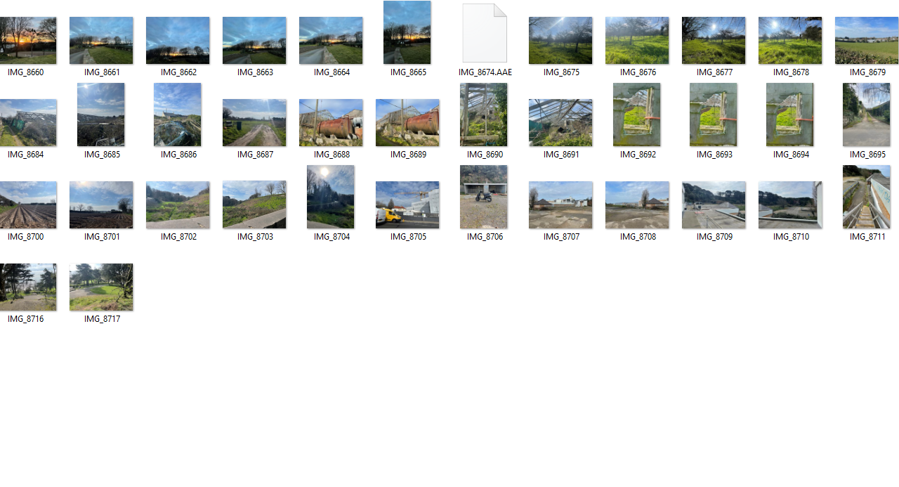
Contact sheets

Lightroom edits:

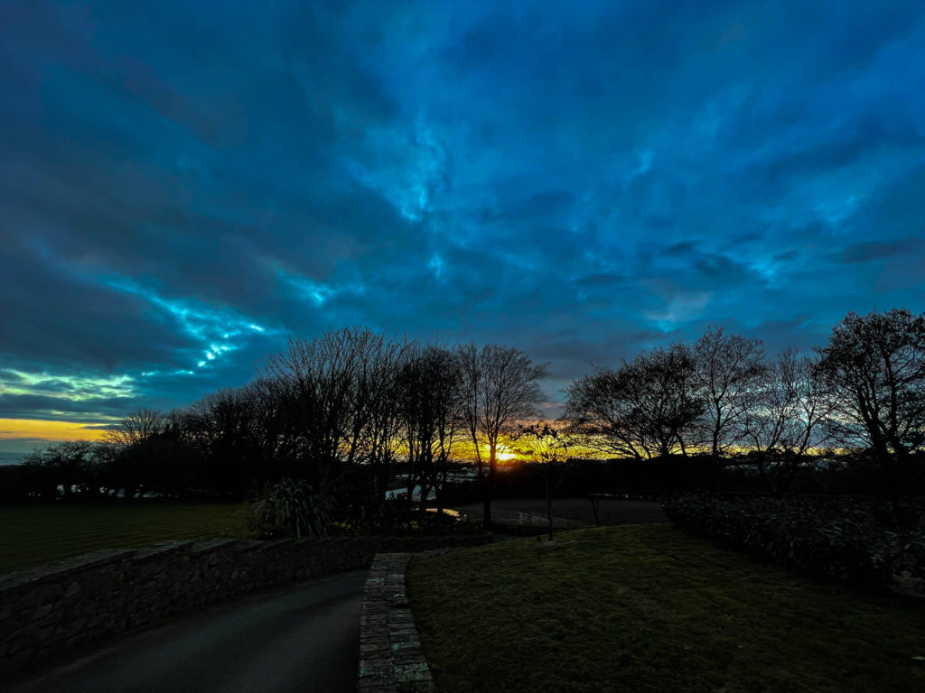
My favourite image:

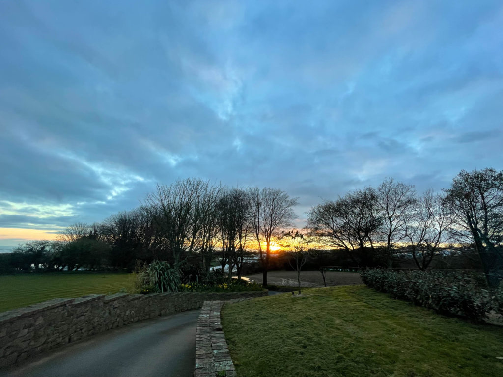
This photo was taken on Les Varines hill as the sun was going down. I like this image because I think the clouds and sun have a really good effect on the image due to the colours mixing together effectively. I also like the way how the exposure is low which makes the sunset stand out more than the trees and wall. The sky reveals a lot more detail than the bottom half of the image which is what I was hoping for when editing this image.

urban landscape photoshoot plan

places to shoot in Jersey:

  • la Collette
  • the harbour
  • skate park
  • building sites
  • next to tall buildings
  • abandoned buildings

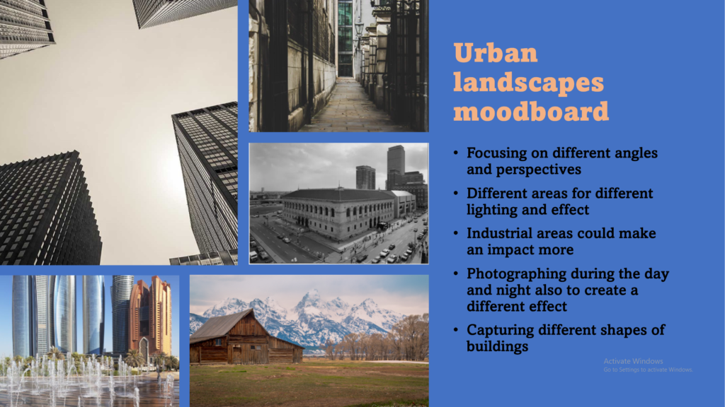
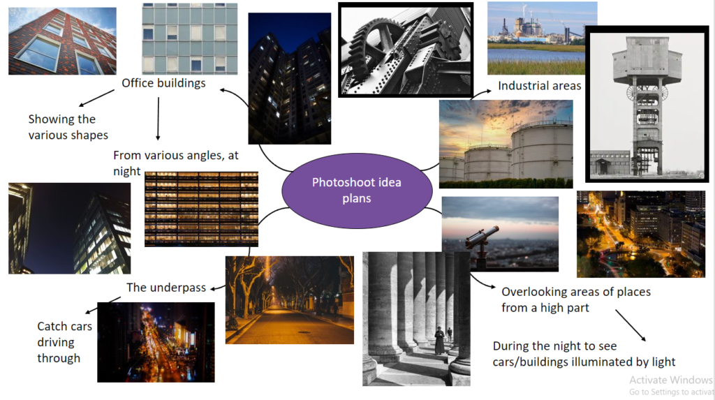
mood board

plan

shoot 1 –

  • location– skate park next to harbour
  • 100 – 200 images
  • time of day – just before dusk/ late afternoon
You've Never Seen Skate Parks Like This Before | WIRED
HD photographs of skate park in Parc de Bercy Paris France

shoot 2-

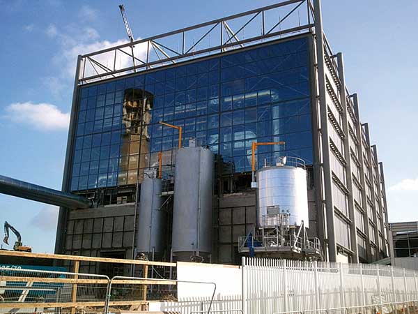
  • location – La Collete
  • 100-200 photos
  • try take when the sky is dull and cloudy
  • take pictures of rubbish burner etc
La Collette Power Station - Jersey Electricity
SSDA Commendation: Energy from Waste Facility, La Collette, Jersey –  newsteelconstruction.com

moodboard

I will be using this as a reference towards my photographs as it will help guide me. I will mainly focus on taking photos during the day as it is easier to capture shots in the daylight and i preferably think that photos look better during the day as you can edit and change them to how you like, i will experiment taking some in the dark to expand my work and use of skill.

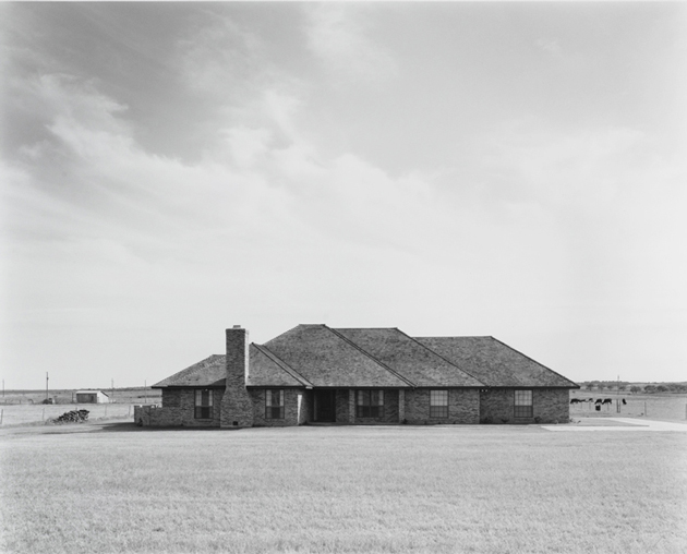
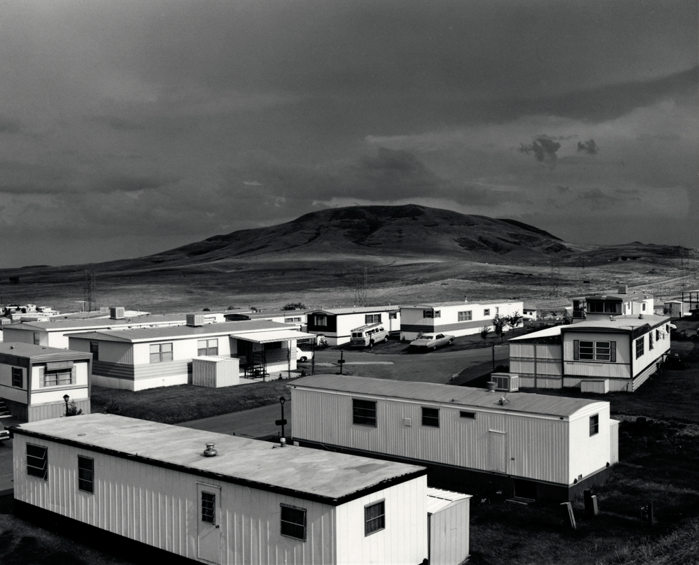
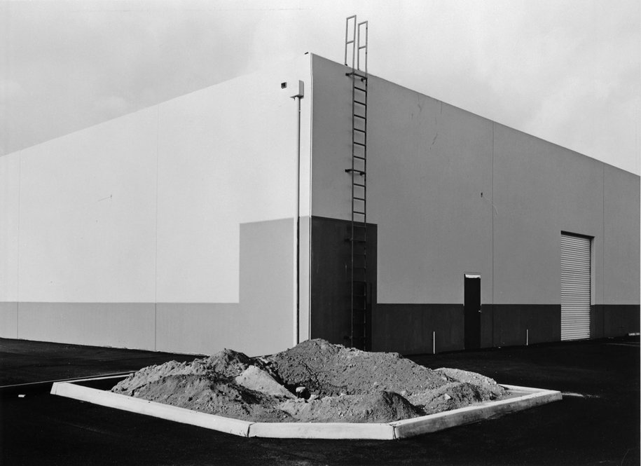
The new topographics

 The 1975 exhibition New Topographic signalled a radical shift away from traditional depictions of landscape. Photographers switched from photographing the traditional romanticism through rural and natural landscapes to taking pictures of man made, urban footprints. This restaging of the exhibition includes the work of all 10 photographers from the original show: Robert Adams, Lewis Baltz, Bernd and Hilla Becher, Joe Deal, Frank Gohlke, Nicholas Nixon, John Schott, Stephen Shore, and Henry Wessel.

Many of these new photographers were inspired by the man-made and wanted to show its beauty in different weathers/times of the day but also a way to emphasize how much the impact of industrial development has made to the natural landscape, an exhibition in the International Museum of Photography in Rochester, New York showed this feeling of unease towards this issue.

examples –

Keld Helmer-Petersen

  • A Danish photographer.
  • Studied at the Institute of Design Art school in Chicago.
  • He developed a graphic black and white aesthetic which he is mainly known for.
  • He studied various silhouettes and industrial structured which he turned into dynamic, abstract patterns,
  • Once he returned to Chicago he then produced various photos of harbours and railways which led to a collection of photos being published in the book “Fragments of a city” in 1960.

Examples of his work –

 Power Lines, Chicago, 1951
Power Lines, Chicago, 1951
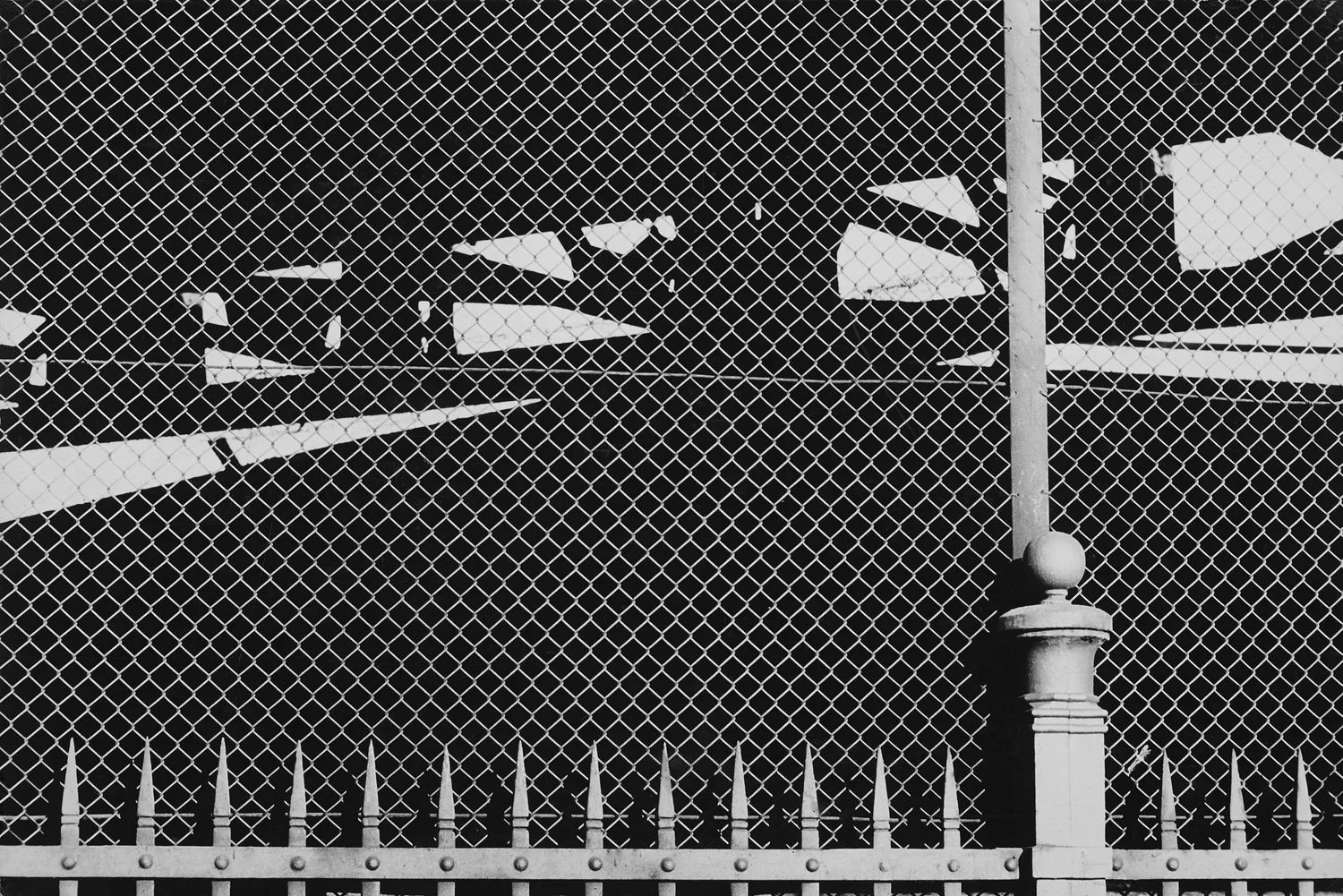
 Fence, Copenhagen, 1950s
Fence, Copenhagen, 1950s
 Wires, Copenhagen, 1950s
Wires, Copenhagen, 1950s

Analysis –

 Fire escape, Chicago, 1951
Fire escape, Chicago, 1951

I think that this is a successful picture taken by Keld Helmer-Petersen in his well-known, abstract graphic black and white style which I will use to reference in my own work because I like how Helmer-Petersen has taken a photo of a fire escape where there would be many lines created due to the stairs which creates the atmosphere of chaos which would happen if there was a fire as everyone would be panicking. I also like how the black and white graphic effect creates this feeling of smoke, which would be caused if there was a real fire and makes the photo appear as if it is foggy as the background is a murky white colour which would be created in an event of a fire and it stands out well against the dark railings because of the heavy contrast between them of the two tones, which I really like as it is able to catch your attention and make you think about what may be happening in this photo and if there was a real fire taking place. I think that the bendy line, created by a railing adds a high level of contrast to the photo as it is seen to be very uniformed in a way with straight lines which are sort of in an order whereas this looks really out of place because the others are straight whereas this is not.

Charles Sheeler

  • An American painter and commercial photographer.
  • Born in 1883 in Philadelphia, Pennsylvania and passed away in 1965.
  • Studied at the Pennsylvanian Museum school of Industrial art from 1900-03.
  • Recognised an a founder of modernist photography/art who also experienced with industrial/rural photography.

Examples of his work –

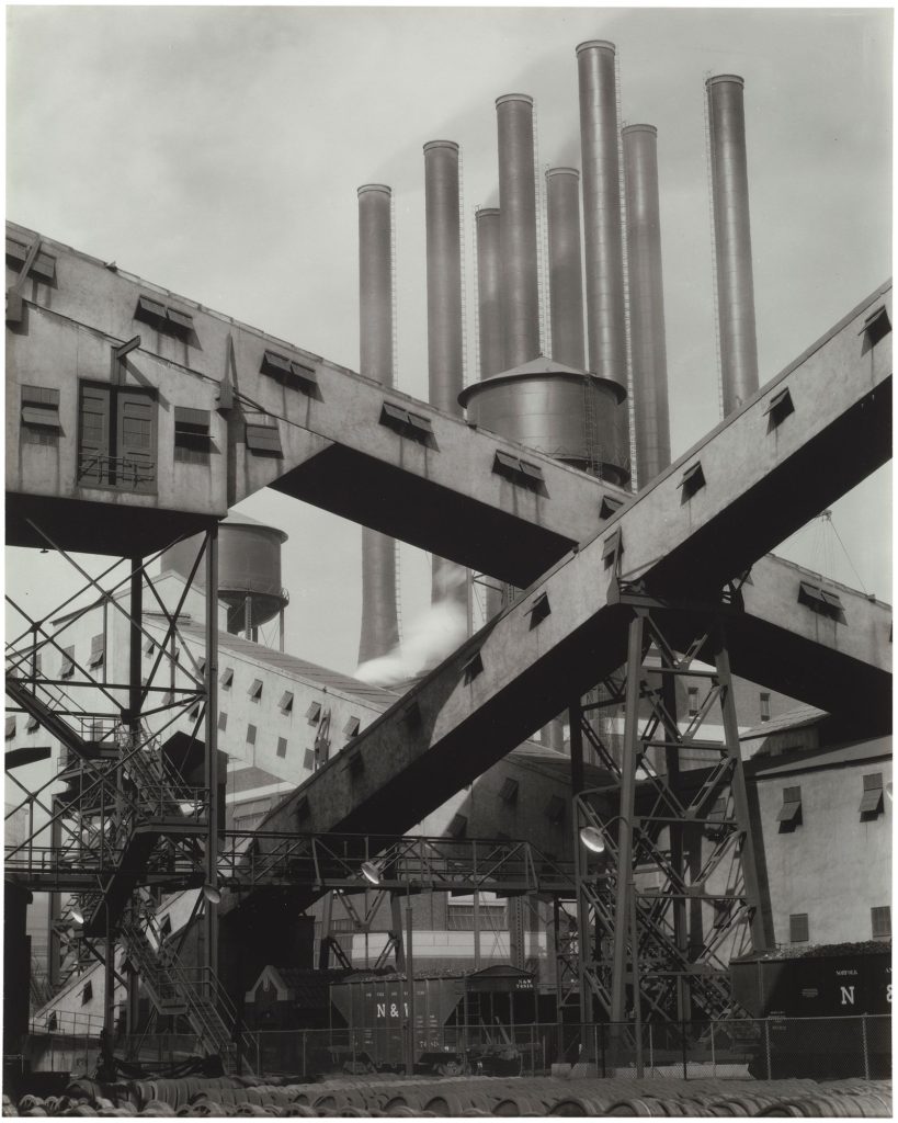
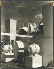
Upper Deck - Charles Sheeler

Analysis –

I am going to work in Sheeler’s style and have his influence within my work because I believe that this photo taken by Charles Sheeler because is a successful representation of industrial/rural photography because it shows a pipe of some sort, from a factory which is currently working as you can see the smoke which is produced which can create the idea of how these fumes are impacting the atmosphere due to mans creations. I also like how this photo has been taken in black and white and brought in different grey tones as it can help show how old tis factory may be and how it hasn’t been around for only a short period of time, instead a long one. I think that the texture also adds a layer of depth and feel to the photograph as it makes it look very heavy, strong and industrial as many factory machines would have this exterior.

Rut Blees Luxemburg

  • Born in 1967 in Germany.
  • Studied photography in the London University of Communications.
  • British based photographer.
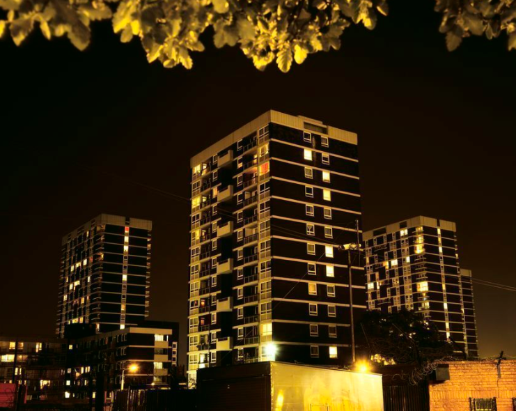
  • Focuses on taking photos at night of the urban landscape, with office blocks or street lights only being featured in her photos.
Welcome to Paris Photo global fine arts photography programme - Paris Photo  Programme

Examples of her work –

A modern project (High rise), 1995.
Nach Innen/ In deeper, 1999.
Caliban Towers II, 1997.

Analysis –

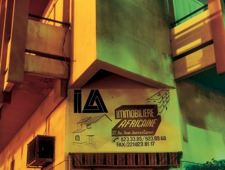
Immobiliere, 2003.

This picture taken by Rut Blees Luxemburg of a part of a building during the evening/night time is a successful picture which I really like and going to take inspiration from so that I can bring their influence into my own work during my photoshoots because I like how there are different shapes from the building which can create a range of different shadows, which it has done in this photo, as it uses the light from streetlights or surrounding lights to create a variety of shapes. I also like how one side of the building is illuminated unlike the other because it shows the rich, golden colour of the building which makes it feel as if it is a warm and welcoming atmosphere to the space and others whereas the other side is darker and more dismal, showing no signs of life which can create an unwelcoming and cold atmosphere which can make people feel as if they don’t want to go in there. There is also a level of personality and uniqueness which is brought into the photo through the sign which is position on the side of the building and taken so that it is in full view of the photo. I really like how Rut Blees Luxemburg decided to add this in as it creates a backstory for the photo and you wonder why she has taken it and if it holds any significance to her.​

In my work, I am going to take photos during the night (and some in the day too) which is like Rut Blees Luxemburg’s work because I like how the lightning can create different shapes, feelings, shadows, etc. I will be taking photos of various office buildings and other industrial areas where they have modern straight-lined shapes on them because I like how it can create a sleek, repeated look to the photo.​