link to romanticism + artist reference

My work’s link to romanticism

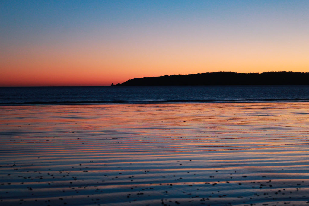
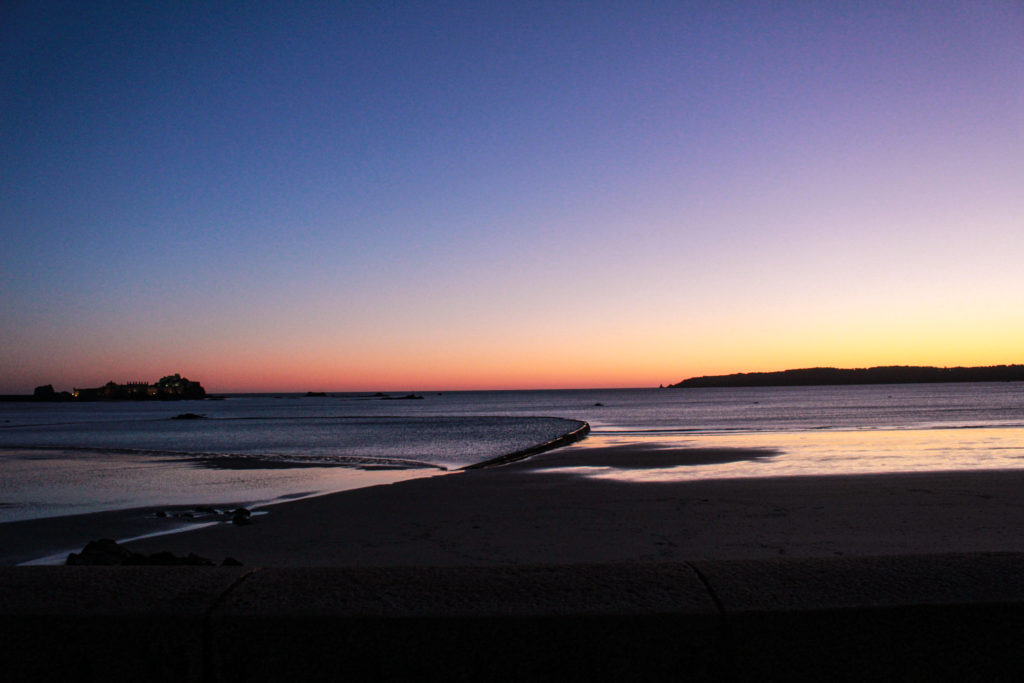
In this blog post I have included an artist reference with includes an analysis of my work vs Fay Godwins. I think that my research on Ansel Adams’ work helped me understand romanticism more before going out and taking my own images, meaning I could identify the best weather conditions so that romanticisable features such as clouds were more present.

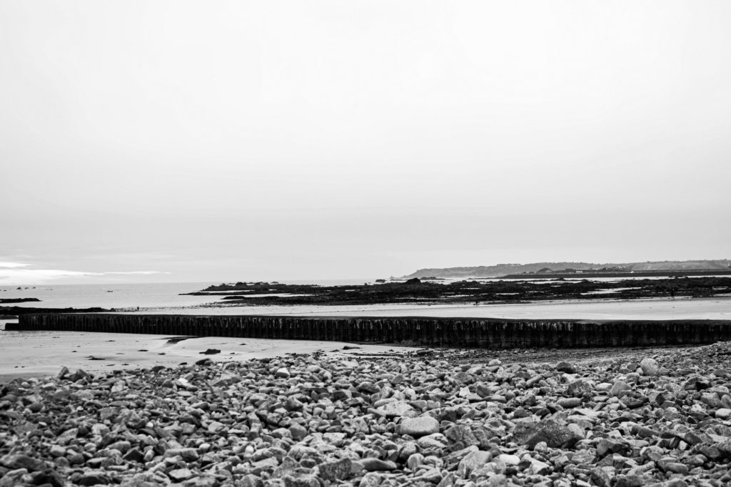
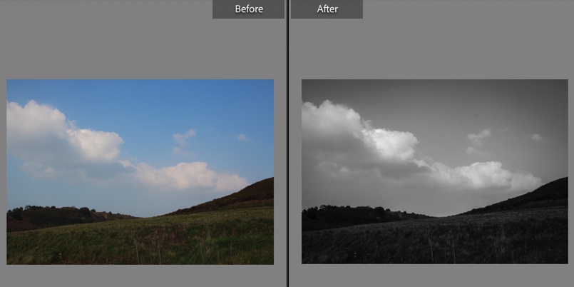
Furthermore, shooting in black and white of editing my images in monochromatic meant that my final pieces have more of a dramatic feel and this helps demonstrate the nicer features of Jersey natural environments. I also think that the image that I have included in my artist reference is a good example of a romanticised image as it has some of the same features but is different from Godwin’s work. I took inspiration for her work and used this to take some of my own images down at the beach, making this artist reference easier to create.

Artist Reference- Fay Godwin

My WorkSimilaritiesFay Godwin’s
BeachLandscapesHills
RocksFocal pointGrass
Cool tonedClear SkyWarm toned
PeopleSymmetricalNo animals
Zone systemHorizon lineLighter image
Long structureRule of thirdsLimited tones
Straight horizon lineCloudsCurved horizon line
RocksClear foreground Textured
This image has an empty alt attribute; its file name is image-199.png

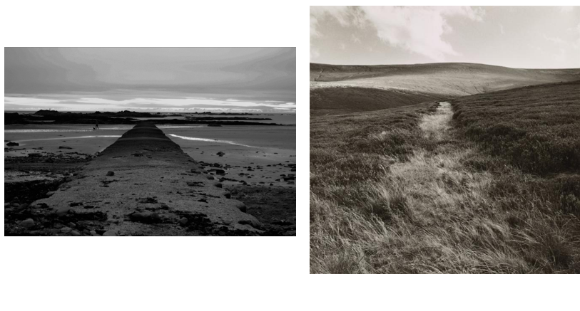
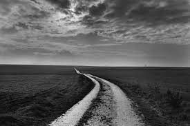
Image analysis- Fay Godwin

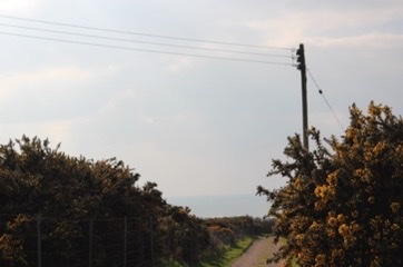
Similarities- I think its important to note that the main focal point of both of these images look very similar, and the centre of both pieces are a path or can have been created by humans. The horizon lines are also located further to the top of both images, meaning that the rule of thirds isn’t really followed in either photograph. Furthermore, I like that both of these images are symmetrical, with the landscape being just surroundings to the paths and this makes both more aesthetic and therefore catching you eye.

Differences- Despite our final pieces of work being quite similar there are multiple differences including the landscape locations themselves as might was taken down at the beach and Godwin’s looks like it was taken amongst some grassy hills, mine also includes a manmade structure as is more a visual representation of our modern world. Overall my piece is more cool toned and demonstrates more range of the zone system, whereas Godwin’s is a warmer tone with less components in the original photograph. I would say Godwin’s piece has more texture then my final image as the clarity of the glass in the foreground means that the natural features come through much more in comparison to the rocks in my image.

Link to romanticism- Despite Godwin’s piece being created during the romanticism era, I think that my piece along with her work together to demonstrate how the world and changed and is now more manmade, as my piece has a built structure and Godwin’s piece is only filled with natural features such as green land and hills. The work of Ansel Adams and the zone system is more obvious in my image as there is a wider range of contrast with the cooler tones of the image, as Godwin’s is more warm toner. Both of our images do romanticise the different landscapes and this is done well with the help of editing and Lightroom and my piece. I like that the monochromatic editing makes the images more dramatic and shows more of the natural beauty of the environment.

rural landscapes- final pieces

Final Images and Analysis

I have selected this as one of my final images as I think that there is many strong features of this image, starting with the perspective of the image, as I had to position the camera low down to the ground, and to make the structure of the image in the centre so that the final piece was symmetrical. Furthermore, the rule of thirds isn’t very present in this piece, but I like that the structure makes up the majority of the width of the image and then it disappears and gets smaller, this then nearly meets the horizon line and creates parallels within the image. I have made this image monochromatic and tried to make the contrast more clear so that the concept of Ansel Adams’ zone system is more present and the fact that this image has a large depth of field means that the wide range of tones is demonstrated all throughout.

This image was originally one that I thought was unusable as I thought it looker very average in colour, which is why I have edited it in monochromatic. Additionally, I think that the fact that the sky lacks tones and is all white is an advantage as it just means that contradiction between the structures, rocks and sky is made more obvious, making the image stronger. I like that this final piece has lots of components so that the cluttered foreground contrasts with the background. Furthermore, I think that the lack of quality if the image gives it more depth as the it makes the shadows look slightly blurred despite me adjusting the dehaze in Lightroom. This piece does contain some weaknesses including the fact that it could be seen as boring as not true to the project as there is manmade structures in this piece.

This is another one of my good images from my photoshoot down at the beach, I have selected this as one of my final images as I think that the composition of the image wasn’t planned but turned out to be successful as I like how most of the image is the land and this contradicts with some of my other final images as they most contain sky. I think that the depth of field with this image is important to note as it means that a lot of the landscape is present and it really shows how important this is when taking landscape photos. Its important to note that this image has been edited so that the rocks are very dark and this contradicts with the light blue, yellow and blue sky. Furthermore, I think that the water which lays on the sand that appears blue on the sand and the blue sky help link the image together.

This photograph was taken during my photoshoot along St Aubins beach, the best part of this image is the colours, and I have enhanced these in Lightroom. I really like that the sunsets contains contrasting colours as the orange and the blue work well when reflecting back onto the sand. Furthermore, the composition of the image and the fact that half of the image is a fake reflection and half is natural features means that the photography itself would be seen as a contradiction. I think that the abundance of parallel lines within the image ties the whole image together they help the image become cohesive as its the only part of the image that matches together.

I have selected this final piece because I think that the perspective of the image is really important as it means that more of the natural landscape is in view and creates a straight horizon line and this image is symmetrical as the top half of the image is sky and the second half is land, structures and sea. Furthermore, I like that this image was taken at sunset as it means that the colours can be easily saturated and the blacks in this piece contradict with the yellows and the fact that everything is in focus means this is more clear. One weakness of this image could be that its very generic and many people have seen this type of landscape photography before but I think that the strengths of the image save it.

Rural Landscapes Photoshoot and Editing

Photoshoot Plan

For my rural landscapes shoot, I am planning to take pictures above St Ouen’s bay in St Peter and St Mary. I’ll try to take photos on a sunny day, but I think that some clouds could add moodiness to my images which could improve them – for example, moody skies adding a more dramatic look to my images. In my images, I will feature fields and farmland to emulate the work of Don McCullin, one of my studied artists.

This image has an empty alt attribute; its file name is images-79.jpg
My photoshoot plan

Contact Sheets

Below are images of my contact sheets, pictured in grid view in Lightroom.

This image has an empty alt attribute; its file name is 5FA53CBD-4ADD-4EF4-B790-BE53E1F265B2.jpeg

In these images, I had trouble with overexposure – I fixed this by turning it down and changing the setting to manual focus on my camera which helped. After putting my images in Lightroom, I used the P and X tools to filter out my good and bad images. I then went through my selected images, picking a narrower selection, and using a red colour filter to highlight them.

This image has an empty alt attribute; its file name is 5C58B8CD-B84F-4DE5-8314-31FA46D1266A.jpeg

Here I struggled with overexposure again, but went into manual mode and turned the exposure down which helped. Pictured in red are my best images, edited in black and white.

This image has an empty alt attribute; its file name is 00D20A6C-32C8-4C96-8950-CCCE0205A4DA.jpeg

Evaluation

Overall, I think this photoshoot had good and bad points. – The weather and cloud were quite variable which made the lighting inconsistent in some of my images. – This made them a little tricky to edit. This also caused some overexposure which meant the skies weren’t as moody and dramatic as I would have liked, but this was not noticeable in some images and was helped with editing later in my process. There were good bits about this photoshoot though too. In particular, in some of my better images, I achieved the moody skies and dramatic landscape look that I wanted. I also have some images that have some interesting leading lines like in Fay Godwin’s images, which I really like. If I was to redo this shoot, I would maybe shoot on a misty or foggy day, near some cliffs or the sea on a day with choppy conditions or some big surf, to respond more to the idea of romanticism.

Best Images

My best images edited and selected using colour filter and flagging in Lightroom.

I then used Lightroom to adjust my images in black and white. I then found a pattern of editing that I found worked quite well for my images. I increased contrast, then decreased highlights to bring out the moody skies in some of my images. I did this to emulate the work of Don McCullin, who uses dramatic skies in his images, relating to the feature of the sublime in romanticism.

Here is a before and after of my editing process in Lightroom Classic

Also in my editing, I added grain and texture to my images to create a film-like effect. To make this effect even further in the future I could shoot in a black and white film camera on a landscape shoot.

Edited Final Images

This was taken in the back roads of St Ouen’s bay, near Bethesda nursery.

I chose this image as one of my best due to a few things. For example, I love the dramatic sky and how it looks like it is looming over the hills. The leading line that carries the eye from the left to the right over the top of the hill is my favourite thing about this image – It reminds me of Fay Godwin, one of my chosen artists. Furthermore, I think my editing was quite effective here. – decreasing highlights to make the sky work well here I think, as well as my use of contrast.

This was taken in St peter, near Mont Matthieu.

My favourite part of this image is the strong leading lines. These leading lines include the road to the right of the image, which bends into a circular shape to the right, creating circular shapes. The leading line of the field and the plastic wrap of the crops are broken up by a verge, which creates contrast between the bright white of the plastic, and the darker tones in the road and verges to the right. I also like how these lines lead to the vanishing point which features the tower in the distance. This tower is centred, which I think helps to keep a balanced composition in the image.

This was taken in St peter, above the bay.

I chose this image as one of my final ones because of the powerful sky, and also the interesting composition. The powerful sky in this image includes elements of the Sublime and the idea of romanticism. The composition is unconventional here: the sky takes over almost the whole image, which could show the power of nature. The contrast between light and dark tones in this image was achieved by my editing mostly, which helped to keep the sky dramatic and increase the contrast in the field too.

This image was taken near the image above, in St Peter’s above St Ouen’s bay.

I chose this as one of my final images due to the composition, and the way the eye is led down towards the horizon, with the sea. The trees and powerline frame the path in the middle nicely, and the clouds are slightly dramatic with light peeking through.