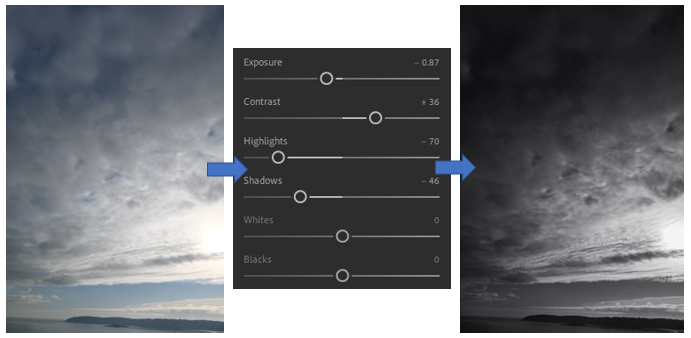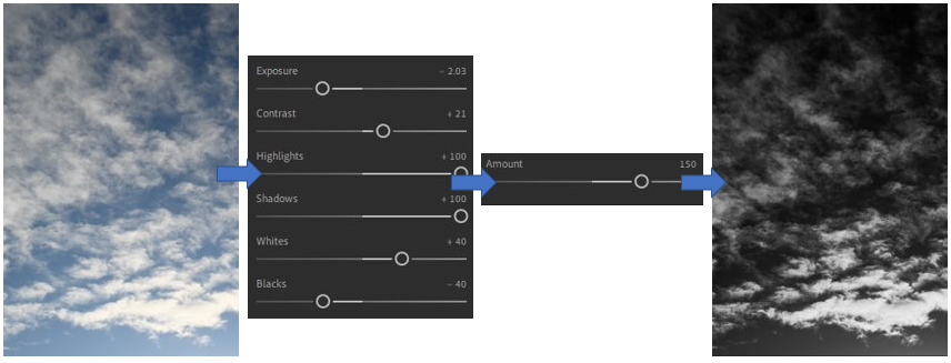


For these edits, which I completed in the style of Alfred Stieglitz, I experimented with different filters which are premade then edited them how I preferred similar to Stieglitz on Adobe Lightroom. I really enjoyed editing these photos because I think that it brought the photos to life and you are able to see the unique and intricate details which are hidden within the clouds as the black and white contrasts help to show these. They are able to create a different, complicated yet dark and gloomy atmosphere in each photo which I think helps to make them successful as Alfred Stieglitz says these are able to reflect somebody’s mind through the way they photograph cloud formations.
In my opinion, I think that I have successfully been able to show Stieglitz influence in my work through my most successful edit that I completed on Adobe Lightroom was the 3rd photo. I really like the way that this photo turned out through the way that I have edited it because I think that it is able to show diverse a range of black/white/grey tones which work well yet create a fluid contrast between them as they look as if they are climbing up the photograph, as if the light from the bottom of the photo wants to be noticed and bring that joy and happiness to the darker and more gloomy parts at the top. I achieved this effect through selecting a present which I think was a good base to work with as it changes the photo into black and white, then I changed the whites, highlights shadows mainly as this creates a contrast between the brighter and darker parts of the photo and then I changed the contrast slightly to help this change be able to see. If I were to try this edit again, I would try to bring down the brightness slightly at the bottom to avoid it looking a bit overexposed which was created through the sunlight previously, besides that I think this is a really successful edit.
I think that my least successful edit which I completed on Adobe Lightroom was the first picture which I experimented with, this is because I think that due to the way which I edited it through choosing a pre-set called “monochrome” then further editing the exposure, contrast, white balance created a dark grey hue over the photograph, especially in the corner as you can’t see the cloud formations, which I don’t like as it stops the darker and brighter tones being able to create a fluid contrast between them which works well. If I were to do this edit again in adobe Lightroom I would make sure that I am able to make the brighter whites and darker tones stand out well and not get lost through using the highlights, whites and exposure better by bringing them up. I also don’t like how the sun ion the corner creates this random burst of brightness in the corner of the photo because it appears to be quite exposed compared to the rest of the photograph and if I were to change this again I would make sure that the sun is defined enough to an extent where the brightness doesn’t become so overexposed.
