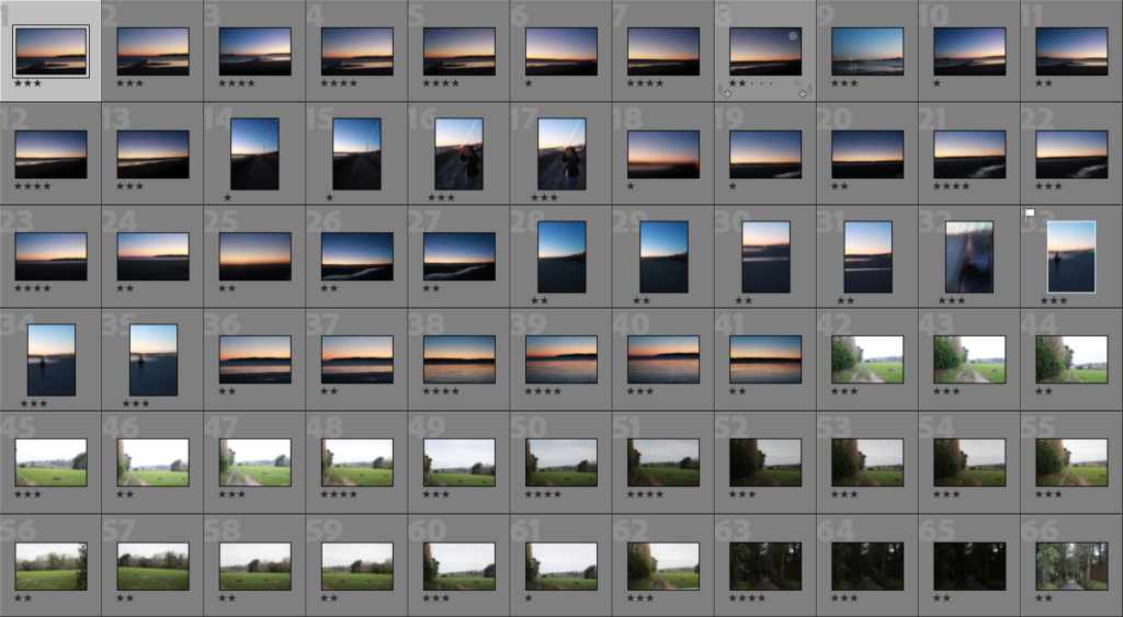
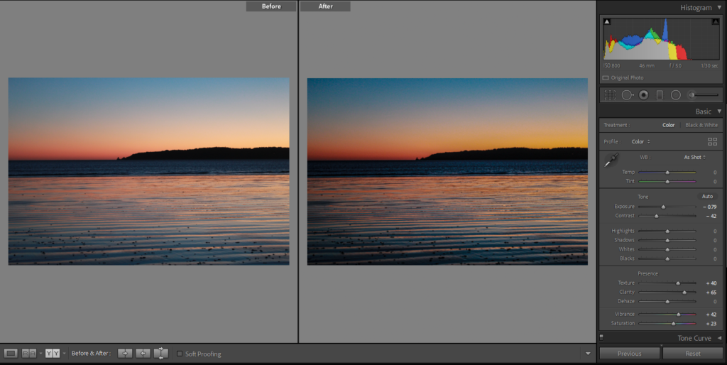
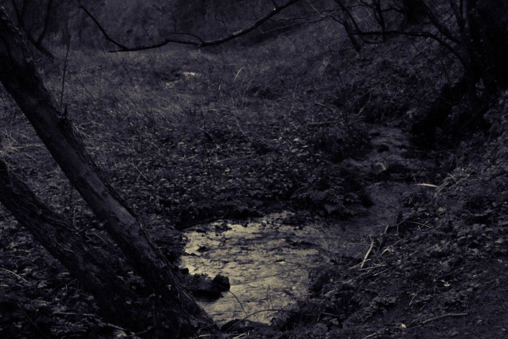
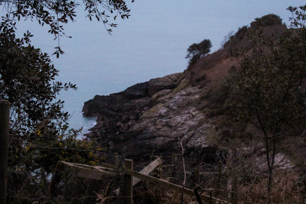
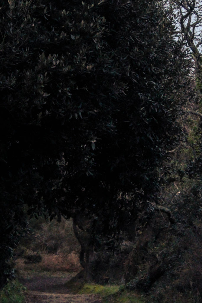
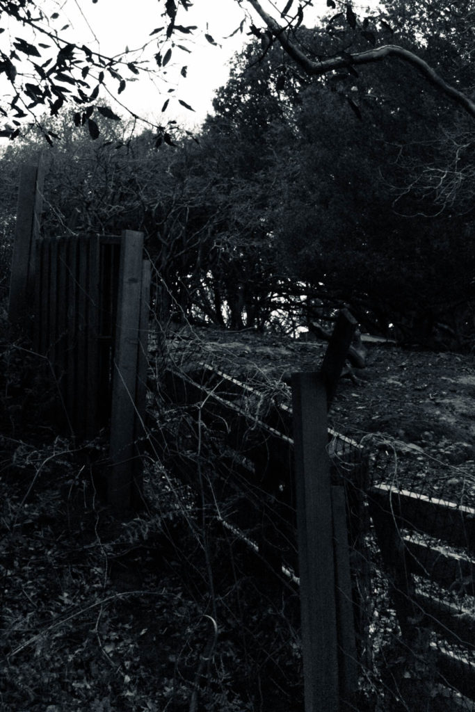
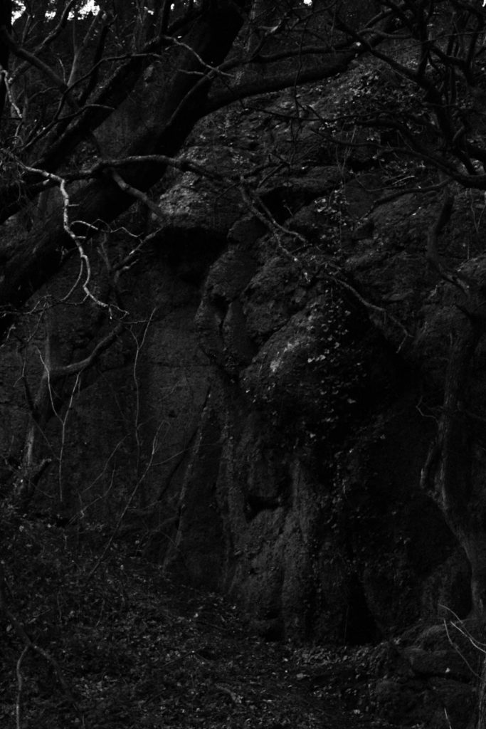
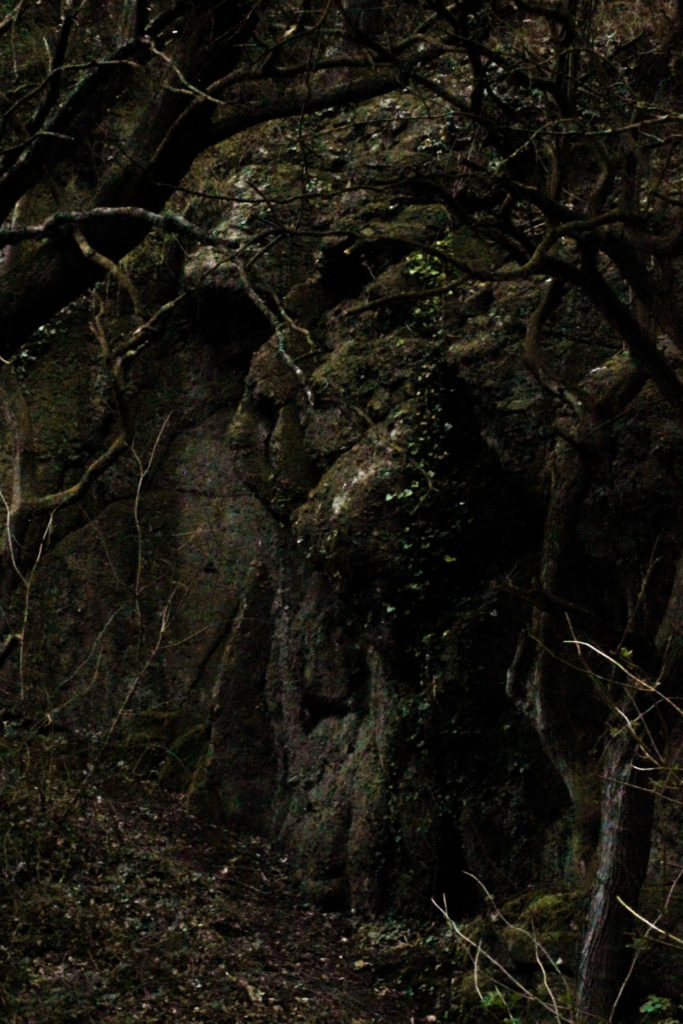
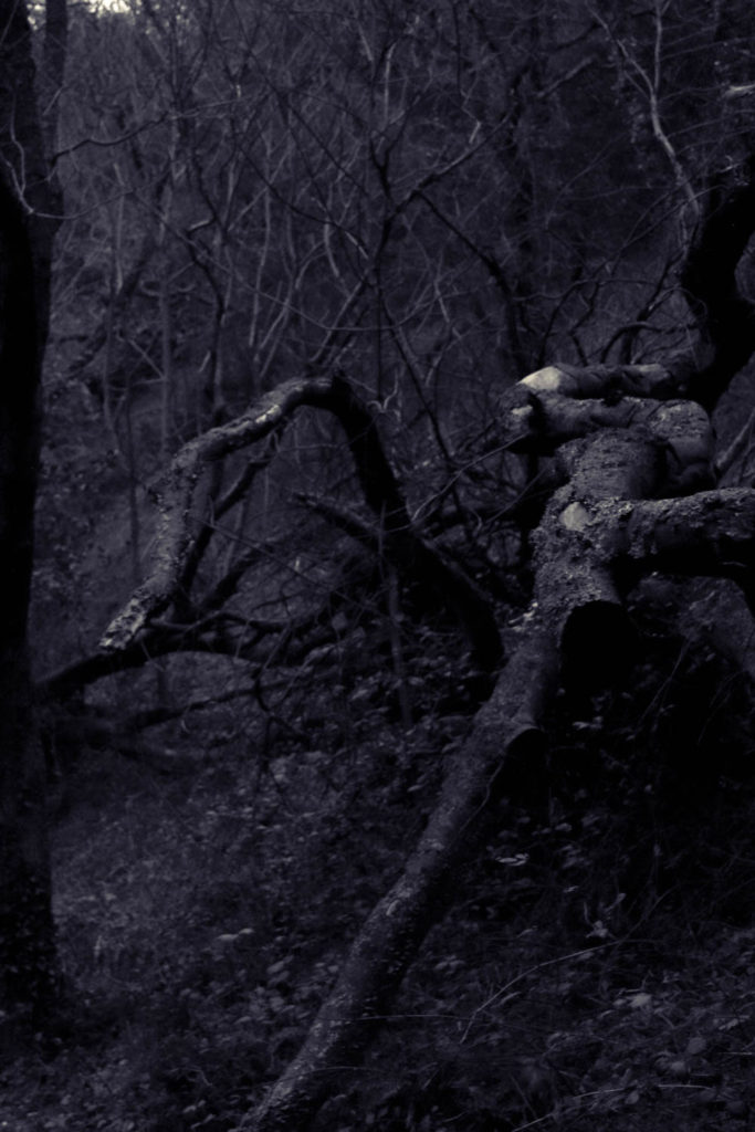
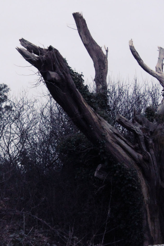
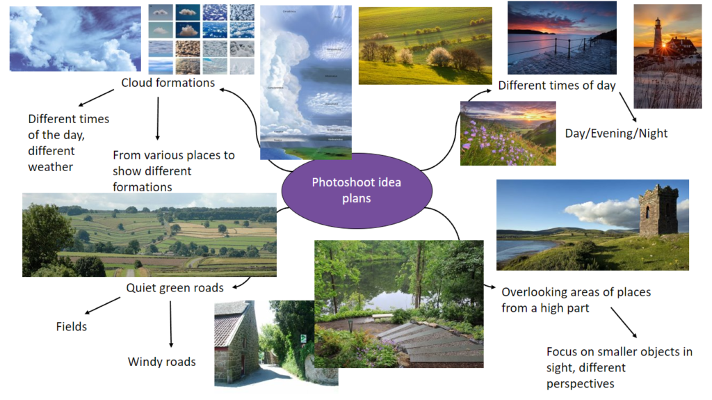
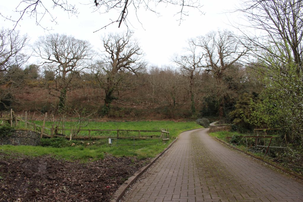
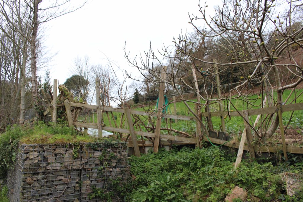
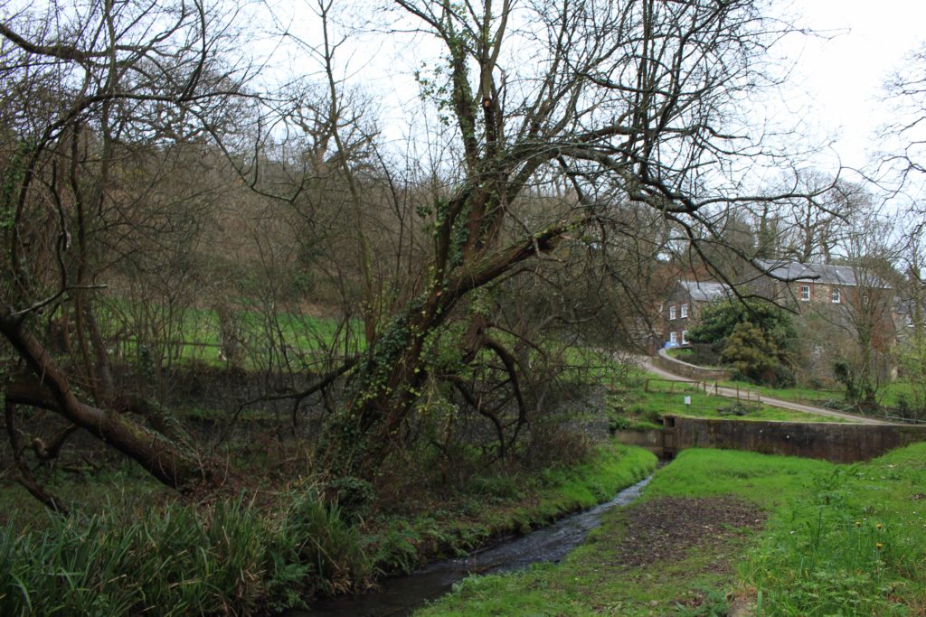
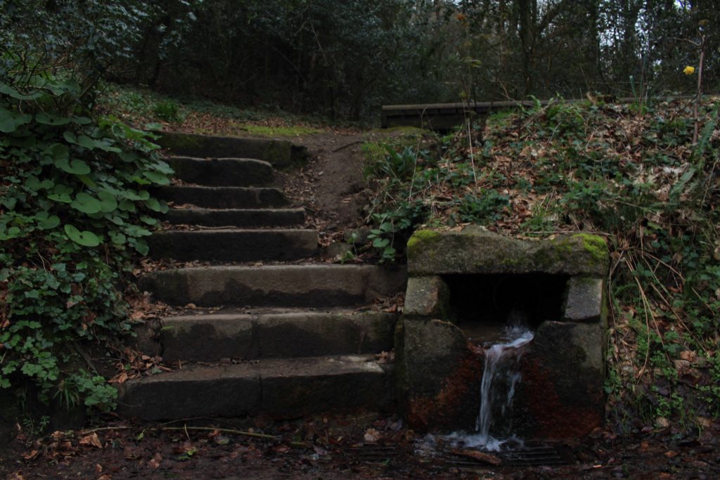
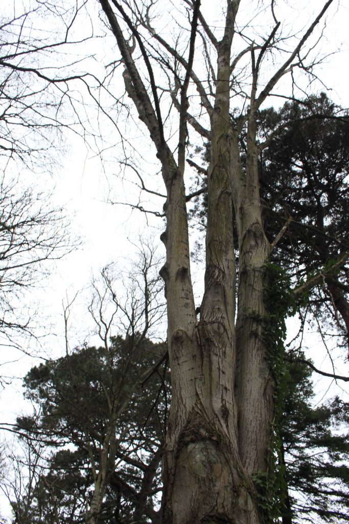
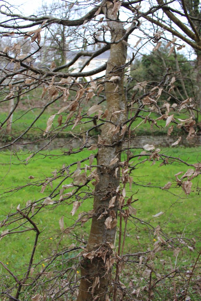
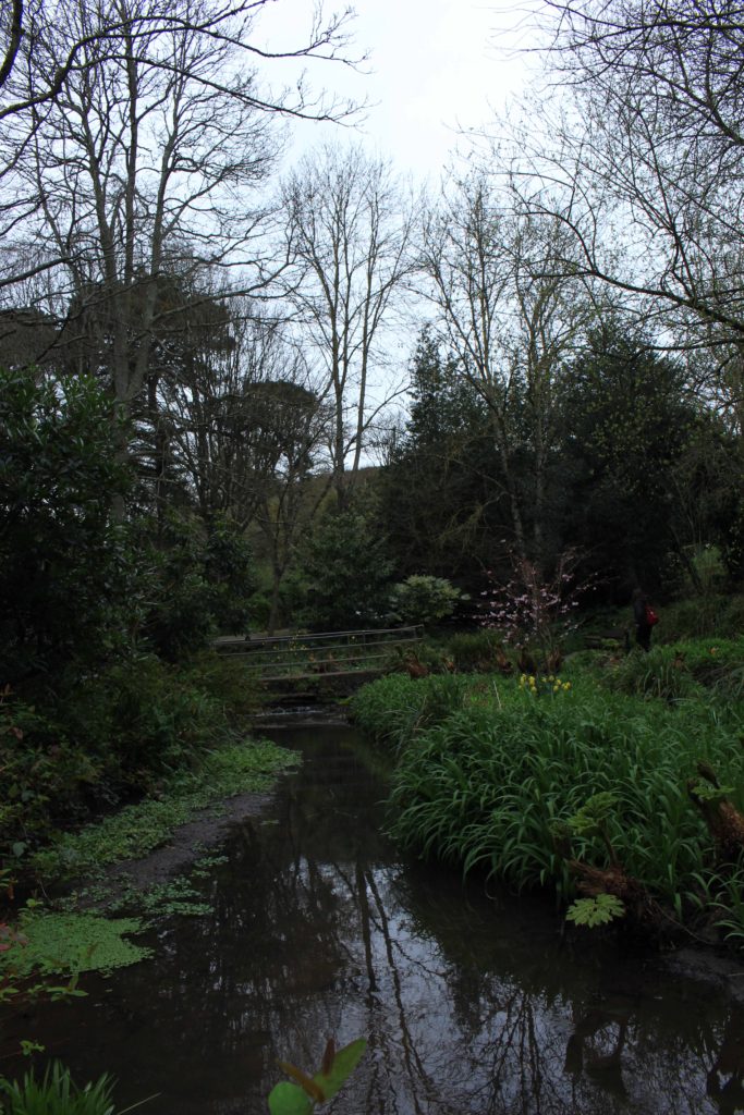
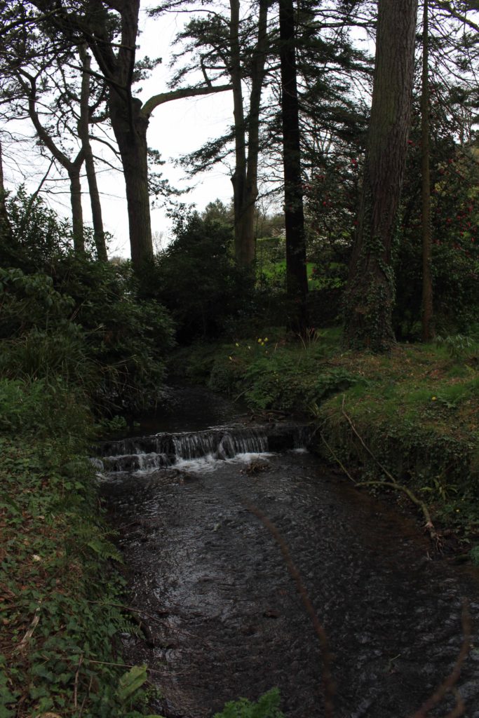
| Photoshoot 1 | For my first photoshoot, I went down to the waterfront and onto the beach (St Aubin’s) along the avenue. I decided to go around 6-6:30 so that I could take photos of the sunset. |
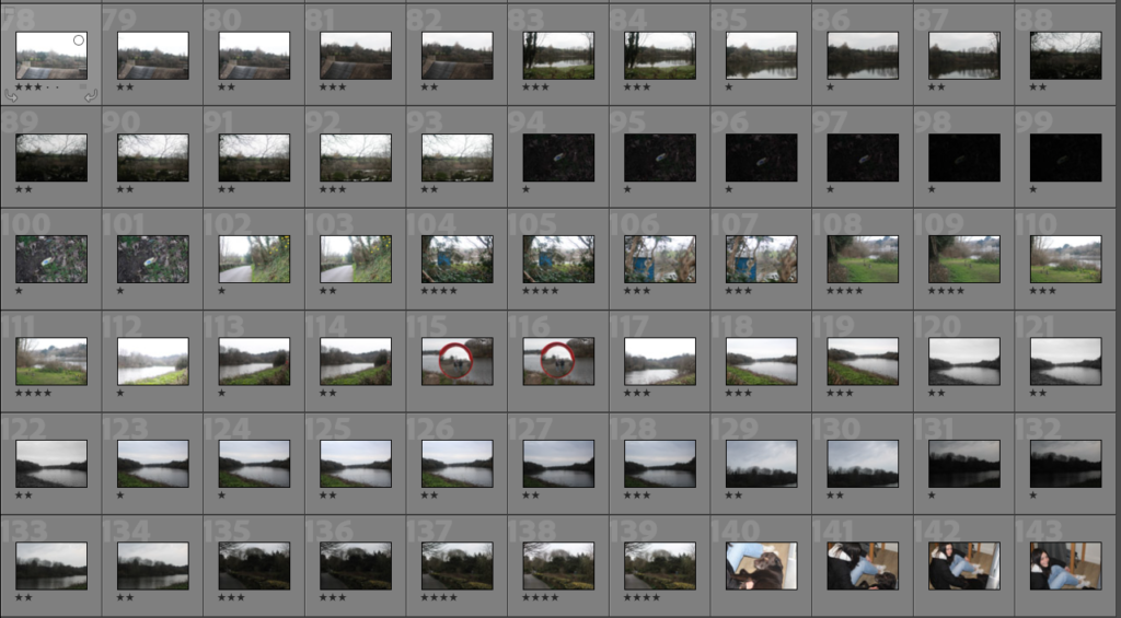
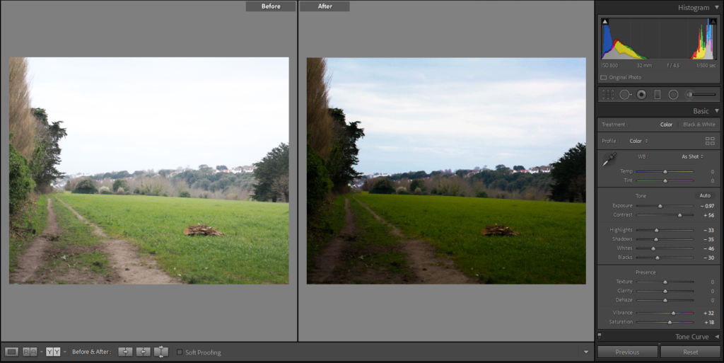
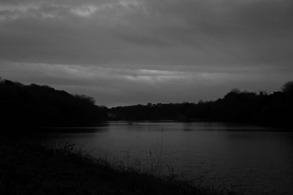
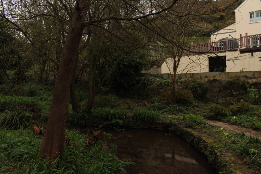
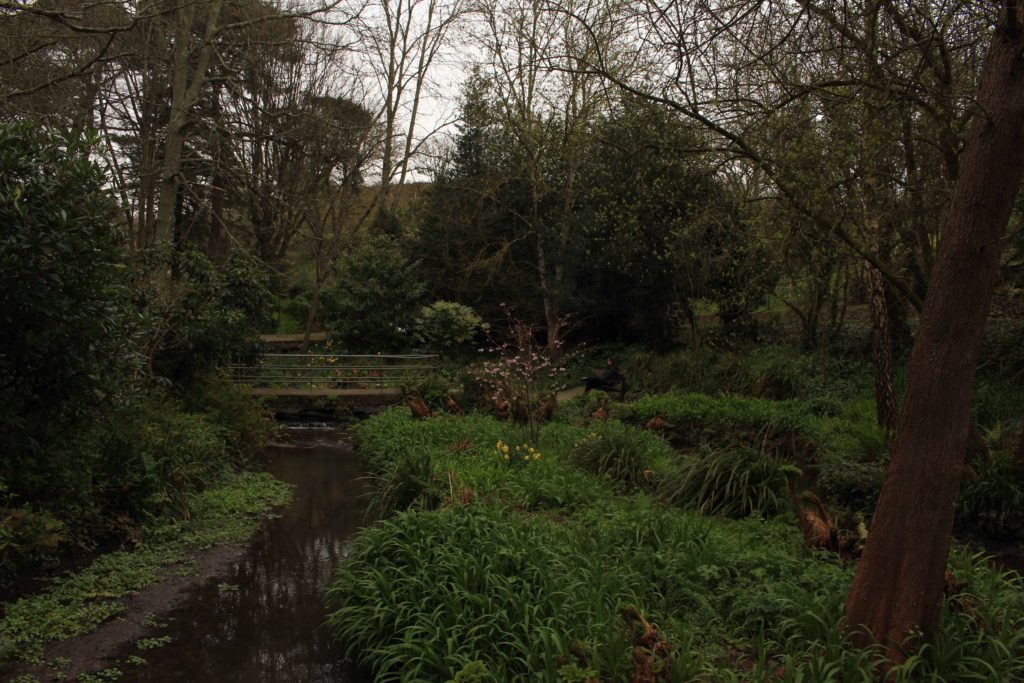
| Photoshoot 2 | For my second photoshoot, I went to a reservoir in St Saviour, I decided to go around 4-5 in the afternoon. On this day the sky was more grey and very cloudy. |
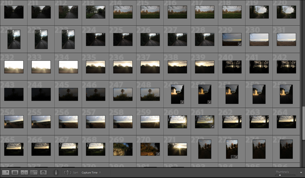
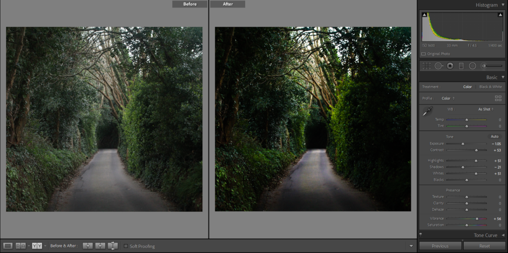
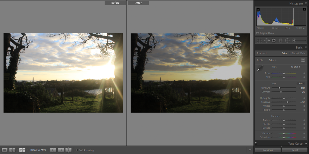
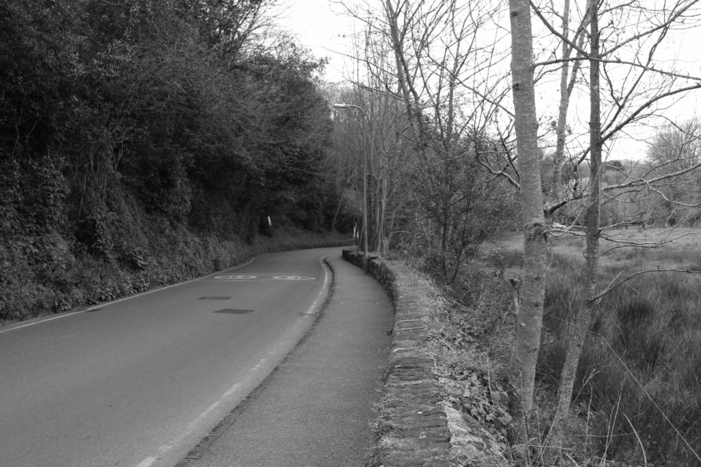
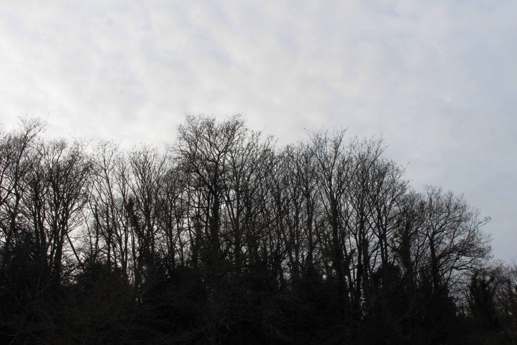
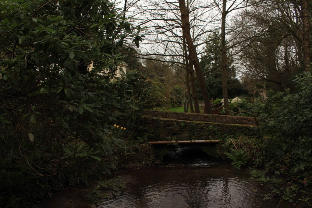
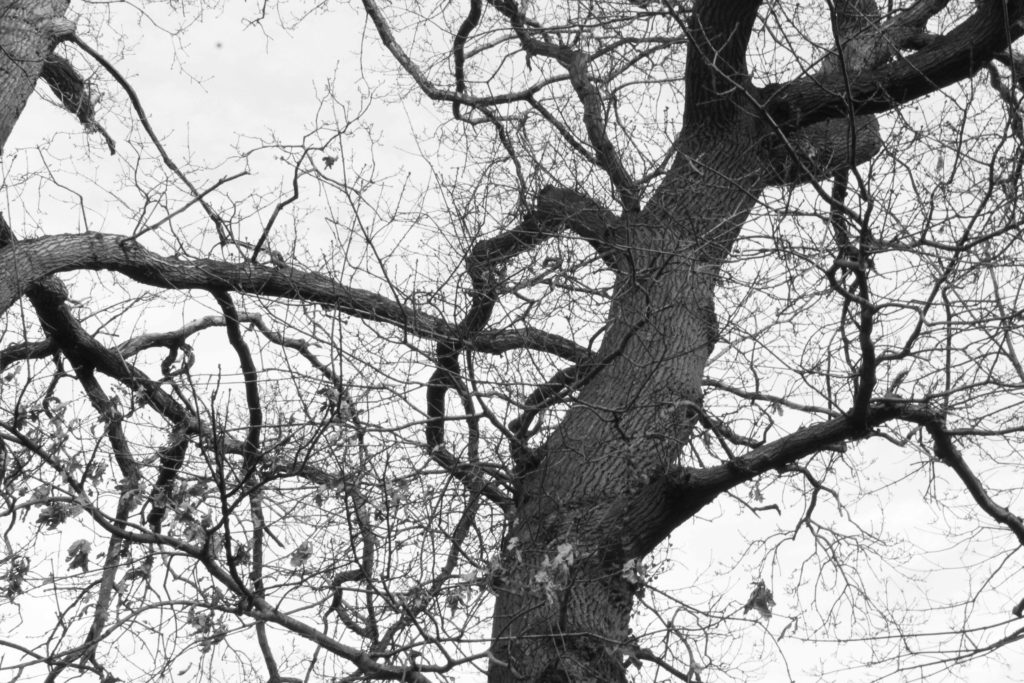
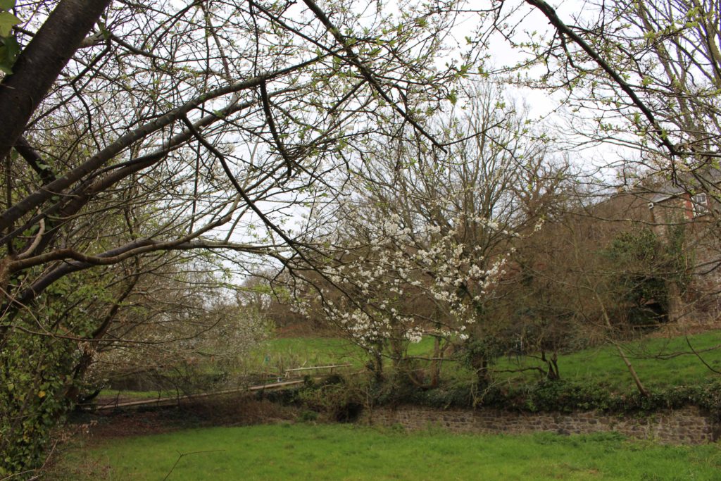
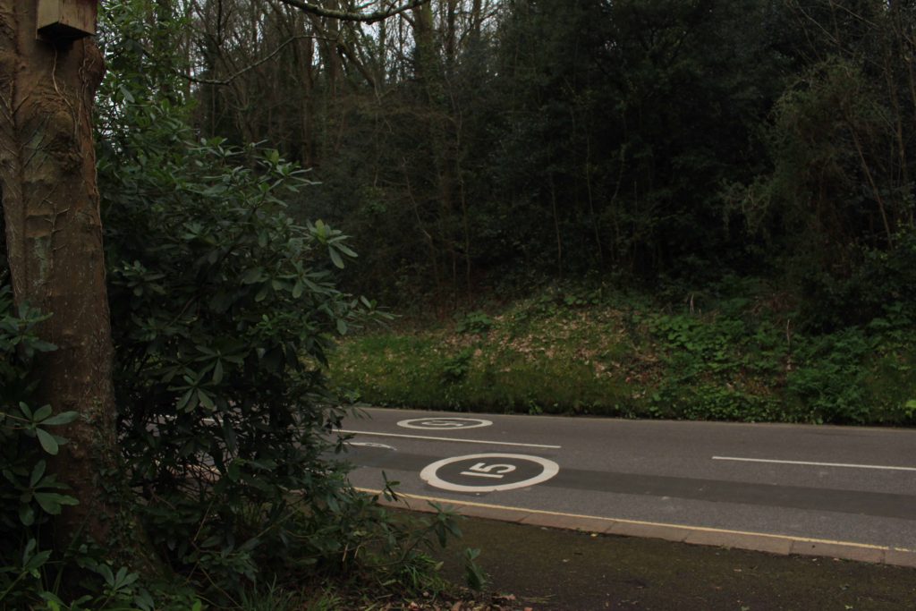
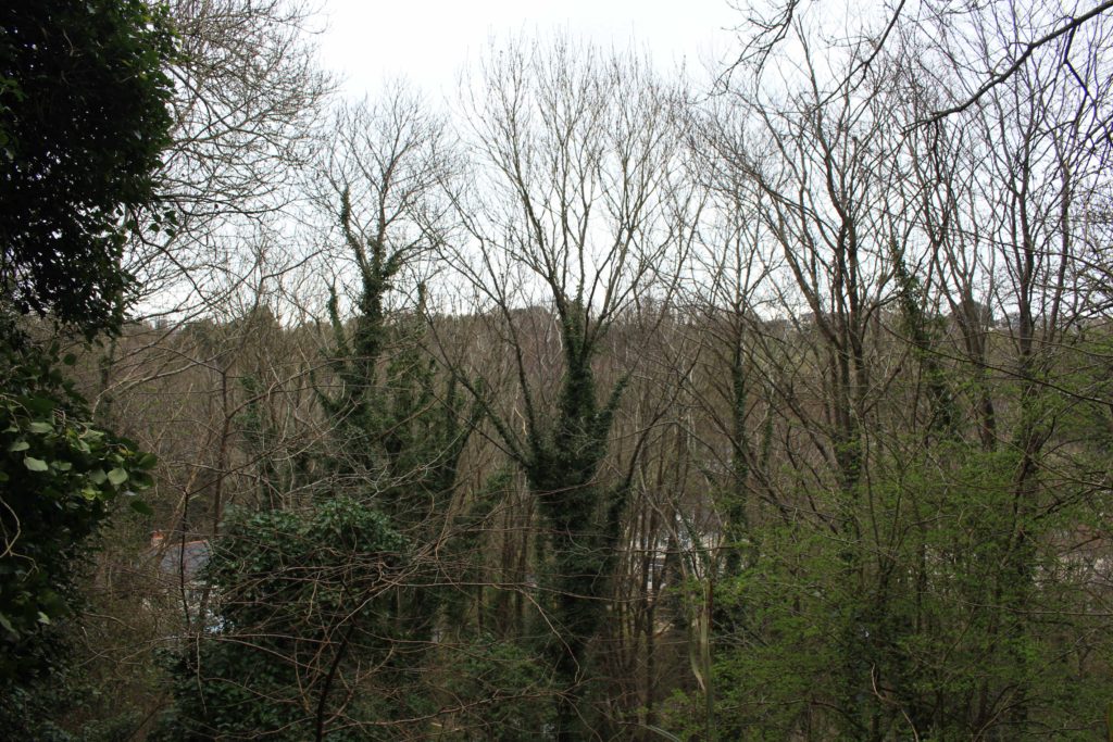
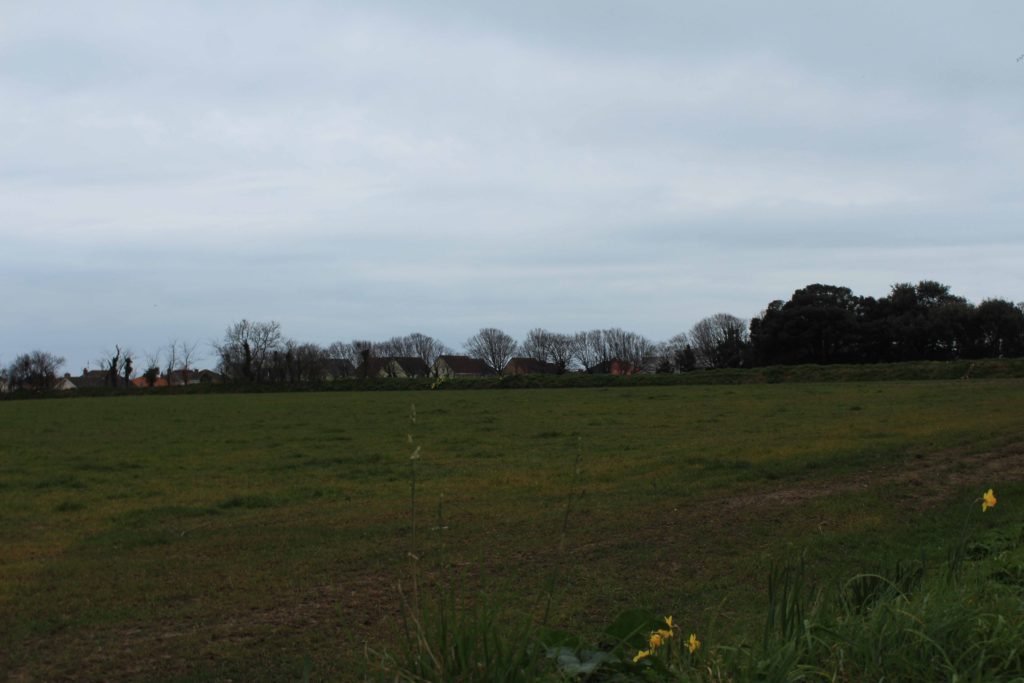
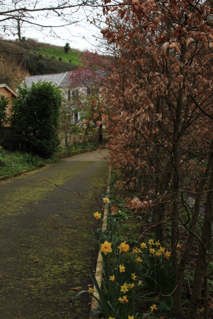
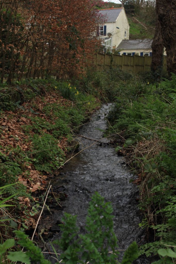
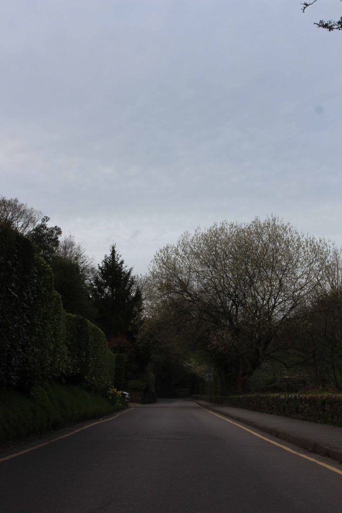
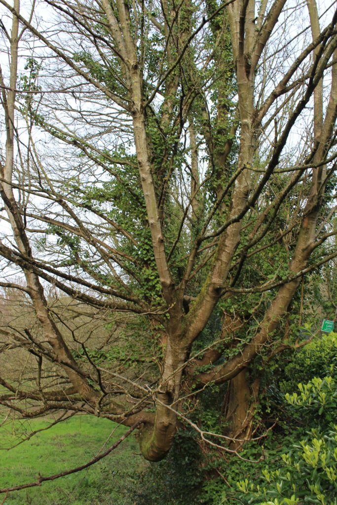
| Photoshoot 3 | For my third photoshoot, I went for a walk on some of the back roads around Jersey, I decided to go around 5:30 in the evening so that I could try and photograph golden hour. |
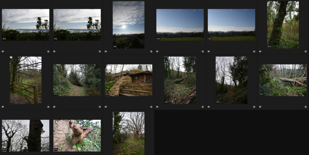
Contact Sheets
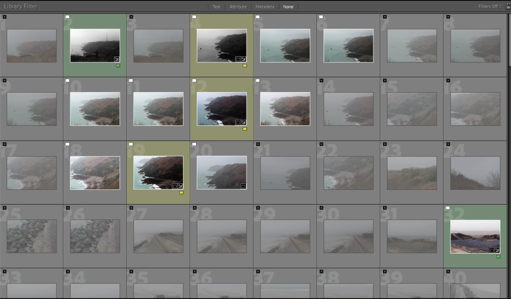
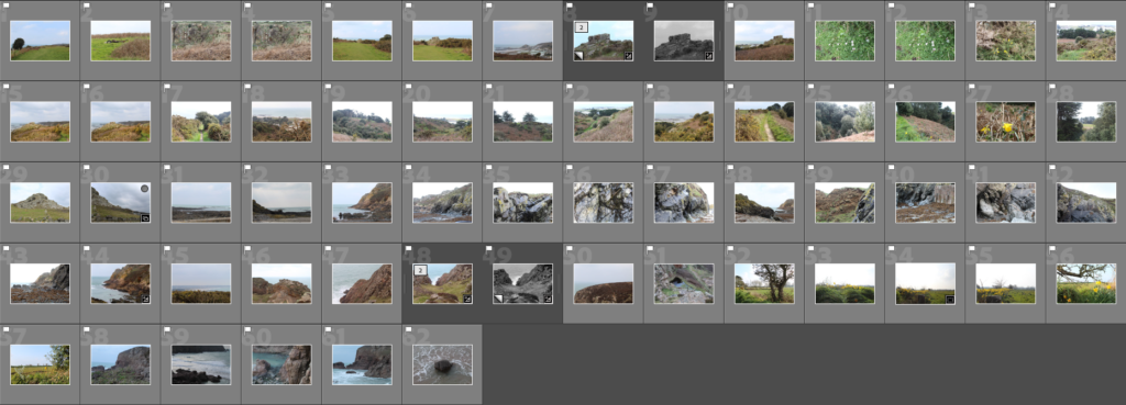
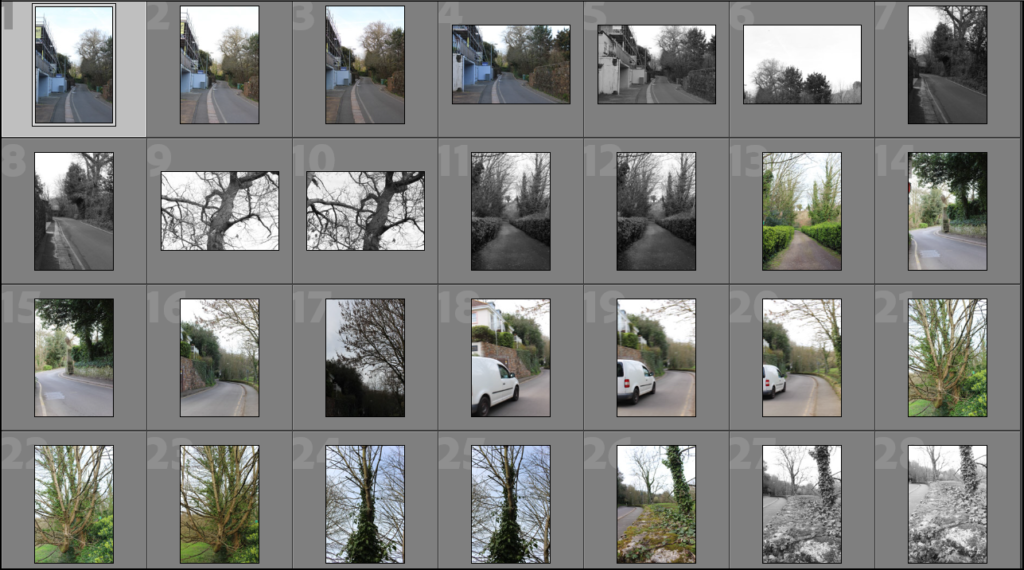
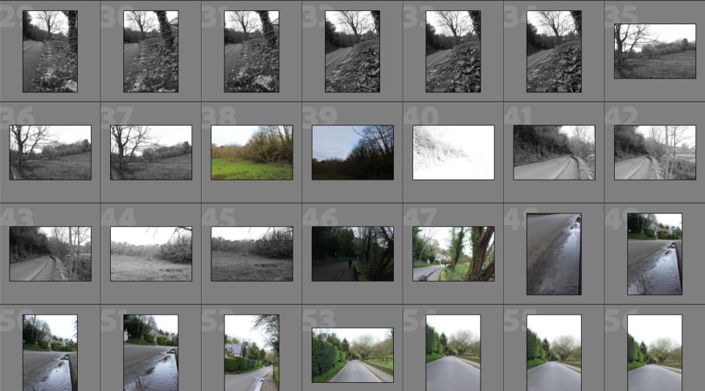
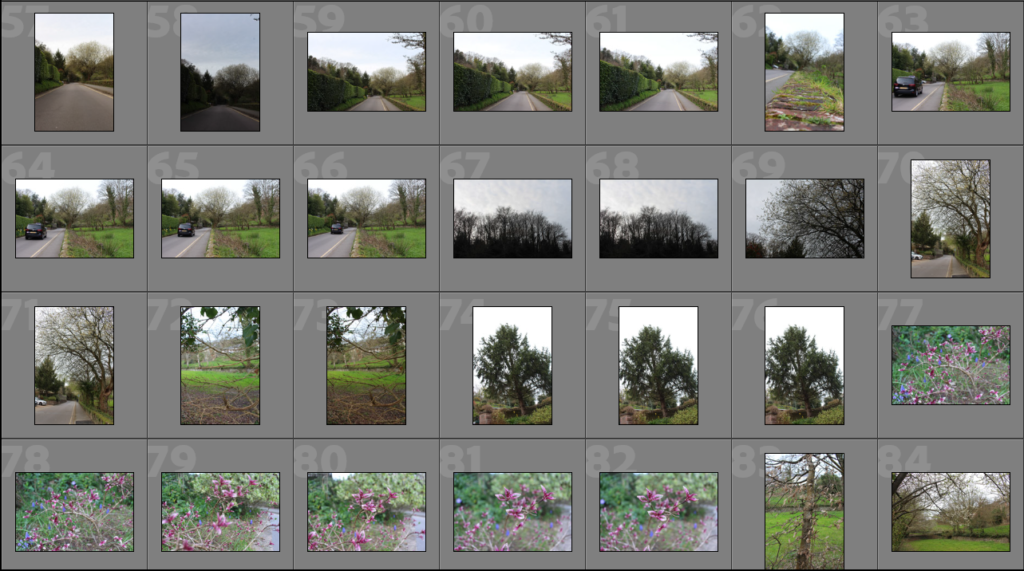
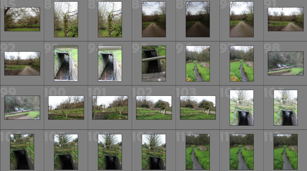
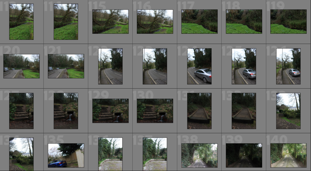
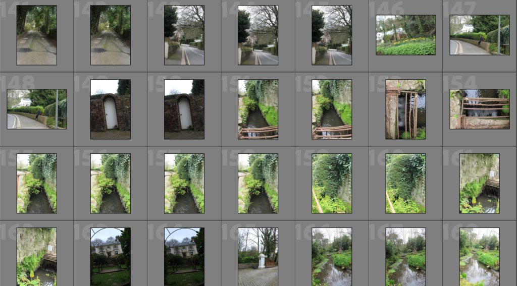
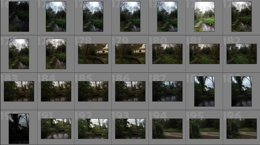
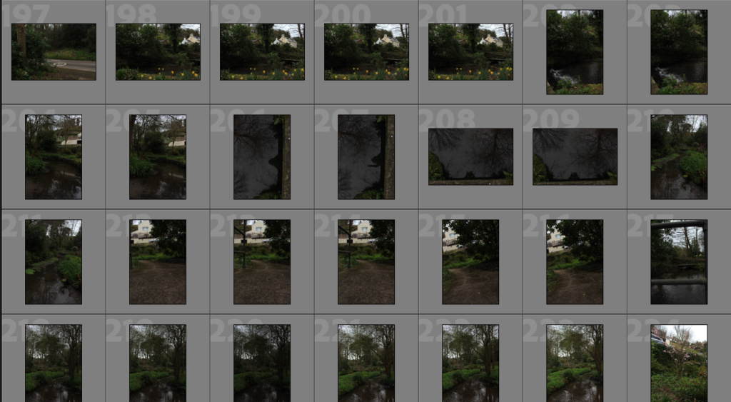
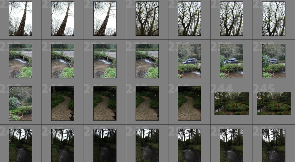
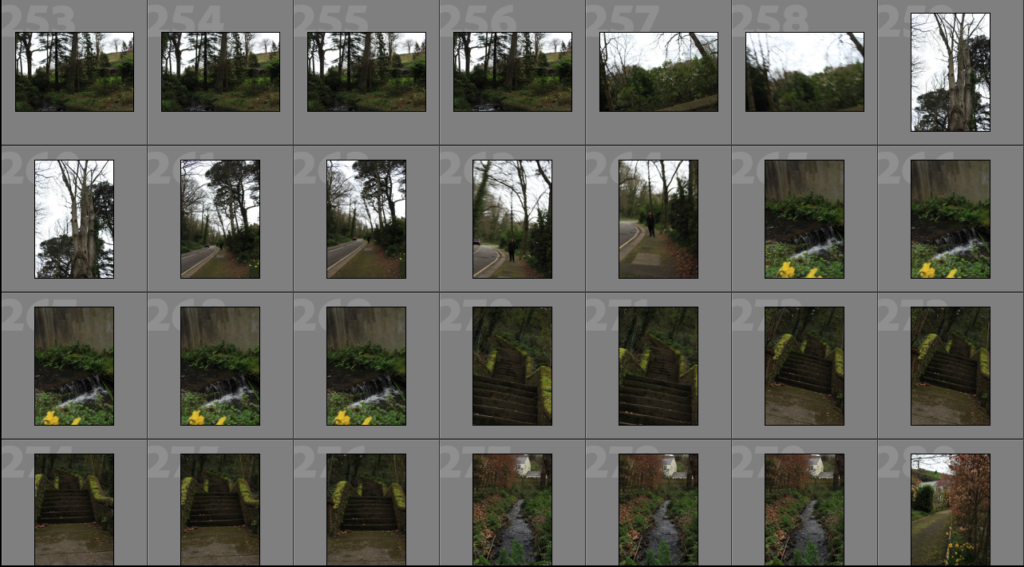
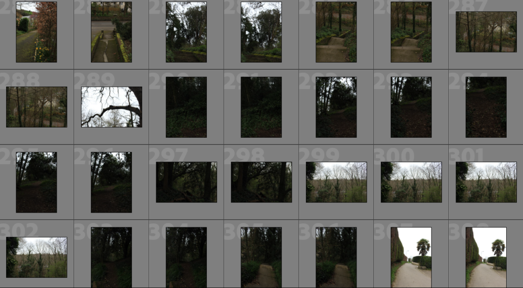
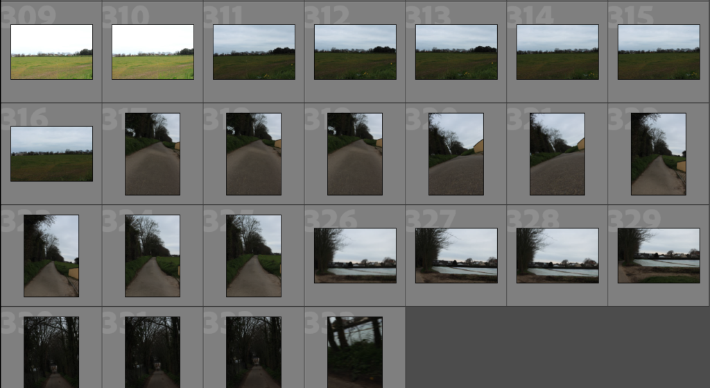
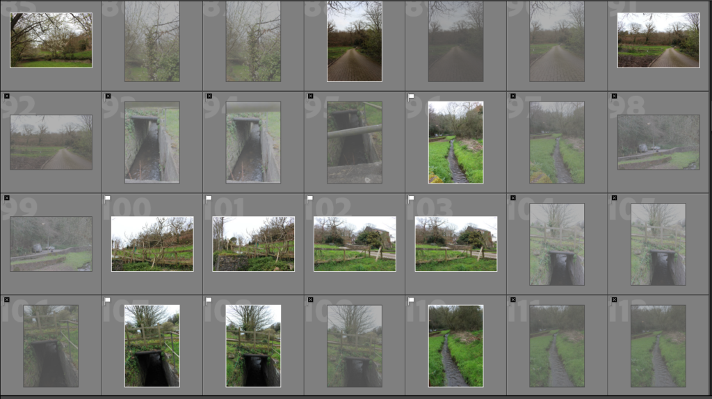
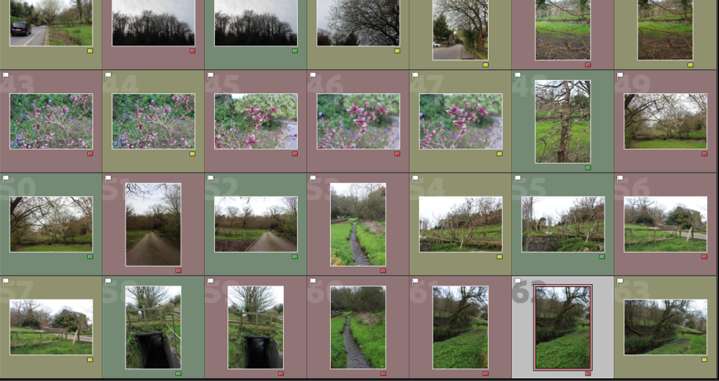
In my contact sheets, there are lots of repeated photos as I had to keep adjusting the ISO, shutter speed and F-number to try and get the right exposure for the type of lighting, I had gone on a grey, cloudy day so the sky kept coming out to bright in the camera.
In these photos, I also had to make repeats as I had gone while the sun was setting so there was a glare in some of the photos due to the high exposure, but as I was walking the lighting would change due to the sun being blocked or because of me being in a more shaded place which also contributed to the number of similar photos.
Editing
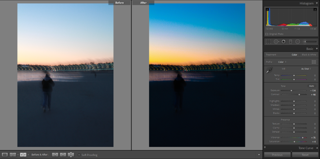
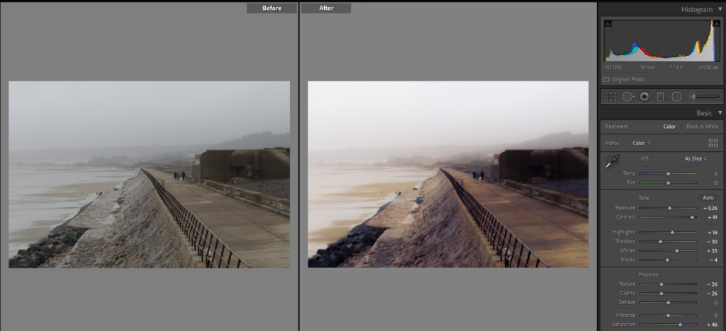
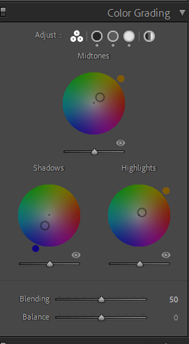
These are two edits from each of my three photoshoots. In all my photos I have chosen to make the colours more vibrant and stand out which contrasts with the somewhat dull photos that they were before.
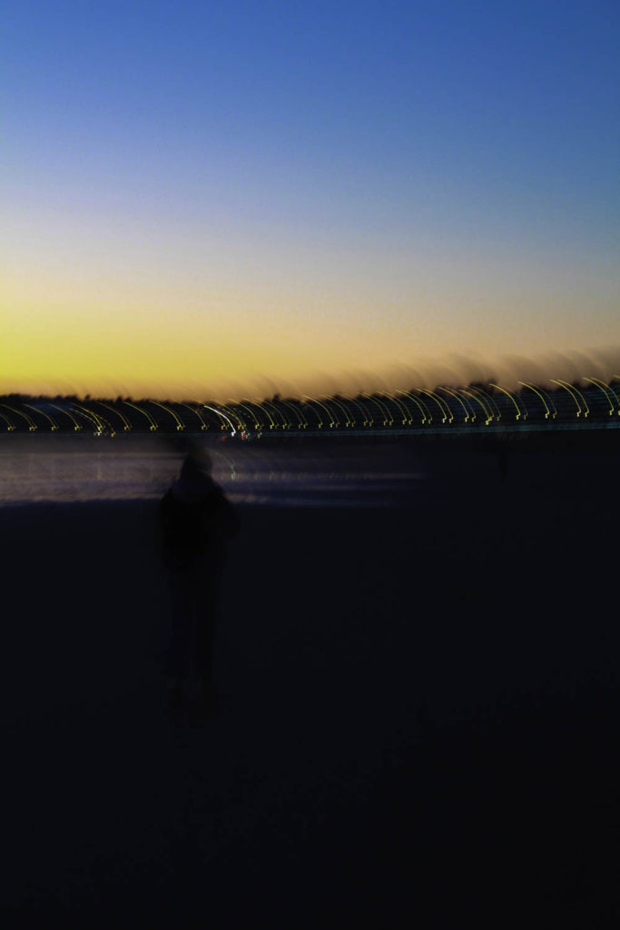
These are two of the photos that I have edited from St Aubin’s beach, in both I have increased the vibrancy so that the colours in the sky, such as the blues and oranges stand out more against the darker parts of the photo like the sand and ocean. In the photo on the left, I have only increased the contrast to make the photo darker so that you can still see the person walking forward. For the photo on the right, I have decreased the contrast so that the photo isn’t as dark as the photo to the left, I have also the texture and clarity so that the ripples in the sand can be seen more clearly and stand out with the reflection of the sunset.
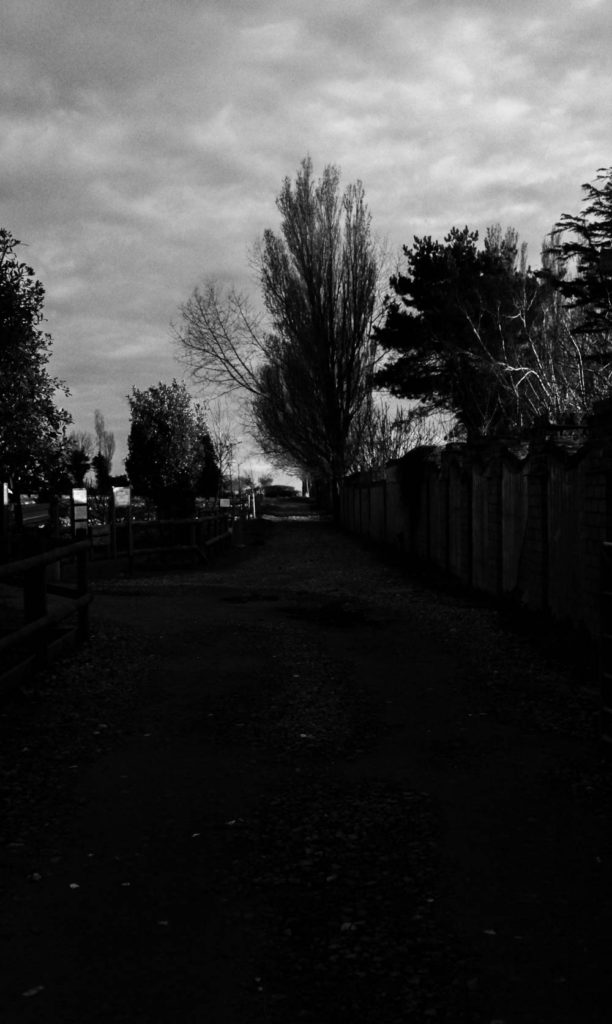
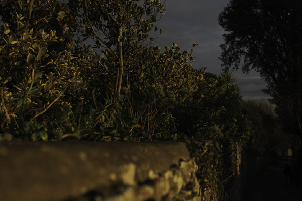
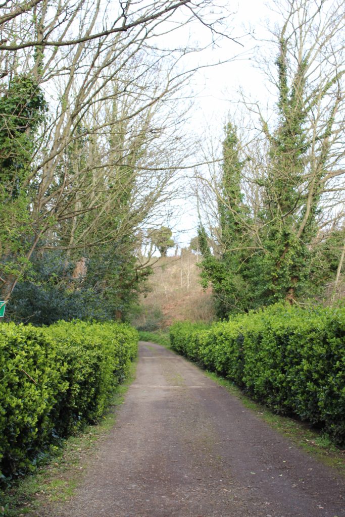
These are two of the photos that I have edited from some of the backroads around the parish of St Saviour, in the photo on the left I have increased the contrast to darken the bushes to the side of the photo and the hills in the background. As the sky was quite bright and grey the clouds couldn’t be clearly seen in the photo, so I slightly decreased the exposure which helped the clouds become more defined in the sky which now has more of a blue tint. I did similar editing to the photo on the right, I liked the look of the darker greens against the grey of the road, but I still wanted them to be vibrant and pop so I also increased the vibrancy so that I could get this effect.
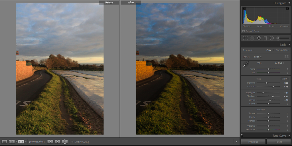
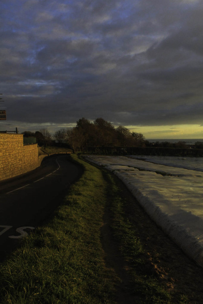
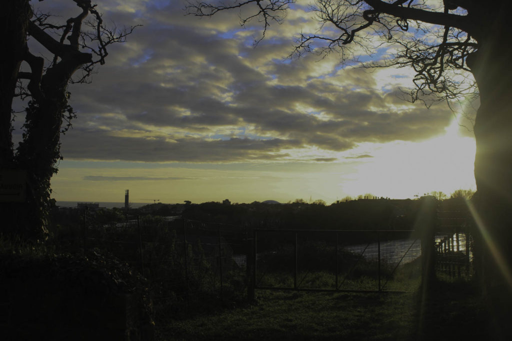
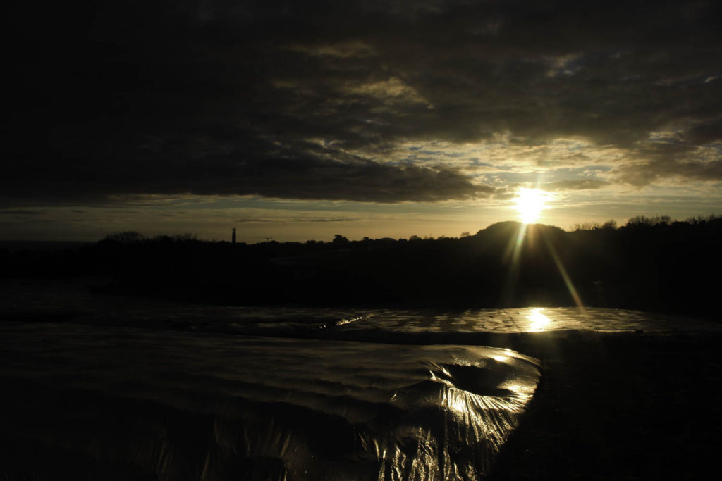
These are also photos taken on backroads around St Saviours but I went at a different time so that I could capture the sunset and hopefully get different lighting than my other photos. In these two photos, I wanted the clouds to be defined so that you could see the key poking through at different places. I did this by decreasing both the contrast and exposure, by doing this I made the clouds darker which made them stand out against the blue of the sky. In the photo on the right and wanted the photo to have a more saturated and golden look as the sun was at the perfect place for the ‘golden hour’. I decreased the exposure and highlights as well as increased the contrast to make the image darker and give it the golden look that I wanted.
Final Photos
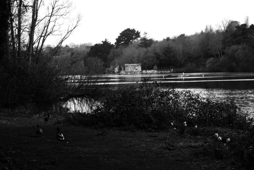
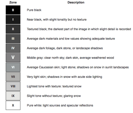
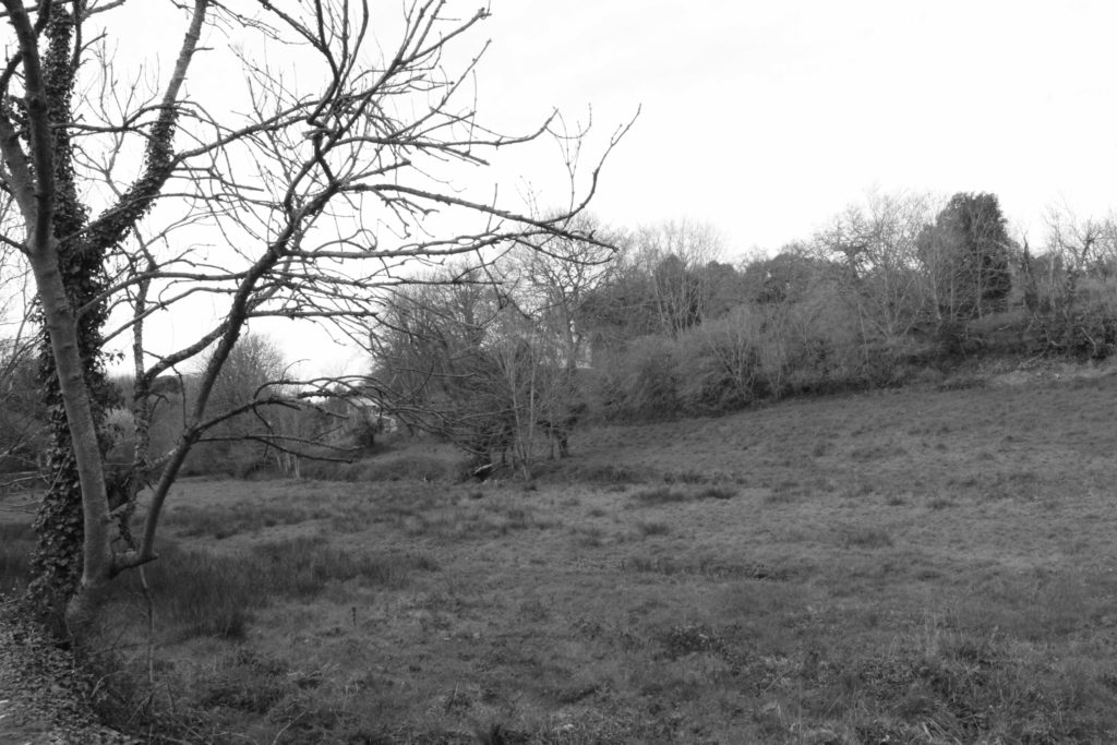
I have chosen these as my final images because I believe that each one shows different parts of Jersey’s beautiful landscapes. One of my favourites is the bottom right as I think that the sun is giving a really nice golden look on the few parts that it is hitting the plastic. I also think that the clouds are nicely formed in the sky and are highly defined. I really like how the lighter sky in the mid-ground contrasts with the darker trees towards the ground and the darker elements of the field. Another one of my favourites in the middle right photo as I think the defined grey clouds sit nicely against the bits o bright blue from the sky poking through. The sun also has a similar effect to the photo just beneath it, with some of the rays being able to be seen in the photo which adds another element to the photos that viewers might find interesting. I also really like the saturation of this photo which just gives it a more brighter effect. Finally, the bottom left is also a good final image as I really like the contrast between the darker tones from the trees and grass and the brighter sky and highlights on the lake. I feel that this phot covers the whole of Ansel Adams Zone system as you can see the darkest shades are in the lake or on parts of the ducks in the bottom of the photo and the lighter parts are either the sky as it was a grey and cloudy day so the sky is brighter or in the different highlights on the lake.

