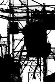
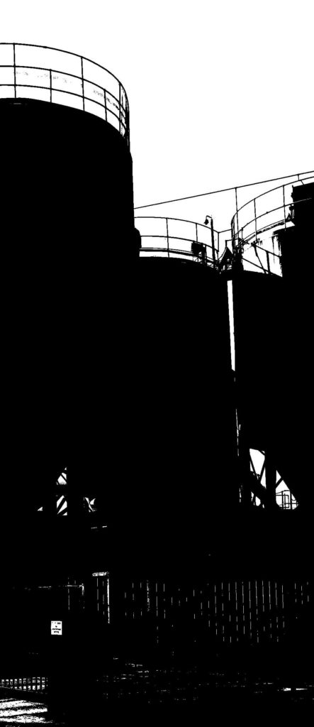
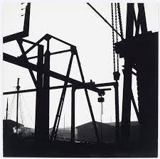
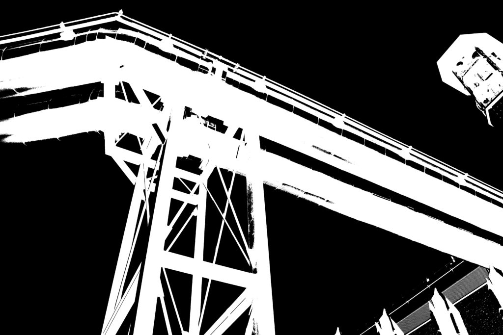
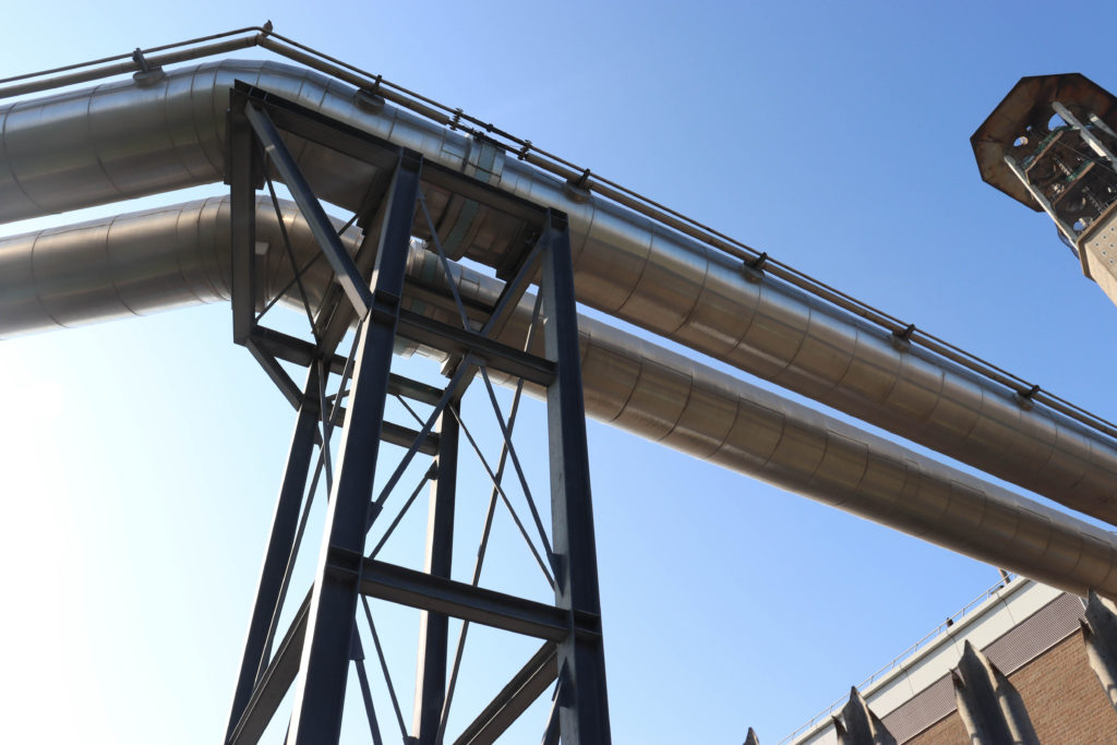
Bernd Becher and Hilla Becher
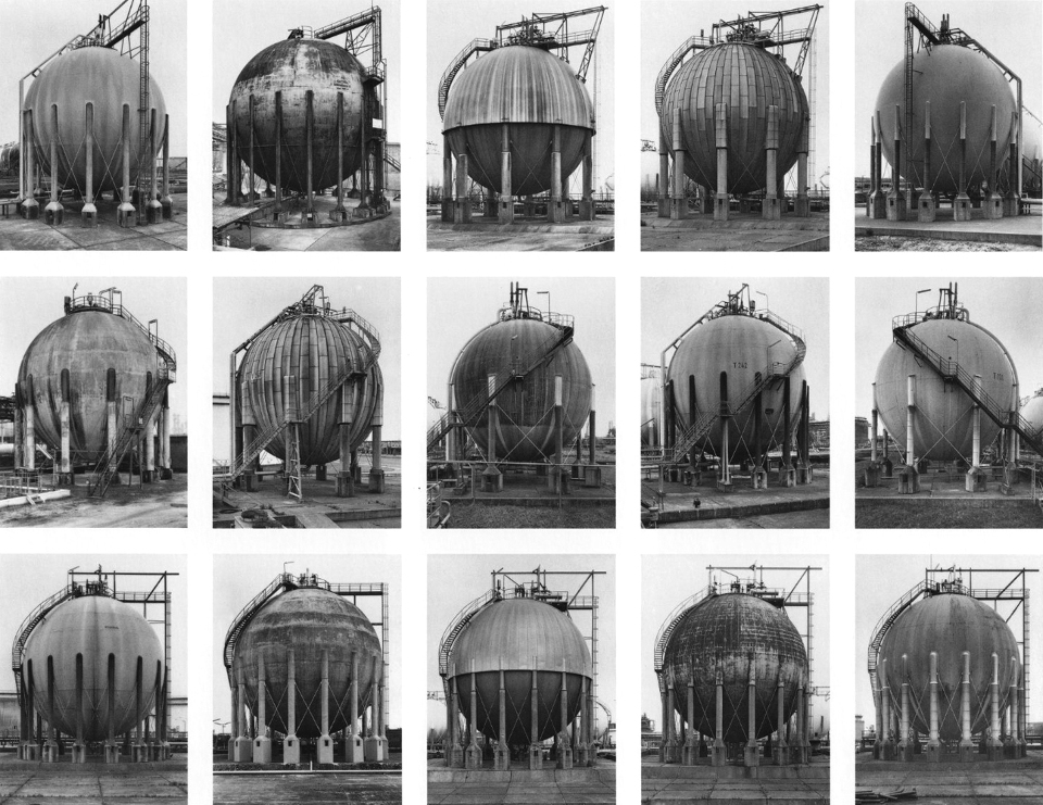
Gas Tanks 1983-92 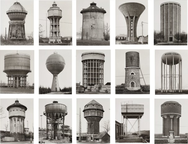
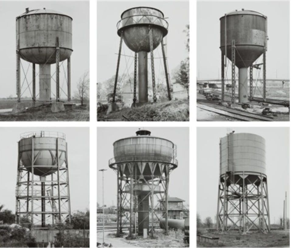
Water Towers 1965-97 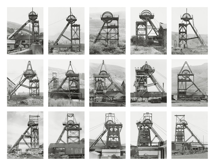
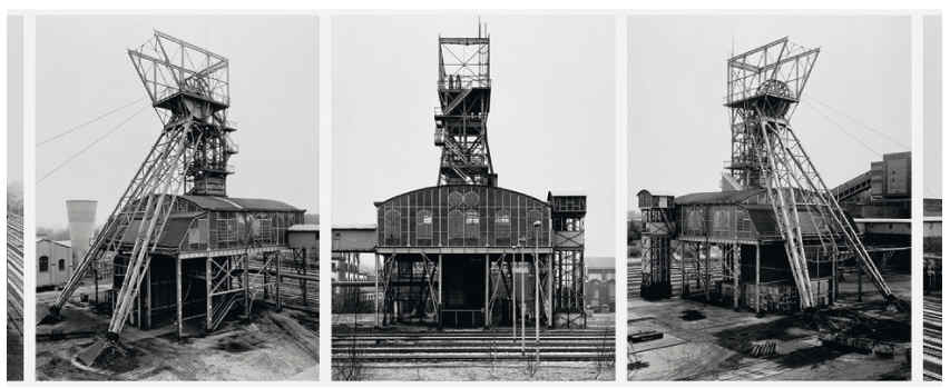
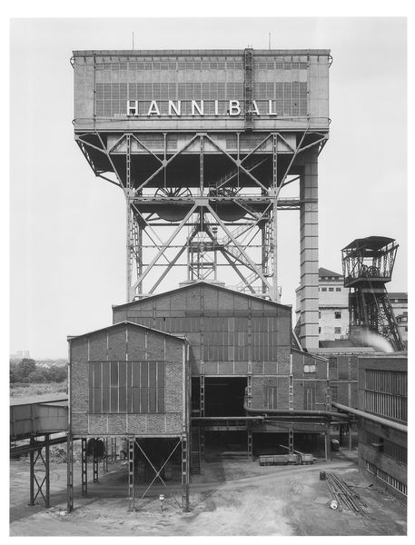
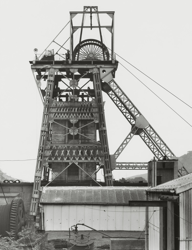
Winding Towers 1966-97
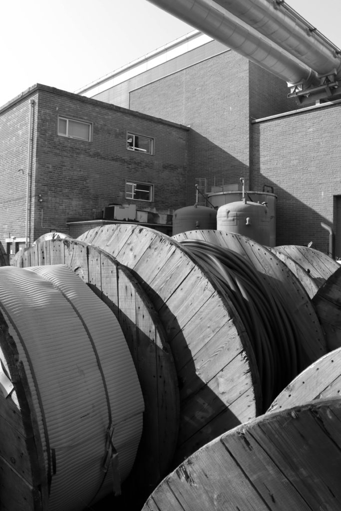
Hilla Becher was a German artist born in 1931 in Siegen, Germany. She was one half of a photography duo with her husband Bernd Becher. For forty years, they photographed disappearing industrial architecture around Europe and North America.
They began collaborating together in 1959 after meeting at the Kunstakademie Düsseldorf in 1957. Bernd originally studied painting and then typography, whereas Hilla had trained as a commercial photographer. After two years collaborating together, they married.
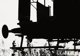
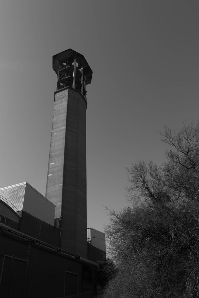
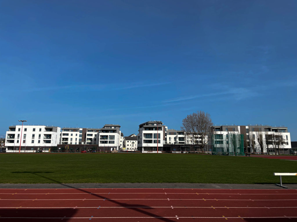
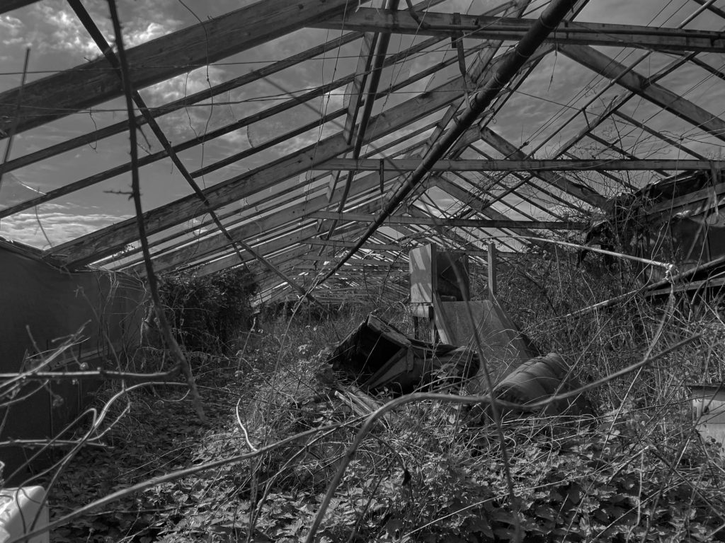
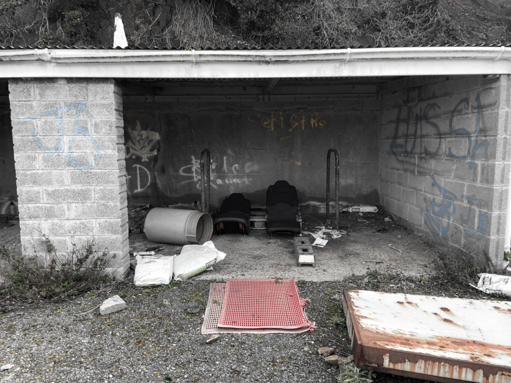
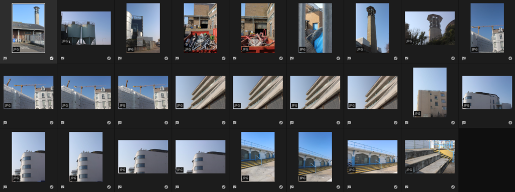
Industrial structures including water towers, coal bunkers, gas tanks and factories. Their work had a documentary style as their images were always taken in black and white. Their photographs never included people.
They exhibited their work in sets or typologies, grouping of several photographs of the same type of structure. The are well known for presenting their images in grid formations.
Sze Tsung Leong
Sze Tsung Nicolás Leong is a British-Mexican-American artist, born in Mexico City. He is currently based in Los Angeles.
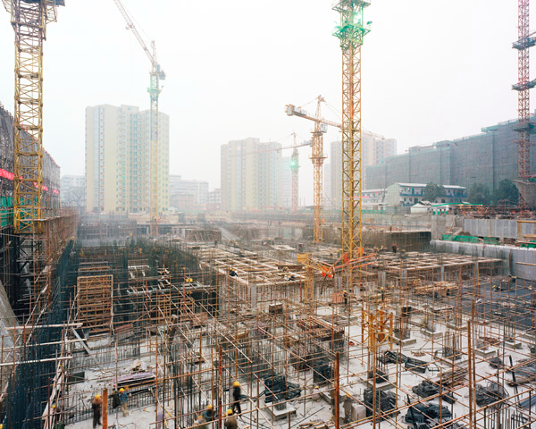
Leong’s work includes the series Cities, a detailed depiction of urban formations throughout the globe, from medieval towns to recent constructions, that together form a picture of the world at this particular moment in time at the beginning of the twenty-first century.
Horizons, an international collection of images of natural terrains and urban landscapes that considers the relationships between far and near, foreign and familiar; and History Images, which examines the erasure of history and the reshaping of society through the built environment.
Suzhou Jie, Daoxiangyuan, Haidian District, Beijing, 2004 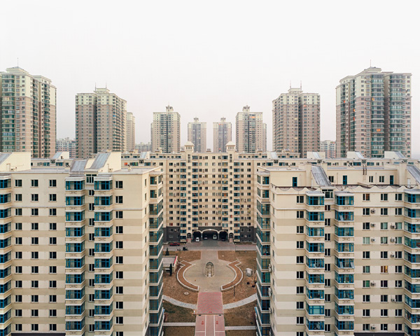
Tiantong Xiyuan Third District South, Changping District, Beijing, 2004 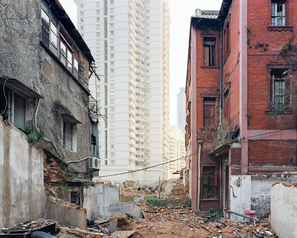
Beizhuanzi II, Siming District, Xiamen, 2004 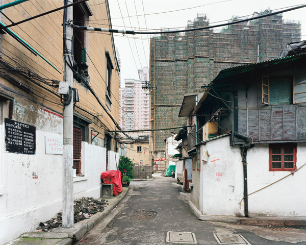
Zhangjia Long, Nan Shi, Huangpu District, Shanghai, 2004 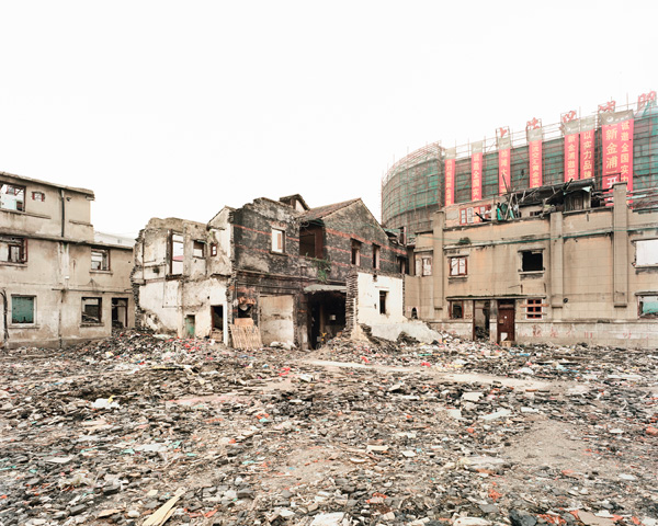
Qipu Lu I, Zhabei District, Shanghai, 2004
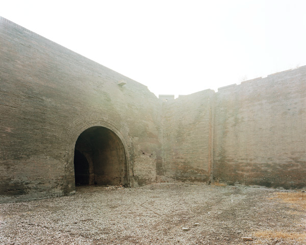
Yongdingmen, Pingyao, Shanxi Province, 2004
These photographs in ‘History Images‘ are of histories, in the form of cities in China, either being destroyed or created at this juncture in time. They are of past histories, in the form of traditional buildings and neighborhoods, urban fabrics, and natural landscapes, in the process of being erased. They are of the absence of histories, in the form of construction sites, built upon an erasure of the past so complete that one would never know a past had ever existed. And they are of the anticipation of future histories, yet to unfold, in the form of newly built cities.
Edward Burntsky
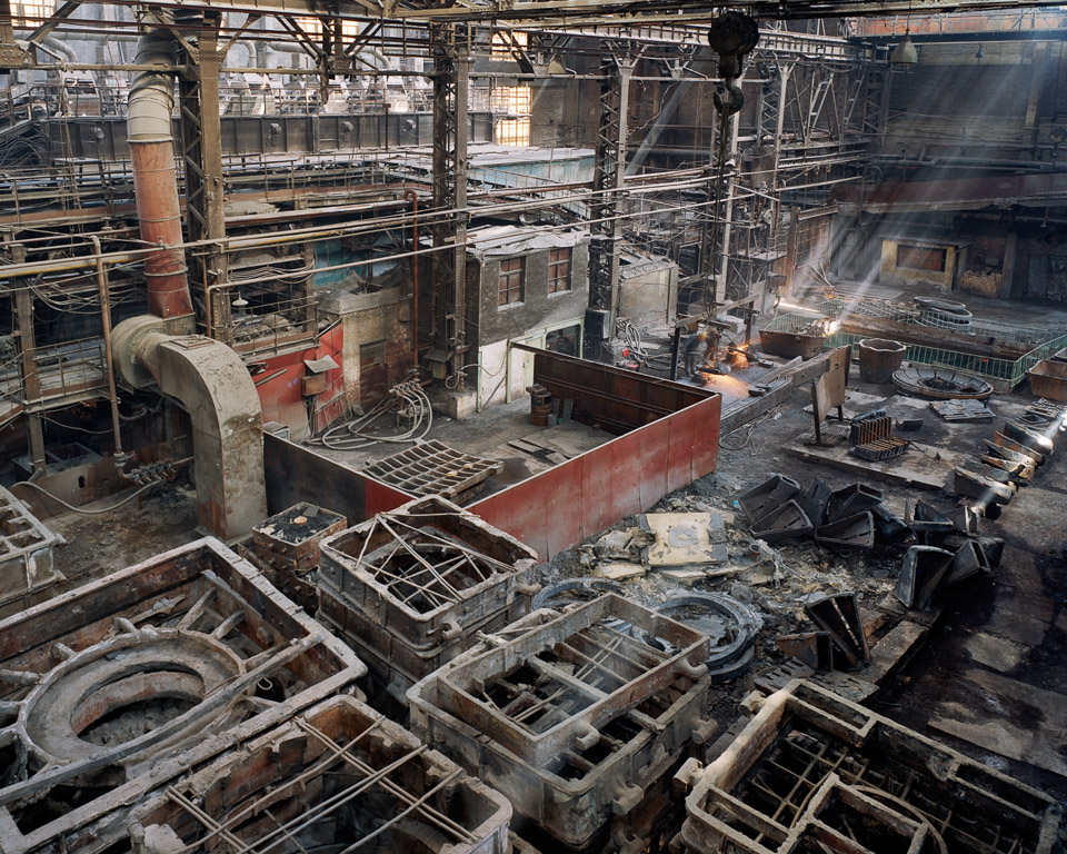
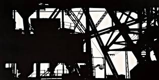
Old Factories #5, China – 2005 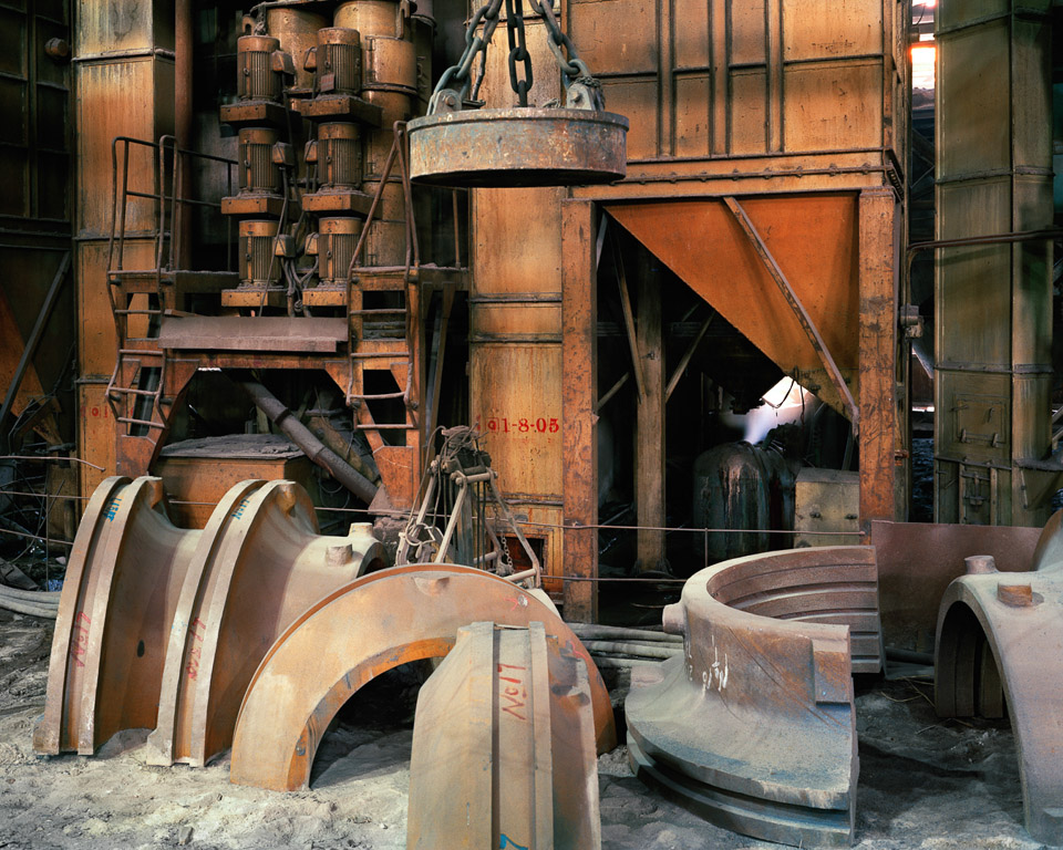
Old Factories #6, China – 2005 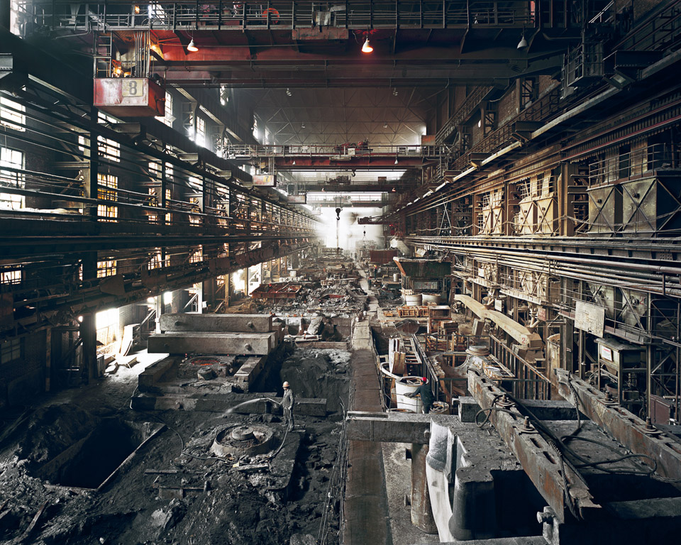
Old Factories #4, China – 2005 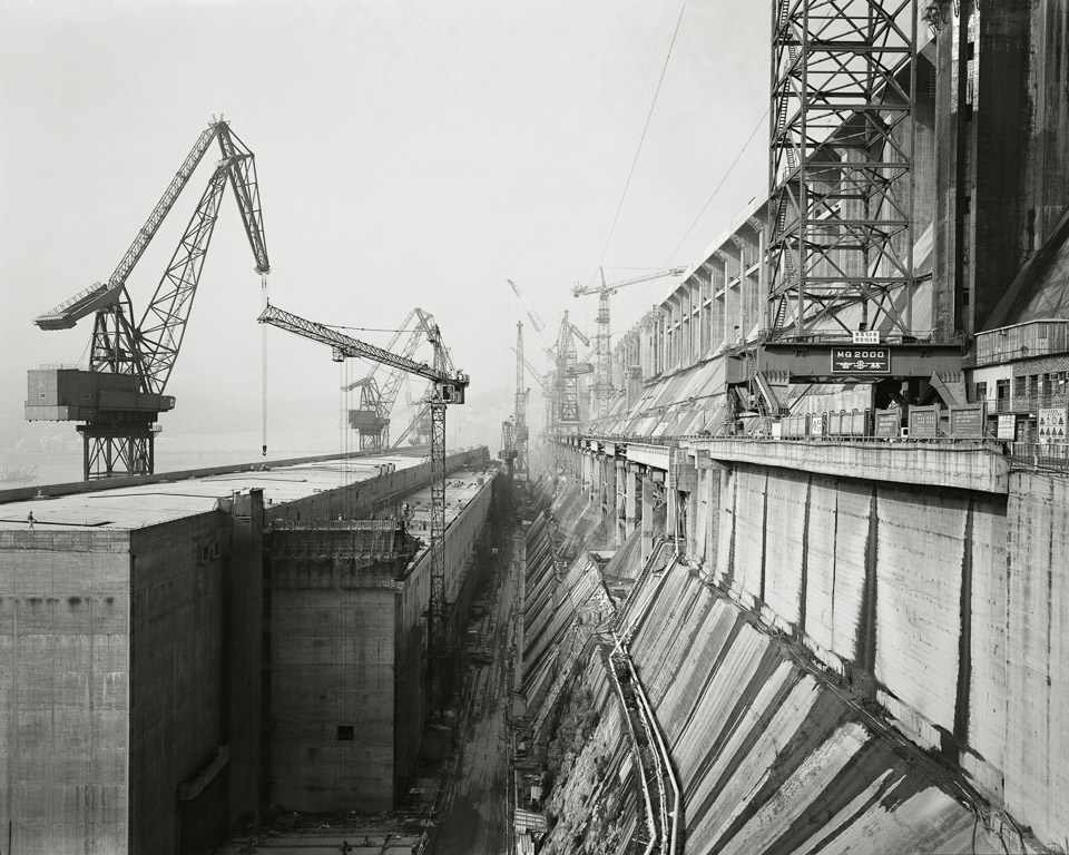
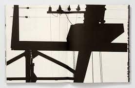
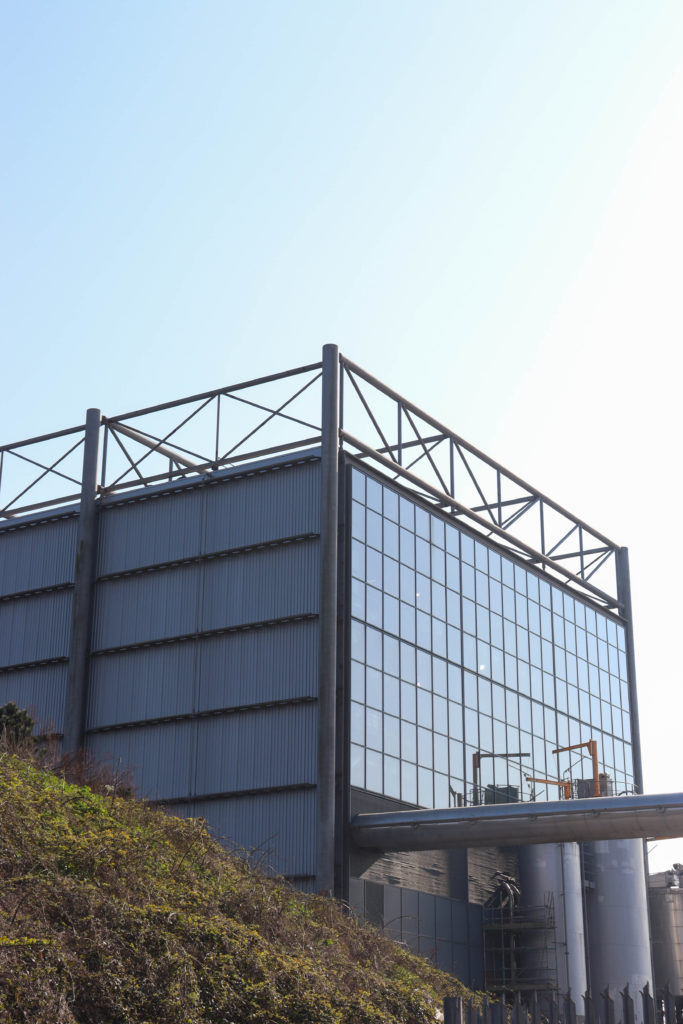
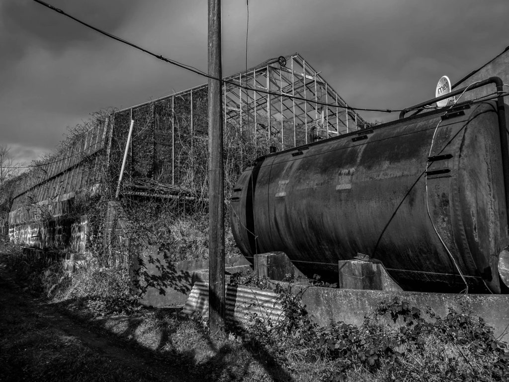
Edward Burtynsky is regarded as one of the world’s most accomplished contemporary photographers. His remarkable photographic depictions of global industrial landscapes represent over 40 years of his dedication to bearing witness to the impact of humans on the planet.
Early exposure to the sites and images of the General Motors plant in his hometown helped to formulate the development of his photographic work. His imagery explores the collective impact we as a species are having on the surface of the planet; an inspection of the human systems we’ve imposed onto natural landscapes.
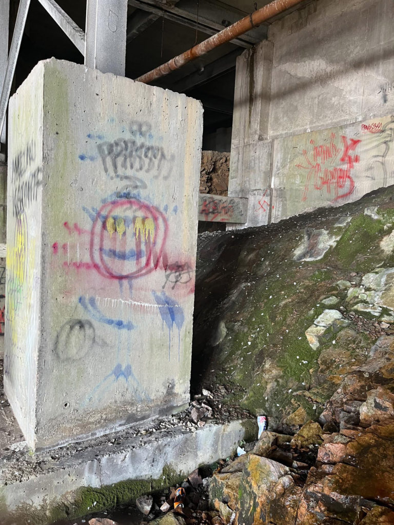
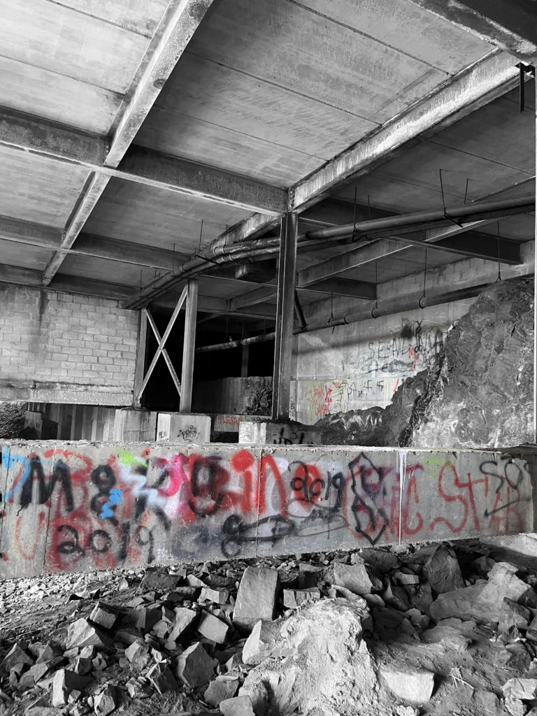
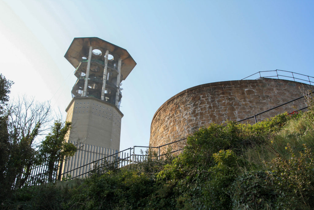
Other artists I liked:
Thomas Struth:
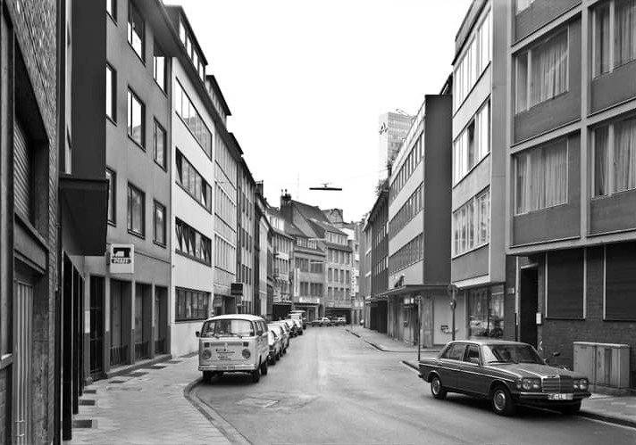
Düsseldorf –
1979
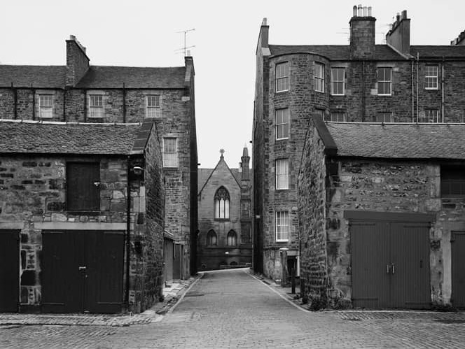
Edinburgh –
1987
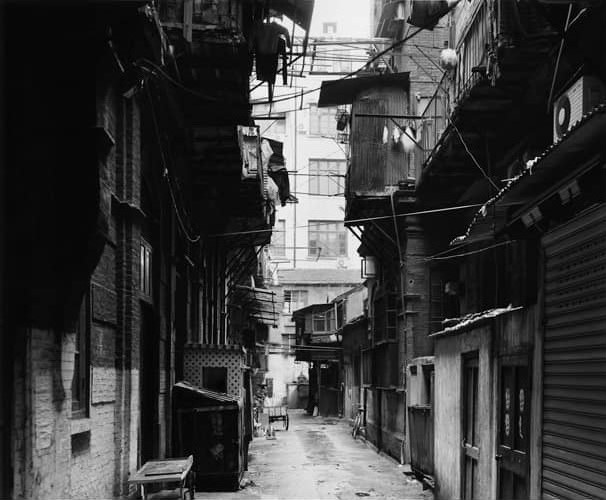
Shanghai –
1995
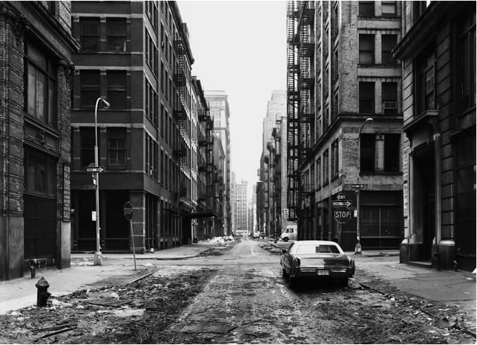
New York –
1978
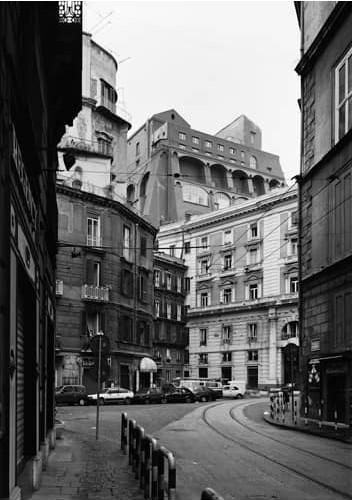
Naples –
1988
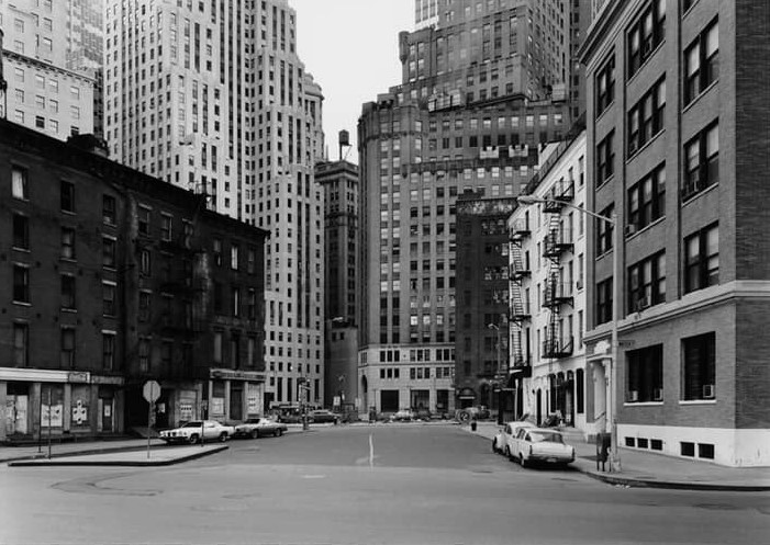
New York –
1978
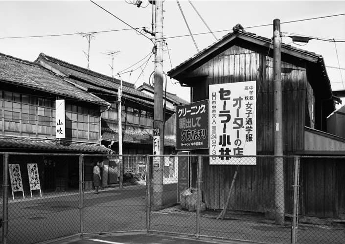
Yamaguchi –
1986
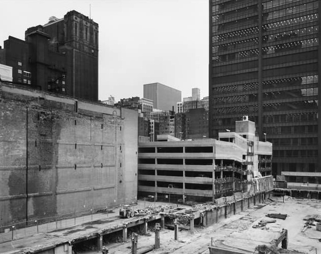
Chicago –
1990
Donovan Wylie:
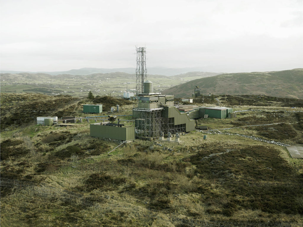
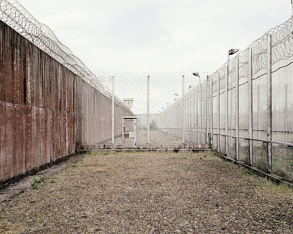
2014
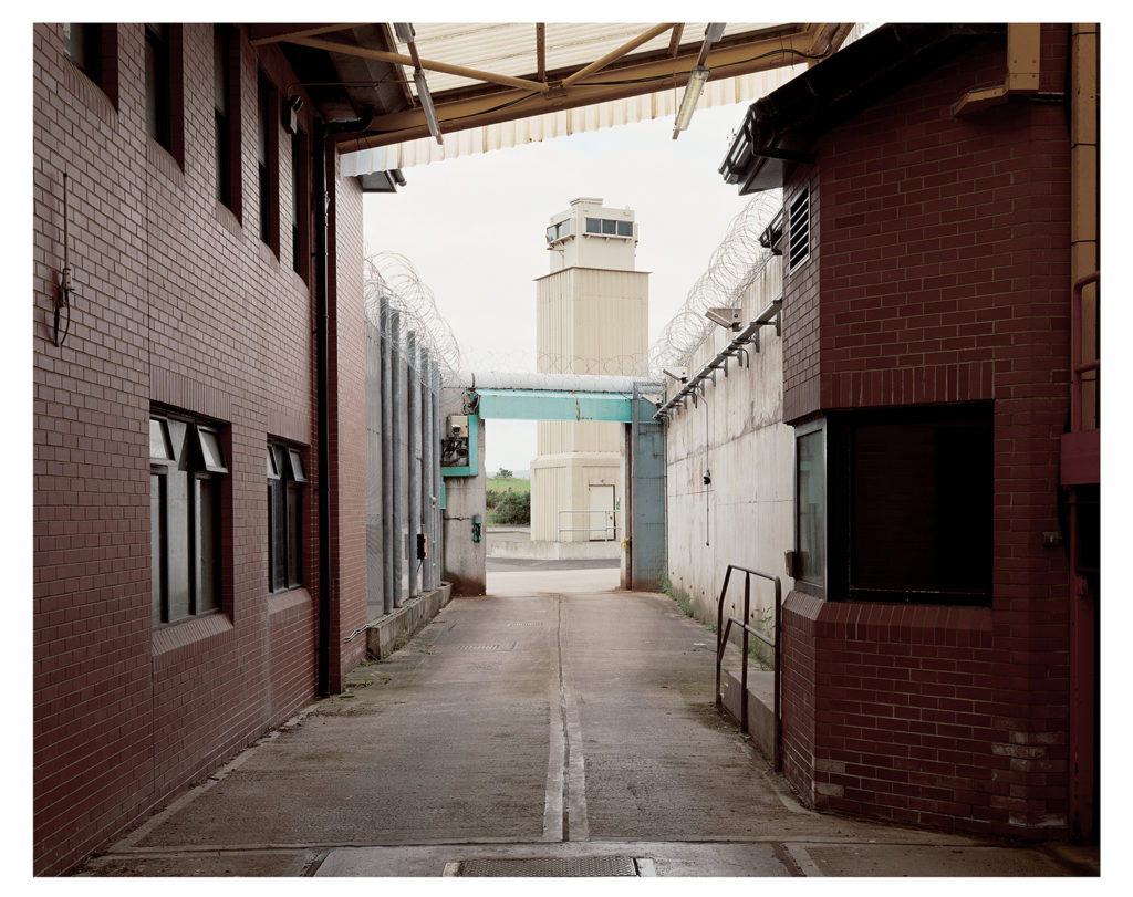
2015