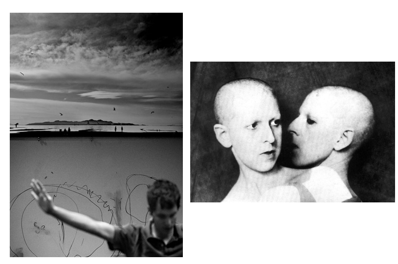
Here I have compared one image of Luke Fowler’s with another image of Claude Cahun, to make this process easier we discussed these images in class and which aspects of each are similar and different. I have created a table below using the information discussed and laid it out clearly and in preparation to fully compare these images.

| Luke Fowler Differences | Similarities | Claude Cahun Differences |
juxtaposed from top to bottom | 1 person | juxtaposed from side to side |
| portrait | monochromatic edits | 2 faces |
| juxtaposed from top to bottom | composed of 2 images | plain background |
| from shoulder up | separate images | more light tones |
| landscape | tells a story | visual facial features |
| not centred | scratchy lines | side profile |
| different shading | face is main aspect of image | |
| idea of freedom | loss of identity |
Full Image Comparison
To compare these 2 images, one composed by Luke Fowler and one by Claude Cahun I have created a this table above to better layout my first ideas, and this has helped me to build my analysis paragraph. Firstly, its important to note that the lighting of these images contrast each other, on the left the lighting is full of gradient terms and medium grey and white tones, whilst the multi exposure, Claude Cahun, piece is a massive contrast between the very light ones on her the faces and the very dark grey background, this means that these images can be linked together of juxtaposed depending on the work.
Furthermore, Fowler’s image is contains other arms of the body and in this case the mans right arm whilst Cahun’s is only composed of faces, this creates the focus just on the face and unlike in Fowler’s, the landscape doesn’t take away from the facial features. Additionally, they can be contrasted as the left is created from two images that are laid out on top of each other (with final piece being portrait) where the right is a multi exposure edit with two different landscape photos (with the final piece being landscape as well) and the fact that the final products are different orientations means this can even be compared.
These images tell two different stories, with Claude Cahun’s exploring the ides of a loss of identity and how the same person can have multiple identities and can feel as if they don’t have one personality or belonging. I can be implied that the message behind Fowler’s image is that identity is lined to this freedom, as he no longer cares about what other thinks when it comes to his identity. This idea is supported by the birds in the background as it contains the sky and birds, which represent freedom and then it links to the freedom within his identity.
