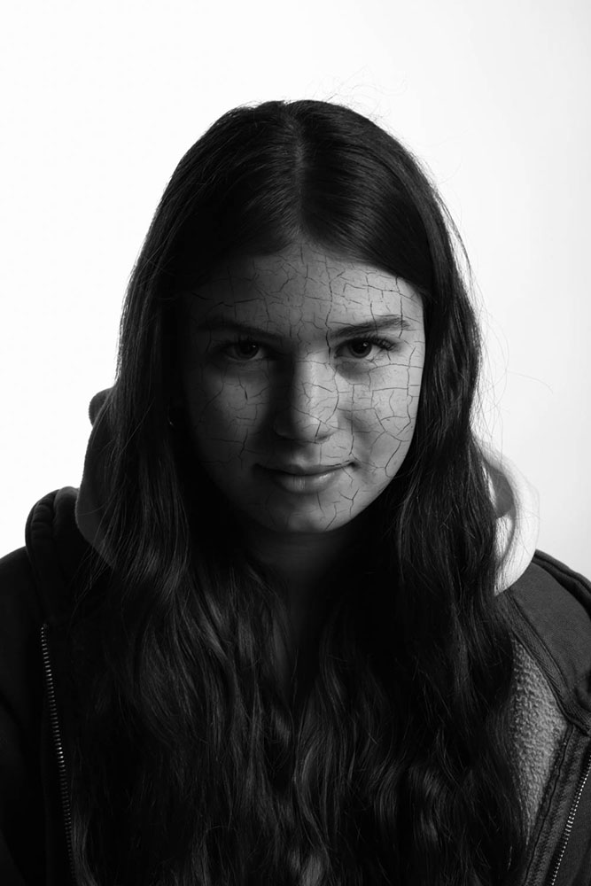
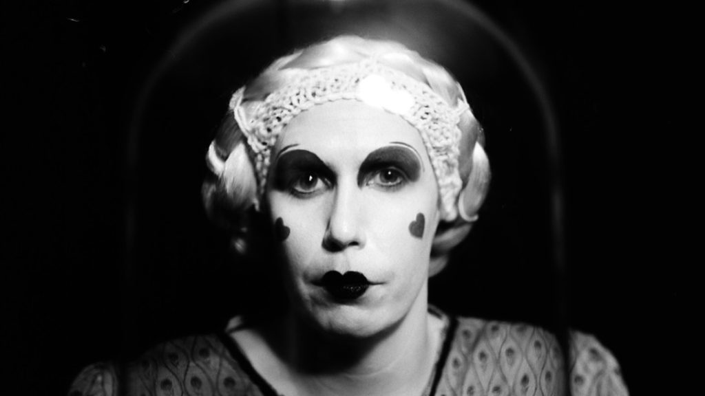
these two images have similarity in the sense that they are both presented in black and white. In my opinion, black and white images are much more interesting than images in colour, because it allows you to focus on what is really being photographed, behind the colours which is what usually draws your eyes to something in the first place. Both of there images are portrait headshots, taken in front of a plain background to draw your attention to the subject. Similarly, both images have a neutral facial expression. These images both explore the way in which identity is presented, in my image on the left, identity is show as something that is crumbling due to a society trying to shape people to all be the same, however in Claude Cahun’s self portrait, it seems as if she is representing her personality as something that is forever changing. In my opinion, Cahun’s self portrait is inspired by the queen of hearts, due to the heavy makeup on her face. I think this is supposed to present her identity as someone who is strong and powerful, no matter the gender they identity as. There are a few differences between the images, for example in my image the design on her face is created digitally using photoshop software, this is because I wanted the cracked face effect to look as realistic as possible. In Cahun’s self portrait, she manually paints on a design on her face, I think she does this because she is forever changing the way she looks and wants the image to look as raw as possible, as well as this, when the image was taken, they did not have the resources to digitally edit these photos. Another difference between these images is that one of them is a self portrait, which shows how Claude wanted to portray her own identity, and the other is a portrait taken of a friend by myself, in which I wanted to highlight how someone else’s identity comes across to me.
