A Comparison using a Venn Diagram

Written Comparison
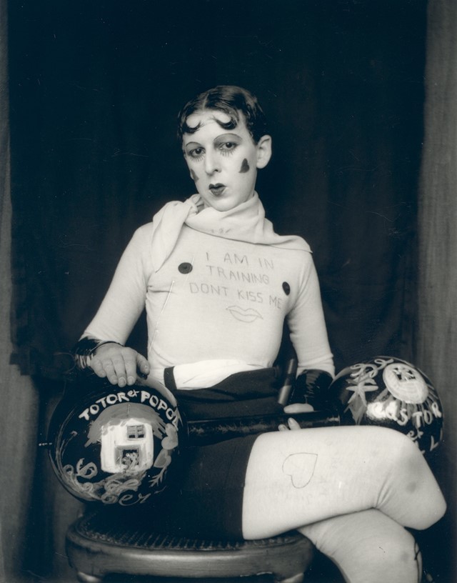
The image on the left is a self portrait of myself. It is a black and white, head and shoulders shot with a plain background. The image on the right is called “I’m training, don’t kiss me” by Claude Cahun in 1927. It is also a black and white portrait image with a plain background, however this image is a full body shot.
Similarities
Both images are black and white portraits, which helps emphasize the features of the model. They both use a plain background to create a contrast not only in colour but also detail, allowing the model to attract the attention of the viewer. There is also a contrast between the lightest and darkest parts of the image, made clearer by the black and white filters.
Differences
My image uses a male model wearing casual clothing, the image is a head and shoulders shot, allowing the face and hair of the model to take up most of the image. The model is looking away from the camera to the side, however there is no clear message behind the image. There are no props in this image.
This image uses a model who’s gender is not made explicitly clear, they are wearing a costume depicting the male bodybuilding stereotype. The image is a full body shot with the model looking directly at the camera. This image has a clear narrative about gender. with the use of lipstick, props, writing that is meant to be seen as mocking, drawings of hearts, etc…


